Email Crash Test: Retrospec
Hi, email geeks! In this Email Crash Test, I'm taking a closer look at how Retrospec harnesses the power of creative design to elevate their email communications beyond the ordinary. Join me as I navigate through the twists and turns of their unique “snake” layout, delve into the psychology behind their color choices and imagery, and see how they've expertly tackled the crucial aspect of accessibility. Let's begin!

Layout
Dive into Retrospec's email, and you'll find yourself on an awesome design journey that is as engaging as an
email should be.
From the moment your eyes meet the header, a bold and beckoning "Sale" button stands as a lighthouse. It's a
strategic gem that's impossible to ignore, signaling savvy shoppers to delve into deals.

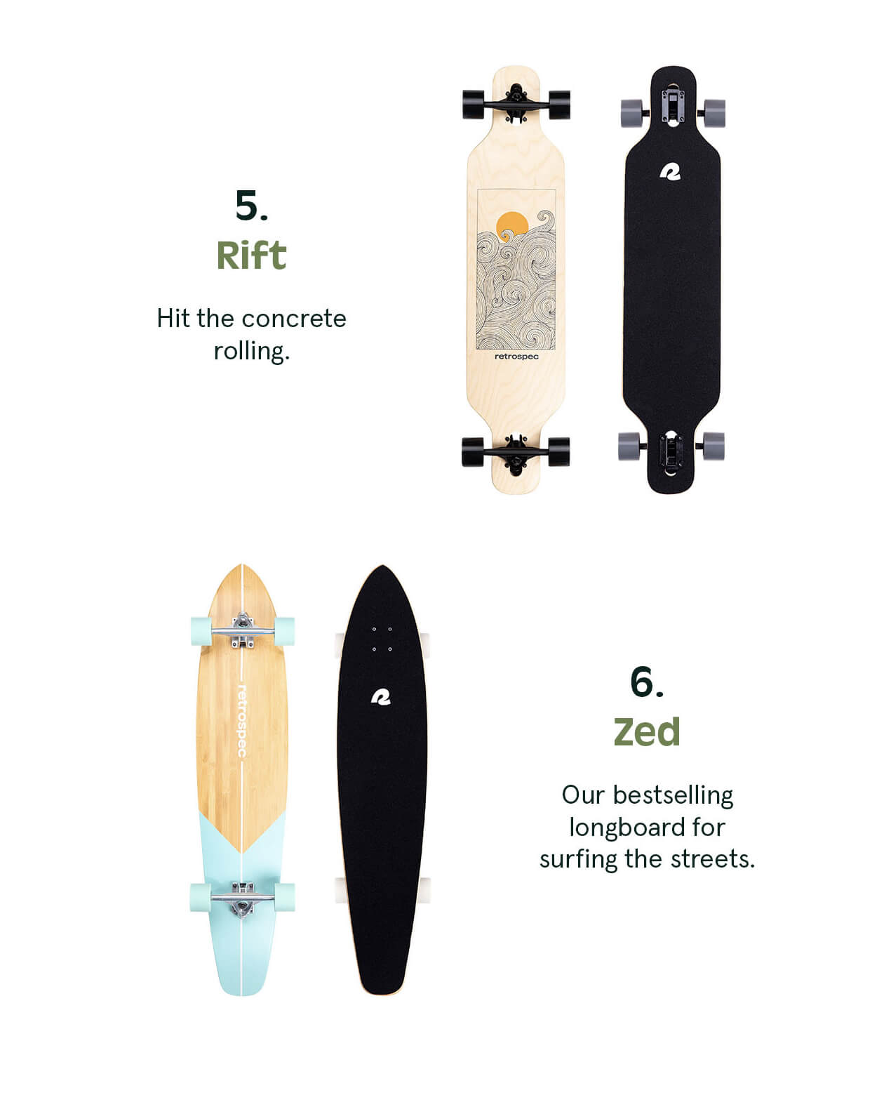
The next thing I’d like to highlight is their “snake” layout. This approach draws the eyes back and forth across the page, making for a more engaging reading experience and ensuring that the experience adapts seamlessly across the myriad of devices we use to interact with the digital world.

Making your email newsletters more captivating can be as simple as shaking up the layout. Most stick to the
standard left-to-right, top-to-bottom flow. But by choosing a layout that's a bit out of the ordinary, your
newsletter will really pop in the sea of usual designs.
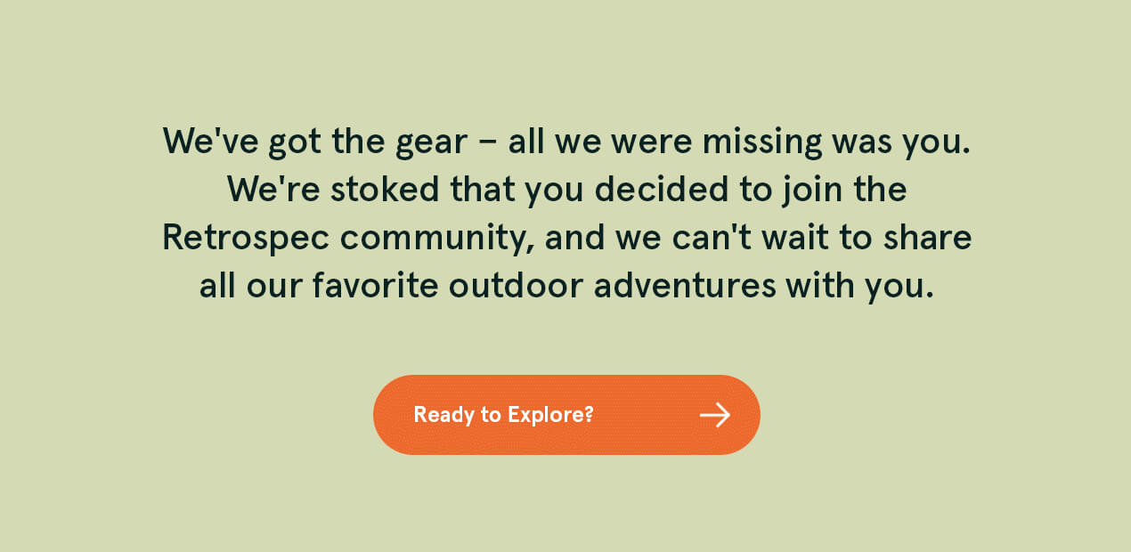
The CTAs like "Ready to Explore?" and "Get Started" are visually striking, designed to draw attention and
prompt action. But there's a practical issue to address — the font size on these buttons is small,
potentially hindering readability. A slight increase in font size would go a long way in enhancing clarity
and the user's ease of navigation.
Another risk in email design is the compiling of images. Pictures may speak a thousand words where plain
text might falter. However, in some email clients, if images don't render properly, your message could be
lost entirely, leaving recipients staring at a blank canvas.
To mitigate this risk, it’s crucial to balance images with text. Here are some best practices:
- Text-based information: Ensure that crucial information isn't embedded in images. Details like offers, important dates, or call-to-action (CTA) buttons should be in text format to remain accessible in all scenarios.
- Alt text: Always use alternative text for images. Alt text ensures that if an image doesn't load, the reader will still understand the context or message the image was meant to convey.
- Image size optimization: Optimize images for email to ensure they load quickly and don't consume unnecessary data. Large, unoptimized images can slow down loading times, leading to a poor user experience.
In general, Retrospec's email is an excellent example of effective email design — it's visually attractive, well organized, and engaging. The layout is not only aesthetically pleasing but also functional, ensuring a positive user experience that efficiently communicates its message and encourages interaction.
Design
Let’s shift our focus to design elements. The logo takes a prominent spot at the top, effectively boosting brand recognition. Product images are strategically placed throughout the email, effectively showcasing Retrospec's offerings. These images serve as more than just visual elements; they provide a clear view of the available products, which is crucial for an eCommerce brand. They play a key role in guiding the customer's journey and understanding of the brand's offerings. The copy is also product-centric, with descriptions that highlight the features and benefits of each item.
The email features a palette of bright and vibrant colors that immediately capture attention. Set against a
neutral background, these colors stand out prominently, effectively guiding the reader's eye through the
email. This use of color is not just aesthetic but strategic, highlighting key sections and points of
interest within the email.
At the beginning of the email, there's an animated GIF
that adds a dynamic element to the layout. The GIF's upper and lower parts move independently, creating a
sense of two separate moving objects.

While this animation is engaging, it might be overwhelming for some users, as the contrasting movements can be distracting. So, let’s talk about accessibility.
Accessibility
Did you know that using GIFs improperly in emails can potentially trigger photosensitive epileptic seizures? To make emails more accessible for individuals with photosensitive epilepsy, we have to:
-
use only one animated GIF per screen
-
ensure GIFs have a maximum of two flashes per second
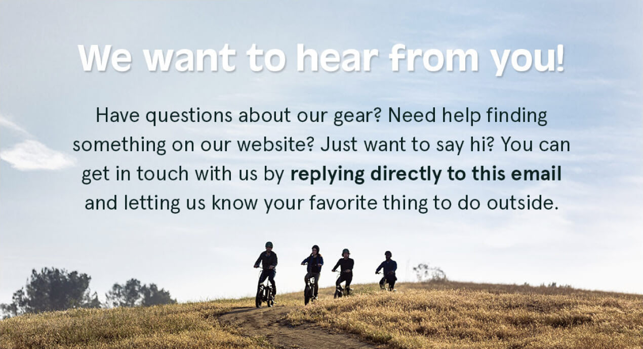
Let’s navigate further. The center-aligned text, while visually appealing, creates a slightly tricky path for readers with dyslexia or reading difficulties, where left-aligned text could offer a smoother journey.
The use of Arial, which is a sans serif font, supports accessibility. Sans serif fonts are generally considered easier to read on screens. The line spacing follows a comfortable rhythm, falling within the 150%–200% range, pacing the text perfectly for easy readability. Steering clear of underlines and italics is a thoughtful touch, removing potential reading hurdles for those with visual challenges.
While the email sets a good course in terms of accessibility, fine-tuning areas like animated elements and text alignment could elevate it to a beacon of inclusivity, enhancing the experience for all readers.
Making emails accessible to all is our social responsibility. That’s why I recommend reading more about accessibility standards and best practices in our article.
To sum up

Lead PR specialist
In my view, the standout features of Retrospec's email are its innovative “snake” layout and vibrant color palette, which together create a visually engaging welcome email. It's a reminder for us email folks that a little creativity and thoughtfulness in design can really make our messages pop. But hey, no design is perfect, right? There's room to up their game in terms of accessibility and maybe ease up on the image overload.
My overall rating
is 4 out of 5
How's your inbox been looking this month? Feel free to send over any emails you've enjoyed to oleksandra.khlystova@stripo.email and share them with me.
0 коментарів