Email Crash Test: Starbucks
Hey, email geeks! It’s been a while since the last Email Crash Test was released, but we’re back with exciting news for email marketers and designers. Stripo has partnered with Email Love to bring you an exclusive collection of email templates from real brands, all fully editable in Stripo. Now you can find inspiration on Email Love and customize the templates directly in Stripo—it’s fast, easy, and no coding needed. Today, I’m diving into one of the Starbucks emails in this collection, an excellent example of a beverage company email showcasing the launch of a new menu item.

Copy
The email from Starbucks feels like a friendly chat—it’s personal and welcoming. It makes me feel like I just walked into Starbucks and got a special hello from a nice barista. They start by saying, “Hello, Emily!” and thanking the user for being a loyal customer, which feels personal. Some may think this level of personalization is easy, but this small touch really helps build relationships with loyal customers.
I love how they mention the year the customer became a rewards member. Makes me feel like Starbucks really knows me

Founder & Head Curator of Email Love

The main idea is clear: Starbucks is introducing new products, and they want customers to try them. The email doesn’t just list the products; it tells a story that resonates with customers who enjoy trying new flavors and seasonal treats. When you read about the new pairing options, you can almost imagine the cool and refreshing taste of a cold iced coffee on a hot day.
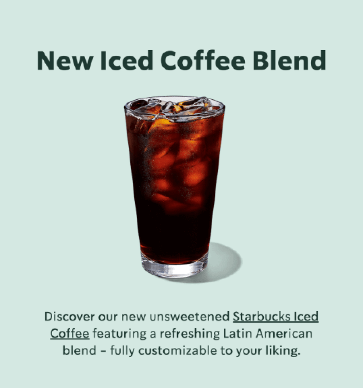
However, while the email effectively describes these products, there’s an opportunity to take it a step further. For example, Starbucks could include a line or two explaining why these products are a must-try, such as “Enjoy a revitalizing burst of energy on your upcoming summer adventure.” This addition creates a more vivid image for the customer, making the offer even more irresistible. In general, the language they have chosen is friendly and accessible, which is perfect for reaching a wide audience.
Design
What is the first thing that catches your attention in this email? The iconic Starbucks green, of course.
It’s more than just a color; it’s an invitation to a world of warmth and community. And, of course, coffee.
The green is used in the background and in the CTA buttons, paired elegantly with bright whites to maintain
a light and welcoming tone for the email. This contrast is essential—it draws the eye while also allowing
the visuals and text to stand out.
The images in this email take on a leading role, much like the exquisite main dish in a multicourse meal.
The cutout product photography really pops, and animation is used to showcase multiple products.

Founder & Head Curator of Email Love
Starbucks carefully chooses each picture to go with the words. We see the frosty condensation on iced coffee
cups, the buttery shine on croissants, and the warm golden brown of breakfast sandwiches. Starbucks has
tapped into a sensory appeal here, making the imagery as essential as the words.
In email design, visual hierarchy plays a crucial role. Starbucks has structured this email in a way that
guides the reader’s eyes through the content so they don’t miss anything. Headings are bold and inviting,
with key points emphasized for maximum impact. From the welcoming color palette to the appetizing images,
each element is carefully designed to make the reader feel like they’re in a Starbucks store savoring a cup
of their favorite coffee.
Moreover, Starbucks made an interesting choice by moving the menu links from the header to the footer while
placing a prominent link to its mobile app at the top. This shift directs recipients to the app for a more
convenient experience with ordering, menu browsing, and reward tracking. It’s a clever design move that
prioritizes customer convenience, encouraging them to access everything they need with ease.
Layout
From the moment you open this email, Starbucks takes you on a journey. It starts with a friendly hello and smoothly transitions to the main focus: the products and the benefits, followed by opportunities for engagement, such as ordering or donating. This structure keeps readers interested, enabling them to explore what’s new, why it’s important, and how they can participate. It’s an experience that feels both intuitive and satisfying, helping to build a sense of connection with the brand.

The Starbucks header is easily recognizable, as it incorporates brand elements and uses clean, well-known
fonts. Starbucks has designed its layout very well with ample spacing, which makes the email design look
clean and effective. Each section of the email feels like it has room to breathe, with a clear separation
between product highlights, promotional offers, and CTAs. This spacing helps guide the reader’s eye down the
page without feeling overwhelmed.
The footer at the end of the email serves as a conclusion, bringing everything together like the final
chapter of a book. Here, we find social media icons inviting readers to continue their Starbucks experience
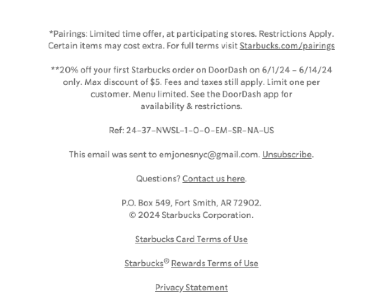
online. However, the footer becomes a bit heavy-handed. For example, the legal disclaimers in the footer
could be presented in a cleaner way. Instead of cluttering the main message, why not allow customers to
click through to an external page for the full terms? This would enable readers to focus on the positive
aspects—the delicious drinks and the exclusive perks.
Accessibility
Accessibility in email design isn’t just a rule—it’s a commitment to making sure everyone can experience the
brand’s message, no matter their abilities or how they choose to engage. Starbucks understands this, and
while their email brings an impressive level of accessibility to the table, there’s always room for a few
tweaks to make it even better.
Alt text is like a hidden narrator, stepping in when images don’t load or when readers rely on screen
readers. Starbucks includes alt text for its visuals, but it could be more descriptive. For example, instead
of “IMAGE OF ICED COFFEE & BUTTER CROISSANT & $5 BUTTON,” they could use a more evocative description, such
as “A refreshing iced coffee paired with a warm, buttery croissant—a perfect start to your summer day for
just $5.” Now, that’s a description that not only informs but also tempts.
The underlined links and clear text contrast are big wins for accessibility. They ensure that clickable
elements stand out and are easy to find—a must for all readers, not just those with visual impairments.

I’d also like to highlight that Starbucks made a smart choice with its email design: using dark text on light backgrounds. This makes the content easy to read for most people, even those with some degree of visual impairment.
You might look at this email and think the whole thing was created with sliced-up images, but Starbucks has put a lot of effort into using HTML text for most of the copy. This not only makes the email more accessible, but the overall email is more responsive and looks much better on mobile in comparison to many image-only emails.

Founder & Head Curator of Email Love
To sum up

Lead PR specialist
This email is a great example of a well-balanced combination of visual and verbal information. The visuals
are tasty, with the iconic green color scheme drawing readers into the world of Starbucks, while the
well-spaced layout guides us effortlessly from one section to the next. Each product highlight feels
intentional, each CTA enticing, and each message clear.
Of course, there’s always room to level up. With a few adjustments—such as enhanced alt text, improved color
contrast, and a more streamlined footer—Starbucks could elevate this email from impressive to masterful,
achieving a perfect blend, just like their coffee.
My overall rating
is 4.5 out
of 5.
Share your favorites emails with me at oleksandra.khlystova@stripo.email—I’d be thrilled to feature them in the next Email Crash Test. See you next time!
0 comentarios