Email Crash Test: Would You Rather
Hi there, it’s Oleksandra! Would you rather be an email marketer or a time-traveling email wizard, sending perfectly timed emails to historical figures? Unexpected, weird question? I know. In a world of intriguing decisions, I stumbled upon a newsletter on Really Good Emails that adds a twist to the classic game of “Would You Rather.” This newsletter is designed to captivate your curiosity and challenge your decision-making skills. Yes, it’s not an email from a big brand, but I reckon you would love it. Join me as I delve into this captivating newsletter experience, exploring the art of decision-making in an entertaining and interactive way.
Copy
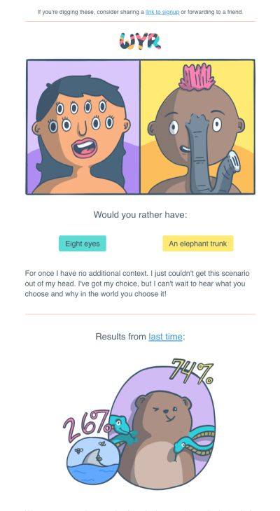
I chose the newsletter with the question, “Would you rather have eight eyes or an elephant trunk?” The email
introduces the concept of the “Would You Rather” scenarios with a humorous and attention-grabbing subject
line: “Things Get a Little Weird 🤪.” This subject line sets the tone for the playful content that follows.
The copy maintains a consistent, playful tone throughout, aligning with the nature of the presented
question. The copywriters have successfully infused a sense of humor into the description, making it
engaging and memorable.
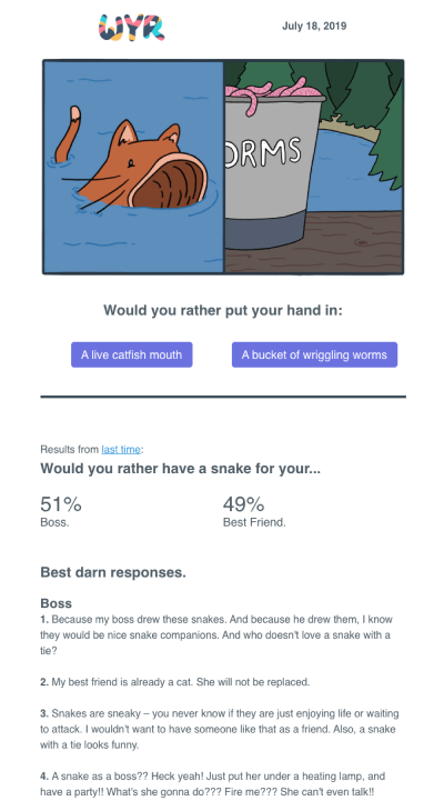
Including vote counts for the previous scenario serves as both a humorous element and social proof. It’s
pretty funny to see how many folks are into these weird choices, and it kind of encourages you to jump in
and join the fun, too.
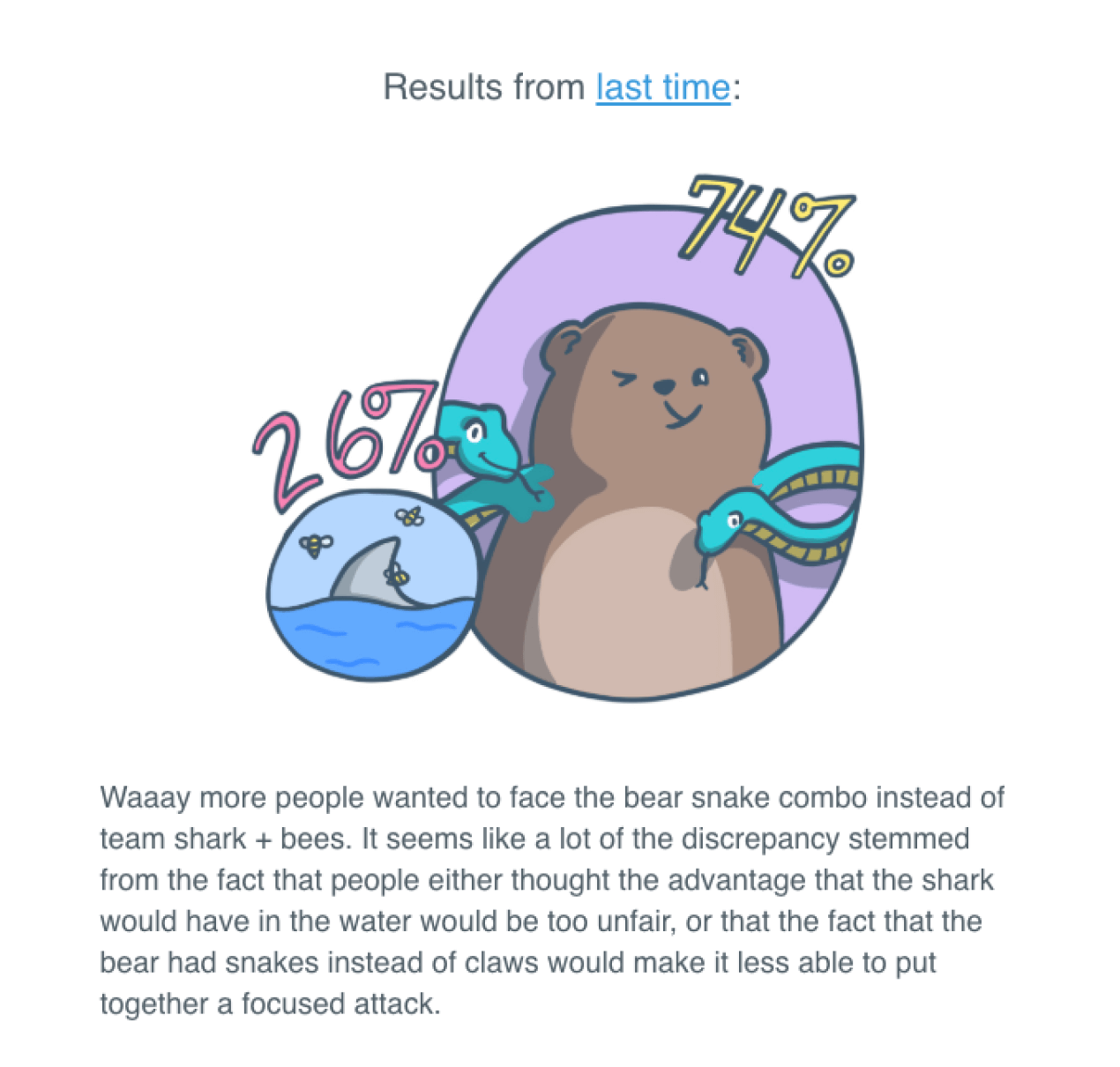
The email’s copywriting is effective due to its consistent tone and humorous “Would You Rather” question. The copywriters have skillfully presented absurd choices in a relatable way, leveraging the power of contrast and visual imagery to evoke laughter. The copy’s playfulness complements the visuals and interactivity, resulting in an email that not only engages subscribers but also leaves them with a smile.
Questionnaire
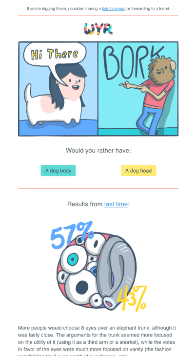
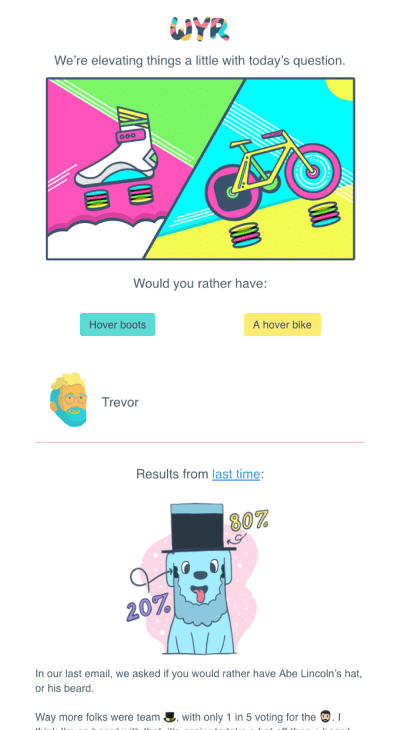
The email begins with a “Would You Rather” question and two illustrated options as answers, each accompanied by buttons to vote. This questionnaire immediately captures the reader’s attention.
By offering readers the opportunity to vote for their preferred option, the questionnaire creates a
sense of personal investment in the content. Moreover, it fosters a sense of community and
participation. As readers see the number of votes accumulated for each scenario, they become part of
a larger group of subscribers who are also engaging with the content.
As a bonus, the interactive elements extend the time recipients spend with the email. Instead of
simply skimming through the content, readers may take a moment to consider their choices and vote.
Also, subscribers may be more inclined to forward the email to their friends or colleagues to get
their input or simply to share a laugh over the amusing choices.
To sum up, questionnaires stand out as one of the most favored methods to add a gamified element to
emails. In the case of the Would You Rather email, users are directed to a separate page after
voting. But you can make your email interactive, allowing them to vote directly within the email and
receive your notification instantly—no external redirection required. If you want to give them a
try, I recommend using Stripo’s interactive modules generator that allows the creation of a
questionnaire, removing the need for coding skills. You create; Stripo handles the tech side.
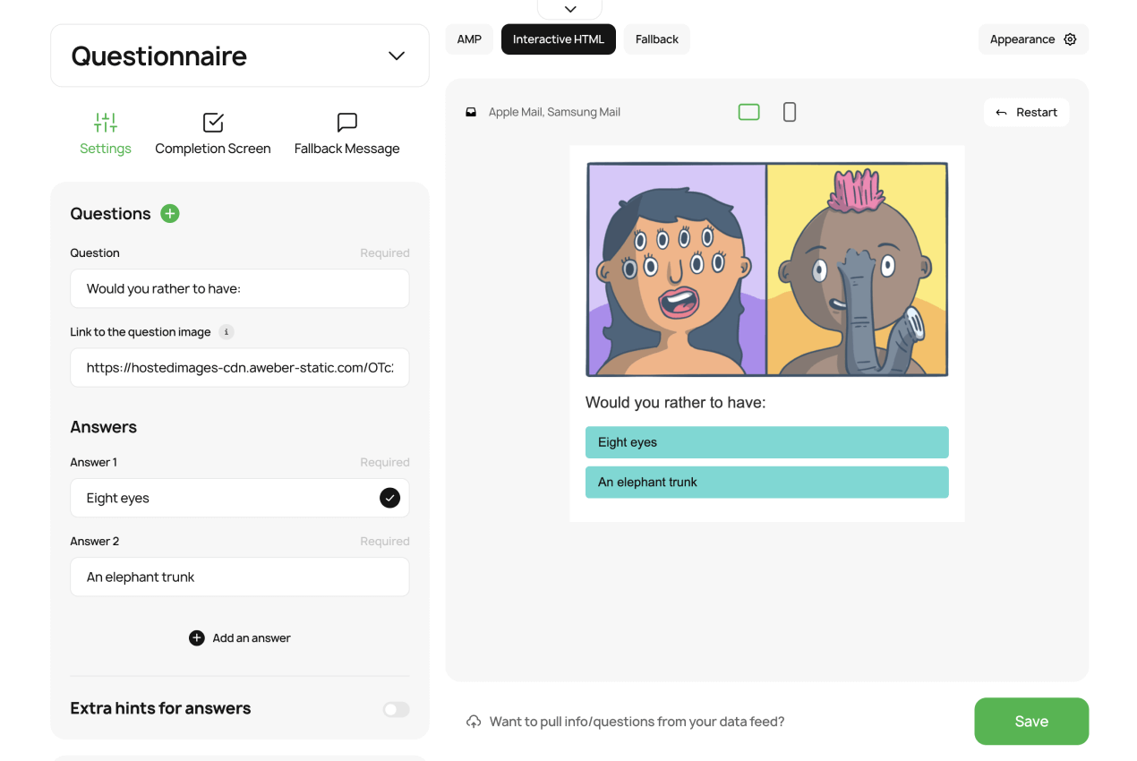
When readers have a positive experience with the interactive questionnaire, they are more likely to engage with future emails from the sender. This can contribute to higher open rates and overall engagement with the newsletter content.
Layout
The email begins with a header that features the “Would You Rather” logo, which is playful and aligned with the theme of the email.

The email’s layout effectively combines playful visuals, engaging content, and interactive elements. The
design aligns with the brand’s identity and mission, creating an enjoyable and memorable experience for
subscribers.
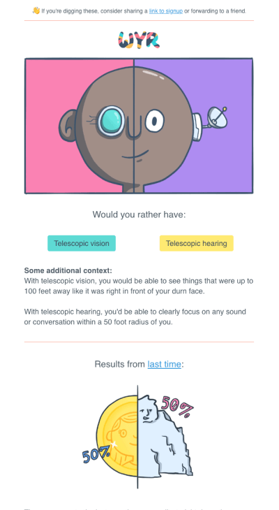
Buttons with options to vote, placed at the beginning of the email, are a great way to make the newsletter
high-performing. Bummer, not every email client treats buttons equally. Take Outlook, for example. It’s a
bit of a rebel and doesn’t play nice with CSS tricks such as rounded corners (border radius). If you want to
know how to deal with it, read this
article.
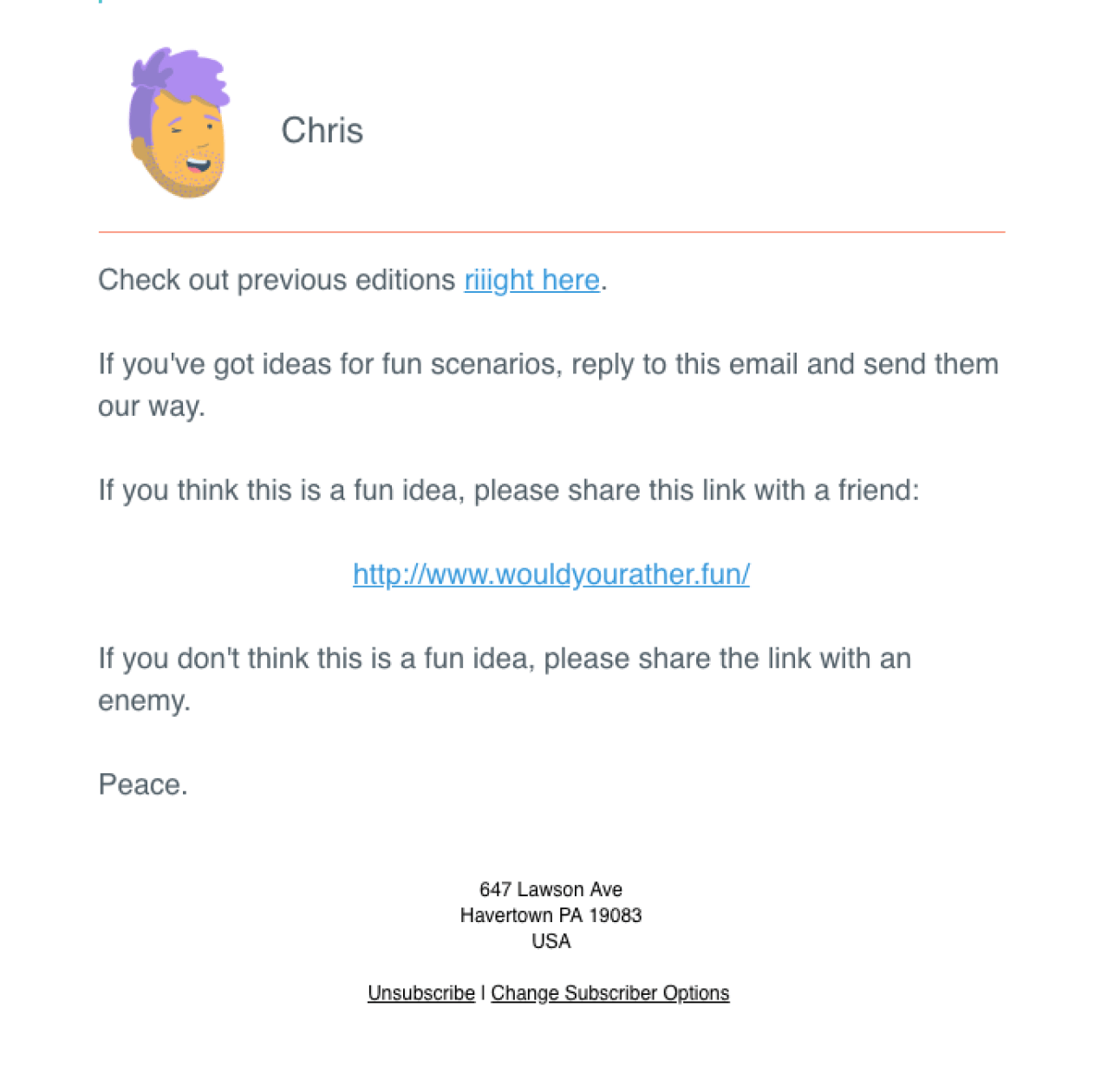
While the footer primarily provides necessary information about managing subscriptions, the casual language
(“If you feel like”) keeps the tone consistent with the rest of the email, maintaining the sense of
approachable humor.
To sum up

Lead PR specialist
In a nutshell, this email is more than just an email; it’s a journey into the realm of playful
decisions and engaging content. From the clever copywriting that maintains a consistent tone of
humor to the interactive questionnaire that sparks personal investment and community participation,
every element is orchestrated to captivate the reader’s curiosity. By getting people involved and
making decisions fun, this email shows us how a cool design and an opportunity to make a choice can
boost how much people like the content and keep them sticking around.
Frankly speaking, I subscribed to this newsletter immediately after I found it.
My overall rating
is 5 of 5
By the way, what would you choose: eight eyes or an elephant trunk? 🙂
Are there any awesome emails I might have overlooked? Drop me a line at oleksandra.khlystova@stripo.email
and let me know!
1 комментариев