Email crash test: Vimeo
Email is hands down the best way to connect with customers, with an ROI of 36:1. It’s like the superstar of communication channels when it comes to getting your message across. So, if you want to rock your customer engagement game, email is where it’s at! Especially if you are SaaS.
So, let’s take Vimeo’s email from Email Love as an example and figure out how to craft an astonishing email that convinces customers to go all-in on your product and find the perfect plan that suits their needs.
Design
I want to highlight the first screen of this email. It’s got this bright animation and well-defined text in its own section, which is a smart tactic to promote Vimeo’s plans and instantly capture the reader’s attention when they open the email.
The first section is the most important in an email. Opening promotional newsletters is such a routine task for subscribers. And that’s why you’ve got just a single shot to catch the reader’s attention and motivate them to keep scrolling.
The first call-to-action is clear and easy to see, so from the very beginning, the reader knows what action Vimeo wants them to take. By doing this, Vimeo makes it more likely for the reader to take that action and visit their website.
The pairing of vibrant yellow and bright pink colors makes for a simple but fresh color scheme that is bound to stand out in the crowd.
Scrolling down the email slightly, we are greeted with a nice, responsive pricing table. The latter is organized in a clear and structured manner, making it easy for recipients to understand the different plans and their respective features.
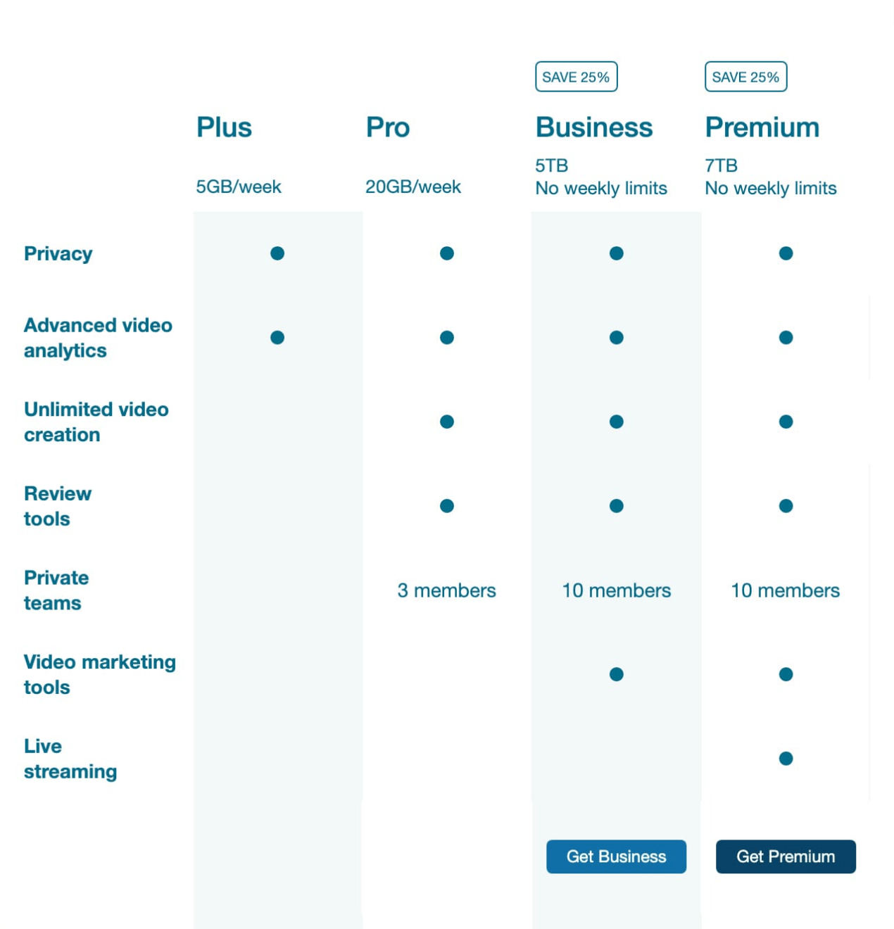
Kudos to Vimeo for creating a minimalistic and clear pricing table. However, I’m a bit puzzled as to why the Plus and Pro plans don’t have buttons to “Get Plus” and “Get Pro.” Who knows, maybe privacy and advanced video analytics are all I want.
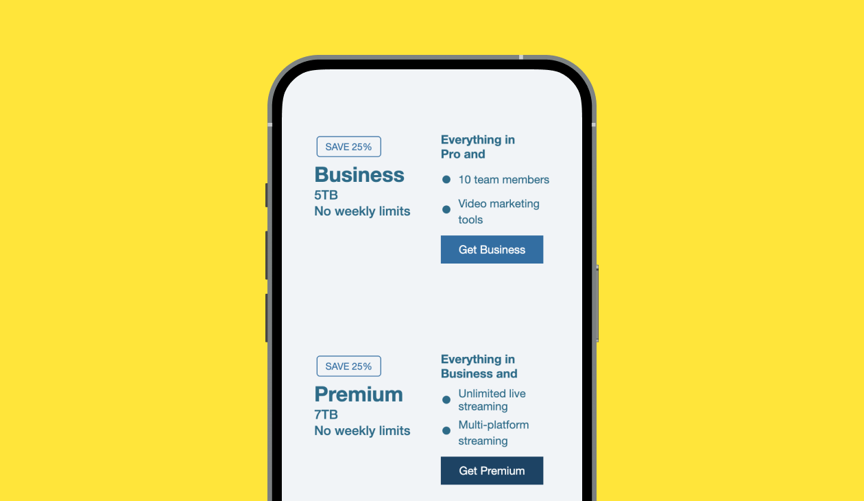
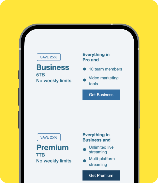
Even more kudos to Vimeo for the mobile version of this pricing table. They coded a separate one that is responsive on mobile devices and also looks great.
Copy
Less is really more. While it’s tempting to cram everything you want to say into an email, it’s best to keep things concise and to the point. Provide enough information for people to decide whether they’re interested and entice them with a compelling CTA.
Vimeo did a great job here, as clear and concise copy provides essential details about the offer, including the discount percentage, time limitation, and benefits. Even if you are not a Vimeo user, you will understand what their features are all about. The copy is well-structured, making it scannable and easy to read.
The subject line, "Our Best Deal of the Year," grabs attention by creating a sense of urgency, enticing recipients to open the email and discover the offer.
The email has some awesome CTA buttons that really catch your eye and make you want to click. They’re cleverly positioned and use action-packed text such as "Get Premium" or "Upgrade now" to make you feel like you gotta act fast.
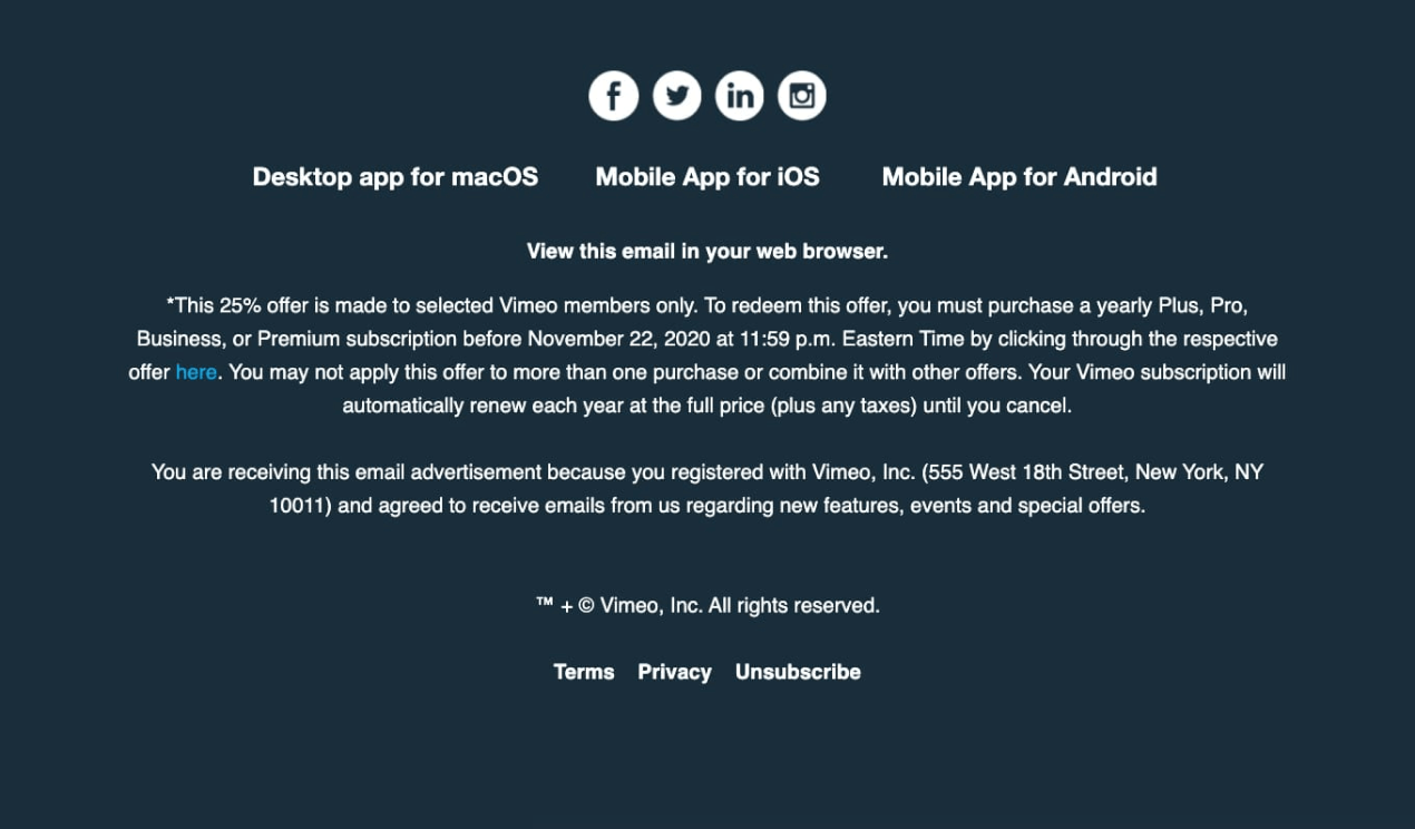
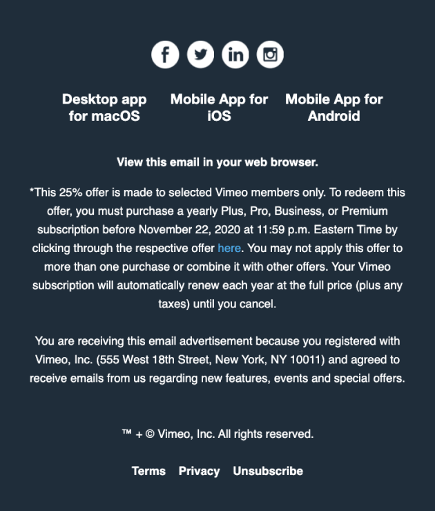
The email concludes with a well-designed footer that includes contact information, social media links, and an option to unsubscribe.
Accessibility
In May 2023, the Email Markup Consortium released the Email Accessibility Report, which includes findings from testing over 303,847 emails using Parcel’s accessibility checker. The report reveals an astonishing fact: a whopping 99.9% of emails fail to meet the necessary criteria for complete accessibility.
Speaking frankly, it was quite unexpected to witness such a significant number of emails falling short of meeting this requirement. As you see, it’s time to embrace accessibility and ensure that your messages reach and resonate with everyone.
What has Vimeo done to demonstrate their commitment to inclusivity?
Pros
All important information with links, including “unsubscribe” options, is in bold and has no underlining or italics.
Simply making a link text blue is not enough when it comes to accessibility. Consider that colorblind individuals or those reading emails on mobile devices with sunlight glare might not perceive the color distinction. Instead, make the link text bold to ensure visibility. It’s also important to avoid underlining the link text, as this can cause confusion for dyslexic readers.
They used color contrast.
Color contrast is crucial for making an email accessible. It ensures that text and visual elements are easily distinguishable and legible for all recipients, including those with visual impairments or color vision deficiencies.

(Source: University of Pittsburgh)
You can verify it using this tool. They even provide suggestions on which colors to adjust to achieve the ideal color ratio.
Left-aligned copy
Remember the dyslexic readers—never add center-aligned text in emails. Left-aligned text reduces the cognitive load by providing a clear and predictable structure. When text is aligned to the left, users can quickly locate the beginning of each line, making it easier to track and follow the content without distractions.
Have you noticed some cons? If yes, share them with me in the comments section below.
Don’t underestimate the power of an accessible email. Together, we can build a more inclusive digital world, one email at a time. Create yours from scratch following our guidelines, or choose from more than 1,350 ready-to-use templates from our library.
To sum up

Lead PR specialist
Vimeo does a great job of keeping their newsletter short yet informative. All in all, the email nails it with cool visuals, straight-to-the-point text, and buttons that make you wanna jump on the offer ASAP. They know how to create a sense of urgency and make you feel like you gotta grab that limited-time deal. And, of course, props to Vimeo for creating a responsive pricing table. It combines visual elements and clear information to facilitate the user’s understanding of the pricing plans and encourages them to take the desired action.
My overall rating
is 4.5 out of 5
Any emails you’ve loved that I’ve missed? Let me know at oleksandra.khlystova@stripo.email.
0 комментариев