Email review
Apple vs. Samsung
Uncover the secrets behind Apple and Samsung's engaging emails — usability, brand consistency, accessibility, and design that make them successful.
First impression
Let's begin by examining the first impression each email made and what caught our eye.
Apple
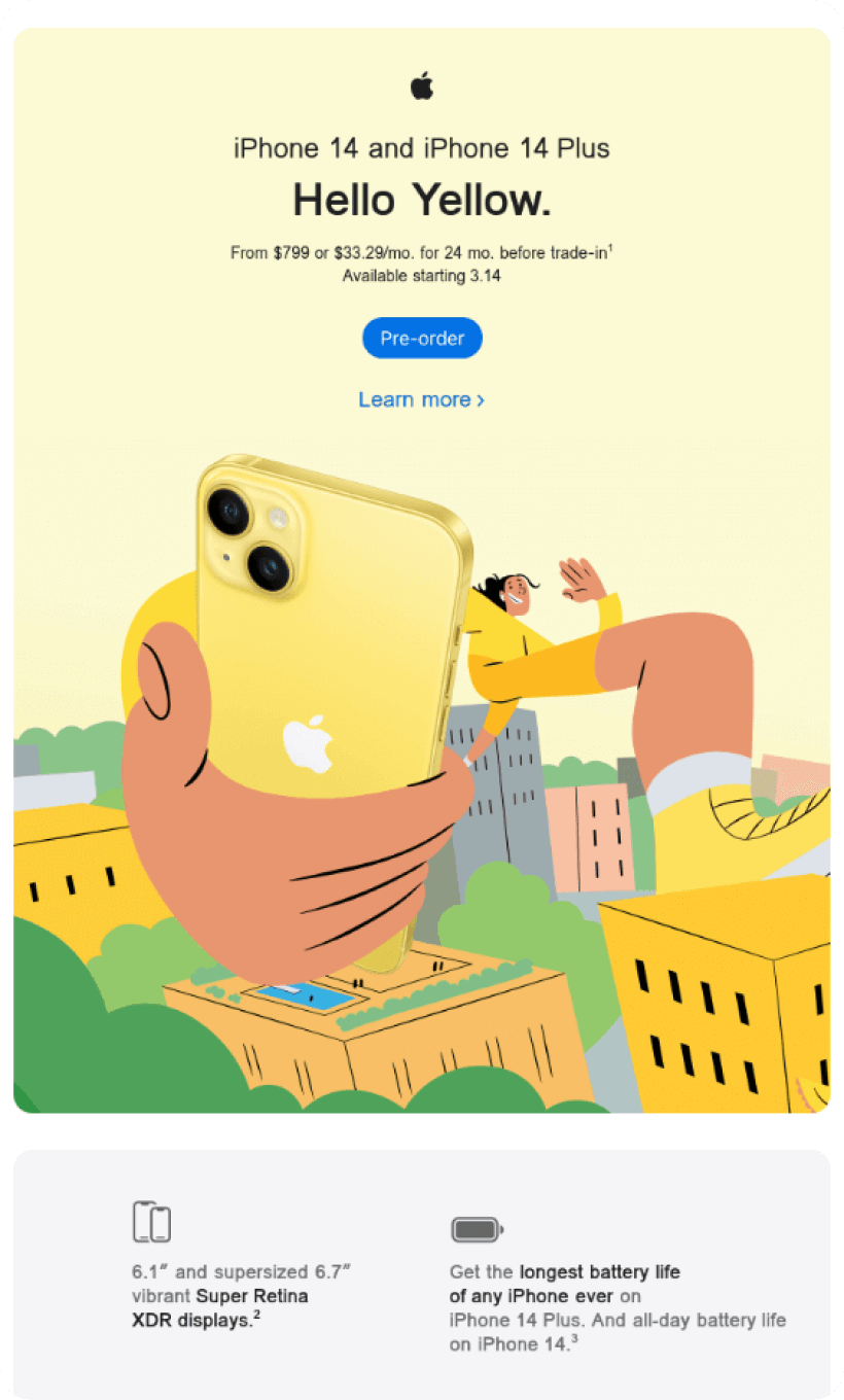
- Apple captivated us with "Hello Yellow.” It's a succinct yet impactful method to capture the recipients' attention, especially when introducing a new product color, yellow.
- Featuring an image of a person holding the phone reinforces relatability, it fosters a deeper connection than standalone product shots.
- Focus on key product features such as display size, 5G connectivity, battery life, and more.
- Offering a trade-in can be a significant saving. Who wouldn't appreciate purchasing an impressive new product at a discounted price? The "Trade-in" option is detailed, ensuring recipients understand the process immediately.
Samsung
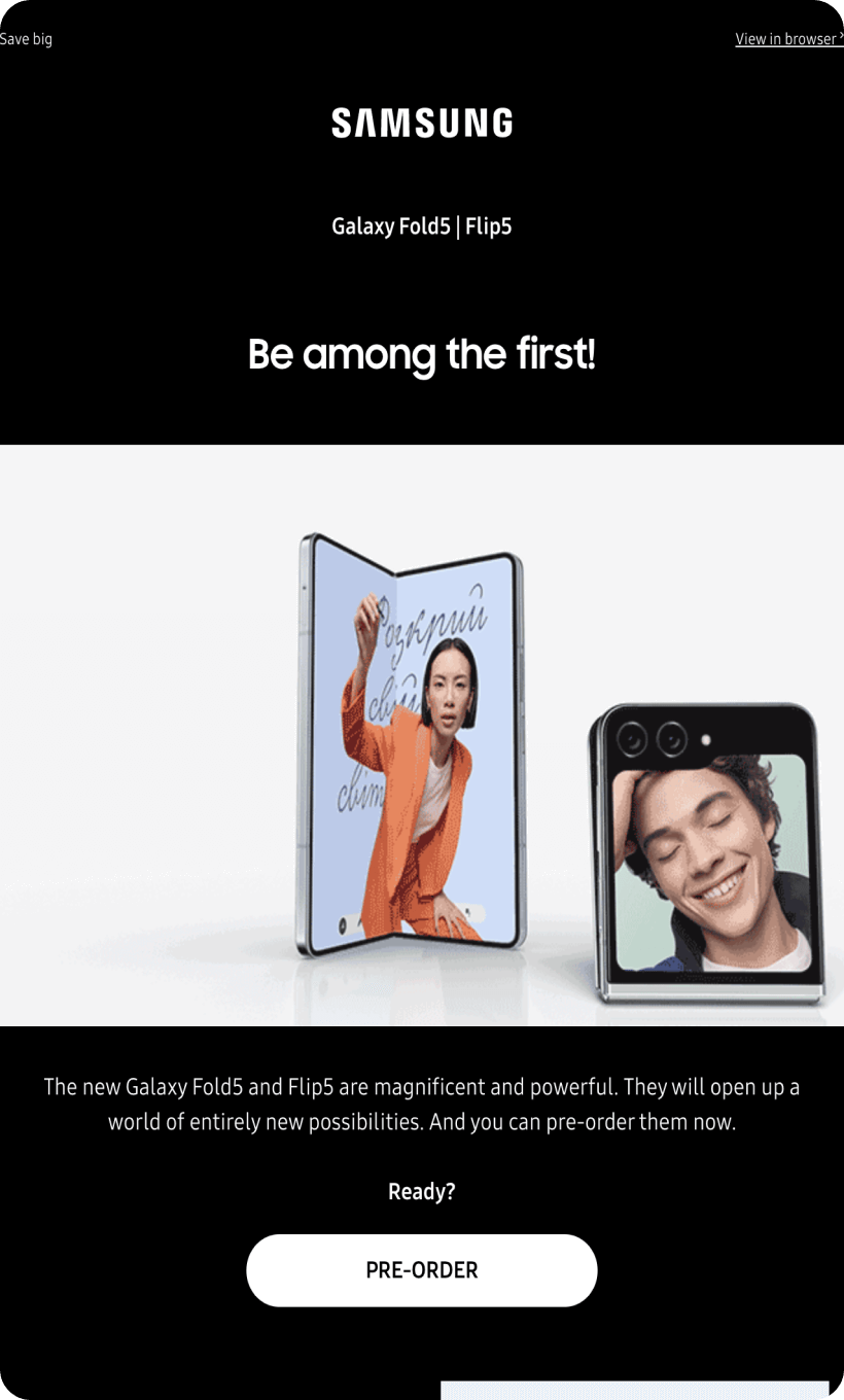
- With the opening phrase, “Be the first to experience,” Samsung appeals to our vanity, making us eager to own the product and excited to read more about it.
- GIF on the first screen showcases the product from multiple angles, while the presence of joyful and confident individuals enhances its allure.
- Samsung offers a $200 rebate for pre-ordering the new phone. Even though they did not explain how you can spend this money, saving some is always nice.
- The countdown timer instills a sense of urgency, clearly indicating the time left to secure this flagship phone and be among its first owners.
Usability
Email web version
Clickable images
Why are these two points important?
Sometimes, due to network errors or other unpredictable issues, images in emails may not load correctly in an email client. The web version link offers an alternative method to access the content.
Many recipients naturally expect that images and banners, will lead them somewhere if clicked. By not making such images clickable, you might confuse or frustrate the recipient.
Design
Email design is intricate. We'll address each aspect individually.
Optimization for mobile devices
Starting with the mobile-first approach, both brands shine — there's no horizontal scrolling, and the text is easily readable with appropriate font sizes.
Optimization for dark mode
Both emails are well-optimized for the dark mode. Yet, Apple's light-yellow background shifted to an olive hue (or something akin to that color). However, everything else in their email displays perfectly in both dark and light modes.
Brand consistency
Both brands maintained their colors, tone of voice, and even their brand fonts, even though most email clients typically substitute custom fonts with default ones.
Email accessibility
Email accessibility is not an option. It is a must today for social, business, legal, and humane reasons. So, are the emails from these famous brands accessible?
Sans serif font
Line spacing at 150%
Extra space around headings
Single-color backgrounds
Punctuation marks at the end of sentences and lists
The “lang” attribute
Both brands narrowly missed the mark on accessibility. We hope for improvements in their next attempt.
Email copy
Intro
As previously noted, Apple's "Hello Yellow" greeting immediately gave their email a friendly touch, while Samsung played to our innate desire to be the first. After all, who doesn't relish being at the forefront of any worthy endeavor? Thus, both emails excelled in their introductions.
The “Pre-order” option
Regarding the primary objective of announcing pre-orders:
Both brands effectively communicated this. Apple provided specific dates, whereas Samsung not only specified dates but also incorporated a countdown timer. Each brand outlined the pre-order process clearly.
Apple went further, detailing the trade-in option for any iPhone version from the iPhone 11 onwards. Samsung highlighted a $200 saving but left out the specifics.
Product description
Apple meticulously described everything — from trade-in terms and product dimensions to an exhaustive feature list for the iPhone 14. If you're curious about the iPhone 14, this email has you covered.
Samsung, on the other hand, teased a world of new opportunities, directing recipients to their website for more in-depth information.
Legal requirements
Each country or continent has its own regulations with different rules, like CanSPAM, GDPR, etc. It is important to abide by them. And if you are a global product, which our heroes are, you should consider the laws in the target countries.
Physical postal address
Unsubscribe option
The reason why they’re reaching out


