Email review
charity: water vs. Water For People
The place where a selfless pursuit meets design—emails from charity organizations bringing water to people in need. Have a glimpse of how brand consistency, usability, and accessibility inspire giving.
First impression
Charity unites the kindest souls by giving them a purpose and showing a better, more humane way. Let’s see whether two non-profit organizations—charity: water and Water For People managed to carry their messages from the inbox to the heart.
charity: water
- charity: water chooses the subject line wisely: “Every day, we're closer to ending the water crisis.” With a “Will you join us?” question slipping into the preheader space, it becomes an encouragement to become a changing force.
- 51 characters, no emojis—this subject line ends with a period. This statement is final and confident.
- The email header is minimalistic. It only has a clickable company name and logo, so the reader’s attention is not scattered across other elements.
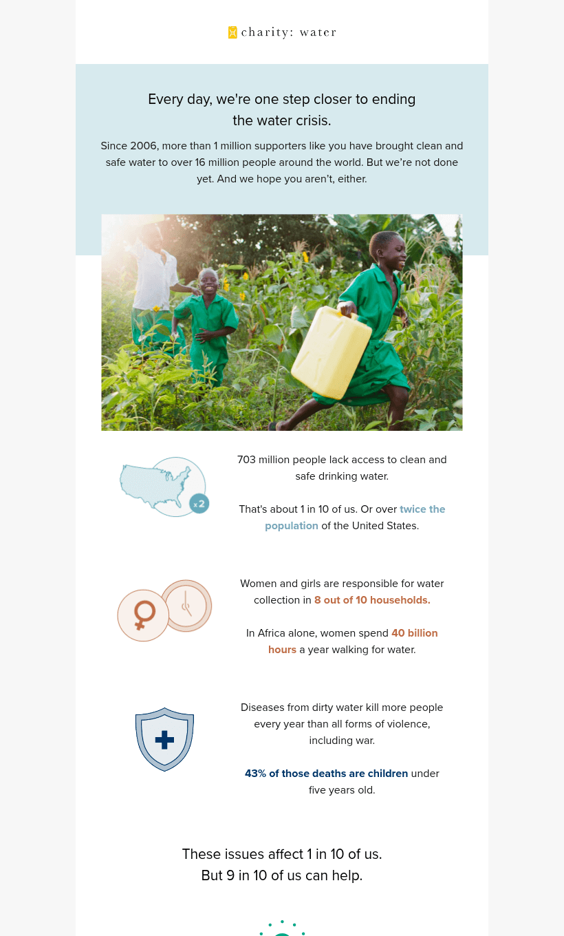
- The message body starts with a statement matching the subject line and a small paragraph with proud results: more than 1 million supporters and 16 million people who got clean water. It’s an inspiring introduction.
- A warm photo of children running across the cornfield with the brightest smiles and a water container. It is a reminder that what we may take for granted is someone’s reason for happiness.
Water For People
- The subject line the company uses gives off the opposite energy—a feeling of discovery. The line is somewhat intriguing— “Beyond Water 💧”— and the reader finds out the details later in the email.
- The subject line has 14 characters and an emoji hinting that a problem lies deeper than it appears.
- The header is simple and clean, with nothing but a logo and a company name.
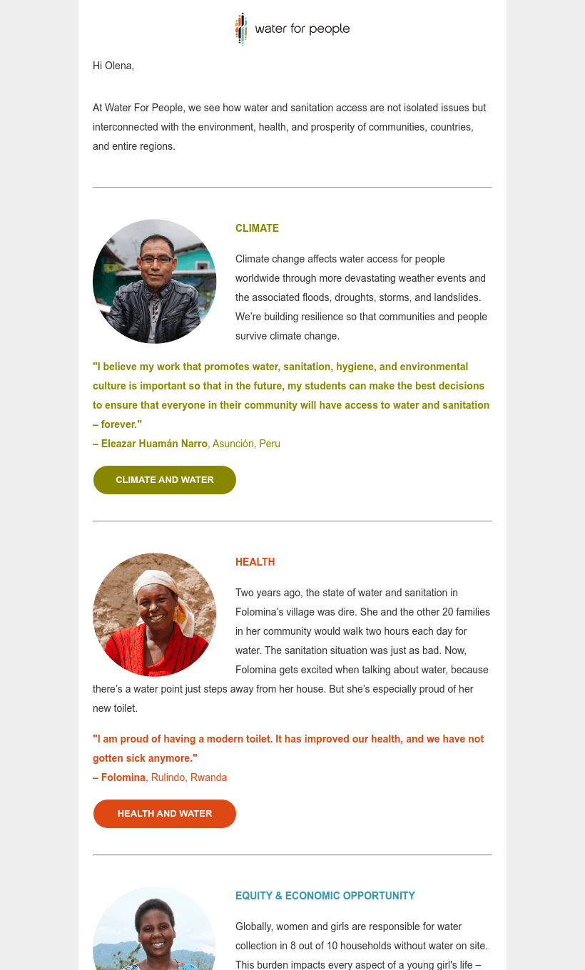
- An email starts with a personalized greeting with a company vision. Water For People enlightens the reader about the interconnection of water and the environment and offers a more complex approach to the problem.
- The email body feels intimate as it focuses on stories of people the organization has helped. A photo and a few words about their improved lives are enough to foster a better understanding of the charity's mission.
Usability
1. Email web version
2. Independent copy
3. Clickable images
4. The “Follow us on socials” section
Why are these points important?
Charity organizations rely on trust and engagement with their audience, so the usability of emails is crucial.
1. Email clients may fail to load the email or its images fully. In these cases, recipients often use web versions. Besides, it is an easy way to share an email if needed.
2. The key message should always remain visible, regardless of whether the images on the provider’s side are enabled. Without pictures, the email can lose important information.
3. Catchy visuals grab attention, so they can link the readers to the relevant landing pages or lead them directly to the donation tabs.
4. Social media creates transparency, connects audiences with organizations, and helps to spread the message.
Design
Emotions often motivate people to act, and the proper email design can stir empathy and encourage donations. Let’s study how organizations connect with people through visuals and which feelings they try to evoke.
Brand consistency
The emails from both charity organizations perfectly reflect their company style: the fonts, colors, and tone of voice match their websites and social media.
charity: water mostly sticks to its brand colors and pastel shades, with the only spotted changes in the button. With blue-gray as a background in the upper email part and light cream at the bottom, the message carefully highlights the essential text sections.
Interestingly, Water For People paints its email in the logo colors—each heading, quote, and call-to-action button reflects a particular palette choice. The logo at the bottom of the message carries the main brand idea: “Water for people, everyone, forever.”
Mobile version
The email from charity: water does not have horizontal scrolling, so the first test was passed, but on particular phone models, some layout elements are slightly displaced. The header logo, icon of the “Spring” community, call-to-action button, and logo in the footer are shifted to the left. The whole message is rather center-aligned, making these pieces visually different.
The Water For People email fits on the small screen entirely; there are no cut-off elements. The body of the message is left-aligned, and the buttons and images are placed correctly and do not overlap the text. The logo in the header and footer is center-aligned, just as in the computer version. Overall, you may read and perceive the email easily.
Dark mode optimization
charity: water added a white image background to the logo, so even in dark mode, the colors remain consistent. Neither the text nor the call-to-action button loses the contrast, making the central email part visible. On some devices, the logo in the footer has dark font coloring, so the dark mode slightly washes away its brightness.
Water For People has a white image background on almost all images. However, while the frame adds more visibility, it also removes the space between a photo and the text. As a result, the text and the frame collide, which may influence the perception of the email.
Email accessibility
Both charity organizations are halfway through the test with only a few assessing criteria left. Let’s see whether every recipient has a chance to become a part of a great mission by testing accessibility.
Sans serif font
Text readability
Line spacing (150%)
Single-color backgrounds
The “lang” attribute
Alt texts for images
The “role = presentation” attribute
It appears that both brands may improve email accessibility. Missing “lang” and “role” attributes, reduced line spacing, low color contrast in some email sections, and text alignment may cause difficulties for some recipients. However, we are confident the remaining points will soon be regained.
Email copy
Introduction
charity: water follows the standard email roles—a slightly altered subject line phrase is the first thing that catches the eye. Its enlarged font and overall central placement draw the reader’s full attention. The logo and the introductory text are side elements that complete the email composition.
On the other hand, Water For People's personalized greeting and the following message create a sense of a conversation with a brand. There are no vibrant colors or flashing banners; their introduction is clean and direct. Being the only bright-colored element, the logo is supreme and stands out from the text.
Buttons
charity: water paints its call-to-action button in aquamarine instead of yellow, which is the leading choice for the website. However, this color change fits the overall email palette better since the central photo is greenish. The shift from greens to aquamarine appeals to the most critical eyes.
The buttons in the Water For People email correspond to the colors in the logo, creating a harmonic and aesthetically pleasing view. The organization uses various coloring options for the buttons on the website or social media so the brand image remains intact.
Overall copy
charity: water operates with facts throughout the whole email. Elements of statistics and numbers of community members or people who do not have access to water foster trust. The tone of voice is motivational and convincing. It is an invitation to join and take the first step to change the world.
Water For People triggers the opposite feelings. The quotes and photos from people make the copy personal and touching. Here, it’s stories from Margaret, Folomina, and Eleazar that make the message convincing, unique, and no less confident.
Legal requirements
Physical postal address
The unsubscribe option
The reason for emailing
Both emails meet legal requirements with physical postal addresses and unsubscribe options. The reason for sending an email is not required for the USA, and thus, organizations pass the test flawlessly since they are targeting the US.


