Email review
Gap vs. Tommy Hilfiger
Black Friday is coming, so it’s time to reflect on last year’s email marketing campaigns. Today, we will compare two beautiful and engaging promo emails from the renowned fashion brands Gap and Tommy Hilfiger.
First impression
First impressions are extremely important in Black Friday email campaigns as recipients’ inboxes are full of tempting offers this season. That’s why the brands’ main task is to capture readers’ attention before they even grasp the main point of the email.
Gap
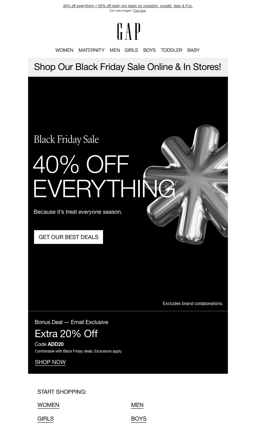
- Gap got right to the point with the headline “Black Friday sale, 40% off everything.” Less talk, more action, right?
- The email also mentions an extra 20% off with a promo code available to email subscribers only. By creating a sense of exclusivity, the email motivates subscribers to act based on knowing they can access special deals unavailable to others.
- The focus is on the deals for everyone — men, women, girls, boys, toddlers, and even babies. Family wardrobe makeover on a budget — sounds tempting!
- The minimalist black-and-white color scheme appears uncluttered and doesn’t distract readers from browsing products.
Tommy Hilfiger
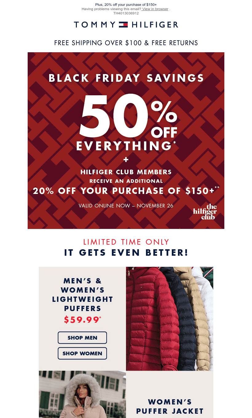
- The headline “Black Friday savings, 50% off everything” immediately shows readers the main point of this email and motivates them to act. There’s also an extra 20% discount for club members.
- The phrase “Free shipping over $100 & free returns” highlights that the brand is ready to help customers save more money during the busy shopping season. It reinforces the idea that purchasing is risk-free and financially smart, as customers save on shipping costs and benefit from hassle-free returns.
- The email is focused on winter clothes, and all the products are divided into categories, making the buying process faster and easier.
- The main banner is bold red and draws the reader’s eye to the key message. In contrast, the product selection is set against a neutral beige background, which ensures that customers stay focused on the products without any visual distractions.
Usability
1. Email web version
2. Clickable images
3. “Follow us on socials” section
Why are these points important?
1. Providing a web version of the email allows recipients to view the content in their browsers, which offers a seamless experience even if images fail to load or display issues arise.
2. Unclickable images in emails can cause confusion or frustration.
3. For a clothing company, showcasing outfits with their products and new collections is vital. Enabling customers to follow their favorite brands on social media is important to ensure they can stay informed about new product releases and share user-generated content.
Design
Consistent and attention-grabbing design is crucial for every email. That’s why we would like to address each aspect individually.
Brand consistency
Both brands’ emails stay recognizable by using their color schemes and product presentation. However, Gap added more black color to match the Black Friday vibe.
Optimization for dark mode
Both emails adapt well to the dark mode, thereby maintaining their visual appeal.
Optimization for mobile devices
Both emails are well-optimized for mobile and offer a clean layout without excess content or the need for horizontal scrolling. The text remains easy to read, but the buttons could benefit from a larger size to improve usability on smaller screens.
Email accessibility
Email accessibility is a must to ensure that all people can conveniently interact with newsletters. So, are the emails from these famous brands accessible?
Sans serif font
Text readability
Single color backgrounds
The “lang” attribute
Alt texts for images
The “role=presentation“ attribute
Both brands have some room for improvement in optimizing their emails for screen readers and ensuring they are accessible to dyslexic and color-blind people.
Email copy
Intro
Gap and Tommy Hilfiger both catch the recipients’ attention with appealing deals and extra discounts for email subscribers and club members.
Headline
Both headlines are catchy and straightforward. “Black Friday sale, 40% off everything” from Gap and “Black Friday savings, 50% off everything” from Tommy Hilfiger leave no room for guessing and immediately show readers the main point of the emails.
Buttons
Gap offers good button copy. The phrases “Get our best deals” and “Gift something great” sound encouraging and boost the motivation to act. Meanwhile, Tommy Hilfiger uses more prominent, eye-catching buttons in the email to ensure they stand out and prompt action.
Legal requirements
Every country or region has its own set of regulations, such as CAN-SPAM and GDPR that dictate how emails should be handled. It’s crucial to comply with these laws. For global products, it’s essential to take into account the specific legal frameworks in each of your target markets.
Physical postal address
The unsubscribe option


