Email review
McDonald's vs. KFC
Explore the mouthwatering elements of these brands’ fast-food promotion emails—focusing on their simplicity, brand identity, customer experience, and effectiveness in conveying offers.
First impression
We deliberately chose emails similar in structure. Before we explore the details, let’s dive into our first impressions of these brands’ promotional emails.
McDonald's
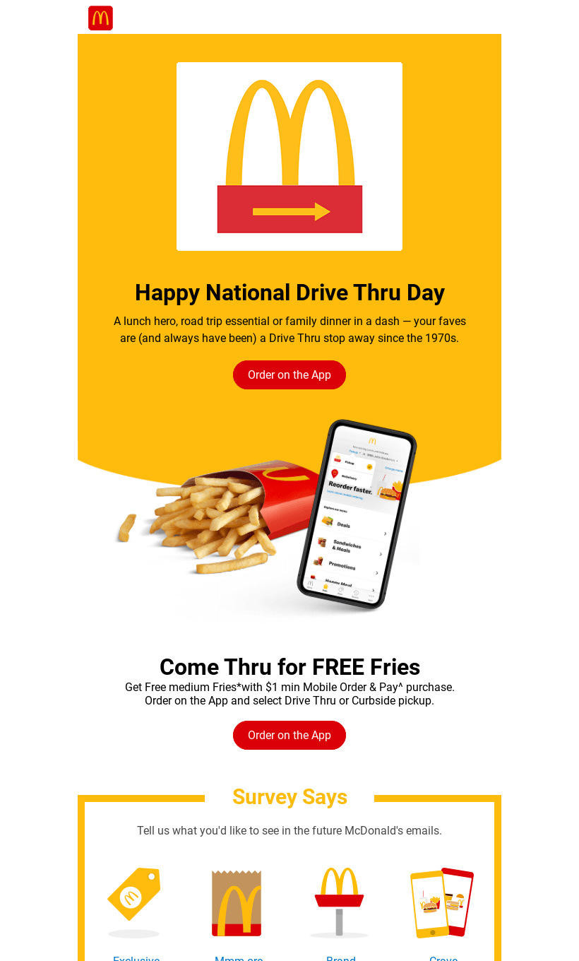
- McDonald’s email celebrates National Drive-Thru Day, giving off a more playful and celebratory vibe.
- The vibrant yellow background, a signature McDonald’s color, immediately connects readers to the brand.
- The promotion of free fries with mobile orders adds an extra incentive, along with an app-focused call to action: “Order on the App.”
- The email is more community-focused, asking for feedback through the “Survey Says” section.
- The clear, bright layout complements the brand’s friendly and family-centric messaging.
KFC
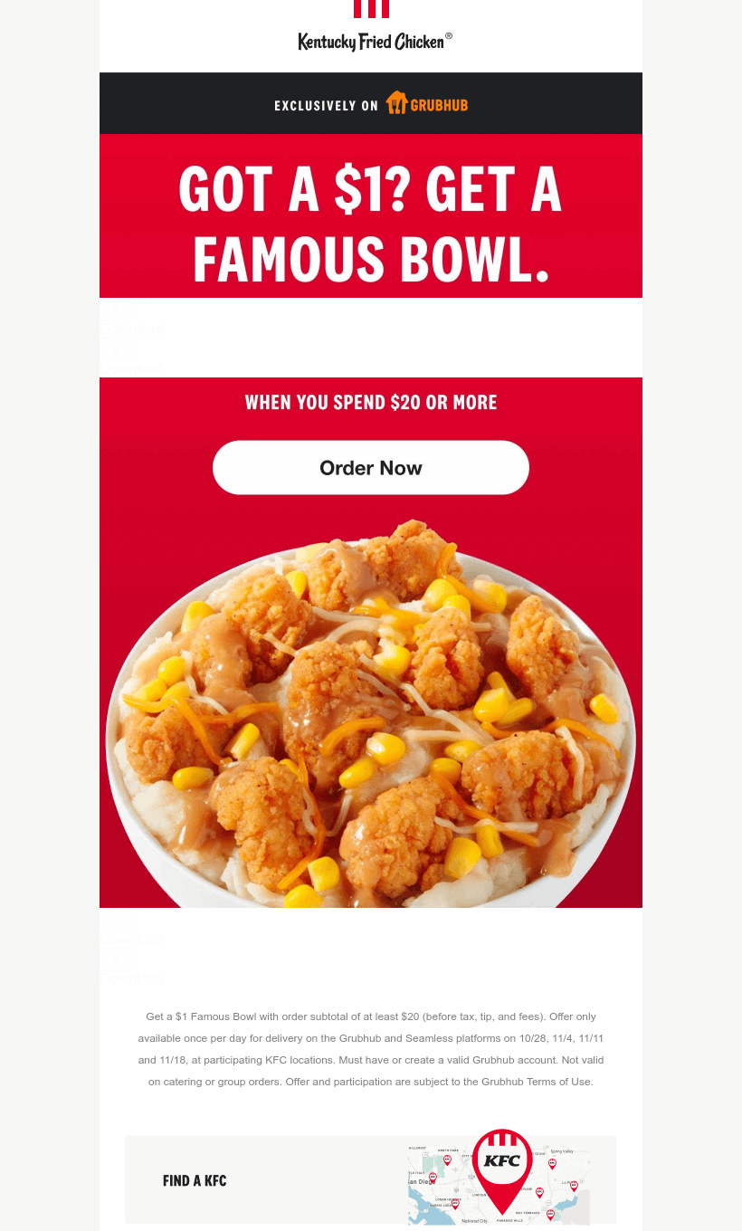
- KFC’s email immediately grabs the recipient’s attention with its bold headline: “Got a $1? Get a Famous Bowl.”
- The simplicity and directness of the message make it clear what the offer is.
- The email highlights the GrubHub-exclusive offer, encouraging immediate action with a large “Order Now” button.
- The dominant red background, coupled with an appetizing image of the Famous Bowl, creates a compelling visual for food lovers.
- The use of the brand’s signature red and white colors keeps it recognizable, while clear sections at the bottom (Find a KFC, How We Make Chicken, Now Hiring) maintain brand engagement.
Usability
Although both emails focus on clear usability and effective communication, they have some differences worth noting:
1. Web-version availability
2. Independent copy vs. images
3. Clickable images
4. Follow us on socials
Why are these points important?
1. Providing a web version of the email is crucial as it ensures that recipients can still view the full content of the email if it doesn't render properly in their inbox or if there are image loading issues due to email client restrictions. This backup option guarantees a seamless user experience and ensures the promotional message isn't lost.
2. Having both text- and image-based information ensures that if images fail to load, users can still access the key details of the promotion. Both brands avoid embedding essential details in the images, making their promotions accessible regardless of email loading errors.
3. Clickable images enhance usability by allowing users to explore offers or products further directly. Both KFC and McDonald’s make excellent use of this feature.
4. Including social media links allows customers to stay engaged with the brands, creating potential opportunities for future interactions.
Design
Email design plays a pivotal role in catching recipients’ attention, and both brands use their signature designs effectively.
Brand consistency
Both KFC and McDonald’s maintain their brand colors and tone of voice in their email designs. KFC’s red and white are synonymous with its branding, while McDonald’s yellow and red reinforce its iconic status. KFC’s email is minimalistic, while McDonald’s has more visual elements and sections, aligning with its playful and family-oriented brand image.
Optimization for dark mode
Both brands ensure that their emails are well-optimized for dark mode, making sure buttons, fonts, and images remain legible and vibrant. The bright colors they use (reds, yellows, and whites) stand out well in dark mode, ensuring a consistent experience for all recipients.
Optimization for mobile devices
Both emails are optimized for mobile use, which is essential since many recipients open promotional emails on their phones. McDonald’s, in particular, focuses heavily on driving users to its app, reinforcing the mobile-centric nature of its promotion, with several calls to action linked to mobile services.
Email accessibility
Accessibility is an important consideration for all businesses, and both brands do a solid job of making their emails accessible:
Sans serif font
Text readability
Alt text for images
Line spacing (150%)
Single-color backgrounds
The “lang” attribute
The “role = presentation” attribute
Both brands excel in ensuring accessibility. Their use of sans serif fonts and clear line spacing (about 150%) ensure readability. The color contrast in both emails is flawless, making the text stand out clearly against their backgrounds. Both companies also include alt text for images, ensuring that visually impaired recipients can grasp the context even if they can’t see the images.
Email copy
Intro
KFC starts with a direct and enticing offer for a $1 Famous Bowl, setting an urgent tone for customers to act fast. McDonald’s takes a more lighthearted approach, celebrating a holiday (Drive-Thru Day) while combining a reward (free fries) with a national event.
Headline
KFC’s headline is clear and action-oriented: “Got a $1? Get a Famous Bowl.” It immediately communicates value and simplicity. On the other hand, McDonald’s headline, “Happy National Drive-Thru Day,” evokes a celebratory tone and highlights the tradition of using the drive-thru, instantly creating a sense of nostalgia and connection.
Buttons
Both brands effectively use buttons. KFC’s “Order Now” button is simple and clear and encourages instant action. McDonald’s places more emphasis on app use, with the call-to-action “Order on the App” repeated multiple times throughout the email, reinforcing the importance of mobile engagement.
Legal requirements
Physical postal address
The unsubscribe option
The reason why they’re reaching out
Both brands comply with legal requirements by including a physical postal address and a visible unsubscribe link as required by laws such as the GDPR and the CAN-SPAM Act.


