Email review
M&M’s vs. Nuts.com
Sweeten your day with a pinch of romance from M&M’s and Nuts.com emails—covering usability, brand identity, design, and comprehensiveness that form St. Valentine’s messages.
First impression
St. Valentine’s Day is when you expect a taste of love covering you like a blanket. Will we catch this feeling from the emails? Let’s check and find out who will carry out this game.
M&M’s
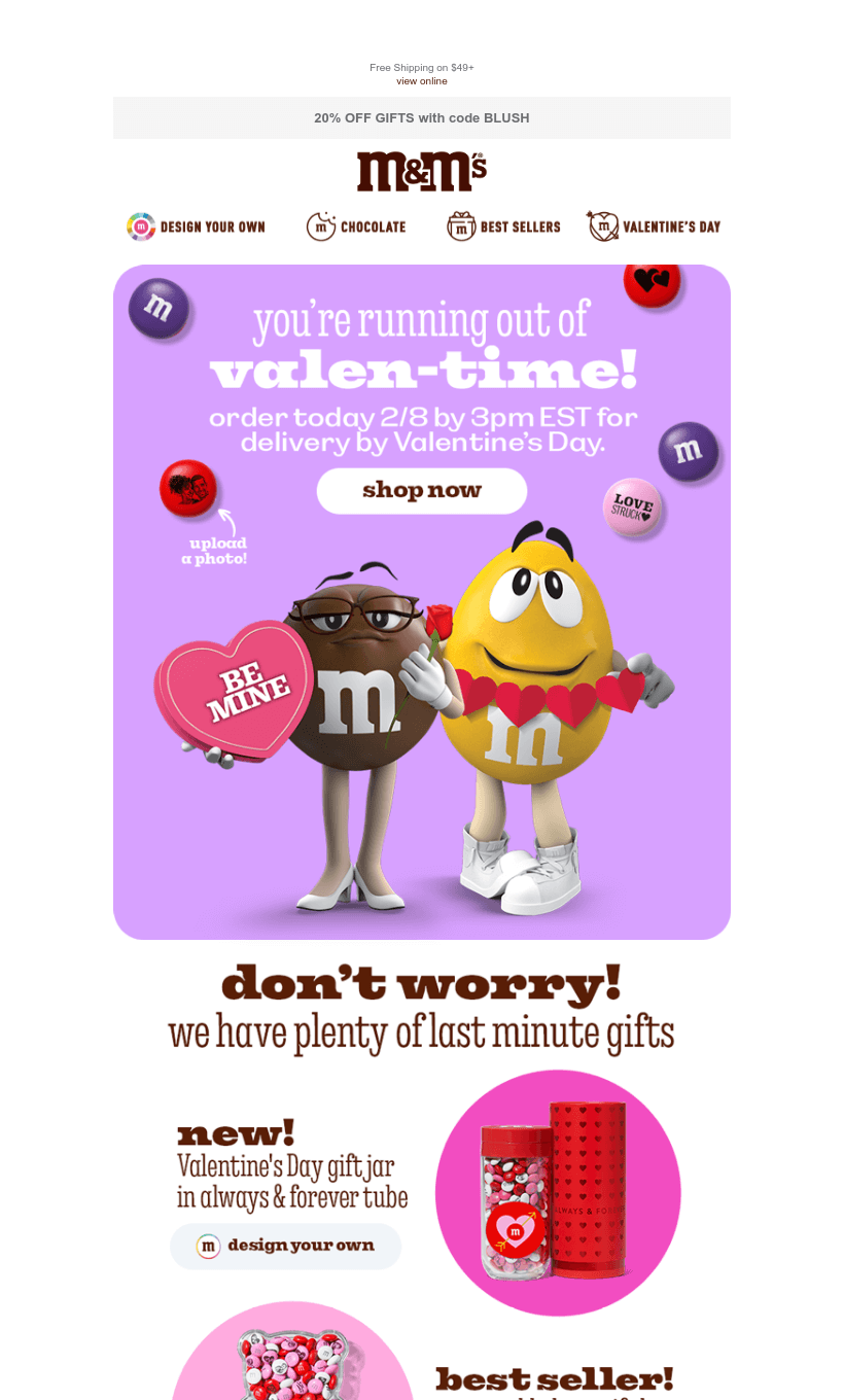
- The subject line is a teaser of what’s inside, and M&M’s is straightforward—😍TODAY = Last Chance for Valentine's Day! 40 symbols urge readers to hurry and not waste the final moments.
- M&M has a heart-eye emoji highlighting the excitement of the offered discounts and the upcoming Valentine’s Day.
- The email header is precise—a navigation bar, the company’s logo, and a discount. Nothing to give or take.
- If the email hasn’t yet stolen your heart, hold on! M&M’s Yellow and Brown are here to inspire love with the “Be Mine” box of sweets. The email is catchy, entertaining, and colorful—exactly what you expect.
Nuts.com
- The email’s subject line instantly reminds you of school years and first love— You + Our 🍫🍫 = 😍. With 16 symbols, this subject is precise, yet you know the deal the company’s about to offer.
- Emojis speak louder than words in the Nuts.com case, and these perfectly picked icons complement the message.
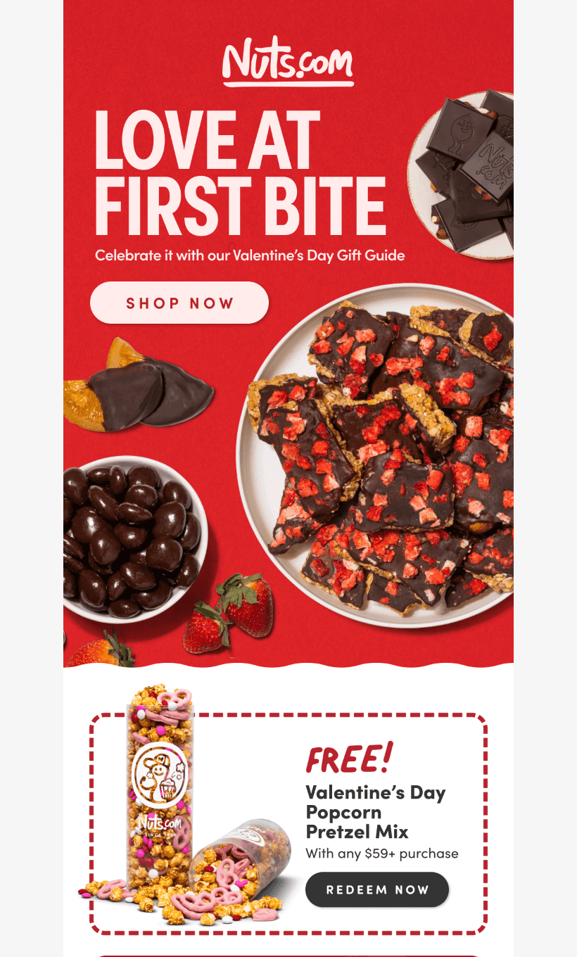
- The email starts with a confident statement claiming love at first bite and a strong call to action button encouraging subscribers to shop now. The banner’s color choice is red—a passionate and powerful variant for the day of love.
- There’s no navigation bar but banners dedicated to various website sections: bestsellers, items on sale, and chocolate-covered nuts, fruits, and pretzels. A reader is one click away from slipping into a chocolate paradise.
- The email's colors are contrasting and intense, making it a great association with Valentine’s Day.
Usability
1. Email web version
2. Independent copy
3. Clickable images
4. The “Follow us on socials” section
Why are these points important?
Since both emails are focused on selling, it’s crucial they deliver the full message to the reader and present more than a visually appealing image.
1. The email web version can be life-saving when email layout elements are not reflected correctly or are not loading.
2. Text independence is no less critical than the web version, as email images can be disabled for safety reasons. When there’s no text above or under banners, they may take away an important part of the message.
3. Images added to the email should be linked to the corresponding website pages. This lets readers easily navigate the email and get to the endpoint.
4. Social media often goes beyond inspiring the audience. It is an easy-to-follow communication channel, so leaving links to the brand pages fosters transparency and encourages communication.
Design
Email visuals greatly influence the perception of the whole message. When communicating with brands, you expect them to put effort into design to show their dedication and interest.
Let’s move to the next point of our test and assess email design. Is it as sweet and hard to resist as their assortment?
Brand consistency
Both brands undoubtedly adhere to the company’s fonts, email structure, and styles. However, the color choice is likely dictated by Valentine’s Day—red for Nuts.com and lilac for M&M’s. Still, the footer’s color remains the same as non-holiday emails: M&M’s sticks to bright yellow, while Nuts.com prefers elegant black.
The brand characters are a calling card of both messages—M&M’s crew and cartoon nuts for Nuts.com. It’s impossible not to recognize either from the ads and previous emails.
Mobile version
No horizontal scrolling in either email is a heavy plus. The whole M&M’s non-image text is readable—mostly 13px, but there’s also 14px, according to the code. The message is easily perceived on a mobile device, though some elements, such as buttons, could be extended to the full email width.
The Nuts.com email appears less crowded, with clearly separated sections. The placement of the buttons is decent—each is separated by text, so it’s convenient to tap. The brand uses a 12px font in the footer, which is okay. Since the email text is embedded in the banners, for the most part, the font size cannot be defined. Visually, an email is easy to read.
Dark mode optimization
While image-based parts of M&M’s email remain unchanged, some sections lose their contrast. The free shipping announcement has a contrast ratio of 1.47 out of 4.5 required. The footer parts also get modified, so this section’s contrast drops to 1.45.
Nuts.com's email stands strong, barely changing its visual in dark mode. Background and text colors remain high in contrast, and readability is not influenced.
Email accessibility
The romantic journey continues—the first impression, charming design, and usability are behind us. Now, let’s see whether St. Valentine's love from the brands is genuinely accessible to every reader.
Sans serif font
Text readability
Line spacing (150%)
Single-color backgrounds
The “lang” attribute
Alt texts for images
The “role = presentation” attribute
It appears that both brands may improve email accessibility. Missing “lang” and “role” attributes, reduced line spacing, low color contrast in some email sections, and text alignment may cause difficulties for some recipients. However, we are confident the remaining points will soon be regained.
Email copy
Introduction
M&M’s starts its email with a ticking reminder that the reader is “running out of Valen-time”. The time-sensitive motive is carried through the whole email but is most visible on the main banner. M&M’s crew, standing with a rose and paper hearts, hint that it is time to come up with a gift idea.
Nuts.com makes you question whether you believe in love at first bite—images of sweets, strawberries, and oranges covered in dark chocolate are quite persuasive. The brand offers readers to celebrate and not to worry about presents with their Gift guide, so how can you say no?
Buttons
M&M’s call-to-action buttons urge readers to design their own candy but appear less noticeable than banner text due to their smaller sizes. They are also not extended to the email width, so the overall frame is pretty compact.
Nuts.com clearly distinguishes between the primary and secondary email buttons. The “Shop Now” call to action on the main banner is distinguished in white. The rest of the calls to action have no frame but an arrow as a pointer next to them.
Overall copy
M&M’s email is playful and bright; you may almost taste its sweetness. It gives off a flirty vibe and reminds you of the first stages of love—tender, fun, and memorable.
Nuts.com's email appears more romantic and passionate—the choice of red color and chocolate in the images is classic. However, it is still hard to resist, and one look is enough to guess the day this email is dedicated to.
Legal requirements
Physical postal address
The unsubscribe option
The reason for emailing
Both emails meet legal requirements with physical postal addresses and unsubscribe options. The reason for the emailing rule differs for the US and EU audiences, making both brands pass the test.


