Email review
Nintendo vs. Steam
A good video game is like a book or movie, whisking you away to a fantasy world and letting you grow with the main character. But let’s be honest: Most of us have lists of things to watch or read that are gathering more dust than our old game consoles. So, how do top game stores keep us hooked and coming back for more? In this fun review, we’ll see how Nintendo and Steam battle it out for our attention. Get your joysticks ready, and let’s begin!
First impression
Let’s explore how different gaming stores grab the attention of their subscribers and offer discounts on games they’ve been eyeing.
Nintendo
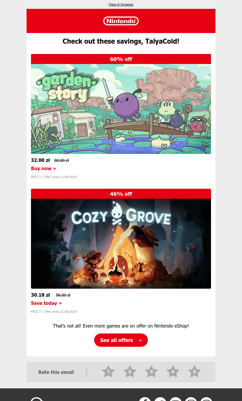
- The design of the email is simple and minimalistic while still being bright and informative.
- Large images of colorful game covers immediately attract attention.
- All the information is well organized. Even though it is a short email, it perfectly fulfills its purpose of offering discounts on games you like and directing you to the store.
Steam
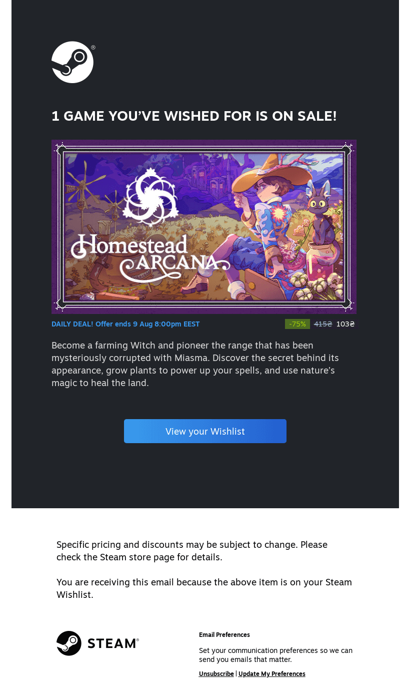
- Steam’s email is also quite simple, but it does its job perfectly.
- The signature dark blue shades highlight the game’s cover. Needless to say, the game’s artists did a great job here, and Steam presented it well.
- We can easily go to the game page or to our entire wish list.
Usability
1. Email web version
2. Clickable images
3. “Follow us on socials” section
Why are these points important?
1. Having a web version of an email ensures recipients can view it as a web page if there are display issues or images fail to load.
2. Incorporating clickable images into emails enhances user engagement, allowing recipients to interact not only with the buttons but also with the images to explore your offerings.
3. Although optional, including social media follow buttons in the emails can boost your follower count across these platforms, thereby increasing brand visibility and popularity.
Design
Game stores have a head start in design because game covers are usually stylish, colorful, and self-explanatory. However, even existing game content can be presented in different ways. Let’s see how Nintendo and Steam use design elements to engage their audiences.
Brand consistency
Both stores use their logos and brand colors in their emails, featuring links to discounts, offers, and customer accounts, along with large, eye-catching game covers. While both designs are appealing, Nintendo’s compact email includes more useful links.
Optimization for dark mode
Nintendo looks good in dark mode, except for the last section on a light gray background, which is very bright. In an email from Steam, all colors are inverted, and the original dark block becomes too bright.
Optimization for mobile devices
Email from Nintendo expertly adapted to mobile devices, while an email from Steam is displayed in a slightly smaller size.
Email accessibility
Sans serif font
Text readability
Single color backgrounds
The “lang” attribute
Alt texts for images
The “role=presentation“ attribute
Email copy
Texts on banners
The banners of both brands inform readers about the sale. Nintendo also uses clickable links on short slogans under the images, while Steam uses only clickable cover art.
Buttons
Both brands make good use of buttons. Nintendo leads to all discounts in the store, and Steam leads to the player’s wish list, which also has discounts on some games.
Overall copy
Both emails are concise yet clear. Nintendo employs calls to action and engaging phrases like “That’s not all!” to encourage purchases and direct recipients to the store. In contrast, Steam utilizes space to describe the games in detail, which is also effective.
Legal requirements
Different countries have their own email compliance laws, such as the CAN-SPAM Act in the USA and the General Data Protection Regulation (GDPR) in Europe. Following these regulations is vital to avoid legal issues and maintain a positive reputation. Let’s find out if today’s examples meet these requirements.
Physical postal address
Unsubscribe option
Reason for receiving a message


