Email review
Pandora vs. BaubleBar
The beginning of summer is the best time to choose bright jewelry and add something original to your look. That’s why we decided to compare two vibrant summer promo emails from well-known jewelry brands: Pandora and BaubleBar.
First impression
First impressions matter — especially in jewelry email campaigns. Jewelry is an emotional purchase, and that initial excitement often plays a big role in the decision to buy
Pandora
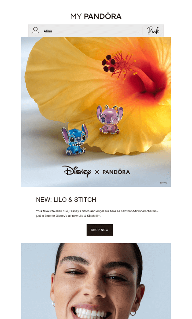
- In this email, Pandora grabs attention with a straightforward approach: announcing a new product in collaboration with Disney. From the subject line, "New! Disney's Lilo & Stitch", to the headline on the first screen, the focus is clear.
- The spotlight is on the new Stitch and Angel charms, released just in time for Disney’s new Lilo & Stitch film. It’s a big moment — not only for collectors of limited-edition charms but also for fans of the movie.
- Bright colors, a bold hero image, various styling ideas, and animated GIFs all help showcase the charms and spark interest.
- And just in case you're not hooked yet, the email closes with a 40% promotion on other limited-edition charms and jewelry.
BaubleBar
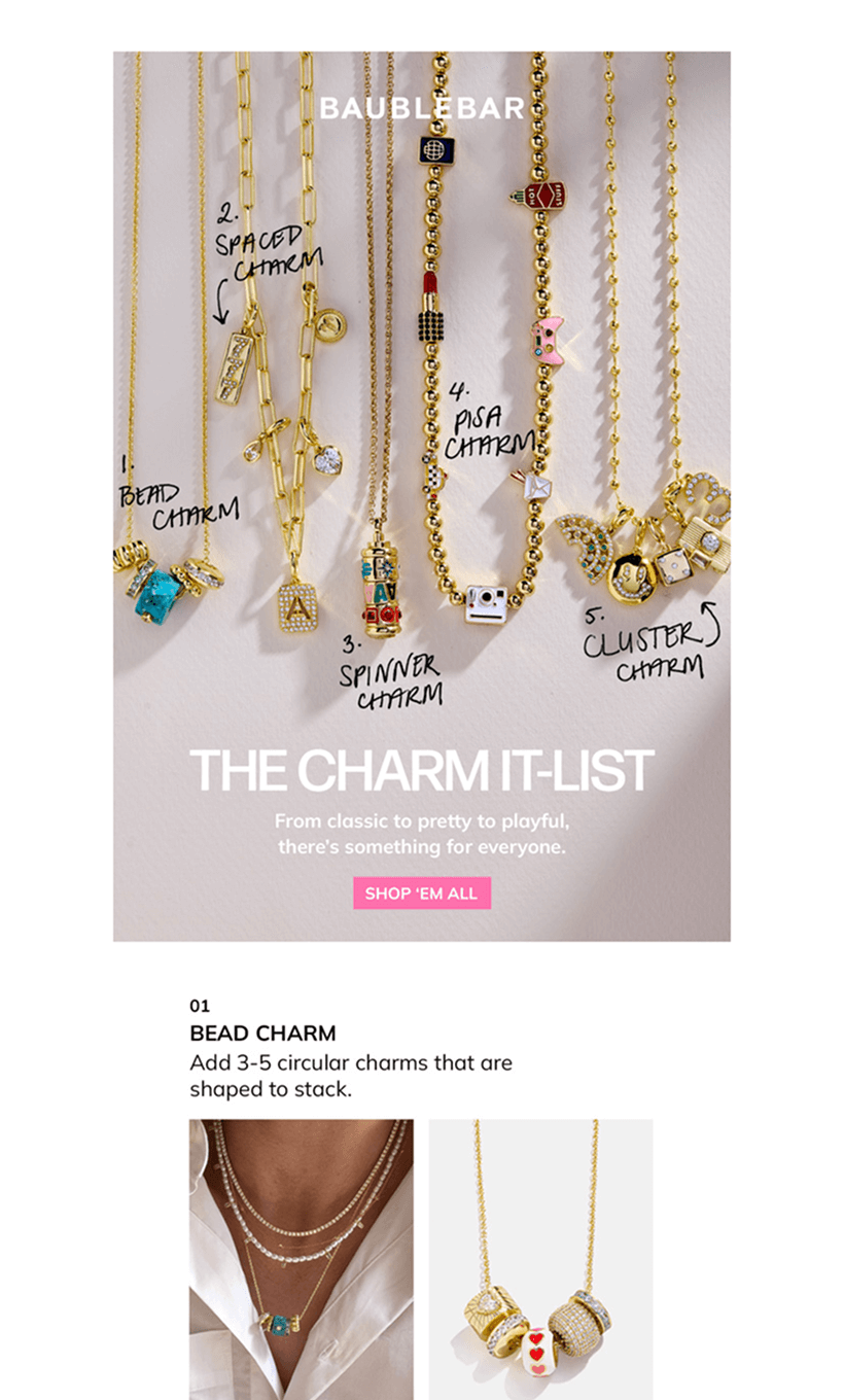
- BaubleBar’s email starts with an eye-catching banner, immediately introducing a charm collection where each piece has its own playful signature. With the line "From classic to pretty to playful, there's something for everyone," the message is clear: variety is the star.
- The focus is on new collections and their unique appeal. The charms are grouped in a fun, thoughtful way, inviting recipients to build their own custom sets right away.
- Design-wise, the jewelry remains front and center. All visuals are set against a light background, giving the email a fresh and elegant look despite the bold colors.
- The final touch? Personalization — a BaubleBar signature. This time, they offer a custom storage pouch you can personalize with your name.
Usability
1. Email web version
2. Email copy
3. Clickable images
4. The “Follow us on socials” section
Why are these points important?
1. Including a web version of your email gives recipients the option to open it in their browser, ensuring a smooth viewing experience even if images don’t load properly or display issues occur.
2. Network issues can prevent email images from loading, so avoid putting key info in images alone. If the visuals don’t display, recipients might miss it and skip the web version.
3. When images in emails aren’t clickable, it can lead to confusion or frustrate readers.
4. Encouraging customers to follow your brand on social media helps jewelry brands stay up to date on new launches and inspires them to share photos of themselves wearing your jewelry.
Design
Jewelry brand email design can inspire purchases and make the brand recognizable. Therefore, let's consider each important aspect separately.
Brand consistency
Both brands have a perfectly matched brand identity of emails and website. When clicking on any link in emails, the reader seems to get to their continuation — sees the same combinations of colors, fonts, and images.
Optimization for dark mode
Pandora and BaubleBar have done well in optimizing dark mode. Buttons, fonts, and text colors are well-tuned. BaubleBar achieves this largely by using images with text, but both brands have made significant efforts in this area.
Optimization for mobile devices
Both emails are mobile-friendly with clean layouts, good structure, minimal content, and no horizontal scrolling. The text is easy to read, though larger buttons would improve usability on smaller screens.
Email accessibility
Email accessibility is not an option. It is a must today for social, business, legal, and humane reasons. So, are the emails from these famous brands accessible?
Sans serif font
Text readability
Single color backgrounds
The “lang” attribute
Alt texts for images
The “role=presentation“ attribute
Both brands have some room for improvement in optimizing their emails for screen readers and ensuring they are accessible to dyslexic and color-blind people.
Email copy
Intro
These brands' strategies can be called "straight to the point" — they do not waste the intro to place a menu or information about delivery, as others do. Both Pandora and BaubleBar make the most of the beginning of the email to present collections. BaubleBar does it creatively, imitating handwriting.
Headline
Pandora highlights the new product and introduces "your favorite alien duo, Disney's Stitch and Angel," to immediately connect with the reader. BaubleBar's headline appeals to the fact that “there's something for everyone.” Both strategies are good for attracting customers.
Buttons
Pandora uses different text for different CTA buttons in the email to attract those who are ready to buy and those who just want to discover. BaubleBar uses the conversational form "Shop ‘em all" for the button, which makes the brand closer to the buyers.
Legal requirements
Every country or region has its own set of regulations, such as CAN-SPAM and GDPR, that dictate how emails should be handled. Complying with these laws is crucial. Let's explore how today’s guests are managing to remain compliant with these requirements.
Physical postal address
Unsubscribe option
The key takeaway when comparing these emails is that although both promote products from the same jewelry niche — charms — each has a distinct vibe. As soon as the subscriber opens the email, it's immediately clear which brand it’s from, which is ideal for promotional emails.


