Email review
Spotify vs. YouTube Music
Music apps know us best—our moods, our playlists, our rhythms. In this review, we’ll compare two leading music platforms: Spotify and YouTube Music and see how their emails hit the right notes (or miss a few). Let’s explore how well they perform across usability, design, copy, and accessibility.
First impression
Both emails focus on mood-based music discovery, but they approach it with distinct voices and aesthetics.
Spotify
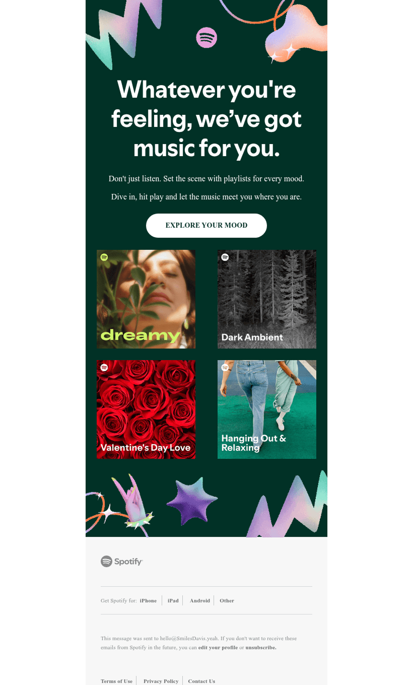
Spotify opens with an expressive message: “Whatever you’re feeling, we’ve got music for you.”
Colorful abstract shapes, curated playlist visuals, and smooth typography build a mood-oriented, immersive atmosphere. It’s not just about discovering music, it’s about being understood.
The visual storytelling is strong, though the email leans more into inspiration than detailed product explanation.
YouTube Music
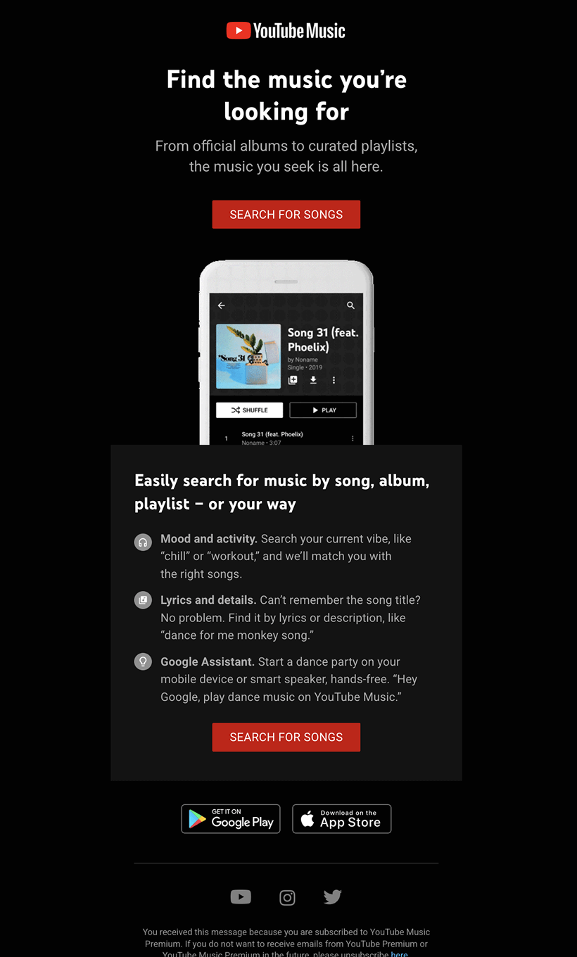
This email dives straight into action: a bold black background, strong red CTA, and a clean, minimalistic layout. The headline—“Find the music you’re looking for” is direct and easy to grasp, though the text rendering may appear slightly off due to formatting inconsistencies in some email clients.
The content centers around a phone mockup and a concise list of helpful use cases (searching by mood, lyrics, or with VOA), making the message practical and product-focused.
Overall, the email feels functional and efficient, prioritizing quick action over emotional storytelling.
Usability
1. Email web version
2. Clickable images
3. “Follow us on socials” section
4. Clickable buttons for navigation
Why are these two points important?
A web version ensures fallback when images don’t load.
Clickable images turn playlists into intuitive browsing triggers — a must for music apps.
Social icons extend user engagement beyond the inbox. YouTube includes them; Spotify omits.
Buttons like “Search for songs” or “Explore your mood” help guide users to the app or platform, and both emails implement this well.
Design
Optimization for mobile devices
Both emails are stacked and mobile-optimized. Buttons are tap-friendly, text is readable, and images scale correctly.
Spotify’s longer layout could slightly increase scroll fatigue, but it also gives more content to explore.
Optimization for dark mode
YouTube’s black background ensures excellent dark mode performance — it’s essentially already in dark mode.
Spotify, with its deep green and white text blocks, also performs well in dark mode, although lighter images may lose a bit of contrast.
Brand consistency
YouTube Music keeps things minimal, on-brand with YouTube’s typical dark UI and red highlights. Fonts, colors, and layout feel lifted straight from the app.
Spotify uses its signature green, rounded buttons and curated playlist art, but also adds abstract visuals to evoke creativity and emotion. Its tone is more expressive, less technical.
Email accessibility
Sans serif font
Text readability
Line spacing at 150%
Single-color backgrounds
“lang” attribute
Alt texts for images
“role=presentation” attribute
Both brands cover accessibility basics:
- Large, high-contrast fonts for headlines and body
- No underlines or italics
- Clean structure and color palettes
But both fall short in:
- Color contrast for button text (below the 4.5:1 threshold)
- Line spacing, which is slightly too tight for dyslexic readers
Email copy
Texts on banners
Spotify leads with emotion: “Whatever you’re feeling...”
YouTube Music is more practical: “Find the music you’re looking for.”
Spotify wins in tone and empathy; YouTube wins in clarity and functionality.
Buttons
Spotify’s “Explore your mood” is soft and exploratory.
YouTube’s “Search for Songs” is direct and action-oriented.
Both are short, clear, and functional, but neither passes contrast compliance.
Overall copy
Spotify focuses on feeling, using short and immersive text to invite the user into a musical experience.
YouTube Music emphasizes features — search by mood, lyrics, or with voice — more like a product demo.
Legal requirements
Physical postal address
Unsubscribe option
Reason for receiving the message
Spotify tells a story. It’s atmospheric, emotional, and visually engaging — ideal for users browsing with feelings in mind.
YouTube Music gets to the point. It’s practical, focused on features, and gets users moving toward the app.


