Email review
Zara vs. H&M
Explore how two global fashion brands, Zara and H&M, communicate new collections through design, storytelling, and usability.
Both emails promote capsule collections but follow completely different approaches: Zara focuses on editorial minimalism, while H&M combines storytelling with a product-driven layout.
First impression
Zara
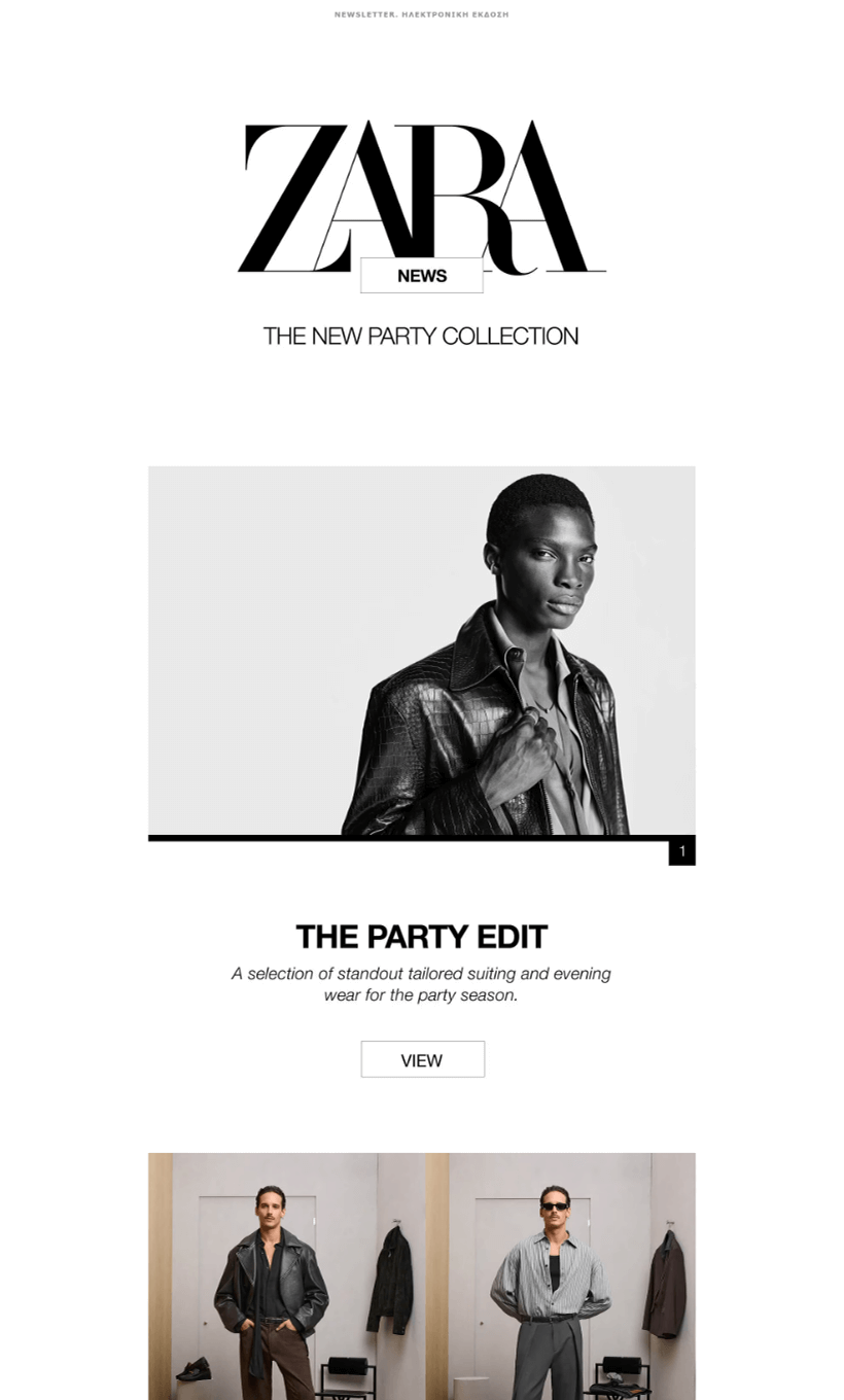
- Zara's "New Party Collection" email opens with a striking monochrome header and high-fashion photography.
- The large serif logo and full-bleed imagery immediately create an editorial feel reminiscent of print magazines.
- The sections: Party Edit, Leather, Shoes, and Pre-Owned, are simple and consistent, each paired with a single call-to-action button labeled "View."
- Every frame feels carefully composed, prioritizing aesthetics over urgency. The absence of clutter allows the visuals to speak for the brand's premium image.
H&M
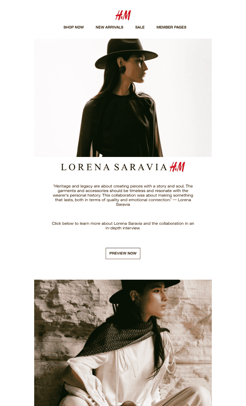
- H&M's email showcases the Lorena Saravia x H&M collaboration.
- It greets the reader with a cinematic hero image, followed by a quote from the designer and a message centered on craftsmanship and heritage.
- The product grid highlights individual pieces with pricing and category notes, while the "Shop by" section at the end organizes links by audience: Women, Men, Kids, Home, and Beauty.
- It's a clean and structured message, elegant yet commercial, with a smooth transition from storytelling to shoppable content.
Usability
1. Email web version
2. Clickable images
3. “Follow us on socials” section
4. Clickable buttons
Both brands deliver strong usability, though with different focuses.
Zara omits navigation entirely, using an editorial scroll format where each "View" button acts as the reader's guide through the story.
H&M includes a navigation bar, footer links, and a clear web version option, providing a complete browsing experience.
Design
Brand consistency
Both emails align perfectly with their respective identities.
Zara’s minimalist black-and-white layout and large serif typography evoke a luxury fashion editorial.
H&M combines soft neutral backgrounds, warm photography, and structured product presentation, blending lifestyle and commerce.
Optimization for dark mode
Both emails use solid backgrounds and clear typography that render well in dark mode. While they do not rely on dark-specific design elements, all main content remains legible and consistent across viewing settings.
Optimization for mobile devices
Zara's sections adapt naturally to mobile with image stacking and short copy, though the numerous full-width visuals extend scroll depth.
H&M's product grid and "Shop by" sections are well spaced and readable. Both maintain a professional mobile experience without text crowding or layout shifts.
Email accessibility
Sans serif font
Text readability
Line spacing 150%
Single-color backgrounds
The “lang” attribute
Alt texts for images
The “role=presentation“ attribute
Both emails are clear and well-structured but fall short on accessibility compliance.
Neither specifies language attributes or consistent alt text for visuals. Color contrast in CTA buttons and light text elements could be improved to fully meet WCAG AA standards.
The minimalist design enhances focus but leaves accessibility slightly under-optimized.
Email copy
Headlines
Zara uses bold, declarative titles: The Party Edit, Selected By, Leather, Shoes, each paired with short supporting text.
H&M leads with Lorena Saravia x H&M, enhanced by a quote from the designer that emphasizes storytelling and emotional connection.
Buttons
Zara repeats the neutral "View" CTA across all sections, clean and consistent but not very descriptive.
H&M's "Preview Now" adds more intent, helping guide the user from discovery to engagement.
Tone and voice
Zara keeps a cool, aspirational tone, distant yet confident.
H&M’s tone feels more conversational and emotional, appealing to a broader audience and inviting connection through brand collaboration.
Legal requirements
Physical postal address
Unsubscribe option
Reason for receiving a message


