
Email Crash Test: Nike
This year, Black History Month (BHM) is celebrated from Sunday, October 1 to Tuesday, October 31.
This month-long celebration honors the African-American community’s rich heritage and serves as a
reminder of the ongoing struggle for racial equality.
In this context, I decided to choose Nike’s
meaningful BHM email. Nike is not just a sportswear brand; it’s a global cultural icon, so
my choice of Nike’s email isn’t just about their design. I want to emphasize the role that brands
can play in advancing social causes and promoting inclusivity and equality.
Copy
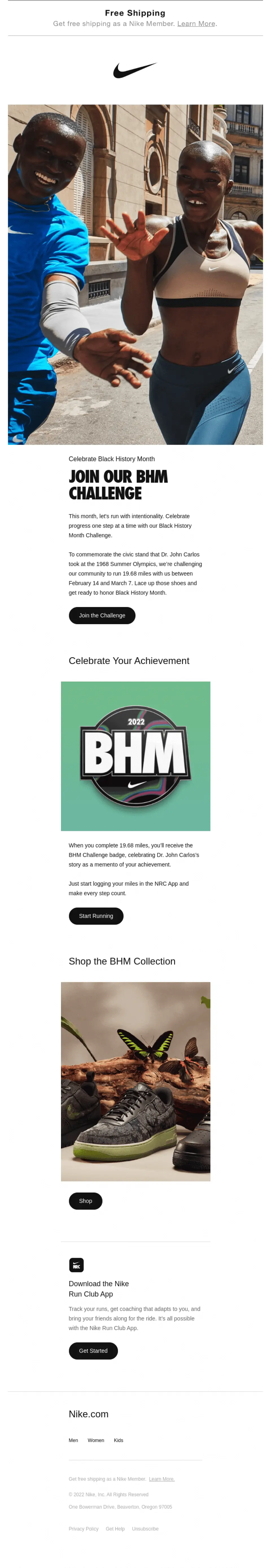
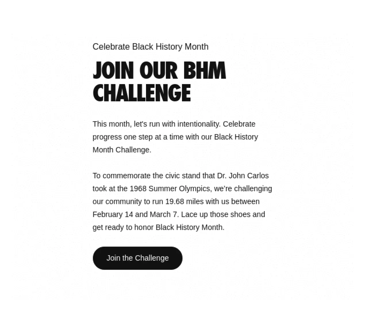
The Black History Month Challenge is the main theme of the email. The email starts with a casual yet intriguing invitation—like a friend saying, “Hey, do you want to join our BHM challenge”? But it's not just a simple challenge; it has a history behind it—the kind of history that makes you stop and think.
Nike invites us to commemorate Dr. John Carlos and his stand at the 1968 Summer Olympics—a piece of Black history that adds depth to the challenge. The company sets the stage for something important, urging the reader to dive into a meaningful adventure.
The call-to-action (CTA) to join the Nike Run Club—“Start Running”—is strategically placed after the text that introduces the BHM Challenge. It's about more than just counting miles; it’s about joining a tribe. Nike’s all about inclusivity and shared goals, so it’s like you’re becoming part of a big, supportive family.

After this, Nike offers a natural next step: exploring the BHM collection. Kudos to Nike for striking the right balance between social awareness and product promotion. Nike shows off their awesome product with an eye-catching and high-quality image that practically screams, “Check this out!” Who can resist the urge to see what’s new from Nike, right? 😉

The tone of the email is like a pep talk from a coach, motivating you to run with purpose and celebrate every step. It’s like your coach is saying, “Come on, let’s do this together!”—creating a warm feeling of being part of a community.
In a nutshell, Nike's email is a smooth mix of motivation, history, and a sneak peek at their products.
Layout
I find the design and layout of the Nike email quite impressive. The typography, structure, spacing, and indentation are executed with finesse. Each section is distinct and fits perfectly on the screen as you scroll through. Additionally, the use of large, high-quality photos positively impacts the brand's image.
I also want to draw your attention to the photo of two Afro-American athletes. For me, it’s more than just a picture; it’s a statement that resonates with the powerful message, invoking history and recognizing the immense contributions of Afro-American athletes to the world of sports, which is a vital part of Black history.

Of note is the header, which is strategically separated from the CTA. This ensures that it catches the attention of each recipient who opens the email, making it a crucial element for engagement.

The section on the Nike Run Club app is well-executed, allowing users to access information from various channels and facilitating the seamless flow of traffic between them.

Finally, the footer is clearly laid out and easy to comprehend, contributing to an overall excellent user experience.

Accessibility
Each user is unique. Ensuring that emails are accessible to diverse audiences is essential, not just from a moral standpoint but also for the positive impact that accessibility has on business. Approximately 15–20% of the global population grapples with some form of disability, and it’s unwise to overlook this substantial segment of potential customers in our target markets.
Nike understands the importance of accessibility and inclusivity in digital communication. In this email, Nike incorporates two key principles:
1. Left alignment of the copy
Imagine you are reading a book, and the text starts jumping around the page, sometimes on the left, sometimes in the middle, and sometimes on the right. It would be quite confusing, right? The same goes for emails.
By left-aligning your text, you create a consistent and comfortable reading experience for everyone. This is especially important for people who read from left to right, including English speakers. Left alignment of the text helps the eyes follow a straight line, making it easier to read and understand the content.
Left alignment is like having a well-organized bookshelf where you can find the book you want without searching too hard. It’s a small design feature that makes a big difference in how accessible and user-friendly your emails are.
2. Line spacing of more than 150%
Think about a crowded room with people standing shoulder to shoulder. It can be tough to move around or even breathe comfortably, right? That’s how it can feel when lines of text in an email are too close together.
Increasing the line spacing to more than 150% means giving each line of text some breathing room. This is incredibly helpful for people with dyslexia, who may find it challenging to distinguish between letters and words when they are too close together. It’s also great for anyone who zooms in when reading emails because it prevents letters from overlapping each other.
Redesign
Isioma, a talented designer, took on the challenge of redesigning Nike’s email, infusing it with fresh creativity. In this exciting transformation, Isioma brought a new perspective to the brand’s communication.
The redesigned email by Isioma not only captures the essence of Nike’s iconic image but also adds a unique flair that resonates with modern audiences. The email template’s revamped look and feel align perfectly with Nike’s commitment to innovation and excellence.
To sum up

Lead PR specialist
Nike doesn’t just sell products; it sells values and a sense of belonging. This email invites us to be a part of something bigger than ourselves: the Black History Month Challenge. This initiative is grounded in history and encourages reflection, making it more than just a marketing gimmick. The email’s design is perfect. The typography, structure, spacing, and imagery are all thoughtfully executed. The header grabs attention, and the content flows smoothly.
In a world where every detail matters, Nike’s email campaign embodies the essence of meaningful content, exceptional design, and accessibility—a recipe for successful digital communication.
My overall rating
is 5 of 5
How has your email inbox looked this month? Feel free to send your favorites to oleksandra.khlystova@stripo.email you might just spot them in a future email crash test.


0 Kommentare