Email accessibility and color-blindness: Making emails color-blind friendly

Almost 300 million people globally have some form of color vision deficiency, which is nearly 5% of the world’s population. Most of these people rely on email as a primary digital interaction channel.
Color-blindness impacts how one interacts with email content, reads promotional texts, responds to call-to-actions, etc., so email accessibility is a key aspect to consider in your email marketing.
Accessible emails are a win-win. When you make your email content accessible and inclusive, more color-blind people and others will subscribe to your newsletters, follow your calls to action, or become your clients.
Let’s take a deeper look at what color vision deficiency is and what you can do to make your emails more accessible and inclusive.
What is color vision deficiency?
Color vision deficiency, commonly known as color-blindness, is the inability to differentiate between certain color shades.
This condition occurs when one or more cones in the eye are missing or damaged, leading to altered color perception.
Color-blindness is mostly congenital, but it can occur later in life as a result of cataracts or other diseases and traumas. It’s common in countries such as India and China because many residents have mixed-race genes.
Did you know that color-blindness is more common among men than women? A study by the American Academy of Ophthalmology revealed that 1-in-10 men suffer from color vision deficiency, but only 1-in-200 women.
More Interesting facts about color-blindness:
- John Dalton is the author of the first scientific paper about color vision deficiency, also referred to as “Daltonism” after him;
- everyone is born color-blind. The color vision of human beings is fully developed by the age of 6 months;
- 99% of people with color vision deficiency have red-green color vision deficiency;
- Meta founder Mark Zuckerberg is color-blind.
What are the types of color vision deficiency?
There are several types of color vision deficiency, each causing issues with perceiving certain shades of colors.
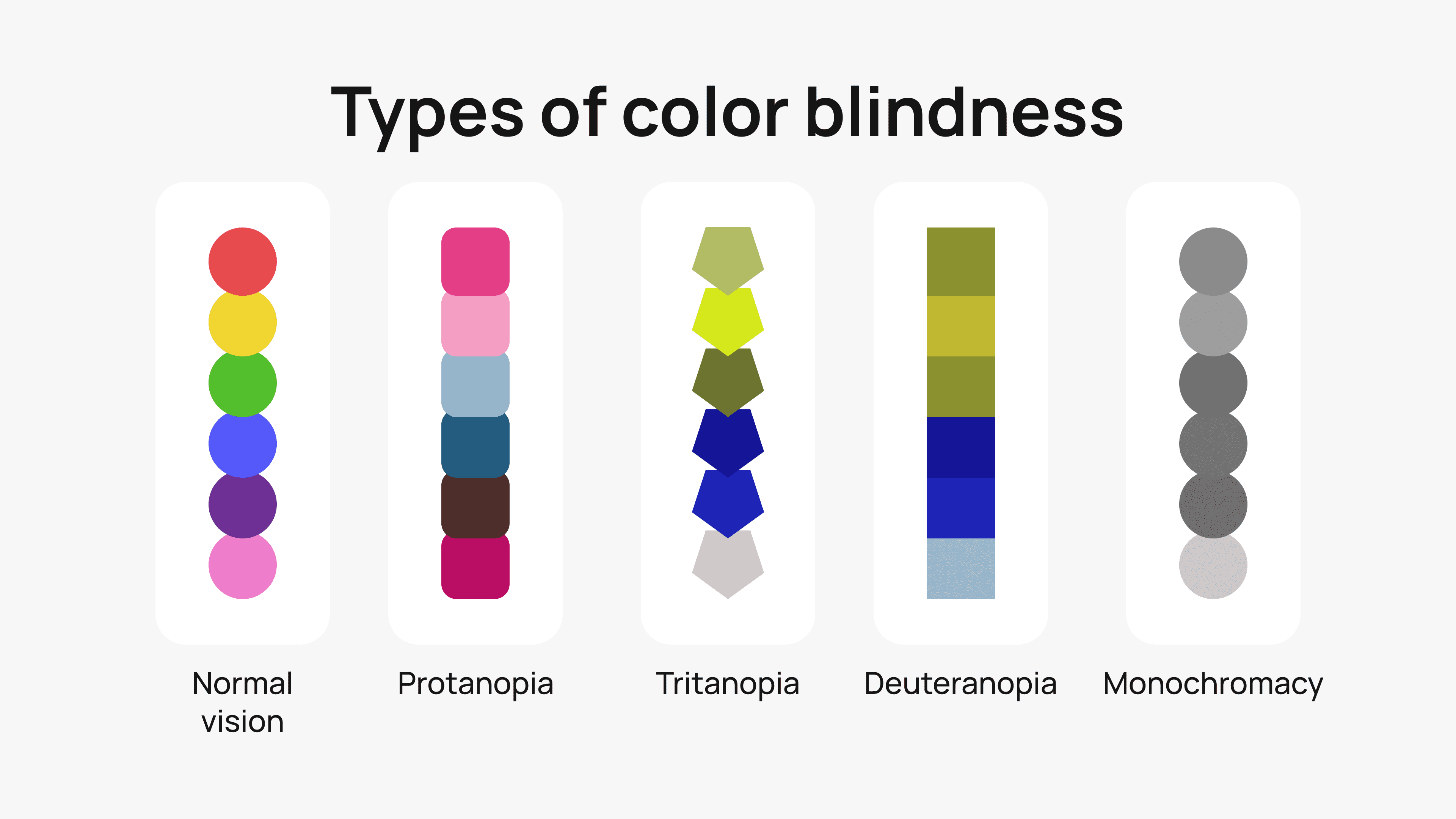
Red-green color vision deficiency
Red-green color vision deficiency is the most frequent type of color vision deficiency. People who suffer from this type find it hard to distinguish between red and green colors.
There are four main types of red-green color deficiency:
- red-blind or protanopia. People with protanopia lack red cones and cannot perceive any shades of red;
- red-weak or protanomaly. People with protanomaly have red cones and can perceive several shades of red, but some shades look green to them. This is a mild color-blindness and doesn’t seriously affect the lives of people who suffer from it;
- green-blind or deuteranopia. People with deuteranopia don’t have green cones and cannot perceive shades of green;
- green-weak or deuteranomaly. People with deuteranomaly have green cones and can perceive some shades of green, but cannot perceive several shades.
Here’s an example from our template:

And here’s how people with protanopia perceive it.

Blue-yellow color vision deficiency
Blue-yellow color vision deficiency is a comparatively rare type of color blindness. People suffering from it cannot perceive various color combinations, including blue, green, yellow, red, and purple.
There are two main types of blue-yellow color vision deficiency:
- blue-blind or tritanopia. People with tritanopia don’t have blue cones and cannot perceive shades of blue.
- blue-weak or tritanomaly. This condition makes it hard to distinguish between green and blue, red and purple, and pink and yellow. People with this condition also perceive these colors less brightly.
Here’s an example of how people with tritanopia perceive colors in the template example below:

Complete color vision deficiency
Complete color vision deficiency, also known as achromatopsia or monochromacy, makes it impossible for people suffering from it to distinguish between any colors. This is a rare condition, occurring in 1 in 30,000 people worldwide.
People with complete color vision deficiency are typically sensitive to light and cannot perceive objects clearly.
Here’s an example of how people with achromatopsia perceive colors in the template example below:

How to design accessible emails for color-blind people
Do you want your emails to hit your target audience and maximize your email marketing ROI?
Well, the first thing you need to do is stop thinking about your subscribers as numbers, but rather as human beings who may have specific requirements and needs.
People with different types of color vision deficiency perceive colors differently, and emails not designed with digital accessibility in mind can make it harder for them to understand your message.
Inaccessible emails render recipients with color-blindness unable to perceive or interact with your call-to-action buttons, follow instructions, or even become customers of your brand.
To ensure that you provide proper digital experiences for color-blind people, marketers can and actually should conduct an audit of their emails at least once.
We have listed some helpful tips below that will not only make your emails accessible to people with different types of color vision deficiency, but also help improve your overall email marketing strategy and increase your customer base and revenue.
Choose colors wisely
Colors matter the most when creating email newsletters for people with color-blindness. Choose colors with accessibility in mind.
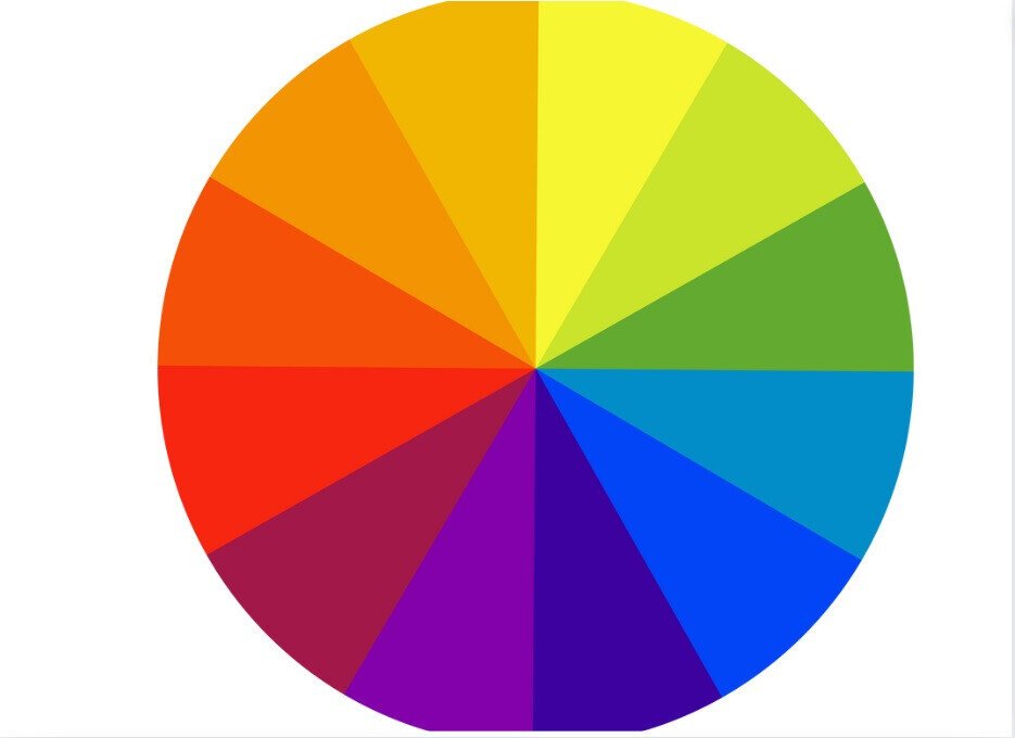
1. Use high-contrast colors. Color contrast is the difference in color and luminance, making the object distinguishable from the background and other objects. The higher the color contrast, the more accessible the content. Moreover, it can draw more attention to your text and enhance your email’s visual appearance.
A simple tip on high-contrast colors: Pick a color wheel and choose the colors opposite, like purple and yellow.
2. Use the right background colors. Making the text easily readable against the background is important. Choosing classic dark-gray text on an off-white background or vice versa is best. For other colors, ensure that you use light text on dark backgrounds and dark text on light backgrounds.
3. Avoid several color combinations. Do not use colors that aren’t accessible to people with color-blindness and those that are difficult to distinguish. Avoid color combinations such as green and red, brown and green, gray and green, purple and blue, and green and yellow.
4. Check color contrast. To ensure you’ve done everything correctly, you can check the color contrast. With color contrast checkers like this, you can evaluate colors for WCAG compliance. WCAG 2.2 requires a contrast ratio of at least 4.5:1. For large text, the contrast ratio can be 3:1.
Don’t convey messages through color alone
Choosing the right color combination for your email newsletters is important, but avoid relying on color alone.
In the example below, green means a team won, while red means a team lost.

(Source: We Are Colorblind)
People with color-blindness may not be able to distinguish between colors, making it difficult to determine which team won.

Make sure you add labels to important messages, like buttons and email CTAs. This will make it easier for people with color-blindness to determine which actions to take.
Another thinking-beyond-color option is to use icons, shapes, and hover effects in your email design to add another communication layer to your main message.
Treat your text like a visual element
Don’t think of your text as separate from your email’s visuals. How you arrange your email text presents an important visual element for the entire email. It needs to be optimized for digital accessibility.
For example, accessible fonts and large left-aligned text with proper spacing can improve readability significantly. Keep the font size larger than 12 and smaller than 38 points — ideally 14-18 points.
Add alt text to images and graphics
Alt text is a short description of an image or graphic read by screen readers for people with visual impairments or color-blindness to understand the content.
Ensure that the alt text is clear and concise. However, it should thoroughly describe the image or graphic. When the image includes buttons in different colors, make sure you describe the function or label each one.
When the color has a critical meaning for the button, describe the color and its meaning.
Avoid any technical terms or abbreviations.
Add a plain text version of your email
To make it easier for color-blind readers to engage with your email, provide a plain text version of your email. The plain text version is a text-only email without any hyperlinks, images, or customized fonts. Almost all email platforms allow editing or include a plain text version along with HTML content. Give your readers an additional choice.
Wrapping up
Designing accessible emails requires providing clear, understandable, and engaging messages to your readers, especially those with special needs, like color-blind people.
It doesn’t mean you need to spend a huge amount of time designing only for people with color vision deficiency or lose your branding. Making emails accessible for color-blind people is easy and fast if you follow the tips provided in this article.
This will help make your emails more accessible, personalized, and engaging for everyone, boosting your brand reputation, revenue, and customer base.


0 comments