Email review
Tissot vs. Cartier
Exploring the elegance and tactics behind Tissot and Cartier's engaging email campaigns — highlighting their expertise in usability, brand consistency, accessibility, and design elements that accentuate their unique brand identities.
First impression
Tissot
- Campaign tagline: Celebrate the 75th anniversary of MotoGP™.
- Visual presentation: Captures movement, dynamics, and energy in images.
- Initial engagement: The email design is strict and minimalistic, and the visuals in the promotional photos convey a sense of movement and energy, reflecting the atmosphere of motorcycle racing. The red color complements the watch's design elements and aligns with Tissot's brand identity.
Cartier
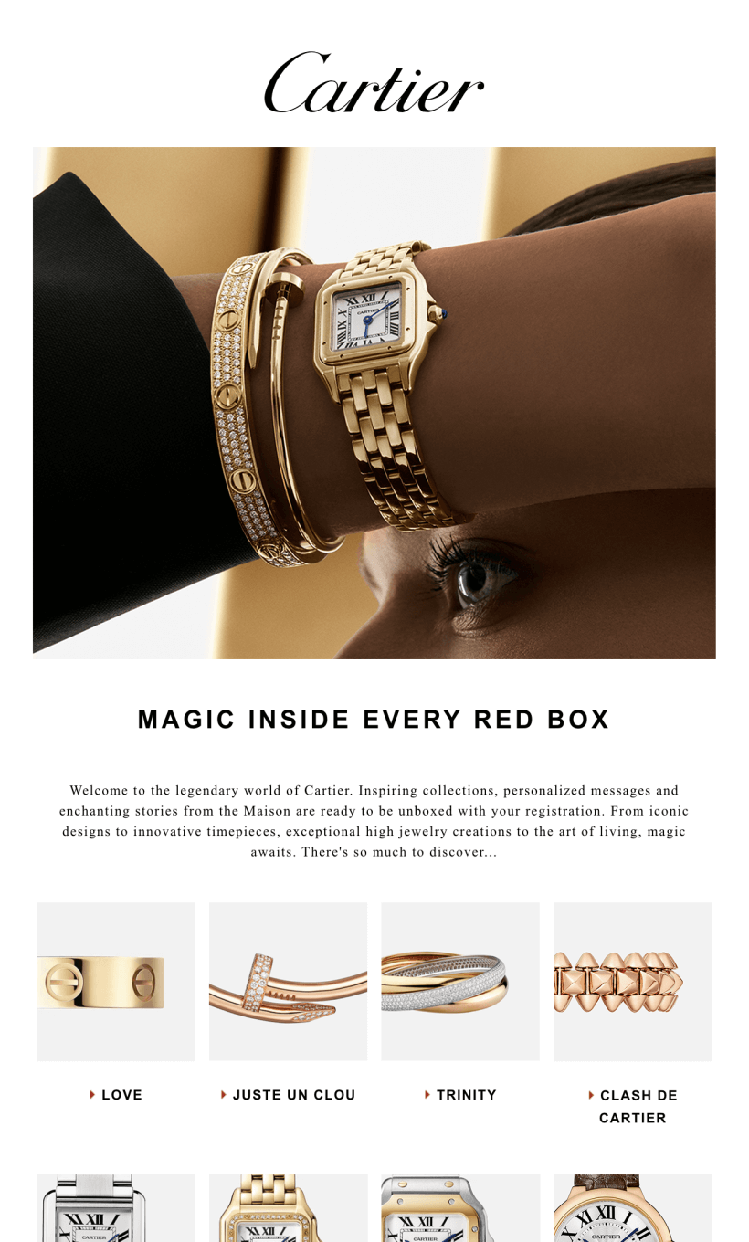
- Campaign tagline: Magic inside every red box.
- Visual presentation: A watch that is also a precious piece of jewelry.
- Initial engagement: A sophisticated, restrained design that emphasizes the high-luxury segment. Cartier is well-known for presenting its products in a distinctive red box. It has become a symbol of luxury and quality, which is why it is mentioned in the slogan.
Usability
Email web version
Clickable images
Why are these points important?
1. Clickable images: Tissot and Cartier elevate the email experience with interactive, clickable images and accessible product cards that swiftly direct users to desired products or website pages, enhancing engagement and streamlining navigation.
2. The web version of an email is crucial for accessibility, serving as a reliable backup when images or content fail to load correctly in email clients due to technical issues and thus ensuring recipients can access the content outside their email client.
Design
Optimization for mobile devices
The visual solution for both brands is adapted for mobile devices, but both Tissot and Cartier have too small a font in their collection descriptions.
Optimization for dark mode
Both Tissot and Cartier are readable in dark mode. However, there are issues with how their logos and product windows, which are displayed in white squares, integrate visually with a dark background. These elements do not create a harmonious appearance against the dark setting. Furthermore, the black Cartier logo tends to merge entirely with the background.
Brand consistency
Tissot manages to convey a sense of speed and an atmosphere of motorcycle racing through the images. By contrast, Cartier focuses on presenting precious jewelry and does so successfully.
Email accessibility
Email accessibility is essential for social, business, legal, and ethical reasons. Let's find out if emails from these well-known brands are accessible.
Use of sans serif font, aiding readability.
Color contrast
Line spacing at 150%
Single-color backgrounds
Alt texts for images
Both brands have problems with fonts. Cartier uses sans serif fonts only in its headlines, while Tissot does not use them at all. This is strange, since the company's website, in contrast, features sans serif text.
Email copy
Introduction
Tissot's email vividly presents a collection dedicated to motorcycle racing, while Cartier's email is more mysterious and intriguing, hinting that much more awaits when you visit the website.
Call to action
Tissot invites you to celebrate its long-standing partnership with MotoGP and feel involved. Cartier intrigues with a large and varied assortment.
Product description
Tissot's email discusses its MotoGP collection and the inspiration behind it, while Cartier introduces the brand to new customers and demonstrates various collections without detailed descriptions but with links where you can find out more.
The text aligns with the campaign goals of both Tissot and Cartier. These brands excel in communicating with the audience in a professional manner.
Legal requirements
Postal address
Unsubscribe option
Consent reminder
Tissot and Cartier are both luxury watch brands; the former targets men with a specific collection, while the latter targets women with a diverse range of products. Both strategies align with the brands' identities and follow fundamental marketing principles, including transparency and respect for consumer preferences.
It would be nice to showcase Cartier pieces on whole-body models in addition to close-up shots to showcase the entire look better. Also, Tissot has a better focus with a small number of subjects. But at the same time, we really liked the solution with the red box at the end of the email from Cartier — it's their catchy signature.


