
Email crash test: Google Store
It can be hard to find inspiration sometimes. I hope the email crash test will be your lifesaver. This time, I decided to choose a promo newsletter from Google Store introducing Google Pixel Buds. So, if you are planning to promote your products or announce your latest collections, let's dive into our newest roundup.
Interactivity
I'll start with what caught my eye and made me stop looking for other emails for
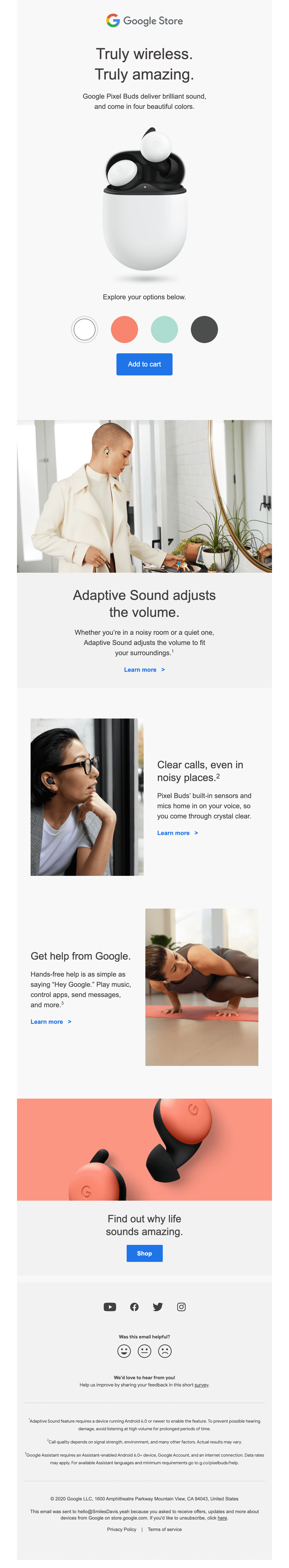
this review. The interactivity of Google's email grabbed my attention straight away. Users can check all the
available colors of Google Pixel Buds and choose the colors they prefer directly in the email. This is an
excellent example of how to include interactive elements in your newsletters.
Keeping the content relevant and adding this kind of "fitting room" is a clever way to add value to the
user's email experience, pushing the product and drawing the eye as soon as the email is opened.


Explore your options below.
- White
- Orange
- Mint
- Black
For email geeks and those who like creating emails using HTML code, we've created a comprehensive guide on how to implement this interactive element in your emails. Check it out here.
Copy
As most digital readers scan, every section of copy should be bite-sized. Rather than focusing on features, have your copy emphasize benefits or pain points and ways to overcome them. Google did a great job here. Every sentence shows me how Google Pixel Buds can improve my life.
I will get clear calls, even in noisy places. I can use the product without my hands, simply telling Google what I need with my voice (e.g., to listen to music or send messages). With the help of the right copy, I understand what problems could be solved with Google's earphones.


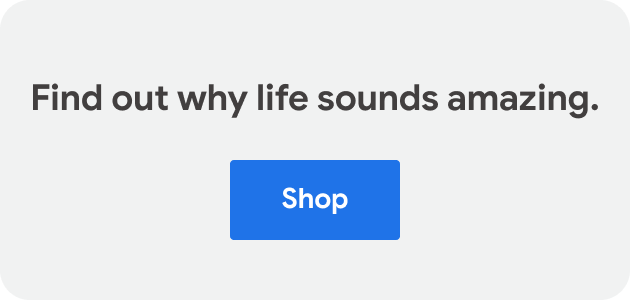
I especially like the last sentence, "Find out why life sounds amazing." A nod to the talented copywriter here.
Also, I can't help but mention the footnotes. They are marked with numbers in the content and deciphered immediately in the footer. A smart way to keep a clean layout with minimal text while explaining crucial additional information.


Design
In a nutshell, it's about simplicity. The design is clean and solid, with great contrast. The color scheme is consistent, relying on gray for the base.
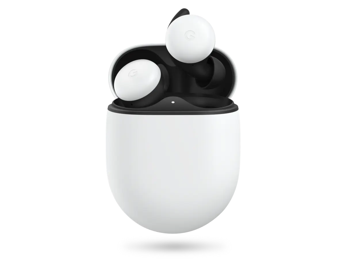
Google paired these short descriptions of their product with high-quality images to make the information more easily scannable. Custom photos show how Google Pixel Buds look in real life with real people.


They use two visual types of buttons, which work terrifically well. The main calls to action are highlighted with large color-filled buttons, while secondary blocks have buttons as text links.


Email layout
This is a great example of a great layout. There is a lot of space and air. Each block is separate and fits into the screen, drawing the reader's attention to specific details as they scroll.
Moreover, I want to mention the feedback module in the footer, which includes a questionnaire. In addition to the fact that you can respond with whether you liked the email, you can also leave a review. Love it!


As MacPaw did in their newsletter, Google uses a smiley face survey. This is definitely more eye-catching than a simple text survey. By the way, if you missed our review of MacPaw's email, here it is.
Accessibility
Accessibility in emails is a must-have. I can highlight three reasons why:
-
to ensure that customers with various kinds of disabilities (vision impairment, hearing disability, and so on) do not feel disadvantaged
-
to meet legislation requirements
-
to get more clicks, conversions, and thus better income
Let's give kudos to Google on this. The newsletter has neither caps nor italics. The background color is not white but light gray. The color of the text is not black but dark gray. They even put periods at the end of Heading 1.
The only thing they didn't do was alignment. Using center-aligned text in emails is not good — a left-aligned copy is preferable. If you want to make your email accessible, check out this guide for more tips.
To sum up

Lead PR specialist
This email ticks all the boxes in the most simple but effective ways: interactive, well designed, and accessible with a great copy. Google provides an excellent example of promoting products in an interesting and engaging way.
My overall rating is 4.5 out of 5. Because the accessibility of email could be improved.
What has your inbox looked like this month? Share what you loved with me at oleksandra.khlystova@stripo.email, and you can see it in the next email crash test.

0 comments