Email crash test: MacPaw
I’m Oleksandra, the PR manager at Stripo. Monthly, I plan to look for emails from different brands, choose one, and review it for you.
We’ll discuss design, UX, copy, and everything email marketing related with our team of designers, copywriters, and marketers. Let’s get the round-up started!
Subject line and preheader
This subject line is basically the compilation of headlines from the email itself. So, rather than reinvent the wheel, MacPaw just displayed the existing copy, and the reader knows exactly what to expect.
MacPaw
New CleanMyMac Menu, SpyBuster...
Dig into the fresh portion of the news
This technique is perfect for an email digest, and it’s better than writing something like “Company News. January / February. It is a bit long. But is that a con? There is a lot of research on how many words and symbols you should use, but I believe that it is more of a context-based approach. MacPaw is no stranger to good and catchy copywriting, and this email is no exception.
Studies show that 64% of recipients open their emails based on the subject line. Determining a clear and persuasive topic is half of the success of your email marketing campaign.
That is why It is important to test your copy on different clients and devices, especially those on which our emails are being read on most often.
CTA Buttons
Instead of vague and common ’Try now” or “Click here,” MacPaw used very descriptive and actionable CTAs.


Please notice that each button starts with the verb that correlates with the next step and desirable action — read, listen, activate, etc.
However, still, one button is too wordy compared to the others. As we all know, if you can remove some text and the main message is still the same — remove it. So I’d leave only the phrase ‘Save Ukrainian Lives’ not to expand the CTA button's size.

Before

After
On the other hand, I support this statement that saving Ukrainian lives is saving the future. As a Ukrainian company, we appreciate that MacPaw brings users’ attention to the Russian aggression against Ukraine. Please join this initiative by donating to the MacPaw Foundation or the fundraising organized by Stripo.
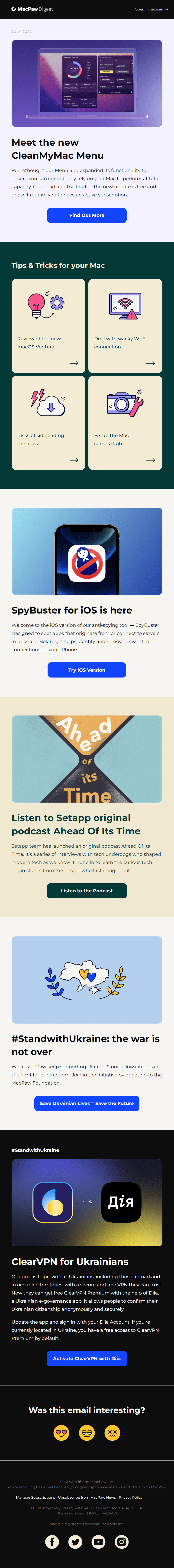
Simplistic design
Among other factors, I chose MacPaw’s email for a simplistic design approach. There is nothing extra that can distract attention. This deep blue color, combined with black and white, looks very nice. The colorful picture in the first section is eye-catching.
Email layout
I’m a big fan of a good structure, and MacPaw is good at it. I’d like to
highlight their
multiple-column section. It’s an excellent way to make something more complex than an ordinary layout.
It helps display a lot of content quickly on the desktop. In the mobile version, MacPaw uses one column
layout, which is the right decision. Two or three columns might make them look small and illegible, and
the same could happen to the buttons. The recommended size of the clickable element is no less than
44×44 pixels.

Desktop

Mobile
Thankfully, with a drag-and-drop email editor like Stripo, you can easily create or use prepared content modules.
Modules like logo, header, menu, and contact information remain unchanged from one campaign to another. You can reuse all these modules, combine them the way you want, edit, create specific modules for different projects, etc. It'd reduce the time you spend on email production. And remember that time is money.
Feedback block

I’d like to mention the feedback section in the footer — it’s a great addition. And I like these
smiley faces — they instantly grab user attention.
A smiley face survey is a perfect technique to approach your customers visually because users are
more willing to participate in such surveys than in simple text ones.
Although, the last two emojis are a little bit unclear to me. The first one definitely shows that’s
it in love. However, the difference between others is not quite clear. I guess the middle one should
be more neutral or even with a little smile.
Unsubscribe process

I think it is fair to say that “Find the unsubscribe button” is the worst game ever. When users can’t
find the unsubscribe button, they’ll mark the message as spam, which can have unwanted outcomes for you.
Here I give MacPaw 10/10. It’s noticeable, which is essential. And users can unsubscribe only with one
click. Moreover, they can leave feedback on why they did it. And it was a point of discussion in our
team. What’s better: to offer some prepared options or give a user a space to compose something custom?
Our email marketer Oleksandr tested them all. He found out that he receives more real insights with the
feedback form. People share honest reasons why they unsubscribe. We recommend that you combine these
approaches to receive more feedback.
Another great alternative is to offer the user an option to pause emails for a while instead of
unsubscribing.
82%
According to Oracle, adding a snooze option to your preference center is an effective retention tactic and is typically able to decrease unsubscribes by 82%
To sum up

Lead PR specialist
MacPaw says that they send a message with love at the end of every email. And I’m sure it’s true. All their emails are well-designed, responsive, and supported with the right copy.
My overall rating
is 4.5 of 5
Here is the first round-up. I do hope that it was not only inspirational but useful too. Please share your feedback with me — what’d you love, what is missing, etc. Also, feel free to suggest a brand you want to see in my next reviews. Contact me at oleksandra.khlystova@stripo.email or leave your comment below.
0 comments