Getting Started
Hi! Welcome to the Plugin documentation. We are glad that you are interested in our service and we will be happy to help you out with all your questions.
The Stripo Plugin is written in native Javascript and designed as a component in a way to be easily configured and extended within any web application.
If you want to see how it works, the easiest way is to use our code samples from GitHub repository or follow the instructions from the video.
By using this simple client-side example, you can try out the Stripo Plugin:
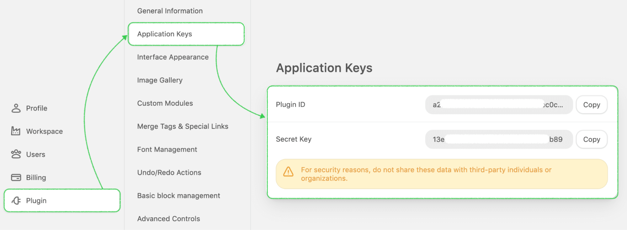
- Get
Plugin_IDandSECRET_KEYvalues by signing up here and creating a new application under the Plugin menu. - Download the client-side code example.
- Open index.html with the code editor.
- Replace
YOUR_Plugin_IDandYOUR_SECRET_KEYwith your values. - Save the file.
- Open it in your browser and enjoy email creation.
Please be advised that client-side examples are created just for demo purposes
only and should NOT be used in production.
It is insecure and your SECRET_KEY can be stolen. Keep your
SECRET_KEY on your backend and do not share it with anyone.
See the authentication process in detail to
implement
authentication correctly.

If you're ready to discover more, let’s move to the technical part that describes how to easily integrate the Stripo Plugin with your own web application.
Displaying the Plugin
The Plugin contains 2 parts: the setting panel and the preview area where your users work.
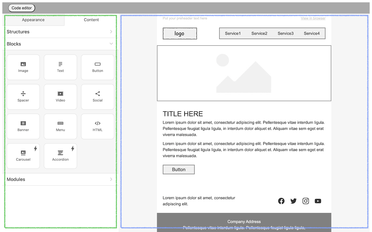
The great news is that you can independently choose where they should be displayed inside your application and what size to set:
- you may set the width of each container according to your preferences;
- the height of
stripoPreviewContainer, by default, stretches from the place where it was inserted to the bottom of the screen. To set another value, you need to set the max-height inline style for this container; - the height of
stripoSettingsContaineris, by default, stretched to the height of the content and limited to the bottom of the screen. To set another value, you need to set the max-height inline style for this container;
For example, max-height: calc (100vh - 100px); where
100px is the
total height of the top and bottom panels. The max-height style must be specified for
each panel separately, if not specified, the height will be adjusted by default, from
the insertion point to the bottom of the screen.

Please be advised that the features above these two containers, that you see in the demo application or in the Stripo account, are not related to the Plugin, so to get the same controls you have to implement them inside your application independently.
To install the Plugin you need to:
-
Define 2 containers for the Stripo settings panel (where controls will be located) and the Stripo preview area (the area where the rendered email template will be displayed).
<div id="stripoSettingsContainer"></div> <div id="stripoPreviewContainer"></div> -
Include the script taken from the application details page of the Stripo Plugin Integration menu of your Stripo account.
Script of the latest editor version
Note: When embedded in your page, this script will automatically update to the latest editor version with each release Copy<script type="text/javascript" src="https://plugins.stripo.email/static/latest/stripo.js" type="module" id="stripoScript"></script>Script for specific version
This script will consistently load a specific editor version, regardless of new releases. Copy<script type="text/javascript" src="https://plugins.stripo.email/static/rev/[version]/stripo.js" type="module" id="stripoScript"></script>where [version] — is a specific version of the editor. For a list of all available versions, visit the version history page.
To check the available versions of Stripo Plugin, please go to Release Notes.
If you want to host Stripo Plugin assets on your end you can download them from Stripo Github repo: https://github.com/ardas/stripo-plugin.
-
Initialize the Plugin by using the window.Stripo.init function with its own JSON configuration described below.
Done! :) Once you have initialized the Stripo Plugin, you can pass a series of configuration parameters to it.
Initialization & Configuration
To initialize the Plugin you should create your own logic for your application. For example, you can display the templates on your interface and relate them with the initialization process so when a user clicks on one of them your application calls the initialization function and passes the HTML and CSS code of the selected template to it from your server. Or you can choose to simply add a button named “Create template” and upon a click on it, your application calls the same initialization function but passes the HTML and CSS code of the default empty template to it.
The general point is to start the initialization process and pass the list of needed parameters.
Once you have added the Stripo Plugin assets on your web page you need to initialize the Plugin:
window.Stripo.init({
    [put here your plugin JSON configuration]
});
The default initialization script for Stripo Plugin should look like this:
window.Stripo.init({
    settingsId: '[put here ID of your settings container]',
    previewId: '[put here ID of your preview container]',
    html: '[put here HTML code of your email]',
    css: '[put here CSS code of your email]',
    apiRequestData: {
        emailId: '[put here ID of email in your external application]'
    },
    getAuthToken: function(callback) {
    }
});
Let’s look at each parameter to understand why we need them.
| settingsId previewId |
These should be the same IDs as you defined in the divs to display the Plugin. |
| html css |
Please place it in two rows: HTML and CSS separately
and escape if needed during the initialization. Find the example
here.
Please note that we have requirements for the code. It won't be displayed without tags <head> and <body>. Please, find more details here. |
| apiRequestData |
You have to specify here at least one mandatory emailId
parameter (for these HTML and CSS)
which we will serve as a Unique ID.
Additionally, you can specify all other parameters you have that will be sent from the Plugin to its server with each request. They may be used to identify a path to the Image storage documents and modules. You can use any parameter you want (like userId,accountId, tenantId, etc.), just make sure that it passed to the apiRequestData parameter during Plugin initialization. |
| getAuthToken | The last important part of the Plugin initialization is the getAuthToken function which is required for authentication. The Plugin calls this function (this parameter value) each time a token is expired in order to get a new one. You have to implement this method on your side as described here and it will be an automatic process. |
Additionally, you can add other parameters to the initialization script. It allows you to get more opportunities for your users according to their category. For example, you can show them different social networks, modules, or merge tags.
As a result, you can independently determine all these parameters for each user (so they can be the same or different) every time during initialization.
Find the full list of them here:
| Parameter | Required | Description | Default |
|---|---|---|---|
| locale | No |
2-letter language identifier. Available Languages:
|
“en” |
| previewId | Yes | ID of preview container. | |
| settingsId | Yes | ID of settings container. | |
| apiRequestData | Yes | These parameters will be passed to the backend with every request. Refer to “the Plugin request parameters” section for details. | |
| getAuthToken | Yes | Please implement this function to get the auth token from the backend. See the “Plugin authentication” section for details. | |
| html | Yes | The HTML code of the email template has to be open. | |
| css | Yes | The CSS code has to be applied to email. | |
| userFullName | No | A full name of the user that uses the editor. Will be displayed in the Version History section of the editor. | |
| codeEditorButtonId | No | ID of the open/close code editor button. | |
| undoButtonId | No | ID of the undo button. | |
| redoButtonId | No | ID of the redo button. | |
| ignoreClickOutsideSelectors | No | List of selectors of elements, click on which does not start the clickOutsidePreview event and as a result does not reset the block selection in the preview area. | |
| notifications | No | Set of methods that will be called when any message needs to be visible for the user. See the “Plugin notifications” section for details. |
{
info: message => console.log(message),
error: message => console.error(message),
success: message => console.log(message),
warn: message => console.log(message),
loader: message => console.log(message),
hide: message => console.log(message)
}
|
| onTemplateLoaded | No | This parameter helps to notify the external application when the plugin initialization is completed. |
onTemplateLoaded: function() {console.log('Loaded')}
|
| socialNetworks | No | List of social networks to be included in the “Social Networks” block. See the “Social Networks" section for details | |
| mergeTags | No | List of the merge tags to be included in the Text Editor panel. See the “Merge Tags” section for details. | See the “Merge Tags” section for default values |
| specialLinks | No | List of the special links to be included in the Link selector component in the editor. | See the “Special Links” section for default values |
| editorFonts | No | List of fonts to be included in the Text Editor panel and the Settings panel for basic blocks. See the “Сustom Font Sizes list” section for details. | See the “Fonts Management” documentation for default values |
| editorFontSizes | No | List of font sizes to be included in the Text Editor panel and the Settings panel for basic blocks. See the “Сustom Font Sizes list” section for details. | See the “Сustom Font Sizes list” section for default values |
| customColorPalette | No | List of colors to display in the color palette for the Text Editor panel and the Settings panel for every basic block. See the “Custom Color Palette” section for details. | See the “Custom Color Palette” section for default values |
| customColorPaletteTextOnly | No | Set up your desired colors for the text available only in the side menu and the CKEditor menu. See the “Custom Color Palette” section for details. | |
| viewOnly | No | Set to TRUE if you want to disable email modifications by a user. | false |
| apiBaseUrl | No | The Stripo Plugin main backend entrypoint. | /pluginapi/api/v1 |
| bankImagesDefaultSearchString | No | Default search string for images from the “Image Bank” if it is enabled. | Depends on current season: “spring” / “summer” / “autumn” / “winter” |
| versionHistory | No | See the “Version History” section for details. | |
| draft | No | The Stripo Plugin supports auto-save that makes calls to the server. In order to be notified in JavaScript when the content is changed and saved, you can rely on this parameter as described in the examples. |
draft: {
showAutoSaveLoader: function() {
console.log('Auto save in process')
},
hideAutoSaveLoader: function(error) {
console.log('Auto save completed')
}
}
|
| externalSmartElementsLibrary | No | This parameter is used to display your own component with an external data list in a pop-up window. See the “Advanced parameters” section for details | |
| enableXSSSecurity | No | BOOL Specifies if meta tag with Security Policy will be applied to the edited document. | false |
| allowedScriptSourceDomains | No |
Specifies a list of domains allowed as sources for script tags in the edited
document. Example: https://domain1.com http://doman2.net |
‘’ |
| conditionsEnabled | No | Set to True if you want to enable the Conditions tab. See the “Display Conditions” section for details | False |
| ampFormServices | No | This parameter is used to fetch a list of services (endpoints) used for collecting data gathered by the Form block. See the “AMP-Form Services" section for details. | False |
| onToggleCodeEditor | false | This parameter helps to notify the external application when the plugin code editor changes its state (opened/closed). |
onToggleCodeEditor: function(codeEditorVisible) {}
|
| canBeSavedToLibrary | false | This function depending on the result enable or disable 'save as module' functionality for individual containers/structures/stripes. |
canBeSavedToLibrary: function(moduleHtml) {return true}
|
| onDataChanged | false | If defined this function is called when there are unsaved changes in the email. |
onDataChanged : function() {console.log('data
changed')}
|
| selectBlockAfterDropFromSettingsPanel | false | If true then block will be selected after d&d from the settings panel. | false |
| localePatch | false | It is possible to override any translation in the
editor.A list of all editor phrases can be found here: https://plugins.stripo.email/static/latest/assets/i18n/en.json.
In order to override translations, you need to list the keys and new values for
each language in the value in the format: {
"localePatch": {
"key1": {
"en": "en_value",
"ua": "ua_value"
},
"key2": {
"en": "en_value"
}
}
Example:
{
"localePatch": {
"settingsPanel.accordion.structures": {
"en": "Available Structures",
"ua": "Доступні структури"
},
"settingsPanel.block.timer": {
"en": "Clock"
}
}
}
|
{} |
| defaultMenuItems | no | Predefined values for the menu items (number and titles) |
"defaultMenuItems": [
{
"name":"Item 1",
"href":"https://google.com"
},
{
"name":"Item 2",
"href":"https://test.com"
}
]
|
| customColorPaletteColors | false | Initial list of colors to be in the custom palette.
These colors will be updated after custom color selection by user. Example: ['#882724', '#35882C', '#FFD351', '#1924FF', '#B621EC',
'#95C4EC','#812724']
|
|
| customColorPaletteColorsChanged | false | Callback that is called on custom color selection with
new custom colors palette. Example: function(colors) {
console.log('Colors palette changed: ' + colors);
}
|
|
| customColorPaletteLabel | false | Title of custom colors palette. Example: 'Last Used Colors:' |
|
| brandColorPaletteColors | false | Initial list of colors to be in the brand palette.
These colors will be unchanged during editor session. Example: ['#35882C', '#FFD351', '#1924FF', '#B621EC', '#95C4EC','#812724', '#95C4EC'] |
|
| brandColorPaletteLabel | false | Title of custom colors palette. Example: 'Brand Colors:' |
|
| youtubeApiKey | No | This parameter connects with Youtube for the video link and generates a screenshot in the “Video” block. | Refer to “How to Get a YouTube API Key” article for details. If you don’t pass this parameter, our default key will be used instead; however, we do not recommend using it for security reasons. |
| supportOutlookButtonsByDefault | No | Passing this parameter with a "true" value will enable the "Outlook Support" control for the "Button" block. | false |
| blocks: { moveBlockAvailability: true } | No | User can move blocks inside the structure just by using a mouse. Catch needed block content and move it in right place. | |
| modulesDisabled: true | No | Set to TRUE if you want your users to manage the modules (the ability to see and manage them on the Settings Panel along with the ability to save new ones). This parameter will be ignored if you deactivate Modules within the plugin configuration page. | false |
| previewIframeAttributes | No | This parameter allows you to add any custom attributes for the stripoPreviewContainer
container if needed for your use cases. Example:
previewIframeAttributes: {
foo: "bar",
withoutValue: ""
}
|
|
Opportunity to disable the responsive view for your email
template
"disableAdaptDesign"
|
No | Set to TRUE to disable the responsive view for your email template. In this case the “Responsive design” control within Appearance tab of the editor will be deactivated by default. | false |
| hideStripoImgUrl | No | Set to TRUE to hide the value of the selected image in the Image Path Configuration input field located in the Image gallery in case the image is hosted with Stripo CDN. | false |
| enableNativeSpellChecker | No | Set to TRUE to enable narrative spellchecker for the users in the editor. In this case, the text with typos will be underlined and, by right-clicking, will appear in the context menu of suggestions for correction. Works in beta-mode. | false |
| eventHandler: (type, data) | No | This parameter helps to notify when the customer takes any actions with modules and or
basic
block name.
Example: eventHandler: (type, data) => {
console.log('onEvent', type, data)
}
Possible values for The data: {
category: string,
tags: string[],
id: number,
description: string,
name: string,
html: string,
blockType: string,
folderName: string
}
For the blocked it as follows: data: {
blockName: string,
copied: boolean
}
|
|
| "modules": { "syncModulesEnabled": true } |
No | Passing this parameter with a "true" value will enable modules to be synchronized. See the “Synchronized Modules" section for more details. | No |
| "codeEditor": { "disabledAutoCloseTags": true } |
No | Set to "true" to prevent autofill from the editor's validator. | False |
| enableTextEmojis | No | This parameter enables you to hide emojis within the text editing panel. It's a simple way to control whether emojis are visible or not while you're working on your text. If you prefer a clean and focused writing environment without the distraction of emojis, you can use this parameter to hide them. | False |
| onRtlSet: (value) => console.log('rtl set', value) | No | You can use the following function to determine whether or not a customer has activated the RTL function. | No |
| ”calendarDateTimeFormat”: “MM dd yyyy” | No | In the timer block, you can change the date and time formats and accordingly, in the sheet, the date and time will be displayed in a new way using this method, starting not from day-month-year, but from month-day-year. |
If the editor is closed by the user in your web application, we recommend calling the following function to stop all processes and improve the performance of your application:
window.StripoApi.stop();Please try out our example with the basic parameters to initialize the Plugin — https://github.com/ardas/stripo-Plugin-samples/tree/master/client-side-code-sample
Just create 2 text files on your device and rename them as in the example, then copy/paste all information from our files into the created ones, and don’t forget to add your own Plugin ID and Secret Key from the Stripo account in the index.html file.
Then you should double-click the Index.html file to get the initialization started.
Authentication Process
Authentication allows us to get an understanding of details concerning your account and the opportunities/limitations that you have. From the user's side, it allows them to have a real-time connection with our server and the understanding that everything works as it should.
The Stripo Plugin can't perform any operation without an authentication token. To authenticate your instance of the Stripo Plugin, call the endpoint shown in the sample code below with your Plugin Id and Secret Key, which are available on the Plugin details page. The Plugin calls the function each time a token is expired in order to get a new one.
Please pay attention that we show only the example of the Authentication process and the real call has to be implemented from your server based on the example below.
https://github.com/ardas/stripo-Plugin-samples/tree/master/server-side-auth-sample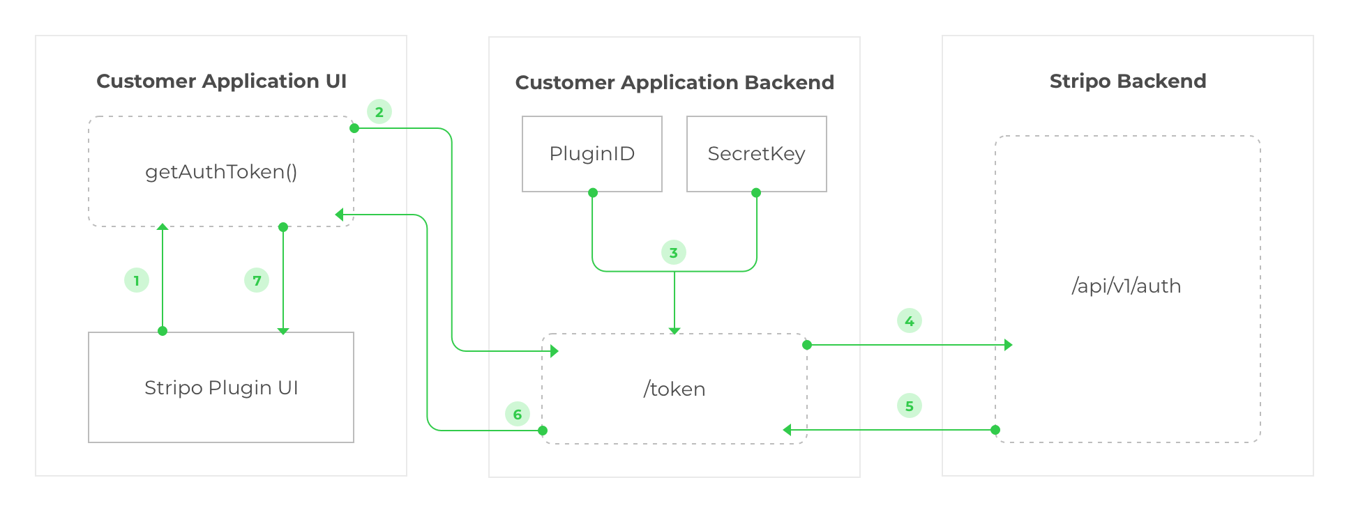
So let's take a closer look at how Authentication works:
- The Plugin configuration contains a parameter named
getAuthToken. To get a new token the Plugin calls thegetAuthTokenfunction defined in Customer Application UI. - Customer Application UI sends the GET requests to the Customer Application Backend (for example, the "/token" request without any parameters).
- Based on it the Customer Application Backend loads the "Plugin Id" and "Secret Key" values from the storage/database/file system.
- After that, the Customer Application Backend sends the "/auth" POST request to the
Stripo Plugin Backend with
PluginId,secretKey, androleparameters. - As a response, the Stripo Backend generates the Plugin authentication token and
- sends this token back to the Customer Application backend.
- Finally, the Customer Application Backend sends a token back to the Customer Application
UI, and there the Customer Application UI calls the
callback(token)method from thegetAuthTokenmethod params to load this token to the Stripo Plugin.
Sounds confusing? Please note that once the configuration is completed all this process will take a few seconds and your users wouldn’t even notice it.
To make it more clear please find the example of the getAuthToken
implementation below:
getAuthToken: function(callback) {
    $.ajax({
        type: 'GET',
        url: '/backend/plugin/token',
        contentType: 'application/json; charset=utf-8',
        dataType: 'json',
        success: data => callback(data.token),
        error: error => callback(null)
    });
}
To get a token on your Backend, please call an endpoint from it, as shown in the sample code below, with your PluginId and Secret Key, which are available on the Plugin details page.
POST: /api/v1/auth
Host: https://plugins.stripo.email/
Content-Type: application/json
Accept: application/json
Body: {pluginId:YOUR_PLUGIN_ID,secretKey:YOUR_SECRET_KEY,role:PLUGIN_EDITOR_USER_ROLE}
Response: {token:YOUR_AUTH_TOKEN}
AUTH REQUEST PARAMS:
| Parameter | Required | Description |
|---|---|---|
| YOUR_PLUGIN_ID | Yes | The value from your plugin configuration page. |
| YOUR_SECRET_KEY | Yes | The value from your plugin configuration page. |
| PLUGIN_EDITOR_ROLE | No | String value of a user role in the editor. For example, “ADMIN” or “USER”. |
Template requirements
The email templates that may be created/edited with Stripo editor, consist of two separate parts: the HTML code and the CSS code.

These parts of one template should be stored in your own database separately and passed simultaneously (see the initialization parameters) when the user decides to edit the template.
To check and compare the Stripo layout of the templates you can use our basic code from the repository.
In order to activate the editor's drag-n-drop feature for an imported email template, it is required the template has particular Stripo classes, which are used by the editor to parse the HTML layout correctly. In case you have a list of email templates created with another builder and you want to edit them with the Stripo editor, please make sure you have converted the HTML code of those templates correctly (with specific classes included in their HTML code) to activate Stripo editing features. Please, refer to this article from our blog with the list of all specific classes and examples of how to convert the HTML code — https://stripo.email/blog/advanced-option-email-templates-adaptation-stripo-builder/
To show the Stripo free email templates and display them in your application for your users for inspirational purposes, you can download them from here.
To provide your users with an option to create new email templates from scratch, please use the pre-built HTML and CSS code of an empty (scratch) email template which you can find here
It is required that the email template’s HTML code has at least one stripe with one structure in it.
How to Upgrade the Plugin?
We are glad that you decided to go further and upgrade your Plugin subscription plan! To do so, please open the Plugin tab in your Stripo account.
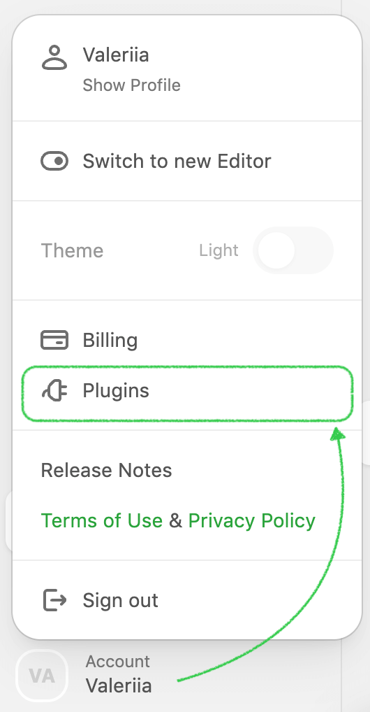
then choose a necessary application and click the "Change Plan" link.
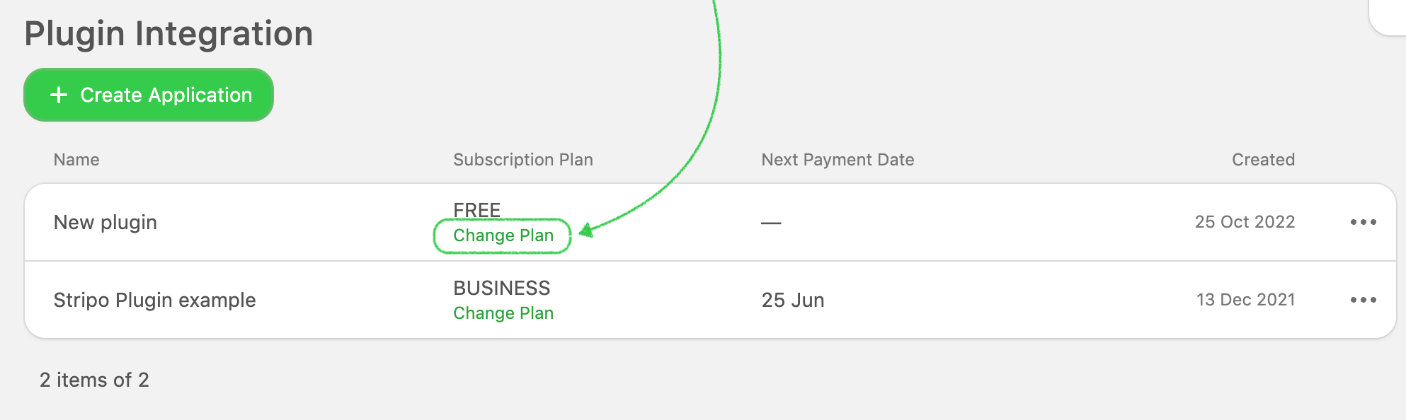
In the new pop-up window, you will get the opportunity to upgrade the subscription on a monthly or annual basis.
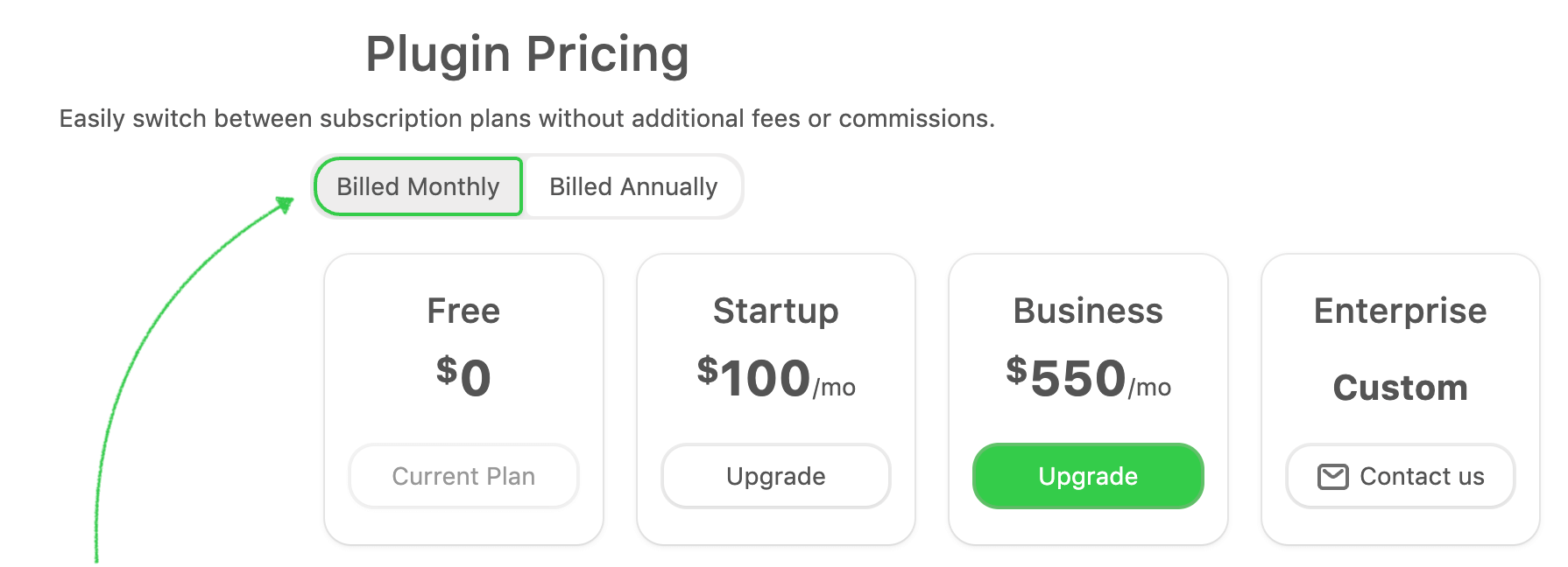
If you want to get the invoice with the annual subscription, please email us at support@stripo.email.
UI Configuration
Interface Appearance In paid subscriptions only
In this section, you can configure the appearance of the Stripo Plugin to make it in the same style as your application.
How can you do that?
Just choose needed controls here and remove our Stripo branding.
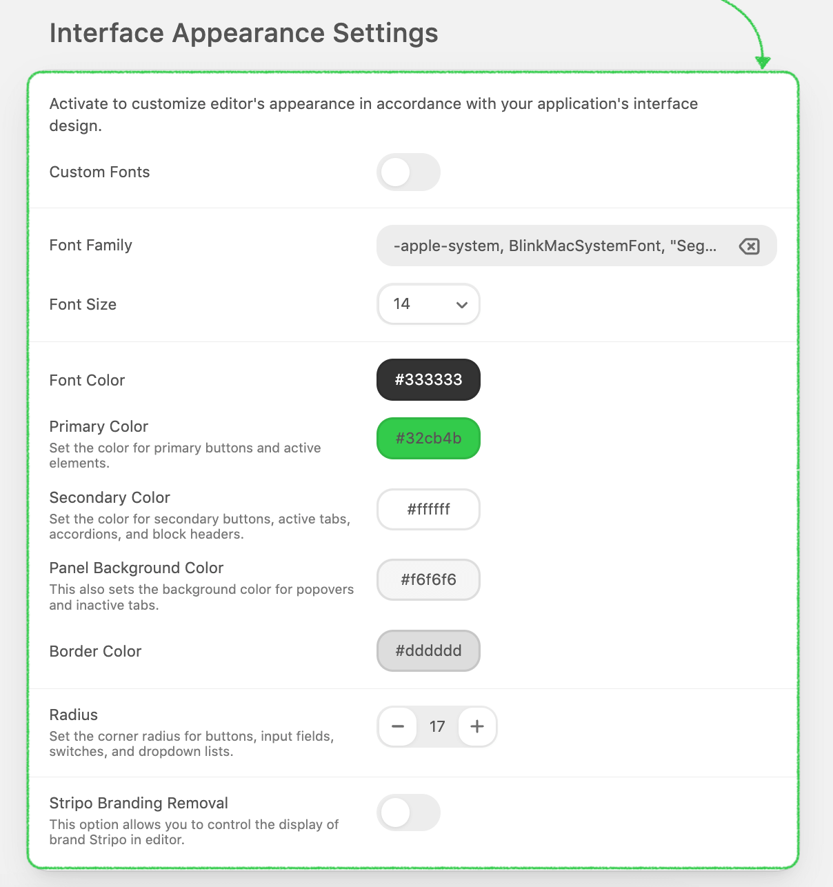
If you need more options for managing styles (appearance), then the Enterprise plan is what you need. There you can host the entire front-end on your side and add your own CSS-file that will prevail over our standard styles.
Sometimes connecting the editor to applications that are also using Bootstrap CSS styles can cause a distorted look of the Plugin styles: components, alignment, etc.
This happens because the styles of your application affect the editor's styles.
In this case, you need to isolate the influence of your application styles on our editor by
connecting it to iframe or you should independently detect (using dev tools) which styles of
your application affect the editor and change their scope (so that they do not work
globally, but only for specific components).
If you have any questions on how to solve this problem, please feel free to contact our
support team at support@stripo.email.
Image Storage
With the Stripo Plugin, you independently choose where all your images should be stored and it’s free for all pricing plans.
We are glad to provide our storage for your integration ー it’s actually specified as the default one in the settings.
Please be advised that there might be a limitation to the use of the Stripo storage depending on the selected Plugin subscription plan. In order to have full control over the images used by your users in newsletters, we do recommend keeping them on your own file storage servers.
Don’t want to store pictures on our end? No problem! Please choose any other preferable option and connect your own server to the image gallery.
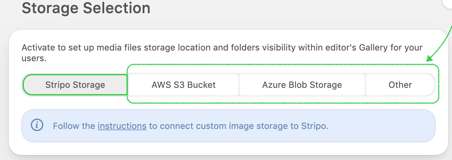
Please, see the example of a configuration for Custom AWS S3 bucket, Azure Blob storage, or even your own server with the Other storage tab below.
Custom AWS S3 bucket
Custom AWS S3 bucket is a Plugin application configuration feature that allows you to easily connect your own Amazon Web Services S3 bucket to our Plugin for storing images.
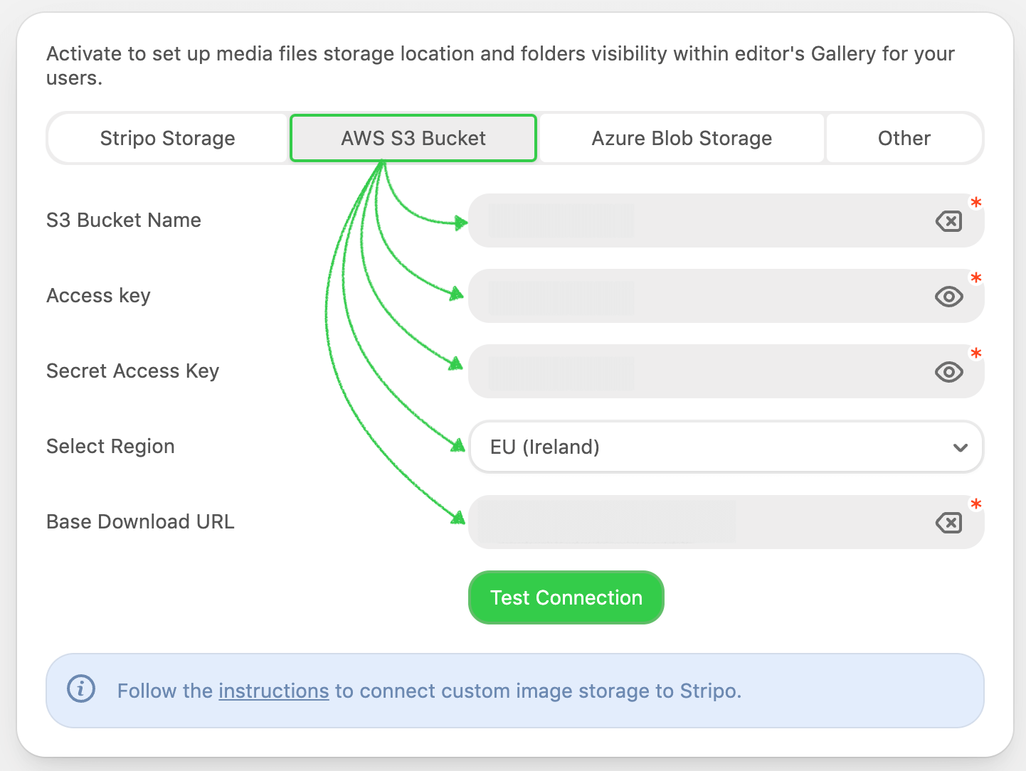
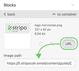
If you choose this option, you’ll have to fill out a form to establish a connection with your storage. Please take a look at the image above to see the description of the form fields with specifications regarding the information required for each of them.
| Parameter | Required | Description |
|---|---|---|
| S3 bucket name | Yes | The name you assigned to the bucket when creating it. |
| Access key | Yes | You can provide AWS Root Account Credentials or IAM User Credentials (we recommend the second option for security reasons). The provided account must have the “Read” and “Write” access to the given bucket. More about AWS credentials. |
| Secret access key | Yes | You can provide AWS Root Account Credentials or IAM User Credentials (we recommend the second option for security reasons). The provided account must have the “Read” and “Write” access to the given bucket. More about AWS credentials. |
| Region | Yes | AWS region where you created the bucket. |
| Base download url | Yes | Define the path that will be specified at the beginning of each URL to the images hosted in your S3 bucket. For example, it may be your CDN domain name or any other address, depending on your server configuration. |
Please make sure that the provided account has the Read and Write access to the given bucket.
For more details on how to configure your AWS S3 storage please refer to this manual.
Azure Blob storage
Azure Blob storage is a Plugin application configuration feature that allows you to easily connect your own Azure storage account to our Plugin for storing images.
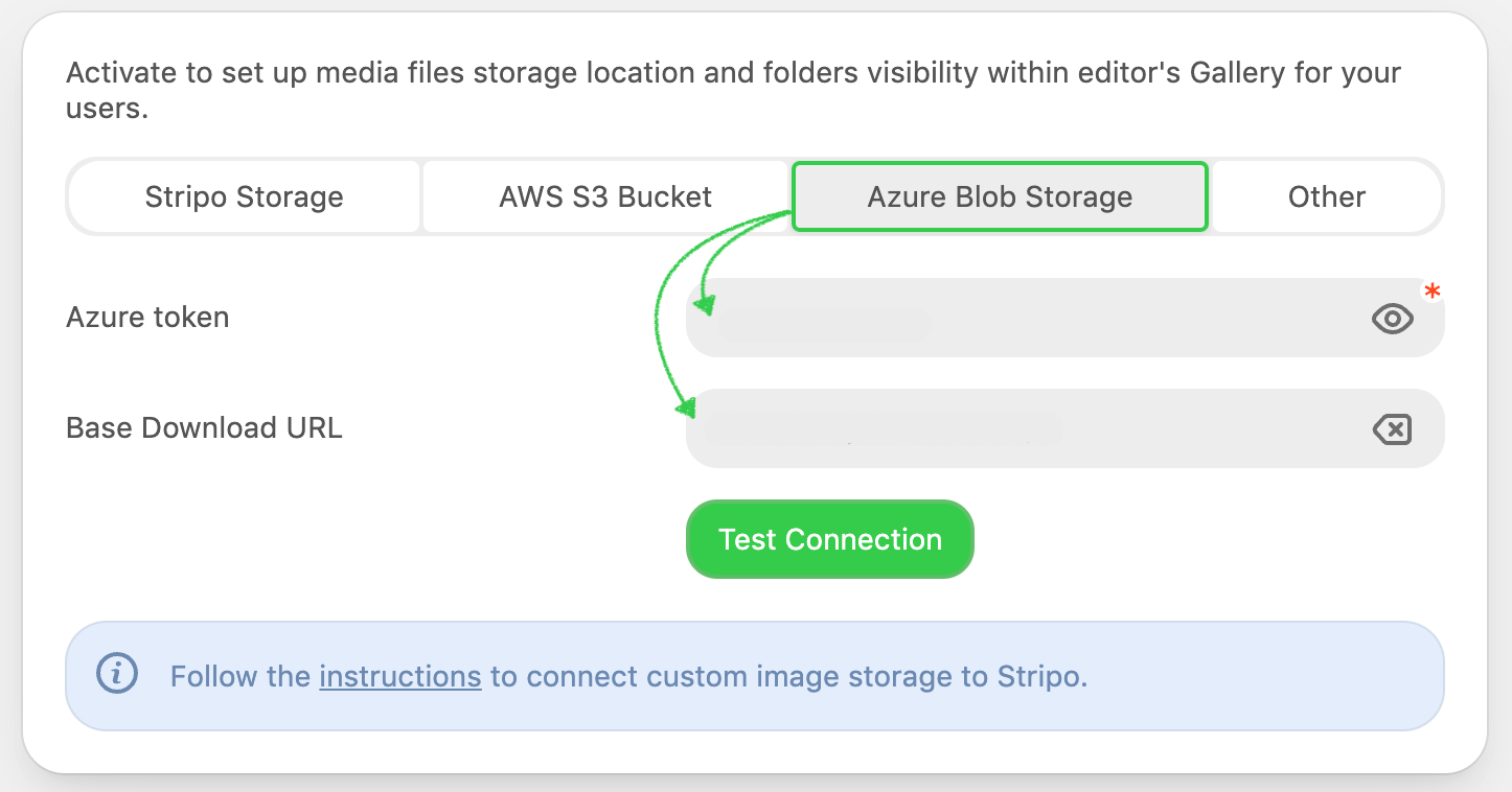
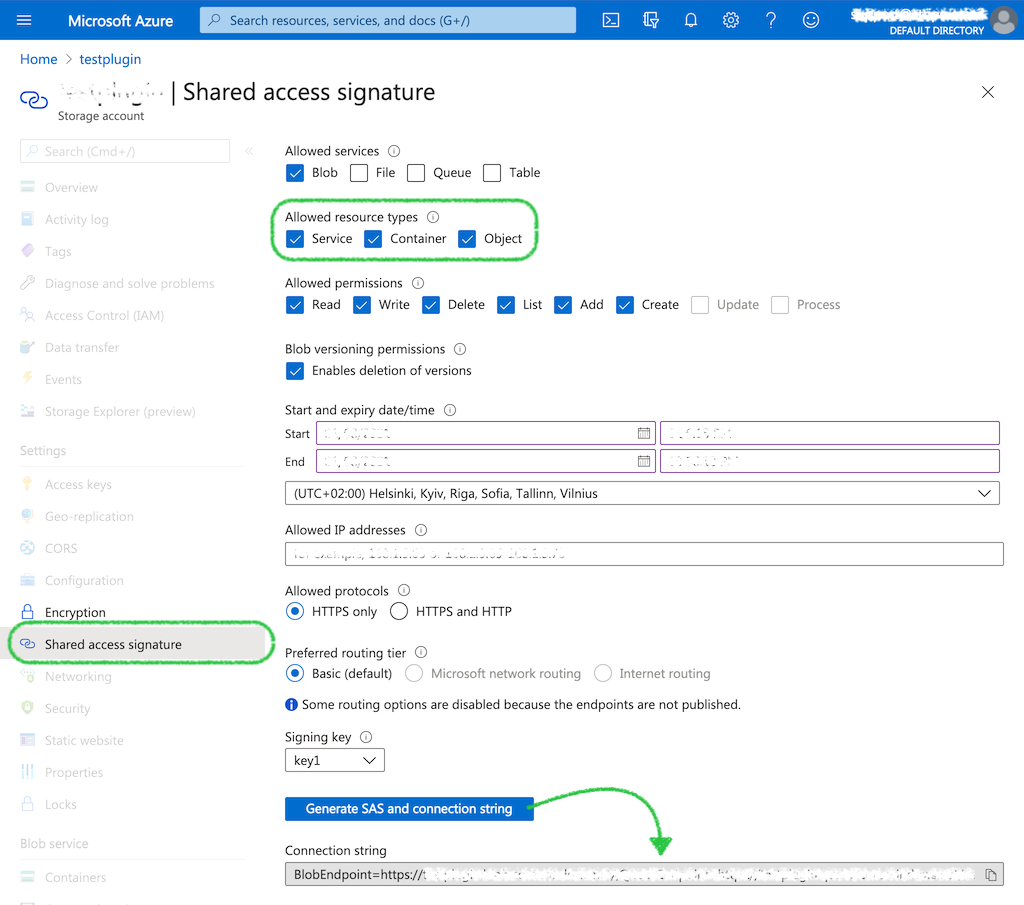
To do so, you need to generate a connection string in your Azure portal account:
If you choose the “Azure Blob Storage” option, you will have to fill out the form to establish a connection with your storage. Please take a look at the image above to see the description of the form field with specification regarding the information that you will need to enter there:
| Parameter | Required | Description |
|---|---|---|
| Azure connection string | Yes | Connection string from your azure portal account. |
Cloudinary
We are now also integrated with Cloudinary so you can connect it with Stripo and store your images here.
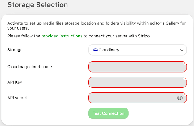
Let's now check how to find the credentials needed to connect it.
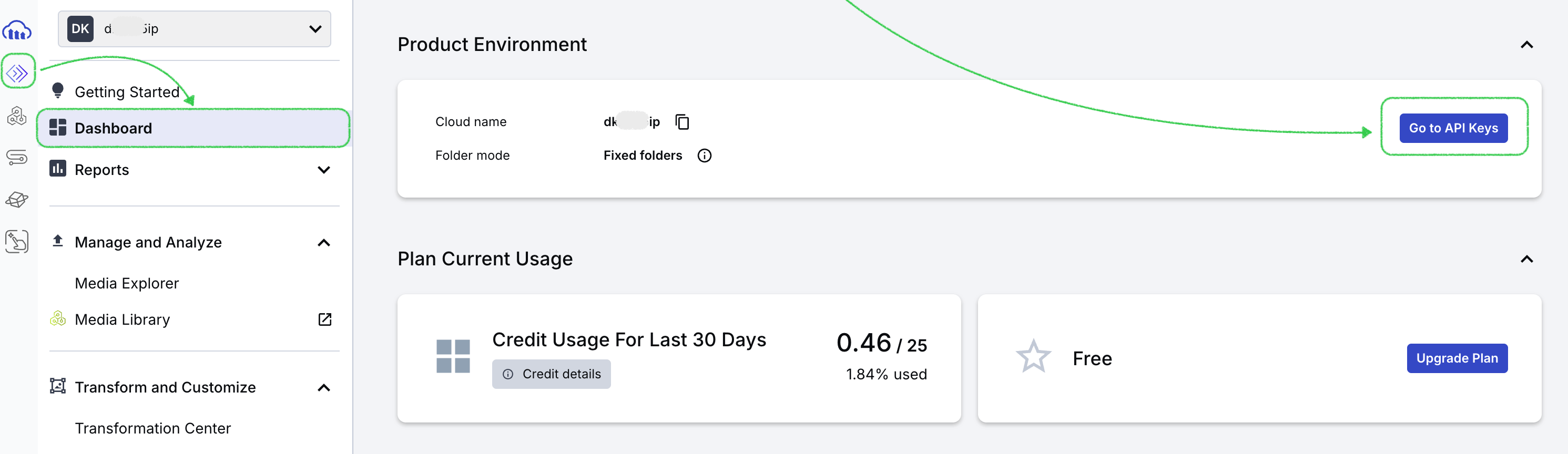
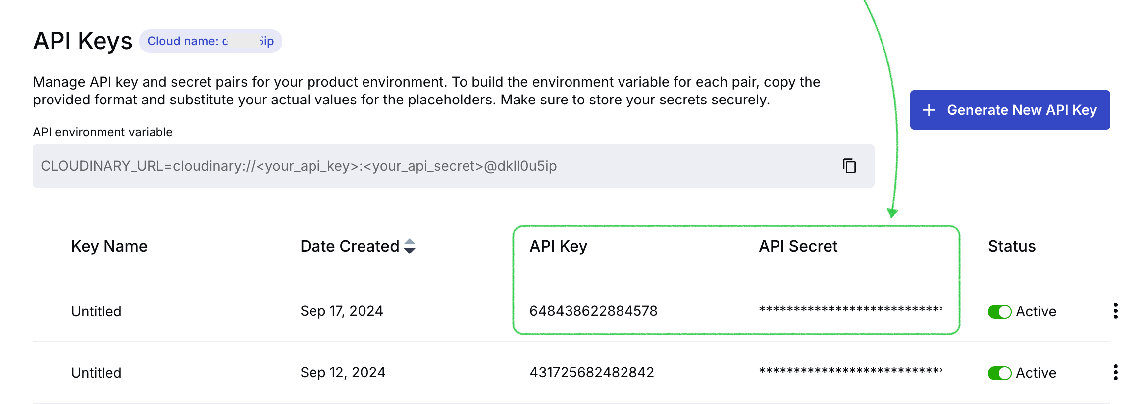
The first step is to go to "Programmable media", move to the "Dashboard" tab in your Cloudinary account, and click on the "Go to API Keys" button.
On top of the page next to the "API Keys" you can find the cloud name, copy it, and paste it to the required field in Stripo while connecting Cloudinary.
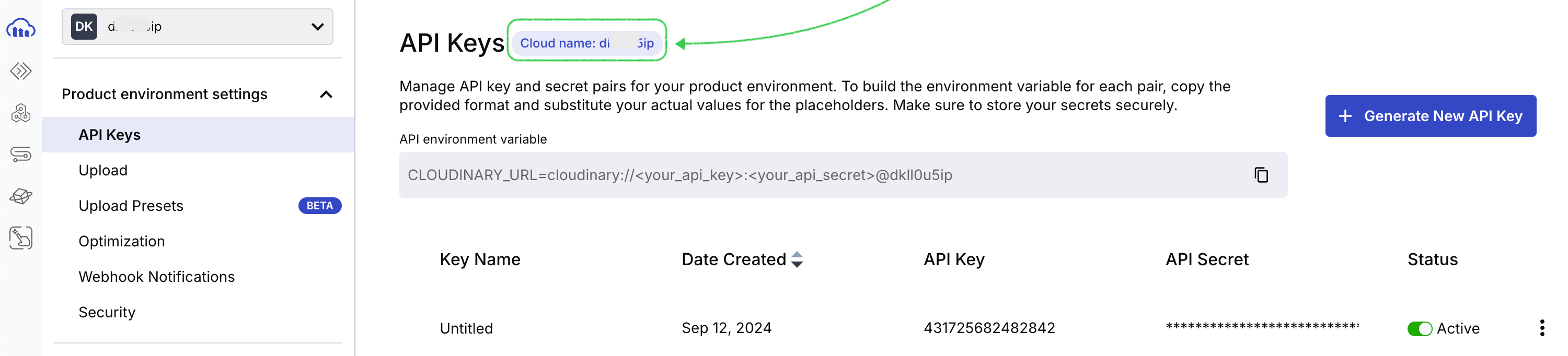
Now let's generate a new API key.
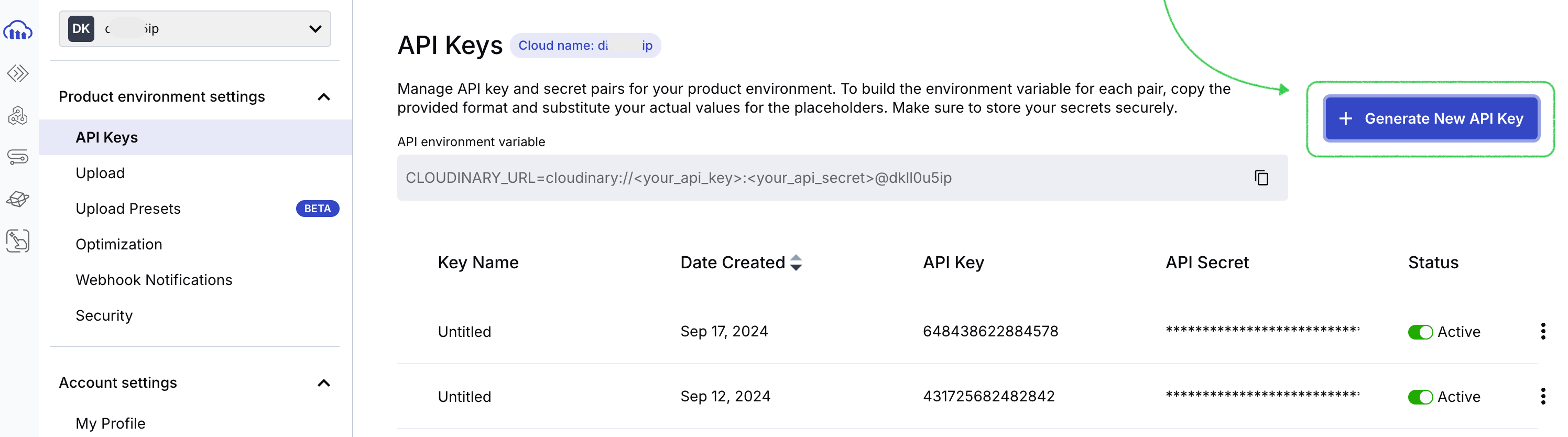
After it's generated, you will find it in the list of all the API keys. Copy the API key and API Secret and pass them to our field in your Stripo account.
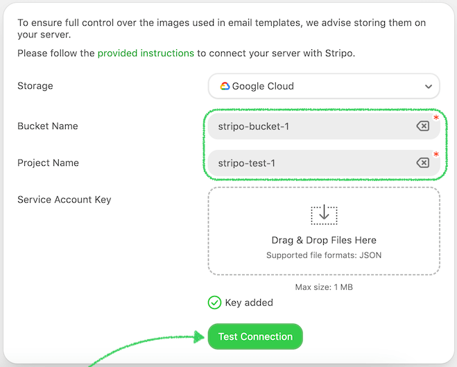
Google Cloud
We are now also integrated with Google Cloud so you can connect it with Stripo and store your images
here.
Let's now check how to set it up and find the credentials needed to connect it.
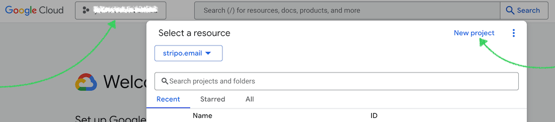
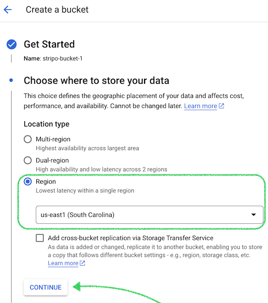
Step 1: Create a Project in Google Cloud.
-
Please open the link and press on the Console;

-
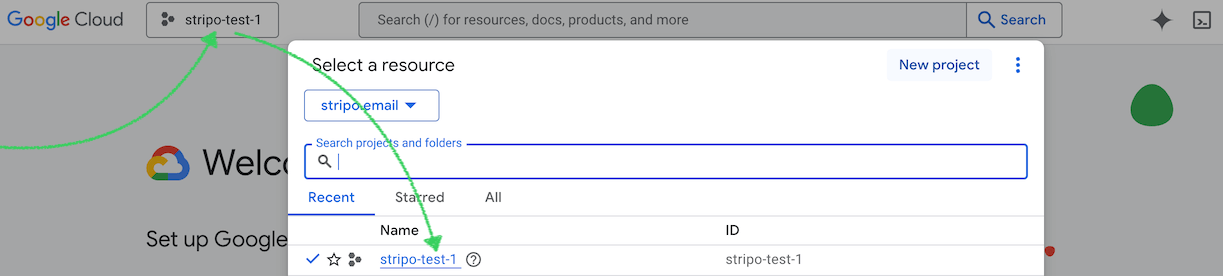
In the top of the screen, open the "Project Selector" and choose "New Project";
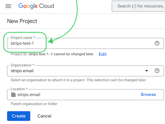
-
Create the project by filling in the required details:
-
📝 "Project Name" (needed later in Stripo settings);
-
🏢 "Organization" (if applicable).
-
-
Click Create.
-
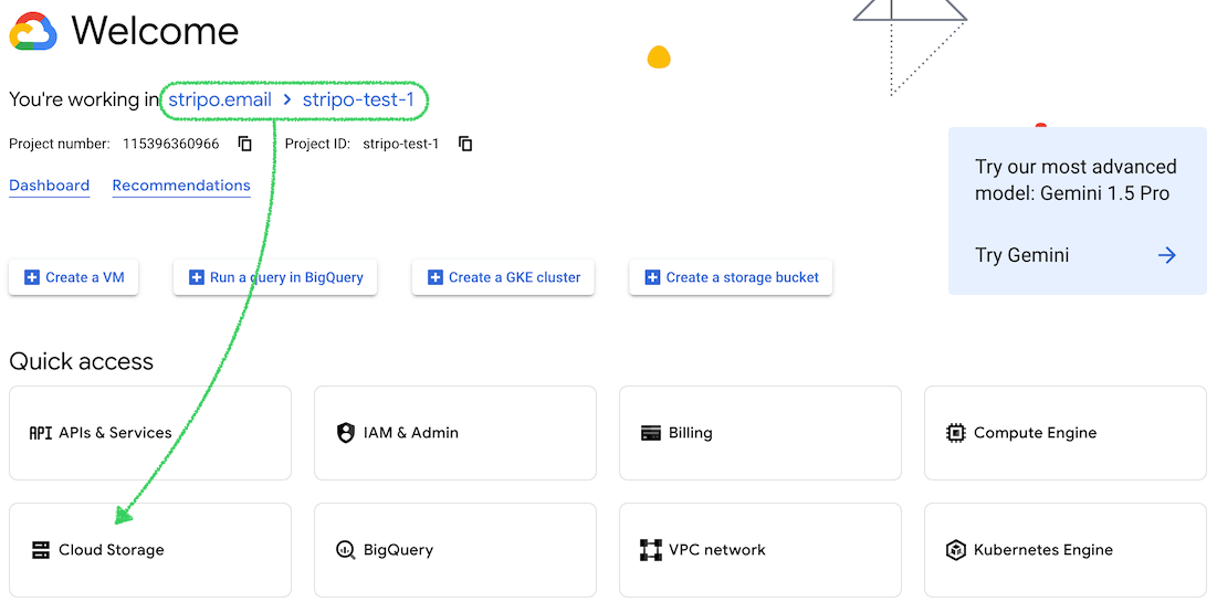
After the project is created, open it through "Notifications" → "Select Project";
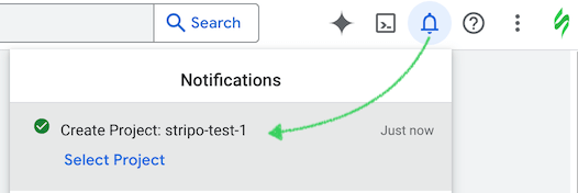
-
or choose it from the list;
Step 2: Create a Storage Bucket.
-
Inside your Google Cloud project, navigate to "Cloud Storage";
-
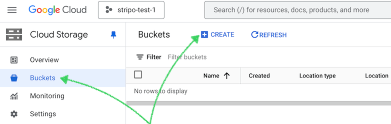
Click on "Buckets" → "Create";
-
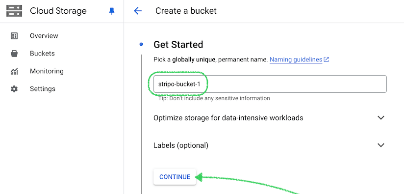
Enter a "Bucket Name" (remember it for later use in Stripo settings).
-
You can skip the other settings and press "Continue";
-
Select a "Region" for data storage and click "Continue";
Important Note: The cost of Google Cloud services varies based on your selection here.
-
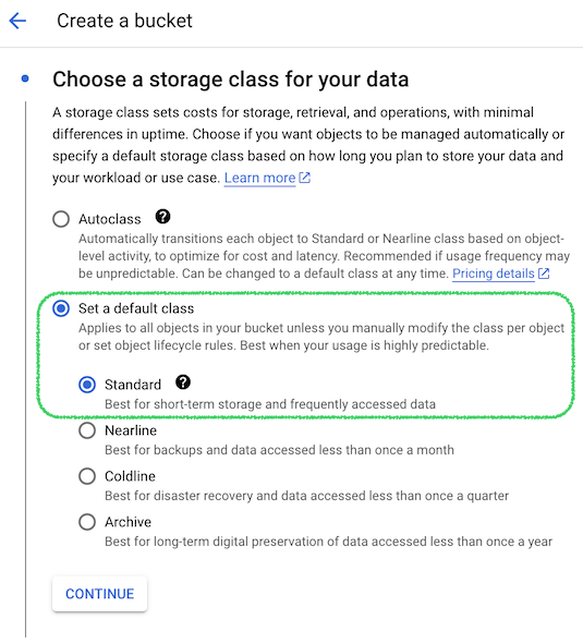
Choose "Storage Class" (recommended: Standard) and click "Continue";
-
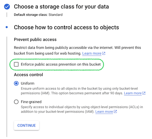
Under "Access Control", uncheck "Enforce public access prevention on this bucket" and select "Uniform";
-
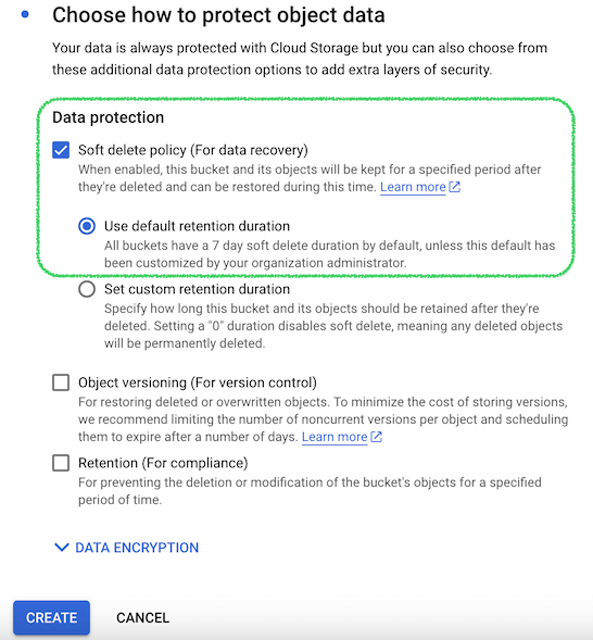
On the next step, leave the default settings "Soft delete policy (For data recovery)" and press on "Create" button;
Important Note: Stripo does not actually delete data from your bucket, instead, we soft delete it.
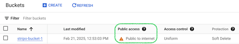
🌐 Make the Bucket Public:
-
Go to your newly created "Bucket" → "Permissions" → "Grant Access";
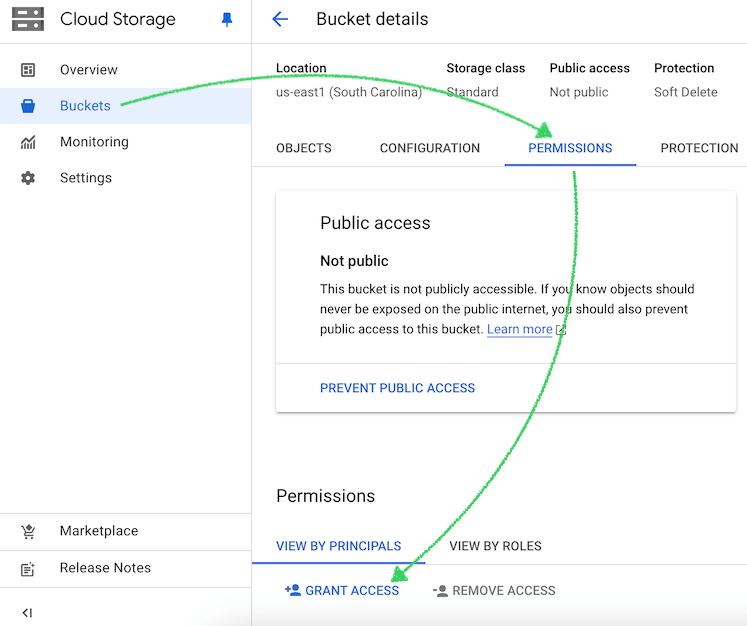
-
Add "allUsers" as a principal and assign the role "Storage Object Viewer";
-
Click "Save" and allow public access;
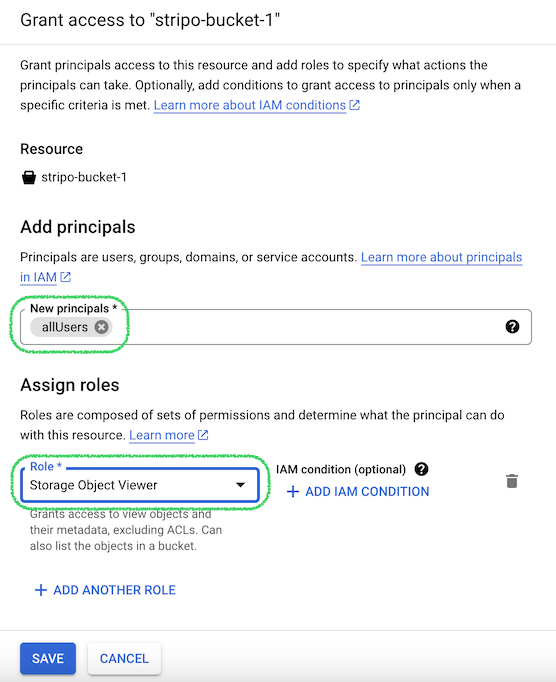
-
Refresh the page and verify that the bucket's public access is set to "Public to Internet".
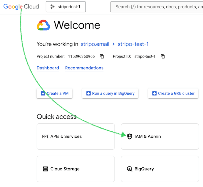
Step 3: Create a Service Account.
-
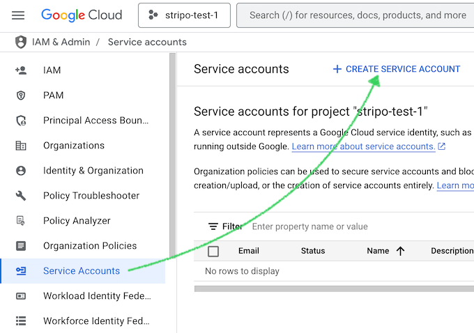
Go to the "IAM & Admin" section on the main page;
-
Click on "Service Accounts" and then "Create Service Account";
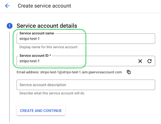
-
Provide a suitable name for the service account and click "Create and Continue";
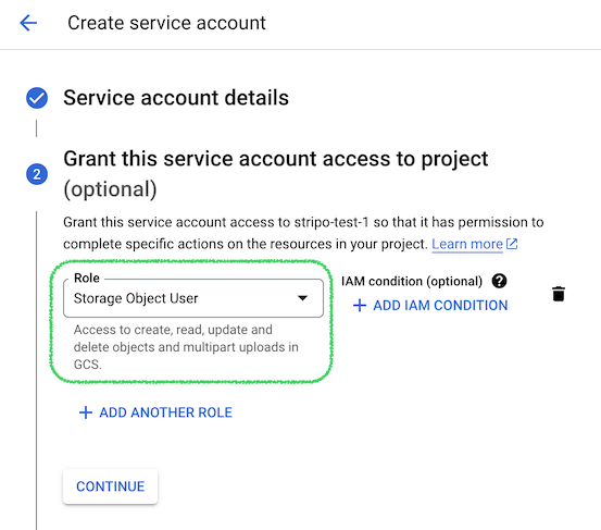
-
In the next step, add the "Storage Object User" role and click "Continue";
-
You can skip the next step Grant users access to this service account (optional) and press "Continue".
Step 4: Generate the Key for the Service Account.
-
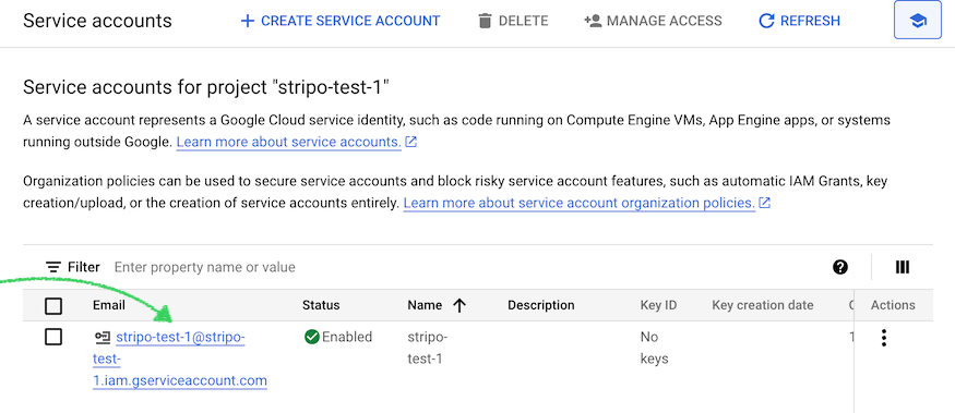
Press on your service account;
-
Please press on "Keys" → "Add Key" → "Create new key" and choose "JSON" type and click "Create";
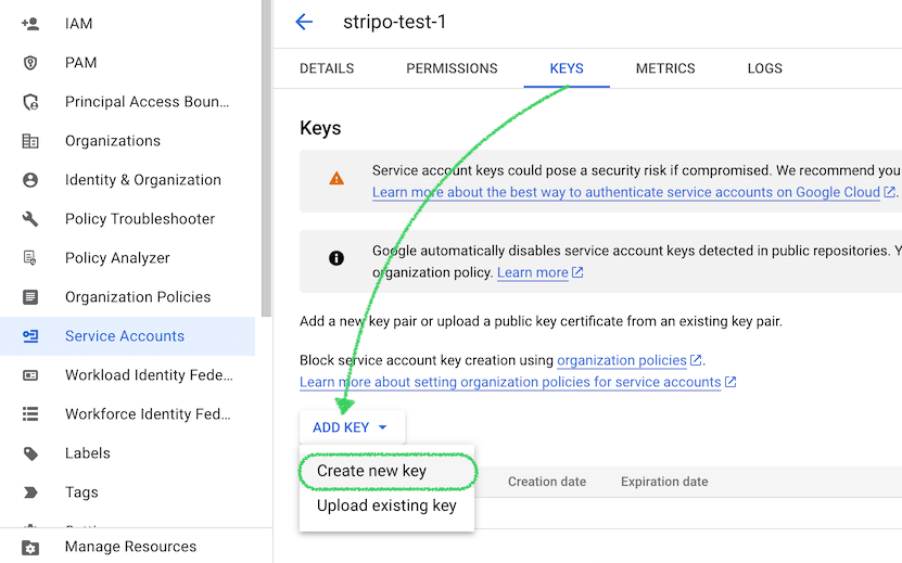
-
Save the downloaded key file to your desktop (this is the third piece of information needed for Stripo);
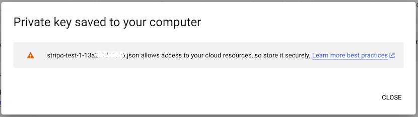
Step 5: Add the Credentials in Stripo.
-
Open your Stripo Image Storage settings;
-
Enter the "Bucket Name", "Project ID", and upload the "Service Account Key";
-
You're all set!
Other storage
This option may be the best choice for you if you’re using another storage type
or want to build a more custom and flexible solution to host your images. We created a way
to connect the Plugin to a custom file system provider (via HTTPS protocol), allowing you to
use the Stripo editor with your own file storage, no matter which technology you use.
It is required to support the set of the methods described below to provide successful
communication between the two systems: the Stripo server and yours.
The Basic Authentication is used to send these requests, so please make sure that you have specified the correct Login, Password, and Base API URL on the Stripo Plugin details page of your Stripo account (if you don’t have an account, please sign up).
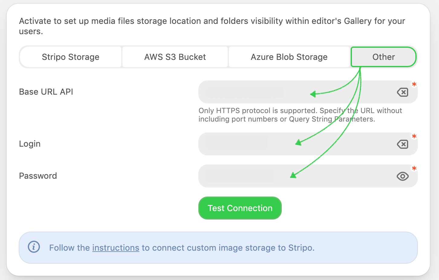
So, once the “Other storage” option is selected, make sure your server
supports all the 4 types of requests with the exact specifications described below — GET
LIST OF FILES, UPLOAD FILE TO STORAGE, DELETE/REMOVE FILE FROM STORAGE, GET FILE INFO.
Note, that your storage must support chunked-encoding mode if you want to get logs
about
any request. See more here.
GET LIST OF FILES
This method is used when the image gallery is opened inside the editor.
GET: /?keys=KEY_FOLDER_1,KEY_FOLDER_2,...
Host: YOUR_BASE_URL
Content-Type: application/json
Accept: application/json
Response: [
    {
        key: KEY_FOLDER_1,
        documents: [
            {
                url: DOC_URL,
                originalName: DOC_NAME,
                uploadTime: DOC_UPLOAD_TIME,
                size: DOC_SIZE_IN_BYTES,
                height: DOC_HEIGHT,
                width: DOC_WIDTH,
                thumbnailUrl: DOC_PREVIEW_URL
            }
        ]
    },
    {
        key: KEY_FOLDER_2,
        documents: []
    }
]
The Copy button may not work, it could be caused by special syntax inside the code. Please try to copy it manually.
| Parameter | Description |
|---|---|
| key | It is generated automatically from the Plugin Id and the value specified in the Folder path field (please see the Folder configuration section) of the folder to which the image is loaded. For example, key=0000000_99999, where 0000000 is the Plugin Id and 99999 is the value set to the Folder path. |
| documents | An array of the uploaded documents grouped by Key. |
| url | Mandatory. Absolute URL to the document. |
| originalName | Optional. Document name. |
| uploadTime | Optional. Document upload time in milliseconds. |
| size | Optional. Document size in bytes. |
| height | Optional. Document height in pixels (px). |
| width | Optional. Document width in pixels (px). |
| thumbnailUrl | Optional. The absolute url of document preview thumbnail. |
UPLOAD FILE TO STORAGE
This method is used when the user uploads an image to the image gallery.
POST: /
Host: YOUR_BASE_URL
Content-Type: multipart/form-data
Accept: application/json
Body:
    key: KEY_FOLDER,
    file: MULTIPART_FILE
Response: {
    url: DOC_URL,
    originalName: DOC_NAME,
    uploadTime: DOC_UPLOAD_TIME,
    size: DOC_SIZE_IN_BYTES,
    height: DOC_HEIGHT,
    width: DOC_WIDTH,
    thumbnailUrl: DOC_PREVIEW_URL
}originalName and the corresponding url in the response. Stripo uses the returned url to reference the image in the email template.
The Copy button may not work, it could be caused by special syntax inside the code. Please try to copy it manually.
| Parameter | Description |
|---|---|
| key | It is generated automatically from the Plugin Id and the value specified in the Folder path field (please see the Folder configuration section) of the folder to which the image is loaded. For example, key=0000000_99999, where 0000000 is the Plugin Id and 99999 is the value set to the Folder path. |
| file | Multipart file. |
DELETE/REMOVE FILE FROM STORAGE
This method is used to remove the system images only from the storage: like thumbnails of the modules, etc.
POST: /delete
Host: YOUR_BASE_URL
Content-Type: application/json
Accept: application/json
Body: {url:DOC_URL}
The Copy button may not work, it could be caused by special syntax inside the code. Please try to copy it manually.
| Parameter | Description |
|---|---|
| url | Absolute URL to the document. |
| key | It is generated automatically from the Plugin Id and the value specified in the Folder path field (please see the Folder configuration section) of the folder to which the image is loaded. For example, key=0000000_99999, where 0000000 is the Plugin Id and 99999 is the value set to the Folder path. |
Please be advised that the Plugin never removes the user’s images uploaded to the image gallery. If a user removes an image, the Plugin simply marks it as a removed one and doesn’t display it in the image gallery anymore. This approach prevents cases when the user accidentally removes the image that is already sent in the email to the recipients. Because if the image is actually removed from the storage, the opened email template may be broken.
GET FILE INFO
This method is used for reading the specific information displayed on the Settings Panel about the selected image
GET: /info?src=DOC_URL
Host: YOUR_BASE_URL
Content-Type: application/json
Accept: application/json
Response: {
    "originalName": DOC_ORIGINAL_NAME,
    "size": DOC_SIZE_IN_BYTES
}
The Copy button may not work, it could be caused by special syntax inside the code. Please try to copy it manually.
| Parameter | Description |
|---|---|
| src | Absolute url of the document. |
Please be advised that the key of the system images (used for a banner block, a video block, and module thumbnails) have the types of the Keys that are different from the described above.
Thus, the key for the system images are as follows:
- for the video block —
pluginId_[application_id]_video - for the banner block —
pluginId_[application_id]_banner - for the module thumbnail —
pluginId_[application_id]_modules
where [application_id] is the Plugin Id of you
application.
Image Gallery. Folders configuration
You can see the image gallery at that time when you or your users choose an image for the “Image” block. You independently decide how many folders it contains and whether the user can only use it as drag-n-drop or also upload images to it for future usage.
For example, below you may see 3 folders in the image gallery named “Email”, “Project”, and “Common”.
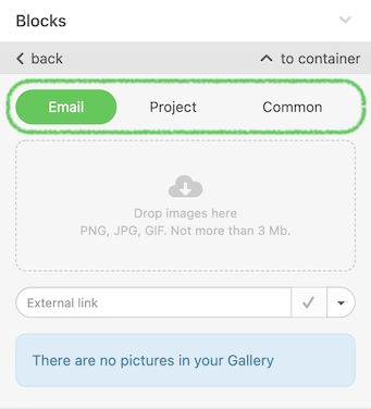
These folders were created and configured on the Plugin details page this way:
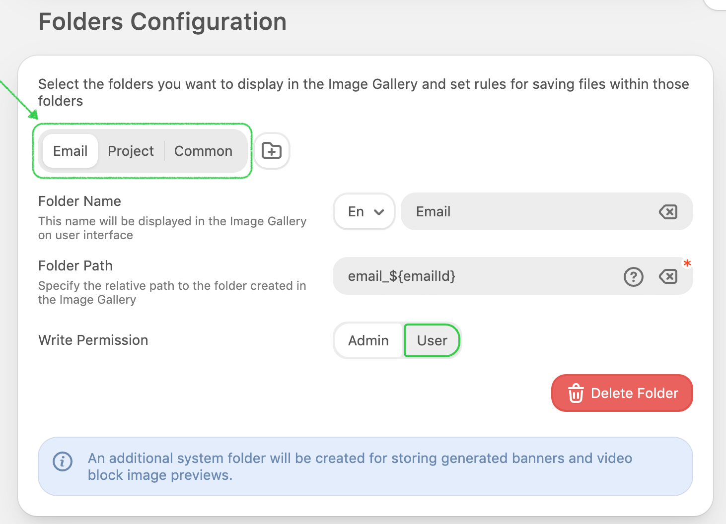
In this section, you can manage:
- the number of folders;
- their names. You have the option to specify what names a created folder should have in every supported language;
- the path to images that should be stored in each folder;
- and also you can grant respective permissions.
You can specify the dynamic folder path to the repository and insert into it the variables that may be taken from your end when the Stripo editor is initialized.
For example, if you want to separate the images of one email template from
another, you can create the "Emails" folder and specify its path as ${templateId}. When initializing the Plugin, you have to pass
the templateId value (e.g., 00000) among the parameters in the apiRequestData and, as a
result, the Plugin will get the images from the “00000” folder (this folder will be
automatically created on a configured server if it does not exist yet).
Please be advised that by default the Stripo plugin also creates the technical folders to store generated banners and image previews for the “Video” basic block, etc. This folder cannot be managed from the Stripo Plugin details page.
If you want to set the User role for the specific folder and at the same time prevent your clients from removing images, you have to initialize the Plugin with additional configuration.
"imageLibrary": {
    "hideDeleteButton": true
}
This code hides the Delete option for images and leaves only the editing option for the User role.
If you have any questions on this matter, please contact our support team at support@stripo.email.
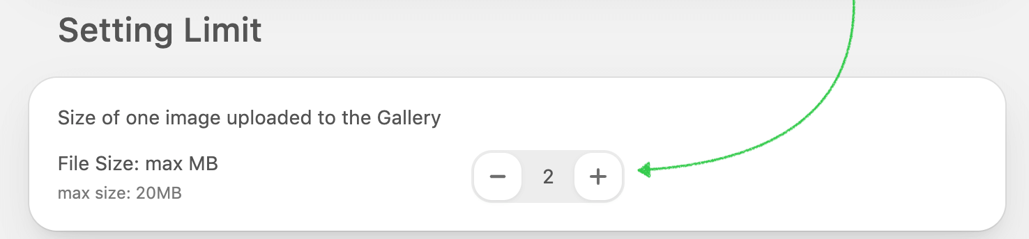
Limits
Below, you can specify the maximum size of one image uploaded to the gallery. The maximum value cannot exceed 20 Mb per one document.
Stock image configuration
If you want to provide your users with an option to search for and use free stock images within the image gallery while creating an email, you need to simply activate the "Stock images configuration" option.
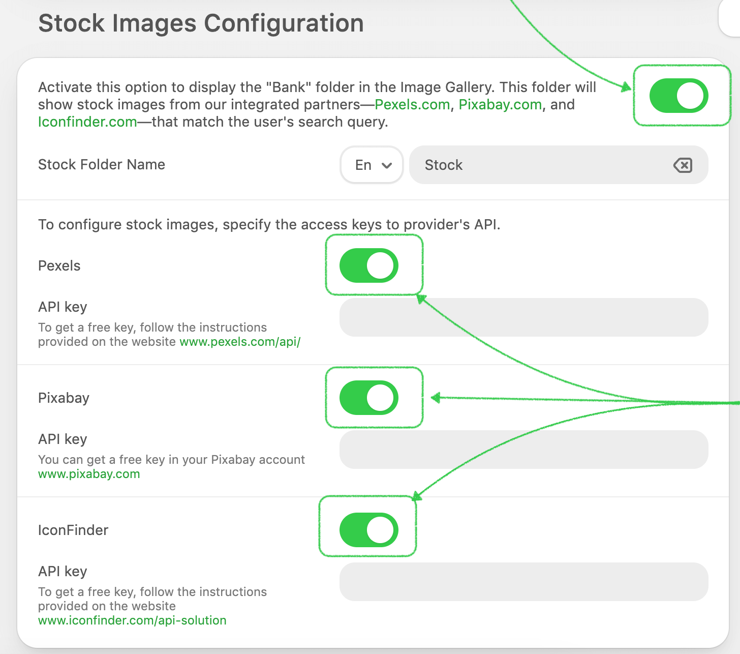
Once it is activated, please specify the stock folder name, choose an available stock images provider, and specify the configuration according to the provided instructions.
The list of providers may be extended in the future.
Custom Gallery Connection
If you want to display your own UI component with an existing hierarchy of images and folders we have a great solution for you. The file with the example of the code describes how it may work.
When users want to use an image, instead of our gallery they will see an external gallery in the modal window. In that window, it’s up to you to define which images should be displayed and how, depending on a user that is currently working with the email in the editor.
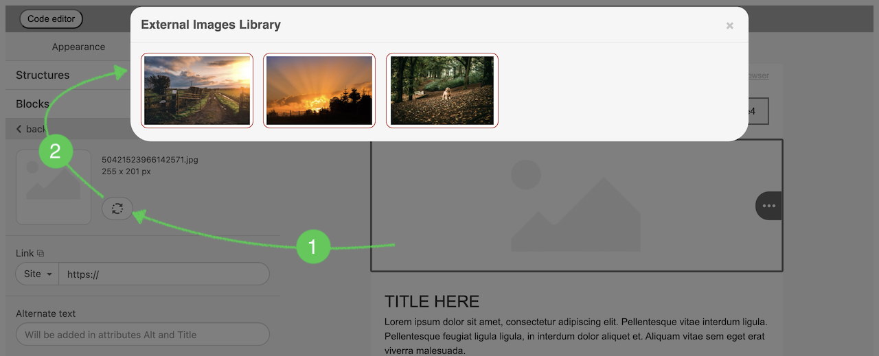
To do so, you should initialize the Plugin with the parameter externalImagesLibrary and put your logic there. We expect that with the image that your user chose you will pass to the Plugin in callback parameters like original name, resolution, size and URL.
Please find the example of the code below:
window.Stripo.init({
    ...,
    externalImagesLibrary: {
        openLibrary(onImageSelectCallback, onCancelCallback) {
        /* Put your logic here.
            Call
                onImageSelectCallback({
                    originalName: 'YOUR_FILE_NAME.png',
                    resolution: '600 x 410 px',
                    size: '169.20 kb',
                    url: 'https://YOUR_STORAGE_URL/YOUR_FILE.png'
                })
            when user select the image from external library.
            Call
                onCancelCallback()
            when user close the library without image selection.
        */
        }
    }
});
You can also find the real example here and try it out on your side.
Modules Library
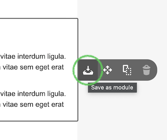
If you want to offer your users some interesting structures with a non-standard layout or provide the opportunity to save particular elements separately from the whole email (structures, containers, stripes) for future use and the easy drag-and-drop functionality you can fulfill it with modules.
Similar to the image gallery, a user may see as many folders (tabs) in the Modules tab as you've created and configured for your Plugin application.
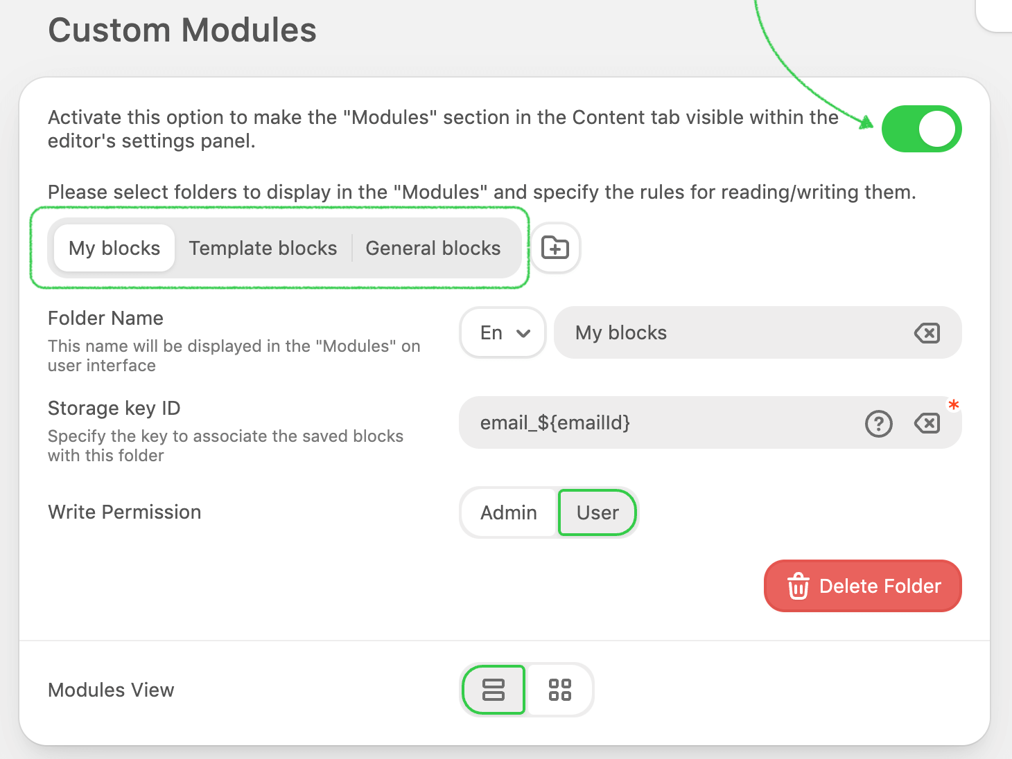
In this section, you can manage:
- the number of folders;
- their names. You have the option to specify what names a created folder should have in every supported language;
- the storage key ID that will be assigned to modules and will be used as an identifier.
- and can even grant respective permissions.
You can specify the Storage Key ID as a static value or a variable (use braces,
e.g. ${UserId}).
For example, if you want to restrict the access to one user’s modules from another user, you can create the ‘My modules’ folder and specify its path as ${UserId}. When initializing the Plugin, you have to pass the userId value (e.g., 00000) to apiRequestData parameter and, as a result, the Plugin will get the modules from the DB by the key “00000”.
Please be advised that you can turn off this feature so the Library section won’t display in the editor at all.
In this case, there won’t be an option to save selected elements from the context menu.
You can create a set of categories to help your users group the modules and filter them according to their preferences.
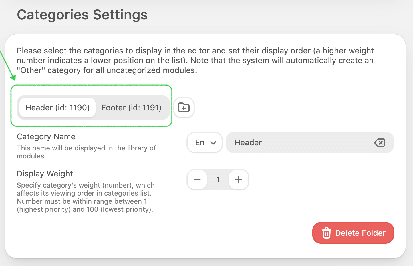
Depending on your use cases, you can hide some categories (along with the assigned modules to those categories) during plugin initialization. To do so, pass the array of the category IDs (which may be taken from the plugin configuration page).
customBlocks: {
    excludedCategories: [415, 10]
}
Synchronized Modules
Let's say you're tasked with updating all email templates with new branding or contact details. Does it mean changing all modules manually? Luckily, no. Synchronized Modules streamline the procedure. Changes to the module will be applied to all templates where the Synchronized Module control is activated.
How to activate?
To enable the Synchronized Modules feature, initialize the plugin by using the specified parameter:
modules: {
    syncModulesEnabled: true,
}
Your customers now have the option to save their modules and activate the synchronized module feature.
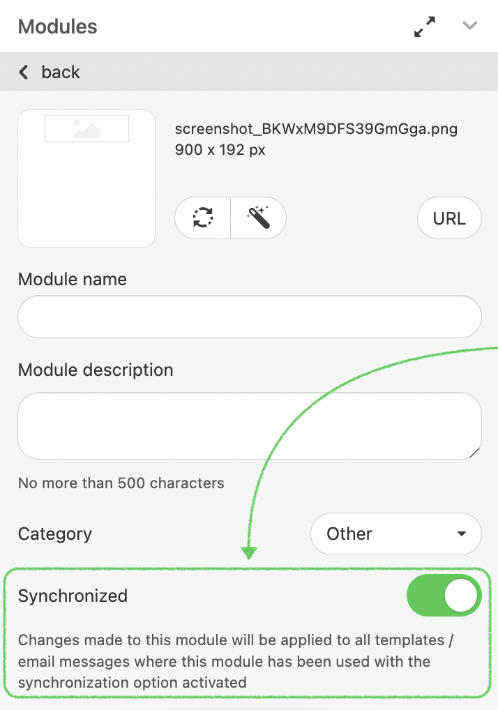
As soon as control is activated, the "Sync OFF" symbol will appear on the particular module.
Once the module is modified (updated) in the Library, the modifications are implemented to all templates that contain this module (if the customer so selects).
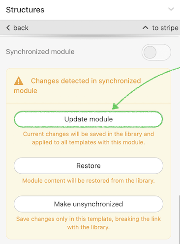
Update - once you’ve clicked it the module would be updated in modules library;
Restore - when you choose this option module will be changed to default;
Make unsynchronized - module became as standard (unsynchronized).
Please note that if a user lacks permission to modify the module, the "Update module" option will be hidden from the settings panel.
How to support on your end?
Let's take a look behind the hood and examine the logic on the module's back-end.
- If the mentioned above parameter is specified, while plugin initialization the editor requests its database for all the saved synchronized modules for all the folders shown in the plugin, based on their configurations (we consider the data we receive in the apiRequestData parameter).
- Once our DB receives such modules, the editor scans the HTML of the template opened in the editor to find if there is any synchronization module inserted and activated. If so - the editor replaces the content of this module with content saved in the Library.
- If the input is passed with value: true, the getTemplate method returns the HTML, CSS, and arrays of IDs of synchronization modules used in this template, along with the HTML, CSS, and IDs of these modules.
- If auto-saving is turned on in the editor, our Back-end will return the HTML and CSS of this template, as well as arrays of IDs of synchronization modules used in this template (the very last parameter) in this method: https://stripo.email/plugin-api/#autosave-option.
- The owner of the Plugin must store this information in its DB: which sync module IDs belong to which template
- Once the owner saves/updates the synchronization module into the library while working with the template, the editor fires an event that must be read by the customer’s app to start the synchronization of other templates where this module is also used.
- To do this, please run the “Compile email
template” method for all templates that contain that module.
Clarification: Compile Email Template with
apiRequestDataWhen compiling email templates that include synchronized modules, it’s essential to send not only the
Why it mattershtmlandcssparameters but also theapiRequestDataparameter — the same one used during the plugin initialization.Including
apiRequestDataallows Stripo Editor to:- confirm that the customer has permission to read or update synchronized modules;
- identify the correct organization, folder, or user context for retrieving module content.
apiRequestDataYou must pass exactly the same parameters that you normally provide when initializing this email in the editor — that is, all the custom parameters used in:
- plugin initialization (
initconfiguration); - module's folder configurations.
NotesPOST: /api/v1/cleaner/v1/compress Host: https://plugins.stripo.email Content-Type: application/json Header: ES-PLUGIN-AUTH: Bearer YOUR_AUTH_TOKEN Accept: application/json Body: { html: YOUR_HTML_CODE, css: YOUR_CSS_CODE, apiRequestData: "{\"emailId\":\"1234\",\"organizationId\":\"testGroup\",\"folderId\":\"abcd\"}", minimize: true } Response: { html: HTML_READY_TO_BE_SENT }-
The
apiRequestDataparameter ensures that the template is compiled within the correct access and configuration context — exactly as if it were opened in the editor by that user. - If the parameter is omitted or incomplete, the editor cannot verify access rights or fetch the latest synchronized module content from the library.
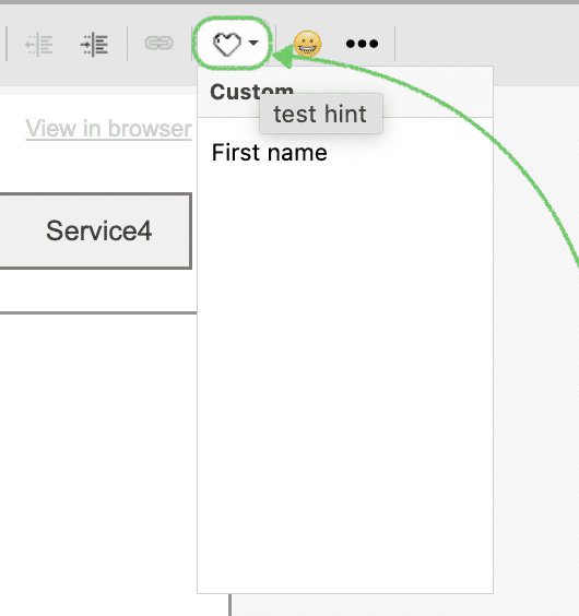
Merge Tags
You can personalize all emails based on your own variables connected to your platform. Merge tags (variables for personalization) help dynamically insert text templates into a text, like very common scripts (e.g., “Dear {first_name}” ). When you send the created email from your platform the variable from the tag will be changed automatically in accordance with the information from your database for a particular recipient.
Merge tags can be inserted from a text formatting panel of the ”Text” basic block by clicking on the “Merge tags” button in the expanded toolbar.
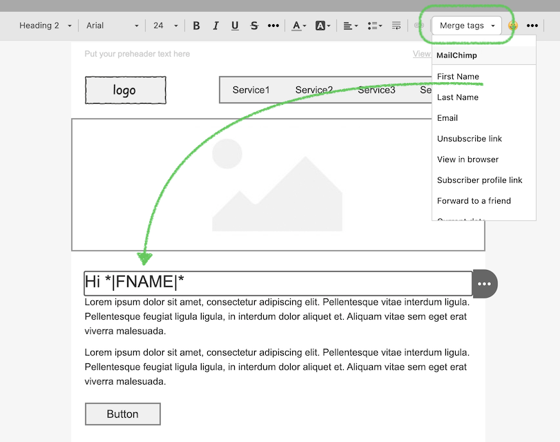
Here is the example of creation of mergeTags that you can pass with Plugin initialization:
"mergeTags": [
    {
        "category": "Personalization",
        "entries": [
            {
                "label": "Customer country code",
                "value": "*|FNAME|*",
                "hint": "This tag will be replaced with the customer's country code",
                "hidden": true
            }
        ]
    }
]| Parameter | Required | Description |
|---|---|---|
| category | Yes | Used to group similar merge tags under one label. |
| entries | No | Array of merge tags for category. |
| label | Yes | This label will be displayed as a merge tag name in the Text Editor. |
| value | Yes | This value will be inserted into HTML code after clicking on merge tag. |
| hint | No | Additional description for the tag. |
| hidden | No | This parameter hide/show merge tag from the drop-down menu depend on the true/false value |
Additionally, you have an option to display your description for "Merge tags" label (if you want to rename this feature) and change standard view:
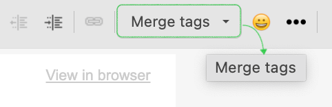
to special icon:
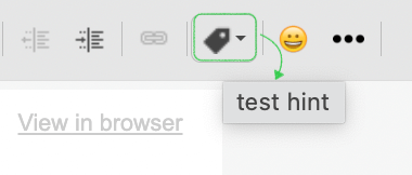
To apply the changes, you must first initialize the plugin with the following settings:
{
    "mergeTagsOptions":{
        "useIcon": true,
        "title": "test hint"
    }
}
where:
"useIcon": true - this parameter replaces the standard name with an icon. If
you want to get rid of it, use the "false" meaning.
"title" - hover description
Instead of text, you can add an image symbol to the merge tag tab on top. Please add the next option in the initialization script with the absolute path of the preferred icon.
"mergeTagsOptions":{
    "useIcon": true,
    "title": "test hint",
    "iconStyle": 'background-image: url("../assets/img/icon-8x16.png"); width: 8px; height: 16px',
}
Important notes: the image icon should be already prepared with the size to add in the console.
Results appear in the Text block's top panel:
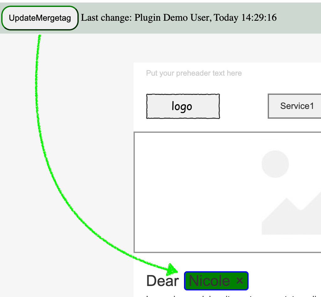
How to update an existing merge tag
To update the label of an existing merge tag that has already been added to the editor, you can use the updateMergeTag function from the StripoApi. This function allows you to modify all occurrences of a merge tag within the email template.
Example:
window.StripoApi.updateMergeTag({value: '*|FNAME|*', label: 'Nicole'});Parameters
value (string)— The value of the merge tag that needs to be updated. This should match the existing merge tag in your template.label (string)— The new label you want to set for the merge tag.
Suppose you have the following merge tag in your configuration. For example: *|FNAME|*
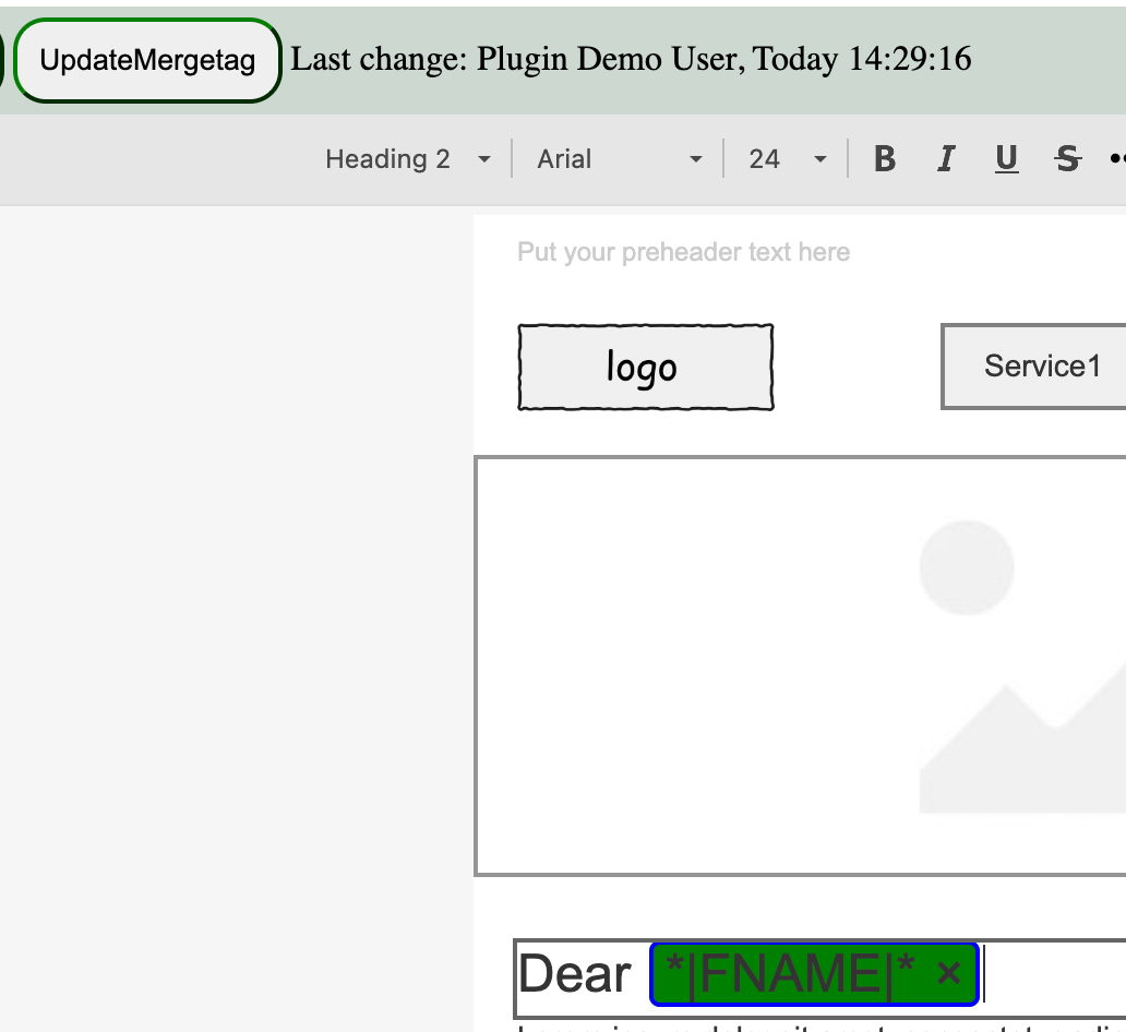
So if you want to update the label for *|FNAME|* to display "Nicole" in the editor, you would use the mentioned function call. The final result will be:
Tracking Merge Tags:
The tags added dynamically can be tracked by modifying the updateMergeTag function to return a unique identifier, such as markupid, for each merge tag.
Console Testing: You can test this by manually calling the
StripoApi.updateMergeTag({value:'{{profile.first_name}}', label: 'new name'})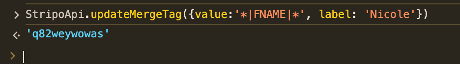
This unique identifier can then be used within the custom extension to track and configure each merge tag dynamically.
Change icon for the "broken" image
When customers use personalization tags (Merge tags) for different images editor can't recognize them and as result replaces image to the "broken" icon:
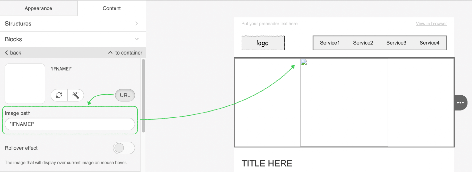
Some people are concerned because it is confusing to them.
If you want to replace the "broken" icon with your own image, use the configuration below:
{ "defaultImgForMergeTagSrc": "URL" }
where:
"URL" - is the link for your image
You should apply this configuration in the moment to initialization and it will work as on the screenshot below:
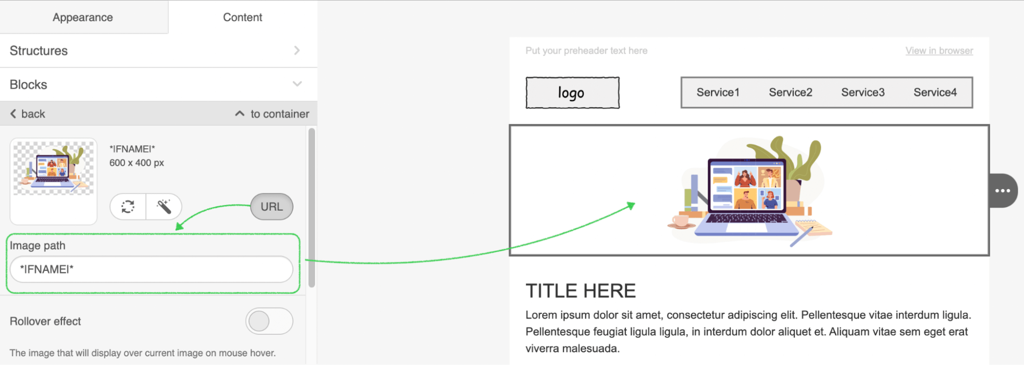
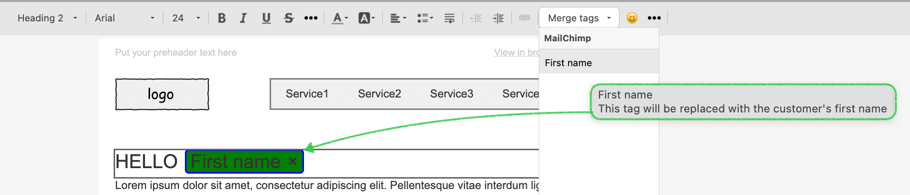
You independently choose how exactly your personalization tags should be displayed. While the initialization script with the help of configuration, below:
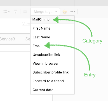
{
    "mergeTags":[
        {
            "category":"MailChimp",
            "entries":[
                {
                    "label":"First name",
                    "value":"{{ profile . first_name }}",
                    "hint":"This tag will be replaced with the customer's first name"
                }
            ]
        }
    ],
    "customAppearanceMergetags":true,
    "customAppearanceMergetagsInLinks":true,
    "customAppearanceMergetagsBorderColor":"blue",
    "customAppearanceMergetagsBackgroundColor":"green"
}
we can get tag description and style in green.
Special Links
You can add more personalized links like Unsubscribe from sending or View in browser link in case if your customer wants to see email in web-browser. Special links option helps dynamically insert correct variables into an email. When you send the created email from your platform the variable from the tag will be changed automatically in accordance with the information from your database for a particular recipient.
Special link will be visible in a settings panel by clicking on the Link control.
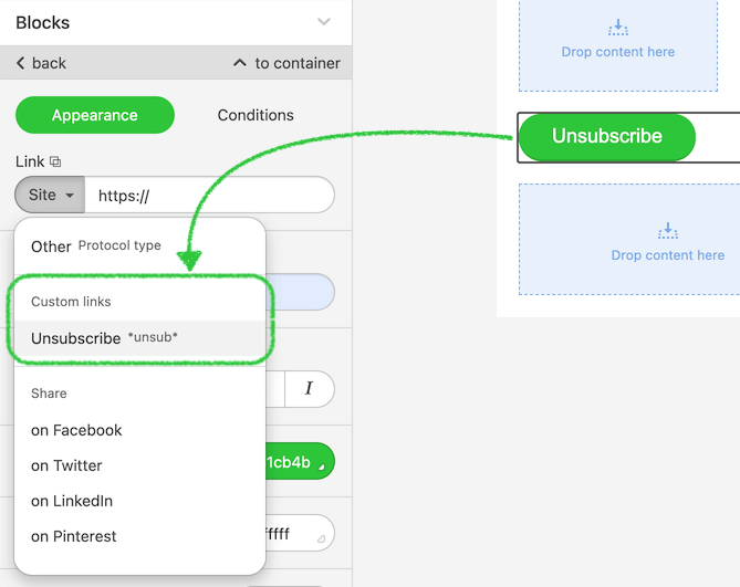
Here is the example of creation of Special links that you can pass with Plugin initialization:
"specialLinks":[
    {
        "category":"eSputnik",
        "entries":[
            {
                "label":"Unsubscribe",
                "value":"https://esputnik.com/unsubscribe",
                "hidden":true
            },
            {
                "label":"View in browser",
                "value":"https://esputnik.com/viewInBrowser"
            }
        ]
    },
    {
        "category":"Other",
        "entries":[
            {
                "label":"Some special link",
                "value":"[ARHIVE]"
            }
        ]
    }
]
Please find the descriptions of the parameters below:
| Parameter | Required | Description |
|---|---|---|
| category | Yes | Used to group similar merge tags under one label. |
| entries | No | Array of merge tags for category. |
| label | Yes | This label will be displayed as a merge tag name in the Text Editor. |
| value | Yes | This value will be inserted into HTML code after clicking on merge tag. |
| hidden:true | No | This parameter allows hiding the label with value. |
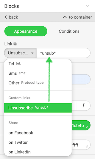
Link selector customization
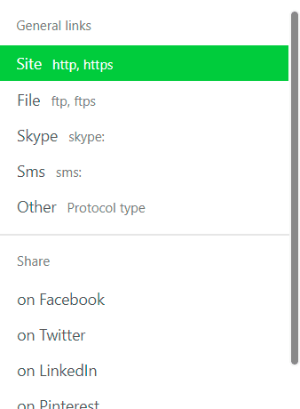
You can independently set up a view of available link protocols. If some of them are not needed, just hide them from customers.
hideLinks: ['mail', 'tel', 'https://some.special.link.url'],
hideLinksCategories: ['eSputnik']
where:
'mail', 'tel' - standard protocols;
'https://some.special.link.url' - there are some custom
links that you reflected in the editor;
['eSputnik'] - category of the link where it placed.
After you enable these parameters, the specified protocols will be hidden:
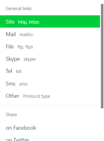
Before
After
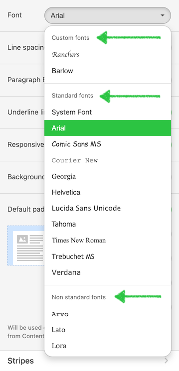
Fonts management In paid subscriptions only
With this option, you can independently choose which fonts your users should see in the editor.
Font management helps you implement a variety of scenarios on your end. For example:
- you want your users to customize the list of fonts loaded in the editor when they edit emails. For this purpose, you can create an interface in your app, and configure the editor accordingly;
- you are a digital marketing agency and you want to customize the list of fonts in the editor according to a client’s brand for whom the email template is being created.
The list of fonts that should display in the editor must be defined each time
the Plugin is initialized.
This helps you to:
- expand the list of available fonts displayed in the editor by adding own web fonts from popular services, like Google fonts and others;
- reduce the list of fonts to a limited number of options by removing the default fonts.
Please find the example of the code below:
"editorFonts": {
"showDefaultStandardFonts":true,
"showDefaultNotStandardFonts":true,
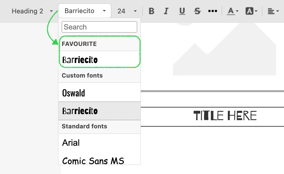
"favouriteFonts": {
"label": "Favourite Fonts",
"values": [
{
"name": "Barriecito",
"fontFamily": "'Barriecito', cursive",
"url": "https://fonts.googleapis.com/css?family=Barriecito&display=swap"
}
]
},
customFonts: [
{
"name": "Oswald",
"fontFamily": "'Oswald', 'helvetica neue', helvetica, arial, sans-serif",
"url": "https://fonts.googleapis.com/css?family=Oswald"
},
{
"name": "Barriecito",
"fontFamily": "'Barriecito', cursive",
"url": "https://fonts.googleapis.com/css?family=Barriecito&display=swap"
}
]
}
Please find the descriptions of parameters below:
| Parameter | Required | Description |
|---|---|---|
| showDefaultStandardFonts | No | This boolean parameter specifies whether to display the entire standard fonts list. The default value is true. |
| showDefaultNotStandardFonts | No | This boolean parameter specifies whether to display the entire non-standard fonts list. The default value is true. |
| customFonts | No | If this parameter contains indicated fonts they will
appear on the Custom fonts list. This parameter may include an array with many
elements, each of them can have the following properties: name — this line will be shown in the drop-down fonts list. Long lines could distort the interface, thus we recommend using short ones. Do not enter the following characters: {} []: "/ \ |?; fontFamily — describes a set of CSS fonts that will be applied to the final HTML. It is important to provide at least one fallback font so that the text is not displayed in any font of an unsupported font family on a user's device. It is important to use single quotes with font names instead of double quotes to maintain the correct JSON syntax; url — this parameter is used only when working with web fonts. It is important to make the URL point at a CSS file with @font-face properties, and not directly at font files. Make sure CSS is hosted on the HTTPS protocol. |
| favouriteFonts | No | If this parameter contains indicated fonts they will appear on the
Custom fonts list in the beginning of the list in the separate item. This parameter may
include
an array with many elements, each of them can have the following properties: name — this line will be shown in the drop-down fonts list. Long lines could distort the interface, thus we recommend using short ones. Do not enter the following characters: {} []: "/ \ |?; fontFamily — describes a set of CSS fonts that will be applied to the final HTML. It is important to provide at least one fallback font so that the text is not displayed in any font of an unsupported font family on a user's device. It is important to use single quotes with font names instead of double quotes to maintain the correct JSON syntax; url — this parameter is used only when working with web fonts. It is important to make the URL point at a CSS file with @font-face properties, and not directly at font files. Make sure CSS is hosted on the HTTPS protocol. |
As a result, specified fonts appear in an individual item at the very top.
Please be advised that Stripo accepts only the CSS font embedding method, and the CSS file must be hosted in HTTPS protocol. You can use services like Google fonts that provide host font stacks and a well-formatted CSS file.
If you want to change the default set of fonts, you need to disable them and use custom fonts to indicate a new set, including the URL parameter for web fonts. In this case you don’t have to pass the URL parameter to the fonts from the “Standard fonts” list.
If you want to extend the functionality of fonts and add possibility to add own font for
your customers, we have a solution for you. You should add appropriate script in the body
section and call externalCustomFont: window.ExternalCustomFont in the
initialization script.
Example of initialization and script you will find follow the link: https://github.com/ardas/stripo-plugin-samples/tree/master/external-custom-font-sample
As an outfit it allows you to have additional field in the font list which you can set up by the click. After, for your customer will be open pop-up window with the following parameters:
"name",
"fontFamily",
"url"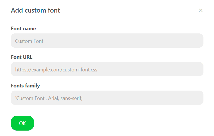
After they filled the data and click OK, the new font will be connected to the editor.
To change the hint for the "Add font" option, please use the following parameter:
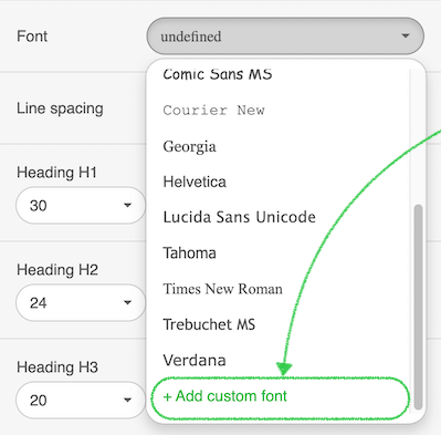
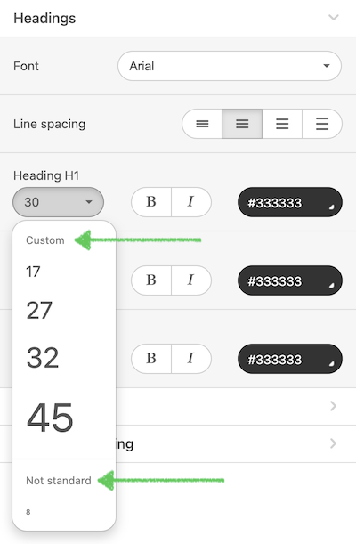
addCustomFontTitle: "Add custom font title"Сustom Font Sizes list
You can display the font sizes in accordance with your brand identity and needs. It can be our standard or your own non-standard list with sizes.
The list of font sizes that should be displayed in the editor may be defined each time the Plugin is initialized. This helps you to achieve one of these scenarios:
- expanding the list of available font sizes displayed in the editor by adding own values of font sizes;
- reducing the list of font sizes to a limited number of options by removing the default sizes (standard and non-standard ones).
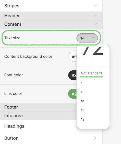
Here is the example of a font size object that you can pass with Plugin initialization:
"editorFontSizes": {
    "showDefaultStandardFontsSizes": false,
    "showDefaultNotStandardFontsSizes": true,
    "customFontsSizes": [17, 27, 32, 45]
}
In this case,
- a default section (Non standard sizes) is loaded, and
- 4 custom font sizes are added to the list (to the Custom sizes section).
Please find the descriptions of the parameters below:
| Parameter | Required | Description |
|---|---|---|
| showDefaultStandardFontsSizes | No | This boolean parameter specifies whether to display the entire standard font sizes list. The default value is true. |
| showDefaultNotStandardFontsSizes | No | This boolean parameter specifies whether to display the entire non-standard font sizes list. The default value is true. |
| customFontsSizes | No | If this parameter contains the indicated values, they will be displayed in the Custom font sizes list. This parameter may include an array with many values represented in the integer type of data. |
Please note that if you want to change the default set of font sizes, you need to disable them and use custom ones to indicate a new set.
Custom Color Palette
This feature helps you to decrease or increase the number of color options that appear on the color palette in the editor. These colors can be applied to text or other elements to make them more interesting and highlight important information.
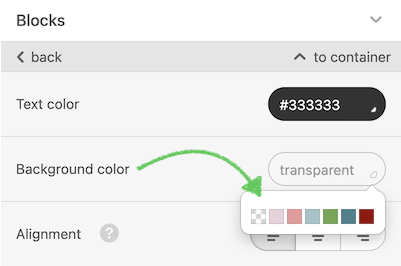
The list of custom colors that should be displayed in the editor must be defined each time the Plugin is initialized. This approach helps you to implement a variety of scenarios on your end like:
- you want your users to customize a list of colors loaded in the editor when they edit emails;
- you can create an interface in your app to do so, and instruct the editor accordingly.
Here is an example of a custom color palette object that you can pass with Plugin initialization:
"customColorPalette": [
    "#882724",
    "#35882C",
    "#FFD351",
    "#1924FF",
    "#B621EC",
    "#95C4EC"
]
Please find the descriptions of the parameters below:
| Parameter | Required | Description |
|---|---|---|
| customColorPalette | No | This is an array of color values that should be given in the Hex format only. The format is a hash (#) followed by 6 figures or letters. Please find the details on the Hex Color Codes here. |
| customColorPaletteTextOnly | No | Set up the needed colors for the text available on the side menu and CKEditor menu. The format is a hash (#) followed by 6 figures or letters. Please find the details on the Hex Color Code here. |
Please be advised that in this case instead of the standard color palette list, only the specified values will be displayed for selection. The input fields connected to colors will be disabled in order to prevent entering incorrect color values.
Display Conditions
Display conditions allow you to change the content of emails displayed to recipients, depending on whether the specified condition on your end is met or not.
Users can set conditions manually in the editor (Custom) or select them from a list of predefined conditions set earlier (Predefined).
Below you can see the Conditions tab with the custom condition category for the selected container.
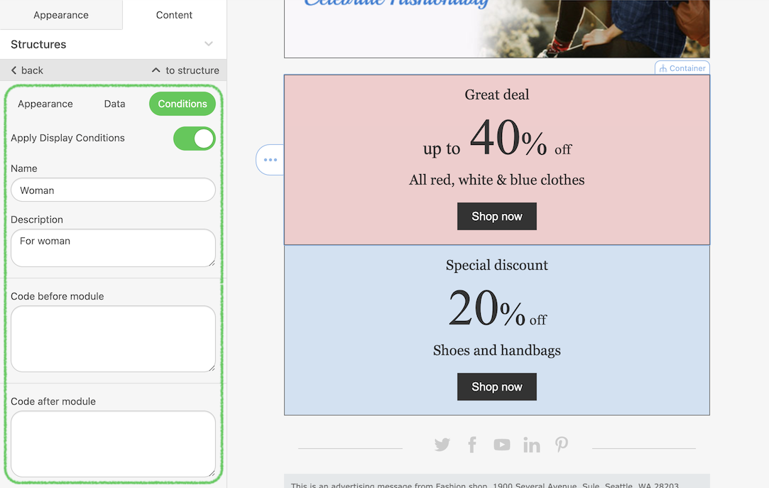
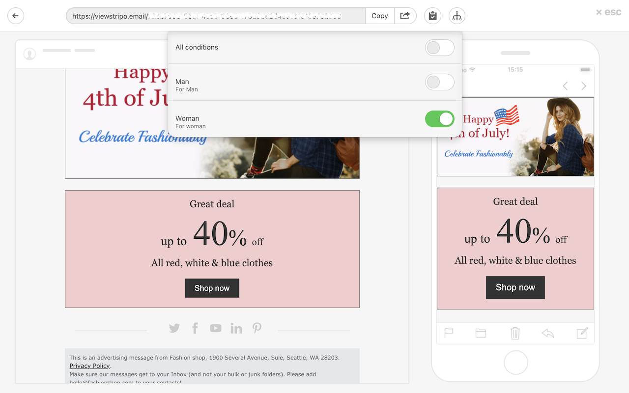
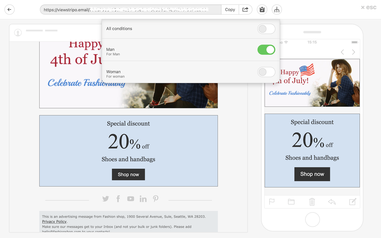
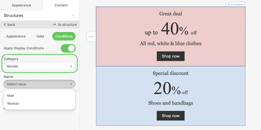
Let’s have a look at the following use-case ー you’re preparing a sales newsletter for your eCommerce project. You’d like to show different banners for men and women in a single newsletter. In your user database, you are able to detect users’ gender.
So here how you can use this information to prepare customized newsletters. After the initial set up you’ll get the following result.
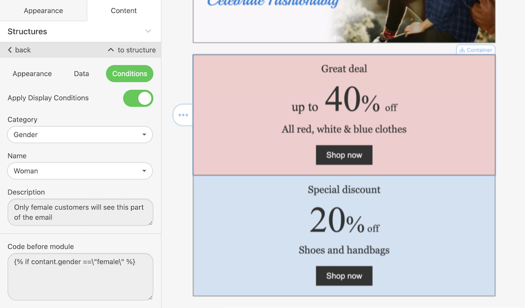
This is how women will see the email:
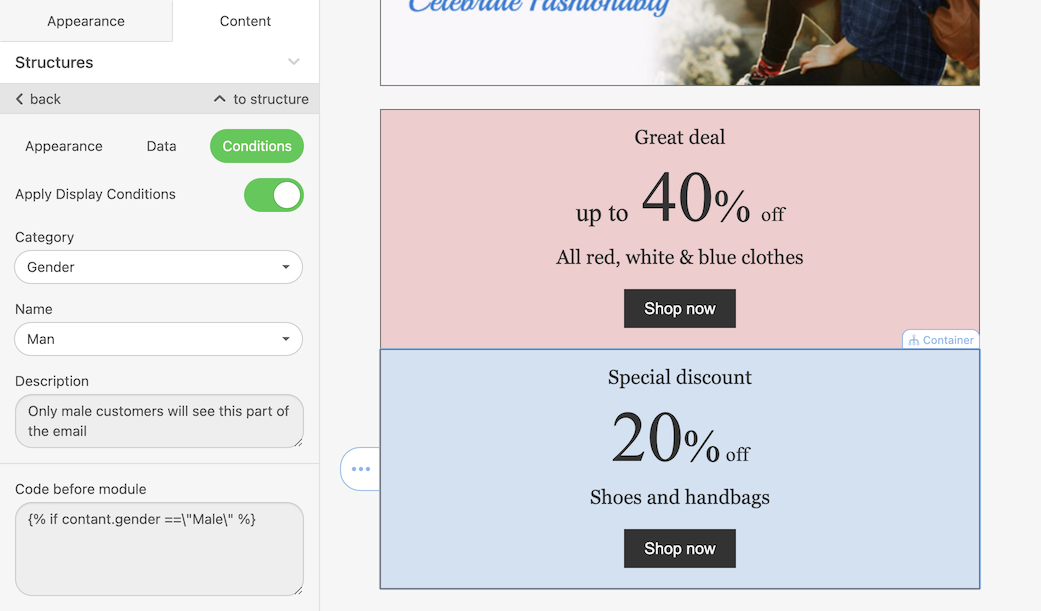
This is how men will see the email:
Now let’s go through the initial process of activating and customizing the Display Conditions for the editor users.
The very first thing to do is to activate the Display Conditions during Plugin initialization:
{
    ...
    conditionsEnabled: boolean = false; //activation of the Display Conditions tab in the Editor
    customConditionsEnabled: boolean = true; //ability to create Local Display Conditions inside the Editor
    conditionCategories: (PredefinedCategory | ExternalCategory)[] = []; //List of Condition categories
    ...
}
This activates the Conditions tab in the editor:
You may have some predefined categories that you want to apply to conditions and use them in the editor. In our example, this is Gender — Male & Female.
To pass the predefined conditions, please use the PredefinedCategory type which has the following configurations:
PPredefinedCategory {
    type: string = 'PREDEFINED';
    category: string; //Category namet
    conditions: PredefinedCondition[]; //conditions array with PredefinedCondition type
}
This is the configuration of predefined conditions:
PredefinedCondition {
    id: number; // unique ID of the Condition
    name: string;
    description: string;
    beforeScript: string;
    afterScript: string;
}
And this is the example of a predefined category with one condition:
{
    type: 'PREDEFINED',
    category:'Gender'
    conditions:[
        {
            id:1;
            name: 'Gender - female',
            description:'Only female customers will see this part of the email.',
            beforeScript:'{% if contact.gender === \"Female\" %}',
            afterScript:'{% endif %}';
        }
    ]
}
In the editor, we get the following:
The same could be set up for any condition, for example, Gender — male:
Instead of providing a list of predefined conditions, you can specify an External category which will allow you to implement your own condition selecting functionality. After the user selects the condition by the means you will provide to them, the latter will be sent back to the Plugin via a callback function.
Here is the type of external category:
ExternalCategory{
    type: string = 'EXTERNAL',
    category: string, //Category name
    openExternalDisplayConditionsDialog: (callback: ExternalDisplayConditionSelectedCB) => void; // callback that accepts a condition with type ExternalCondition
}

type ExternalDisplayConditionSelectedCB = (condition: ExternalCondition) => void;

ExternalCondition{
    name: string;
    description: string;
    beforeScript: string;
    afterScript: string;
}
Please see an example of an external category below:
{
    type: 'EXTERNAL',
    category:'Gaming platform'
    openExternalDisplayConditionsDialog: function(cb) {
        // your code goes here
        cb({
            {
                name: 'Console',
                description:'Only console gamers will see this part of the email.',
                beforeScript:'{% if contact.gamingPlatform=== \"peasant\" %}',
                afterScript:'{% endif %}';
            }
        });
    }
}
Please see a full example of the Display Condition configuration:
"conditionsEnabled": true,
"customConditionsEnabled": true,
"conditionCategories": [
    {
        "type": "PREDEFINED",
        "category":"Gender",
        "conditions":[
            {
                "id":1,
                "name": "Gender - female",
                "description":"Only female customers will see this part of the email.",
                "beforeScript":"{% if contact.gender === \"Female\" %}",
                "afterScript":"{% endif %}"
            }
        ]
    }
]
Undo-redo actions In paid subscriptions only
You can activate this feature to enable users to undo/redo their actions in the editor.
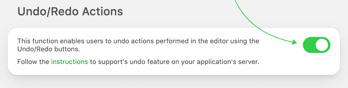
Please be advised that you need to implement the undo/redo buttons by yourself outside the Stripo Plugin Editor, and pass their IDs during the Plugin initialization (see the “Plugin initialization and configuration” section). This allows you to place these buttons anywhere on your web page and design them the way you like.
Social Networks
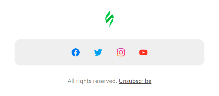
If your users want to share any data about their organization or site to the social networks they could use our basic “Social Networks” block for these purposes. They can choose a lot of icons and different styles for them. If needed your users can even upload their own images to the “Social Networks” block and then apply a necessary link.
You can add your favorite social networks in the “Social Networks” block, too. Your users will see it this way:
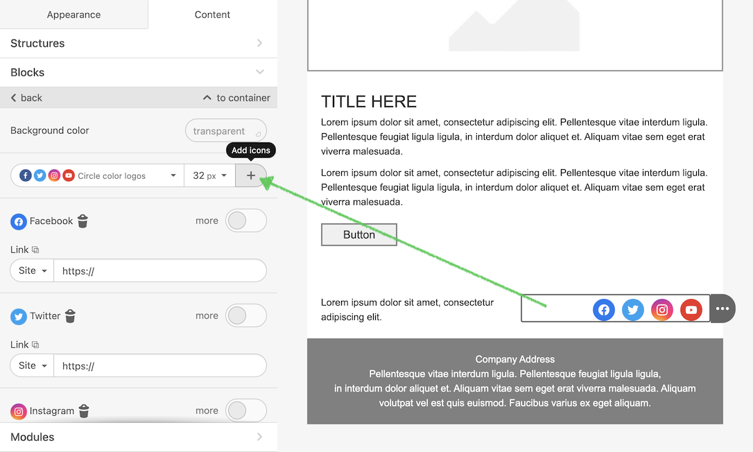
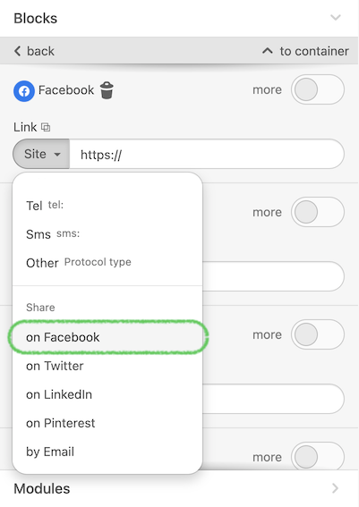
This block also supports the Share links, so anyone can share the email to his/her social network.
To include your favorite (predefined) social networks, add a config parameter in the initialization script, as you can see in the example below:
"socialNetworks": [
    {
        "name": "twitter",
        "href": ""
    },
    {
        "name": "facebook",
        "href": ""
    }
]
Please see the full list of supported network names or icons:
Ask.fm
Behance
Dribbble
Facebook
Flickr
Foursquare
Google-plus
Instagram
Last.fm
Linkedin
Livejournal
Myspace
Odnoklassniki
Pinterest
Soundcloud
Tumblr
Twitter
Vimeo
Vkontakte
Weibo
Youtube
Hangouts
ICQ
Mail.Ru Agent
Messenger
Skype
Snapchat
Telegram
Viber
Wechat
Whatsapp
Slack
Blogger
Email
Website
Map Marker
World
Address
Share
RSS
AppStore
Playmarket
Windows Store
Medium
You can independently choose which style should be in the social icons when your customer drop it to email message. All you need to do is initialize the Plugin with the configuration below:
"socialIconsDefaultView": "squareColoredBordered"| availableValues: | logoBlack, logoGray, logoWhite, circleColored, roundedColoredBordered, circleColoredBordered, roundedColored, squareColored, squareColoredBordered, circleBlack, circleBlackBordered, roundedBlack, roundedBlackBordered, squareBlack, squareBlackBordered, circleGray, circleGrayBordered, roundedGray, roundedGrayBordered, squareGray, squareGrayBordered, circleWhite, circleWhiteBordered, roundedWhite, roundedWhiteBordered, squareWhite, squareWhiteBordered, logoColored |
The final result depends on your score. In my case, it “logoColored”
Basic blocks management
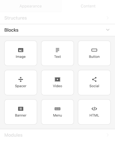
The general menu with blocks can be configured and displayed for end users in accordance with your preferences and/or needs.
For example, if you don’t want to display AMP blocks because your service doesn't support them, you can just hide it in the Plugin for the end user.
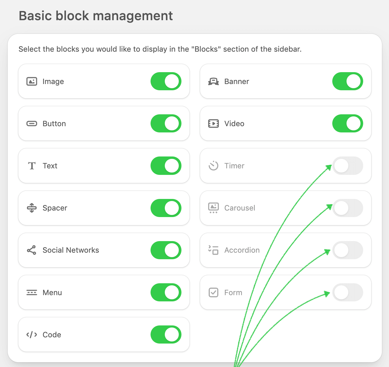
In this case, once the Plugin is initialized users will see the blocks this way:
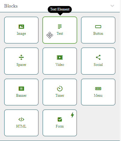
We made it possible to specify the description of each block that will be displayed in the tooltip. In this case, you should pass these parameters in the initialization script:
settingsPanelBlocksTooltips: {
    imgBlock: "Image Block",
    textElement: "Text Element",
    btnBlock: "Button Block",
    spacerBlock: "Spacer Block",
    videoBlock: "Video Block",
    socialBlock: "Social Block",
    bannerBlock: "Banner Block",
    timerBlock: "Timer Block",
    menuBlock: "Menu Block",
    htmlBlock: "HTML Block",
    ampCarouselBlock: "Amp Carousel Block",
    ampAccordionBlock: "Amp Accordion Block",
    ampFormBlock: "Amp Form Block"
}
As an outcome, your user will see the description you offered while hovering over the block.
It is also possible to alter the UI so that if a block has a tooltip, the tooltip will automatically appear when the cursor hovers over the icon in the top right corner of the block.
Please use the code below to apply it:
settingsPanelBlocksTooltips: {
showTooltipIcon: "true"
}
Configuring Blocks for Different Customers In business and enterprise subscriptions only
The baseBlocks parameter allows you to customize the availability of different content blocks for different customers.
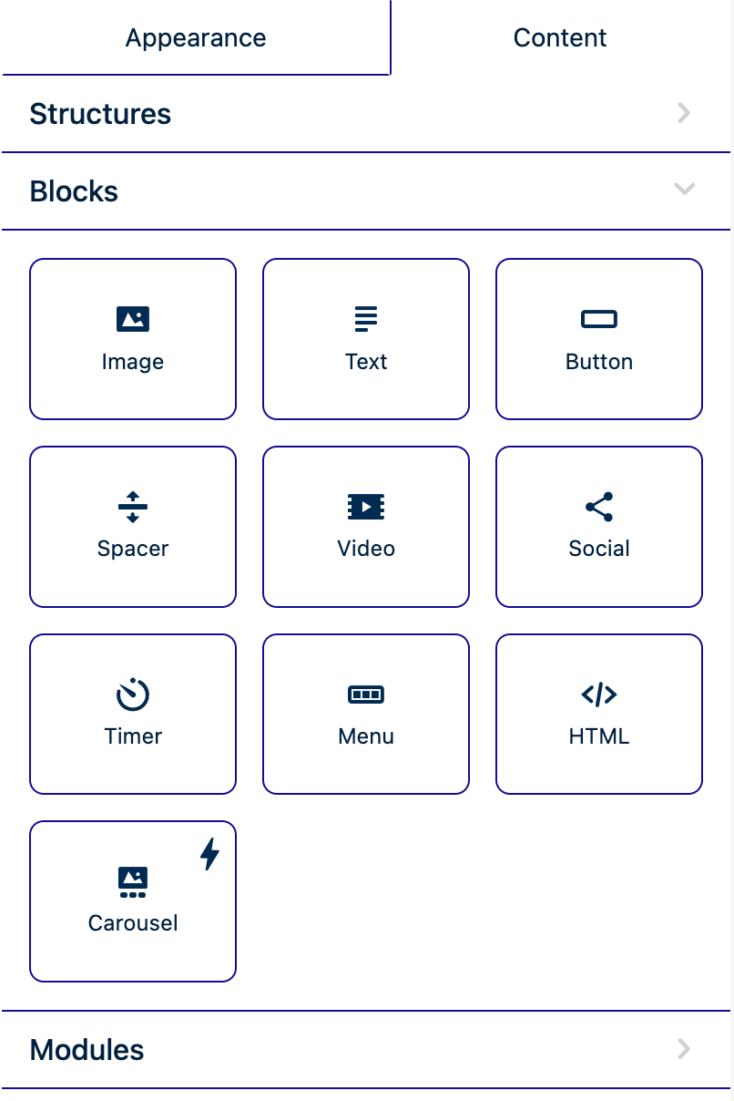
In this example, the customer will have access to AMP Carousel, Button, HTML, Image, Menu, Social Networks, Spacer, Text, Timer, and Video blocks, while the other blocks will be hidden.
By defining baseBlocks in the initialization settings, you can enable or disable specific blocks using true or false values. Customers will only see the blocks that are set to true.
baseBlocks: {
            ampAccordionEnabled: false,
            ampCarouselEnabled: true,
            ampFormControlsEnabled: false,
            bannerEnabled: false,
            buttonEnabled: true,
            htmlEnabled: true,
            imageEnabled: true,
            menuEnabled: true,
            socialNetEnabled: true,
            spacerEnabled: true,
            textEnabled: true,
            timerEnabled: true,
            videoEnabled: true,
            }
This setting ensures a customized editing experience, allowing you to control which content blocks are available for specific customers.
Hide stickers in image editor
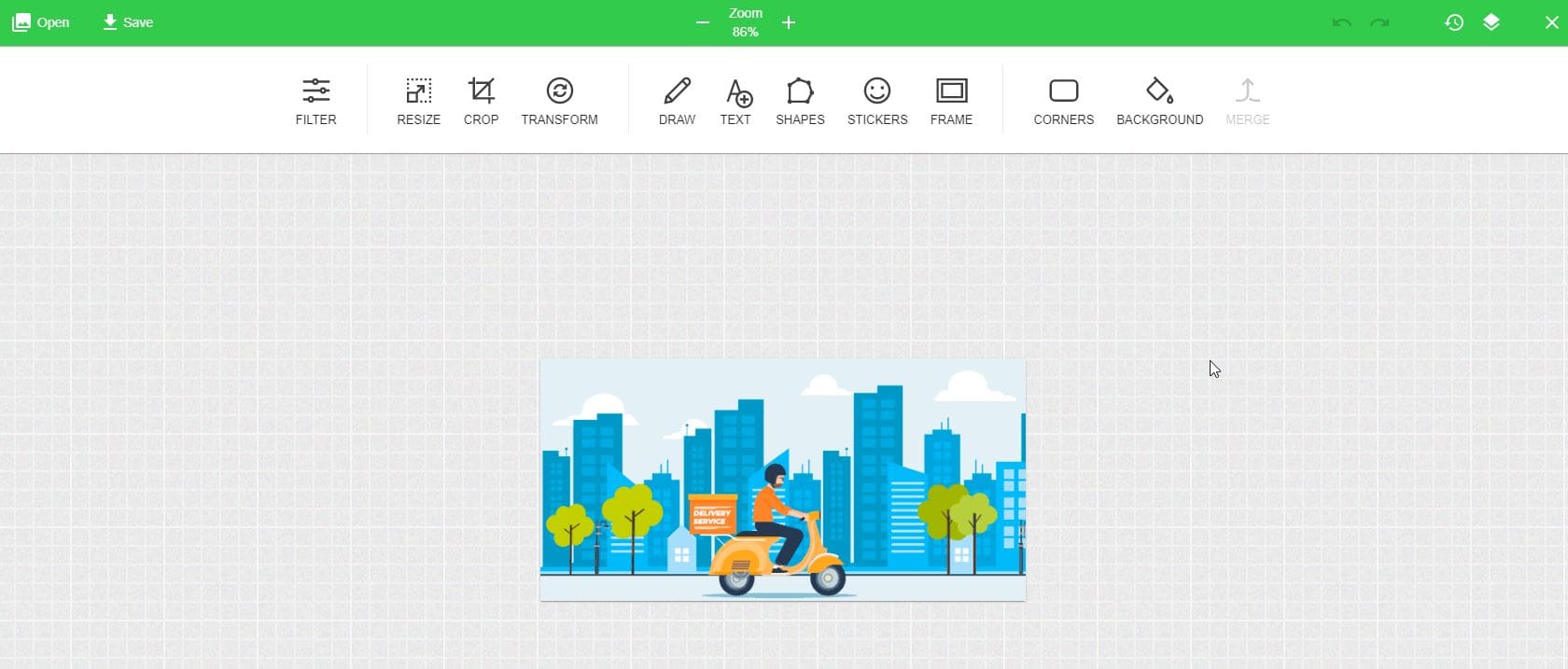
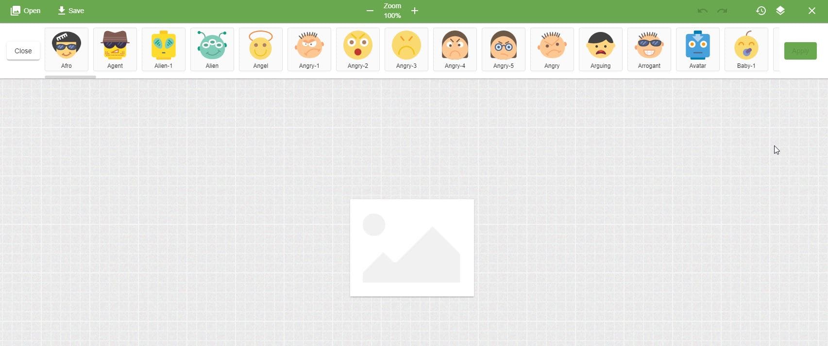
In Stripo we have additional Pixie editor which helps our users make a lot of useful changes inside the images. Here is how it look like:
If you want to affect it and hide for your customers some elements from “Sticker” menu we have prepared instructions for you.
In the example, we will exclude and then include these images from stickers:
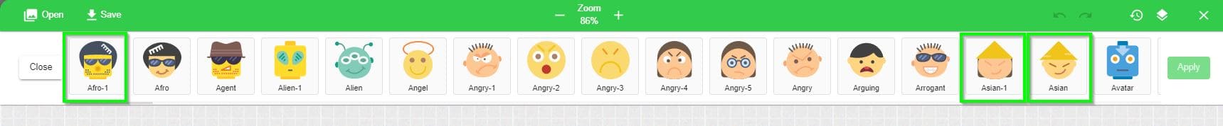
Just add to your initialization script these parameters:
"imageEditor":{
    "stickers":{
        "emotIcons":{
            "exclude":[
                "asian",
                "asian-1",
                "afro"
            ]
        }
    }
}
and icons won’t be visible for end user:
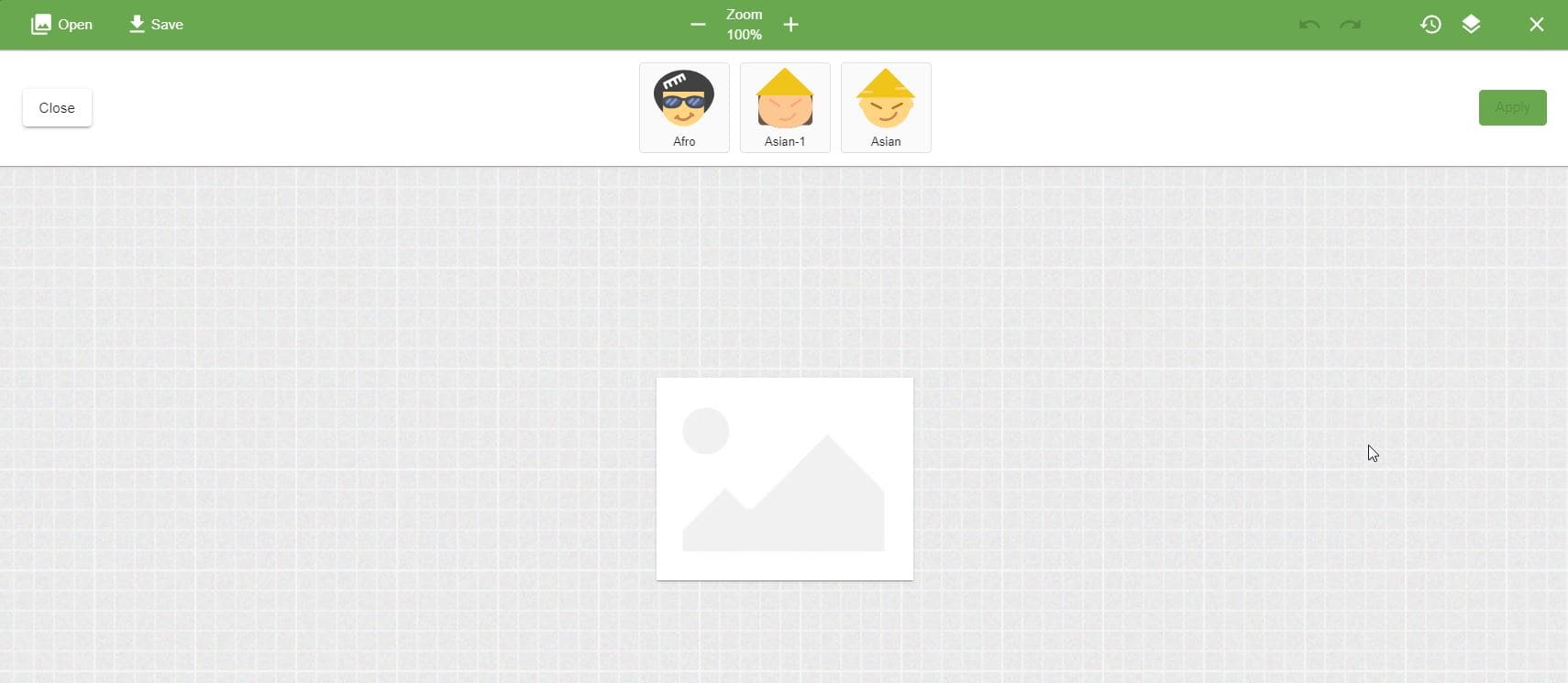
If, on the other hand, you wish to demonstrate only these icons, you should use these parameters:
"imageEditor":{
    "stickers":{
        "emotIcons":{
            "include":[
                "asian",
                "asian-1",
                "afro"
            ]
        }
    }
}
And your customer will see only those icons
CSS Optimization
The CSS Optimization feature ensures that the file size of your branded emails remains
as small as possible to prevent them from being clipped. When this option is activated,
the styles in the compileEmail function will not be inlined; instead,
they will be included in the header.
Benefits
-
Efficient File Size: Keeps your email file sizes minimal, reducing the risk of clipping.
-
Compatibility: Major email providers like Gmail, Yahoo, Apple, Outlook, and AOL support embedded styles.
Considerations
-
Less-Known Providers: Some lesser-known inbox providers do not display embedded styles. If a significant portion of your audience uses these providers, you may want to disable CSS Optimization to ensure your emails display as intended.
Initialization
The state of CSS Optimization (enabled or disabled) is set during plugin initialization.
Initialization Parameter:
cssOptimization: {
  defaultValue: true,
  onValueChanged: (value) => console.log('css optimization value changed', value),
},
Enabling this parameter will add the CSS Optimization option to the General settings panel, allowing users to toggle it as needed.
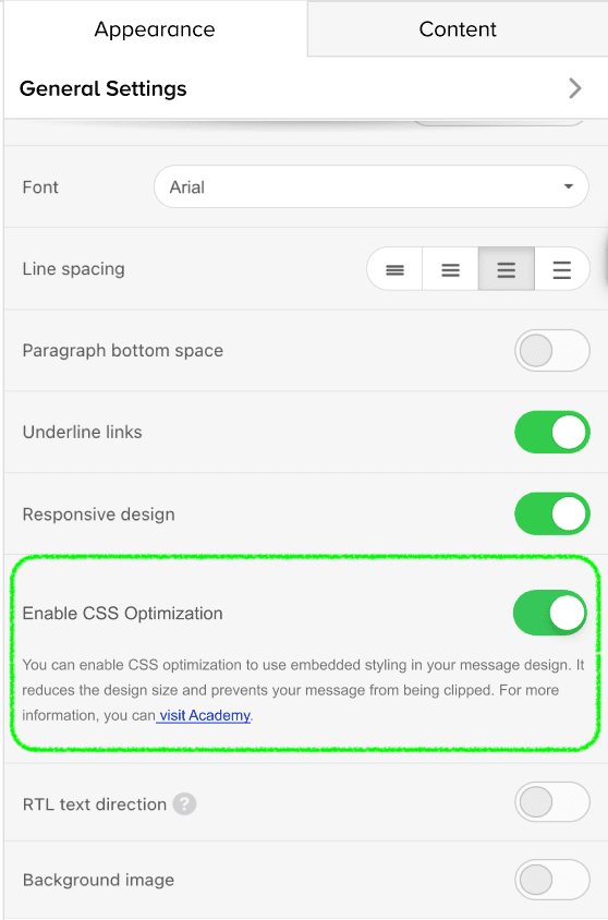
Advanced Controls in paid subscriptions only
In this section, we gathered some advanced controls that can help your users create their email templates in the most powerful way. The list of these controls with their explanations is as follows:
Rollover Effect
This feature is also known as a mouseover. When you place a mouse cursor over
an image, the latter is replaced with another one.
The image rollover effect works on desktop devices only. Other users will see the primary
image. It can be applied to any image you add in email except for the banner one.
How to implement an image rollover effect with Stripo:
- Upload your first image.
- In the settings panel, toggle the “Rollover effect” button.
- Upload the second image — edit it if necessary.
- Insert a URL link — it will be tied to both images.
- Enter the “Alternate text”.
- Set alignment and size of the images.
To learn more about how image rollover effect can be used read this article.
Mobile Padding
If you turn on this control when you configure the Plugin, it will be added to the set of controls for structures, stripes, and basic blocks (e.g. “Image’, “Text”, “Button”, etc.) in the Padding section and will appear like this:
When a user selects any structure or block in the editor and then decides to set up individual padding for mobile, all they need to do is activate this control and enter values — this structure or block will be displayed with the specified padding values on mobile devices.
Element Hiding
If you turn on this control while you configure the Plugin, it will be added to the set of controls for every basic block (e.g. “Image”, “Text”, “Button”, etc.), containers, structures, and stripes and will appear like this:
When a user selects any of the elements in the editor and then decides not to display this element on mobile or on desktop only, all they need to do is activate this control and this is it — this element won’t be displayed when the email is opened on mobile devices or on desktop respectively.
Containers inversion on mobile
If you turn on this control when you configure the Plugin, it will be added to the set of structure controls only if there are 2 containers in it (the control will be hidden for structures with 1 or more than 2 containers inside) and will appear like this:
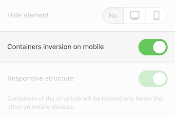
Please be advised that by default this control is turned off and also this control won’t be active in case a user turns off the “Responsive structure” control.
This control allows specifying which container should be displayed at the top and which one at the bottom of the mobile version of the email template.
If a user turns on the “Containers inversion on mobile” control, the containers will be placed on mobile the following way:
- the first container on the desktop will be displayed as the second container on mobile;
- the second container on the desktop will be displayed as the first one on mobile.
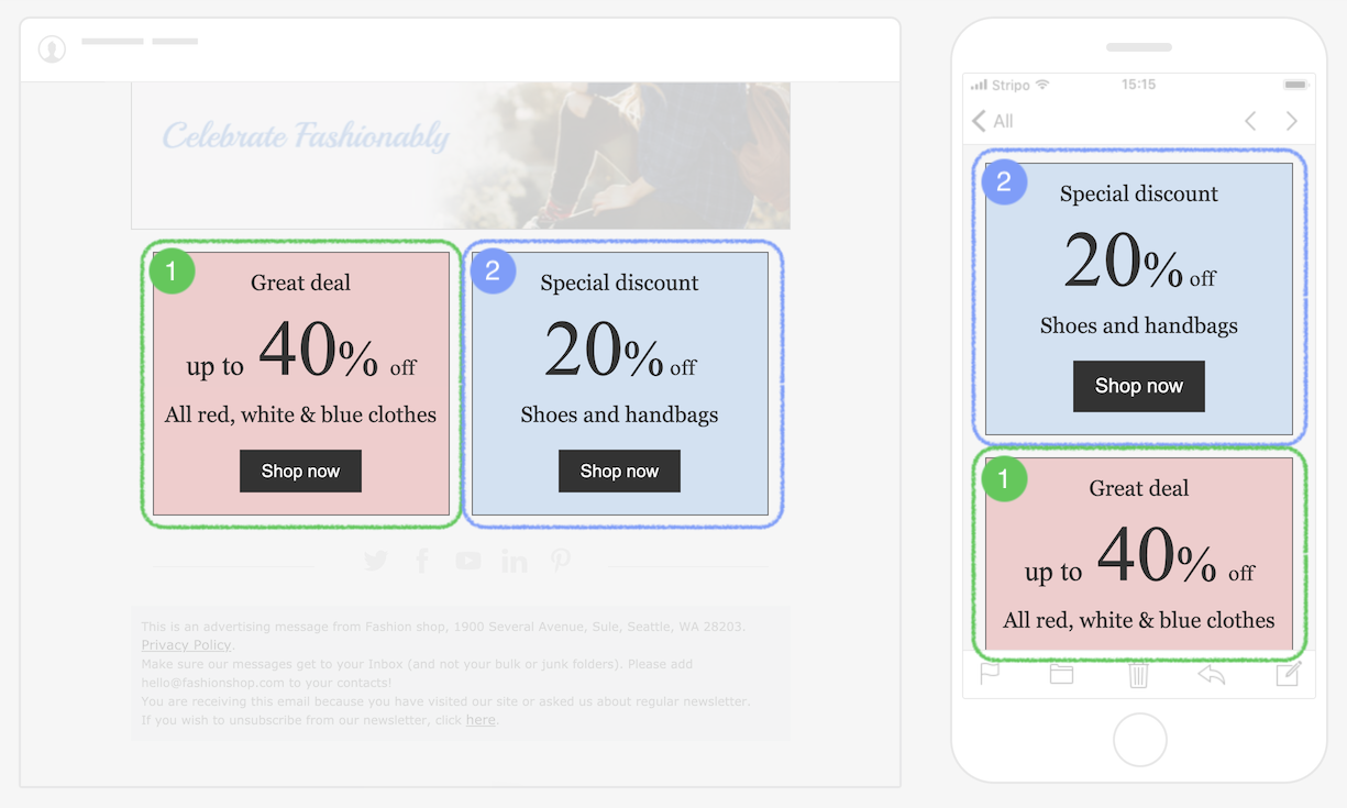
Basic Block Alignment on Mobile
If you turn on this control when you configure the Plugin, the mobile icon will be added to the Alignment control of every basic block (e.g. “Image”, “Text”, “Button”, etc.) that have the “Alignment” control and will appear like this:
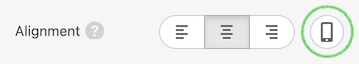
By default this icon is not activated, which means that the set alignment is
relevant for the desktop version, yet will be the same for the mobile version if we do not
specify another value.
To specify another value we should click on the “mobile” icon, it becomes activated
(clicked), and then set another alignment by clicking on the proper icon here.
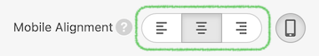
To switch back to the desktop version it is enough to click again on the “mobile” icon (it gets its default state when it’s non-clicked).
Border of Content Part of the Stripe
If you turn on this control when you configure the Plugin, it will be added to the set of stripe’s controls and will appear like this:
It allows setting the border for the content area of a selected stripe. It is possible to configure the borderline type (straight, dashed, dotted line), its color, and width for all sides or for a particular one (like only on the left side or on the top, etc.)
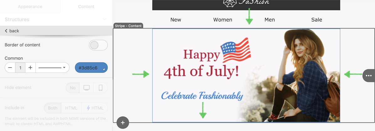
Container Background Color
If you turn on this control when you configure the Plugin, it will be added to the set of container’s controls and will appear like this:
As the name suggests, this control allows setting up the background color for a selected container ;)
Structure Background Image
If you turn on this control when you configure the Plugin, it will be added to the set of structure’s controls and will appear like this:
This control allows setting up any image as a background for a selected structure. It enables to configure the alignment and provides the ability to repeat a chosen image.
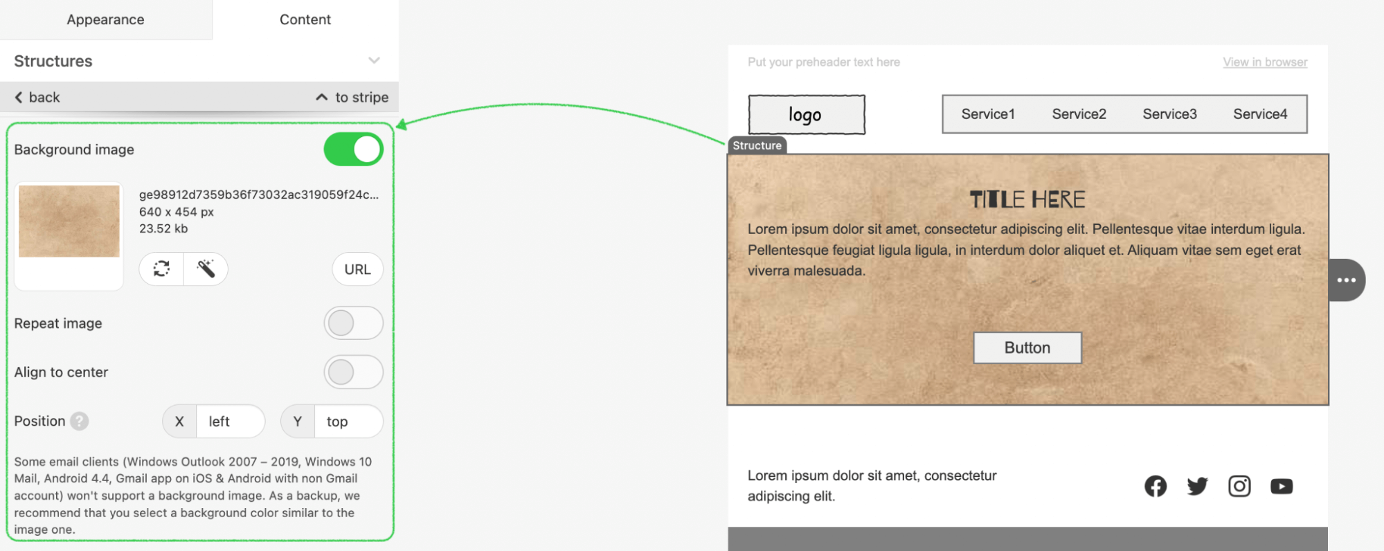
Container Background Image
If you turn on this control when you configure the Plugin, it will be added to the set of container’s controls and will appear like this:
This control allows setting up any image as a background for a selected container. It enables to configure the alignment and provides the ability to repeat the chosen image.
Management of Container Numbers and Sizes in the Structure
If you turn on this control when you configure the Plugin, it will be added to the set of structure’s controls and will appear like this:
It allows adding or removing any existing container within a selected structure (it is possible to put up to 8 containers per structure). This control also allows changing the container’s width and indents between them.
Image Path Configuration
If you turn on this control when you configure the Plugin, the extra “Link” control will be added to the set of the Image block controls (as well as for the Menu, Banner blocks, etc) and will appear like this:
It allows specifying/replacing the URL to the image without making any changes to the HTML code. This feature is useful in case a user doesn’t want to place the image in your storage and simply wants to host it elsewhere (on an Internet site or any own storage of their own).
All they have to do is click on this “Link” control and replace the image URL with the required one in the “Image path” field.
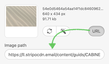
However, if you do not want to share the URL when it is hosted on the Stripo domain (or any other
external
source), you can disable it by default for customers.
For doing this you should apply next configuration in the code:
imageLibrary: {
    needHideImageUrlFunc: (url) => url.includes('test.com'),
},
where “test.com” is the name of the domain that should be hidden. In
such
a situation, when the customer adds a photo with the provided domain directly into the Image gallery,
the
URL does not appear after reopening the gallery. It’s also possible to specify a few domain names
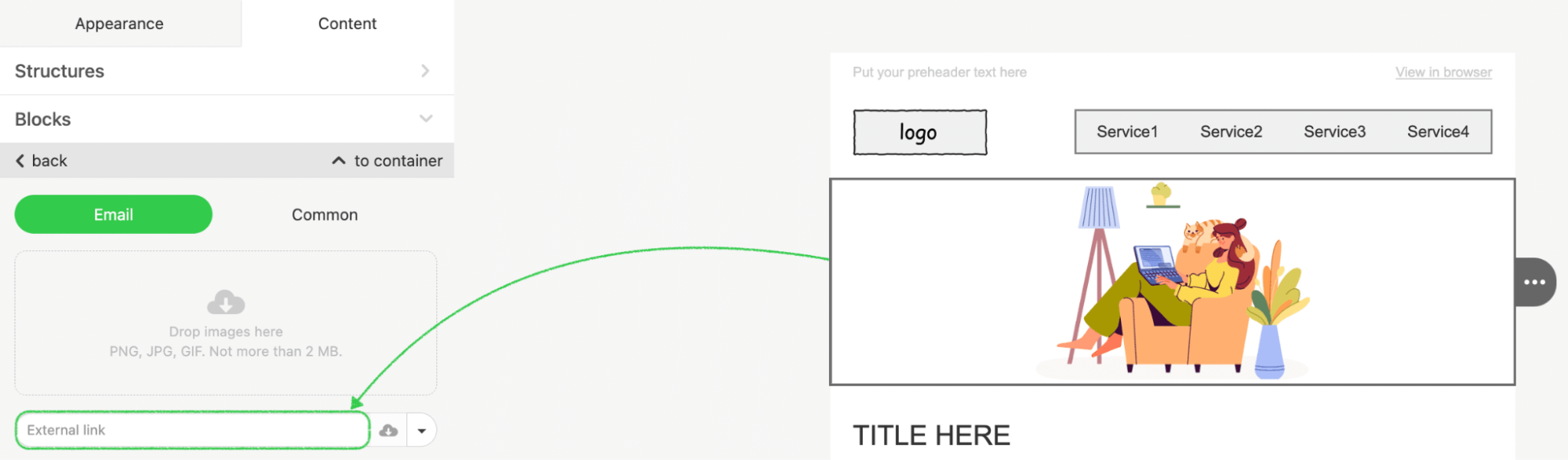
Image Format Validation for External Links
To ensure that only supported image formats are allowed when inserting an external image link, you can
enable URL validation. This functionality restricts the accepted formats to PNG, JPG, JPEG, and GIF,
preventing the use of unsupported formats like SVG, WEBP, and others.
Add the validation parameter to the imageSettings object when initializing the plugin.
imageSettings: {
  validateImageUrl: true
},
The system will automatically check the format of the image URL when a link is inserted. If the format does not match the supported formats, an error message will be displayed.
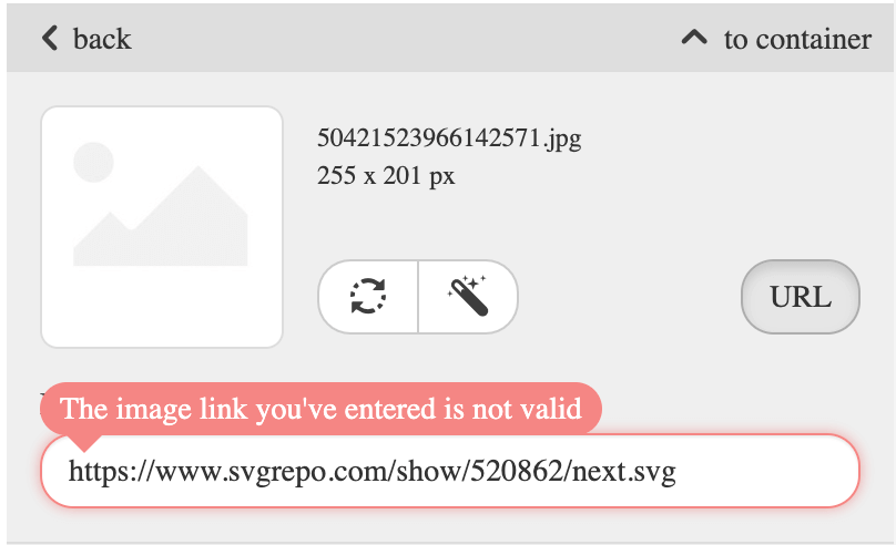
Smart-elements Properties
This option provides the ability to activate smart properties for containers, structures, and stripes. If you activate this control when you configure the Plugin, and the user selects any container (structure or stripe) the new “Data” tab will be displayed at the top above the set of controls.
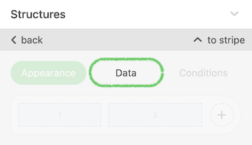
In this tab, a user has the ability to activate smart properties for a selected element and perform its configurations.
For more information about smart properties, please refer to our blog post – https://stripo.email/blog/smart-elements-reducing-time-creating-similar-letters-automating/.
AMPHTML MIME Type Support
In March 2019, Google released its AMP for emails technology. And as of July 2, 2019, it is available even for the G-Suite users and is “on” by default for all Gmail users. It allows senders to include AMP components inside engaging emails, making modern app functionality available within the email. This dynamic email format provides a subset of the AMP HTML components to use in email messages, that allows recipients of AMP emails to interact dynamically with content directly in the message.
Since June 18, 2019, Stripo has been supporting the creation of a new AMP HTML format of email template in the editor. To provide this option to your users you may activate the “Support of AMP HTML Mime type” on your Plugin details page. When it is activated and the user selects any block or container (structure or stripe) the new control will be added to the settings panel and will appear like this:
By default, all elements will be included in 2 versions of an email template: the traditional HTML version and the AMP HTML version. But users have a choice to include any element only in a particular version, for example, only in HTML or only in the AMP HTML version. In this case, that element will be highlighted with an orange border and a tooltip that indicates in which version that element is included. For more information on how to build AMP emails with Stripo, refer to our blog post – https://stripo.email/blog/how-to-build-amp-emails-with-stripo/
Please be advised that if the email template has at least one element that is included in the AMP version (or if it has a custom code with AMP components), then when you call the compileEmail JS function or compress method from your server, in addition to HTML version in response you will get the AMP HTML version of your email template. For more details, go to the Plugin Invocations section.
Image editor
This option helps you to enable or disable the image editor embedded in the
Stripo Plugin. It helps to apply different effects to images, change their sizes, shapes,
etc.
When it is activated and the user selects any image in email template, the new control will
be added to the Settings panel and will appear like this:
Prohibit image modification
Sometimes we don't want to show our customers certain options. For example, if you don't want them to edit images that have already been approved, or if you have specific mandatory colors and sizes.
You have this opportunity starting today.
To accomplish this option, you must first configure the Plugin as indicated below:
{
    "imageEditor":{ "restrictedUrlRegexList":[ "domain1", "domain2", "domainN" ] }
}
where:
domain1, domain2, domainN - the name of domains for images.
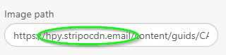
It can be one domain name or a few which you should separate by comma.
As a result, when your customer click on the image he didn't find icon for editing it.
Image Compression
This option helps you to compress PNG and JPEG image formats for the newly uploaded images.
Set the desired Compression Level in percent while configuring the Plugin:
Artificial intelligence
Based on ChatGPT4, this tool is meant to help your customers write text for emails. All marketers have
times
when they feel uninspired and can't think of anything to say in an email. AI will figure out how to
solve
this problem.
With the plugin, you can make small bits of text based on a given prompt or a part of a text in the
block.
All of the features are built right into the email editor and are easy to use.
You can enable this feature in the Plugin's UI by scrolling to the very last option in the Plugin app's
settings. We separate it for two different purposes:
- AI assistant for the text block;
- AI assistant for smart module
Setup your OpenAI API key and activate appropriate sections in the editor where you want to use AI.
*The API key can be found in the configuration menu of the AI service you're using to generate text. The text we generate will be based on the AI service you choose to use.
Let’s consider how it works for both options from the customer side.
AI assistant for text block
After adding a text block to the email template, we can see an additional option “Launch AI” in the settings panel.
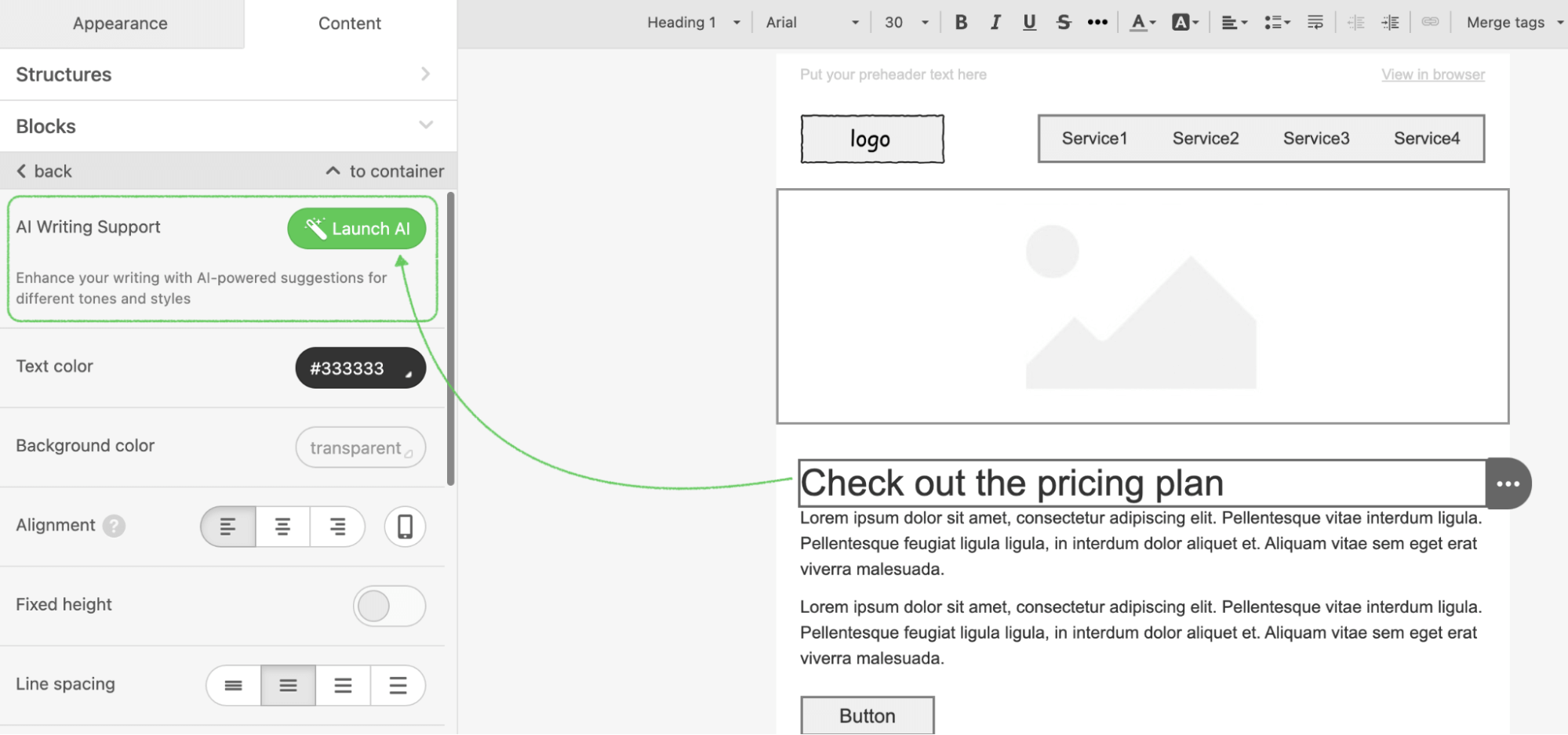
*If the field in block text is empty, this choice won't work. Please bear in mind that you have to type at least one word in order to use it.
The customer should click on it and give ideas for how AI could make the text better in the field that pops up, or use one of the prompts that appear below. Then, click the "Send to AI" button to finish the action.
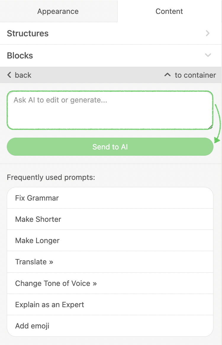
To see more examples of using, please follow this article.
AI for smart modules
With the help of smart elements, you can quickly and easily build a product card that matches your
brand's
design. In order to quickly and easily create excellent emails that contain data from external sources,
this
is an absolute must-have.
AI makes it much faster and easier to create smart elements and eliminates the need to manually set the
parameters our platform will look for on your information source.
Firstly you should enable the "AI assistant for smart module" under the "UI settings" menu:
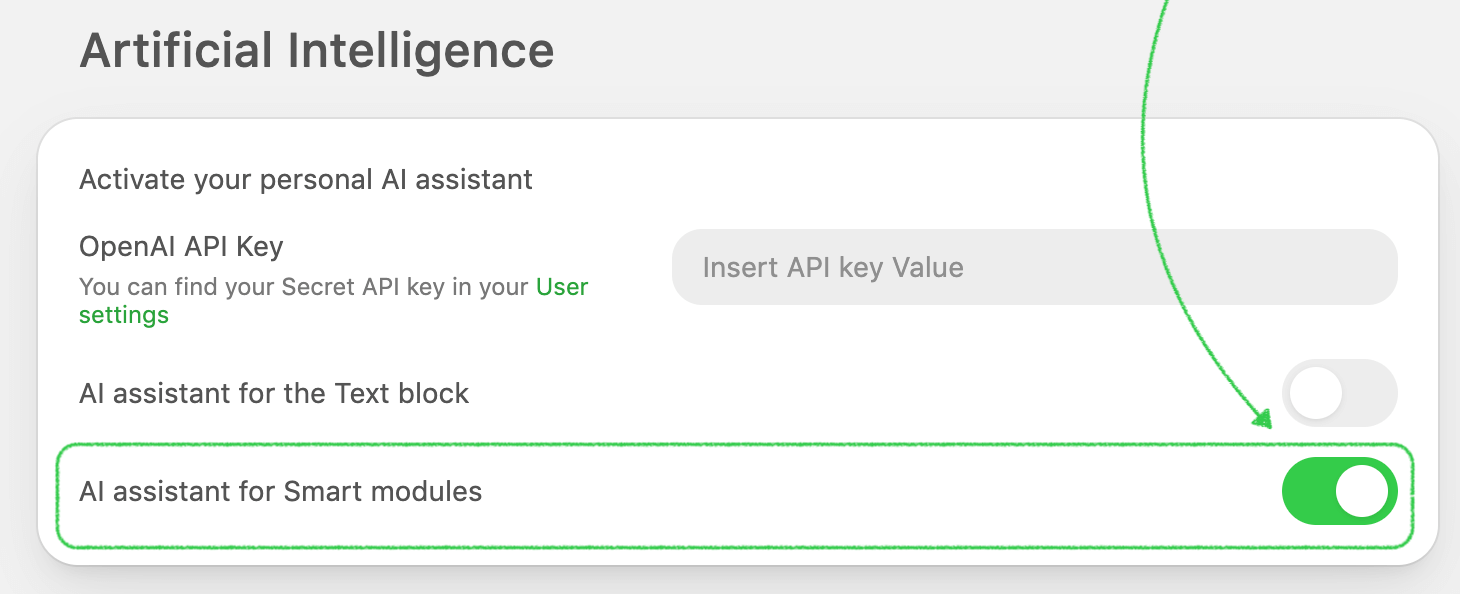
For example, you have a description on the site and want to add it to your email.
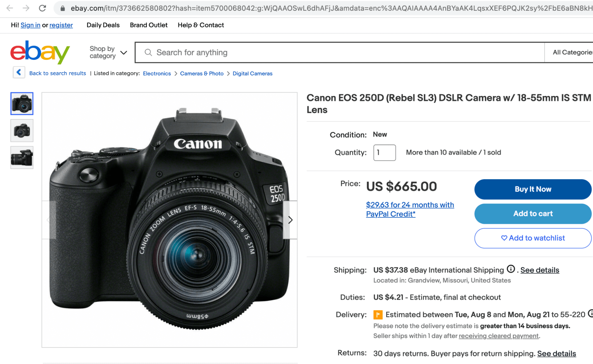
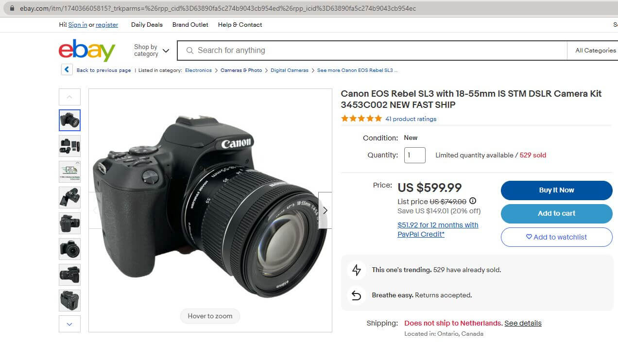
Usually from the customer side it’s enough to prepare product card design with activated smart-properties and add the link in the appropriate place to pull the data.
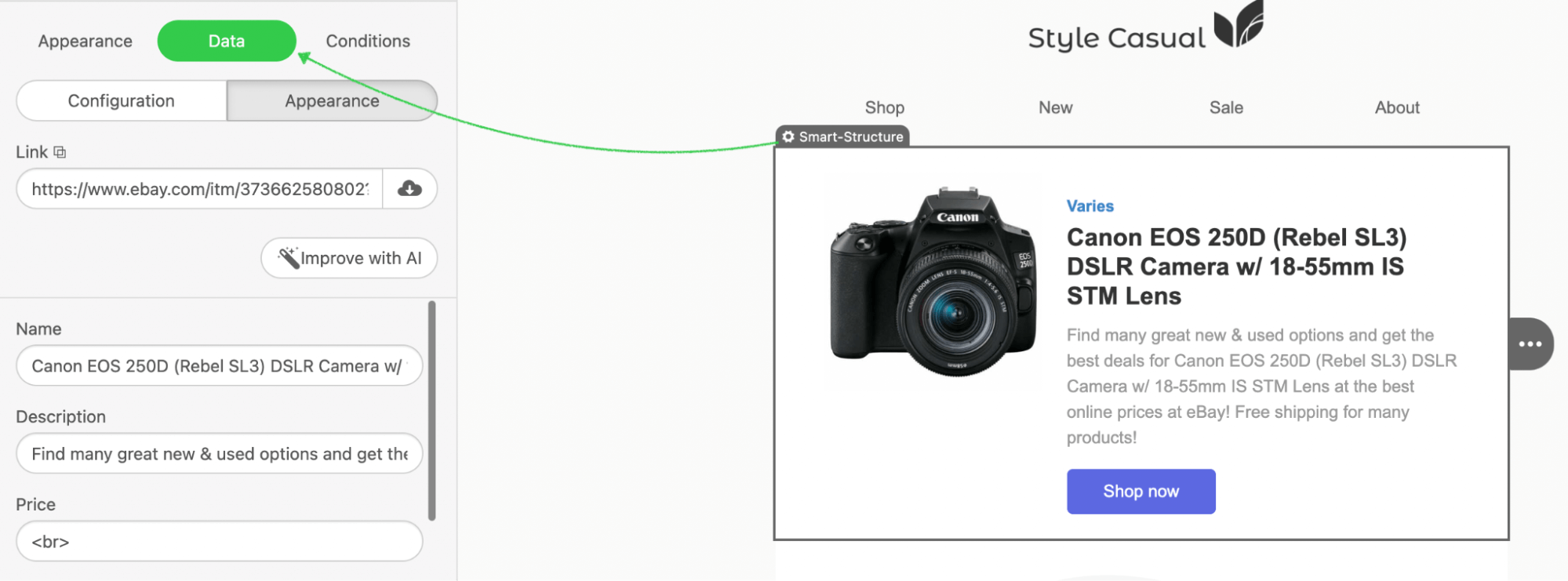
By selecting the "Improve with AI" button, text blocks within the smart module will be additionally improved by artificial intelligence.
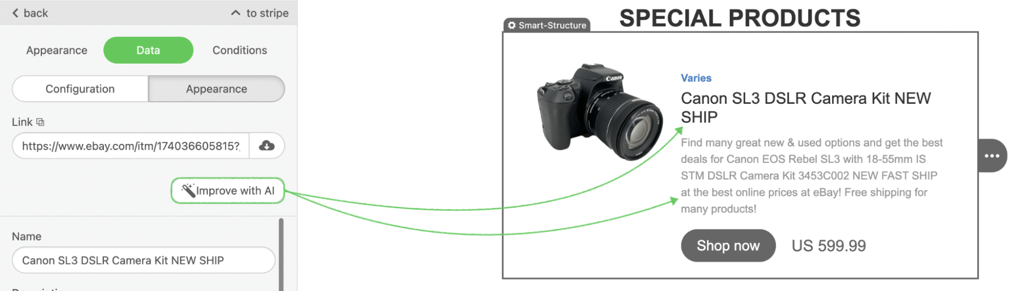
By the way, you can override the AI feature in the editor initialization parameters if you need some personalization. Here are the list of supported params:
window.Stripo.init({
  ...,
  "ai": {
    "textBlock": {
      "enabled": true, //You can enable/disable AI feature for editor initialization session and override plugin settings
      "api": {
        "createPrompt": function (promptAction, currentContentValue) {
            // Here:
            //    promptAction - prompt from user input
            //    currentContentValue - HTML code of selected text block

            const result = 'Prompt for AI'; // Here you can put your logic to generate final prompt to AI
            return result;
        },
        "createAiPromptsList": function(currentContentValue, locale) {
            // Here:
            //    currentContentValue - HTML code of selected text block
            //    locale - editor locale
            // As a result an array of items must be returned there:
            //    key - unique item id
            //    label - label that is displayed on UI
            //    prompt - prompt for AI
            //    sublist - an array of subitems
            return
                {
                    key: 'makeLonger',
                    label: 'Make longer',
                    prompt: 'Make longer'
                },
                {
                    key: 'translate',
                    label: 'Translate',
                    subList: [
                        {
                            key: 'translate.english',
                            label: 'English',
                            prompt: 'Translate to English'
                        },
                        {
                            key: 'translate.portugues',
                            label: 'Português',
                            prompt: 'Translate to Português'
                        }
                    ]
                };
        }
      }
    },
    "smartModule": {
      "enabled": true, //You can enable/disable AI feature for editor initialization session and override plugin settings
      "api": {
        "createPrompt": function(link, title, description) {
            // Here:
            //    link - link of external product site
            //    title - current title (variable p_name or b_title value)
            //    description - current description (variable p_description or b_description value)


            const result = 'Prompt for AI'; // Here you can put your logic to generate final prompt to AI
            return result;
        },
        "parseAiResponse": function(message) {
            // Here you can put your logic to parse AI response message for title and description
            // ...
            const result = {
                "title": "Some title",
                "description": "Some description"
            }
            return result;
        }
      }
    }
  }
}
Custom Components
External AI Assistant for Text
The default AI feature in Text Block can change the text to a specific topic, correct mistakes, or
improve the speech tone.
But it is also possible to obtain a callback parameter for AI Assistant if you like to modify it using
your own external tool, which will be in the modal window.
For doing this, please use the configuration below:
externalAiAssistant: {
  open: function(inputHtml: string, callback: function(ouputHtml: string): void)
}
Please find a code example here to see how it works.
Mobile mode. Preview in the Appearance tab.
With a dedicated parameter during editor initialization, you can customize the editor's behavior in the
Appearance tab. This adjustment separates the Appearance tab into two categories:
Desktop and Mobile, allowing you to view and manage changes for both
modes in a single location.
While in Desktop mode, you can adjust the following design elements:
- General Settings
- Stripes
- Headings
- Buttons
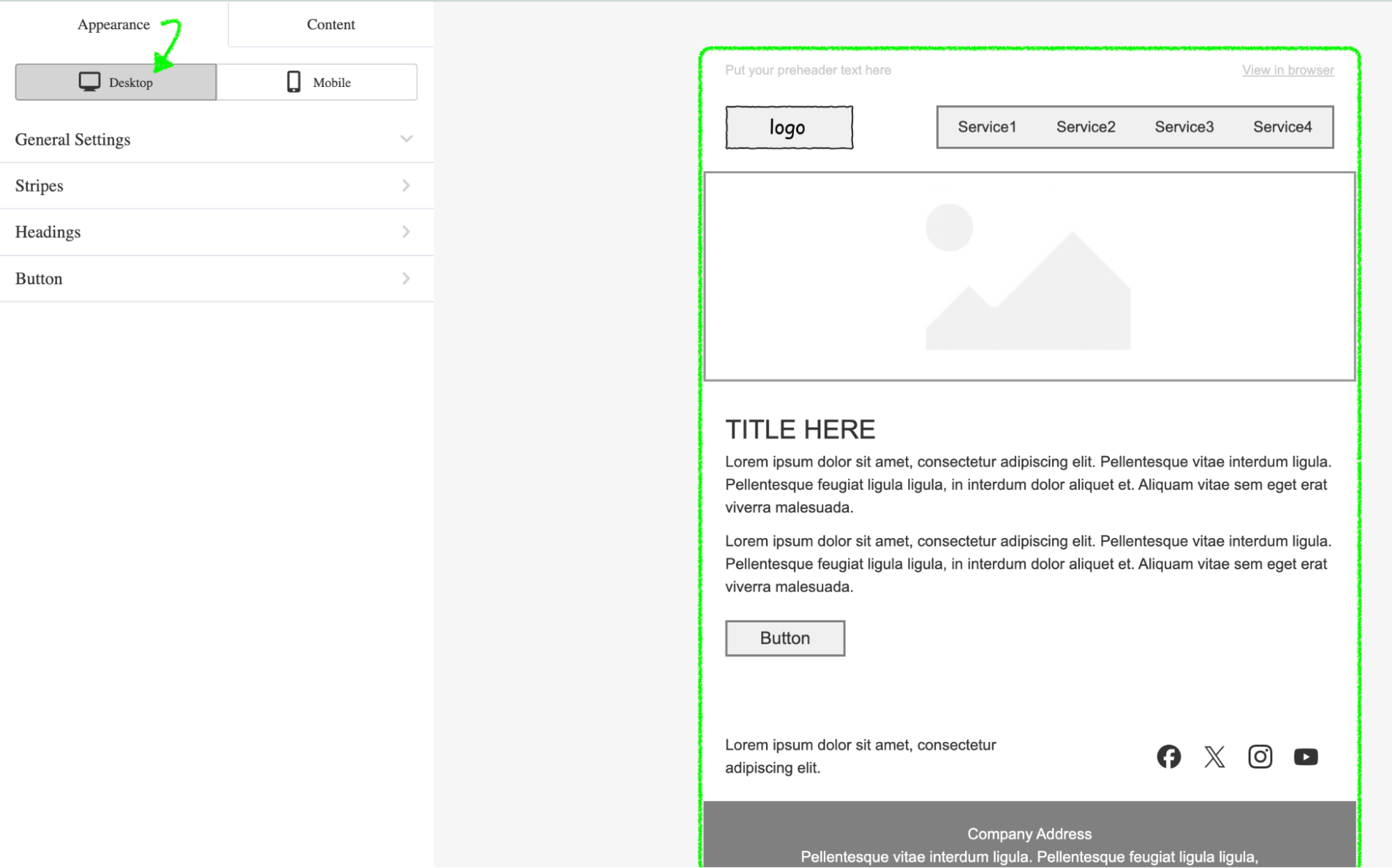
Mobile Preview
- The email's render area is reduced to 400 px to simulate the look on mobile devices.
- The Mobile preview is for visual reference only — it is not editable. Changes must be made using the Desktop Appearance controls.
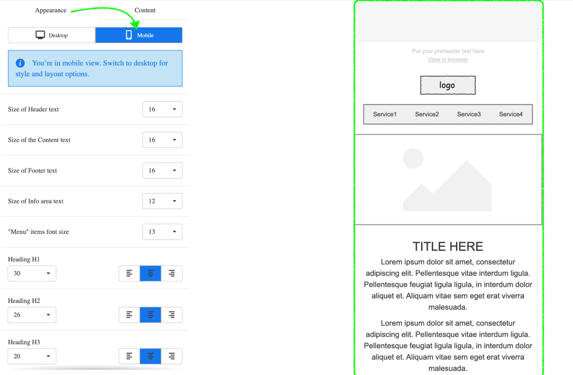
Important Note: You have the option to modify notification messages and their styles, such as text, color, size, etc.
To see how to enable this feature, refer to the example of Plugin initialization here.
External Images Library
If you have your own external image library that you would like your users to
use while creating an email, you can display it instead of a Stripo image gallery. To do so,
you need to set the externalImagesLibrary parameter when
you initialize the Plugin:

To do so, you need to set the “externalImagesLibrary” parameter when you initialize the Plugin:
window.Stripo.init({
    ...,
    externalImagesLibrary: {
        openLibrary(onImageSelectCallback, onCancelCallback) {
            /* Put your logic here.
                Call
                    onImageSelectCallback({
                        originalName: 'YOUR_FILE_NAME.png',
                        resolution: '600 x 410 px',
                        size: '169.20 kb',
                        url: 'https://YOUR_STORAGE_URL/YOUR_FILE.png'
                    })
                when user select the image from external library.
                Call
                    onCancelCallback()
                when user close the library without image selection.
            */
        }
    }
});
Please find a code example here to see how it works.
External Video Library
Just like in the case with the external image library, you also may display your own component with an external library of videos.
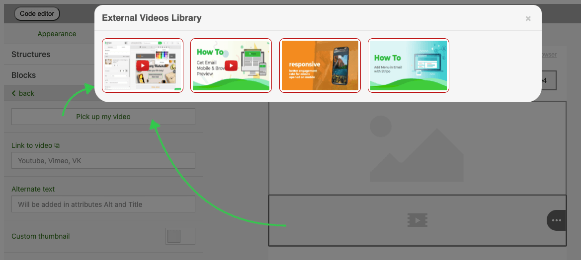
To do so, you need to set the externalVideosLibrary parameter when you
configure the
Plugin:
window.Stripo.init({
    ...,
    externalVideosLibrary: {
        buttonText: 'YOUR BUTTON NAME',
        open: openLibrary(onVideoSelectCallback, onCancelCallback) {
            /* Put your logic here.
                Call
                onVideoSelectCallback({
                    originalVideoName: 'YOUR VIDEO NAME',
                    originalImageName: 'YOUR IMAGE NAME',
                    urlImage: 'https://YOUR_STORAGE_IMAGE_URL.png',
                    urlVideo: 'https://your_storage_url/YOUR_FILE',
                    hasCustomButton: true || false
                })
                when user select the video from external library.
                Call
                onCancelCallback()
                when user close the library without video selection.
            */
        }
    }
});
Please find a code example here to see how it works.
External Merge Tags
If you have your own merge tags library that you would like your users to use while creating an email, you can display it instead of a Stripo merge tags.
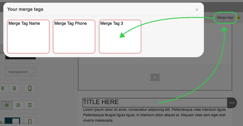
To do so, you need to set the externalMergeTags parameter when you
initialize the Plugin:
window.Stripo.init({
...,
        externalMergeTags: {
        open: open(oneSelectCallback) {
            /* Put your logic here.
            Call
                oneSelectCallback('%%YOUR_MERGE_TAG%%')
                when user selects the merge tag from external.
            */
        }
    }
});
Please find a code example here to see how it works.
File Picker for Links
If you want to add your own control for selecting a file from an external file
system in the pop-up window to be linked with the existing Link
control
for every basic block, you can set the externalFilesLibrary param
when
you initialize the Plugin:
window.Stripo.init({
    ...,
    externalFilesLibrary: {
        buttonText: 'YOUR BUTTON NAME',
        open: openLibrary(onFileSelectCallback, onCancelCallback) {
            /* Put your logic here.
                Call
                    onFileSelectCallback('https://YOUR_STORAGE_FILE_URL')
                when user select the file from external library.
                Call
                    onCancelCallback()
                when user close the library without file selection.
            */
        }
    }
});
As a result your customers can add the file by clicking on the right button.
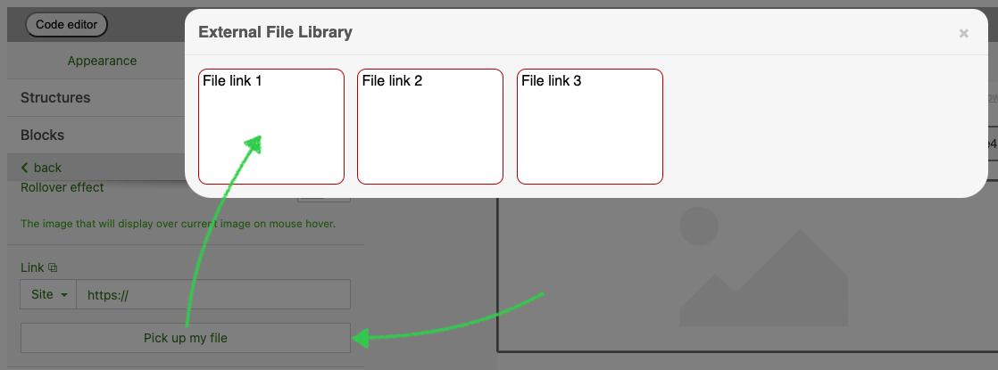
Please find a code example here to see how it works.
External links
The Stripo Plugin includes a feature that allows users to select and modify URLs via an external user interface. When the user clicks the "Create Link" icon within the Stripo editor, the plugin triggers an external window where the user can specify the desired URL. Upon setting the URL, the plugin expects to receive the URL value through a callback function, which then inserts it into the HTML content.
To activate this feature, please make sure you pass the parameter while Plugin initialization as follows:
the changes
could be added to showOpenCustomLinkIcon parameter or openOnClickByInput in the customTextLink configuration.
So now it looks like:
customTextLink: {
  activate: function(params, linkCallback) {
    renderExternalLink(params);
  },
  showOpenCustomLinkIcon: true,
  openOnClickByInput,
}
The showOpenCustomLinkIcon option enables the display of an icon within
the Link field on the
Settings panel, which triggers the same external user interface.
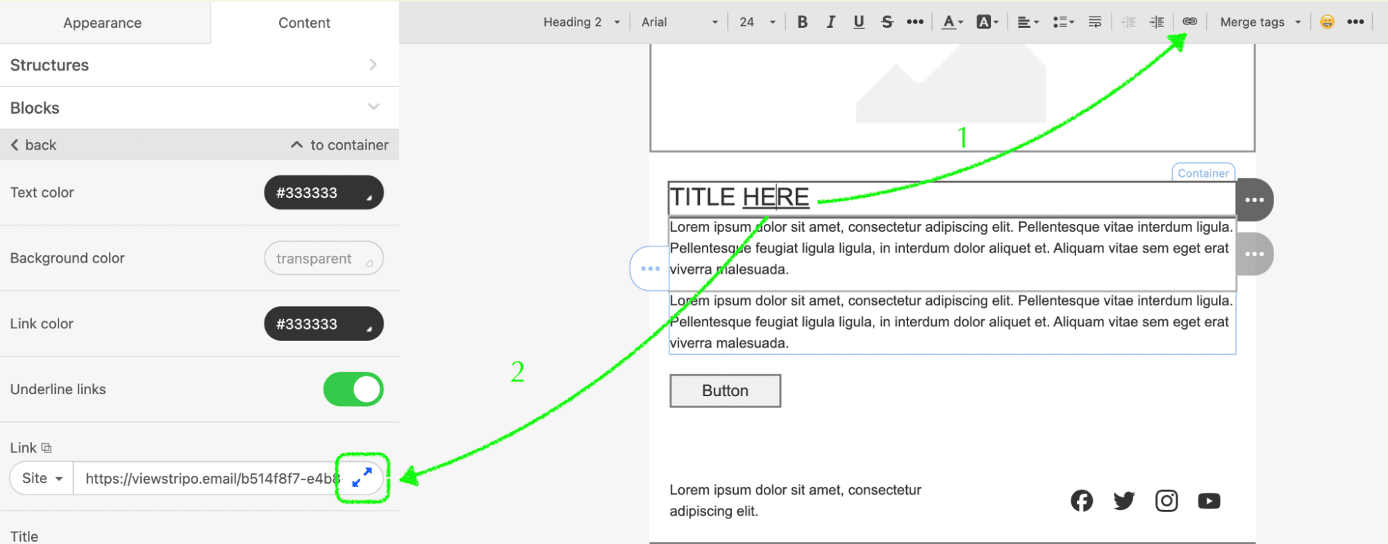
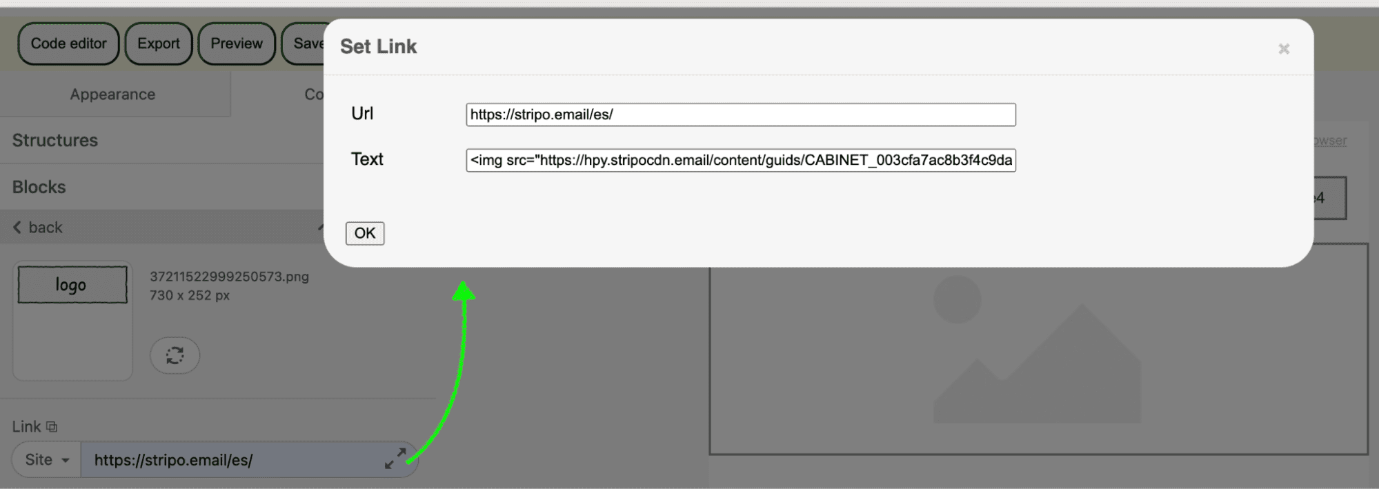
The openOnClickByInput parameter you should add this only if you want
to avoid clicking on the
special icon and prefer to click on the link section.
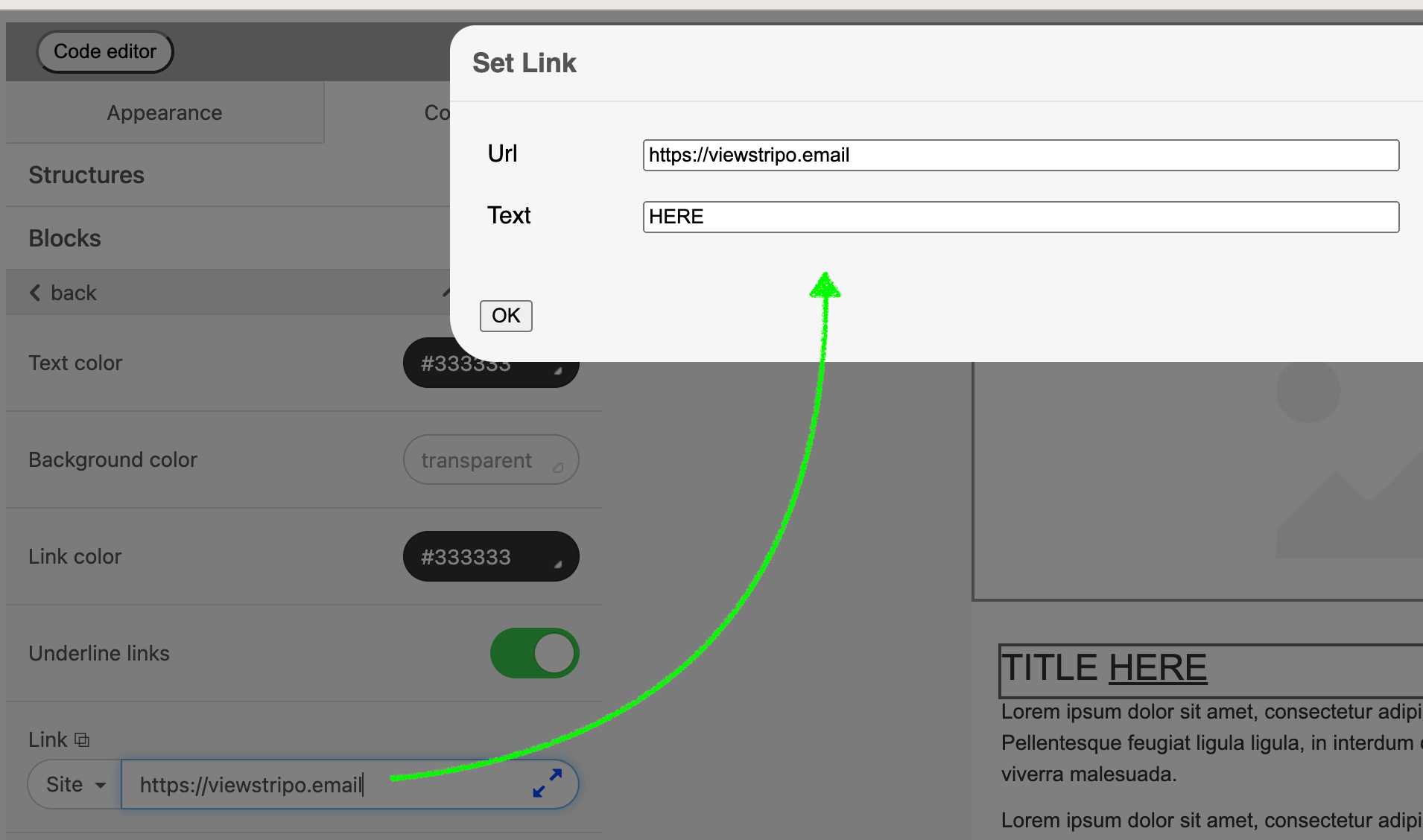
Please find a code example here to see how it works.
External Color Picker
This option allows your users to utilize an external color picker instead of the default one in the
settings panel and CKEditor.
When users click on the color input field or the color selector in CKEditor, an external trigger is
activated to display a custom color picker in a separate window. Upon color selection, the callback
function receives the selected color in the hex format.
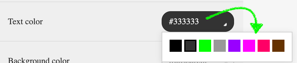
To implement this feature, add the following configuration:
externalColorPicker: {
    open: ({params, callback}) => Element,
    close: () => void,
}
open(params, callback) is a function for displaying a custom colorPicker that returns the Dom Element of a custom colorPicker. Required in order to correctly process clicks outside the colorPicker: for example, when clicking in the middle of the element, it does not need to be closed, but when clicking elsewhere, it is necessary.
- callback: a function that receives the selected color as a string in the color-hex format (e.g., #B6D7A8)
- function (color: string) close(): a function responsible for closing the custom color picker.
| Parameter | Type | Description |
|---|---|---|
| currentValue | string | The current color in hex format (e.g., #B6D7A8) or rgba(0, 0, 0, 0) for transparent colors. |
| transparentEnabled | boolean | A flag indicating whether transparent colors are allowed. |
| inputElement | HTMLElement | The DOM element that triggered the color picker. |
| isTextColor | boolean | A flag indicating whether the color is being applied to text. |
Please find a code example here to see how it works.
Smart Modules
To display your own external data list in a pop-up window that users can choose
to dynamically retrieve data from for their smart modules, you can set the externalSmartElementsLibrary parameter when you initialize
the Plugin:
window.Stripo.init({
    ...,
    externalSmartElementsLibrary: {
        openLibrary(onDataSelectCallback, onCancelCallback, selectedModule) {
            /* Put your logic here.
                Call
                    onDataSelectCallback({
                        key: value
                    })
                when the user selects the data from the external library.
                Call
                    onCancelCallback()
                when user close the library without image selection.

                selectedModule could include data such as tags or variables
                attached to the module
            */

        }
    }
Please find a code example here to see how it works.
If you want to provide option to choose whether use external data list or
website data list, you can set up additional parameter enableWebSiteLinksForSmartElementsLibrary when you initialize
the Plugin:
window.Stripo.init({
    ...,
    externalSmartElementsLibrary: {
        openLibrary(onDataSelectCallback, onCancelCallback, selectedModule) {
            /* Put your logic here.
                Call
                    onDataSelectCallback({
                    key: value
                    })
                when the user selects the data from the external library.
                Call
                    onCancelCallback()
                when user close the library without image selection.

                selectedModule could include data such as tags or variables
                attached to the module
            */
        }, enableWebSiteLinksForSmartElementsLibrary : true,
    }
As a result your customers can add their own data from the site or external source.
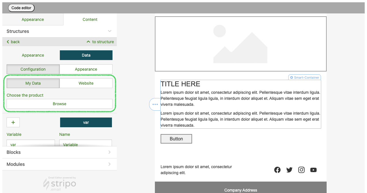
AMP Form Services
This parameter is an array of objects with the value and label fields that
are used for collecting data from the AMP Form block. Label
is the name of the service where the data from the AMP Form would be sent to, Value is a link to the endpoint for submitting forms.
"ampFormServices": [
    {
        "label": "My endpoint 1",
        "value": "https://my-endpoint1.net"
    },
    {
        "label": "My endpoint 2",
        "value": "https://my-endpoint2.net"
    }
]
This is how a predefined list of services looks in the editor when a user clicks on the Form block inside their email template.
If you want to block action to add the external service for AMP-form you should
additionally call the parameter: "showExternalAmpFormServices": false
In this case the
result will be reflected this way:
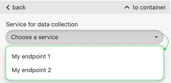
Editor extensions In business and enterprise subscriptions only
If you want to create your own editor blocks, flexibly customize their behavior and manage email layout, you can use the Stripo editor extensions.
First, create your own extension following the steps below:
- Checkout out the https://github.com/ardas/stripo-plugin-samples repository
- Navigate to preferred extension example in /extensions folder
-
Install dependencies:
npm i - Replace sample extension code with your logic
- Compile this code
npm run build
The ready-to-use code will be stored in the dist folder. Then you will need to store the compiled extension files on your hosting. When you initialize the Plugin, insert the code sample given below:
window.Stripo.init({
    ...,
    "extensions": [
        {
            "globalName": "YourExtensionName",
            "url":"https://your.hosting/main.hash.extension.js"
        }
    ]
});
Please find the code example and detailed guidelines here.
Blocks’ Custom Order
settingsPanelBlockSortFunc - used to order
blocks in the settings panel. Example:
{
    settingsPanelBlockSortFunc: function(names) {
        return names.sort();
    }
}
If it is not specified, blocks sorting works without changes.
Plugin Notifications
This is useful for those who want to show messages or notifications to users when an action is performed in the editor, e.g. the image is uploaded, the module is saved, etc.
You have the opportunity to display the editor’s messages with the script initialization and call one of these functions:
"notifications": {
    info(message: string, id?: string, params?: NotificationsParams): void;
    error(message: string, id?: string, params?: NotificationsParams): void;
    success(message: string, id?: string, params?: NotificationsParams): void;
    warn(message: string, id?: string, params?: NotificationsParams): void;
    loader(message: string, id?: string, params?: NotificationsParams): void;
    hide(id: string): void;
}
Where Notifications Params can be:
{
    closeable?: boolean; //default true
    autoClose?: boolean; //default true
    customClasses?: string; //default ''
}
? means not a mandatory parameter.
You need to configure these functions to show messages in the correct place and styled the way you like.
External Display Conditions
If you want to apply the display conditions that you would like your customer to choose while creating an email, you can display it in the same place with buttons "Copy", "Move", "Delete"
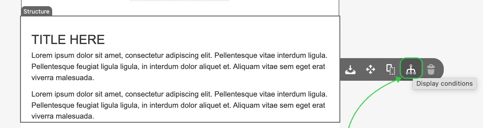
To do so, you need to set the ExternalDisplayConditionsPopup parameter when you initialize the Plugin:
conditionsEnabled: true,
customConditionsEnabled: false,
conditionsTooltip: window.ExternalDisplayConditionsPopup.getConditionsTooltip,
conditionCategories: [
   {
      type: 'EXTERNAL',
      category:'Complex conditions',
      openExternalDisplayConditionsDialog: window.ExternalDisplayConditionsPopup.openExternalDisplayConditionsDialog,
      useContextActionsInsteadOfSettingsTab: true
   }
]
Please find a code example here to see how it works.
Custom View Styles
There is a different option in the top panel to make an element highlighted. When you click on it, a certain area in the email will be selected (the area will be read through classes and CSS), and when you click on it again, the selection will be erased.
For example, let’s check the button:
customViewStyles: '.esd-block-button {border: 2px solid green;}',People who want to show dynamic content in structures or containers should call the following function in the API:
"activateCustomViewStyles(true|false)"
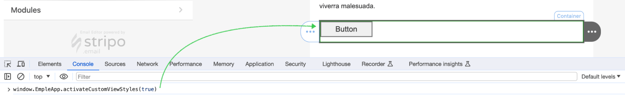
Anyone should be able to see where the changing content is by setting a frame around all structures and
containers when you click on the button. Besides that, you can choose the style of this frame yourself.
To hide the frame please set up the “false” action to it.
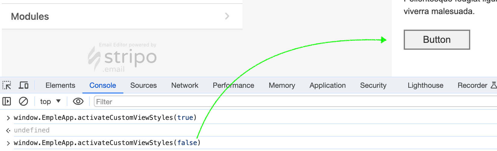
Сustom controls for blocks
Stripo Plugin allows you to extend existing controls for basic blocks and create custom ones. This works
similarly to extensions, giving you more flexibility in managing design
elements.
Custom controls let you add new settings or modify existing ones within the Stripo editor. For example,
you can add additional options to modify background colors, padding, borders, or button styles in
specific areas of a block. These controls integrate seamlessly into the settings panel and behave like
built-in Stripo controls.
If you want to add a new control for setting the background color of an element inside a stripe, you can
define it as follows:
Below is an example of a custom control for setting the background color of an element:
const stripoBackgroundColorControl = {
    // Parent control name is the name of the control that this control will be extended from
    parentControlName: 'stripoBackgroundColorControl',
    name: STRIPO_BACKGROUND_COLOR_CONTROL_NAME,

    getTargetElements() {
        return [this.initialDomElement];
    },

    getInitialColor() {
        return this.getTargetElements()[0].getAttribute('bgcolor');
    },
};
This example extends the existing stripoBackgroundColorControl, allowing you to control and modify the background color of specific elements.
The list of all possible controls for adding:
'stripoBackgroundImageControl''stripoBackgroundColorControl''stripoBorderControl''stripoButtonAlignControl''stripoButtonBorderHoverControl''stripoButtonBorderRadiusControl''stripoButtonBorderControl''stripoButtonColorControl''stripoButtonHoverColorControl''stripoButtonInternalPaddingControl''stripoButtonStretchControl''stripoButtonStyleControl''stripoButtonTextColorControl''stripoButtonTextColorHoverControl''stripoButtonTextControl''stripoFixedHeightControl''stripoFontColorControl''stripoImageSizeControl''stripoLinkColorControl''stripoPaddingControl''stripoStructureAdaptControl''stripoStructureBorderControl''stripoStructureMarginControl''stripoStructurePaddingsControl''stripoTextAlignControl''stripoTextLineSpacingControl''stripoTextStyleControl''stripoVisibilityControl'
For a working implementation of a custom control, check out this example here.
Custom context menu for blocks
With the new parameter, plugin developers can add custom options to the context menu (block toolbar) of specific block types. This allows for additional actions beyond the standard options like move, copy, or delete.
You can apply the custom menu to one or multiple block types: 'Block Img','Block Text','Block Button','Block Spacer','Block Video','Block Social','Block Banner','Block Timer','Block Menu','Block HTML','Block Amp Carousel','Block Amp Accordion','Block Amp Form', ${extension.name} (for custom extensions)
When initializing the Stripo Plugin, you should pass a configuration object to contextMenuForExternalBlockContentControl that defines:
- A custom icon;
- Hint text;
- The position of the icon in the context menu;
- A list of block types where this option should appear;
- Two callbacks – one for opening the custom action and one for saving changes
The logic of process:
Clicking the new context menu item will trigger the open() function.
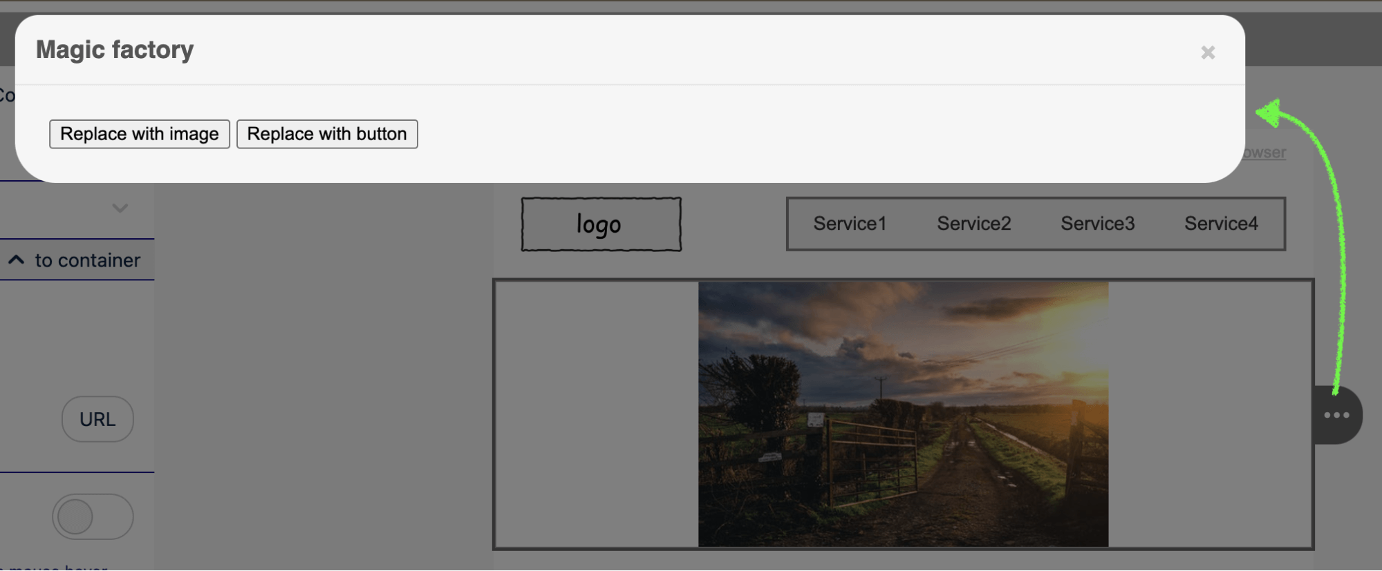
The function receives the current block’s HTML code as htmlCodeOfBlock.
The developer can modify the HTML and pass the new content to replaceHtmlCodeOfBlockCallback().
The selected block remains highlighted after the update, ensuring a smooth user experience.
Configuration Example:
contextMenuForExternalBlockContentControl: {
    open: function(htmlCodeOfBlock, replaceHtmlCodeOfBlockCallback) {
        // Logic to process the block's content
        console.log("Block HTML before modification:", htmlCodeOfBlock);

        // Example: Modifying the block content
        const newHtmlCode = htmlCodeOfBlock.replace('<p>', '<p style="color: red;">');

        // Calling the callback to replace the block's content
        replaceHtmlCodeOfBlockCallback(newHtmlCode);
    },

    contextMenuTitle: 'Magic Factory',
    contextMenuIcon: 'https://rf.stripocdn.email/content/guids/CABINET_c4aa6e445e77c0a0872dc084ef3a17cd9dc5b402ce2ab34f45da5bae21f078fe/images/magic.png',
    contextMenuPositionIndex: 1,
    applyToBlocks: ['Block Text', 'Block Img']
}
Please find a code of the example here to see how it works.
Server Configuration
In this chapter, you’ll find instructions on how to set up and customize the Plugin’s backend.
Permissions Checker API
Using this option you can be sure that only your users have the rights to edit emails in your application. Enable the permissions checker feature to prevent third-party people from pretending to be who they are not.
This means that the Stripo Plugin will not perform any server-side operation (load/save/update...) without permissions from your end. To enable this feature, you need to implement this backend endpoint on your server.
POST: /
Host: YOUR_PERMISSIONS_CHECKER_URL
Content-Type: application/json
Accept: application/json
Body: {
    "pluginId": "YOUR_PLUGIN_ID",
    "uiData": {
        "emailId": "123",
        "someAnotherIdentifier": "456",
        ...
    },
    "requestPermissions": [
        {
            "type": "BLOCKS",
            "action": "READ",
            "key": "pluginId_YOUR_PLUGIN_ID_emailId_123_id_456",
            "keyTemplate": "emailId_${emailId}_id_${someAnotherIdentifier}"
        },
        ...
    ]
}
Response: {
    "grantPermissions": [{
            "type": "BLOCKS",
            "action": "READ",
            "key": "pluginId_YOUR_PLUGIN_ID_emailId_123_id_456",
            "keyTemplate": "emailId_${emailId}_id_${someAnotherIdentifier}"
        },
        ...
    ]
}
Please take a look at the descriptions of the request parameters below:
| Parameter | Description |
|---|---|
| pluginId | Your plugin ID. |
| uiData | The value of apiRequestData parameter from plugin
initialization parameters. |
| requestPermissions | Array of permissions that plugin requests. |
| type | Operation subject. Supported values: BLOCKS, DOCS. |
| action | Operation type. Supported values: READ, MODIFY. |
| key | Key identifier that was configured in plugin settings with filled values. |
| keyTemplate | Key identifier that was configured in plugin settings. |
Please take a look at the descriptions of the response parameters below:
| Parameter | Description |
|---|---|
| grantPermissions | Array of operations for plugin that are allowed to do. If you want to deny some operation just do not include it into this array. |
| type | Operation subject. Supported values: BLOCKS, DOCS. |
| action | Operation type. Supported values: READ, MODIFY. |
| key | Key identifier that was configured in plugin settings with filled values. |
| keyTemplate | Key identifier that was configured in plugin settings. |
When choosing the Permissions Checker API option, you have to fill out the form to establish a connection with your backend. This is a description of the form fields with specifications regarding what information you will need to provide:
| Parameter | Required | Description |
|---|---|---|
| URL | Yes | Endpoint address of your permissions checker backend. |
| Login | Yes | Basic auth username. |
| Password | Yes | Basic auth password. |
AutoSave Option In paid subscriptions only
Whenever users make any changes to the email they are working on, these changes should be saved automatically. The Plugin sends micro changes (we call them “patches”) to its server, which in turn recreates the final version of the edited email template from them and sends it to your server for further saving/processing.
Enable the AutoSave option on the Plugin details page to receive a fresh version of the HTML and CSS code to your backend every time a change has been done by a user in the editor.
To support this option, you need to implement the interface on your backend that will receive the calls:
POST: /
Host: YOUR_BACKEND_AUTO_SAVE_URL
Content-Type: application/json
Accept: application/json
Body: {
    key: plId_YOUR_PLUGIN_ID_emailId_YOUR_EMAIL_ID_FROM_UI_REQUEST_PARAMS,
    emailId: YOUR_EMAIL_ID_FROM_UI_REQUEST_PARAMS,
    html: YOUR_HTML_CODE,
    css: YOUR_CSS_CODE,
    width: EMAIL_WIDTH,
    height: EMAIL_HEIGHT
}
Status: 200 OK
Please take a look at the descriptions of the request parameters below:
| Parameter | Description |
|---|---|
| key | Email’s unique AutoSave key that contains the pluginId and emailId params. |
| emailId | Email ID from the request params. See the “Plugin request parameters” section. |
| html | HTML code. |
| css | CSS code. |
| width | Email width. |
| height | Email height. |
The Basic Authentication is used to send these requests, so please make sure that you have specified the correct Login, Password, and API URL in the Stripo Plugin Integration menu in your Stripo account (if you don’t have an account, please
sign up).Version History In paid subscriptions only
This option enables your users to view changes of an opened email template in the editor, as well as gives the ability to restore any previous version of the email template from earlier versions.
When it is activated your users can track all changes displayed in the Settings Panel area. As soon as they click on a particular change, they are able to restore the opened email template to the selected version.
Please note: the editor won't display a user name if it was not passed as one of the parameters with the Plugin initialization.
You can place the button/LINK (the trigger) in your application, by clicking on which the mode Version history of an opened email template will be activated.
Once this option is activated, please add these config parameters to the Plugin initialization call (see the “Plugin configuration” section):
"userFullName": "YOUR_PLUGIN_USER_NAME",
"versionHistory": {
    "changeHistoryLinkId": "YOUR_LINK_ELEMENT_ID",
    "onInitialized": "function(lastChangeInfoText)" {
        // Do any additional actions here when version history is initialized
    }
}
If you do not use the AutoSave Option you can independently create the points displayed in the Version history section.
To do so, please add this function and call this method every time a template is saved on your end or when you want the corresponding entry to appear in the Version history:
function saveVersionHistoryPoint(onSaveCallback) {
    if (window.StripoApi.createVersionHistoryPointAsync) {
            window.StripoApi.createVersionHistoryPointAsync(onSaveCallback);
    } else {
        // Deprecated
        window.StripoApi.createVersionHistoryPoint();
        onSaveCallback();
    }
}
This function will create visible endpoints in the Version history and update the data of the last changes. You can independently choose where it should be applied, we recommend that you use it every time when your user clicks on the "Save" button.
If an AutoSave option is activated and configured, then all changes made in the editor will be automatically saved to our DB as a patch.
As soon as they are saved, our server will send the request to your end-point set for the AutoSave option with the changed HTML and CSS in order to replace the previous version in your DB. As a result, every change made by a user in the editor will be saved in your DB for that particular email and you have only the final, most up-to-date version of every template, opened in the editor.
If this feature is not activated, then a user has to click on the Save button manually within your app and you should call the getTemplate function to take out modified HTML and CSS from the editor in order to save it within your DB.
If you wish to modify your history button, so that it does not reflect updates when it is highlighted, check out the relevant Help center article.
Webhook Integration In paid subscriptions only
This feature enables your users to track the remaining email IDs and timer views within your
subscription plan and receive automatic notifications when these limits are approaching.
Once activated, you will be able to receive updates on your server via a webhook that reports data about their usage. These updates include the number of remaining email IDs and timer views,
allowing users to monitor their limits and ensure uninterrupted access to their services.
To connect your Webhook, access "Server Settings" of your Plugin account, enable the control, and enter
your URL, Login, and Password.
You can place a trigger within your application, which, upon activation, will connect to the Webhook and begin tracking the usage of email IDs and timer views.
response body
{"timerViewsLeft":55, "uniqueEmailsLeft":1055}
If the webhook detects that your usage is nearing its limit and your subscription plan won’t be updated in time, you may contact support at support@stripo.email for assistance in increasing your limits.
Roles and Access Managements
Soon we will add the ability to manage the roles you can assign to any user when you initialize the editor.
Currently, there are only 2 roles preset by default in the system:
- Admin
- User
You can use these roles when you configure the access levels to the folders created in the image gallery and in the Library of modules. Pass correct roles with authentication (see the “Plugin authentication” section) to enable your users to write data in one or the other folder: the image gallery or the Library of modules.
Plugin Invocations
The Stripo Plugin has the Javascript API and Backend API, where the Javascript API is used for interaction with the UI part of the Plugin and the Backend API is used to combine two files, HTML and CSS, to get a ready-to-send email template.
Stripo Plugin JS API
The Stripo Plugin JS API can be accessed via the window.StripoApi js
object.
The list of available JS API functions:
| Function | Input parameters | Output parameters | Description |
|---|---|---|---|
| getTemplate | callback | This method returns the HTML and CSS codes with the
Plugin internal extra styles and editor markup. Format: callback(HTML, CSS, width, height). You should call the getTemplate function to take out modified HTML and CSS from the editor in order to save it in your DB. Please, check out the samples in our GitHub repository. |
|
| compileEmail | callback, minimize |
This method returns compiled and compressed HTML code that is ready to be sent
out to clients. Format: callback(error, html, ampHtml, ampErrors). If an error occurs, the first parameter will contain the error description. In case of success, the first parameter will be null and the second parameter will contain HTML code. In case your email template contains AMP elements or components, the third parameter will contain the HTML code of the AMP HTML Mime type. In case AMP HTML is invalid, the fourth parameter will contain the error descriptions (array of strings). minimize — boolean flag. If set "true" value — the HTML code will be in a format of a single line without line breaks and classes will be minimized to one letter. The classes that didn’t get any connections to styles will be completely removed from the code. Example: compileEmail(function(error, html, ampHtml, ampErrors) {...}, false) |
|
| stripoApi.updateCss(newCss) | newCss | Updates the CSS of the open email and creates a patch with the changes. | |
| getTitle | emailTitle | This method returns an email title/subject line. | |
| setTitle | emailTitle | This method sets an email title/subject line. | |
| getHiddenPreHeader | preHeader | This method returns an email’s hidden preheader. | |
| setHiddenPreHeader | preHeader | This method sets an email’s hidden preheader. | |
| getGoogleAnnotations | null || { logo: 'https://logo', description: 'description', discountCode: 'discountCode', availabilityStarts: '2019-06-26T04:04:00+00:00', availabilityEnds: '2019-06-30T04:04:00+00:00', image: 'https://image' }; |
This method returns the Gmail Promo Annotations’ microdata inserted into the
HTML code of the email template in the editor. In case the microdata code is not available there, the null value is returned. If any of the parameters are disabled or empty, then the empty data is returned (for example, discountCode: ''). For more information on these parameters, please refer to this page (go to the “Generate my code” button and check the “Microdata Format” tab) or on our blog here |
|
| setGoogleAnnotations | { logo: 'https://logo', description: 'description', discountCode: 'discountCode', availabilityStarts: '2019-06-26T04:04:00+00:00', availabilityEnds: '2019-06-30T04:04:00+00:00', image: 'https://image' } || null; |
This method inserts/updates the Gmail Promo Annotations’ microdata in HTML code
of the opened email template in the editor.
In case you want to disable the whole feature please pass the null value. Otherwise, you will pass all or any parameters with the data according to these requirements. If you want to disable any of the parameters, simply pass the empty data (for example, discountCode: ''). Please find more information on every parameter here (click on the “Generate my code” button and check the “Microdata Format” tab) or on our blog here. |
|
| allDataSaved | - | true/false |
Use this function to identify whether all changes are saved or not. If something was not saved it returns False, if everything saved - True. Can be applied only if you don’t use Autosave option |
| showAmpErrorsModal | ampErrors, userSuccessButtons onCancel, onSubmit | - | Use this function to display the AMP validation errors
in the Stripo preview mode if there are any in the email template.
Example: showAmpErrorsModal(ampErrors, userSuccessButtons, onCancel, onSubmit) The first parameter ampErrors represents
the array of AMP errors received after calling the compileEmail function.
The second parameter userSuccessButtons
includes the array of external buttons that may be displayed in the preview
window in case if there are no validation errors.
The third parameter OnCancel is a
callback function the editor may call if the user closes the preview window.
The fourth parameter onSubmit is a
callback function the editor may call when the user clicks on the “Fix in Code
Editor” button if there are any errors. Please be advised that this button won’t
be displayed if you did not pass the codeEditorButtonId
with the Plugin
initialization.
Please find the detailed description here. |
| setHtmlReadyForSave | No | true |
Set setHtmlReadyForSave(false) if you want
temporarily
disable the option to create patches for auto-saving the changes that were applied to
the
template in the editor. Set the function setHtmlReadyForSave(true) to activate the patches
creation
again.
|
Stripo Plugin Backend API
Compile email template
As mentioned above, the Stripo Plugin Backend API endpoint allows inlining CSS styles into HTML tags and provides the final HTML code of email templates that is ready to be sent to recipients.
POST: /api/v1/cleaner/v1/compress
Host: https://plugins.stripo.email
Content-Type: application/json
Header: ES-PLUGIN-AUTH: Bearer YOUR_AUTH_TOKEN
Accept: application/json
Body: {html:YOUR_HTML_CODE, css:YOUR_CSS_CODE, minimize:true}
Response: {html:HTML_READY_TO_BE_SENT}
Please see the descriptions of the request parameters below:
| Parameter | Description |
|---|---|
| html | HTML code. |
| css | CSS code. |
| minimize | If set "true" value — the HTML code will be in a format of a single line without line breaks and classes will be minimized to one letter. The classes that didn’t get any connections to styles will be completely removed from the code. |
| inlineCss | Allows you to select the type of code in the received compiled email. inlineCss: true - by default. This means that we will see CSS placed inside tags when we make a compiled form of HTML. inlineCss: false - editor will not inline the CSS in the tags, but rather write it at the head of the email. |
Example:
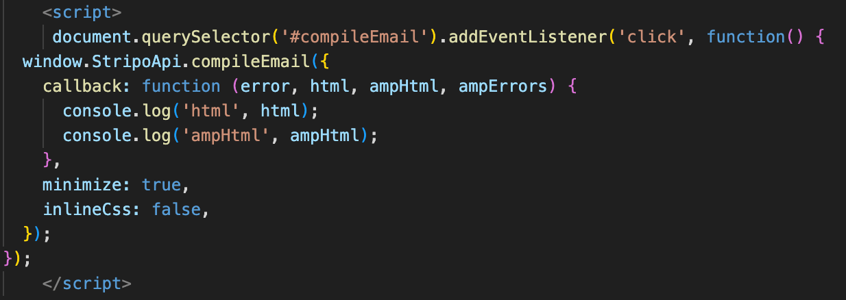
inlineCss: boolean can accept an object
{callback: (error, html, ampHtml, ampErrors), minimize: boolean, inlineCss: boolean}
or arguments
(callback: (error, html, ampHtml, ampErrors), minimize: boolean)
To get YOUR_AUTH_TOKEN please take a look at this section.
Please be advised that if your email template contains AMP elements or components, in response you will see the ampHtml parameter that contains the HTML code of the AMP HTML Mime type.
In case the AMP HTML is invalid, you will also get the ampErrors parameter that contains the error descriptions (array of strings).
Example:
Request:
curl -X POST https://plugins.stripo.email/api/v1/auth -k -H "Content-Type: application/json" -H "Accept: application/json" --data "{\"pluginId\":\"YOUR_PLUGIN_ID\",\"secretKey\":\"YOUR_SECRET_KEY\"}" -i

Response:
{"token":"YOUR_AUTH_TOKEN"}

Request:
curl -X POST https://plugins.stripo.email/api/v1/cleaner/v1/compress -k -H "Content-Type: application/json" -H "Accept: application/json" -H "ES-PLUGIN-AUTH: Bearer YOUR_AUTH_TOKEN" --data "{\"html\":\"Some html\",\"css\":\"body {color: green}\",\"minimize\":true}" -i

Response:
{"html":"Some html"}
If the email code contains conditional comments <!--<unchanged>, the editor does not change the code inside this
tag in the comments, and you will see it as is after the code compilation.
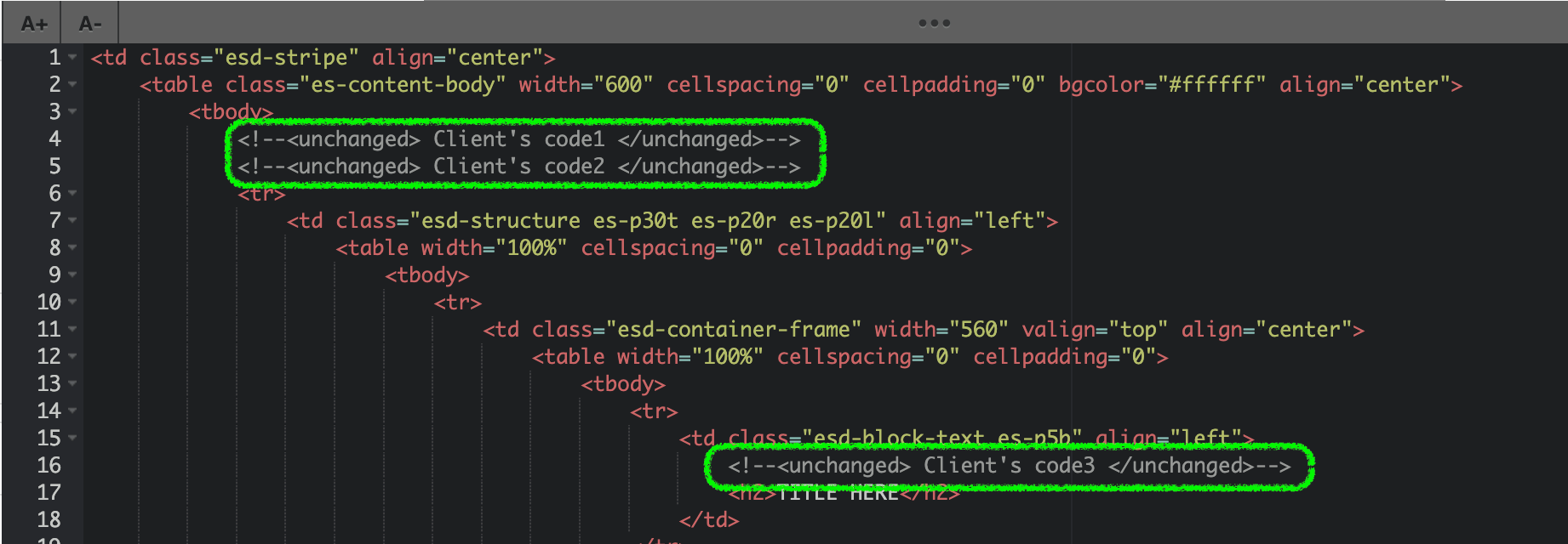
Just keep in mind that these conditional comments will be removed during compilation, leaving only the code inside.
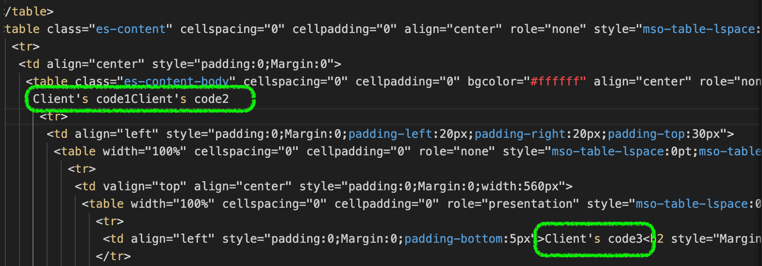
Access to Stripo Templates
Stripo is prepared to give you access to the templates that we have already produced. If you have already made your own plugin application and registered your account, you have the ability to have them.
Depending on the plan, you can get the following templates:
- FREE plan - only basic templates;
- STARTUP - basic and templates that marked as FREE;
- BUSINESS and ENTERPRISE = basic, free and PREMIUM templates.
After you perform the first request to get the array of needed templates, you have to make a sequence of separate calls for each template to get its HTML and CSS, as described in the GET TEMPLATE method below.
GET TEMPLATES
This method returns an array of templates that match the specified search criteria, including their metadata, but excluding the HTML and CSS code. The list of parameters you can find below.
GET: /v1/templates
Host: https://my.stripo.email/bapi/plugin-templates
Header: ES-PLUGIN-AUTH: Bearer YOUR_AUTH_TOKEN
query params:
    type (BASIC | FREE | PREMIUM)
    sort (NEW | ACTUAL)
    limit (int)
    page (int)
    templateTypes (array of integer, example: &templateTypes=1&templateTypes=2)
    templateSeasons (array of integer, example: &templateSeasons=1&templateSeasons=2)
    templateFeatures (array of integer, example: &templateFeatures=1&templateFeatures=2)
    templateIndustries (array of integer, example: &templateIndustries=1&templateIndustries=2)
response: {
    total: int,
    data: {
        templateId: int;
        name: string;
        logo: string;
        premium: boolean;
        hasAmp: boolean;
        updatedAt: long;
        createdTime: long;
        templateTypes: {id: int, name: string}[];
        templateSeasons: {id: int, name: string}[];
        templateFeatures: {id: int, name: string}[];
        templateIndustries: {id: int, name: string}[];
        previewLink: string; //URL of template’s preview
    }[];
}
Please see the descriptions of the parameters below:
| type | This is the mandatory parameter and specifies the variety of templates that should be returned. Possible values are as follows: BASIC, FREE, or PREMIUM |
| sort | Optional parameter that defines how the templates are sorted in response. This parameter has
2
values:
|
| limit | Optional parameter that regulates how many items should be returned per the page. We suggest specifying the limit of no more than 50 entities as the speed of response to the request depends on this |
| page | Optional parameter that defines the number of the page |
| templateTypes | Make use of the optional parameter to filter templates that specifically pertain to relevant categories. For a complete catalog of possible categories within this context, please utilize the GET TEMPLATE TYPES method. |
| templateSeasons - templates array sorted by season events | Utilize the optional parameter to restrict the selection of templates to those associated with seasonal events categories. For a comprehensive listing of potential categories related to this topic, kindly employ the GET TEMPLATE SEASONS method. |
| templateFeatures | Use the optional parameter to ensure that only templates related to specific feature categories are retrieved. To access the full array of potential categories under this classification, kindly employ the GET TEMPLATE FEATURES method. |
| templateIndustries | Apply the optional parameter to narrow down your template selection to include only those featuring industry-specific categories. For an exhaustive list of potential categories within this field, please use the GET TEMPLATE INDUSTRIES method. |
| previewLink | URL with the email template preview which is returned on request. |
GET TEMPLATE
This method returns the metadata, as well as the HTML and CSS code, for a specific template specified by its ID.
GET: /v1/templates/{templateId}
Host: https://my.stripo.email/bapi/plugin-templates
Header: ES-PLUGIN-AUTH: Bearer YOUR_AUTH_TOKEN
response: {
    templateId: int;
    name: string;
    logo: string;
    premium: boolean;
    hasAmp: boolean;
    updatedAt: long;
    createdTime: long;
    templateTypes: {id: int, name: string}[];
    templateSeasons: {id: int, name: string}[];
    templateFeatures: {id: int, name: string}[];
    templateIndustries: {id: int, name: string}[];
    html: string;
    css: string;
    previewLink: string; //URL of template’s preview
}
GET TEMPLATE TYPES
This method returns an array of the available values for the templateTypes
parameter.
GET: /v1/templates/types
Host: https://my.stripo.email/bapi/plugin-templates
Header: ES-PLUGIN-AUTH: Bearer YOUR_AUTH_TOKEN
response: {id: int, name: string}[];
GET TEMPLATE SEASONS
This method returns an array of the available values for the templateSeasons parameter.
GET: /v1/templates/seasons
Host: https://my.stripo.email/bapi/plugin-templates
Header: ES-PLUGIN-AUTH: Bearer YOUR_AUTH_TOKEN
response: {id: int, name: string}[];
GET TEMPLATE FEATURES
This method returns an array of the available values for the templateFeatures parameter.
GET: /v1/templates/features
Host: https://my.stripo.email/bapi/plugin-templates
Header: ES-PLUGIN-AUTH: Bearer YOUR_AUTH_TOKEN
response: {id: int, name: string}[];
GET TEMPLATE INDUSTRIES
This method returns an array of the available values for the templateIndustries parameter.
GET: /v1/templates/industries
Host: https://my.stripo.email/bapi/plugin-templates
Header: ES-PLUGIN-AUTH: Bearer YOUR_AUTH_TOKEN
response: {id: int, name: string}[];
Update timer links in the cloned email template
You need to call this method in case of copying email template outside Stripo editor.
POST: /api/v1/timers/clone
Host: https://plugins.stripo.email
Content-Type: application/json
Header: ES-PLUGIN-AUTH: Bearer YOUR_AUTH_TOKEN
Accept: application/json
Body: {html:HTML_CODE_WITH_TIMER_LINKS}
Response: {html:HTML_CODE_WITH_UPDATED_TIMER_LINKS, timersMap: {oldTimerId_1:` {newTimerId_1: newTimerUrl_1}, {oldTimerId_2:` {newTimerId_2: newTimerUrl_2}, …}
Request params:
“html” - “dirty” html code of cloned email template that was saved in the
database. This HTML is returned with window.getTemplate()
inside editor or received by your endpoint in case of autosave enabled.
Response params:
"html" - "dirty" html code with replaced timers links.
Original HTML in the database should be replaced with this one.
"timersMap" - info about timers that were
cloned. You can see how many timer's links were cloned with this info.
Example:
Request:
curl -X POST https://plugins.stripo.email/api/v1/auth -k -H "Content-Type: application/json" -H "Accept: application/json" --data "{\"pluginId\":\"YOUR_PLUGIN_ID\",\"secretKey\":\"YOUR_SECRET_KEY\"}" -i

Response:
{"token":"YOUR_AUTH_TOKEN"}

Request:
curl --location --request POST 'https://plugins.stripo.email/api/v1/timers/clone' \
--header 'Content-Type: application/json' \
--header 'ES-PLUGIN-AUTH: Bearer AUTH_TOKEN' \
--data-raw "{\"html\":\"DIRTY_HTML_CODE_WITH_TIMER_LINKS\"}"

Response:
{
    "html": "DIRTY_HTML_CODE_WITH_UPDATED_TIMER_LINKS",
    "timersMap": {
        "123": {
            "124": "https://new_timer_124_link"
        },
        "234": {
            "345": "https://new_timer_345_link"
        }
    }
}
Element Selection and HTML Management
This feature allows you to track which element (block, container, structure, or stripe) is selected by the customer within the Stripo Plugin. Additionally, it provides the capability to retrieve and update the HTML of the selected element if needed.
Use Case
Customers often modify emails using editor options for each element (such as stripes, structures, etc.). However, in some cases, it's necessary to remake the content using the provided HTML. This feature facilitates such modifications by identifying the selected element and enabling HTML retrieval and updates.
The call-back function below helps identify which element was chosen by the customer:
onElementSelected: (name) => void*name - there is an element that was chosen (block, container, structure or stripe)
Then, to get and update HTML, you can call these two functions by API:
- getSelectedElementHtml: () => string;
- Returns the HTML of the selected element
- updateSelectedElementHtml: (string) => void;
- Updates the HTML of the selected element
To see this feature in action, click on a button block in the provided example. This will display a pop-up window where you can view or edit the HTML.
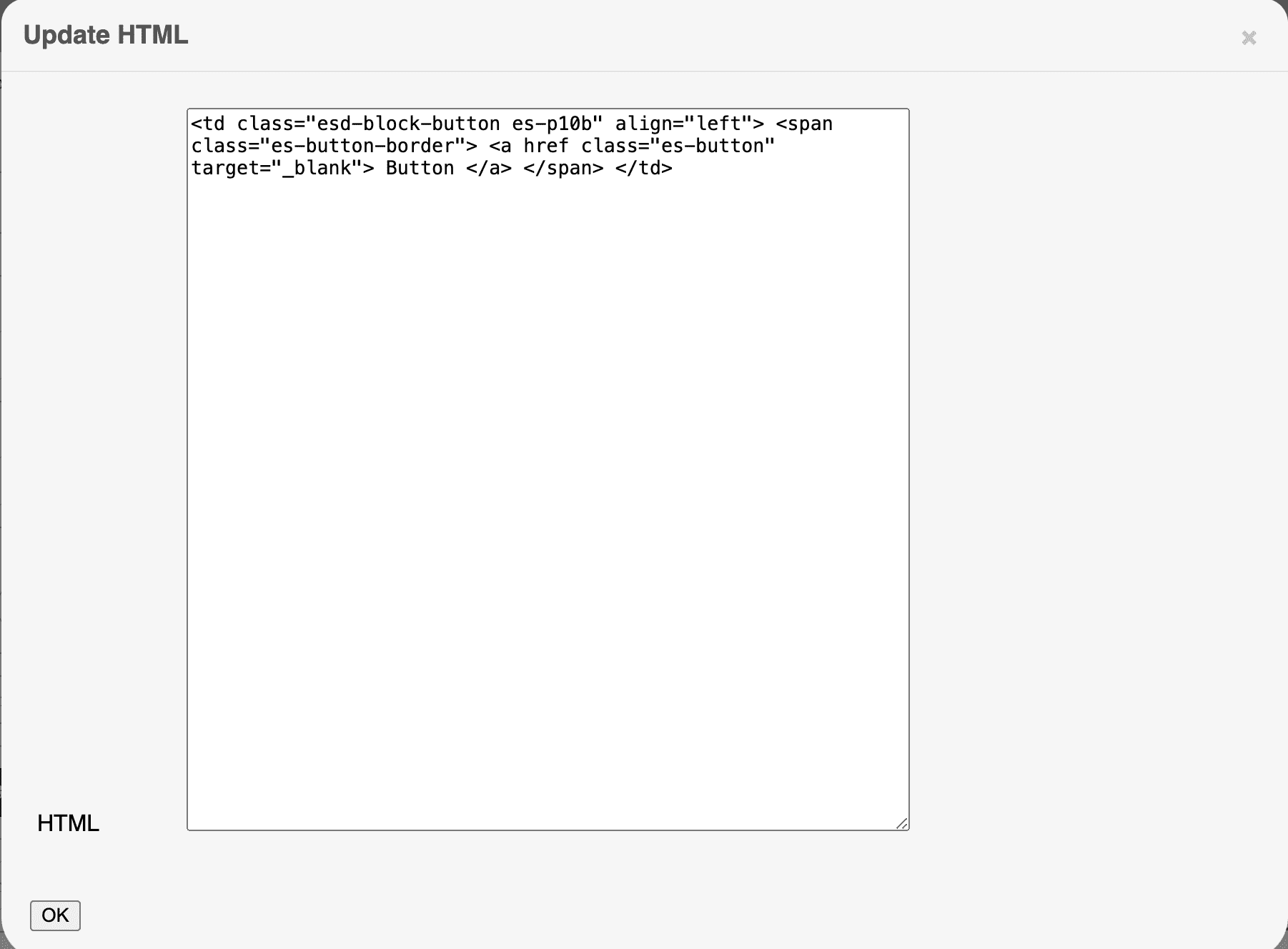
Helpers
How to Call the showAmpErrorsModal Function
Some errors may appear when users work on their emails. In order to notify your users about such errors and help them fix the bugs, the showAmpErrorsModal function is at your service.
Please see the example of how to call the showAmpErrorsModal function
below:
showAmpErrorsModal(
    ampErrors,
    [
        {
            text: 'Preview',
            action: () => {console.log('"Preview" button clicked');}
        }
    ],
    () => {console.log('"Close" button clicked');},
    () => {console.log('"Fix in Code Editor" button clicked');}
)
If you have set the option to display the code editor codeEditorButtonId,
the “Fix in Code Editor” button will also
be displayed:
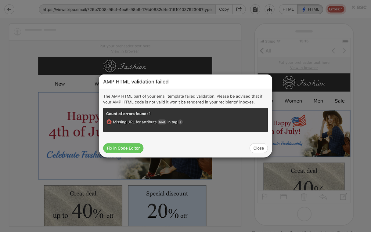
Upon a click on this button, the preview window will be closed and the code editor will get opened instead. If you want anything else (not the code editor) to open upon a click on this button, then pass the 4th parameter to this function.
Once the “Close” button is clicked, you can add a callback function with the
3rd parameter, as well.
Upon a click on the red badge displayed on the code editor panel, the previous AMP errors
will be displayed.
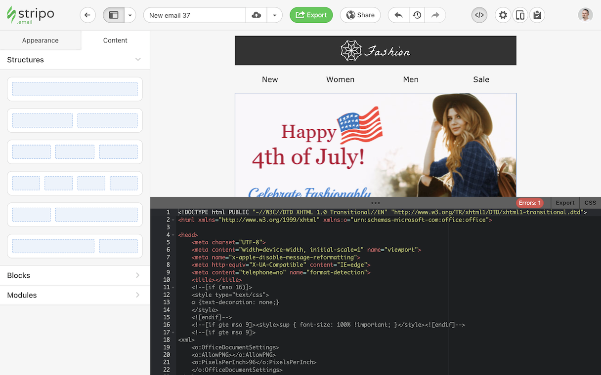
To run the email code validation again, the user has to click on the “Repeat check” button.
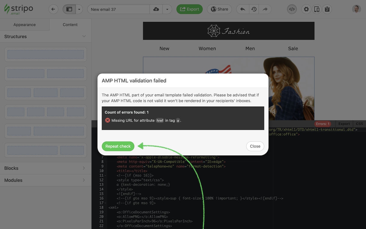
In case, no errors received once the email code validation check is completed, the editor will display the success notification message in the preview window as shown below:
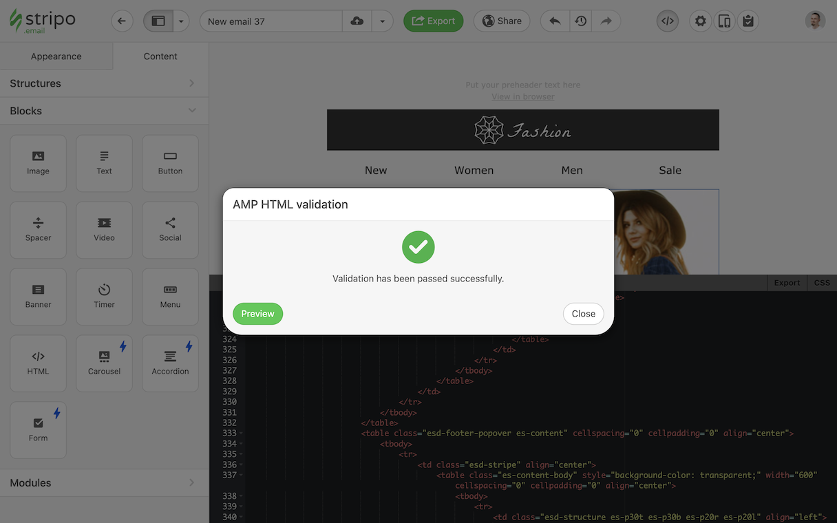
If you want to display your custom buttons in this window, make sure you have passed them to the second parameter of the “showAmpErrorsModal” function. In our example above, we passed the “preview” button that triggers opening the preview mode on an external application.
If the second parameter is empty, the only “Close” button will be displayed.
Configuration of AWS S3 Storage
To create custom AWS S3 storage, you need to:
- Create an Amazon AWS account.
- Create an IAM user with S3 bucket permissions.
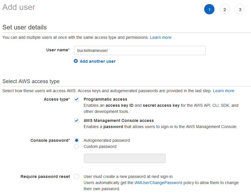
-
Create IAM policy:
{
    "Version": "2012-10-17",
    "Statement": [
        {
            "Sid": "VisualEditor0",
            "Effect": "Allow",
            "Action": [
                "s3:GetObject",
                "s3:PutObject",
                "s3:GetBucketCORS",
                "s3:DeleteObject",
                "s3:ListBucket"
            ],
            "Resource": [
                "arn:aws:s3:::bucketname",
                "arn:aws:s3:::bucketname/*"
            ]
        }
    ]
}
Please be advised that you should replace the
bucketnamevalue with the name of your bucket created in your AWS account.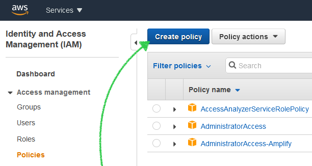
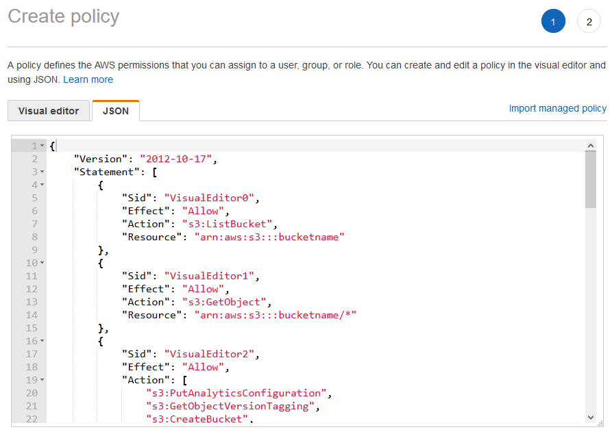
- Assign the created policy to the IAM user:
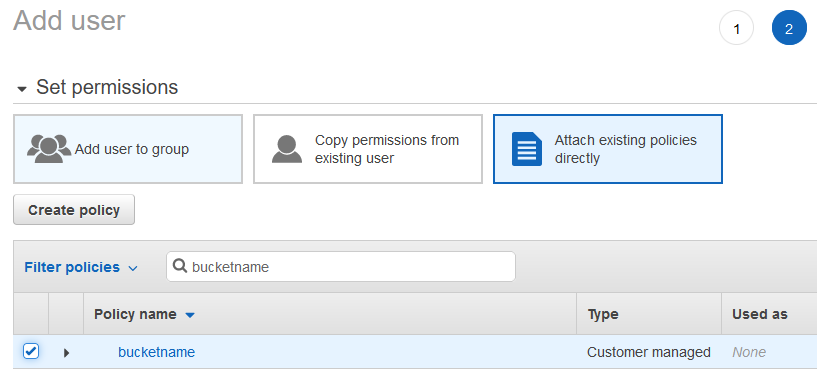
-
Create access key:
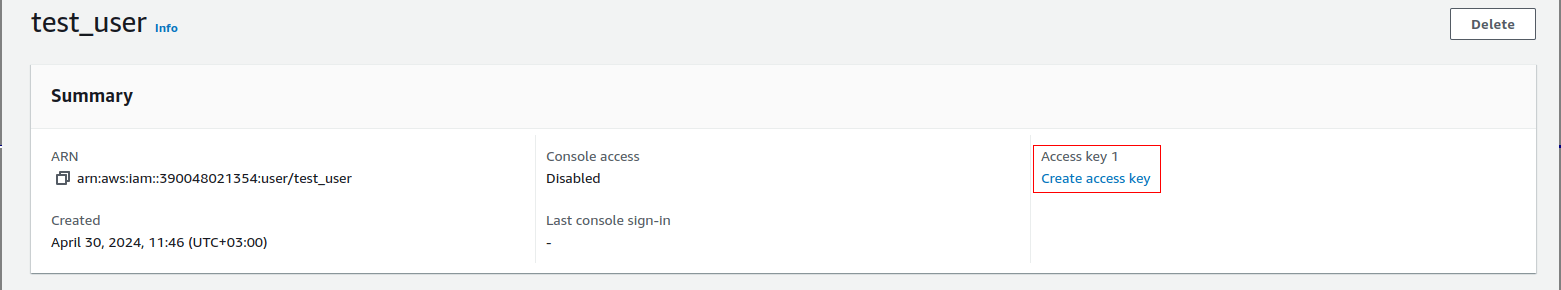
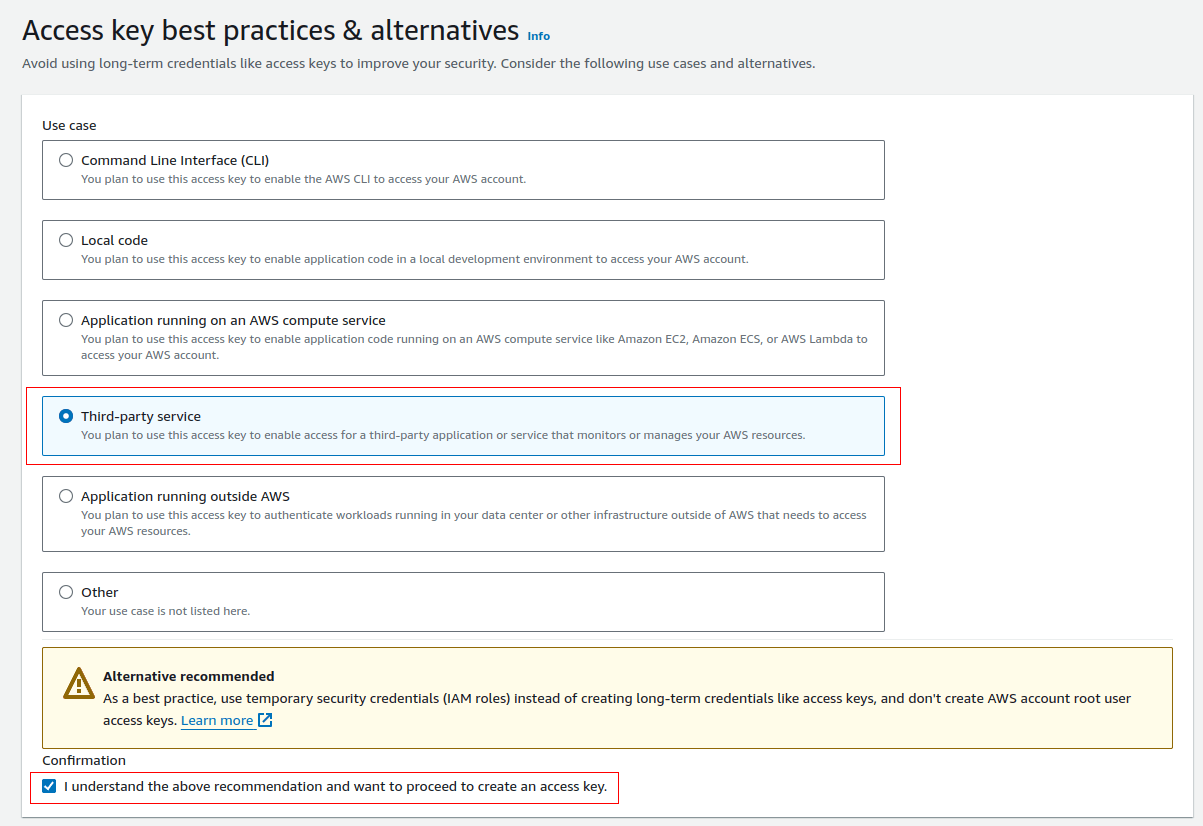
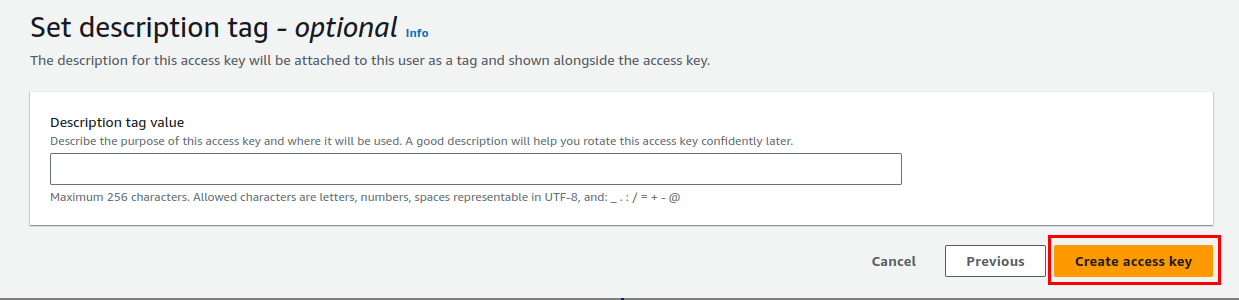
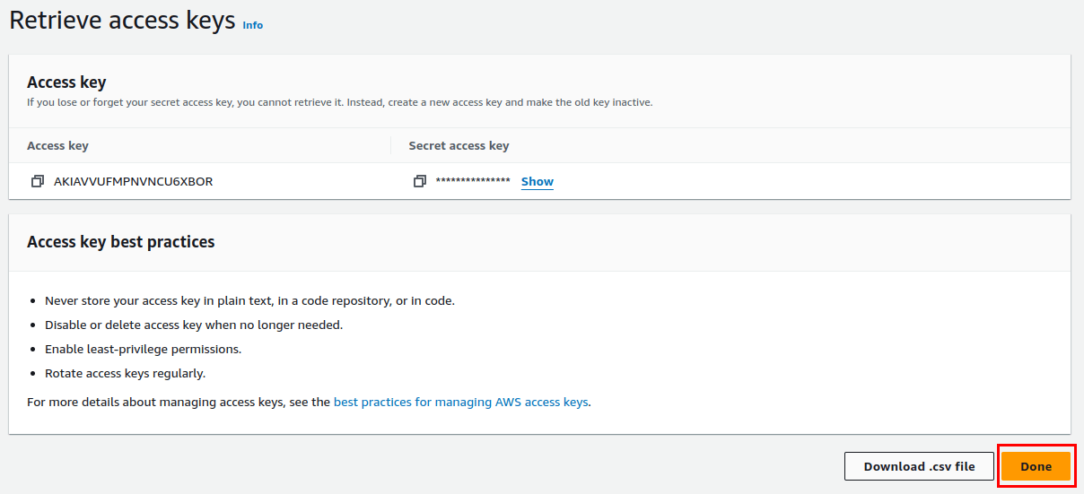
- Create the S3 bucket with a necessary custom name and in a necessary region:
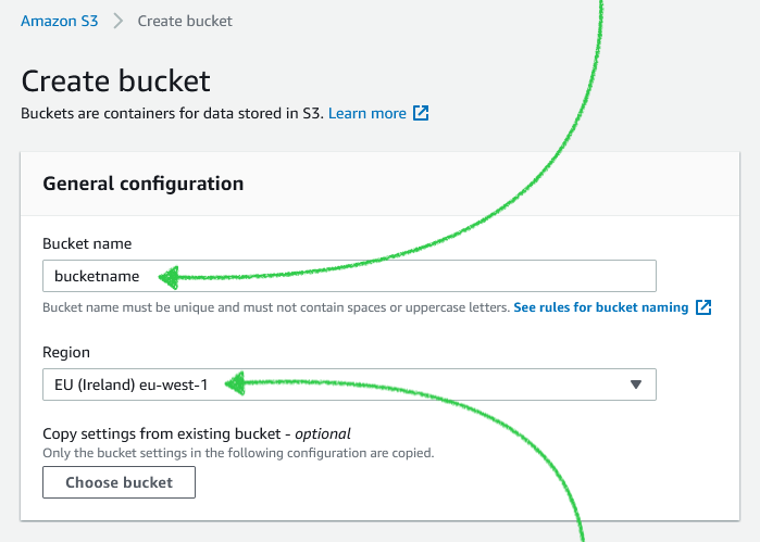
- Choose Static website hosting and index document index.html:
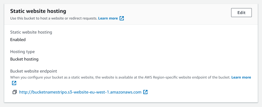
- Set Bucket permission policy.
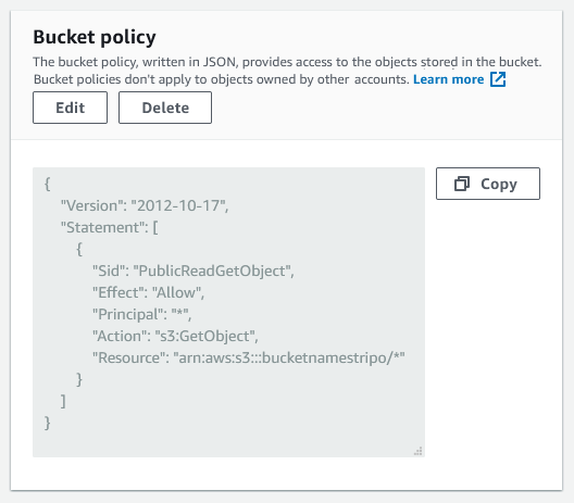
{
    "Version": "2012-10-17",
    "Statement": [
        {
            "Sid": "PublicReadGetObject",
            "Effect": "Allow",
            "Principal": "*",
            "Action": "s3:GetObject",
            "Resource": "arn:aws:s3:::bucketname/*"
        }
    ]
}
Please be advised that you should replace the
bucketnamevalue with the name of your bucket created in your AWS account. -
Use the example below to generate a Base Download URL:
For example:https://{bucket}.s3.{region}.amazonaws.combucket- bucketnameregion- eu-west-1 (Ireland)
https://bucketname.s3.eu-west-1.amazonaws.com - Deactivate Objects from the bucket permissions:
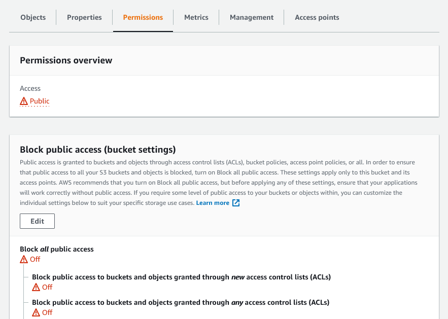
-
Use the following items below only if the connection is not configured directly to the AWS bucket, but if nginx is used as a proxy.
-
Add settings to web server, e.g., nginx: Optional
location /content { add_header 'Access-Control-Allow-Origin' '*'; proxy_pass http://{{ S3_BUCKET_URI }}/; proxy_redirect off; } - Enter “YOUR_DOMAIN_ADDRESS/content” as “Base Download URL” when you configure the Plugin settings. Optional
-