Streaming platforms have turned their emails into a vital part of the viewing experience. Every message now reflects a viewer’s habits, what they have watched, paused, or saved. These behavioral triggers keep audiences engaged long after they leave the app.
In this review, we take a closer look at an example of a real Netflix email and see what makes it effective. Then, we explain how to recreate the same professional structure and functionality using Stripo’s tools.
We focus on four essential areas that define every successful streaming campaign: usability, design, accessibility, and copy.
First impression and usability
What subscribers notice first often defines whether they continue reading or click away. Netflix’s “Because you watched Project Power” email shows how clear hierarchy and personalization can make a message feel personal yet simple to navigate.

(Source: Stripo’s template)
Header and personalization
The greeting “For Smiles Davis” instantly signals that this message is made for a specific viewer. This small detail builds recognition and strengthens the connection with the brand.
How to do it in Stripo:
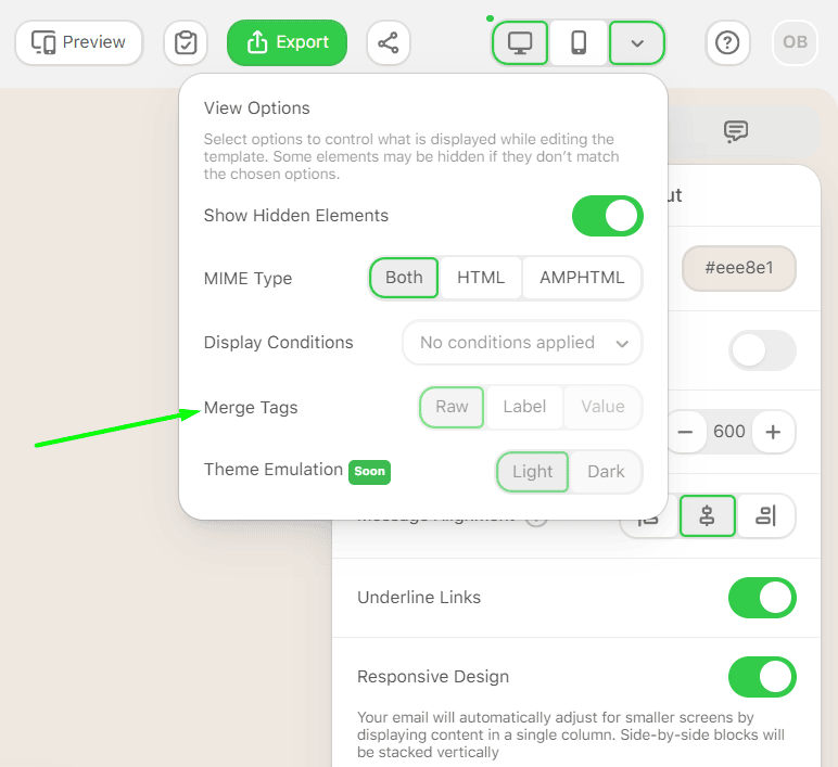
Use merge tags to insert subscriber data such as name, plan type, or region. Combine this with display conditions to show different versions of the same email based on country, language, or device type. The ESP processes these conditions at the moment of sending, so every subscriber sees only what fits them.
Clear purpose and layout flow
The subject line “NEW suggestion because you watched Project Power” gives context right away. It tells the subscriber why they received the email and what to expect inside.
The layout follows a natural sequence: hero → description → CTAs → recommendation rail → footer. Each section has a clear function and guides the reader through the message without confusion.
How to do it in Stripo:
Create a modular structure that mirrors this layout. Start with a hero banner, add text and CTA blocks, and end with a content rail and a simple footer. Save each element as a module for future campaigns.

Core usability elements
|
Element |
Why it matters |
How to build it in Stripo |
|
Web version link |
Helps when email clients block images or layout rendering |
Insert via “Special links” → view in browser |
|
Clickable images |
Increase clicks and match the way recipients explore content |
Use the “Image” or “Banner block” and link directly to titles |
|
Clear CTA buttons |
Guide attention to one main action |
Customize the “Button block” with brand colors and hover effect |
|
Social icons |
Optional, but useful for sharing or following |
Add the “Social block” and predefine networks in your brand settings |
Design and brand consistency
A strong streaming email looks and feels like an extension of the platform itself. Netflix achieves this by mirroring its in-app interface through layout, color, and typography. This familiarity builds trust and helps subscribers recognize the brand instantly.
Visual hierarchy and consistency
The Netflix palette of black backgrounds, red buttons, and white sans-serif text follows the same structure viewers see on screen. Each element has a purpose: dark backgrounds draw attention to the visuals, while red buttons stand out as clear calls to action.
How to do it in Stripo:
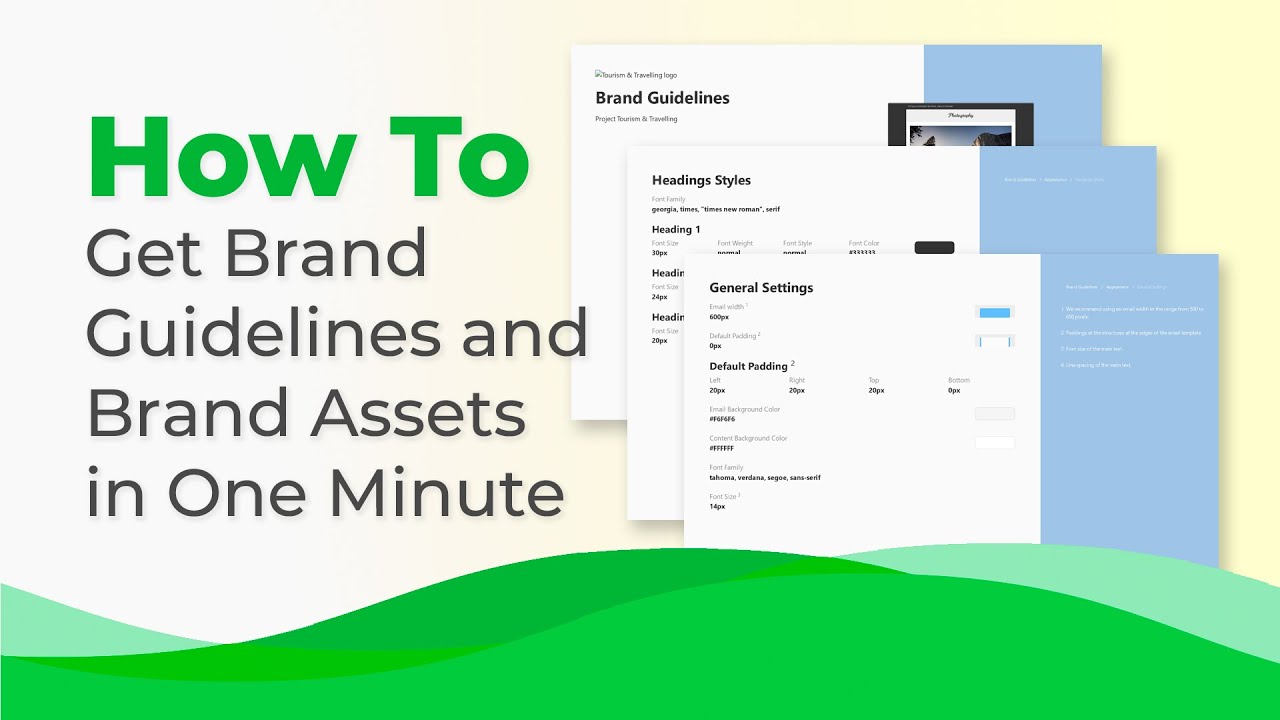
Set these design rules once in “Appearance”. Define background color, font family, and button styling so every new email stays consistent. Save the setup as a Brand Guidelines kit to keep your design system ready for future campaigns.
You also might be interested:

Responsive and mobile design
The Netflix layout uses one column, generous spacing, and large touch-friendly buttons that stack neatly on smaller screens. It reads smoothly without zooming or horizontal scrolling.
How to do it in Stripo:
Use the Mobile settings preview to adjust padding, alignment, and image scaling for smartphones. Toggle between desktop and mobile views to confirm that CTAs and images remain legible and easy to tap.

Dark mode readiness
Because Netflix’s interface is already dark, the email works naturally in both modes. The black background prevents color inversion and keeps text readable even when a client switches to dark display settings.
How to do it in Stripo:
Enable dark mode adjustments in the editor. Add alternate logo versions for light and dark backgrounds, and test both with the built-in preview before sending.
Reusable design structure
The same combination of hero image, recommendation rail, and footer can appear across many campaigns. This modular system shortens production time while keeping every message visually aligned.
How to do it in Stripo:
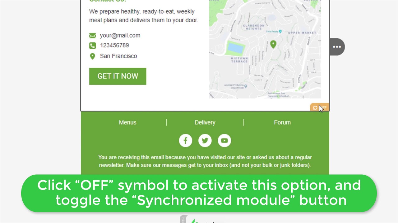
Save these recurring parts as synchronized modules. Any change you make, such as updating the footer or background, automatically applies to all templates that use the same module.
Email accessibility checklist
Accessibility ensures that every subscriber can read, navigate, and interact with an email, regardless of device, client, or visual ability. Netflix’s “Because you watched” email follows many of these principles naturally: simple layout, strong contrast, and clear hierarchy. When recreated in Stripo, each of these points can be configured directly in the editor.
|
Accessibility factor |
Description |
Stripo implementation |
|
Left-aligned copy |
Easier to read on mobile and with screen readers; avoids uneven spacing |
Align all text blocks to the left in the editor |
|
Sans serif font |
Improves legibility, especially at smaller sizes |
Set a sans serif family (Arial, Helvetica, or Inter) in “Global Styles” |
|
Text readability |
Comfortable reading experience with enough white space |
Adjust line height to 150% in the typography settings |
|
Color contrast |
White text on a black background meets WCAG 2.1 AA standards |
Use contrast checker tools before sending |
|
Alt text for images |
Describes visuals for screen readers and when images are turned off |
Add meaningful alt text to every Image block |
|
Role attributes |
Decorative visuals should be ignored by assistive tech |
Add role="presentation" in Stripo’s HTML view for non-informative images |
|
“lang” attribute |
Helps screen readers pronounce content correctly |
Add lang="en" or your target language in email settings |
|
Single-color backgrounds |
Prevents dark mode inversion or gradient distortion |
Apply solid color fills in container styles instead of complex backgrounds |
Stripo’s accessibility setup aligns with the Email Markup Consortium recommendations, addressing most issues at the code level. This means designers can build fully compliant templates without touching raw HTML, while still keeping control over structure and semantics.
Copy and compliance
Strong copy keeps attention and guides action, while proper compliance ensures the message remains trustworthy and legally sound. Netflix’s recommendation email balances both by speaking in a simple, action-driven tone and maintaining a clean, regulation-ready footer.
Text structure and tone
The email uses short and direct sentences. The headline immediately connects to the subscriber’s viewing habits, while every CTA leads to a single next step.
- headline: Concise and relevant to recipient behavior (“New suggestion because you watched Project Power”);
- buttons: Use simple verbs such as Play, My List, or Play Trailer, removing friction between intent and action;
- descriptions: Set the mood without cluttering the layout, using a few adjectives like Rousing, Heartfelt, or Exciting.
How to do it in Stripo:
Use our AI Assistant to generate alternative tone options for titles, buttons, or microcopy. Then review and edit manually to match your brand’s voice and ensure the text stays natural and concise.

Footer compliance essentials
|
Required element |
Purpose |
Stripo feature |
|
Unsubscribe link |
Required under CAN-SPAM for quick opt-out |
Insert via “Special links” → “Unsubscribe” |
|
Physical address |
Confirms sender identity and legitimacy |
Add a “Text block” with your company’s postal address |
|
Privacy or help links |
Build trust and meet privacy regulations |
Use a text + “Links block” with URLs to support or privacy pages |
|
Reason for email |
Optional for U.S.-based messages |
Add a short sentence or merge tag if targeting other regions |
When these elements are included, the email stays both professional and compliant. Stripo’s prebuilt footer modules already contain placeholders for most of them, which can be synchronized across templates to simplify updates.
How to recreate this email in Stripo
Building a streaming-style recommendation email in Stripo takes only a few steps. Each part of the Netflix “Because you watched” layout can be replicated using tools inside the editor.
1. Start from a blank template
Open a new email in Stripo and set the background color to black with white default text. This keeps the look consistent with streaming app interfaces.
2. Add a header with personalization
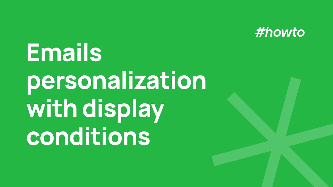
Insert a text block for the greeting and include a merge tag such as {{FirstName}} to display each subscriber’s name dynamically. You can also use display conditions to adjust content by region or subscription plan.
3. Build the hero section
Use a “Banner block” for the main show image. Make it clickable and link it directly to the video page. Add a simple “Play” button over the image to encourage immediate action.
4. Add text and metadata
Below the hero, place a “Text block” with short details like genre, release year, or a brief description. Keep sentences short and scannable.
5. Create CTA buttons
Insert a “Button block” and set the color to #E50914. Adjust the size and padding for both desktop and mobile. Duplicate the button for extra actions such as “Play Trailer” or “My List.”
6. Build a recommendation rail
Add a multi-image structure to show other titles. Each image should link to a content page. Save this section as a module so you can reuse and update it in future campaigns.
7. Add a footer
Include an unsubscribe link, company address, and help links. Save this as a synchronized module so any future changes to compliance details apply automatically across all templates.
8. Check accessibility and dark mode
Confirm the text, buttons, and icons remain clear. Review line spacing and color contrast using the accessibility checklist before testing.
9. Run QA tests
Launch Email on Acid directly from Stripo’s testing tab. Review how the email appears in Gmail, Outlook, Apple Mail, and other clients. Pay attention to image-off states and mobile stacking.

10. Export to your ESP
Use one-click export to send the template to your platform (WhatCounts, Netcore, Constant Contact, Pubrio, or another). If this email is part of a recurring campaign, select “Replace existing” to update the running version automatically.

Make sure to check out our email review where we compared emails from two iconic entertainment giants, Netflix and HBO.
Key takeaways
- Streaming emails work best when they feel personal, visually clear, and easy to navigate.
- Every design decision should match the platform’s interface, creating instant recognition for the subscriber.
- Accessibility and mobile optimization are not optional; they directly affect engagement and retention.
- Stripo’s synchronized modules, display conditions, and integrated testing tools make it simple to recreate and scale streaming-style campaigns without losing consistency.
Wrapping up
Streaming platforms rely on personalized design because every well-timed email brings viewers back to watch more. With Stripo, marketers can build emails that follow the same logic: relevant content, clean design, and precise targeting. From behavior-based recommendations to reusable, modular templates, Stripo gives teams a complete setup for scaling campaigns while keeping the brand look and feel consistent.


0 comments