
Great examples of black and white emails to inspire your campaigns


People get tired of the information overload: they feel overwhelmed by the volume of news, events, and other details demanding their attention each day is too high. An inbox overflowing with emails can also become a source of irritation. Statistics show that 40% of email recipients have at least 50 unread messages in their inboxes. In response, minimalist email design has emerged as an effective way to reduce visual clutter and improve the subscriber experience.
In this article, we’ll explain and illustrate how and when to use minimalist email design. We’ll break down what black-and-white emails are and what makes them effective, discuss accessibility in black-and-white email layouts, and showcase best practices for this type of communication.
What is a black and white email design, and why do marketers use it?
Black-and-white email design refers to emails in which the focus is on simplicity, minimalism, and the importance of the text itself. Black and white is also a universal color combination that can be used when a brand or product’s colors don’t work well together in an email layout.
If you are interested in the psychology of other colors, watch our video “Color psychology in emails,” where we break down each color and what it can mean for a brand.

Minimalist emails, in both design and content, are easy to keep short and clear. They usually have a specific purpose and a single CTA. This helps the recipient make a decision quickly. Such emails are also easier to optimize for mobile, which is a crucial aspect of the design interface.
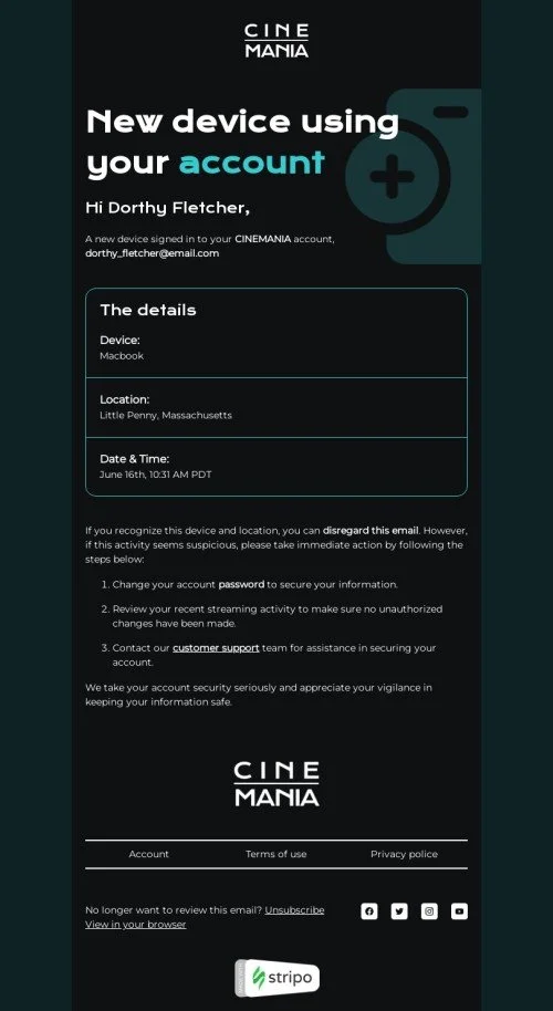
Did you know that 40% of subscribers view emails in dark mode? So, black-and-white design isn't just about visuals; it's about prioritizing the customer experience.
Black and white emails are effective due to the win–win option for dark themes; you can be sure that such an email will display perfectly for recipients with dark mode. It’s important to note that this color scheme makes it possible to clearly structure the content and direct the reader’s attention to the necessary elements, including the CTA. Additionally, this type of email is easier to create and test, which reduces the time required to build a campaign and allows you to focus more on its content.
That said, you may need to consider whether this format aligns with your brand’s colors and complies with your brand guidelines.

Oleksandr Dieiev,
The key features of minimalist emails are carefully crafted text with few (if any) trigger words and the absence of aggressive design, large images, and an excessive number of links. This will significantly increase the chances that your email will reach the recipients’ inboxes and actually be read.
Black and white email examples and what makes them effective
Brands often choose black-and-white design for its aesthetics and the way it emphasizes brand attributes on a monochrome backdrop. Let's take a look at the best examples of such aesthetics.
1. Ecco
Choosing the right shades of black can do wonders for your design. Ecco shows how to combine different shades of black to make the email look luxurious and classy.

(Source: Email Love, email from Ecco)
2. Bosca
Black-and-white design doesn’t mean you have to completely avoid other colors. Find an accent (using a brand color or a product highlight), and it will stand out even more against the minimalist background.

(Source: Email Love, email from Bosca)
3. Victoria’s Secret
Not all black-and-white designs consist of black and white only. Many variations are possible: images or individual elements can be painted blue, orange, green, and so on.

(Source: Email from Victoria’s Secret)
How can you build this email element with Stripo?
It’s easy as 1-2-3:
- drag the banner block in your email;

- apply a grey filter to your banner image;

- then upload an image with your value offer as an additional image;
- add your URL to the entire banner.


4. Moschino
Even an abandoned cart email can be made elegant and stylish.

(Source: Email from Moschino)
5. Great Jones
A dark or white background offers a stronger contrast, which makes email text easier to read. Add some key text and a clear CTA, and your email is ready to go.

(Source: Email from Great Jones)
6. Aritzia
In this email, the white background provides more brightness and lightness in general, and doesn’t just fill the space. Such options are easier on the eyes.

(Source: Email from Aritzia)
7. AirPods Pro
A black background, a white product, and a single colorful CTA button for the perfect balance direct the customer’s attention to what matters most.

(Source: Email from Apple)
You can find a similar layout among the Stripo dark email templates.
8. Tom Raffield
When you are going to share something personal, why not go with a grayscale design? It’s a way to transmit emotions; it makes your emails cozy. It seems like the Tom Raffield team is sharing something personal and emotional.

(Source: Email from Tom Raffield)
9. Belle & Bloom
Adding monochrome clipart images can make your emails appear more polished and high-end.

(Source: Email Love, email from Belle & Bloom)
In my opinion, black and white emails are a good design option for important triggers (transactional emails, password changes, etc.) and notification emails. The email should not contain anything superfluous, only information. It will also look more congruous with professional services (legal, finance, real estate) and minimalist tech and SaaS.
Oleksandr Dieiev,
Use any of our 1650+ prebuilt email templates as a base for your future campaigns.
Accessibility in black and white email layouts: contrast, fonts, legibility
So, what tips should you follow to ensure your email projects meet all accessibility requirements?
- avoid pure black and pure white;

(Source: Email from Venngage) - ensure sufficient contrast. Contrasting colors or strokes for the button will make it stand out more;


- use readable fonts and sizes;
(Source: Email from Mango) - use alt text for images and GIFs, and make them meaningful.
Learn how to make your emails fully accessible in this article.
Design best practices for black and white emails
And a few more ideas on how to make your minimalist email design unique:
- ensure full readability and accessibility without relying on color;

(Source: Email from Nisolo) - use emojis and email icons to add emotion or highlight details;


(Source: Email Love, email from Brilliant Labs)
On a white background, minimalist emojis look neat and don’t distract from the email’s message.

(Source: Email Love, email from Huel)
- keep the layout clean and structured to enhance UX;

(Source: Pinterest) - maintain consistent branding through typography and tone of voice;

(Source: Canva) - black and white icons create a modern email design with a universal feel while adding aesthetics to the email;

(Source: Email Love) - monochrome email icons work well when you want a clean, up-to-date design aesthetic;

(Source: Email Love) - optimize your emails for both dark and light mode environments;

(Source: Email Love, email from Polestar)


We explain more about email optimization for dark mode in this article.
- test emails across devices to ensure clarity in grayscale rendering;

(Source: Pinterest)

Interesting facts about black and white emails
1. Black and white email clipart images are available for free download.
You can download free clipart from many websites. But when you want to download any free items, make sure to check the website licenses. Sometimes you can use clipart for free if it’s only for your personal needs, but payment is required when using it for commercial purposes.
2. Some people believe that, without color or key visuals, black-and-white emails offer fewer opportunities to highlight brand identity.
That may be true, but not always. As you have seen in the examples in this blog, a monochrome email campaign can sometimes reflect a brand’s values very well, even without a vivid logo. And you can always keep a bright accent on a monochrome background; this kind of design looks great too!
3. Using a monochrome palette can instantly elevate an email’s aesthetic and make it feel more upmarket.
Just take a look at the examples above. Emails can look very different depending on how you use the range of possibilities available in a black-and-white palette. So it’s all up to you.
Tips for grayscale email design
- try using high-contrast typography to guide the recipient’s attention;

(Source: Email Love, email from DKNY) - add clear, descriptive CTAs with strong verbs;

(Source: Email Love, email from Aether) - use bullet points to keep the text scannable;

(Source: Email Love) - increase the font size slightly to compensate for the minimal design;

(Source: Email from Urban Outfitters) - use bold text to highlight key messages;

(Source: Pinterest) - try using simple email icons in outline style;


These can be email icons on a dark background.
![]()
(Source: Email Love)
And email icons on a white background.
![]()
(Source: Email Love, email from xBloom)
- use transparent backgrounds for images;
- add extra spacing between sections.

(Source: Pinterest)
In the article “How to improve your email marketing campaigns with images,” we discuss using pictures in emails in more detail.
Wrapping up
Remember, simple doesn’t mean boring. Black-and-white emails provide plenty of room for creativity. Get inspired by our examples, track the statistics, and don’t hesitate to experiment.


0 comments