Email crash test: Figma
Hello, email fellows. Oleksandra here, ready to start the next crash test. Today I’d like to inspire you with Figma’s newsletter — not because of the recent Adobe-Figma deal, which caused a lot of concerns among designers, but because of its engaging content.

Copy
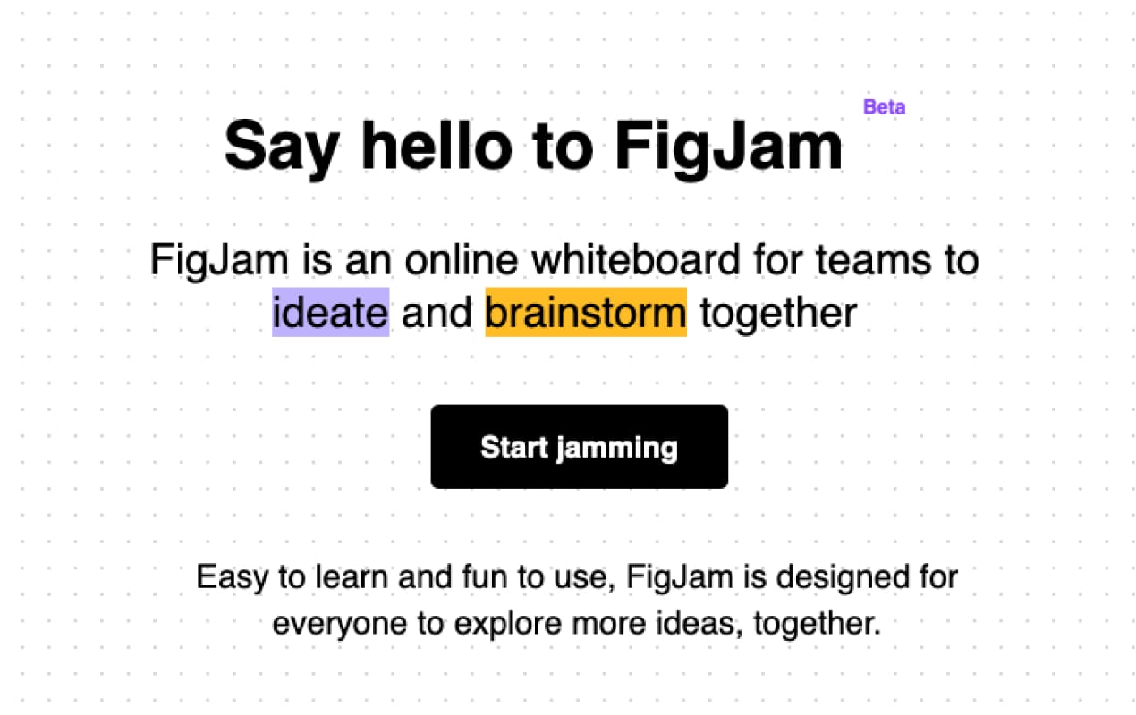
This email opens with a great introduction to a product launch and immediately intrigues readers — even
those who are not Figma users — to discover what it is about. The email’s task is to explain that the online
whiteboard FigJam is made to help designers ideate and brainstorm with their extended teams.
Though the email is long, the Figma team did a great job writing concise copy throughout, using light and
sometimes funny headings. I love when brands focus on engaging audiences by presenting fun content aligned
with their values instead of just selling or promoting.

It can be tempting to stuff everything you want to say into an email. But it’s better to keep things short and sweet. Give people just enough information to decide if they want to know more and entice them with that CTA.
Structure
It's essential to visually structure your emails in ways that increase your click-through rate and limit unsubscribes. Readers should quickly understand the purpose of your email and how it’s relevant to them. Aiming to present FigJam in this newsletter, Figma explains what it is and includes a clear CTA — “Start jamming” — that stands out from the rest of the text.
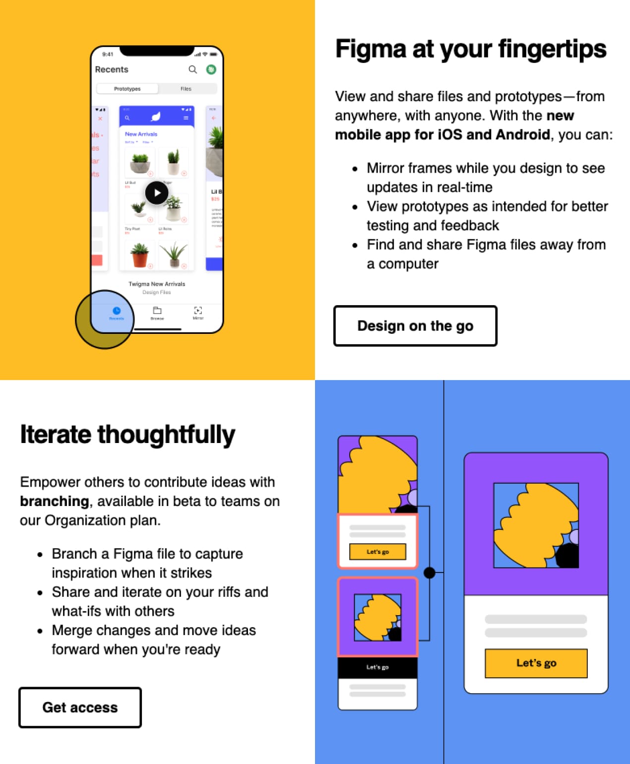
The Figma team also includes a multiple-column section, which makes the email more compact by displaying a lot of content in a relatively small space.
You can save a lot of time designing such emails by using modular email
architecture. To better
understand this approach, visualize your emails as a set of Lego blocks that you can add, rearrange, and
remove as you wish. A modular email template includes several content modules that represent various email
elements, such as headers, product cards, banners, signatures, and footers.
I recommend Stripo’s easy-to-use modular system to save time, maintain brand consistency, and
streamline the design process.
Design
Emails overfilled with pictures or large images are often a one-way ticket to the recipient’s junk mail folder. But this is not the case for Figma’s newsletter. Its eye-catching imagery brings a real depth to the email’s aesthetic.
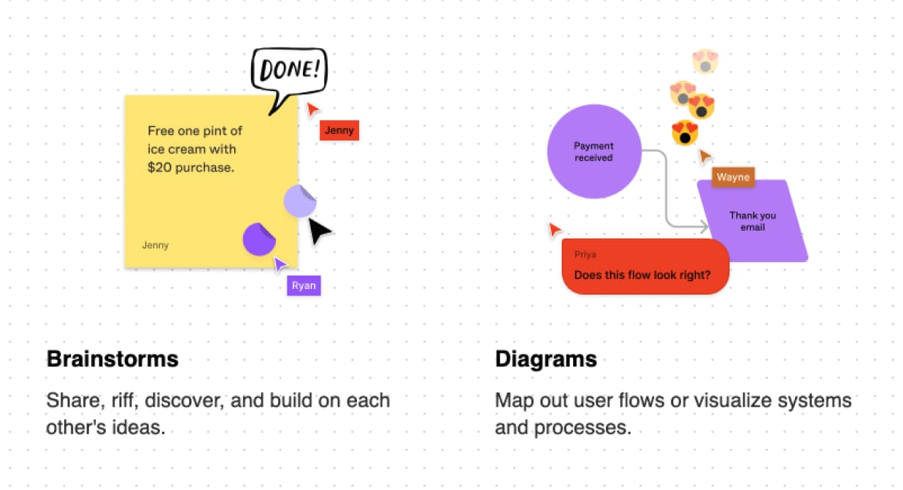
The zigzag design — a great way to break up information — makes the content clear and easy to follow. I’d also like to highlight the dot pattern, which is less boring than a simple white background and recalls the platform’s recognizable background. It’s an excellent way to stay brand consistent. Speaking of which…
Brand consistency
At first sight, even before reading the sender’s name, I immediately knew that this email was from Figma.
The brand maintains a consistent tone across its email marketing channel. Creating a strong brand voice that
aligns with your corporate culture is important.
Your email campaign must include a well-designed logo, a consistent brand color scheme, appealing fonts,
etc. No worries if you haven’t yet created your brand's design styles. Stripo's Brand Guidelines kit
was
designed to help you do that in minutes.
21%
Because 21% of marketing emails are opened within the first hour after delivery, it’s crucial to grab recipients’ attention with brand-consistent subject lines.
Unsubscribe option
Umm, unfortunately, I don’t see any unsubscribe button or link in the Figma email.
Many companies are frightened to let customers leave; however, unsubscribe links are essential in every
newsletter. You must include one for the following reasons:
-
To prevent subscribers from becoming annoyed. Users can report you for sending spam if they don’t see an option to unsubscribe.
-
To follow the law. Unsubscribe links are required by the GDPR rules, the CanSPAM Act, and the Australian Spam Law.
-
To focus on your target audience. Why waste money sending emails to those no longer interested in your company?
Don’t be afraid to give your readers the freedom of choice. By doing so, you’ll ensure you have the most relevant and loyal subscribers.
Final thought
Oleksandra - PR Specialist
The overall appearance of the Figma email is really nice. I enjoyed reading this beautifully designed newsletter. Though a little long, its information is laid out in a way that’s easy to understand and remember. However, Figma failed to include an unsubscribe option. My overall rating is 4.5 out of 5.
My overall rating
is 4.5 of 5
What do you think? I’d be happy to read your feedback. If you have received any emails you think I should choose for my next review, please write me at oleksandra.khlystova@stripo.email.
1 comments