
Email crash test: Italic
Hey there, it’s Oleksandra! Confession time: I’m totally obsessed with review emails. I love reading about other people’s experiences with products, and I think it’s awesome when brands are not scared to show how happy their clients are. But what about the not-so-happy ones? That’s where the support team comes in (cue the hero music).
Anyway, let’s dive into a cool email I found from Italic on Really Good Emails that cleverly pushed its products. Get ready for a dash of inspiration!
Design
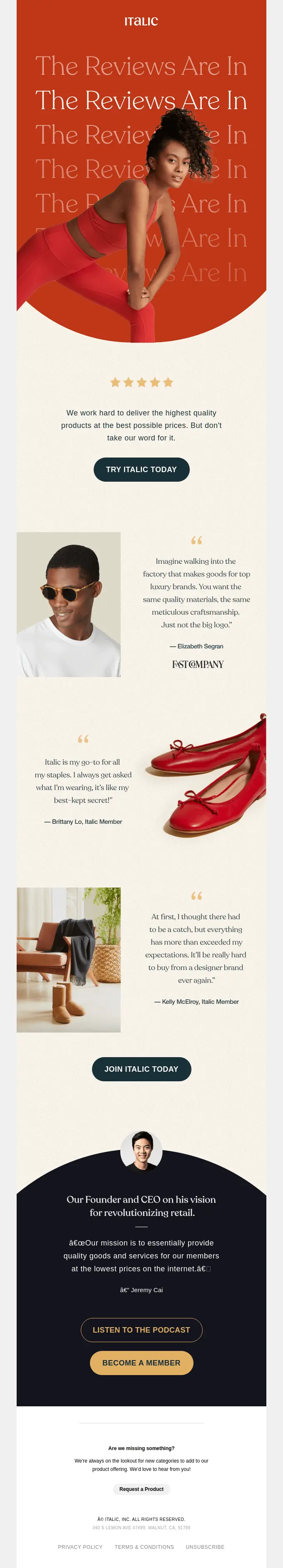
They certainly make it pop with red, don’t they?
At the beginning of the email, Italic used a simple but eye-catching GIF that delivers a clear and simple message to its customers with its striking design. The message is to check reviews about the company. But we’ll talk about copy later. Let’s analyze that design first.
An element that caught my eye was the arch at the beginning. According to Litmus, shapes such as arches and waves are becoming popular in email designs because they grab the reader’s attention and guide them toward important information. In Italic’s case, the arch is a visual cue for subscribers to keep scrolling to read the reviews. It’s a clever design choice that helps keep the reader engaged.
Furthermore, adding good old animation to the email really enabled it to grab subscribers’ attention and entertain them while reading. By using animated text, Italic highlighted the main message.
Just be sure to optimize your GIFs by keeping their size between 500 KB and 1 MB to ensure they load quickly. If the file size is too large, it can slow down the loading time, so compressing the file beforehand can be helpful. Check out our article for more examples of using GIFs in emails.
Copy
Always ask yourself whether you need to include a quote in your email. In this one, it works great. After they shared reviews about their company, Italic increased trust in it by including a quote by the CEO along with his photo.
Quoting your CEO is a great way to add credibility and authority to your message. People tend to respect and trust the opinions and insights of a company’s leader. Furthermore, a CEO’s quote in an email can be a powerful tool for communication and marketing. Just be sure to choose a quote that is relevant to your message and accurately represents your company’s values and beliefs.

The sentence “But don’t take our word for it” in the intro section is awesome. Giving props to the wordsmith wizard in the house!
Also, I like the subject of the email: “It’s Like My Best Kept Secret.” It’s a really interesting choice, but honestly, when I started reading, I wasn’t sure how it related to the content. If you have any thoughts on why they chose this subject, I’d love to hear them. Just put them in the comments below.
Structure
To ensure that your emails aren’t overlooked, it’s important to utilize a solid structure. Italic used a color-blocking style that allowed it to separate the information:
-
Red for grabbing the reader’s attention and for the main message
-
Light beige for the reviews
-
Dark gray for highlighting the CEO’s quote
-
White for additional information and the footer

However, to improve the section, I would add a star-rating scale so that readers can rate the services directly in the email. When clients provide feedback on your products, tools, or services, it’s important that you and your email service provider create short “Thank You” landing pages to acknowledge their feedback and confirm that you’ve received it.
Check out how we did it in our email dedicated to Mother’s Day

The star system is also a good way to encourage more clients to share their feedback on review platforms. Here’s an example:
Accessibility
Italic has center-aligned most of the email’s elements. I reckon they did this so that the reader is guided to focus directly down the middle of the page. While this technique is pretty effective, it’s not good for email accessibility.
As Italic used a GIF in its email, let’s talk about accessibility guidelines. Always add descriptive Alt text to GIFs in a newsletter to assist readers who use screen readers. Also, select GIFs with maximum flashing (two flashes per second or less) and limit each screen to one GIF to avoid triggering seizures in affected readers. Lastly, place the most important image in the first frame of the GIF, as some versions of Outlook may display only the first frame.
To sum up

Lead PR specialist
A well-designed email plays a crucial role in capturing and maintaining readers’ engagement with its content. If readers find it appealing, they are more likely to open your following emails.
The Italic email caught my attention because the company has done a great job by sharing clients’ reviews instead of being too salesy about its products. However, there is still room for improvement.
My overall rating
is 4 of 5
What has your inbox looked like so far this month? Share emails you liked with me via oleksandra.khlystova@stripo.email.

2 comments