An easy-to-follow guide on making an interactive Find Differences game (code samples included)



In this article, we’ll show you how to create an interactive Find Differences game for your emails. You’ll receive all code samples you need, as well as a step-by-step guide to create this game for your newsletter.
Do you want to test your sharp eye? We have something for you that both tests your perception and brings back childhood memories. Find Differences games from the backs of cereal boxes are back, and now they can be placed in any email you want. And we are here to show you the full process of creating this interactive email piece.
How this game works
The principle of this email game is quite simple. There are two pictures side by side that appear to be identical. However, as always, the devil is in the details, namely, the pictures differ in a few small details that you must spot. Clicking on the element that differs marks it with a checkmark. Find five of these differences, and you'll receive a prize on the final screen of the game (which can be anything, but in our example, it's a promo code for a discount).
And that’s pretty much the whole game. It’s simple yet engaging mechanic that allows you to:
- grant different gifts to your customers via an engaging approach;
- tease new products and events by placing “sneak-peek” images of them as the main pictures of this game.
In this article, we will show you in detail how to create a full-fledged game that is compatible with major email clients, so all your subscribers will be able to interact with the game and include the following:
- AMP version of the game;
- kinetic version, built with HTML5 and CSS3;
- fallback version for email clients that do not support interactivity.
Now, let’s get down to our game creation process.
AMP version
First of all, we start our game creation process with a one-column structure that you will need to place in your template and make visible only in AMP HTML.
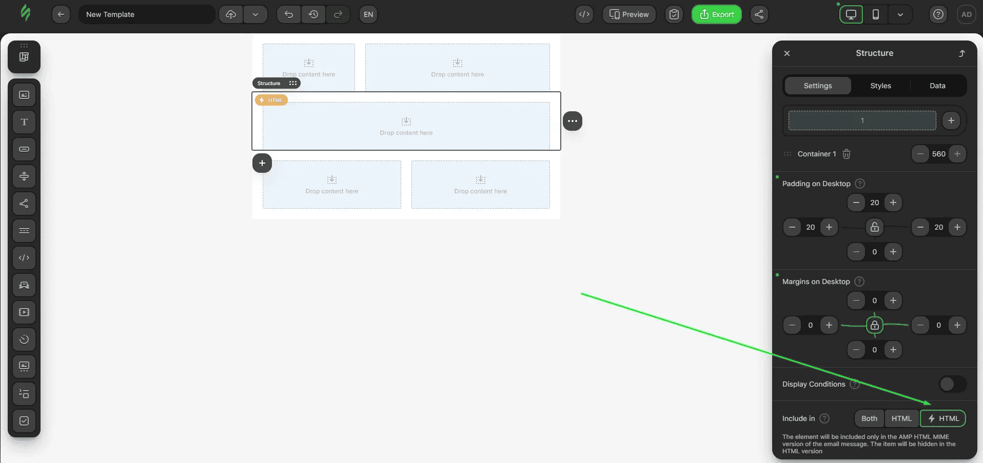
After that, you need to place an HTML block inside and paste this code into the block:
<style amp-custom>
  .game-container div { display: inline-block; width: 49%; position: relative;}
  .game-container label { display: block; position: absolute; top: 0; left: 0; width: 20%; height: 20%; cursor: pointer;outline: 1px solid #000; }
  .game-container .active { background-image: url(https://zlnfb.stripocdn.email/content/guids/CABINET_c5f406ac2c5f802aab99caabbb8964fc82ed152794cd59abbcd605fe51cb82df/images/check3.png); background-repeat: no-repeat; background-position: center; background-size: 70%; }
  .game-container .square-1-2,
  .game-container .square-2-2,
  .game-container .square-3-2,
  .game-container .square-4-2,
  .game-container .square-5-2 { left: 20%; }

  .game-container .square-1-3,
  .game-container .square-2-3,
  .game-container .square-3-3,
  .game-container .square-4-3,
  .game-container .square-5-3 { left: 40%; }

  .game-container .square-1-4,
  .game-container .square-2-4,
  .game-container .square-3-4,
  .game-container .square-4-4,
  .game-container .square-5-4 { left: 60%; }

  .game-container .square-1-5,
  .game-container .square-2-5,
  .game-container .square-3-5,
  .game-container .square-4-5,
  .game-container .square-5-5 { left: 80%; }

  .game-container .square-2-1,
  .game-container .square-2-2,
  .game-container .square-2-3,
  .game-container .square-2-4,
  .game-container .square-2-5 { top: 20%; }

  .game-container .square-3-1,
  .game-container .square-3-2,
  .game-container .square-3-3,
  .game-container .square-3-4,
  .game-container .square-3-5 { top: 40%; }

  .game-container .square-4-1,
  .game-container .square-4-2,
  .game-container .square-4-3,
  .game-container .square-4-4,
  .game-container .square-4-5 { top: 60%; }

  .game-container .square-5-1,
  .game-container .square-5-2,
  .game-container .square-5-3,
  .game-container .square-5-4,
  .game-container .square-5-5 { top: 80%; }

  .result { text-align: center; }
  .result p { padding: 15px 0; }

  @media only screen and (max-width: 600px) {
    .game-container div { display: block; width: 100%; }
  }

  #differences > div { position: relative;height: auto;}
</style>
<amp-list width="auto" layout="flex-item" src="https://amp.stripo.email/v1/list/ytxje/difference-game" id="differences" style="min-height:40px">
  <template type="amp-mustache">
    <div class="game-container">
      <div>
        <amp-img height="270" layout="responsive" src="{{imgFirst}}" alt="" width="270"></amp-img>
      </div>
      <div>
        <amp-img height="270" layout="responsive" src="{{imgSecond}}" alt="" width="270"></amp-img>
      </div>
    </div>
    <div class="result">
      <h2 style="padding-bottom:10px">
        Congratulations!
      </h2>
      <h4 style="padding-bottom:5px;font-size:18px">
        You've scored some amazing discounts!
      </h4>
      <h4 style="font-size:18px;padding-bottom:15px">
        <b>15% OFF</b> your next purchase.
      </h4>
      <h4 style="font-size:16px;padding-bottom:15px">
        Use the promo code <b>PRIZE3</b> on our website.
      </h4>
    </div>
  </template>
</amp-list>
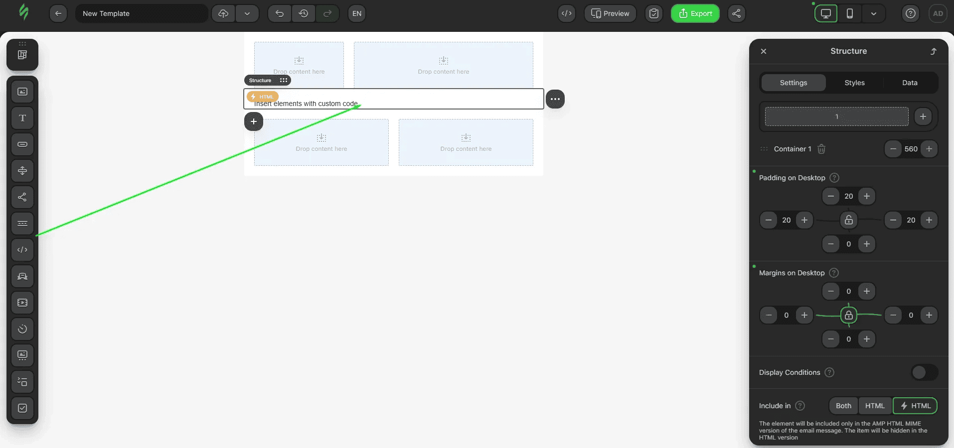
You’ll see a basic layout of the game that looks like this:
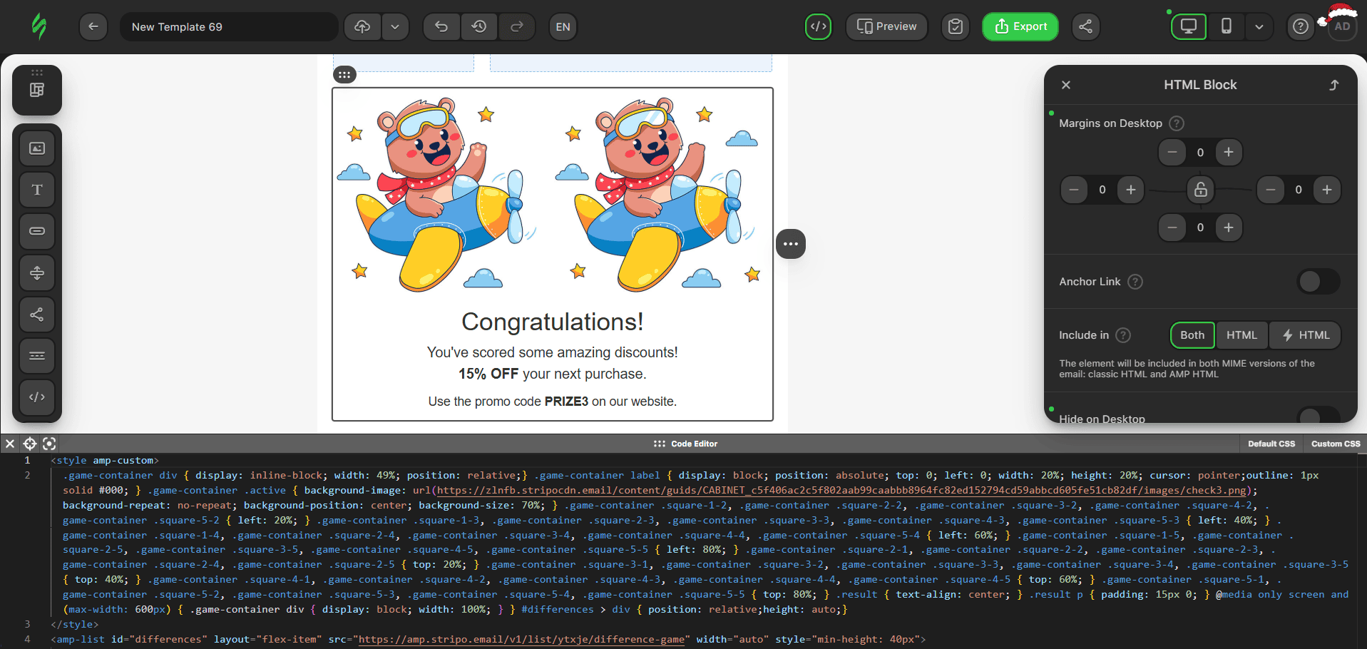
The code currently contains two images and a notification message after the game ends. The images are already differentiated. To allow the recipient to click on the different pieces of the second image, we need to cover it with a 5x5 grid of label tags.
This mechanic uses the amp-list component. It dynamically loads data from a JSON endpoint and displays it in the specified template. Additionally, the amp-list tag always has a template tag.
In our example game, we have a custom JSON file that looks like this:
{
  "items": [
    {
      "imgFirst": "https://zlnfb.stripocdn.email/content/guids/CABINET_c5f406ac2c5f802aab99caabbb8964fc82ed152794cd59abbcd605fe51cb82df/images/find01_5z2.jpg",
      "imgSecond": "https://zlnfb.stripocdn.email/content/guids/CABINET_c5f406ac2c5f802aab99caabbb8964fc82ed152794cd59abbcd605fe51cb82df/images/find02_5cX.jpg",
      "differences": 5,
      "rows": [
        {
          "rowsId": 1,
          "cols": [
            {
              "colsId": 1
            },
            {
              "colsId": 2
            },
            {
              "colsId": 3,
              "check": 1
            },
            {
              "colsId": 4
            },
            {
              "colsId": 5
            }
          ]
        },
        {
          "rowsId": 2,
          "cols": [
            {
              "colsId": 1
            },
            {
              "colsId": 2
            },
            {
              "colsId": 3
            },
            {
              "colsId": 4,
              "check": 2
            },
            {
              "colsId": 5,
              "check": 3
            }
          ]
        },
        {
          "rowsId": 3,
          "cols": [
            {
              "colsId": 1
            },
            {
              "colsId": 2,
              "check": 4
            },
            {
              "colsId": 3
            },
            {
              "colsId": 4
            },
            {
              "colsId": 5
            }
          ]
        },
        {
          "rowsId": 4,
          "cols": [
            {
              "colsId": 1
            },
            {
              "colsId": 2
            },
            {
              "colsId": 3
            },
            {
              "colsId": 4
            },
            {
              "colsId": 5
            }
          ]
        },
        {
          "rowsId": 5,
          "cols": [
            {
              "colsId": 1
            },
            {
              "colsId": 2
            },
            {
              "colsId": 3
            },
            {
              "colsId": 4
            },
            {
              "colsId": 5,
              "check": 5
            }
          ]
        }
      ]
    }
  ]
}
To replace the images with your own, you need to create your own JSON file and replace the link to it in the src attribute of the amp-list tag.
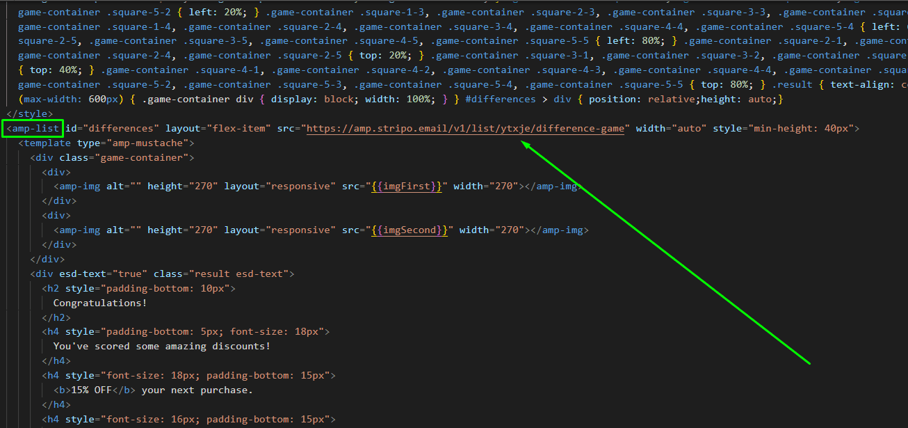
Important note: You can easily create your own JSON file using this guide from our support team
Our JSON contains:
- the imgFirst and imgSecond keys, which contain a link to the image;
- the differences key, which contains the number of different elements;
- the rows object, which contains data about the elements in a 5x5 grid.
To output a variable value from JSON, a special component, amp-mustache, is written in the code. Here's the syntax used for this mechanism:
- {{variable}} is the name of the variable whose value should be output as text is specified in double curly braces;
- {{#section}} {{/section}} is the section tag; it can check for the existence of a variable and iterate over it if it's an array;
- {{^section}} {{/section}} is an inverted tag; it can check for the absence of a variable.
Currently, image links are retrieved from the imgFirst and imgSecond keys using this syntax:

The next step is adding a grid that will track recipients’ clicks.
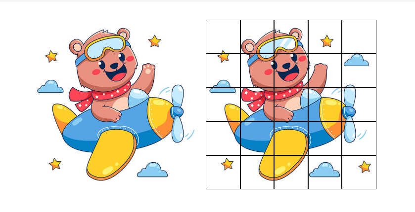
To make things easier to understand visually, we used table logic in the JSON file. We have rows (rows array) and columns (cols arrays), each with its own ID. Some have a check key with an ascending numeric value. We assigned these keys to the cells that overlap the different parts of the image. For example, the third cell in the first column is different and is assigned "check": 1 in the file, then the fourth cell in the second row is assigned "check": 2, and so on.
To do this, we need to display all the cells and add a class with the row ID and cell ID to them, making it easier to position them on the field using styles. It sounds complicated, but in practice, it's much simpler. Here's the code you need to copy:
{{#rows}} {{#cols}} <label class="square-{{rowsId}}-{{colsId}}"></label>{{/cols}} {{/rows}}
And paste it here:

This template will be used for all elements in the array. Since we have two arrays, rows and columns, we specify both, so you need to paste the code we gave you after the second image to make it look like this:

The right image is currently covered with black squares; this frame is temporary to make things easier. We'll show you how to remove it at the end of the game creation process. For now, you can view the right image and ensure that all the different elements are contained within their own squares.

Next, we need to make the squares clickable and display a checkmark (after the recipient clicks) in the different squares. Our JSON file contains check keys, which serve as our reference points.
The first thing we need to do is split the layout into two variants: elements without a check key (they are not clickable) and elements with a check key (they will be clickable).
To do this, we need to change this piece of code that we inserted earlier.

To avoid typing everything in manually, simply copy this code and paste it in place of the highlighted one.
{{#rows}} {{#cols}}
        {{^check}}
        <label class="square-{{rowsId}}-{{colsId}}"></label>
        {{/check}}
        {{#check}}
        <label on="tap:AMP.setState({ state: {points: state.check{{check}} ? state.points : +state.points+1, check{{check}}: true} })" [class]="state.check{{check}} ? 'square-{{rowsId}}-{{colsId}} active':'square-{{rowsId}}-{{colsId}}'" role="button" tabindex="{{check}}" class="square-{{rowsId}}-{{colsId}}"></label>
        {{/check}}
{{/cols}} {{/rows}}
Let's break this code down a bit so you understand what each element does:
- {{^check}} {{/check}} ensures that the code in this block is displayed if the element in the JSON doesn't have a "check" key;
- {{#check}} {{/check}} is the opposite scenario, and the code in this block is displayed if the element in the JSON has a "check" key;
- on="tap:" is the "click" event handler;
- AMP.setState({ })" is a special AMP syntax for creating variables;
- points: state.check{{check}} ? state.points : +state.points+1 is needed to check the variable check{{check}} (instead of {{check}}, 1, 2, 3, and so on will be used). If its value is true, the value of points remains unchanged. Otherwise, 1 is added (on click, the value of the points variable is first incremented, and then check is set to true so that points remain unchanged on a second click);
- check{{check}}: true is needed to create variables check1, check2, check3, etc., depending on the value of the {{check}} key in the JSON for this element, and set it to true;
- [class]="state.check{{check}} ? 'square-{{rowsId}}-{{colsId}} active' : 'square-{{rowsId}}-{{colsId}}'" is a special AMP attribute that changes the class and checks the check variable. If it is true, the 'square-{{rowsId}}-{{colsId}} active' classes are added. Otherwise, only the first class is used;
- role="button" is a required attribute to indicate that the element will be used as a button. In AMP, it is required, along with on="tap:" if the tag to which we add it is not a button.
- tabindex="{{check}}" is responsible for the focus order when navigating between elements using the Tab key. This attribute is required when using on="tap:" if the tag to which we add it is not a button.
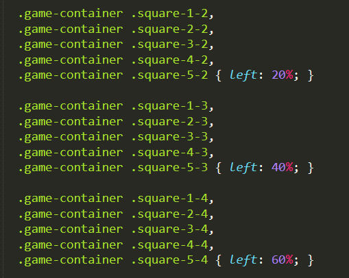
The cell styles are already in the code and look like this. Every second, third, and so on, cell is assigned the same left position:
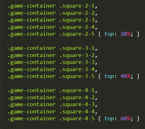
Meanwhile, every second, third, and so on line is given the same top position:
The styles also already specify that the cell with the difference that was clicked is assigned a background image of the check mark:

Next, you need to make the game block disappear at the end and then display the final message. To do this, copy this code and paste it here.
[hidden]="state.points>={{differences}}"

And the block with the result class, which is responsible for the final message, needs to add this code so that the end result is this.
hidden [hidden]="state.points<{{differences}}"
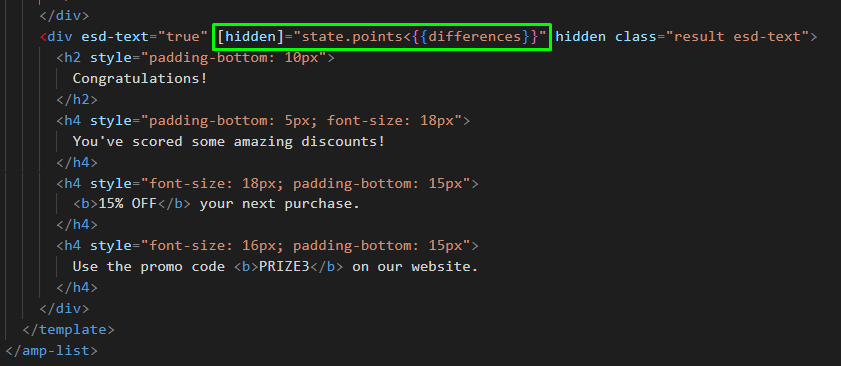
The last thing we need to do is remove the black grid from the image. It's very easy to do; just remove this line from the styles:
outline: 1px solid #000;

The AMP version is set and done. Here’s the full code below so that you can check whether you have done everything correctly according to the guide.
<style amp-custom>
  .game-container div { display: inline-block; width: 49%; position: relative;} .game-container label { display: block; position: absolute; top: 0; left: 0; width: 20%; height: 20%; cursor: pointer;} .game-container .active { background-image: url(https://zlnfb.stripocdn.email/content/guids/CABINET_c5f406ac2c5f802aab99caabbb8964fc82ed152794cd59abbcd605fe51cb82df/images/check3.png); background-repeat: no-repeat; background-position: center; background-size: 70%; } .game-container .square-1-2, .game-container .square-2-2, .game-container .square-3-2, .game-container .square-4-2, .game-container .square-5-2 { left: 20%; } .game-container .square-1-3, .game-container .square-2-3, .game-container .square-3-3, .game-container .square-4-3, .game-container .square-5-3 { left: 40%; } .game-container .square-1-4, .game-container .square-2-4, .game-container .square-3-4, .game-container .square-4-4, .game-container .square-5-4 { left: 60%; } .game-container .square-1-5, .game-container .square-2-5, .game-container .square-3-5, .game-container .square-4-5, .game-container .square-5-5 { left: 80%; } .game-container .square-2-1, .game-container .square-2-2, .game-container .square-2-3, .game-container .square-2-4, .game-container .square-2-5 { top: 20%; } .game-container .square-3-1, .game-container .square-3-2, .game-container .square-3-3, .game-container .square-3-4, .game-container .square-3-5 { top: 40%; } .game-container .square-4-1, .game-container .square-4-2, .game-container .square-4-3, .game-container .square-4-4, .game-container .square-4-5 { top: 60%; } .game-container .square-5-1, .game-container .square-5-2, .game-container .square-5-3, .game-container .square-5-4, .game-container .square-5-5 { top: 80%; } .result { text-align: center; } .result p { padding: 15px 0; } @media only screen and (max-width: 600px) { .game-container div { display: block; width: 100%; } } #differences > div { position: relative;height: auto;}
</style>
<amp-list id="differences" layout="flex-item" src="https://amp.stripo.email/v1/list/ytxje/difference-game" width="auto" style="min-height: 40px">
  <template type="amp-mustache">
    <div [hidden]="state.points>={{differences}}" class="game-container">
      <div>
        <amp-img alt="" height="270" layout="responsive" src="{{imgFirst}}" width="270"></amp-img>
      </div>
      <div>
        <amp-img alt="" height="270" layout="responsive" src="{{imgSecond}}" width="270"></amp-img>
        {{#rows}} {{#cols}} {{^check}}
        <label class="square-{{rowsId}}-{{colsId}}"></label>
        {{/check}} {{#check}}
        <label [class]="state.check{{check}} ? 'square-{{rowsId}}-{{colsId}} active':'square-{{rowsId}}-{{colsId}}'" on="tap:AMP.setState({ state: {points: state.check{{check}} ? state.points : +state.points+1, check{{check}}: true} })" role="button" tabindex="{{check}}" class="square-{{rowsId}}-{{colsId}}"></label>
        {{/check}} {{/cols}} {{/rows}}
      </div>
    </div>
    <div esd-text="true" [hidden]="state.points<{{differences}}" hidden class="result esd-text">
      <h2 style="padding-bottom: 10px">
        Congratulations!
      </h2>
      <h4 style="padding-bottom: 5px; font-size: 18px">
        You've scored some amazing discounts!
      </h4>
      <h4 style="font-size: 18px; padding-bottom: 15px">
        <b>15% OFF</b> your next purchase.
      </h4>
      <h4 style="font-size: 16px; padding-bottom: 15px">
        Use the promo code <b>PRIZE3</b> on our website.
      </h4>
    </div>
  </template>
</amp-list>
Kinetic version built with HTML5 and CSS3
The next thing we need to do is a kinetic version, which can also be called an interactive HTML version, built with HTML5 and CSS3. We’ll start with another empty one-column structure that we place below our AMP version. Select it and pick an “Include in HTML only” option.
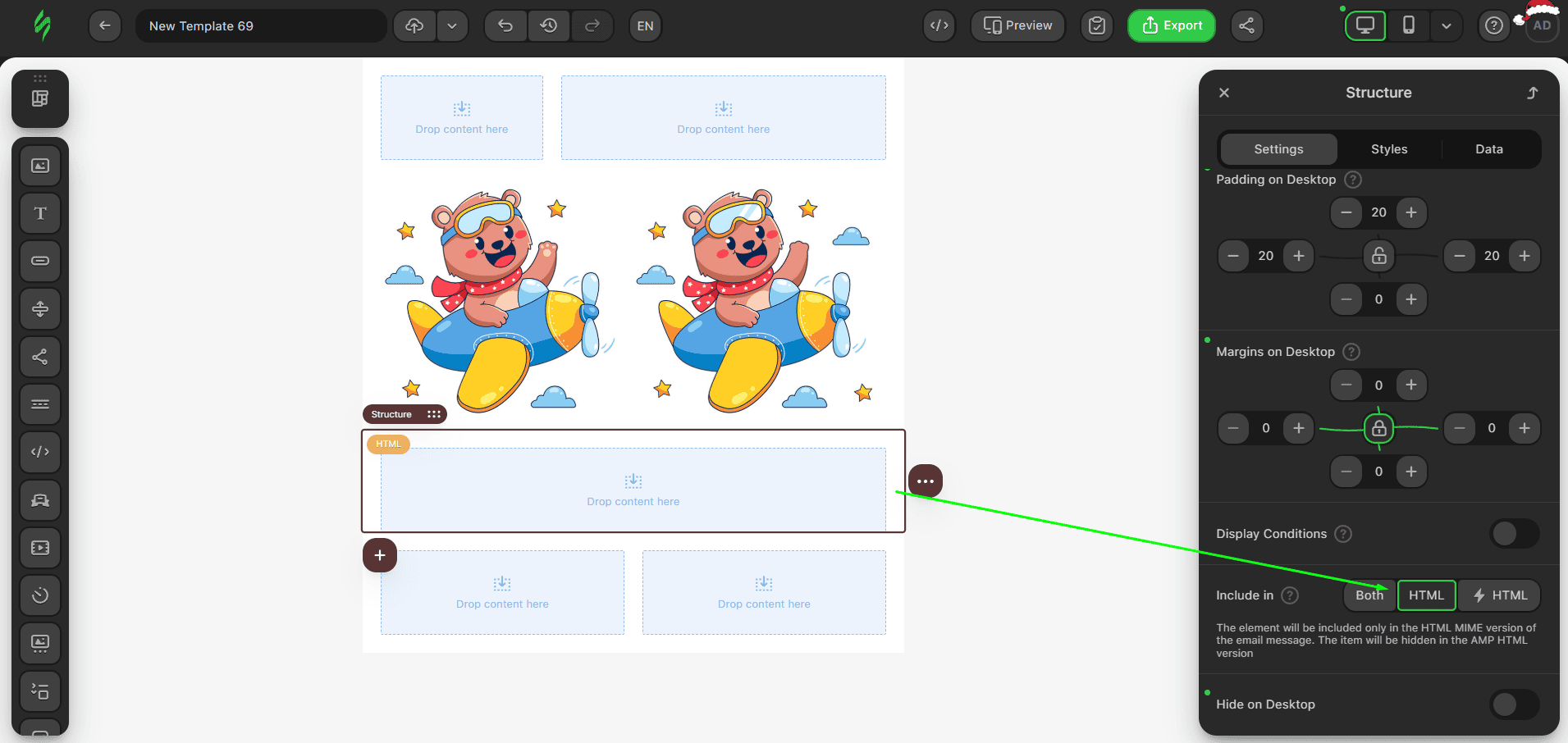
After that, add an HTML block inside this structure and paste this code into the block.
<style>
  .game-container div { display: inline-block; width: 49%; position: relative; } .game-container label { display: block; position: absolute; top: 0; left: 0; width: 20%; height: 20%; cursor: pointer; background-repeat: no-repeat; background-position: center; background-size: 70%; } .game-container .square-1-2, .game-container .square-2-2, .game-container .square-3-2, .game-container .square-4-2, .game-container .square-5-2 { left: 20%; } .game-container .square-1-3, .game-container .square-2-3, .game-container .square-3-3, .game-container .square-4-3, .game-container .square-5-3 { left: 40%; } .game-container .square-1-4, .game-container .square-2-4, .game-container .square-3-4, .game-container .square-4-4, .game-container .square-5-4 { left: 60%; } .game-container .square-1-5, .game-container .square-2-5, .game-container .square-3-5, .game-container .square-4-5, .game-container .square-5-5 { left: 80%; } .game-container .square-2-1 { top: 20%; } .game-container .square-2-2, .game-container .square-2-3, .game-container .square-2-4, .game-container .square-2-5 { top: 20%; } .game-container .square-3-1, .game-container .square-3-2, .game-container .square-3-3, .game-container .square-3-4, .game-container .square-3-5 { top: 40%; } .game-container .square-4-1, .game-container .square-4-2, .game-container .square-4-3, .game-container .square-4-4, .game-container .square-4-5 { top: 60%; } .game-container .square-5-1, .game-container .square-5-2, .game-container .square-5-3, .game-container .square-5-4, .game-container .square-5-5 { top: 80%; } .result { text-align: center; display: none; } .result p { padding: 15px 0; } @media only screen and (max-width: 600px) { .game-container div { display: block; width: 100%; } } #check1:checked~div .check1-label, #check2:checked~div .check2-label, #check3:checked~div .check3-label, #check4:checked~div .check4-label, #check5:checked~div .check5-label { background-image: url(https://zlnfb.stripocdn.email/content/guids/CABINET_c5f406ac2c5f802aab99caabbb8964fc82ed152794cd59abbcd605fe51cb82df/images/check3.png); } #check1:checked~#check2:checked~#check3:checked~#check4:checked~#check5:checked~.game-container { display: none; } #check1:checked~#check2:checked~#check3:checked~#check4:checked~#check5:checked~.result { display: block; }
</style>
  <form>
    <input type="radio" name="check1" id="check1" style="display:none">
    <input type="radio" name="check2" id="check2" style="display:none">
    <input type="radio" name="check3" id="check3" style="display:none">
    <input id="check4" type="radio" name="check4" style="display:none">
    <input type="radio" name="check5" id="check5" style="display:none">
    <div class="game-container">
      <div>
          <img width="270" height="270" src="https://zlnfb.stripocdn.email/content/guids/CABINET_a9928c32e6494fb7e1e20cf040cb8f7be647ae27b2b78b2440b1037be46efed3/images/find01.jpg" alt="" class="adapt-img">
      </div>
      <div>
        <img src="https://zlnfb.stripocdn.email/content/guids/CABINET_a9928c32e6494fb7e1e20cf040cb8f7be647ae27b2b78b2440b1037be46efed3/images/find02.jpg" alt="" width="270" height="270" class="adapt-img">
        <label class="square-1-1"></label>
        <label class="square-1-2"></label>
        <label for="check1" class="square-1-3 check1-label"></label>
        <label class="square-1-4"></label>
        <label class="square-1-5"></label>
        <label class="square-2-1"></label>
        <label class="square-2-2"></label>
        <label class="square-2-3"></label>
        <label for="check2" class="square-2-4 check2-label"></label>
        <label for="check3" class="square-2-5 check3-label"></label>
        <label class="square-3-1"></label>
        <label for="check4" class="square-3-2 check4-label"></label>
        <label class="square-3-3"></label>
        <label class="square-3-4"></label>
        <label class="square-3-5"></label>
        <label class="square-4-1"></label>
        <label class="square-4-2"></label>
        <label class="square-4-3"></label>
        <label class="square-4-4"></label>
        <label class="square-4-5"></label>
        <label class="square-5-1"></label>
        <label class="square-5-2"></label>
        <label class="square-5-3"></label>
        <label class="square-5-4"></label>
        <label for="check5" class="square-5-5 check5-label"></label>
      </div>
    </div>
    <div class="result">
      <h2 style="padding-bottom:10px">
        Congratulations!
      </h2>
      <h4 style="padding-bottom:5px;font-size:18px">
        You've scored some amazing discounts!
      </h4>
      <h4 style="font-size:18px;padding-bottom:15px">
        <b>15% OFF</b> your next purchase.
      </h4>
      <h4 style="font-size:16px;padding-bottom:15px">
        Use the promo code <b>PRIZE3</b> on our website.
      </h4>
    </div>
  </form>
The HTML version has a similar structure, but all interactivity is achieved using label tags linked to input tags using the for="" attribute.
The input tags are placed at the very top. It's important not to move them, as we use the CSS selector "~" in the styles, which is tightly tied to the code structure, and if the layout changes, the game may stop working.

It also has a grid of label tags and similar styles. However, the label tags that represent different elements have been given for attributes and classes (check1-label, check2-label, etc.). These classes set the background image for the checkmark:

To hide the game block and show the message at the end, the following styles are used in the code:

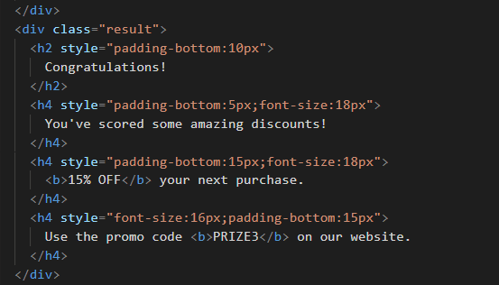
To change the final message, you can easily edit texts in this part of the code.
Fallback version
The last thing on our list is the fallback version. Fallback is required for email clients that don’t support HTML5 and CSS3, or AMP. This version will have a layout similar to our interactive version, but without the interactivity. Clicking on any element will lead to the web version of the email.
In our game example, the fallback has 2 images next to each other.

We continue to work in the interactive HTML block that we already have. Insert the following code between the </style> and the <form> tag in the HTML version you already created previously:
<!--[if !mso]><!-- -->
<input type="checkbox" id="fallback_ctrl" checked class="fallback_ctrl" style="mso-hide:all;display:none !important">
<!--<![endif]-->
<!-- FALLBACK -->
<span id="fallback" class="fallback">
  <table width="100%">
    <tbody>
      <tr>
        <td>
          <a href="https://viewstripo.email/680e3ff3-b654-449d-8ad8-0f185b242e161759234932358?type=amphtml" target="_blank"><img alt="" height="270" src="https://zlnfb.stripocdn.email/content/guids/CABINET_a9928c32e6494fb7e1e20cf040cb8f7be647ae27b2b78b2440b1037be46efed3/images/find02.jpg" width="270" class="adapt-img"></a>
        </td>
        <td>
          <a href="https://viewstripo.email/680e3ff3-b654-449d-8ad8-0f185b242e161759234932358?type=amphtml" target="_blank"><img width="270" alt="" height="270" src="https://zlnfb.stripocdn.email/content/guids/CABINET_a9928c32e6494fb7e1e20cf040cb8f7be647ae27b2b78b2440b1037be46efed3/images/find02.jpg" class="adapt-img"></a>
        </td>
      </tr>
    </tbody>
  </table>
</span>
<!-- /FALLBACK -->
<!--[if !mso]><!-- -->
<!-- INTERACTIVE ELEMENT -->
<div class="container" style="mso-hide:all;display:none">

Besides that, at the end of the code, you need to paste the following small piece:
</div><!-- /INTERACTIVE ELEMENT -->
<!--<![endif]-->

Changing links to your website and image links is easy, as you need to replace them with your own.

The last thing to do is add styles to show only the version that is appropriate for the email client. Just paste this code inside the style tag at the very end:
    /* --- */
    @media screen and (-webkit-min-device-pixel-ratio: 0) {
        input.fallback_ctrl:checked~.container {
            display: block !important;
        }

        input.fallback_ctrl:checked~#fallback {
            display: none !important;
        }
    }

    [owa] .container {
        display: none !important;
    }

    [class~="x_container"] {
        display: none !important;
    }

    [id~="x_fallback"] {
        display: block !important;
    }

    @media screen and (max-width: 600px) {
        body[data-outlook-cycle] #fallback {
            display: block !important;
        }

        body[data-outlook-cycle] .container {
            display: none !important;
        }
    }

This code has an important piece for our fallback version:
<!--[if !mso]><!--><input type="checkbox" id="fallback_ctrl" class="fallback_ctrl" style="display:none !important;mso-hide:all;" checked>

<!--<![endif]-->
This input is used to show or hide the fallback by using styles. It’s enclosed in comments <!--[if !mso]><!--> … <!--<![endif]--> to ensure that it’s hidden in the Outlook Desktop client.
Also worth noting is the <span id=“fallback” class=“fallback”></span> block, which contains all of our fallback layout. It should have a simple, tabular layout suitable for Outlook. In our example, this is a table with links to the web version. You can create your own layout, but just make sure it’s understandable for Outlook.
While these styles don’t have clear rules for each email client, there is a set of hacks that can be used to control the display:
- styles that start with [owa] are used for Outlook;
- the [class~="x_container"] styles are needed for Outlook in case [owa] does not work;
- body[data-outlook-cycle] styles are needed for Outlook on iOS and Android mobile devices;
- mso-hide:all; is used for Outlook.com.
The full code
Here is the full code of the game, including the kinetic HTML part and the fallback version:
<style>
  .game-container div { display: inline-block; width: 49%; position: relative; } .game-container label { display: block; position: absolute; top: 0; left: 0; width: 20%; height: 20%; cursor: pointer; background-repeat: no-repeat; background-position: center; background-size: 70%; } .game-container .square-1-2, .game-container .square-2-2, .game-container .square-3-2, .game-container .square-4-2, .game-container .square-5-2 { left: 20%; } .game-container .square-1-3, .game-container .square-2-3, .game-container .square-3-3, .game-container .square-4-3, .game-container .square-5-3 { left: 40%; } .game-container .square-1-4, .game-container .square-2-4, .game-container .square-3-4, .game-container .square-4-4, .game-container .square-5-4 { left: 60%; } .game-container .square-1-5, .game-container .square-2-5, .game-container .square-3-5, .game-container .square-4-5, .game-container .square-5-5 { left: 80%; } .game-container .square-2-1 { top: 20%; } .game-container .square-2-2, .game-container .square-2-3, .game-container .square-2-4, .game-container .square-2-5 { top: 20%; } .game-container .square-3-1, .game-container .square-3-2, .game-container .square-3-3, .game-container .square-3-4, .game-container .square-3-5 { top: 40%; } .game-container .square-4-1, .game-container .square-4-2, .game-container .square-4-3, .game-container .square-4-4, .game-container .square-4-5 { top: 60%; } .game-container .square-5-1, .game-container .square-5-2, .game-container .square-5-3, .game-container .square-5-4, .game-container .square-5-5 { top: 80%; } .result { text-align: center; display: none; } .result p { padding: 15px 0; } @media only screen and (max-width: 600px) { .game-container div { display: block; width: 100%; } } #check1:checked~div .check1-label, #check2:checked~div .check2-label, #check3:checked~div .check3-label, #check4:checked~div .check4-label, #check5:checked~div .check5-label { background-image: url(https://zlnfb.stripocdn.email/content/guids/CABINET_c5f406ac2c5f802aab99caabbb8964fc82ed152794cd59abbcd605fe51cb82df/images/check3.png); } #check1:checked~#check2:checked~#check3:checked~#check4:checked~#check5:checked~.game-container { display: none; } #check1:checked~#check2:checked~#check3:checked~#check4:checked~#check5:checked~.result { display: block; } /* --- */ @media screen and (-webkit-min-device-pixel-ratio: 0) { input.fallback_ctrl:checked~.container { display: block !important; } input.fallback_ctrl:checked~#fallback { display: none !important; } } [owa] .container { display: none !important; } [class~="x_container"] { display: none !important; } [id~="x_fallback"] { display: block !important; } @media screen and (max-width: 600px) { body[data-outlook-cycle] #fallback { display: block !important; } body[data-outlook-cycle] .container { display: none !important; } }
</style>
<!--[if !mso]><!-- -->
<input checked id="fallback_ctrl" type="checkbox" class="fallback_ctrl" style="mso-hide: all; display: none !important">
<!--<![endif]-->
<!-- FALLBACK -->
<span id="fallback" class="fallback">
  <table width="100%">
    <tbody>
      <tr>
        <td>
          <a href="https://viewstripo.email/680e3ff3-b654-449d-8ad8-0f185b242e161759234932358?type=amphtml" target="_blank"><img alt="" height="270" src="https://zlnfb.stripocdn.email/content/guids/CABINET_a9928c32e6494fb7e1e20cf040cb8f7be647ae27b2b78b2440b1037be46efed3/images/find02.jpg" width="270" class="adapt-img"></a>
        </td>
        <td>
          <a href="https://viewstripo.email/680e3ff3-b654-449d-8ad8-0f185b242e161759234932358?type=amphtml" target="_blank"><img alt="" height="270" src="https://zlnfb.stripocdn.email/content/guids/CABINET_a9928c32e6494fb7e1e20cf040cb8f7be647ae27b2b78b2440b1037be46efed3/images/find02.jpg" width="270" class="adapt-img"></a>
        </td>
      </tr>
    </tbody>
  </table>
</span>
<!-- /FALLBACK -->
<!--[if !mso]><!-- -->
<!-- INTERACTIVE ELEMENT -->
<div class="container" style="mso-hide: all; display: none">
  <form>
    <input id="check1" name="check1" type="radio" style="display: none">
    <input id="check2" name="check2" type="radio" style="display: none">
    <input id="check3" name="check3" type="radio" style="display: none">
    <input id="check4" name="check4" type="radio" style="display: none">
    <input id="check5" name="check5" type="radio" style="display: none">
    <div class="game-container">
      <div>
        <img alt="" height="270" src="https://zlnfb.stripocdn.email/content/guids/CABINET_a9928c32e6494fb7e1e20cf040cb8f7be647ae27b2b78b2440b1037be46efed3/images/find01.jpg" width="270" class="adapt-img">
      </div>
      <div>
        <img alt="" height="270" src="https://zlnfb.stripocdn.email/content/guids/CABINET_a9928c32e6494fb7e1e20cf040cb8f7be647ae27b2b78b2440b1037be46efed3/images/find02.jpg" width="270" class="adapt-img">
        <label class="square-1-1"></label>
        <label class="square-1-2"></label>
        <label for="check1" class="square-1-3 check1-label"></label>
        <label class="square-1-4"></label>
        <label class="square-1-5"></label>
        <label class="square-2-1"></label>
        <label class="square-2-2"></label>
        <label class="square-2-3"></label>
        <label for="check2" class="square-2-4 check2-label"></label>
        <label for="check3" class="square-2-5 check3-label"></label>
        <label class="square-3-1"></label>
        <label for="check4" class="square-3-2 check4-label"></label>
        <label class="square-3-3"></label>
        <label class="square-3-4"></label>
        <label class="square-3-5"></label>
        <label class="square-4-1"></label>
        <label class="square-4-2"></label>
        <label class="square-4-3"></label>
        <label class="square-4-4"></label>
        <label class="square-4-5"></label>
        <label class="square-5-1"></label>
        <label class="square-5-2"></label>
        <label class="square-5-3"></label>
        <label class="square-5-4"></label>
        <label for="check5" class="square-5-5 check5-label"></label>
      </div>
    </div>
    <div class="result">
      <h2 style="padding-bottom: 10px">
        Congratulations!
      </h2>
      <h4 style="padding-bottom: 5px; font-size: 18px">
        You've scored some amazing discounts!
      </h4>
      <h4 style="font-size: 18px; padding-bottom: 15px">
        <b>15% OFF</b> your next purchase.
      </h4>
      <h4 style="font-size: 16px; padding-bottom: 15px">
        Use the promo code <b>PRIZE3</b> on our website.
      </h4>
    </div>
  </form>
</div>
<!-- /INTERACTIVE ELEMENT -->
<!--<![endif]-->
Wrapping up
The Find Differences game is an easy way to make your emails more engaging and unique. Thanks to this interactive mechanic, you can grant gifts and teaser products in an interactive way wich is also easy to create thanks to our guide. We hope that our article will help you step on the email interactivity path to level up your email marketing.



0 comments