Creating visual hierarchy in your email design


This article explains how to create a clear visual hierarchy in your email design to guide readers’ attention and improve readability. Discover practical tips to structure your content for maximum impact and engagement.
Your email layout is often the most critical factor in getting subscribers to read your content. If your emails are poorly designed or difficult to peruse, your subscribers are likely to delete them without even reading them.
Alternatively, if your emails are well designed and easy to read, your subscribers are going to be far more likely to read them (and take the action you’d like them to take, of course).
The only way to get this right and do it well is to focus on visual hierarchy in your design. But what is visual hierarchy? Allow us to explain.
Visual hierarchy 101
Essentially, visual hierarchy refers to how design elements are arranged in your emails according to their importance. It is used to guide readers’ attention to aspects that matter the most—crucial for businesses like a Manhattan courier service aiming to communicate quickly and clearly with customers. In the context of email design, it ensures that your recipients quickly grasp your message even if their attention spans are limited.
There are a few key principles of visual hierarchy in email design:
- Size and scale: Larger elements naturally draw more attention, so headlines should be bigger than the body text and so on.
- Color and contrast: Bright colors and high-contrast elements stand out against neutral backgrounds.
- Typography: Font choices, weights, and styles help distinguish content types and how important the content is to the reader.
- Spacing: Strategically placed white space also helps streamline audience attention and improves readability (because, let’s face it, folks are skimming emails in 2025).
- Directional cues: These are the visual elements that guide the eye toward crucial content (such as arrows, lines, and pointing figures) and are a big part of where we’re going with this.
We’re going to be discussing how you can tie these elements together while using directional cues and typical reading patterns to effectively create a visual hierarchy in your emails.
We begin by looking at the most common tried-and-tested methods for nailing your email layout: the inverted-triangle layout, the Z-pattern layout, and the F-pattern layout.
In this article, you’ll discover how each email layout works and why these are a good choice for certain types of emails, along with some tips for how to choose the right layout for your emails.
1. The inverted triangle email design
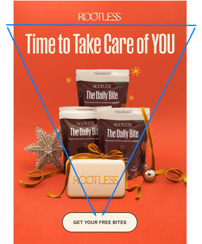
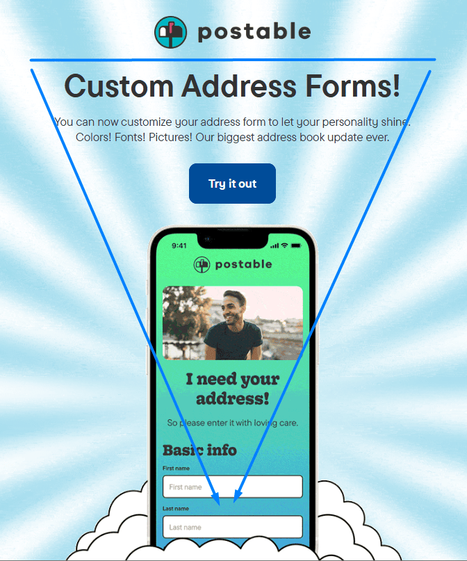
The inverted-triangle layout is one of the most popular email layouts out there. Because this design follows the natural direction in which people scan emails, you’re creating a solid visual hierarchy right off the bat.
Below are two great examples to give you an idea of what this type of layout looks like. Here is an example by Rootless:
(Source: Email Love)
And here is another example by Postable:
(Source: Email Love)
The inverted-triangle layout places the most important information at the top of the email and less important information further down. This makes it easy for people to scan the email and quickly find the information they are looking for and creates that visual hierarchy we mentioned earlier.
This visual hierarchy and the way your readers’ eyes navigate these emails are illustrated below:
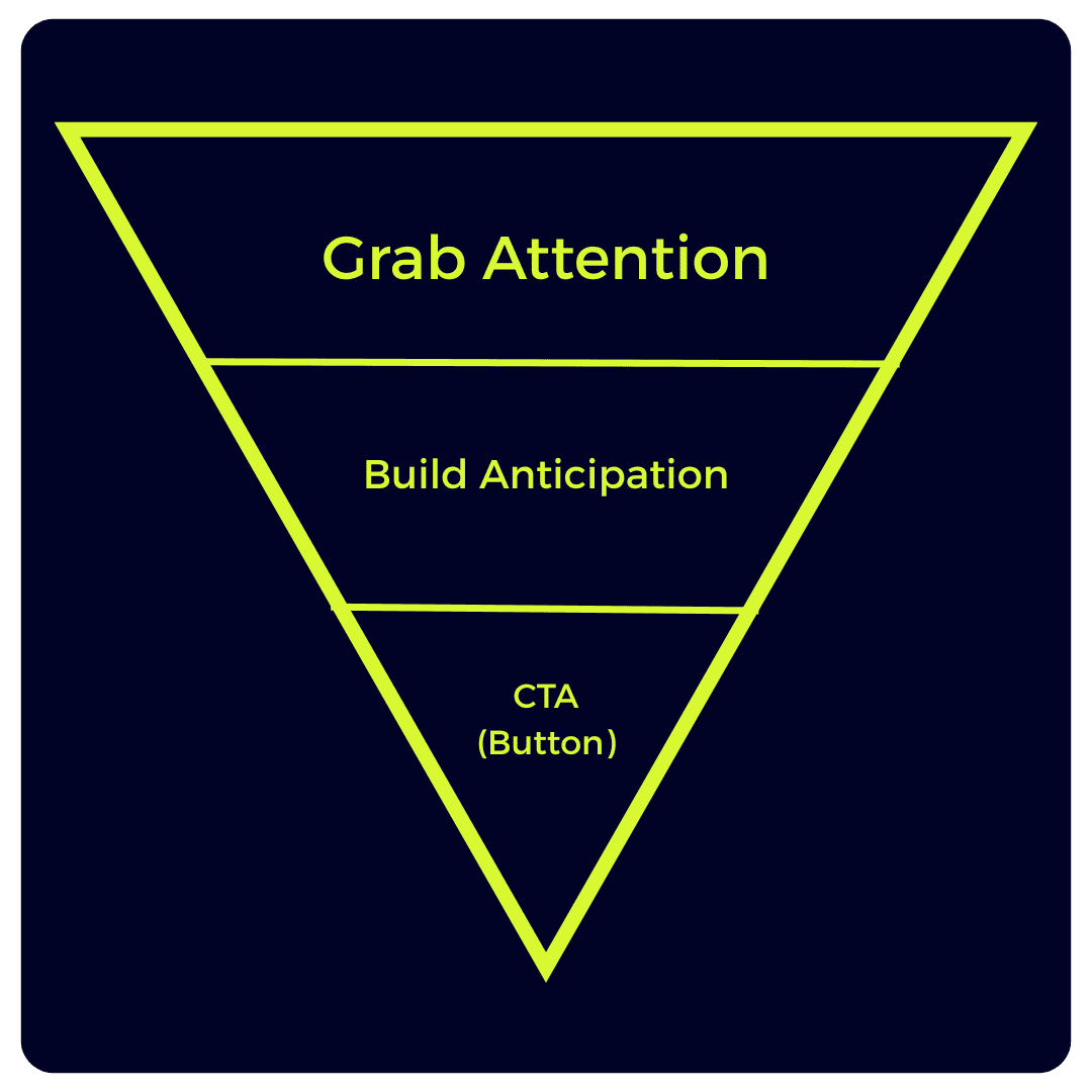
Think of it this way,
- you’re establishing an element in your emails to capture attention;
- you’re then building anticipation using secondary, supporting information;
- lastly, you’re driving home your engagement using a call to action, thus achieving the result you had set out to achieve in the first place.
That’s why this principle can be a game changer, especially when looking to convince your readers to take the action you wanted them to take through your emails.
When to use the inverted triangle email design
The inverted-triangle layout is a good choice for emails that need to communicate a lot of information quickly.
For example, it is a good choice for sales, marketing, and promotional emails. The goal is to “hook” your readers, offer them more information, and get them to take the action you want them to take.
If you’re looking to promote multiple products, this layout may not be the best choice for you. We’ll explore multiple-product emails shortly, but there are various actions that readers may take in such emails, which is why you need a different way to get eyes on your content.
2. The Z-pattern email design
The Z-pattern layout is another popular email layout that is based on the way in which people’s eyes naturally move across a web page.
When people look at a web page, their eyes tend to follow a Z-shaped path. The main reason for this is that, in the Western world, when reading from left to right, we tend to jump ahead when engaging with content.
This rings especially true in the case of emails.
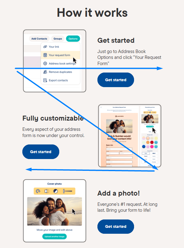
For context, here are two examples of what the Z-pattern email design looks like. The first one is from Postable:
(Source: Email Love)
Here is another example from Samsung:
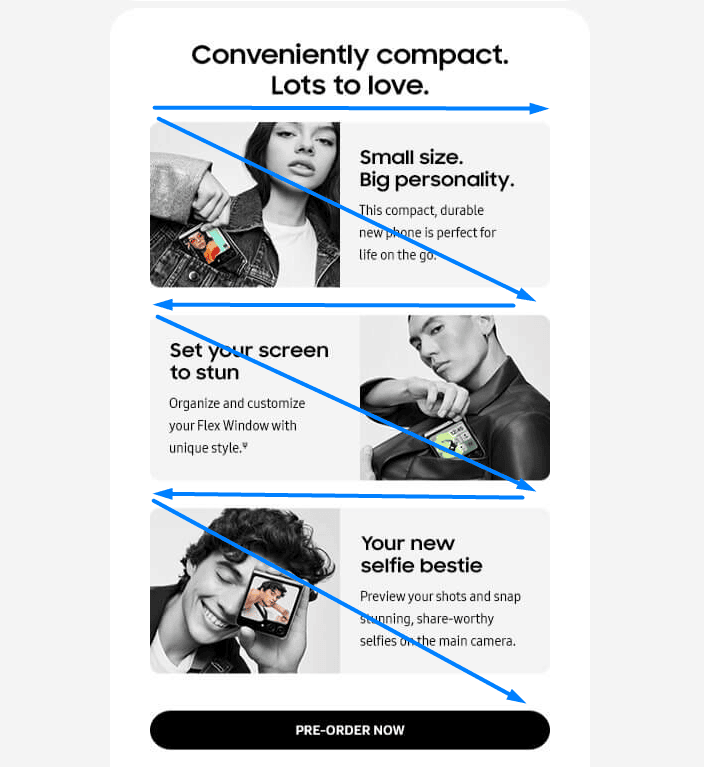
(Source: Email Love)
The Z-pattern layout takes advantage of people’s natural scanning pattern, with the most important information being placed at the top of the email, followed by less important information in the middle, and then the call to action at the bottom or the edge of every point of the “imaginary Z.”
As illustrated, you can see the progression from left to right, with each section drawing the eye to the next part in a natural way. This does not mean, however, that the whole email has to be shaped like one big “Z.”
Although this might work for sign-up forms, landing pages, and most intro sections of an email, it is better suited for content that involves storytelling, which can follow the shape of subsequent smaller “Zs,” creating a zigzag pattern.
When to use the Z-pattern email design
The Z-pattern layout is a good choice for emails that need to communicate a lot of information or content but also need to be visually appealing.
For example, it is a good choice for product-oriented emails, event invitations, and travel emails. As there are multiple calls to action and points of interest in such emails, this layout can still appeal to subscribers who tend to skim emails or are looking to quickly obtain information about each section of your campaign.
If you only need a single action to be taken in your emails, you may want to consider the inverted-triangle design that we spoke about earlier instead.
However, if you’re looking to get readers to consume more than one snippet of information, this layout is ideal.
3. The F-pattern email design
The F-pattern layout is essentially a variation of the Z-pattern layout.
In this layout style, the most important information is placed at the top of the email, followed by less important information on the left and right sides of the email, while the call to action is placed at the bottom.
This, again, follows the natural progression of the reader’s eyes from left to right, leading them from one section to the other, with a call to action strategically placed to the left at the start of the subsequent section below that, to which the eyes are drawn. As the text goes on, the sweeps to the right become increasingly shorter, ultimately leading to the call to action.
For further context, here are two great examples of this design showcased in emails. The first one is from Dwell:
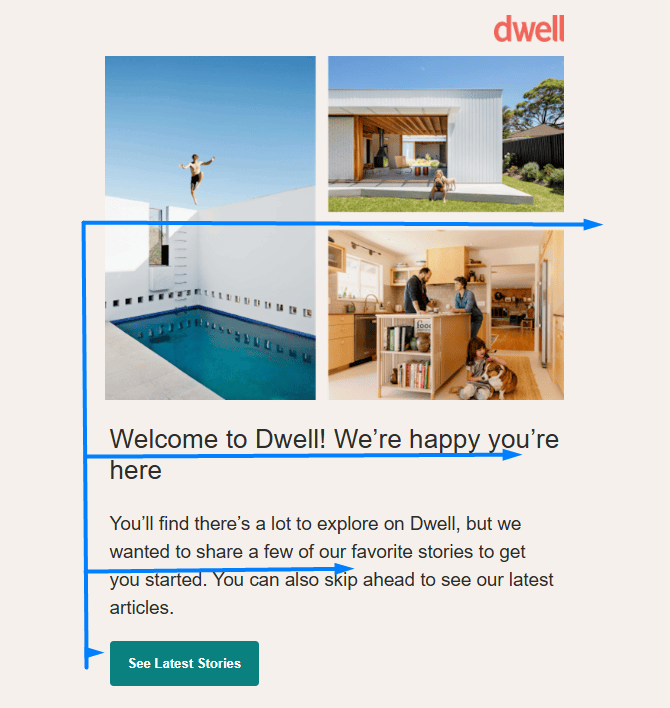
(Source: Email Love)
The other example is from Asana:
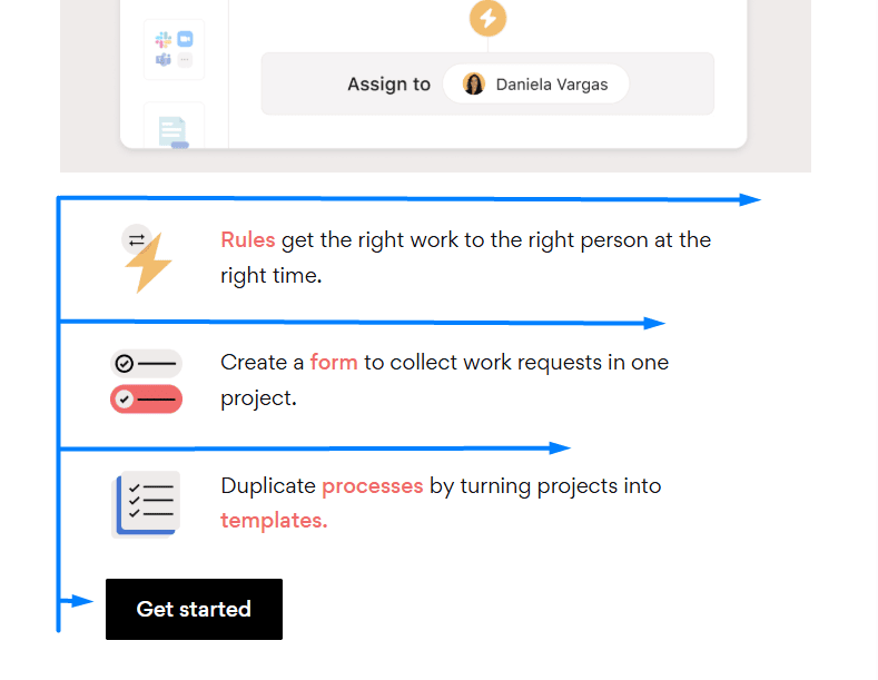
(Source: Email Love)
As with the Z-pattern layout, the F-pattern layout is based on our tendency to scan content in a left-to-right fashion.
Eye-tracking studies, such as this one conducted by the Nielsen Norman Group, back this with empirical evidence. If readers consume digital content in this manner, why not have your emails laid out accordingly to suit their habits? We discuss this often as an in-depth topic in our blog about email.
Here’s an outline of how a reader’s eyes scan content following the F-pattern:
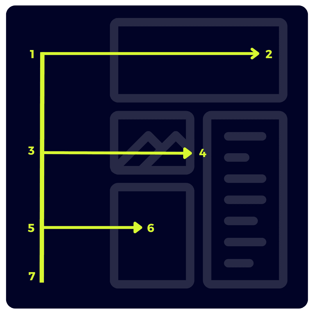
By arranging the different parts of the content of your email in the shape of an F, you’re prioritizing them according to how important each one is.
You can place the most important parts in the “hot spots” of the pattern to increase reading interaction. This allows your content to still be understood and internalized even if it is skimmed.
When to use the F-pattern email design
The F-pattern layout is a good choice for emails that need to communicate a lot of information while being visually appealing and easy to read on mobile devices.
For example, it is a good choice for product announcement emails, company news emails, and customer support emails.
If you’re a news publisher, this layout is great for creating short headlines with snippets of the article and an image attached before leading readers to a call to action to read the full article.
However, this layout is not without its potential flaws. You’re temporarily disrupting the structure of the content by shortening it as you go, so there’s the possibility of multiple calls to action being ignored. Generally, it’s best to use this layout for your email content after creating a solid intro using a different layout, such as the inverted-triangle layout.
The F-shaped layout and even the Z-pattern layout are also not ideal for mobile optimization. Don’t forget that the majority of your emails are likely to be read on a mobile device, so consider this when choosing the right pattern in your journey to establishing visual hierarchy.
Which email layout design should you use?
As always, which email layout will be the best for you will depend on the type of email you are sending and who your target audience is.
When choosing an email layout, make sure you consider the following:
- the type of email you are sending;
- the message you want to convey;
- the tone of your message; and
- the design of your email.
Once you’ve run through these, you’ll find it just a little bit easier to decide which template or layout to use. Although, there’s one more critical factor to consider: your target audience.
If you’re insensitive to the needs of your audience and who you’re speaking to, no amount of email design is going to produce the results that you want. You can, however, use your design and specific layouts to appeal to various audience types.
Emails afford the phenomenal ability to dynamically serve content to various audiences. This entails that you can pay close attention to what you’re creating in various sections of your email without needing to rewrite the email over and over again for different segments or targets.
As an example, if you’re sending an email to a demographic that is considered to be short on time, you’ll want to focus on a layout that optimizes benefits quickly with a clear message and has a CTA closer to the top of the email.
If, however, you have an audience that seeks a wide variety of content, you’ll need to alter your layout to suit multiple sections, scenarios, or highlights.
This is where the TLDRs and summaries built into various layouts can be a boon for your email design.
With regard to using the three layouts we’ve discussed to enhance visual hierarchy, here are a few more quick examples:
Example 1: If you are sending a sales email, you might want to use the inverted-triangle layout to get your message across quickly.
Example 2: If you are sending a multi-product marketing email, you might want to use the Z-pattern layout to create a visually appealing email that subscribers will want to read till the end.
Example 3: If you are sending a customer support email, you might want to use the F-pattern layout to make it easy for people to find the information they need.
Wrapping up
There are no hard and fast rules dictating which pattern you should use. You could incorporate all three of these layouts into a single email if you wish to. As always, regardless of which layout you choose, make sure that your email is well designed and easy to read. Use clear and concise language, and make sure that your call to action is clear and easily understandable.


0 comments