If your inbox felt louder this year, you’re not imagining it. Between promo tabs filling up, numerous newsletters, and the rise of AI-generated messages impacting every email category, email competition is at an all-time high.
However, in all that hullabaloo, something became very clear: design is what readers use to decide what’s worth their attention.
In this article, we’ll focus on four of the biggest email design trends that moved the needle on engagement in 2025:
- scannable layouts;
- mobile-first formatting;
- real, warm imagery;
- brand consistency.
We’ll also look ahead and reveal how these trends are setting the stage for 2026.
1. Scannable layouts: Designing for the 5-second skim
Why scannability became non-negotiable
It may have felt like it, but our collective attention span didn’t shrink this year. Instead, inbox behavior changed. Email recipients prefer to skim before they dive in. According to industry email marketing research, only 6% of email recipients say they prefer longer emails, while 67% prefer shorter ones.
They evaluate whether an email is “worth the scroll” in just a few seconds.
Emails that win attention and drive conversions are:
- visually lightweight;
- organized around a single message;
- structured with predictable visual cues.
Anything dense, multi-columned, or text-heavy simply can’t keep up.
What we saw work this year
We’ve found that four scannability elements will consistently make your emails perform:
- clear hierarchy: And I’m talking clear. Emails need a big headline, clear subhead, short body copy, and single CTA;
- room to breathe: Generous spacing and modular sections improve dwell time;
- shorter visual sections: Two to four sections with visuals, maximum. Any more, and the email will be deemed overwhelming;
- clear “next step” and placement: CTAs with concise language and placed above the fold increase click-through rates, especially on mobile.
Practical design patterns to use
These formats perform well:
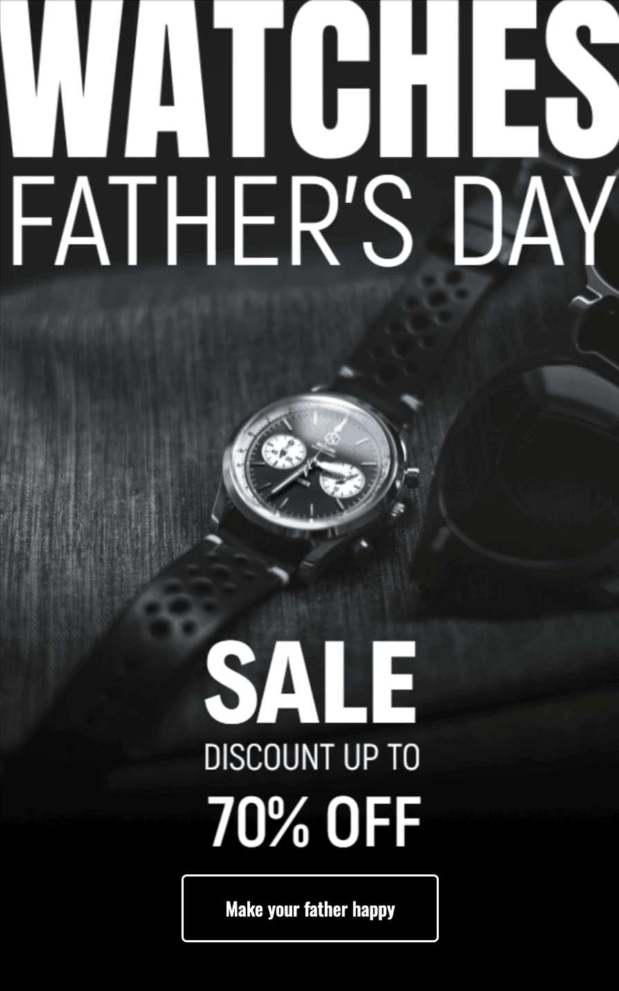
- the “Inverted pyramid”: This format has one main visual, one message, and one CTA;
- the “Card stack”: This format has small modules stacked vertically for quick scanning;
- the “Spotlight block”: This format has one bold header with a concise value statement and a product visual.
Copy and design working together
The highest-engagement emails paired short, conversational copy with layouts that helped readers skim. A useful rule of thumb: If the layout doesn’t help your copy say less, it’s time to simplify the layout.
2. Mobile-first formatting: Designing for the thumb, not the mouse
Reality check: mobile is no longer a “nice to have” (and hasn’t been for a while). Mobile continued to dominate this year, and some industries saw as many as 65% of opens from phones. The standout difference? Finger taps.
Mobile readers don’t scroll the way they do on desktop. They skim more quickly, impulsively tap, and bail as soon as layouts change or text gets tiny. In a nutshell, mobile readers can be a bit flaky.
Mobile-first best practices that designers stuck to
Here’s what designers implemented and saw results from:
- keeping CTAs within the first 300px of the email;
- single columns over multi-column grids;
- reducing image weight (which decreases load times);
- including alt text in case images don’t load.
Patterns that improved mobile engagement
The designs that consistently outperformed:
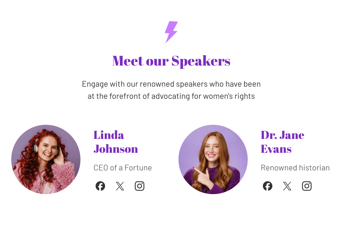
- single-column layouts: No horizontal padding issues;
- big, tappable CTAs: 44px minimum;
- large typography: 16-18px body size;
- shorter hero sections: No more full-screen images blocking the message.

How teams tested and iterated
The biggest shift this year came from how teams tested:
- mobile-only previews first (desktop took a backseat);
- A/B testing with placement rather than just focusing on copy;
- testing email length to see whether short or long performs better according to the audience;
- using heatmaps to decipher scroll patterns.
The consistent takeaway: As long as a design is solid on mobile, it will work everywhere else.
3. Real, warm imagery: Moving beyond stock and staged
Why imagery mattered more for trust, not just aesthetics
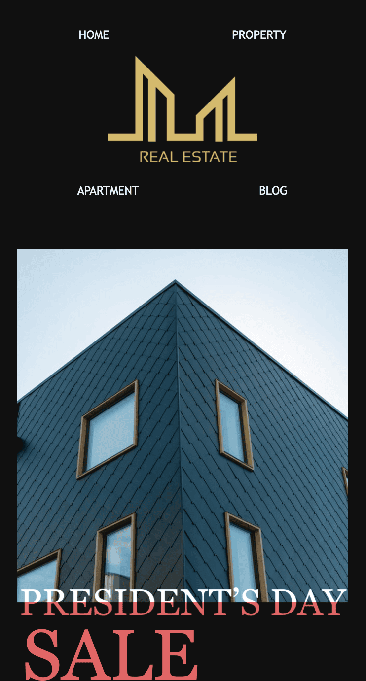
AI-created imagery became mainstream this year, and ironically, it made real, imperfect, warm visuals more irreplaceable. In fact, over 50% of readers can recognize overly staged or synthetic visuals, which sent a clear message: Authenticity isn’t a trend; it’s a trust signal that’s here to stay.
The visual shift we saw
Higher engagement comes from imagery that looks:
- real and human;
- warm and approachable;
- lightly stylized but not overly edited;
- purpose-driven (supports the copy).
Images showing actual customers, real workspaces, human faces, and natural expressions are favored over stock-style photos. Getty Images released a global survey revealing that 98% of consumers think authentic images and videos are pivotal in establishing trust.
Principles for high-performing email imagery
Strong visuals used in campaigns typically share these traits:
- color harmony: Tones matched or complemented brand palettes;
- high quality: No high-contrast edits or blurry images allowed;
- purposeful composition: Imagery supported one clear message.
Beneficial design tactics this year
- cropping images into softer shapes or rounded modules;
- using consistent color grading;
- leveraging negative space around photos;
- using illustrations for clarification only, not decoration.
4. Brand consistency: The hidden driver of engagement
Why consistency outperformed reinvention
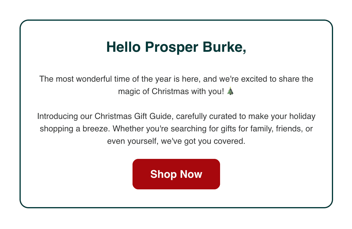
When inbox noise increases, familiar branding becomes a shortcut to trust. 50% of consumers are more likely to make purchases from brands they recognize. Simply put, readers engage with emails from brands whose visual identities are predictable and recognizable.
Stance Park, a branding firm, claims that consistent branding across email campaigns has led to noticeable improvements. For example, they saw a +62% boost in email open rates after improving a client’s brand consistency.
It was a significant pattern this year: Consistent brands earned engagement faster than clever brands.
What consistency looked like in practice this year
- same headline style rhythm;
- same CTA style and placement;
- same color palette across emails;
- repeated visual structure.
This wasn’t creative repetition; it was cognitive accessibility. Readers knew what to expect, so they could skim faster.
Consistency supports better data and experimentation
When your baseline elements are consistent, it’s easier for you to isolate what is actually affecting performance, whether it’s:
- a new headline;
- a different hero image;
- different CTA copy;
- a simplified email layout.
Teams that standardized visual frameworks saw clearer, faster insights from experiments.
The EU accessibility law: Why accessibility rose to the top this year
In 2025, a significant shift hit the email world: The European Accessibility Act (EAA) entered its enforcement phase ahead of its 2025 compliance deadlines.
Although the complete requirements took effect on June 28, 2025, marketers and email designers began adapting early this year to avoid last-minute scrambles and will continue to do so in 2026.
What the EAA means for email design
The EAA requires that digital communications, including emails, be accessible to people with disabilities. That impacts:
- color contrast;
- font size and readability;
- screen-reader text structure;
- alt text on images;
- logical reading order in code;
- avoiding text embedded inside images.
Design teams across Europe began shifting their processes to ensure:
- minimum 4.5:1 text contrast;
- headings rendered as text instead of graphics;
- a clear focus, order, and layout hierarchy;
- descriptive alt text.
Accessibility moved from a “nice to have” to a legal requirement and a universally beneficial practice. The upside is that accessible emails performed better for everyone.
Looking ahead to 2026: What’s in store for email design?
2025 taught us what works. 2026 will take those teachings one step further.
From “pretty emails” to predictive, data-informed design
Design will increasingly align with behavioral insights, revealing what readers tap, skim, ignore, or revisit.
In 2026, expect the following:
- layouts that adapt based on engagement patterns;
- modular design systems optimized around behavior, not aesthetics;
- personalized hierarchies based on subscriber history (subject to privacy laws, of course).
More personal, less “template-looking” emails
Readers are tuning out anything that feels “done.” We’ll see more:
- warm imagery;
- conversational tones;
- human-focused layouts;
- modular frameworks that allow variation without sacrificing consistency.
AI and automation support, not replace designers
The best-performing teams in 2025 used AI to:
- resize, crop, and optimize images;
- perform accessibility checks;
- offer layout suggestions;
- provide short copy changes.
AI won’t remove the need for thoughtful, human-led design. It will simply take the repetitive tasks off designers’ plates.
What marketers should focus on now to be ready
To prepare for 2026:
- document a simple, flexible email design system;
- standardize your mobile-first approach;
- prioritize accessibility now (EAA compliance isn’t optional);
- build image libraries with real, authentic visuals;
- keep your email structure consistent so you can more effectively measure performance.
The strongest design teams next year will be the ones who simplified and standardized this year. This year made one thing clear: email design is no longer about decoration. It’s about decisions.
Wrapping up
Design is how readers choose what to open, what to skim, and what to click. The brands that embraced scannability, a mobile-first approach, warm imagery, and a consistent identity saw not just better engagement but also faster insights, smoother workflows, and stronger trust.
And with accessibility laws tightening, inboxes getting louder, and AI reshaping production workflows, design is only becoming more essential.
If you’re refining your approach, keep these four principles close. They’re becoming the foundation of how email works.




0 comments