Email accessibility testing tools: A complete guide for marketing teams

Sometimes, an email looks accessible until you test it.
A design may seem clear and polished, and the copy may feel straightforward, yet real accessibility testing can reveal barriers that affect how subscribers read, understand, and interact with your message.
This is where email accessibility testing tools come in. They help you spot issues that are easy to overlook, from color contrast problems and missing alt text to structural code issues that can affect screen readers and other assistive technologies.
In this article, you will find tools for testing email accessibility, along with tools that help you build more accessible emails from the start so that your campaigns are more inclusive and functional for all subscribers.
Before choosing a tool, it helps to understand why email accessibility testing matters, what standards guide it, and what exactly needs to be checked.
Why test email accessibility?
Email accessibility testing ensures that all subscribers, including those with disabilities, can fully engage with email content. It helps identify and address potential barriers that might hinder usability.
Some striking stats
- in a room with four people in it, at least one person is likely to have some form of vision impairment;
- around 1 in 180 people worldwide are blind;
- if a company uses only red and green to indicate correct and incorrect responses, around 1 in 12 men and 1 in 200 women may struggle to interpret that information because of color blindness;
- in a group of 20 people with epilepsy, at least one may have photosensitive epilepsy, meaning flashing visuals can be harmful;
- around 1 in 10 people have dyslexia, which can make overly complex text harder to process;
- in a group of 100 people, 12 may have motor disabilities that make small buttons, hover-only interactions, or complex navigation difficult to use;
- in that same group, 5 to 6 may have disabling hearing loss.

Email accessibility standards: WCAG, ADA, EAA, Section 508, etc.
Before checking accessibility in email, it helps to understand the relevant standards and regulations. Some define what accessible digital content should look like, while others set legal requirements for organizations. Together, they give email senders a clear understanding of what accessibility in email means in practice.
What is WCAG and how does it apply to email?
WCAG is the main accessibility standard used worldwide. It guides the creation of accessible digital content, including websites, support chats, and emails. While some experts argue that it does not fully address the unique challenges of email accessibility, it is still widely regarded as the gold standard. The latest version, WCAG 2.2, was published in 2023.
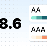
WCAG defines three levels of accessibility: A, AA, and AAA. Level A is the foundational level, but it is usually not enough. Level AA is the standard that most accessibility laws and policies are based on, which is why it is widely seen as the practical benchmark for compliance. Level AAA is the ideal; it is something to strive for where possible but not a realistic requirement for every piece of content.
Which laws do we need to follow?
ADA, EAA, Section 508, and other regulations: What email senders need to know
- Americans with Disabilities Act (ADA): The ADA requires state and local governments and businesses open to the public to make their digital content accessible. While the law does not name WCAG directly in every case, WCAG is widely used as the main standard for digital accessibility.
- European Accessibility Act (EAA): Adopted in 2019, the EAA sets accessibility requirements for certain products and services across the EU, many of them based on European standards linked to WCAG principles. It came into effect on June 28, 2025.
- Accessible Canada Act (ACA): The ACA came into force in 2019 and aims to make Canada barrier-free by 2040. It applies mainly to organizations under federal jurisdiction and thus does not cover all organizations in every province.
- Equality Act 2010: In the UK, the Equality Act 2010 requires service providers to make reasonable adjustments for people with disabilities. For public sector websites and apps, the Public Sector Bodies Accessibility Regulations 2018 set more specific accessibility requirements.
- Section 508 applies to US federal agencies and requires their information and communication technology to be accessible to people with disabilities, including both employees and members of the public. This includes official agency communications and email messages.
If your brand operates globally, please make sure to review each country’s accessibility laws to ensure compliance.
Now, let’s talk about how to check accessibility in email.
Testing emails for photosensitivity triggers
Why test: Visuals with three or more flashes per second can trigger seizures in people with photosensitive epilepsy.
What to test: Animations and videos shared in the email.
Testing tools for animations in emails
1. Trace RERC (PEAT): Developed by the University of Maryland, this tool verifies that your GIFs comply with the recommended limits on flashing frequency. You must download it to start using it.
What to do if your animations don’t comply
If your animations exceed the flashing limits outlined in the WCAG guidelines, online services such as Ezgif allow you to easily slow down or optimize their speed.

(Source: Ezgif)
Pro tip: Avoid placing more than one GIF per screen. Multiple animated elements displayed simultaneously can trigger photosensitive epilepsy, just like animations with more than three flashes per second.

Testing emails for color blindness
Why test:
- emails that rely on color to convey meaning can be inaccessible to people with color blindness, making important information harder to interpret;
- poor color contrast, such as bright yellow on light blue or light gray on medium gray, can also make text difficult or even impossible to read. Lack of color contrast affects not only people with low vision but also people with different types of color vision deficiency;
- color combinations that seem to provide enough contrast in light mode may have much lower contrast in dark mode.
What to test: Color-coded elements, such as buttons, labels, charts, banners, and other visual indicators.
Testing tools for color accessibility in emails
2. Coblis (Color blindness simulator): This tool simulates how individuals with various types of color blindness, including those who can’t see red or green and those who see only monochromatic tones, perceive your images.

(The original image)

(How people who can’t see red perceive this image, according to Coblis. We showed these images to individuals with color blindness, and they reported seeing no difference)
3. WebAIM (Web Accessibility in Mind): This is an online tool for evaluating contrast ratios between text and background colors; it offers results for normal text, large text, and graphical elements.
4. Contrast Checker by Lea Verou: This tool allows you to input color values or select colors from the palette to test contrast ratios, with visual previews provided.
5. Accessible Colors: This tool allows you to check the contrast of text and design elements (excluding images, unless you manually input the color values).

Testing alt texts for images in emails
Why test: Alt text is easy to forget, but it plays a major role in email accessibility.
- it helps screen readers describe images;
- it gives context when images are blocked;
- it helps preserve meaning when visuals do not load properly;
- it may also support AI systems that analyze email content to generate AI summaries or annotations like in Apple.
Because missing alt text is one of the most common accessibility issues in digital content, overlooking it can also increase legal risk.
What to test: All informative visuals, including GIFs, should have meaningful alt text, while decorative ones should use empty alt text: alt="".
What “meaningful” means: Alt text should clearly convey what is shown so that subscribers get the actual meaning rather than a vague idea.
- bad example: Shirt;
- good example: Men’s white long-sleeved shirt with blue buttons.
Pro tip: Make sure your alt text is under 100–120 characters as this is the limit at which most screen readers stop reading. Avoid phrases like “image of” or “picture of” since screen readers already announce the element type.
Tools for testing alt text in emails
6. Stripo Email Accessibility Checker: This is a free tool that helps you check whether your imagery has alt text. If any text is missing, Stripo can generate it with AI directly in the editor. It also supports other accessibility checks, which we discuss later in the article.

7. Campaign Precheck by Email on Acid: This tool spots all missing alt text and suggests where you need to add it. It also includes other accessibility checks, which we discuss later in the article.
Testing email code and HTML structure
Why test: Ensuring valid email code is essential for ensuring accessibility as structural errors can disrupt compatibility with assistive technologies.
What to test: HTML structure, table presentations, language direction, charset definitions, etc.
Testing tools for email code and HTML structure validation
8. Accessibility Checker by Parcel: This tool evaluates email compatibility with screen readers and other assistive technologies and ensures the proper use of ARIA roles, alt text for images, semantic list structure, <area> elements with alternate text, and the inclusion of lang attributes. Additionally, it checks text direction for RTL and LTR compliance and much more.
9. Accessible Email: With this tool, you can check email code for compliance with screen readers, and identify and resolve potential barriers. It detects missing links, alt texts, and other accessibility issues.


All-in-one email accessibility testing tools
Why use them: Even after optimizing elements such as color contrast, animations, and code validation, it’s crucial to perform a broader accessibility check. Comprehensive testing helps ensure that no issues are overlooked and that your email works well across different devices, clients, and assistive technologies.
What these tools check: Different tools may check color contrast, alt text, link clarity, headings, text alignment, font size, code structure, screen reader support, and other accessibility issues that affect how subscribers read and interact with your email.
Testing tools for general email accessibility
10. Stripo Accessibility Checker: This tool scans emails for accessibility issues across content, design, and code and then helps fix them directly in the editor. It checks for missing alt text; missing labels on buttons, links, and form fields; unclear link text; missing titles and headings; incorrect language or text direction attributes; low color contrast; hard-to-read text alignment; and HTML or ARIA issues, such as invalid roles, missing required attributes, duplicate IDs, inaccessible tables and lists, focusable hidden elements, and keyboard-inaccessible scrollable areas. It also supports built-in fixes for the issues, including AI-generated alt text, AI-generated email titles, AI-generated link text, auto-tune for color contrast, and preview modes that let you see emails the way people with color vision deficiencies, such as protanopia, deuteranopia, and tritanopia, may see them.
11. Email on Acid: With this tool, you can test screen reader compatibility, image alt text, link functionality, color contrast, and text alignment and display how your email appears when zoomed. Tests also detect repetitive alt text and unnecessary or excessive title attributes that may hinder screen reader usability, as well as simulate how emails are perceived by color-blind recipients.
12. Litmus: This is an email accessibility testing tool that you can use to evaluate accessibility for users with visual impairments and those relying on assistive technologies. It includes visual impairment filters to simulate how emails appear to individuals with color vision deficiencies, checks for over 40 accessibility criteria, such as alt text and heading hierarchy, and offers NVDA screen reader previews to ensure audible content is accurate. Additionally, it supports text justification and language attribute checks to enhance overall accessibility;
13. Parcel Accessibility Checker: This tool helps you assess your email for accessibility best practices and issues; it categorizes any identified issues by severity (critical, serious, moderate, and mild), making it easier to prioritize fixes.
Tools that help you design more accessible emails from the start
Accessibility does not need to fully rely on final checks. It should start during email creation. The tools below can help you design more accessible animations, visuals, alt text, and code before your email reaches the testing stage.
Tools for creating accessible animations
When creating animations, tools such as Photoshop by Adobe and Ezgif give you control over the number of frames per second, ensuring compliance with accessibility standards.
Tools for designing accessible email visuals
Stark: This is a plugin for Figma, Sketch, FigJam, and Adobe XD that checks contrast ratios. It scans your design files during the development stage and provides real-time reports to address accessibility issues proactively.
Color Oracle: This is a free desktop app that applies real-time color blindness filters to your screen and helps you visualize how your design will look to users with different types of color blindness.
AI tools for generating alt text for images
Stripo email template builder: Stripo has a built-in AI alt text generator that helps you create or improve alt text directly in the editor. It analyzes your images and generates descriptive, meaningful alt text, making the process faster and helping you improve accessibility.

Tools for creating accessible email code
Stripo: Stripo helps create email code that is compatible with screen readers by supporting proper direction settings, charset definitions, table structures, and other accessibility-related requirements. To make the final email accessible, you need to include meaningful alt text, use descriptive links, and compose the content carefully. You can do all this through UI, and no coding skills are required.

Wrapping up
Email accessibility testing helps make your campaigns more inclusive, functional, and easier to use, ensuring that subscribers with different access needs can engage with them easily. The tools covered in this article can help you identify and reduce accessibility barriers at every stage, from design to final testing.
FAQ
1. What is email accessibility testing?
Email accessibility testing is the process of checking whether people with disabilities can read, understand, and interact with your email. It includes reviewing the email against accessibility requirements and testing how well the content, design, and code support different access needs and assistive technologies.
2. Does WCAG apply to email?
Yes. Although WCAG stands for Web Content Accessibility Guidelines, it applies to all digital content, including email. Since most modern emails are built using HTML, they function like small web pages. To ensure your emails are accessible to everyone, including those using screen readers, you should follow WCAG principles, including maintaining high color contrast, providing alt text for images, and using clear hierarchy.
3. What is the minimum contrast ratio for accessible email text?
According to WCAG 2.2, for text smaller than 18 pt regular or 14 pt bold, you should use a contrast ratio of at least 4.5:1. For larger text, the minimum contrast ratio is 3:1. We strongly recommend checking your color contrast in both light mode and dark mode, since the appearance of text and backgrounds can change. In this article, we’ve listed several helpful tools.
4. How do I test email accessibility without coding skills?
You do not need coding skills to test email accessibility. Email accessibility usually comes down to three core areas: design, content, and code. Design and content issues, such as poor contrast, small text, missing alt text, or too flashy motion, can often be checked manually. For code-related issues, you can use email accessibility testing tools that scan your email and highlight potential problems for you.
5. What is the difference between ADA and WCAG?
ADA is a US law that prohibits disability-based discrimination and requires equal access for people with disabilities. WCAG is a set of technical accessibility guidelines for digital content. In simple terms, WCAG shows how to make digital experiences more accessible, while ADA tells organizations that they are responsible for making sure people with disabilities can access and use their content. WCAG is often used to measure accessibility under the ADA, but the two are not the same thing.
6. Are inaccessible emails illegal?
In many countries, yes. Inaccessible emails can create legal risk, especially when they are part of marketing, customer communication, or essential digital services. The specific rules vary by region, but accessibility laws and regulations exist in the US, the EU, the UK, Canada, and many other markets. This is why businesses should review the legal requirements in every country where they communicate with customers or subscribers.

7. Which email clients support screen readers best?
There is no universal answer. Screen reader support can vary depending on the email client, operating system, browser, assistive technology, and the way the email is built. This is why the safest approach is to follow accessibility best practices and test your emails across different environments instead of optimizing for just one client.


0 comments