Case study by Brian Riback: How prioritizing quality over quantity boosted email engagement for a B2B publisher
The most valuable knowledge in email marketing comes from practice. That’s why we at Stripo asked practicing email marketers and marketing consultants to share their experiences and tell us about the email campaigns that stood out to them the most. Every email marketer has a campaign that they will discuss enthusiastically, even on a Friday evening.
With this series of case studies, we want to inspire email marketers to find great ideas and unexpected solutions to complex marketing challenges. In this case, Veteran MarTech and CRM optimization consultant Brian Riback shared a story about an email campaign to implement changes, which took almost a year, and a deep dive into the differences between UI/UX and graphic design.
Interview Expert

About Brian Riback
Brian Riback is the founder and chief consultant at Labrador, where he has specialized in MarTech and CRM optimization since before these terms even existed. His career has evolved alongside rapid technological advancements, from the early days before Google to the sophisticated MarTech landscape we navigate today. His passion for staying at the forefront of both technological and strategic developments is driven by a deep fascination with human behavior and a commitment to helping others reach their full potential.
During his 20-plus-year career, he has consulted or worked with over 60 clients across various industries, always prioritizing people and processes over technology.
Brian thrives on being “in the weeds,” improving workflows and ensuring that technology serves its users efficiently. His approach is truly data-driven, a philosophy he applies rigorously — even down to researching the best umbrella before purchasing. This unwavering attention to detail is why he consistently has doubled my clients’ CRM engagement rates, a benchmark I strive to exceed daily.
Outside of work, Brian is a proud father and husband, passionate cook, novice woodworker, and lifelong musician. He is finishing his vegetable garden, working on his book, and recording his first independent album of original songs. These hobbies keep him grounded and continually inspire his professional life.
Brian Riback wrote this case study specifically for the Stripo blog to share the story of the email campaign format transformation they went through with his client.
The key idea and marketing challenge: Paving the way from nine emails per day to two
This is the story of how we improved email campaigns for my client, a B2B publisher. In addition to sending editorial content, the company needed to promote different events, podcasts, webinars, surveys/polls, and a number of other sales-driven initiatives to their audience, primarily made up of busy executives.
The key idea was to cut down on the overwhelming number of emails sent to busy executives by a B2B publisher. Imagine receiving up to nine emails daily — it's no wonder people were tuning out! Engagement was dropping with so many emails coming across 17 different publications, podcasts, sales teams, webinars, surveys, and events.
The solution? Consolidate everything and bring it down to just two emails per day.
The primary challenge in this decision was to reduce the number of daily emails without sacrificing essential information for subscribers. We couldn't simply stop sending content, so we had to focus on restructuring the emails to ensure they remained convenient and readable.
To implement this, it was necessary to understand in detail the difference between UI/UX and graphic design. UI/UX is a science, ensuring everything works smoothly, while graphic design is an art.
Preparing for this campaign wasn't easy. Here are the main challenges we faced:
- The most challenging part was convincing the editorial teams to send fewer emails — it was a big shift in how they usually worked. It took a whole year to get everyone on board with the idea.
- We faced additional challenges when changing email service providers. Initially, we had five different providers. We consolidated by replacing four with one larger provider while retaining one other. This reduced the number of email service providers to two, alongside Salesforce CRM. We were disappointed with and frustrated by the new provider due to unfulfilled promises. We were committed to using them contractually, so we needed to improve our ability to combine content and manage email frequency, both within that platform and in coordination with the others. Through this experience, I learned that UI/UX and graphic design each have distinct roles: UI/UX focuses on function (layout), while graphic design emphasizes fashion (the elements that fit within the layout).
- We had to work around time limitations. It took time to convince people and revamp the database so we could manage the content accurately. Plus, juggling email frequency across three different systems — Salesforce Marketing Cloud, Marketo, and Zeta — was a bit of a headache.
Solution and results: New email layout that increased engagement
The solution was to reduce the number of emails by prioritizing content based on what actually would interest recipients. For instance, if an event and a podcast were both relevant, but the podcast was more likely to engage a specific recipient, it was given priority.
While it sounds logical, implementing this during an email campaign required understanding both the science of UI/UX and data, as well as the art of graphic design.
Example of new email design
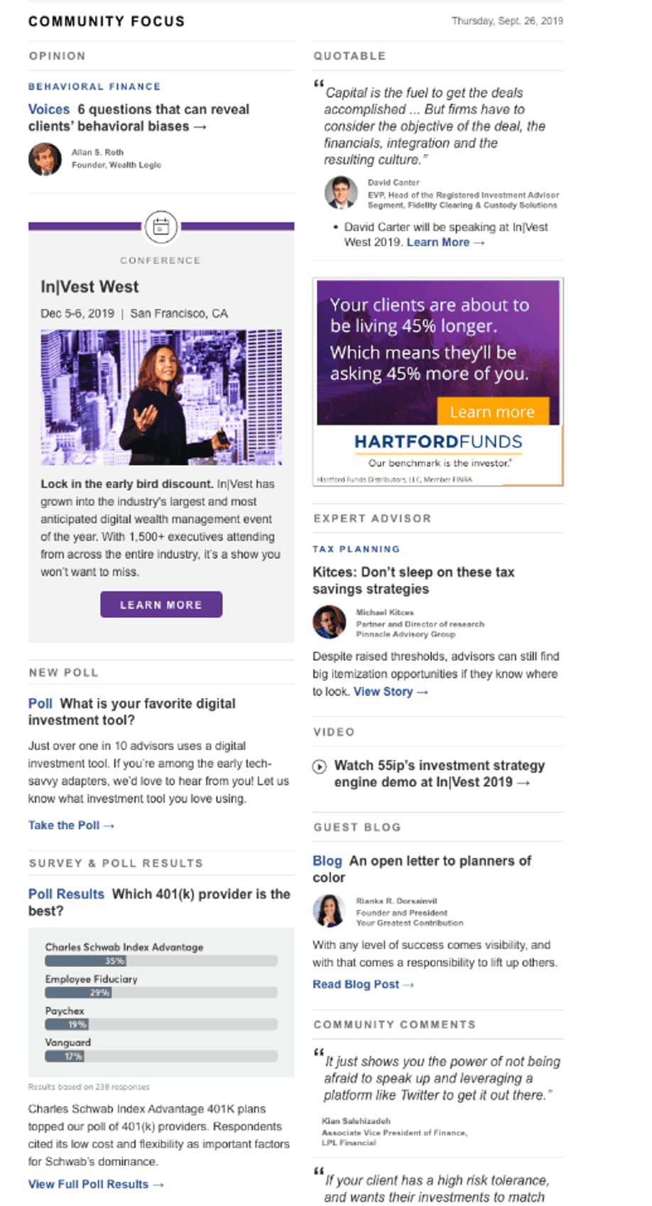
Here's how we laid out email blocks to make them readable and eye-catching. The visual below is from the design template. The actual content would have varied.
(Source: Email made by Brian Riback and other contributors)
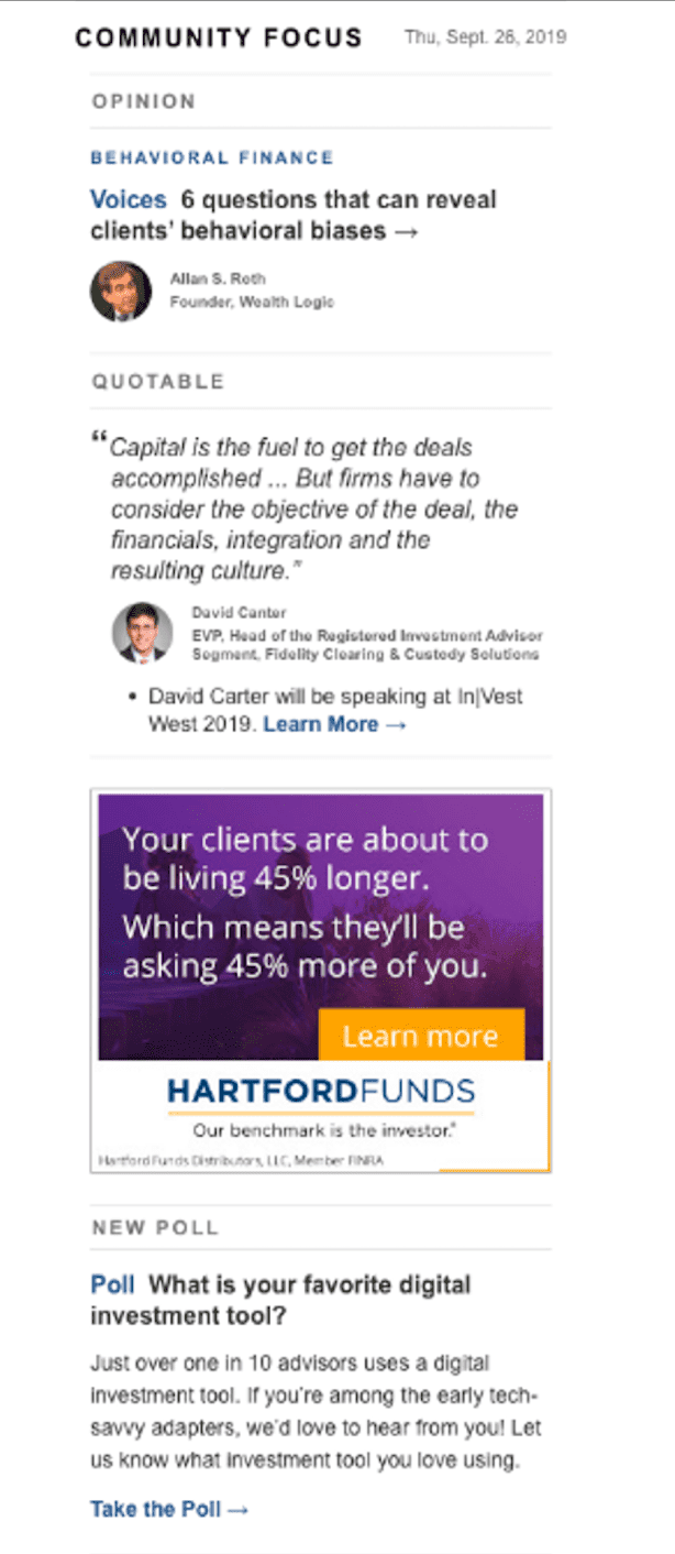
A two-column email can easily become a one-column layout on mobile, but a one-column email can't be transformed into a two-column layout on a desktop. Given the limitations of email design — in which advanced features like JavaScript don't work and media query capabilities are limited — starting with a one-column design restricts your flexibility.
Email design is more of a science than an art, and layout is as important as content. By beginning with two columns, you ensure that the second column can simply “wrap” under the first on smaller screens.
(Source: Email made by Brian Riback and other contributors)
This is particularly crucial in B2B emails, in which the first 300 pixels are prime real estate. A two-column “hero” section allows you to maximize this space, effectively doubling your content in this critical area.
This email layout aimed to encourage someone who previously abandoned event registration to complete their sign-up. For this reason, we made the following changes:
- To reinforce the value proposition, we included a keynote speaker quote highlighting the event’s importance and the brand’s authority on the topic.
- We also incorporated a poll to drive retention, with the promise that responses would be featured in the following week’s email. This approach provides ongoing value and encourages the user to continue engaging with our content each week.
- Ultimately, this email helped us reduce recipient emails from nine a day to two by including content for each of the following teams: Market research (the poll); editorial; ad sales; and blog announcements.
This shift in strategy led to much greater engagement and proved that sending fewer, but more relevant, emails made a real difference. This project also reinforced the importance of approaching UI/UX as a science: Making decisions based on data and logic was key to the success we observed.
A/B testing process
A/B testing played a significant role in this campaign. We experimented with various factors, such as email frequency, content segmentation, and the impact of sending fewer emails. Testing revealed that engagement increased when we targeted emails more precisely.
Interestingly, we didn’t spend time testing the creatives because we engaged active subscribers for feedback while the email template was being developed. Instead, we focused on testing sending frequency. However, as a B2B publisher with a large portion of our audience in the finance industry, deliverability was always a challenge. To address this, we collaborated with systems administrators at major banks, such as Chase and CitiBank, to whitelist our IPs — a step they only agreed to after we cleaned up our list.
After removing disengaged users and reducing email frequency for four weeks (to allow the IP address reputation to “heal”), we conducted a standard 10/10/80 split test over the subsequent four weeks:
- Audience 1 (10%) — Editorial and everything else combined: This group received editorial emails and a separate daily email combining events, polls, podcasts, etc. The hypothesis was that separating editorial content within the email, apart from the other content, would reduce engagement in the combined email, which was confirmed. Open rates for the second email were below 10%, while editorial-only emails maintained pretest performance levels.
- Audience 2 (10%) — The new email: This group received a new email format, which immediately outperformed the others by at least 6% in open rates. Click engagement doubled, and teams observed increases in conversion rates, which could be traced back to this email.
- Audience 3 (80%) — Business as usual: This group received the original (control) creative with unchanged sending frequencies. Although we observed marginal increases in engagement (click-to-open rate) due to list cleanup and sender reputation improvements, I suspect that these increases were partly due to firewalls “seeing” these emails for the first time.
This process made it clear that understanding the science behind UI/UX is just as important as the creative side of email marketing.
Results
The results were impressive. Engagement with all content parts — event content, poll responses, webinar registrations, and podcast downloads — increased. While I can’t share specific metrics for each team’s content, overall click-to-open rates more than doubled, and open rates improved by 8–12% over time, continued to rise. Notably, the segments that received fewer emails showed the most significant improvements in open rates. This demonstrated that a thoughtful, scientific approach to UI/UX and design can lead to excellent outcomes.
While creative optimization played a role in our success, our data cleanup efforts — removing disengaged records, improving deliverability, and reducing email frequency — truly drove these results.
Life hacks for preparing a digest email campaign
Improving the digest format of the email campaign yielded the following conclusions that will help in future work:
- Use A/B testing: Always validate hypotheses, especially when demonstrating the benefits of reducing email frequency. A/B testing helps you back up your ideas with data, making it easier to convince stakeholders.
- Focus on quality over quantity: Reducing the number of emails can lead to higher engagement, especially when the content is more relevant. In fact, by focusing on making your content more relevant to your audience, you’ll likely elicit better results.
- Utilize the right tools: Ensure you have the appropriate tools to manage email frequency and content consistency across different systems. Recognize the need to treat UI/UX as a science that requires rigorous testing and validation, while graphic design remains an art focused on enhancing visual appeal and not layout.
Lessons learned
One thing I definitely wouldn’t repeat after this campaign is choosing an email service provider that only talks the talk, but doesn’t actually deliver on its promises. We learned the hard way that it’s essential to vet any vendor thoroughly before making a commitment. As such, while providers continue to receive positive industry reviews from companies like Forrester, this doesn't influence my vetting process. Instead, I have developed my own criteria when choosing a new vendor, which includes requiring practical examples to my specification be executed, so I can see their technology in action. This experience underscored the importance of confirming that the provider's capabilities and support can handle the demands of my work.
Another takeaway was the importance of clearly separating the roles of UI/UX and graphic design in a project. Each plays a critical role, but they need to be applied correctly to meet the project’s specific needs. Getting this balance right can make all the difference in how successful the campaign turns out to be.
Wrapping up
We are grateful to Brian Riback for the inspiring case he shared with us. This is really how hard work and perseverance pay off.
This case shows how taking a strategic approach to email campaigns can make all the difference. By reducing email frequency and prioritizing content that truly matters to your audience, you can boost engagement, rather than overwhelm your recipients. The key takeaway here for any email marketer is to remember that more emails don’t always mean more impact — quality over quantity is the way to go.
Another significant lesson is the need to vet your tools and service providers thoroughly. Having the right support and capabilities is essential for managing complex campaigns, especially when dealing with multiple systems. Don’t just rely on promises — ensure that your tools can deliver what you need.
Finally, never underestimate the importance of UI/UX and graphic design. Treat UI/UX as a science that requires careful testing and validation to ensure smooth functionality. Simultaneously, don’t forget the artistic side of graphic design, which helps your emails stand out visually. You can create compelling, engaging email campaigns that resonate with your audience by balancing these two elements.
Using these insights in your campaigns can help you achieve better results, improve engagement, and create a more efficient and impactful email marketing strategy.
P.S.: Are you a practicing email marketer and have a case study of an outstanding email campaign that you want to share with the community? Write to us, and we definitely will discuss it.




0 comments