Successful examples of brand identity + important assets

The corporate world is too competitive nowadays. It was estimated that there were about 333 million companies in 2021 and the number has only continued to grow, especially after the pandemic, as more people shifted from jobs to starting their own ventures.
In this stiff competition, straightforward marketing efforts alone are not enough. However, not all is lost as there is a way to stand out in the crowd.
You need to build your brand identity.
Building a strong brand identity is essential when it comes to representing your brand accurately and connecting to your customers. This guide will cover all the details on how you can build a cohesive brand identity by investing in important digital assets. Let’s explore them more.
What is brand identity?
Brand identity is like a human identification document. As an individual, you have a photo, home address, phone number, fingerprints, and more that set you apart from other people.
In a similar manner, a company needs to have a unique set of visual elements or graphic representations to set itself apart from the rest of the crowd.
Memorable brand identity includes a vast array of things like brand colors, social media channels and posts, a website, a logo, and much more. It also includes the fonts used, business card designs, etc.
Brand vs. brand identity
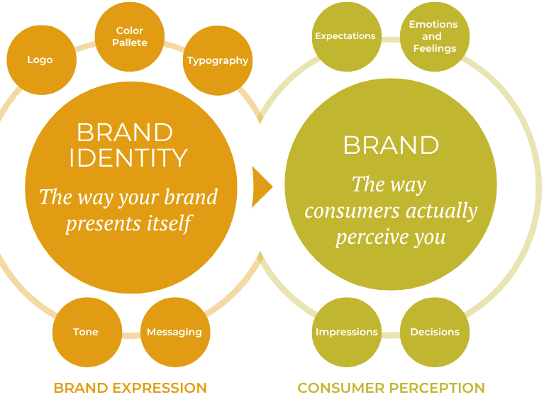
However, you should be cautious to distinguish this from the brand itself. A brand is different from a brand identity as it is based on the emotional connection your target audience develops with the company. It is all about how you make the customer feel when they see your brand’s visual identity.
If you want to go far in business, building a successful brand is a must. You need people to feel strongly about your company and become loyal customers. To build a brand, you must have all the elements of a brand identity. And to build your brand identity, you need to have brand assets.
(Source: LinkedIn)
Brand assets
Brand assets are the aspects that make up a brand identity such as logos, videos, photos, taglines, slogans, sounds, and other visual elements.
For example, Apple has a unique logo of the half-bitten fruit, a gray color palette, and a distinctive typography. People take the Apple logo as a status symbol and stand in long queues just to get their hands on that specific brand.
Now that you know why you need a brand identity, what should you have in your brand asset kit? Some of the most important brand assets are listed below.
-
Brand logo
A logo is probably one of the first and most important brand assets you need to set up. It is a pictorial or graphic representation of what your entire brand stands for and should ideally be clear and simple rather than complicated and clever.
There are some important points you should remember before communicating your logo design needs to a designer:
- don’t overdo the background or handwriting;
- keep away from flowery backgrounds and illegible writing;
- the background color and text color should complement each other so that people can clearly read the text without straining their eyes;
- a logo should have a simple font that anyone can understand and a plain background;
- take your time choosing the colors for your brand logo, as using those colors throughout your business makes a company more memorable.
While there are several things you can do with a logo, it is better to have something that will remind people of your company constantly and as soon as they see it. An example of a memorable and instantly-recognizable logo is the iconic Nike swoosh.
For a logo, you can hire a designer or use a simple logo design tool to create one yourself.
-
Typography or font
Fonts can trigger serious emotional reactions in people, so you need to choose fonts that go well with your brand identity.
The fonts you use and the typography is also dependent on the aura of your brand. If it is a luxury brand, a plain font won’t do much good, you should opt for a fancier font. Similarly, you could use some fun fonts for a food-related brand. You get the idea.
This does not mean that you have to use only one font for all your brand-related work, but you should use a single font family. A font family has all the fonts that complement each other.
-
Color palettes
Using a consistent color palette throughout will make sure the customer starts associating those colors with your brand. Ideally, whenever they come across similar hues, they will think of your company. Being in the minds of people is great marketing as a reference and word of mouth creates an immense amount of business for companies.
The color palette you choose can depend on a lot of factors but there are some popular colors commonly used in the corporate world.
- blue is a central and representative color for many top companies like Facebook, Twitter, LinkedIn, and more;
- food-related companies tend to use more tantalizing and attractive colors like red, yellow, orange, etc.;
- companies trying to establish themselves as luxury companies tend to favor black or gray tones such as Apple.
This doesn’t mean that if a successful company already uses blue you can’t use it. You can use the same color as another company, but your entire color palette should be different. The way you use the colors in your unique color palette should be unique as well.
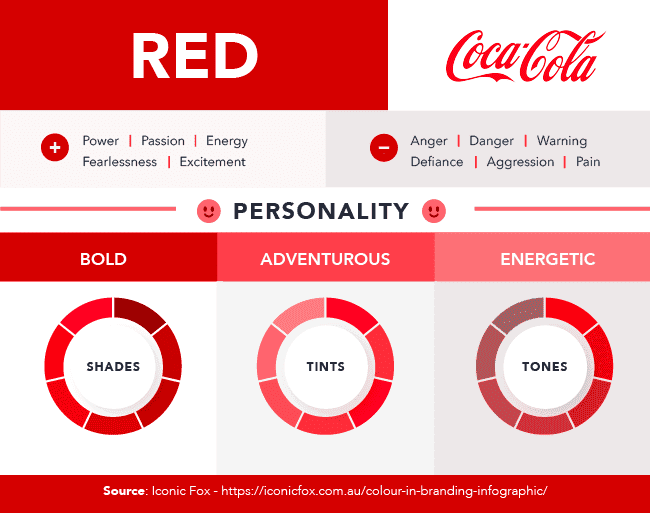
Take Coca-Cola and McDonald's as examples. They both have red in their palette but that color is matched with different hues. And the exact shade is different too. So, keep that in mind when choosing a color palette.
While working on your brand color palettes, don’t forget to make them accessible for customers with visual impairments (2.2 billion people worldwide) and dyslexia (9-12% of the population). You can use tools like Contrast Checker, Colorable, and Chrome’s add-on Disability Simulator to make sure your content is consumable for all users.
-
Tone and messaging
Your brand’s tone and messaging will come together to create a brand voice. Strive for a unique voice that really encapsulates what your brand stands for to create a cohesive and well-rounded identity.
To nail your brand voice, think of words that go with the tone you want to set for your brand. Do you want the tone of your brand to be powerful or do you want it to be ethereal? Are you going for a serious tone or a more quirky one?
An example of a powerful brand voice is Dove. They offer an uplifting and encouraging message of self-love and acceptance in the beauty industry, which shows the brand’s commitment to its values and to its customers. On the other side of the spectrum, Skittles is a great example of a brand with a humorous and fun tone. Their communication is always irreverent, whether it’s their tagline, social media posts, or ads.
(Source: HubSpot)
-
Website design
According to statistics, about 2.14 billion people make a purchase online. Most people today go to the internet for research purposes before making the final decision. A website is one of the main tools businesses use to reach customers besides social media channels, review sites, and more.
People who click on a website spend very little time on it so you need to have a catchy design that compels customers to stay and explore more. The user interface should be straightforward, elegant, and understandable. It is better to match the colors of your website with the color palette you have chosen for your brand.
It’s also crucial to use the same colors and fonts on imagery and tone of voice across social media platforms and in email marketing like Sender. Thus, it will be easier to maintain brand consistency and obtain customers’ trust.
-
Tagline
“It’s finger-lickin’ good” — what does this line remind you of? That’s right, this KFC tagline has been embedded in our minds forever. It’s almost impossible to think of anything else when you hear those words.
It is incredible how a simple play on words in just one line can create an unmatchable brand voice. That’s the power of taglines.
If you don’t have a tagline, you must come up with one. Taglines can create memories and connections with people like no other asset can. Just like we remember poems we learned in nursery school, catchy words have a way of staying in our minds.
Take the example of some other brands that have unforgettable taglines. “Think different” for Apple, “You’re worth it” for L’Oreal, and “Just do it” for Nike.
These tag lines are surprisingly simple. You don’t need to come up with clever words or twist phrases beyond recognition. What you need to do is create something that is so plain and memorable it will stick with everyone.
Get inspired by these brand identity examples
1. Coca-Cola
Tagline: Real magic.
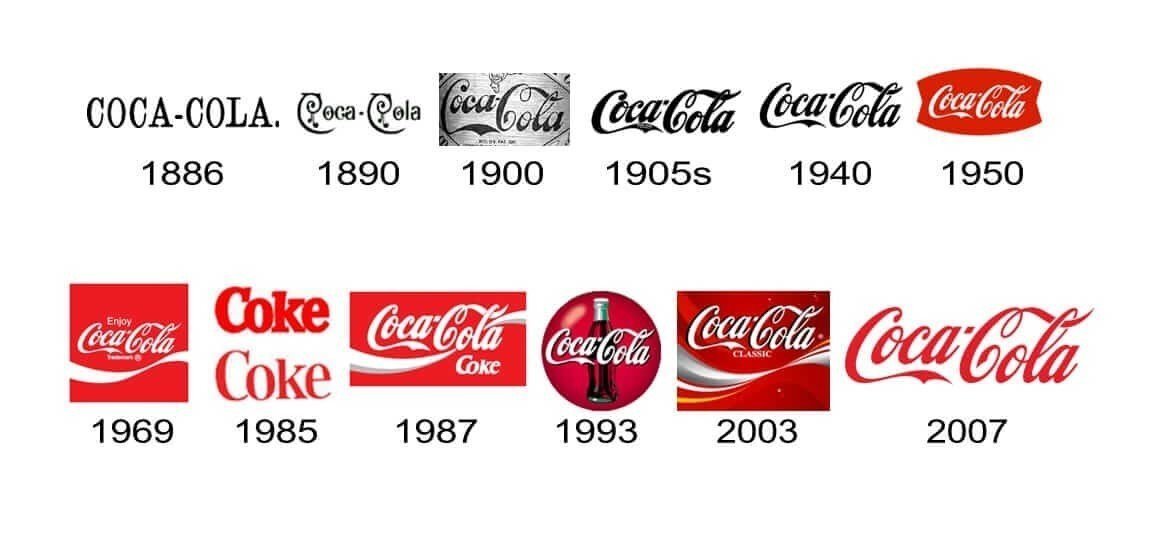
This is a classic example of how getting your brand identity right can lead to massive success. While Coca-Cola has made adjustments through the years, they never lost the classic elements that make the brand memorable and recognizable.
The basic red and white color palette and distinct typography in their logo work perfectly together and have come together to create one of the most iconic logos of all time. No matter where in the world you live, you know it’s Coca-Cola when you see it and you know exactly what they’re selling.
Coca-Cola dominates the market with a globally recognized brand that brings a smile to people’s faces.
(Source: Fabrik)
2. McDonald’s
Tagline: We love to see you smile.
Like Coca-Cola, McDonald’s is a globally recognized brand that inspires confidence no matter where you run into its golden arches.
This fast-food giant sticks to a simple red and yellow color palette that is memorable and easily recognizable worldwide. Their iconic M, also dubbed the golden arches, has stood the test of time and is recognized by consumers of all ages.
While they are easy to recognize, they also do a great job adapting their brand identity to target different audiences. The simple color palette and iconic M are used alongside characters like Ronald McDonald and the Hamburglar to market to children (Happy Meals) and diverse markets that can have dietary restrictions and cultural differences. Even so, they are a pillar of consistency, making consumers feel safe and welcome when stepping into any of their locations.

(Source: AdAge)
3. Headspace
Tagline: A personal meditation guide, right in your pocket.
Headspace is an app created to help people release the stress that burdens them on a daily through guided meditation and mindfulness practices. This may seem like something that is difficult to communicate visually, but they’ve mastered it completely.
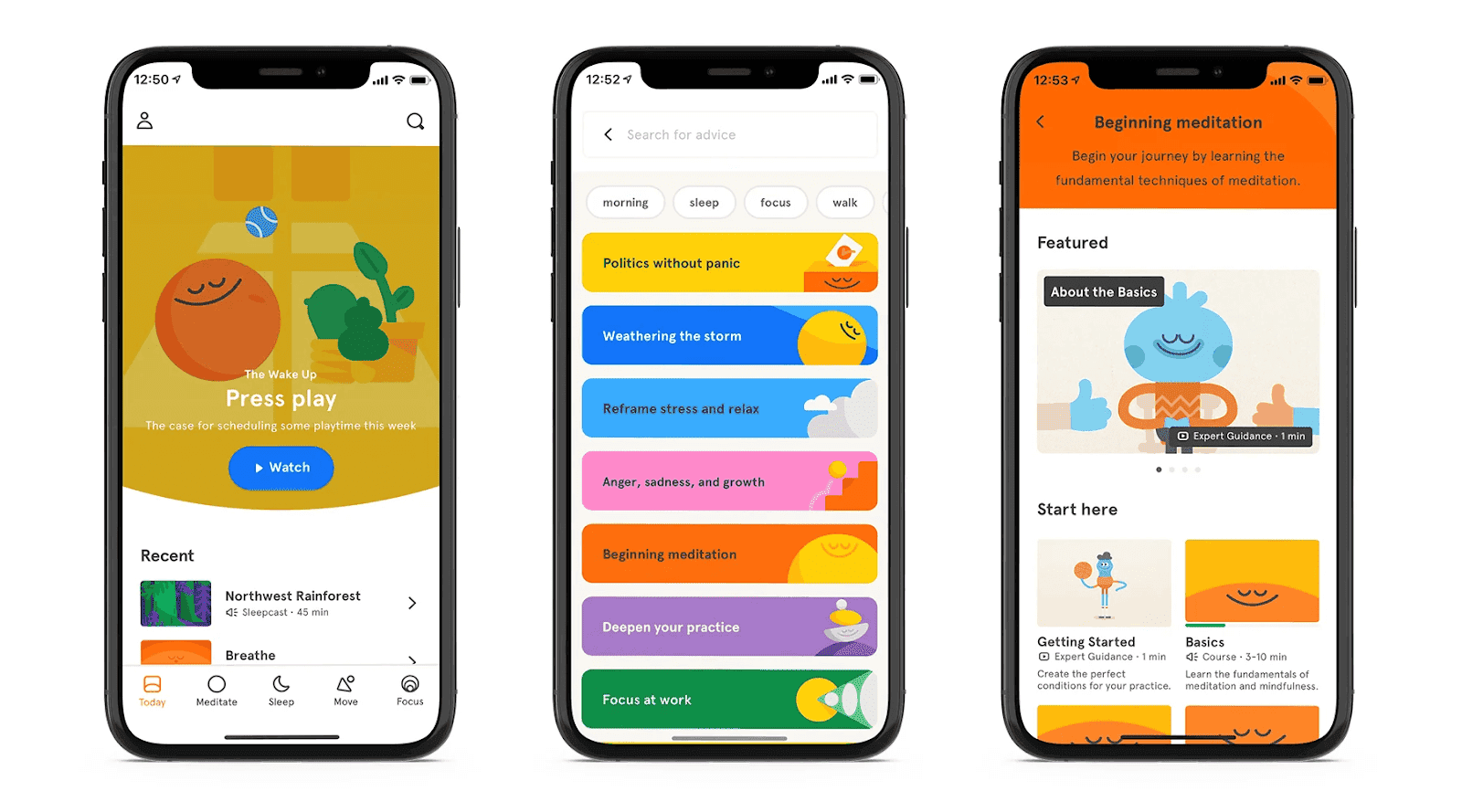
Headspace’s logo is a simple orange dot and its brand name is written out in a sans-serif font that is simple, clear, and minimalistic. While this orange dot may not look like much, it represents a still, centered, and calm state of mind, which is exactly what the app aims to achieve for its users.
We often think of shades of blue as calming, but Headspace actually uses tons of color on their website, in their app, and in their social posts and videos. This bright and cheerful color palette makes sense alongside their cartoon-like graphics — they work together to spark joy and happiness in users across their communication channels.
(Source: Paper Leaf)
4. Glossier
Tagline: Skin first. Makeup second. Smile always.
Glossier started off as a blog (Into the Gloss) and grew into the huge makeup and skincare brand it is today thanks to the loyal following they were able to establish as an authentic and young voice in beauty.
Knowing their audience was mostly comprised of young beauty enthusiasts who opted for more natural products, Glossier made the smart decision to create a minimalist brand identity. Even their tagline, “Skin first. Makeup second. Smile always”, holds true to their natural approach to beauty. This combination along with their elegant packaging and ads featuring real skin was a big hit with consumers.
Their focus on accessibility and inclusivity helped the brand grow beyond just beauty products and into more of a lifestyle brand. Their brick-and-mortar locations along with their website, social channels, and marketing campaigns stick to the essentials and let their products do the talking.

(Source: Glossier)
Wrapping up
There are many more brand assets you should have in your brand guidelines kit such as icons, illustrations, business cards, email design, etc. However, these are the most important ones that will guide the rest of the assets for you. Don’t be afraid to play with the colors and have fun.





0 comments