Level up your brand and design emails that resonate

Our inboxes are crowded. Maybe that’s an understatement, so making your emails stand out is crucial. Your brand’s voice and visual identity should shine through every communication, and emails are no exception. This article will guide you in elevating your brand through good email design.
Get ready to explore strategies for aligning email aesthetics with brand identity, crafting compelling content, and ensuring a seamless experience for subscribers, as well as integrating AI tools to supercharge your email marketing efforts, allowing your brand to truly stand out in crowded inboxes.
Aligning your email strategy with your brand identity
According to the Content Marketing Institute, 71% of marketers distribute digital newsletters these days and make them part of their overall strategies. So, aligning your email strategy with your brand identity is essential for creating a cohesive and recognizable presence.
Consider your brand’s core values, visual elements, and overall tone. Ensure these aspects are reflected consistently in your emails. Use your brand’s color palette, fonts, and logo to maintain visual consistency.
Your email’s content should echo your brand’s voice, whether formal, friendly, or innovative. Craft messages that resonate with your target audience while reinforcing your brand’s personality. This alignment builds trust and strengthens email branding recognition, fostering deeper connections with your subscribers.
Why consistent branding in email design elevates marketing results
Consistent branding in email design isn’t merely an aesthetic choice, but a strategic imperative that significantly enhances marketing results.
According to Siteimprove, consistent branding (logo, color palette, typography) helps recipients quickly identify the sender, cutting through inbox clutter. Each email becomes an opportunity to embed the brand’s personality, values, and unique selling propositions deeper into the recipient’s mind.
When visual elements align with the brand’s voice and overall marketing strategy, the message becomes more coherent and impactful. Ultimately, these factors translate directly into improved marketing results. Higher open rates due to recognition, increased click-through rates driven by trust and engaging design, and enhanced conversion rates stemming from clear brand messaging all contribute to a stronger return on investment (ROI) for email marketing efforts.
Key elements of a successful on-brand email template design
A well-crafted email template is the foundation of effective communication. It combines design, copy, and structure to deliver your message clearly and engagingly. As stated before, consistency is key: every element, from copy and visuals to typography and structure, should align seamlessly with your business’ brand guidelines.
Let’s now explore the elements that will make your email template successful, ensuring it captures your audience’s attention and drives desired action.
Copy
Compelling copy is the heart of effective email communication. It’s not just about conveying information but about connecting with your audience.
That being said, a good copy should:
- speak directly to the reader, addressing their needs and interests while showcasing your brand’s unique voice;
- guide subscribers through the email, highlighting key messages;
- drive them toward the desired action, be it purchasing, clicking a link, or simply engaging further with your content;
- refer to your brand’s tone of voice guidelines and terminology to ensure consistency across all email campaigns.

(Source: Email from Cuisinart)
In the example above, Cuisinart’s newsletter boasts witty, compelling copy due to its clever use of puns and evocative language that resonates with its audience. The heading “Make it a Shell-abration” exemplifies this perfectly by employing a playful, ocean-themed pun immediately hinting at beach-inspired recipes.
This grabs the reader’s attention and creates a sense of fun and excitement, subtly linking Cuisinart products to enjoyable seasonal culinary experiences. The copy’s effectiveness lies in its ability to be both entertaining and informative, enticing readers to explore the suggested products and recipes with a lighthearted approach.
Structure
A well-organized email structure is fundamental for creating a well-crafted email. The structure must:
- take the reader seamlessly through your content, ensuring they grasp your message effortlessly;
- include logical sections, defined by headings and subheadings, that break down information into digestible chunks. This prevents your reader from getting overwhelmed and maintains engagement;
- allow a natural flow, leading recipients from the introduction to key points and finally to the call-to-action. A good structure respects your reader’s time and makes your email both easy to read and highly effective.
Headings
Effective headings are vital for successful email templates, and they should:
- act as signposts, guiding readers through your content and breaking it into digestible sections;
- enhance readability, making it easier for recipients to scan and quickly grasp key points;
- establish a logical flow, ensuring your message is understood and retained;
- capture attention, encouraging engagement and preventing reader fatigue;
- use on-brand terminology and capitalization (e.g., sentence case, where only the first word and proper nouns are capitalized).
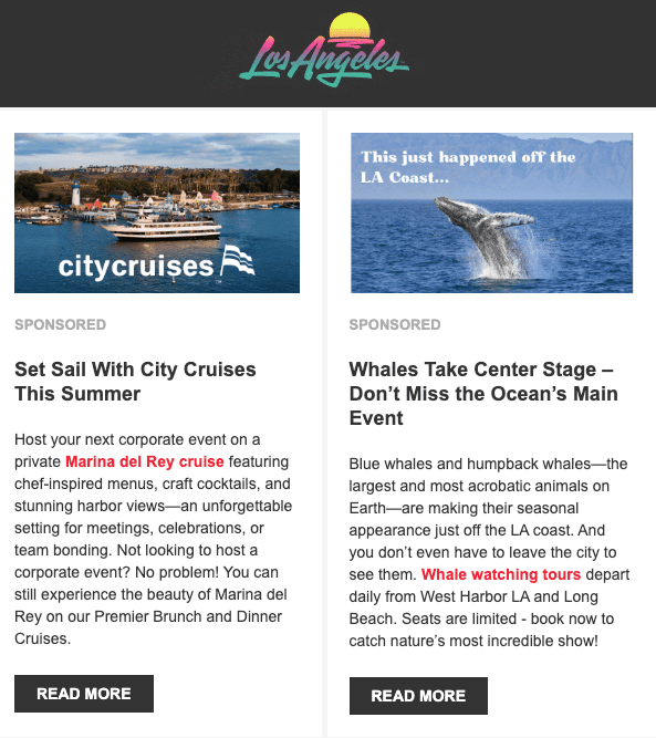
(Source: Email from Discover Los Angeles)
Discover Los Angeles is a good example. This sender nails the messaging with concise, attractive headings because they understand their audience — visitors seeking clear, straightforward information to plan their trip. Their headings avoid jargon and get straight to the point, directly addressing typical visitor needs like “Things to Do,” “Eat & Drink,” or “Where to Stay.”
Concise emails like this one, often paired with visually appealing design and photography, ensure that the message is instantly digestible and appealing, making it incredibly easy for potential tourists to find relevant information quickly.
Links
Links are the connective tissue of your email, guiding readers deeper into your content and driving engagement. When used strategically, they enhance the reader’s experience by providing additional resources, relevant articles, or product pages.
Take into consideration that:
- well-placed links make your email more informative and valuable, allowing recipients to explore topics that interest them further;
- links offer a clear path to your calls-to-action, directing readers exactly where you want them to go;
- thoughtful use of links transforms your email from a static message into an interactive journey, fostering deeper connections with your audience and boosting overall engagement.

(Source: Email from Coursera)
Coursera’s newsletters are highly effective due to their strategic placement and clarity of links, which are consistently useful and relevant to the recipient. Given Coursera’s focus on education and professional development, their emails typically feature prominent calls-to-action that lead directly to specific courses, specializations, or learning paths tailored to recipient interests or browsing history.
Calls-to-action
A compelling call-to-action is crucial for driving engagement and achieving your email’s desired outcome. It provides a clear directive for your audience, guiding them to the next step, whether it’s visiting your website, making a purchase, or signing up for a newsletter. A well-crafted CTA is not just an invitation but a bridge connecting your email content to actionable results. Effective CTAs increase conversion rates and strengthen the effectiveness of your email marketing efforts.
Some best practices for CTAs:
- use action-oriented language (e.g., “Shop Now,” “Learn More”);
- make CTAs visually prominent with buttons or distinct design elements;
- keep the text concise and focused;
- place CTAs strategically within the email, especially above the fold;
- ensure CTAs are mobile-friendly and easily clickable on all devices;
- A/B test different CTA phrasings and designs to optimize performance;
- style your links the same way you style buttons and hyperlinks on your website, and keep that style consistent across all email campaigns to maintain a unified brand experience.
CTAs work best when they reflect where your audience is in their decision-making process. From sparking interest to driving action, each CTA should be crafted with the customer journey in mind. Nextiva offers a clear breakdown of this digital journey, highlighting five key stages that can help you deliver the right message at the right time and maximize impact across your email campaigns.
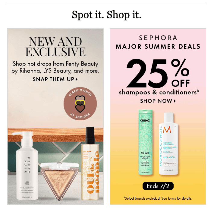
(Source: Email from Sephora)
Sephora’s newsletters excel at driving engagement and sales through their masterful use of action-oriented CTAs. They strategically employ powerful verbs and benefit-driven language like “Shop Now,” “Snap them Up,” or “Claim Your Free Gift” that tell the customers directly what to do and what they stand to gain. These compelling phrases are often integrated with visually rich, clickable images that showcase desirable products or offers, making the act of shopping feel seamless and irresistible.
Sephora’s wording and visually appealing elements effectively lower the barrier to purchase, transforming scrolling into buying.
Visuals
Visuals play a huge role in making your email template design truly effective. Images, illustrations, and videos can convey complex information quickly and memorably, making your message resonate more deeply. They also help establish consistent email branding, reinforce your style, and foster recognition.
For your email visuals, always:
- consult your brand book or branding guidelines for overall consistency;
- refer to your defined color palettes to maintain visual harmony;
- stick to your approved fonts to ensure consistent typography.

(Source: Email from ZaraHome)
For example, Zara Home’s emails excel in showcasing their new collection due to a well-defined and visually attractive structure that prioritizes clear presentation. They leverage high-quality, editorial-style imagery that effectively highlights their products’ aesthetic and texture, often presented in aspirational lifestyle settings.
This visual appeal is typically complemented by a clean, minimalist layout with ample white space, allowing each item to stand out without feeling cluttered, making for an engaging and effortless browsing experience.
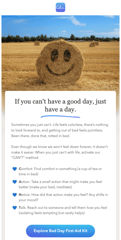
(Source: Email from Calm app)
Calm app’s newsletter consistently features nice visuals that perfectly align with their brand and marketing efforts because their core identity is built around serenity and mental well-being. Their visuals typically incorporate soothing color palettes, tranquil nature scenes, gentle animations, and minimalist design, all of which evoke a sense of peace and calm.
This is a great example of how consistent aesthetics can reinforce this brand’s message of providing tools for mindfulness and relaxation, directly supporting their marketing goal of attracting subscribers seeking to reduce stress and improve sleep.
AI image generation tools for email design
AI image generation tools make creating engaging visuals for your email campaigns easier. These tools leverage artificial intelligence to produce unique images, helping you maintain a fresh and dynamic visual identity in your emails.
Here’s a list of AI tools that can help you generate images:
- Envato’s ImageGen: This tool allows you to easily generate AI images from text, making it a valuable resource for email designers looking for custom and inspirational visuals;
- Midjourney: Known for its artistic and often surreal image generation capabilities, Midjourney is a popular choice for creating unique and eye-catching visuals;
- DALL-E 3: Developed by OpenAI, DALL-E 3 can generate highly detailed and contextually relevant images from text prompts, making it versatile for various design needs;
- Diffus: An open-source model, Stable Diffusion offers extensive customization and control over image generation, and is suitable for users who require more specific outputs;
- Adobe Firefly: Integrated with Adobe’s creative suite, Firefly provides AI image generation capabilities particularly useful for designers already using Adobe products.
Remember that thoughtfully created visuals enhance overall aesthetic appeal, build emotional connections, and guide the reader’s eye, ensuring your message is not only seen but truly felt.
Color
Color is key in email template design, influencing both aesthetics and effectiveness. A thoughtfully chosen color palette that aligns with your brand identity instantly creates recognition and reinforces brand value.
- colors evoke emotions and can guide the reader’s eye, highlighting key elements and calls-to-action;
- strategic color use can also enhance readability by creating contrast between text and background;
- colors create visual hierarchy, helping readers navigate your content effortlessly;
- use your brand’s official color palette to maintain consistency and strengthen brand recognition;
- well-applied color makes your emails visually appealing, emotionally engaging, and highly effective in achieving your communication goals.

(Source: Email from Kitchn’s)
The Kitchn’s newsletter effectively uses pops of color to maintain a playful and engaging tone while informing its readers. In contrast to a strictly minimalist or muted palette, the strategic inclusion of vibrant hues — in headings, call-to-action buttons, or accent elements — adds a dynamic and cheerful energy to the design.
A playful use of color not only makes the newsletter visually appealing and less monotonous but also subtly reinforces The Kitchn’s brand identity as a source of accessible, enjoyable, and often creative culinary inspiration.
Typography
Typography is crucial for good email design, as it dictates readability and reflects your brand’s personality. Well-chosen fonts enhance the visual hierarchy, guiding readers through your message and emphasizing key points. Poor typography, on the other hand, can confuse or overwhelm, leading to disengagement. Selecting the right typeface and size ensures that your message is seen and easily understood, boosting overall engagement and effectiveness.
Some best practices for choosing fonts and adding text to your design:
- use web-safe fonts like Arial, Times New Roman, or Georgia for consistency across devices;
- limit the number of fonts to two or three to maintain a clean look;
- ensure text is large enough to be read easily, particularly on mobile devices;
- maintain good contrast between text and background colors for optimal readability;
- use fonts that are authorized by your branding team or included in your brand book.
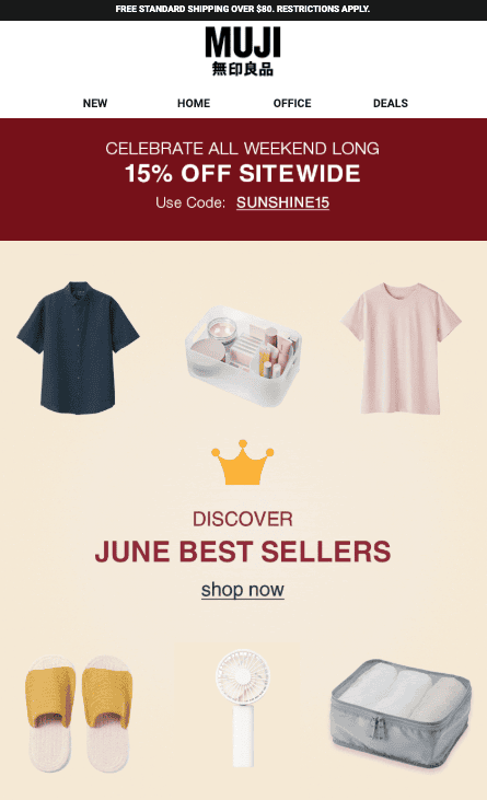
(Source: Email from MUJI)
MUJI’s newsletter leverages web-safe fonts to ensure maximum readability, a choice that perfectly mirrors the brand’s commitment to minimalism and functionality. Their newsletter sticks to widely supported fonts like Arial or Verdana. Therefore, their messages display consistently across all devices and email clients, avoiding broken layouts or unreadable text.
MUJI’s simplicity in typography reinforces their brand ethos of “no-brand” quality and essential design, allowing the focus to remain on clean product photography and straightforward messaging, rather than distracting visual elements. It’s a subtle yet effective way to maintain brand integrity and provide a seamless, effortlessly legible experience for their subscribers.
Accessibility
Accessibility is crucial for good email design because it ensures that your message reaches everyone, regardless of their abilities. It’s not just about compliance but also about providing a seamless experience for all subscribers.
Here’s a short checklist to ensure email design accessibility:
- use sufficient color contrast between text and background;
- provide alternative text (alt text) for all images;
- use clear, concise language and avoid jargon;
- structure content logically with proper headings;
- ensure links are descriptive and easily identifiable;
- make emails keyboard navigable;
- test emails with screen readers to ensure usability.

(Source: Email from Apartment Therapy)
For example, Apartment Therapy’s email design combines visual appeal with readability through a thoughtful typographic strategy. The use of simple serif fonts for headings provides a classic, elegant touch that is easy on the eyes and clearly delineates different sections, guiding the reader’s attention. Additionally, sans-serif fonts for calls-to-action ensure that these crucial elements stand out with their clean modern aesthetic, promoting scannability and immediate comprehension. This clear distinction in font styles, coupled with a high-contrast ratio between the dark text and muted background colors, significantly enhances accessibility.
Also, the subdued color palette prevents visual fatigue, while the strong contrast ensures that all text — especially vital CTAs — is legible for a wide range of recipients, making the email both aesthetically pleasing and effortlessly navigable.
Advanced design techniques for engaging emails
Utilizing visual hierarchy in layouts
Visual hierarchy is a top technique for engaging emails because it guides the reader’s eye and highlights key information. A well-structured layout ensures important details stand out, creating a clear path through your content.
This can be achieved by:
- using varying font sizes and weights;
- employing strategic white space;
- placing key elements above the fold;
- using contrasting colors and visual cues.
Incorporating interactive elements
Interactive elements significantly enhance email engagement by moving beyond static content. They invite readers to participate actively, fostering a more immersive experience. This not only increases attention but also drives deeper interaction.
Examples include:
- interactive buttons;
- polls;
- quizzes;
- sliders;
- embedded videos;
- expandable sections.
All of these elements help the design captivate and hold the reader’s interest, making the email more memorable and effective.
Test different approaches
Testing various approaches to email template design is critical for optimization and effectiveness. Every audience responds differently, so trying multiple designs, layouts, and copy styles provides valuable insights into what resonates best. A/B testing subject lines, calls-to-action, and visuals can significantly impact open rates and conversions.
This iterative process allows for continuous improvement, ensuring that emails are engaging and aligned with audience preferences. By analyzing results and adapting strategies, businesses can maximize the impact of their email marketing campaigns and achieve desired outcomes.
- test one element at a time for accurate results;
- use a control group to compare against variations;
- track key metrics like open rates and click-through rates;
- analyze results thoroughly and apply learnings;
- document each test and its findings for future reference.
Wrapping up
Creating effective email templates that resonate with your audience and elevate your brand is an ongoing journey. Remember to align your email strategy with your brand identity, using your brand’s visual elements and voice consistently. Key aspects like compelling copy, a well-organized structure, strategic use of headings and links, and strong calls-to-action are essential. Visuals, color, and typography should be chosen thoughtfully to enhance readability and engagement.
Accessibility ensures that your message reaches everyone, while advanced design techniques, such as visual hierarchy and interactive elements, can significantly boost engagement. Continuous testing of different approaches will provide invaluable insights for optimizing your email campaigns.
By implementing these best practices, you can transform your email communication, build stronger connections with your subscribers, and drive meaningful results.
It’s now time to put these insights into practice and craft emails that not only look great but also truly resonate with your audience.




0 comments