
Case study: How an email with a dual-option CTA delivered an SaaS with a 5% click-to-conversion rate


When promoting a new SaaS product, it’s important to help different audiences feel comfortable engaging with the brand. Some users are ready to buy right away, while others are willing to wait and see what happens next. Marketers are often skeptical about reaching both target audiences in a single email campaign, as this can make the message too complex and lead to confusion.
In this case study for our Email Marketer’s Сode series, Claudio Mascarella shares how an email with a dual-option CTA helped an SaaS brand reach nearly 400,000 subscribers with a clear, choice-driven offer. By combining two focused CTAs with a simple structure and built-in urgency, the campaign delivered strong engagement and conversion results without overwhelming its audience.
Expert

Meet the expert
Claudio Mascarella is a digital marketing services coordinator at Cleverbridge, where he works across email and affiliate campaigns with a strong focus on performance and optimization. He’s a results-driven marketer with hands-on experience in digital marketing, customer support, and B2B sales, combining campaign execution with client communication and data analysis. Claudio is fluent in English, Italian, German, and Spanish, which helps him collaborate with international teams and clients.
His path into email marketing was shaped by a natural interest in processes, clear problem-solving, and system optimization. With that mindset, email marketing felt like a logical specialization. Claudio has been working in the field for about 2.5 years and has already collaborated with dozens of clients, supporting a wide range of campaign types.
Outside of work, Claudio is an avid reader and a gamer. He especially enjoys deck-building board- and video games, where players start from scratch and gradually build powerful systems through smart combinations. Not surprisingly, he sees a clear parallel with email marketing: building strategies step by step, optimizing over time, and letting well-designed automations do the heavy lifting once everything clicks.
In this case study, Claudio shares an unexpected result from a promotional campaign with a double call-to-action button.
The challenge: Promoting a new product without confusing users
I worked on a campaign for EndNote, a well-known reference management software package used by researchers and academic institutions worldwide. The business goal was clear: to promote an upcoming product launch while still driving revenue from the current version. The challenge was how to do both in a single email campaign without overwhelming the recipients or forcing them into a one-size-fits-all decision.
The key idea was to give subscribers a clear, simple choice. Instead of pushing one offer, we presented two straightforward options:
- pre-order the new product with a discount, or
- buy the current version right away at a discounted price and get a free upgrade on launch day.
This was a strategic decision made together with the EndNote team. It allowed us to convert two very different mindsets at once: those who were happy to wait for the new release and those who needed the product immediately. The dual-option approach helped to maximize conversions while keeping the audience unified in a single campaign.
The difficulty didn’t come from building the email itself. The real challenge was at the concept stage: finding a way to explain the pre-order model and the dual offer in a way that felt intuitive and frictionless. We had to be especially careful with the wording and structure to ensure the recipients immediately understood their options without having to think twice.
Claudio Mascarella,
Time was another important constraint. Every campaign at this level undergoes extensive testing and QA, covering not only the email template but also links, tracking, and pricing logic. In this case, the discount was applied through a price rule set directly on the platform, not a standard coupon code. This meant adding additional parameters to the links and conducting more thorough testing.
On top of internal QA, we worked closely with the EndNote team to review, test, and approve everything before launch, which added pressure but was essential for getting the details right.
The solution: Turning a complex offer into a clear choice
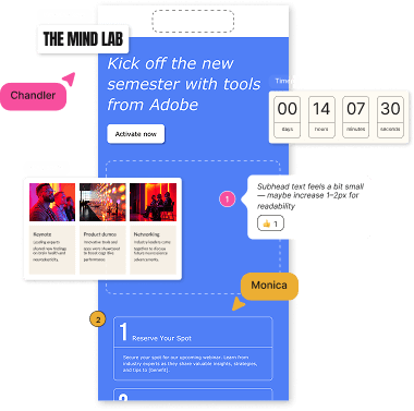
Once the strategy was defined, the solution became quite straightforward. The goal was not to add more elements but to make sure every element in the email had a clear purpose and supported the decision-making process.
To support this idea, we followed a KISS approach (Keep It Short and Simple). The email focused on concise copy, two clear CTAs, and nothing extra that could distract from the decision. Each CTA led to a distinct path, empowering recipients to choose the one that worked best for them.

(Source: Email by Cleverbridge)
Visually and structurally, this made the choice obvious. Recipients didn’t have to compare long feature lists or read dense explanations. They could immediately see both options and pick the one that best met their needs.
To reinforce the offer, we added a countdown timer. This wasn’t just a visual add-on; it worked as a gentle nudge, reminding users that the discounted options were time sensitive. Combined with the dual CTAs, the timer created urgency without pressure and helped move subscribers from consideration to action.
We used the Stripo email builder to create the campaign. It provided exactly what we needed to turn the pre-order strategy into a clean, functional email. Implementing two CTAs, adding a banner, adding a countdown timer, and managing multiple links were straightforward. This allowed us to focus less on technical limitations and more on making sure the message, structure, and user flow were right.
Claudio Mascarella,
Note from Stripo: To quickly add a countdown timer in the Stripo editor, you can open the Structures and Modules menu and select the section with pre-built timers. You can use any of the pre-built modules in your email. Try it out in the editor.

Results: How the campaign performed
The campaign was sent to a large audience of nearly 400,000 recipients, so it was a good test of whether the idea would scale without losing clarity. Despite the complexity of the offer on paper, the results showed that subscribers clearly understood the message and were comfortable making a choice.
Here’s how the campaign performed:
- open rate: 10.3%. The subject line and timing did their job, bringing a solid portion of the audience into the email and giving the offer a chance to be seen;
- click-to-conversion rate: 5%. This was the most telling metric for us. Recipients who clicked didn’t just browse; they converted. This confirmed that the two-CTA structure helped attract highly motivated and well-qualified subscribers;
- unsubscribe rate: 0.3%. The low unsubscribe rate showed that the messaging felt relevant and respectful. Even subscribers who didn’t convert weren’t put off by the offer or its presentation.
Overall, the campaign generated meaningful engagement and measurable revenue impact, especially considering the size of the audience and the dual-option concept. The results validated our core assumption: when you give recipients a clear, simple choice and remove unnecessary friction, they’re far more likely to act.
What can email marketers learn from this campaign?
This campaign reinforced a simple but often overlooked truth: even complex offers can perform well if the email experience is built around clarity and recipient choice. The structure, not the volume of information, made the difference.
Based on this experience, here are a few practical recommendations you can apply to similar campaigns:
- Start with one clear goal and design everything around it. Before touching the template, define the main objective of your campaign. In our case, it was supporting the pre-order phase with a dual-option offer. Once the goal is clear, it becomes much easier to decide what to keep in the email and what to remove.
- Make the decision easy, not impressive. Ask yourself what the subscriber actually needs to see to make a choice. Two clear CTAs, short explanations, and a logical layout often work better than clever copy or feature-heavy blocks. If subscribers can understand their options in a few seconds, you’re on the right track.
- Use urgency carefully and support it with structure. Elements such as countdown timers work best when they support a clear message. When paired with a simple layout and focused CTAs, urgency encourages action without creating pressure or confusion. Tools such as Stripo make it easier to test and implement these elements while keeping the email clean and well structured.
When the goal, message, and structure are aligned, the email does most of the work for you. Your job as a marketer is simply to remove friction and let the recipients choose.
Wrapping up
A big thank you to Claudio for sharing the strategy behind this campaign. His experience is a great reminder that effective email marketing doesn’t rely on complex mechanics or overloaded messages but on clarity, structure, and respect for how subscribers make decisions. When the goal is clear and the choice is simple, even large-scale campaigns can feel intuitive and personal.
Read other case studies from the Email Marketer’s Сode series and get inspired to create new, effective campaigns.


4 comments