Email call to action best practices: The complete guide [2026]

![Email call to action best practices _ The complete guide [2026]](https://live-content-worker.stripocdn.email/media/article/19962/conversions/01kwmgd4fbkn09c2vd2dyb94hs-1380x768-webp.webp?v=1783099728 "Email call to action best practices _ The complete guide [2026]")
You can write a beautiful email, fill it with catchy text, and still get nothing back if the email’s call to action falls flat. The CTA is the one element that turns a reader into a buyer or subscriber. Everything else in the email exists to get people to that button.
This guide covers email call-to-action best practices end-to-end: what a CTA actually is, how many to use, how to write copy that gets clicked, where to place it, how to design it, and how to test it. You’ll also find professional email call-to-action examples by goal and a set of fixes for the mistakes that quietly kill your click rate.
Key takeaways
- One primary CTA per email goal.
- Personalized CTAs convert 202% better than standard ones, HubSpot data show. Match the copy to the reader’s intent.
- Buttons beat text links. Use buttons for the primary CTA and leave text links for less important secondary CTAs
- Keep the button copy to 2-5 words, start with an action verb, and lead with the benefit.
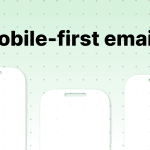
- Design for mobile first: full-width buttons, a tap target of at least 24 × 24 px, preferably 48 × 48 px, and high color contrast.
What is a call to action in email? (Types & examples)
Here’s what a CTA is, the types of CTAs with examples, and how the CTA hierarchy works.
Definition and role in email conversion
A call to action (CTA) in an email is an instruction that tells readers what to do next in the simplest possible way. It can be a bright button saying “Buy now,” “Sign up,” “Confirm,” or “Read more.” This button or link directs customers to your website, subscription form, confirmation page, or another destination where they must complete the action for which you sent them the email.
CTA types: Button, text link, image, interactive
There are four CTA formats you’ll use most often:
- button CTA. A bright, clickable element with a short call to action. Buttons are generally the most effective CTA format and work particularly well in both promotional and transactional emails. They stand out from other content, and subscribers can easily scan the email and get the gist without reading the whole message. And buttons outperform text links by around 28% in click-through rate;

(Source: Email love) - text link CTA. A hyperlink is attached to a word or phrase within the body copy. Text links are less visually noticeable and attract less attention than buttons. They work well in digests, where the button will get more attention than necessary. Text CTAs are also useful in cold outreach or sales emails, where simple text without unnecessary elements is more likely to land in the inbox rather than the spam folder;

(Source: Email love) - image CTA. A banner or image that is fully clickable. This type of button works well for products and offers where the visual component is important. But it’s still a good idea to add a link in the text or a regular button in case the email client blocks the image;

(Source: Email love) - interactive CTA. AMP elements, in-email forms, AMP carousels, or gamification allow recipients to take action without leaving their inbox.

(Source: Stripo template)


Here is an example of gamification applied to a CTA button.

(Source: Stripo template)
With Stripo, you can create these using AMP Form, AMP Carousel, and AMP Accordion elements while providing HTML fallbacks for email clients that don’t support AMP.
Primary vs. secondary CTA: The hierarchy explained
Every email should have one primary goal. The primary CTA supports that goal. It is usually a bright button on the first screen of the email, making it one of the first elements subscribers notice when they open it.
A secondary CTA serves either a secondary goal or a reader who needs more information. It is less bright and not so visible, located lower in the email.
The secondary button often uses softer calls to action, such as “Read more,” “Learn more,” or “Explore the details.” That is, if the reader doesn’t click the first “Buy now” button, then they may take action with the second, such as “Subscribe to our newsletter to stay updated on new releases,” and you will remain in the black.

(Source: Email love)
How many CTAs should an email have?
The answer depends on several factors, which we’ll examine below.
The core rule: One primary CTA per goal
There is no right answer to this question, as it depends on many factors: the goal of your email, its length, and its type.
The rule of thumb is one primary CTA per goal. Only add a secondary CTA when the format really requires it.
CTA count by email type: Decision table
In some types of emails, a single CTA is determined by the email’s goal, making it difficult to come up with options. For example, if it is an abandoned cart, then all you need is for the buyer to complete the purchase.
Newsletters are different. There can be several CTAs because this is a selection of materials, each with its own goal. In promotional emails or product launch announcements, the call to action can be repeated in different words.
|
Email type |
Recommended CTAs |
Why |
|
Event-triggered (confirm, reset, verify) |
1 |
One essential action |
|
Product launch announcement |
1, can be repeated |
The same message that you can repeat at the end of the email |
|
Promotional/sales |
1 primary, optional secondary |
Drive the offer. Let the less interested explore |
|
Newsletter/digest |
1 per content block |
Each block has its own separate CTA |
|
Abandoned cart |
1 |
Return to the cart. Remove every distraction |

(Source: Email from UNICEF)
When repeating the same CTA is acceptable
If your email is long, repeating the CTA is not a problem. You can place one CTA at the beginning, another in the middle, and a third at the end, so subscribers don’t have to scroll through the email after each paragraph.
You can also name each button slightly differently to avoid repetition. For example, one button might say, “Start your free trial,” while another might say, “Try it now.” But all of these CTAs should lead to the same destination. Don’t give the customer a choice; give them multiple entries to the same path.

(Source: Email love)
How to write email CTA copy that gets clicked
A good call to action in email marketing makes the next step obvious and worth taking. Here are six basic rules for writing email CTAs that get clicked.
Rule 1: Start with an action verb
Use action-oriented verbs, such as Start, Book, Try, or Get. They clearly signal what subscribers should do next. “Get my report” works. “More information” doesn’t.

(Source: Email love)
Rule 2: Lead with the benefit, not the action
Write about the benefits rather than simply telling people what to do. In essence, the message may be the same, but “Start my free trial” sounds better than “Subscribe.”
When Mailmodo changed its homepage CTA from “Book a demo” to “Talk to a Human,” conversions changed from 0.29% to 0.61% after the new copy framed a benefit rather than a sales step.

(Source: Email love)
Rule 3: Keep it to 2-5 words
Button text should be short; it’s not a sentence. If your CTA needs a comma, it’s probably too long. Find a balance between creativity and effectiveness.

(Source: Email love)
Rule 4: Use first-person pronouns
Your CTA button might say, “Buy it” just ordinary. But if you use “Yes, I want it” or “Add to my cart,” clicks increase. Words such as “my” and “me” make the action feel like the reader’s own decision. These simple pronouns get our attention immediately. Don’t hesitate to use them for your email campaign, but test them on your own list since the effect varies by audience.

(Source: Email from World Wildlife Fund)
Rule 5: Choose action words over friction words
Some words can create resistance, such as “Buy now” or “Submit.” Replace them with more neutral words that are a little easier to accept because they don’t seem to impose any obligation: “Get started” or “Claim my spot.”

(Source: Email from Holistic Email Marketing)
Rule 6: Create urgency without sounding desperate
Urgency works because people don’t like missing out on opportunities. Adding phrases such as “today” or “only this week” can improve CTR. But don’t overuse urgency. Fake “LAST CHANCE” messages on a product that is always in stock teach people to ignore such appeals. Pair your CTA with a countdown timer placed next to your offer to show how much time is left visually.

(Source: Email love)
Where to place your CTA: Placement rules that drive clicks
Where to place your CTA is just as important as what you write on it.
Above the fold: The non-negotiable default
First, your primary CTA should be visible without scrolling. People often scan emails rather than read them from start to finish. If your CTA is placed too low, it can get lost in the text. Place your button near the top of the email to grab the reader’s attention immediately.

(Source: Email love)
End-of-email placement for narrative content
If it’s important for customers to read all the information before making a decision, then it makes sense to place the CTA at the end of the email. This will give the person context and make it easier to move on to the next step, whether it is a sign-up, a subscription CTA, or another desired action.

(Source: Email love)
Repeating CTAs in long emails
What if you have a long email with lots of arguments and a diverse audience? Place one CTA at the beginning to capture the attention of readers who have already made a decision. Add a second CTA that leads to the same destination at the end of the email for those customers who need more information before taking action.
Multi-section newsletter: One CTA per section
In a newsletter with multiple stories, each deserves its own CTA. If readers want to dive into a third story, they don’t have to search the entire email for a link. Each section of the digest serves its own purpose, so separate CTAs don’t compete for the customer’s attention.

(Source: Email love)
Email CTA button design best practices
Even with great text on your button, it won’t do any good if the design hides your CTA. In this section, we share email call-to-action design best practices that make your button impossible to miss.
Button vs. text link: When to use each
Use a button for the primary CTA in your email. A bright button is hard to miss and easy to tap. This is especially important for promotional and transactional emails.
Text links work well for secondary calls to action, links within newsletter content blocks, and cold emails, where plain text has a better impact on deliverability.

(Source: Stripo template)
Color contrast and color psychology
Your CTA needs to stand out against everything surrounding it. If your email’s dominant color is white or beige, you can apply any color to your buttons. If the email is already colorful, pick a contrasting but on-brand shade, so the button still reads as part of the design.
Color carries an association. Green suggests safety and trustworthiness. Blue reads as stable and professional. If your brand colors include purple, it represents elegance, luxury, and leadership.
But contrast is more important than color associations. A green button on a green background loses contrast. To pick the best color for the CTA button that perfectly suits your entire email, use Paletton or another tool to help you choose a color scheme.

(Source: Email love)
Size and mobile tap target
Email buttons should be easy to tap on mobile devices, as this is where many recipients read their emails. According to WCAG 2.2 accessibility requirements, interactive elements should have a minimum target size of 24 × 24 px. At the same time, best practices recommend aiming for 48 × 48 px with some space around it, so people don’t accidentally click another element.
One of the easiest ways to improve mobile usability is to make your CTA buttons full width. This makes them more noticeable on smaller screens and reduces the risk of customers tapping the wrong element.
How to make full-width buttons on mobiles with Stripo
When your email is almost ready, click your CTA button to open the “Button block” settings. Then, under the “Settings” tab, select “Adjust to width on mobile.”

Visual hierarchy: Make the CTA win every visual contest
Your primary CTA should be the most visually dominant element in the email. Make it bright and the most contrasting element on the screen. Clicking on the CTA is what you’re sending this email for.

(Source: Stripo template)
White space: Give your button room to breathe
Padding around the button creates space and focuses attention on your CTA. When a button is placed too close to the surrounding text or other elements, it tends to blend into the content.
White space is one of the simplest ways to make a CTA stand out. By adding sufficient padding and spacing around your button, you make the desired action more obvious to readers.

(Source: Stripo template)
Button styles: Filled, ghost, outlined, image-based
- filled. A standard button with a solid background and strong contrast. They are easy to create, highly visible, and a reliable choice for primary calls to action;
- ghost. Ghost buttons use a transparent background with a thin border. This button is less visible, so it is more suitable for a secondary CTA;
- outlined/shaded. Adding darker borders on two sides of a button creates a subtle 3D effect that can help draw attention to the CTA;
These are very easy to create in Stripo. You just need to set borders on two sides of the button, for example, the bottom and left sides. Make the border color slightly darker than the button's main color.

- image-based buttons. The button is designed as part of a banner image. You can’t place a clickable HTML button over an image, so you add a hyperlink to the entire banner.
CSS hover and rollover effects
A hover (rollover) effect adds subtle animation to your CTA button. When a recipient moves their cursor over the button, the button changes color. This is a simple way to add interactivity and motion to an email without relying on complex animations.

And now, the button will change color when hovered over.
Adding icons, GIFs, and images to buttons
Adding a small icon, image, or even an animated GIF to a button can help it stand out and attract attention. Use this for only one button in an email so that the email doesn’t look too busy.
One caveat: button icons aren’t supported in Outlook, so don’t rely on them there.
How to add icons and images to CTA buttons with Stripo:
- click the necessary CTA button in your email template;
- on the side panel, activate the “Icon” option;
- upload your icon/image or choose from the existing;
- change its alignment if needed;
- edit if necessary;
- you can set the distance between the icon and your CTA copy inside the button.
![]()
CTA best practices by email type
Depending on the type of email, you can experiment with the button text, placement, and design to find what works best for your audience.
Promotional and sales email CTAs
Promotional and sales email CTAs typically feature one offer per CTA. Add benefits and urgency if the offer is truly time limited.
If you’re promoting multiple products in one email, create a separate CTA for each one, so the customer knows where to click to buy that specific product.

(Source: Stripo template)
Newsletter CTAs
Newsletters are an exception when it comes to the number of CTAs in one email. Each story should have its own CTA. In this case, it’s also better to use link text instead of actual buttons, so that the email feels more like content rather than a wall of ads.

(Source: Stripo template)
Abandoned cart email CTAs
The purpose of this email is to bring the recipient back to their cart and help them complete the purchase. The abandonment rate for abandoned cart emails is quite high. According to Analyzify research, abandoned cart emails have an average open rate of 39.07%, a click-through rate of 23.33%, and a conversion rate of 10.7%.
So, keep it simple, and don’t add anything extra to the email to avoid distracting the buyer. You can read more about abandoned cart statistics in our article on this topic.

(Source: Stripo template)
Welcome email CTAs
In a welcome email, you are just getting to know the customer, so the CTA should guide them toward one first step: completing their profile, taking the product tour, or claiming a welcome offer.

(Source: Stripo template)
Cold outreach and B2B email CTAs
In cold emails, a button can look too salesy and may also hurt deliverability. So, it’s better to use a text link with a low-commitment question or offer.

(Source: Stripo template)
Event-triggered and transactional email CTAs
Transactional emails do not come as a surprise; subscribers already expect them: order confirmations, password changes, receipts, or verification emails. Clarity and simplicity are especially important in these emails; therefore, the CTA should be tied to a single action and designed to prevent customers from missing it.

(Source: Stripo template)
Aligning your CTA with the landing page
Creating an email with the right CTA is only part of the job. The other part is making sure the CTA destination matches the email content and the button itself.
Why CTA-to-landing-page mismatches kill conversions
A CTA button is a promise. If a subscriber clicks on a “30% off dress” button and ends up on the homepage, where they have to search for dresses and figure out which ones are discounted, they feel cheated. It’s like a broken promise.
The CTA and its destination should be consistent in messaging, offers, and design. A mismatch wastes every click you worked for.
The alignment checklist
Before sending an email, check the following:
- the text on the button and the landing page headline communicate the same message;
- the offer matches: the discount amount, products it applies to, and urgency (if applicable);
- the visual style is similar, so the page looks like a continuation of the email;
- the landing page loads quickly and works well on mobile devices, since most email opens happen on mobile;
- the action readers need to take on the landing page is clear and matches the CTA they clicked in the email.
Aligned vs. misaligned: Two examples
Aligned: The CTA says, “Claim my free trial.” The landing page headline says, “Start your free trial,” and the subscriber immediately sees the sign-up form. The reader’s expectations are met.
Misaligned: The CTA in the email was, “Shop the summer sale.” But after clicking, the recipient is taken to the website’s main page, where there is no information about the sale. They have to search for discounts on summer products themselves, but there is often no time or desire to do so. The disappointed subscriber leaves the website.
|
Email with CTA |
Aligned landing page |
Misaligned landing page |
 |
 |
 |
(Source: World Wildlife Fund email and website)
Technical CTA best practices: Bulletproof buttons and dark mode
Now it’s time to examine how to build CTAs that work reliably across email clients, render properly in Outlook, and do not break in dark mode.
HTML button vs. image button: Why it matters
An HTML button is a piece of coded text styled with CSS. Such a button is reliable, works across email clients, stays sharp on any screen, and even works when images are blocked.
An image button is an image. It will disappear if the email client blocks images, leaving your email without a call to action.
Use HTML buttons for your primary CTA. If you use an image-based button, support it with a real text link so that the CTA remains clickable, even when images are blocked.
Bulletproof buttons for Outlook
In Outlook, some elements of an email may look slightly distorted. This happens because Outlook doesn’t support media queries, which causes problems with displaying buttons, background images, and other elements of an email.
To avoid this, we recommend activating the “Support for Outlook” option. To do this, go to the “General Styles” tab and then “Global Styles & Layout”. Next, select “Button Styles,” and turn on the “Support for Outlook” toggle.
The “Support for Outlook” option ensures the most accurate rendering of your buttons in Microsoft Outlook email clients by inserting special VML code. Keep in mind that enabling this option may increase email size by up to 1 kilobyte per added button.


CTA design in dark mode
A large share of subscribers read emails in dark mode, where colors may be inverted and contrast can be disrupted. A button that looks perfectly readable in light mode can disappear in dark mode if contrast is not considered during the design process.
That’s why CTA buttons should be tested in dark mode as well. Review your call to action in dark mode, and adjust colors so that the button remains visible and the text stays readable.
Stripo lets you preview dark mode directly in the editor so that you can fix contrast issues before sending rather than discovering them during testing.


UTM tracking of CTA links
You can add UTM parameters to every CTA link so that your analytics can show which email, campaign, and button led to each click and conversion.
How to add UTM tags to the email in Stripo:
- open an email template and switch to the “Message Settings” menu;
- enable the “UTM Parameter” control;
- write UTM parameters for analytics in the provided fields.
If you wish, you can also add custom UTM tags to the field below.

Subject line and preheader: Setting up the CTA before email is opened
To make your CTA as effective as possible, combine the “efforts” of the button, subject line, and preheader.
Subject line as a pre-CTA primer
The CTA’s work begins before the email is even opened. The subject line sets expectations that the CTA must fulfill.
People receive dozens of emails every day; therefore, a clear, relevant subject line can influence whether the email is opened and the button is clicked. If the subject line is confusing or uninteresting, the subscriber may never make it to the CTA in the first place.

Preheader: The second subject line that primes the click
A preheader is a line of text below or after the subject line in the inbox. You can use this line to reinforce your offer, add benefits, or define an action that the customer should take in the inbox. A wasted preheader robs you of the opportunity to motivate subscribers to open the email and complete the desired action.
In Stripo, you can use AI to generate subject lines and preheaders. The AI will create suggestions based on your email content, and you can then refine and polish them yourself.

How to test and measure your email CTAs
To improve the performance of your CTAs, you need to measure results and be willing to experiment.
CTR vs. CTOR: Which metric to optimize
The click-through rate (CTR) shows the percentage of recipients who clicked at least one link in the email. The click-to-open rate (CTOR) shows the percentage of people who opened the email and then clicked on the CTA.
A more useful metric for evaluating CTA is CTOR, because it focuses on how effectively the email content and CTA convert opens into clicks.
But CTOR should be interpreted and trusted with caution, as Apple Mail Privacy Protection (MPP) can inflate open rates by preloading email content, making open-based metrics less reliable than they once were.
A/B testing CTAs: What to test and in what order
You need to test one variable at a time to understand which changes produced the result.
- Start with the CTA copy. Usually, the wording has the greatest impact. Test different action verbs, specific benefits, and first- or second-person phrasing.
- Button or link text. Campaign Monitor found that buttons increased click rates by 28% compared to links.
- Button color against the background color.
- CTA placement, such as on the first screen or at the end of the email.
- Single vs. secondary CTA. It is worth checking whether the second CTA improves performance or distracts subscribers.

Email CTA benchmarks by industry
According to Klaviyo’s research, the average email marketing metrics in 2025 were as follows:
- the average email open rate across all industries was 31%;
- the average email click-through rate (CTR) across all industries was 1.69%;
- click-to-open rate (CTOR) varies by industry and audience, and based on Mailerlite data, it ranges from around 3% in industries such as politics and insurance to 13-14% in manufacturing, legal services, and media.
Use benchmarks as reference points, and compare them to your past email performance. This provides more useful insights than comparing your results to industry averages.
Common email CTA mistakes (and how to fix them)
What not to do with your CTA to avoid hurting your metrics.
The 8 most common CTA errors and their fixes
Eight errors account for most lost clicks:
- Too many CTAs. Too many buttons scatter the reader’s attention, and they may not click on any button. Follow the rule of “one primary CTA per goal.”
- Vague copy. A call to action, such as “click here,” explains nothing and will only be understood in rare cases. It also goes against accessibility requirements. Write specific actions or benefits on the buttons.
- Buried CTA. If a CTA is placed too far down in an email, the reader may not scroll far enough to see it. You can test different placement options for different types of emails. But until there are convincing test results, place the primary button above the fold.
- Low contrast. A CTA button gets lost in the background of the design. To avoid this, make the button the most contrasting element of the email.
- Tiny mobile tap target. The button is too small to be easily tapped on a mobile device. Make sure your CTA is large enough for touch interaction and leaves enough space around it to prevent accidental taps.
- Image-only button. An image-based button can disappear if the email client blocks the images. Use an HTML button or add a backup text link to ensure that subscribers can still access the CTA even when images are not displayed.
- CTA-to-page mismatch. The button promises one thing, but the landing page delivers something completely different. Check the consistency of the offer, texts, and design between the CTA and the landing page to which it leads.
- No tracking. If you don’t track the results, you can’t tell whether a button works or which CTA performs better when there are several buttons in the email. Always add UTM parameters to every link to measure clicks.
Using AI to write and test CTA copy
Test the AI Assistant’s capabilities to write button text. The results may not be perfect on the first try, but they will provide options to use as a starting point and refine into an effective CTA.
When AI-generated CTA copy works (and when it doesn’t)
AI has its strengths: It can generate dozens of different variations in a few seconds and experiment with action verbs and benefits. This is useful material for A/B tests.
Among the limitations of AI: It doesn’t know your audience, may not understand the specifics of your product and offer, and does not have access to performance data from your previous campaigns.
Don’t be afraid to use AI to generate drafts. Then, evaluate these options according to the available data and your brand voice. After refining the variations and creating a shortlist, run A/B testing. Let the CTAs that your audience responded to best win, not the ones that you personally like.
Prompting Stripo’s AI Assistant for CTA variants
Stripo’s AI Assistant can support you at any stage of creating an email campaign.
Simply provide the context it needs, such as your target audience, email goal, offer, and preferred tone of voice. Then, write a short prompt and wait for the result, which can be edited or used right away.
The AI Assistant can also help with generating subject lines, preheaders, alt text, and email copy.

How to use Stripo’s AI Assistant:
- go to the AI Hub in your editor’s account;
- enter general settings for the AI Assistant: company name, industry, target audience, tone of voice, etc.;
- select “New AI Request”;
- describe the email sequence you need in your prompt: webinar campaign or a newsletter, number of emails, and a brief outline. The AI Assistant will generate a draft that you can edit, add content, modify, or delete altogether;
- the AI Assistant will generate an email structure, which you can also edit, rearrange, and customize as needed;
- at the “Design & Content” stage, the AI Assistant will offer a ready-made sequence of emails, including copy, images, and CTAs. You can edit any element manually or provide the AI Assistant with clarifications to refine the content.
If you only need help with a button, you can use the built-in AI Assistant to generate and optimize CTA copy. It can suggest button text based on your goal, audience, and email context.

Email CTA examples: 30+ real-world buttons by goal
We have compiled a collection of CTA examples for different email types. Use them as a starting point, and adjust the text to best suit your needs.
eCommerce and promotional CTAs
- Shop the sale
- Get 25% off today
- Claim my discount
- Grab my deal
- Add to cart
- Complete my order
- Back in stock, shop now
- Treat myself
SaaS and software CTAs
- Start my free trial
- Try it free
- Upgrade my plan
- Get started
- See it in action
- Activate my account
- Explore the new feature
- Claim my spot
B2B and lead gen CTAs
- Book my demo
- Talk to a human
- Get the report
- Download the guide
- Reserve my seat
- See pricing
- Request access
- Open to a quick chat?
Newsletter and content CTAs
- Read the full story
- Keep reading
- Watch the video
- See all articles
- Get the template
- Catch up on the blog
- Save my spot at the webinar
- Browse this week’s picks
These calls to action cover the most common needs. But the best CTA text will be the one you have tested with your audience.
Wrapping up
You can build and test all of this without touching code. Stripo’s drag-n-drop editor lets you design buttons, save them as modules for reuse across campaigns, and duplicate them with a click so that your CTAs stay consistent, and you spend your time on the copy instead of the markup.
What can you do tomorrow? Test the CTAs in your most frequently used campaigns in dark mode, review your button design and placement, and try design elements you have not used before, such as hover effects or subtle shadows, to see whether they improve performance metrics.
Keep experimenting to ensure that the most important element of your email, the CTA, delivers the maximum possible impact.
FAQ
1. What is the best call to action for email?
There is no universal answer to this question. The CTA depends on the type of email and the offer it promotes, and it should be consistent with the landing page it leads to. The best call to action is specific, highlights the benefits, uses an active verb that encourages action, and aligns with the email’s purpose. And, it should be tested on your audience.
2. How many CTAs should be in a marketing email?
One primary CTA per goal. Newsletters and digests can have separate links for each section or story.
3. What is a good click-through rate for email CTAs?
In 2025, the average email CTR across all industries was 1.69%. Compare these numbers to your previous sends and your specific industry, not to the overall average.
4. Should CTA buttons be images or HTML in email?
HTML buttons are a better choice. They are more reliable and render consistently across email clients. An image-based button can become invisible if a recipient’s email client blocks images.
5. What color CTA button converts best in email?
There is no single “best” CTA button color that works for every email. But contrast is important and whether the button stands out from the rest of the email content.
6. Does button text affect email click rates?
Yes, text matters more than most other variables. A personalized CTA converts 202% better than a regular CTA. Start with an action verb, lead with the benefit, and keep your copy short.


0 comments