
How to build a perfect thank you page for eCommerce and SaaS


Purchasing a product or service may seem quick and easy for the customer, but it takes a lot of behind-the-scenes work for the marketing team to lead customers to make the decision to purchase.
You may think that your work is done once a credit card number is entered and the purchase is being processed, but that’s not quite right. There is one more thing that can make or break your repeat sales numbers.
We are talking about thank you pages. This page is often treated as a mere order confirmation when, in fact, it can be so much more.
A thank you page is instrumental in increasing your average order value (AOV) and driving repeat purchases. Today’s guide will uncover everything that goes into building a successful thank you page, along with actionable tips and real-life examples.
What does a typical thank you page usually look like?
Thank you pages can be anything you like. However, pages that are both engaging and helpful usually have the following elements:
- a personalized thank you note to the customer for making the purchase;
- confirmation details and a brief summary of the order placed so that the purchase can be double-checked one last time;
- some form of a call-to-action (CTA) in which the customer is encouraged to download extra materials, look at more products, or follow the company on social media;
- unique offers and bonuses, discount codes, and sale announcements to encourage additional spending;
- links to more materials, such as the company’s blog, useful guides for new customers, or how-to videos.
What to include on a thank you page to maximize its potential
Your thank you page is your last chance to shine and make a good impression on your customers. Below are some ways to make it memorable and use it to support your company’s goals.
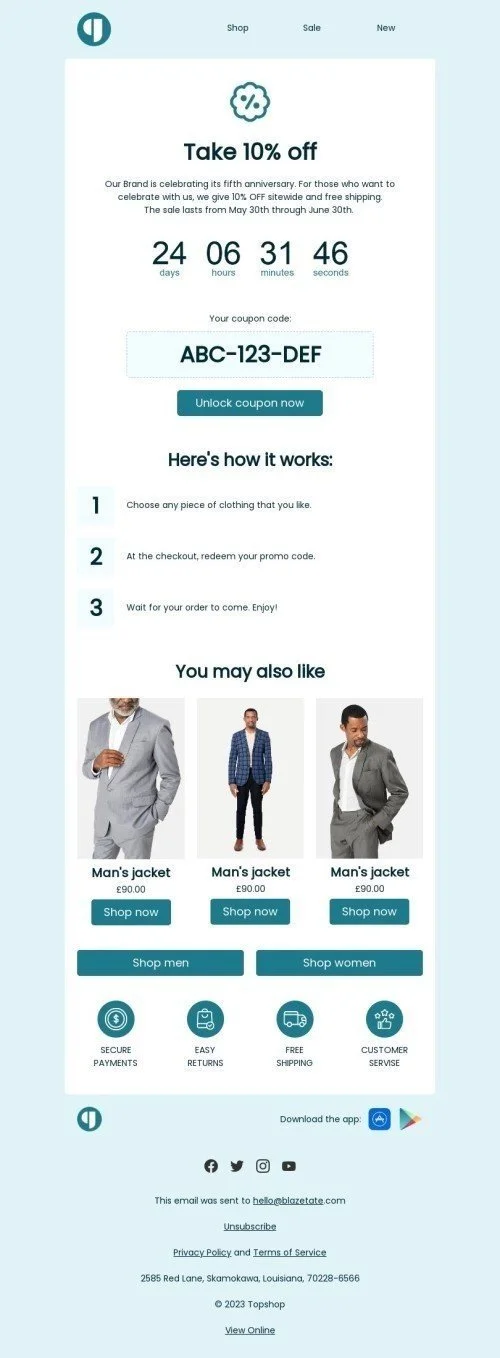
#1. Product recommendations
The customer has just made a purchase, so they’re excited and trust you at this moment. There’s no better time to suggest more products to them. You can increase your average order value by offering them related products, add-ons to the products they just ordered, and your newest arrivals.
Introduce these products with:
- “You may also like…”;
- “Frequently bought together…”;
- “Customers who bought this also bought…”;
- “People who bought this also liked...”.
#2. Social media links
In the US, 70% of customers crave a deeper connection with a brand, and what better way to provide this connection than through social media? Encourage users to follow your social media accounts, and give them a glimpse of what you have there. Mention limited offers and entertaining and educational content that will generate value for clients and help you raise awareness and engagement numbers.

(Source: GREATS)
#3. Newsletter subscription
Don’t forget to invite new customers to subscribe to your newsletter. Despite the social media boom, retention email marketing remains a powerful tool for boosting customer loyalty and promoting additional sales and upgrades.
#4. Videos
If you have a brief company intro video, now is the time to use it!
Yes, the customer has already made a purchase, so they’re somewhat familiar with your brand, but don’t expect them to be completely in love with you or to know every detail about your business. Share your values, company culture, main product offerings, and anything else to make a stronger connection with the customer.
Alternatively, add a quick tutorial video on using your products, or explain the next steps after the order is placed.
#5. Downloadable resources
Extra resources that customers can unlock after they make a purchase create additional value and highlight you as a caring brand. Free guides or white papers leave a good impression and boost repeat sales and upgrades to more expensive product lines.
For example, if you’re selling clothes, share a guide on caring for the clothes to prolong their life.
#6. Referral or affiliate program
There is no better opportunity to promote your affiliate or referral program than right after checkout.
Satisfied customers make perfect brand ambassadors and advocates, so make it easy for them to promote you by adding a quick sign-in form or referral link on your thank you page. Briefly specify what benefits this brings the customer, and provide links to further information. It’s much easier to recruit customers when they’ve just made a purchase rather than chase them days or weeks later, when their excitement has waned, and they’ve switched their focus to something else.

(Source: Connecteam)
Tip: Inviting customers to your affiliate or referral program is a step in the right direction, but how you manage them afterward matters, too. If you haven’t done so already, invest in referral tracking software to automate the entire process—onboarding, sales tracking, commission payout, reporting, and more—without losing the personal touch. As the number of your affiliates and referrals grows, you’ll be glad to have a system that takes care of key workflows and keeps your partners satisfied.
#7. Feedback
Direct feedback from customers is invaluable to a company’s growth and improvement. Look for opportunities to invite your customers to provide feedback, including comments and complaints.
People love sharing their opinions, and customers are no different. Show them that you value their input by inviting them to leave reviews. This information can be used later to tailor marketing campaigns, work on product improvements, or plan the company’s strategy.
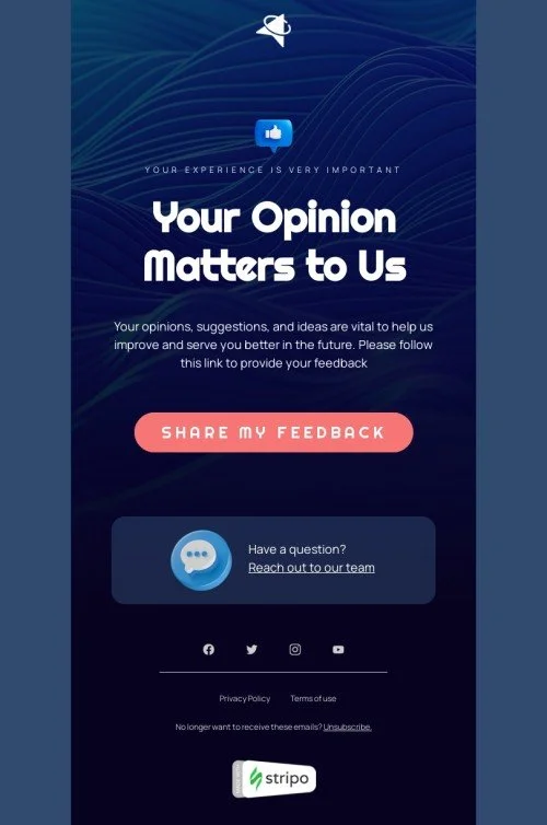
Tip: Don’t ask customers whether they’re satisfied with their purchase, as they haven’t had a chance to use your product or service yet. Instead, ask about their experience with the website, their thoughts on the product range, or their past interactions with your brand.
#8. Survey
Marketing, product development, and sales teams are always on the hunt for new insights and data about customers, their preferences and behaviors, and their potential interest in new product releases. A great way to get this information is through customers’ responses to surveys, which can be tricky to collect.
Here, thank you pages can be a lifesaver. Ask customers to complete a short survey, and be sure to keep it brief. Few people have the time to go through pages of complex questions. Also, offer a reward, such as a small discount or bonus, to customers who complete the survey.
Tip: Avoid rewards that apply only to future purchases. While your customer may be back for a future purchase, they aren’t sure yet, and they will not be motivated by the promise of a future reward that may not materialize. Instant gratification will get you many more survey respondents.
#9. Limited-time offers
Add a sense of urgency to your thank you page by encouraging customers to make a repeat purchase quickly. Leave a time-sensitive discount on the page, or include a countdown for a promotion to lead them to a purchasing decision. You can easily implement this using a ready-made countdown timer template — no coding required. It’s a quick way to create urgency and visually boost conversion rates right after purchase.
Design tips for crafting high-impact thank you pages
The “It’s not what you’re saying but how you say it” principle very much applies to the design of thank you pages. As many as 88% of online consumers claim they won’t return to a company’s website after a bad experience, and design plays a big role in their perceptions. Over 90% of users specify that poor design is the primary reason they do not trust a website.
Naturally, if a customer makes it as far as the thank you page, they must have at least some trust in your business, so now you need to reassure them about the wisdom of their decision.
UX secrets to make your thank you page user-friendly
User experience is our number one stop when it comes to building awesome thank you pages. UX ensures that the pages we develop are intuitive and a pleasure to navigate and help nudge users in the right direction, whether that is making a purchase, signing up for a newsletter, downloading a trial, or anything else.
Here are the key characteristics to consider when designing your thank you page:
- clean layout with a strong visual hierarchy. Confusing pages will be abandoned quickly, and any useful and engaging content will go unnoticed;
- mobile optimization. About 52% of the world’s internet traffic is mobile. This means that your thank you page (and all web pages, for that matter) has to be optimized for mobile devices, or you’ll be missing out on conversions;
- accessibility. Up to 5 billion people worldwide have some form of disability, such as visual impairment, color blindness, photosensitive epilepsy, etc. Your thank you page needs to accommodate at least the most common disabilities to help customers feel included and appreciated. Many companies are not doing this, and someone who struggles with using the internet will be delighted that you’ve thought of them;
- CTAs that work. Make your call-to-actions clear and actionable. Place CTAs where they make the most sense, avoid confusing phrases, and make it easy for customers to take action;
- loading speed. Beware of design elements that can slow the loading speed, especially if you operate in regions notorious for weaker internet connection. There’s nothing more annoying to customers than having to wait, even if it’s only for a few seconds.
Thank you page examples
Enough with the theory! Let’s look at some examples.
ASOS
Asos is one of the largest UK online fashion retailers, and its thank you page post-order is an excellent example of what these pages should look like.

(Source: ASOS UX case study)
All the key elements are present, including the following:
- key order details (total price, reference number, delivery address, and order status);
- images of the product ordered to help customers instantly confirm that they’ve purchased the right thing;
- non-promotional CTAs (cancel order, my account, returns policy) that users might need;
- links to social media accounts;
- an invitation to complete a survey where the customer can share their perspective;
- a promo of a new service (ASOS credit card);
- a CTA to continue shopping;
- a referral link to share with friends to get a discount on future purchases.
Despite the wealth of information and call-to-actions, the page is minimalistic and intuitive.
Promotional blocks are located to the right, helping the user immediately see the key information about the order instead of having to search for it among promo codes and other CTAs.
eDreams
Next, let’s look at eDreams—an online travel agency that offers a range of services, including flights, hotels, and car rentals.
Rather than thanking customers for making a purchase on their thank you page, eDreams congratulates them for getting the best deal.

(Source: Personal order on eDreams)
The page features the following:
- key information about the purchased flight right at the top, paired with a suggestion to book accommodation (cross-sell CTA);
- an invitation to join a program and get discounts and free services;
- helpful links regarding the customer’s order: trip details, check-in request option, and discounts overview.
Overall, this thank you page does a good job of balancing a wide range of information and action points in a user-friendly design that doesn’t confuse the customer.
Etsy
Etsy is an online marketplace primarily known for hosting independent artisans who sell their handcrafted items.

(Source: Etsy UX case study)
Etsy’s thank you page offers only basic information about the customer’s order (i.e., the order number, the name of the seller, and the email to which the receipt was sent). In addition, this thank you page includes the following:
- a CTA to create an account;
- promotional CTAs to other categories;
- product examples of what other people liked;
- a non-obvious promotional CTA encouraging users to browse for inspiration.
Overall, Etsy focuses on cross-selling products from other sellers and categories, giving customers a variety of options to look through existing offerings while keeping the main focus on thanking the user for the purchase and outlining key order information.

Tools for building thank you pages
Building a perfect thank you page takes time and commitment. Luckily, the following helpful tools can automate and streamline many elements of the process for you:
- landing page builders, such as Unbounce or Leadpages, can help you create pages quickly without requiring a developer or designer on your team;
- email campaign platforms, for example, ActiveCampaign or Mailchimp, can do most of the work involved in email campaigns, enabling you to send better emails that customers will read and enjoy;
- AI-powered video creation tools, such as Moovly or VideGen, are no-code and do most of the work for you, allowing you to easily add custom short videos to your thank you page;
- survey and form builders, including Typeform and Paperform, create surveys that customers are willing to complete.
Next steps: Promotion and optimization
You’ve prepared a wonderful thank you page; now let’s make sure your customers like it, too. Follow these two simple steps to ensure that your thank you page generates loyal and happy customers who make repeat purchases and talk about you with their peers.
SEO
You wouldn’t do classic SEO work with thank you pages because they are not indexed by search engines; plus, they contain personal customer information. However, you can still optimize them for user experience by including the following:
- relevant content;
- links to social media;
- reviews by other customers;
- referral program promo;
- other products that the user might like;
- promotions and discounts;
- a sign-up form for your company’s newsletter.
A/B testing
A/B testing is a marketer’s godsend. No matter how experienced and knowledgeable we are, our ideas don’t always work in real life. The solution is hypothesis testing. Run A/B tests to see what version of your thank you page performs better, and use it to test all new ideas, such as new CTA buttons, the overall messaging, layouts, etc.
Wrapping up
We hope our guide has convinced you of the importance of a well-thought-out, well-designed thank you page. This is the final step in the sales funnel and possibly the last direct point of contact with your customers.
Making your thank you page relevant, helpful, and even entertaining is essential to leaving the best impression and building a long-term relationship with your customers. If set up correctly, thank you pages can support your key marketing goals and help your company reach its targets faster, with less investment needed to get new leads or upsell to your existing customers who purchased a while ago.
Don’t be afraid to experiment and test out different theories and hypotheses. The more tests you run, the better your thank you page will become.


0 comments