The ultimate guide to HTML email buttons (Part 1)

In this guide, we will explore the definitions of email buttons and study their email design essentials. With real examples to compare, you will get a solid understanding of how color, text, and mobile optimization impact their effectiveness.
An HTML email button is one of the pillars of successful email marketing. For me, it is a shortcut to the website page and an encouraging element for shopping or reading a blog post. However, the more emails the recipients receive, the pickier they become. Is there a way out? Yes.
Implementing responsiveness alone can boost click rates by up to 15%. Accessibility, color psychology, and text choice increase the chances even more.
So, what is the email button recipe to win people over? How can you design them with no coding skills?
Together, we will answer these questions, compare what emotions and actions different buttons trigger, and learn how to create HTML email buttons with Stripo. Let’s get started!
Understanding HTML email buttons
Before you learn how to create email buttons, I suggest that we study these elements and review their types.
What is an HTML email button?
An HTML button is a clickable email layout element styled with cascading style sheets or CSS. Unlike text elements, buttons stand out, making them impossible to miss.
The email buttons come in various shapes and serve multiple purposes. This is when differentiation comes into play:
- Call to action or CTA button: This email button drives email recipients to act — to shop, get a discount, review an article, or book a meeting — thus the button name.

(Source: Email from ConnectTeam) - Text-only button: The key feature of this email button is that it uses only the text and no button-like styling elements. The hyperlinked text often serves as an unsubscribe option or forwards readers to policies and service conditions.

(Source: Email from Travel Awaits) - Bulletproof button: This button’s design ensures correct rendering across all email clients. The key lies in its formation — it is built using HTML code and inline CSS. Even with disabled images in your mail, these buttons remain the same. There are a few bulletproof button subtypes to work with:
- padded buttons: This email button is based on the HTML table with CSS styles to add more space around the text;
- VML buttons: VML stands for vector markup language. This technology is used when crafting bulletproof buttons for Microsoft Outlook in particular;
- border-based buttons: Instead of padding in an actual button table, you style these with thick borders to define their shape.
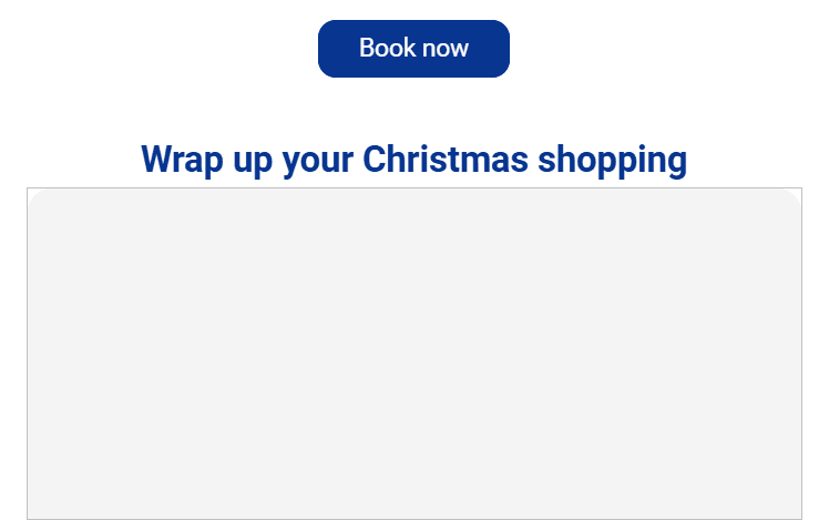
(Source: Email from Ryanair)
- Image-based button: To create buttons based on pictures, you need image files (JPG, PNG, and JPEG) representing a button. You may experiment with the style or fonts, but this variant is not entirely practical. Emails solely based on images may load slowly. Apart from that, with images disabled, the button disappears from view, and the email does not display correctly:

Now, let’s have a look at the same email with enabled pictures with image-based buttons:
(Source: Email from Reserved)
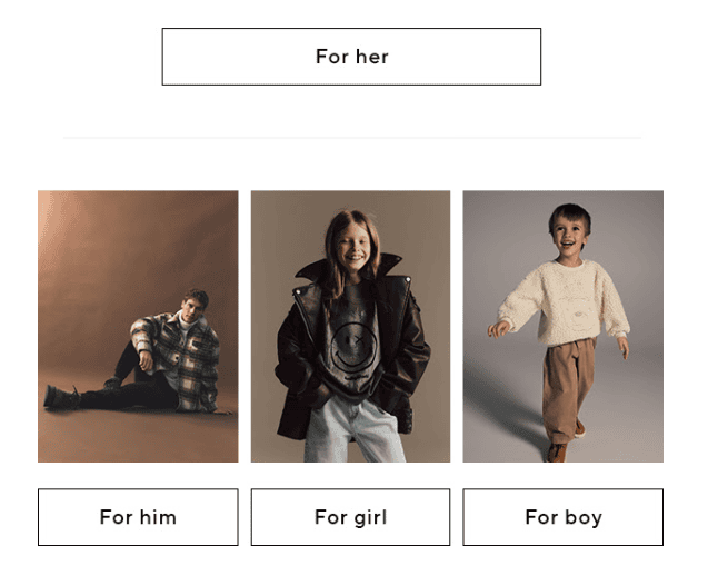
(Source: Email from Reserved) - Social media button: This type of email button links social media profiles and is mostly used in the header or footer. The buttons are smaller and represent a social media platform.

(Source: Email from Brevo)
Understanding button types and strengths is key to improving your email campaigns. Now, let’s discuss their actual impact.
Why are HTML email buttons important?
Nothing is insignificant in email marketing. HTML email buttons may appear trivial, but they influence engagement and create a positive user experience. How?
A well-crafted CTA button may increase clicks by 371% and boost sales by 1617%.
Contrasting colors, clear text messages, and increased fonts make email buttons stand out and motivate recipients to complete an action.
Besides the look, HTML buttons make emails easy to navigate and often split lengthy text. An example might be more convincing.
Did you notice that the “Explore Adventure Fix GO” phrase was used twice in the screenshot below? That’s right! The first time, it was mentioned in the text, and in the second instance, it served as a button text.

(Source: Email from Adventure Fix)
I noticed it only on the button at first — and only after carefully reading through the text did I realize it was repeated! This is how powerful and noticeable the buttons are.
The button message never fails to catch an eye, so properly crafted email buttons are more than an element but a tool. I suggest that we move to the design and see what makes some buttons great.
Designing HTML email buttons
Crafting buttons is both science and art. They must be usable, accessible, quick to load, and aesthetically pleasing. While the HTML button’s visual may be the first thing that catches the eye, accessibility makes it work for everyone.
Email buttons not adjusted to screen readers or people with disabilities disappear from the context and get lost. That’s why accessibility is the next topic we will cover.
Accessibility
Accessibility allows all recipients, including visually impaired subscribers and those with screen readers, to interact with emails.
According to the Web Content Accessibility Guidelines, there are a few points to consider when creating email content:
- Assistive technologies should be able to define the button’s purpose using only text.
- If your HTML button is animated, it cannot include more than three flashes in a second.
- An email button and its text color have a minimum contrast ratio of 4.5:1.
- An entire button has a minimum size of 24 × 24 CSS pixels.
- Layout elements, including buttons, must be fully operable through a keyboard.
The good news is that if you create your templates with Stripo, everything, including email buttons, is accessible. If you use other tools or work with the HTML editor, keep these points in mind as we move to the design tips.
Color choice
I will start with color psychology. Did you know that red, as a background color, is thought to have a high influence? It is associated with power, so the email button below immediately urged me to click. Its contrast ratio of 5.63 also makes it visually accessible and easy to spot.

(Source: Email from New Balance)
However, while New Balance benefits from the choice of background color, healthcare companies should avoid it. Red may trigger anxiety, so green and blue, representing calmness and stability, are better picks.
The next color example we will check is yellow, which is often associated with happiness. From the contrast point, it has a ratio of 6.51, which matches the requirements and attracts attention. It is no surprise that an airline chose this background color for the button.

(Source: Email from Ryanair)
Button text
Now that we have discussed the colors, I suggest that we move to the button text. Catching the reader’s attention is not enough. The email button should serve as a motivator and encourage actions.
The first button we will study is precise and compact. It highlights the desired action, which is to shop now. The font size is 14 px; the font family is Verdana, and it is a sans-serif font. With a contrast ratio of 18.42, the text is more than readable and digestible.

(Source: Email from Zappos)
The next button text does not encourage much but intrigues me instead. Since this is an image-based button, the HTML code does not provide details on font size or font family. The contrast ratio is 20.12, but the style difference is clear: italics for mystery and caps for intensity.

(Source: Email from Reserved)
The choice of black email buttons is not accidental; even with the same colors, each triggers different emotions. The text you choose for the buttons is as important as its design.
Now, will my inbox buttons match the mobile device recommendations? Let’s see.
Mobile device optimization
The email button must be functional on mobile devices. If you are still having second thoughts, the numbers may be convincing!
Approximately 61% of email recipients use their mobile devices to check email.
Not optimizing layout elements means losing potential customers. Personally, I give email buttons a few clicks — if they do not work, they are not meant to be. Surely, this does not have to happen to your emails.
Here are key points to consider:
- tap area: Google’s usability guidelines recommend a minimum tap area of 48 dp × 48 dp. Ensure the email buttons are easy to tap;
- email button placement: Avoid crowding multiple call-to-action buttons, as it makes it difficult to tap on the needed one;
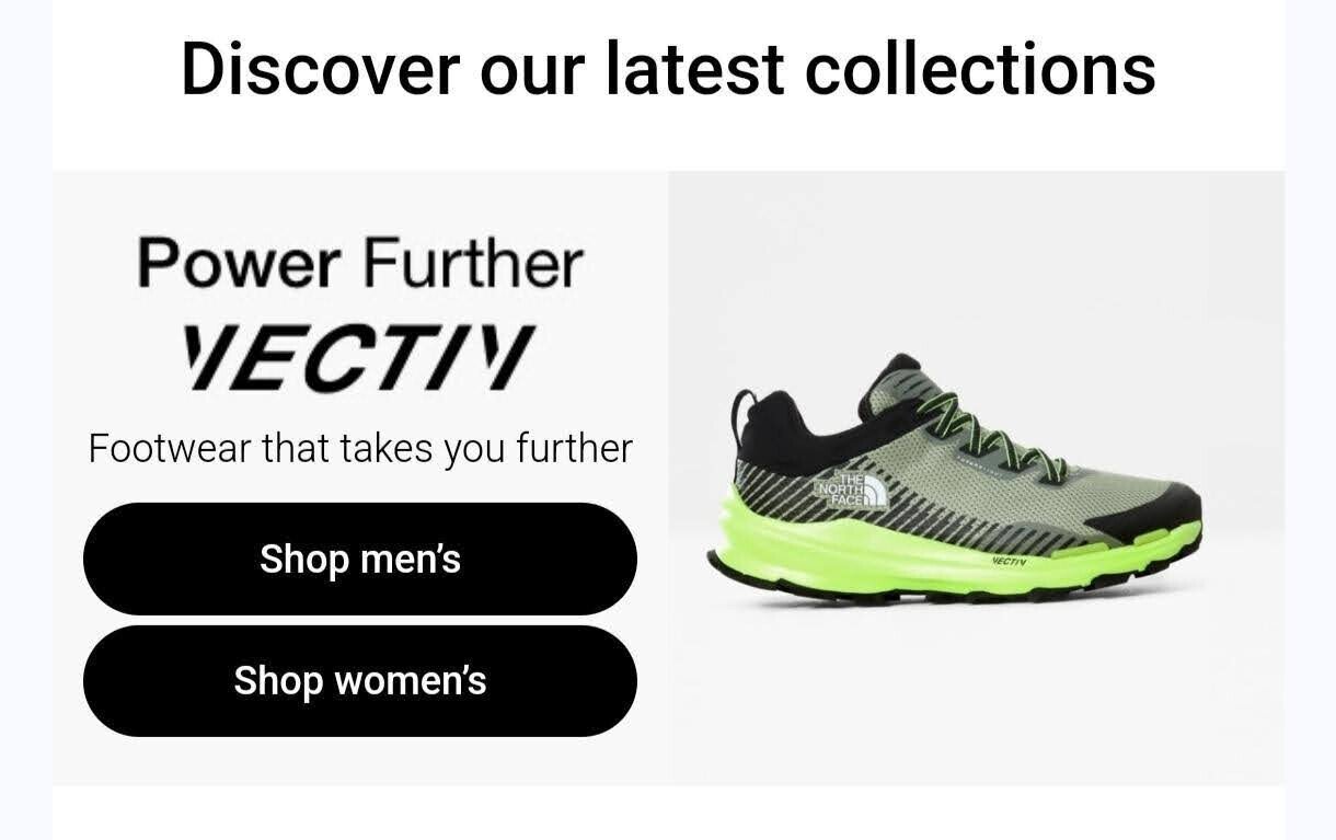
(Source: Email from The North Face)
- operating systems: Operating systems may handle the same elements created with HTML code differently. Android and iOS devices may render email buttons dissimilar. I recommend testing elements to prevent this from happening.
With all key responsiveness points in mind, it is time to build an email button and move to practice.
Creating HTML email buttons with Stripo
Email buttons are a tiny element that must still be accessible and optimized for mobile devices. However, the design takes time that the email marketing team might not have.
This is when Stripo’s template builder can save the day! Here is how you can create a button:
- Open the Editor in your account.
- Drag-n-drop the email button block to the template area:
- The button has been added.
Once the email button is on the template, you may start setting it up. If you click on the element, you will see two tabs.
- Settings tab: Here, you can edit button text, add links, align your button, edit desktop margins, fix height, and add icons.

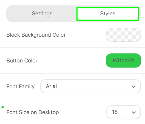
- Styles tab: The tab lets you choose block background color, button color, font family, font size, and border radius.
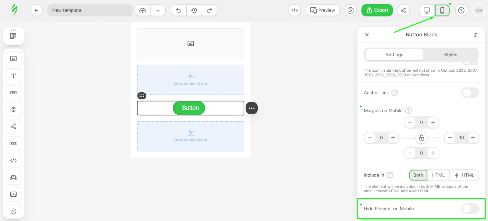
To ensure that your email buttons are optimized for mobile devices, use the switcher in the upper right corner. Once switched, you can hide elements on phones to free up space if the email gets overwhelming.
The button created in Stripo is already accessible and semantically correct, so it will display properly and keep the rounded corners in any email client.
If you wish to save even more time, our team has a template library you may use. All the email templates are editable, so you can adjust them to your needs.
Wrapping up
Despite their size, email buttons are an essential part of the layout. Making your buttons accessible, contrast, and optimized for different email clients and mobile devices can improve email campaigns and boost conversion rates.
This is something Stripo can help you take care of! While you focus on designs and visuals, we will handle the code.
In the second part of this guide, we will learn how to create email buttons using the HTML editor and the code. Stay tuned for more tips and Stripo expert tricks!


0 comments