Responsive email design: Make your template mobile-friendly


In this article, we’ll show you how to set your email templates on the rails of responsive email design. We’ll tell you all the needed tips and tricks to make your emails mobile-friendly in no time.
Statistics show that 41% of email views come from mobile devices, which means that optimizing emails for mobile screens is essential. To achieve this, responsive email design is the tool you need. Besides, it’s not just a matter of the recipient’s comfort. Making your email responsive can bring you, the sender, a significant boost in engagement, as you can receive 15% more unique clicks.
In this article, we’ll discuss the essence of responsive email design, how it works, and how you need to prepare for your email design transformation. Without further ado, let’s dive right in.
What is responsive email design?
Let’s start with the basics. Responsive email design is one of the stages of email design evolution that adjusts your email design across different devices to maintain style and usability. This means subscribers have a great experience on any device or email client, no matter the size of the screen, as your email design fluidly adapts to any screen size.
The core of responsive email design
The main concept of responsive email design belongs to @media queries usage. Basically, you may define a style for any screen width. You should input the maximum width in pixels and use percentages for defining the elements sizes. This is a way to avoid any unexpected email review issues.

According to this example, the style for the desktop version is defined without using media queries, and the style for the mobile uses the one with a “screen” type. If the email is being reviewed on a desktop, the user will see left text alignment, and the mobile audience will observe the email with central text alignment.
Of course, instead of text alignment or in addition to it, you may define any style—starting from the font family to the element sizes and their dispositions.
The role of media queries in responsive email design
A media query consists of two elements: a query type and a query feature—in other words, a query specification. One query may have several properties that can be declared using the keyword “and.” Simultaneously, the query could not contain any expressions. This will not be a mistake; however, usually, in a responsive email design, media queries have properties.
Here is an email template sample that was coded using CSS media queries in Stripo:
- all — it is a default expression that declares the query for any device;
- braille — all devices that are dedicated to blind people. These devices are based on the Braille system;
- embossed — printers that use the Braille system;
- handheld — smartphones and similar devices;
- print — printers and similar devices;
- projection — projectors;
- screen — monitors and their screens;
- speech — voice coders, programs that reproduce the voice or read the text aloud. For example, voice browsers;
- tty — devices with a fixed width and string length (e.g., teletypes, data terminals, devices with screen limitations);
- tv — TV sets.
To implement a responsive email design, the type “screen” is always used.
Here is a list of the most frequently used features for media queries:
- width;
- height;
- device-width;
- device-height;
- orientation;
- aspect-ratio;
- device-aspect-ratio;
- color;
- color-index;
- monochrome;
- resolution;
- scan;
- grid.
Most of these media query style features may have the “min-” or “max-” prefix. Usually, you input minimal and maximal values in pixels and use percentages to define all the other values.
How does responsive email design work?
Using a responsive email design, you may show two different email samples for mobile devices and desktops. Of course, you should create both templates. This is the best choice for the mobile-first approach because it allows you to reduce your mobile template’s size and, as a result, load it faster.
Another advantage is that creating a separate mobile email template version allows you to avoid endless scrolling, inappropriate email element sizes for thumb-hitting, too big or too little fonts, awful and terrible horizontal scrolling, etc.
However, you don’t have to make two different email templates. You may just define two different styles and declare which style will be used due to the screen width. This approach is used more often than the one in which several different templates are used. As a result, you will receive a responsive solution that doesn’t look worse than any other email design.
Not only can the email template’s width be defined in responsive emails, but you may also define different element sizes for the desktop and mobile versions. This allows for significantly improving user experience.
There is no need to declare styles that are not supported by different email clients. Responsive design always stands on simplicity. Besides, in addition to the styles that you may define for different widths and heights, you may also define which layout to use for different screen orientations.
Here are the litmus test results for responsive email templates used for different mobile Gmail clients:

Requirements for responsive email design
Before you begin transforming your email design into a responsive one, you should learn some requirements to make your design transition flawless.
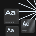
Use only web-safe fonts
Web-safe fonts are the cornerstone of responsive email design. They prompt the web browser to pull fonts from your local font directory, AKA the pre-installed fonts on everyone’s computers. Web-safe fonts are safe to use because there’s a strong chance that your subscribers will already have them. Here are a few examples of web-safe fonts you can use to wrap your texts:
- Arial;
- Verdana;
- Tahoma;
- Courier New;
- Times New Roman;
- Trebuchet MS;
We’ve written a full-fledged article on email fonts and how to use them properly to make your texts look gorgeous and accessible for recipients with visual impairments. Check it out, as it is vital for email designers to know how to work properly with fonts.
Use pictures with a bigger resolution and size
In this case, they will be appropriately displayed on Retina screens. Of course, you can’t avoid vertical scrolling at all, but don’t make endless emails, and also don’t make your mobile users zoom emails to read something or to press a button. You have to avoid horizontal scrolling with 100% probability.
Structure your emails
No plain text is allowed. Use pictures and buttons, and equally divide the text into small paragraphs for better readability. The whole screen shouldn’t be used only for plain text without any paragraphs. Use short sentences. The best text line length should be between 65 and 75 characters.
Make sure that your first call-to-action (CTA) element is visible on the first screen in your mobile template version. For this purpose, you may even resize or crop the banner. It’s better to use editors that allow you to edit images without using any additional tools.

(Source: Maillibr)
Utilize clear messages and short content
They don’t stand on responsiveness directly, but they influence the general user experience. Don’t ever use tables with data in your emails. It’s crucial to use the space on mobile devices in the most rational way. The more content you have, the harder it is to structure and make it readable.

(Source: Maillibr)
Choose a column template for mobile devices
If you use two- or three-column templates for mobile devices, you may cause a situation that your content will be so small that it becomes unreadable, and the same thing happens with your buttons and links. Take care of the mobile-friendly design. The size of the clickable element should be no less than 44×44 pixels.
Make a short and clear email topic
Don’t use caps lock or infrequent abbreviations. Defining a clear and compelling topic is half the success of your email marketing campaigns. Remember that a personalized email topic works even better than a hot topic.
Use a clear vertical hierarchy
Making a hierarchy for your content is the same as tabulation in programming. The code will work even if you write it in one line, but the document will be unreadable—the same happens with emails. If you don’t put enough spaces between lines or elements, the user experience will be ruined.

(Source: Maillibr)
Don’t overload your marketing emails with unnecessary images
If you use three banners but only one of them has a CTA, you are making a mistake. The same thing applies to products that you add to promo marketing emails. You may think that if you add more products, you will sell more items. But that’s not true. Add not more than nine products. If your target is to sell much more goods, then just make a series of promo marketing emails or send a single email that presents not products but their categories and provides links to the target web pages.
On your website, you have enough space to describe every separate product and show its benefits. In your email, you have space only for a little picture, the product’s name, and its price. That’s all. Don’t try to give the general info that everyone knew before to improve your sales process. That doesn’t work.

(Source: Maillibr)
It’s better to choose an email editor that provides you with several ready-design solutions for shopping cards with products. This will save you time and make the workflow more efficient as well. If the editor provides free, separate email design elements, you can combine them within one responsive template, which is much better than having free email templates. If you use only separate components from the custom library, the email you get will never be the same as anyone else’s.
Incorporate fluid images
Yeah, according to the title, it’s better to make your images fluid in responsive email design, but what does it mean? Fluid images are those that adapt to the different screen sizes mentioned in media queries, or the image sizes are defined in percentages to the maximum dimensions or relative units. This allows you to avoid horizontal scrolling.
Here is a way to make the image fluid (for mobile phones with a 480px maximum width) using a media query:
<style type="text/css">
   @media only screen and (max-width: 480px){
       .emailImage{
           height:auto !important;
           max-width:600px !important;
           width: 100% !important;
       }
   }
</style>
Here is a list of the most widely used relative units:
- percent — %;
- ex (font size related to x-height) — ex;
- em (font size) — em;
- root em (font size for root elements) — rem;
- viewport height — vh;
- viewport width — vw;
- viewport maximum — vmax;
- viewport minimum — vmin;
- fraction (the shash number) — fr;
- character (font character) — ch.
As for videos, you may define proper sizes for a video for both desktop and mobile devices in the same way as for images. Making your images and videos fluid will save you from an inappropriate email review.
One more solution is to use SVG images instead of the most popular PNG and JPEG pictures. This format allows you to zoom and resize the screen dimension without losing the quality of your images.
Another aspect is that the SVG format allows you to change the image color and background by adding appropriate values to the code when declaring the element. You should know that SVG images are much bigger than PNG and JPEG images with the same resolution. Maybe that’s why SVGs are used more rarely than other image formats.
Tweak your texts
As mentioned above in the design requirement for creating a responsive email template, the best line length should be between 65 and 75 characters. The total 600 px email width limits your possibilities to write a lot of text content. Even a few sentences may take a lot of space.
Try to use as little text as possible, but nevertheless cover the topic. No general phrases and clichés are allowed. Try to be creative, but don’t forget that your text should also include call actions. After reading, there should be no questions or misunderstandings about what this message was about.
If you use double line spacing, that will be okay for desktops, but it will ruin the user experience on mobile devices. Here is the time to use a media query to define a different line spacing for mobile devices. This will save the situation.
The most commonly used font with a 14 px size is perfect for desktops, but it’s not big enough for mobile devices. Use no less than a 16 px font for your text content. At the same time, don’t use a font size that is too big for headings and subheadings. That’s won’t be user-friendly if your title takes 3 to 4 lines.
Don’t ever write text after the footer just to follow the rule where you have to use a 60% to 40% image-to-text ratio. Sometimes, spam filters don’t allow messages with only graphical elements to pass through. In this case, just think about whether all those images are necessary to make sense of your email. Make a few more content blocks inside your email and provide only useful information.
Once you apply all of these requirements, you will achieve a perfect-structured and responsive email. Here is an example of a great responsive email with all the requirements applied:

(Source: Maillibr)
Wrapping up
Responsive email design opens up new possibilities for the mobile optimization of your emails. By adopting this approach, you will provide your recipients with the same experience of interacting with your newsletters, regardless of what device they open them on.
However, remember that, along with technological solutions, come nuances and requirements that should be considered when you create responsive emails. The correct selection of fonts, content structure, images, and overall hierarchy will help you create genuinely responsive email marketing campaigns where the content will look organic, both on the desktop and on the mobile.


0 comments