From strategy to email sequence: How to turn your positioning into content that converts


Many email sequences underperform because the team starts building before clarifying what the sequence needs to say.
Your template can look great, the CTA can be clear, and the send time can be painstakingly optimized, but if your message underneath is vague, your email might still be asking the reader to do too much work.
Let's say your team invests in visual design, module layouts, and reusable templates, then thinks copy alone can turn a vague positioning statement into a high-converting campaign. The result is usually a nice-looking email that still fails to grab your readers' attention. They don't get your point immediately, and there's nothing in it for them.
And no, you should not care less about design or templates, but you do need to give them better words to work with. Before writing any of those words, you need a simple system for turning your positioning (what you do, who you do it for, and how) into repeatable, resonant messaging before anyone writes the first subject line.
That is what this article walks you through.
Why good-looking emails still underperform
A well-designed email can still fail if the reader cannot immediately tell why it matters to them. According to Litmus, the average time people spent looking at an email was just 8.97 seconds in 2022, down from 13.4 seconds in 2018. When attention is measured in seconds, the core idea of an email has to be obvious immediately.
Vague messaging creates a cognitive load that even the best design cannot fix. When your strategy is unclear, the reader has to work too hard to extract value. Design should amplify clarity, not compensate for a lack of it.
Relevance matters just as much. HubSpot reports that 93 percent of marketers say that personalization improves leads or purchases, while segmented emails generate better open rates for 65 percent of marketers. Don't take this as a nudge to just “personalize more.” The lesson is that emails perform better when the message matches the reader's context, priorities, and situation.
That matters even more today. As inboxes become crowded with AI-generated content, clarity and human relevance are on your side.
That's why open and click-through rates suffer when messaging is vague: the reader ends up doing work that the marketer should have done for them.
The best-performing emails tend to arrive with one clear idea and enough support to make that idea believable. That means the real work starts with messaging, so design has something specific to organize, emphasize, and amplify.
What a messaging framework actually gives you
A messaging framework is different from brand guidelines, a style guide, or a content calendar. Those tools matter, and your messaging framework might contain parts of them, but they do not tell an email what strategic job it is supposed to do.

(Source: Conversion Alchemy)
A useful messaging framework gives you the raw material behind the copy. It defines:
- market category and frame of reference: What mental shortcut should prospects use to understand you? Which alternatives will they naturally compare you against?
- value stack: How much of the message should focus on benefits, differentiators, and features? A new category may need more education; a crowded category may need more differentiation and proof;
- competitive alternatives: What are all the ways the reader could solve this, including direct competitors, internal workarounds, spreadsheets, agencies, manual processes, or doing nothing? And how do you differentiate among them?
- strategic narrative: What is wrong with the current way the market handles this problem, and what is a better way forward?
- sales pitch variations: How do you take your strategic narrative and turn it into an actual pitch? How can you sell your value proposition in just a few words?
- key messaging pillars: These are the fundamental themes that support your value proposition, seen through different lenses (gain, loss, logical, benefit, short description, on-liner);
- brand voice chart: This is your guide to maintaining consistent communication across all channels.
Without that map, your sequences will tend to diverge from your messaging goal. You don't want each email to feel like a disjointed piece of marketing without a story. With a framework, you give the sequence a shared logic. Every email can still have its own job (and it should), but it serves the same positioning and messaging architecture instead of starting from scratch.
5 decisions you need to make before writing any email
Before drafting, and with your messaging framework in hand, you'll need to make five essential decisions:
1. Market category and frame of reference
What category are you asking the reader to place you in? Are you a familiar tool in a familiar category, a new approach inside an established category, or a new solution that needs more market education? You'll end up in one of four buckets: pioneer, challenger, reframer, or defender. This determines how much context the email needs before it can ask for action.
2. Primary audience and ICP
Pick your one reader, and don't limit the description to something generic like "marketing managers at mid-size SaaS companies." A more useful version adds the personality, the buying situation, the pressure they're under, and the workaround they're probably using today; in short, their psychology and decision-making criteria. This approach and your specificity make the email easier to write and more resonant. Think of it this way: You're helping them make progress, not selling them something.
3. Competitive alternatives
List the real options in the reader's head. This includes direct competitors, doing nothing, using an internal team, stitching together multiple tools, or relying on a manual process. Email copy becomes crisper and spikier when it argues against the actual alternative (even without naming names), not an imaginary competitor.
4. Value stack
Decide the balance between benefits, differentiators, and features. If the market is unfamiliar, lead with education and outcomes. If the market is crowded, lead with the pain point, the contrast, and proof that your approach works differently. Features should usually support the argument rather than become the argument.
Here's a quick table to help you see where you fit:
Table 1. Strategy & focus by bucket:
|
Bucket |
When this applies |
Primary goal |
Key focus |
|
Pioneers |
New solution + new category (often in a market that's also new or unfamiliar) |
Market & problem education |
Teach the problem first, evangelize the new category, anchor in macro shifts/trends |
|
Challengers |
New solution in an established category & market |
Solution education & value demonstration |
Show why your fresh approach delivers better outcomes while fitting familiar needs |
|
Reframers |
Established solution in a new category inside a mature market |
Category creation & value alignment |
Contrast the old frame vs. the new frame, thought-leadership heavy, position as category-definer |
|
Defenders |
Established solution in an established category & market |
Differentiation & preference creation |
Stand out in a crowded market with clear, compelling differences, proof, and brand preference |
Table 2. Stack mix by bucket (Benefits/Differentiators/Features):
|
Bucket |
Benefits % |
Differentiators % |
Features % |
|
Pioneers |
70% |
20% |
10% |
|
Challengers |
60% |
25% |
15% |
|
Reframers |
50% |
30% |
20% |
|
Defenders |
30% |
50% |
20% |
5. Sequence goal and per-email job
Your email sequence should have one main goal: whether it's onboarding new customers, nurturing leads, encouraging product adoption, re-engaging inactive subscribers, or generating demo requests. And every email needs a job inside the larger sequence.
To map out these jobs, think about how people typically make decisions. Most prospects don't jump from awareness to action; they move through a series of questions:
- is this problem worth paying attention to?
- is my current approach actually holding me back?
- is there a better way?
- why should I trust this solution?
- what happens if I take the next step?
With these questions in mind, consider each email through these blocks:
- objective: What does this email need to accomplish inside the larger argument?
- core idea: What is the one idea the reader should remember?
- strategic angle: Is this email educating the market, contrasting against an alternative, challenging a myth, proving a claim, or lowering risk?
- supporting evidence or example: What proof, story, data, comparison, or illustration makes the idea credible?
- CTA: What is the next action?
Trying to say too much in one email is one of the most common conversion killers I see. Marketers get attached to their elaborate messaging frameworks and try to squeeze too many points into the opening paragraph, which leaves the reader overwhelmed and without a clear reason to click.
A quick, useful clarity test is whether you can describe every email in your sequence with one sentence. If email three is "reframes the prospect's current tool as a liability rather than a neutral choice," you are probably on track. If it's "covers features, pricing, a case study, and onboarding," the email is carrying too much.

(Source: Email from Miro)
The Miro welcome email includes one proposition, one CTA, and one job. A single yellow Start creating button, a four-quadrant feature grid offering four different ways to enter the product, and a social proof block at the bottom, each earns trust without competing for the click. Every design decision serves the activation message; nothing in the email is decorative for its own sake. That is what it looks like when messaging and layout agree on a single job.
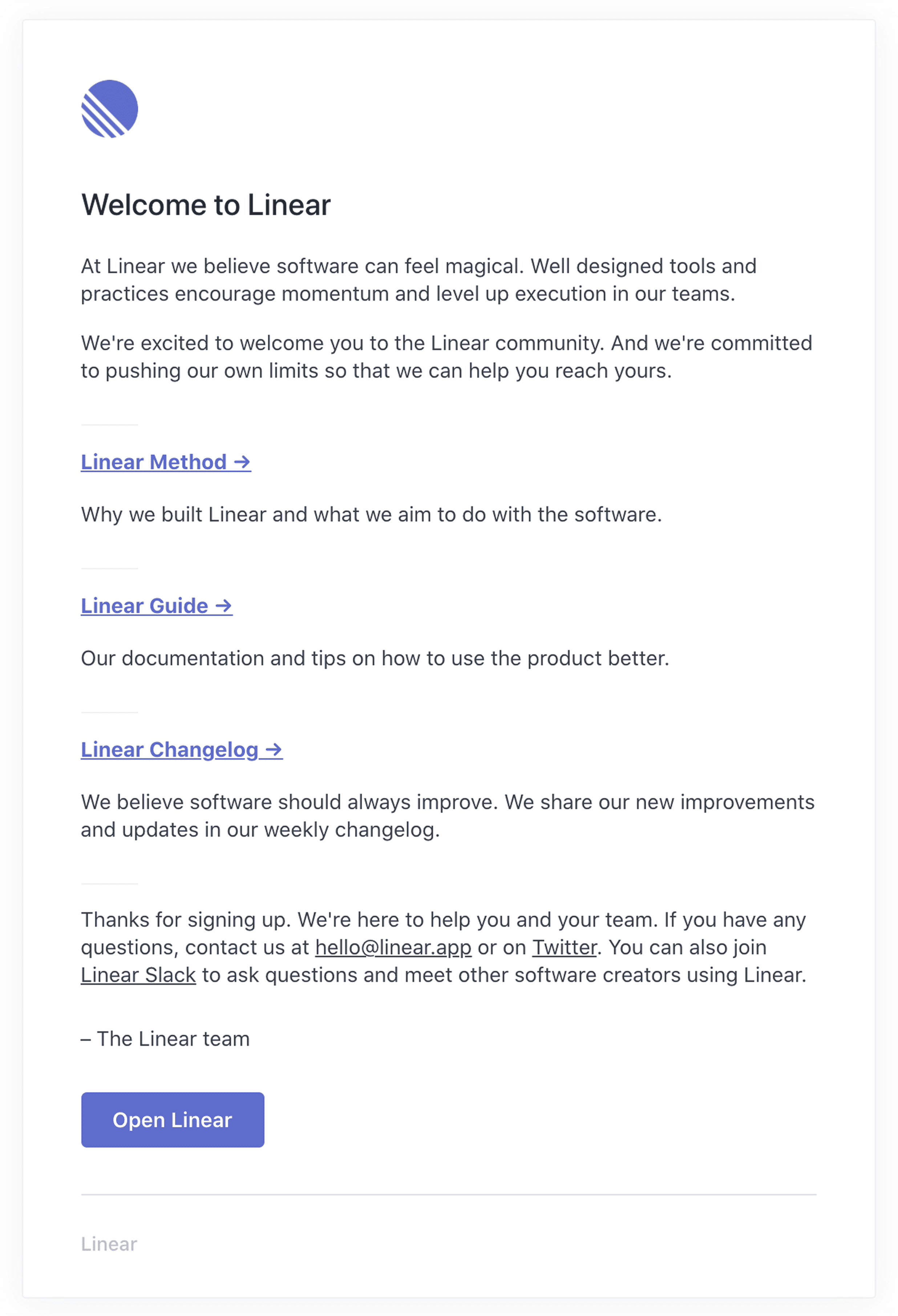
(Source: Email from Linear)
The Linear welcome email takes a different approach: minimal design, with indoctrination as the job. Compare the two. Miro leads with a hero image, a brand color, and an above-the-fold CTA. Linear leads with a paragraph of philosophy, three reading paths, and a small button near the bottom. Both emails have one job, and both serve it well; they just disagree about how to get there. That is the real lesson. The design and the message are not in competition. They are the same bet made in two different mediums.
How to map messaging pillars across a full sequence
We talked about key messaging pillars earlier. These are your differentiated themes, the unique combination of values that your ideal customer is looking for. Your sequence should weave in one or more to move the reader through a connected set of ideas rather than a random collection of points.
For example, imagine a project management SaaS targeting agency owners. From their positioning, you might identify four messaging pillars:
- Visibility: Know exactly where every project stands without status meetings.
- Efficiency: Reduce time spent chasing updates and managing tasks.
- Client confidence: Keep clients informed and eliminate surprises.
- Team accountability: Create clear ownership and responsibilities across the team.
Those pillars become the foundation of your sequence. One email might focus on the cost of poor visibility. Another might show how greater accountability improves delivery speed. A third might use a customer story to demonstrate how better visibility increases client trust.
The pillar changes, but the narrative remains consistent, helping agencies deliver projects more efficiently and predictably.
One narrative structure I often use:
- Intent: Open by acknowledging the reader's situation or raising the stakes.
- Contrast: Show why the status quo, common workaround, or familiar alternative creates the problem.
- Explain: Reframe the problem or introduce the missing piece.
- Detail: Go deeper into the mechanism or differentiator.
- Prove: Show evidence that the outcome is achievable.
- Handle: Address the risk, timing issue, or objection that could stop the reader from acting.
- Ask: Present the next step.
This is one example of a map, not a universal rulebook. Cold prospects may need more time in the explain stage, while warmer audiences may be ready for proof sooner. What matters is knowing, with each email, which part of the journey you're handling.

The common mistake is to treat the sequence like a feature tour: email one on integrations, email two on reporting, email three on the mobile app. That assumes the prospect already cares about the features when most care first about the outcome and the trade-off between alternatives. Features become interesting only once they help prove how that outcome happens.
Worked example: From positioning statement to nurture sequence
Here's a simplified example.
Positioning statement: "For product-led B2B SaaS founders who need to turn customer activity into a qualified pipeline, [Company] is the activation layer that connects your product to your revenue motion, unlike legacy analytics tools that surface data without suggesting next steps."
Frame of reference: This is not "another analytics dashboard." The market frame is activation: turning product behavior into the next best revenue action.
Competitive alternatives:
- keep using analytics dashboards and ask the team to interpret the data manually;
- build manual segments in the CRM or marketing automation platform;
- wait for sales reps to notice activity and decide when to follow up.
Value stack: Because this is a new approach inside a familiar category, the sequence should lean heavily on benefits and problem education and then use differentiators and proof to show why this mechanism works better than dashboards or manual segmentation.
Four messaging pillars:
- Revenue actionability: Turn product activity into clear next steps for sales and marketing instead of forcing teams to interpret dashboards manually.
- Pipeline visibility: Know which accounts are gaining momentum, stalling, or ready for outreach before opportunities slip away.
- Automation over manual work: Replace spreadsheets, manual segmentation, and guesswork with automated signals and workflows.
- Smarter decision-making: Help teams focus on the accounts and actions most likely to drive revenue instead of reacting to incomplete data.
Six email angles:
- The hidden cost of manual analysis: Show how teams waste time interpreting dashboards and still miss buying signals (automation over manual work).
- Why product data rarely becomes pipeline: Explore the disconnect between collecting behavioral data and acting on it (revenue actionability).
- The accounts you're not seeing: Demonstrate how a lack of visibility causes teams to overlook high-intent opportunities (pipeline visibility).
- How the activation layer works: Introduce the mechanism behind identifying, scoring, and triggering revenue actions (revenue actionability + automation).
- Customer proof: Share a story showing how better visibility and automated signals improved pipeline generation (pipeline visibility + smarter decision-making).
- Take the next step: Invite the reader to see the system in action through a demo or trial (all pillars reinforced).
The point isn't that every sequence needs exactly six emails but that each email has a clear relationship to the pillar underneath it and the argument around it.
By the time the prospect reaches the final email, they have moved through a connected story that compounds across the full lifecycle, instead of a handful of disconnected feature claims.

(Source: Email from Asana)
Asana's welcome email is a clean B2B example of the Intent stage in action: The B2B version of that Intent email (the first one in your sequence) looks like this. The headline frames the cost ("missed deadlines, no context, constant pings"), the visual sets the energy, and the entire send funnels to one action: "Create a task." Notice what is not here: no feature tour, no pricing, no second CTA competing for the click.
You can see the same principle in simple lifecycle sequences outside B2B SaaS. A re-engagement campaign such as Duolingo's win-back emails works because the message is easy to understand at a glance: You paused, the habit matters, and returning is low-friction. The tone is playful, but the strategy is disciplined: one idea carries the send instead of making the reader sort through several competing reasons to act.

(Source: Email from Duolingo)
Duolingo's "30 days later" re-engagement email is about one idea, one click. The headline does the heavy lifting: "30 days later, Duo has learned as much as half a semester's worth of university-level Japanese class." It names the gap, anchors the loss in something the reader can picture, and ends with a five-minute path back. There is no list of features, no mention of plans, and no generic "we miss you."

(Source: Email from Duolingo)
A later email in the same Duolingo re-engagement flow uses the same pillar, a deeper cut. This is the same win-back pillar used at a different level of depth. The first email shows the gap; this one names the cost: an empty streak, a paused reminder, an owl that is "laying off" the nudges. The visual is a row of faded gray circles, which is the cleanest possible way to make a count of zero feel like something. Same argument, different angle, and the reader's understanding of the cost compounds.
Where design comes in
Once the message is clear, the design can amplify it.
Visual hierarchy should guide the reader toward the most important thing on the page. Once the team has decided what that thing is, layout has a clear job: Make the idea easier to notice, understand, and act on.
Suddenly, design decisions become easier:
- headline size can reflect the main idea;
- space around a CTA can signal the primary action;
- bullet structure can show whether items are equal or whether one point leads to the next;
- color contrast can direct attention instead of making everything compete.
Reusable modules keep emails consistent without forcing every email into the same shape. A good modular system gives the team a small set of useful variants and clear rules for when to use each one.
Stripo's guide to creating visual hierarchy in email design is useful here, as it shows how layout patterns, contrast, typography, spacing, and directional cues support the reader's attention. Its guide to modules and modular email design also shows how reusable blocks can make production faster and more consistent once the messaging framework is already solid.
Design can organize and emphasize the message, but the message still has to be clear enough to persuade.
Common mistakes to avoid
Here are the mistakes to check before every send:
- Writing emails before clarifying the sequence goal. If you don't know what the sequence is trying to accomplish overall, no individual email can be written well. Start with the goal.
- Changing tone or message from email to email. If email two sounds like a different brand from email one, trust erodes quickly. The messaging pillar gives you a consistency anchor.
- Cramming multiple ideas into one send. When a paragraph starts turning into "and another thing," split the idea out or decide which point actually matters.
- Expecting templates to solve messaging problems. A template can improve layout, speed, and consistency, but it still needs a clear message and value proposition to carry.
- Optimizing layout before achieving clarity. If the headline, subheadline, body copy, bullets, and CTA are all competing for attention, button color won't solve the problem. Simplify the message first, then design around it.
Wrapping up
Most email conversion problems are messaging strategy issues disguised as either copy or design problems. The teams that consistently run engaging and high-converting sequences start with clear positioning, translate it into compelling messaging pillars, and give every email a specific job inside a coherent argument.
A strong design system helps. It works even harder when the message infrastructure underneath it is clear.
0 comments