Mobile-first email design: How to build emails people actually read on their phones

Mobile-first email design has become an important approach and a long-term trend in email marketing. People’s habits are changing over time, and smartphones aren’t just constantly in our hands; they’re also convenient and familiar tools for all types of communication, personal and professional. Messengers, apps, social media, and, of course, email clients are always at hand on mobile devices.
Email marketers can no longer ignore this shift in behavior. After all, if your emails are impossible or difficult to read in places where people usually receive communication, they’ve failed. To prevent this, let’s explore how mobile-first email design can help.
Key takeaways
- Mobile-first email design in 2026 isn’t just a trend; it’s the baseline. If a design works on a mobile device, it will usually work on a desktop. The reverse is rarely true.
- The main things that allow you to create a mobile-first email design correctly are a one-column layout, correctly sized fonts, and an expressive CTA button with sufficient space.
- Even if you’re creating a mobile-first email design using all the recommendations or a ready-made template, take the time to test it before sending.
What is mobile-first email design, and why does it matter?
Mobile-first email design means designing emails for mobile screens first and then adapting the layout and content for larger screens like desktops. The focus is not on resizing a desktop template but on building emails around mobile behavior from the start. This includes a single-column layout, readable typography, clear visual hierarchy, and buttons that are easy to tap with a thumb.
In practice, mobile-first email design starts with the smallest screen. Content is kept concise, the main message appears early, and every element takes its place. This approach is very different from the traditional workflow, where emails are designed on a desktop first and later adjusted for mobile devices.
It is important not to confuse mobile-first with responsive email design. Responsive design ensures that an email adapts to different screen sizes, but it usually begins with a desktop layout as the primary version. Mobile-first, on the other hand, treats mobile as the default experience and scales up from there. When emails are designed with mobile constraints in mind, they load faster, feel easier to scan, and reduce friction at every step. The result is a better reading experience, stronger engagement, and higher chances that subscribers will take action.
Mobile-first email design is one of the important email marketing trends we discussed in the webinar session “Email marketing trends 2026: What will shape next inbox experiences” with Natalie Slyman, Content Marketing Manager at Benchmark Email. In this article, I’ll add the tips Natalie shared during the webinar.
Why does this matter? Because the majority of email opens now happen on mobile devices:
- mobile continued to dominate this year, accounting for about 65% of email opens;
- 35% of email marketers use a mobile-first or mobile-responsive design process.
In our research on East Asian email marketing, we found that 80% of emails were read only on mobile devices. Most people do not even have the habit of opening emails on desktops. This reinforces exactly why a mobile-first email approach is essential.
In our survey, which we conducted during the webinar, 35% of email marketers said they chose a mobile-first approach, while 59% preferred a desktop-first and mobile-as-an-adaptation approach.
How to create mobile-first email designs
Mobile readers do not read emails the same way desktop users do. They scan content in short bursts, scroll with their thumbs rather than a mouse, tap quickly, and abandon emails quickly. They are not sitting down to read. They check emails between meetings, while standing in line, or while in the middle of another task. Because of this, clarity beats creativity, and speed beats polish.
Several patterns consistently improve mobile engagement and reflect mobile-first best practices.
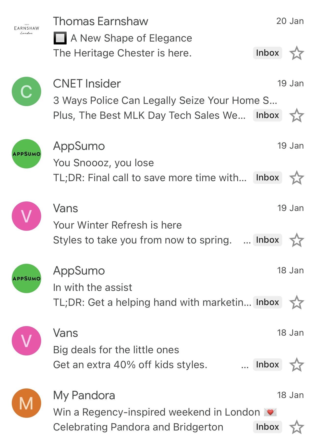
Subject line: First step of inbox design
Proper email design starts before the email is opened, with how your email looks when it hits your inbox. Specifically, for mobile email clients, it’s important to monitor the length of the header and subheader, as well as the presence of a brand logo, to build trust.
As for the subject line, it’s the best practice to keep it to 30 characters or fewer because smartphones have much smaller screens than laptops or computers. Thirty characters are enough to catch attention and drive clicks, but they force you to be more precise with your subject lines.
One-column layout
Check out how this email example from a women’s clothing brand implements this approach—a single-column layout is used for both mobile and desktop versions.

(Source: Email from Girlfriend Collective)
Big tappable CTAs
Not only are the size and placement of the CTA important but also the amount of white space around buttons and hyperlinks, as fingers aren’t a mouse cursor. Furthermore, there’s no need for hover effects on buttons; they look impressive on desktop but are invisible on mobiles.
Notice how Bulgari not only uses a mobile-first design throughout the entire layout and a large contrasting button but also places it even above the hero block to ensure that it ranks first on mobile devices.

(Source: Email from Bulgari)
High-contrast typography and readable fonts
Typography also has great significance. It helps to create a frictionless experience for readers who are limited by screen size and time. This makes your email content easy to read without requiring the person to pinch and zoom.
Best practices include the following:
- 16–18 px body text minimum for readability;
- 20–24 px for headlines;
- 44 px minimum tap targets for buttons;
- high-contrast CTAs that stand out instantly.
Take a look at this example—even though the fonts used aren’t the most popular, the size and contrast make the text easy to read on any smartphone.

(Source: Email from Baublebar)
Shorter hero section
Experts recommend shorter hero sections that support skimmable behavior and keep emails concise while introducing value early. Email is not the place for long narration. People reading emails are in a hurry, so content should be direct, focused, and easy to process. It is important to make the most of the limited space and attention mobile readers have.
In this mobile email design, you see a hero block and a main button that fit on 1–2 smartphone screens and look very appropriate on them.

(Source: Email from Miu Miu)
Optimized images
Image weight is also critical. Heavy images increase load time, and mobile users do not wait for emails to load, which is particularly frustrating on slower connections. When an email takes too long to load, many subscribers leave before they see any content.
To prevent this, images should be optimized for fast loading without losing visual quality. Use PNG files, compress them to reduce weight, and always add alt text so the message remains clear, even if images do not load. Text should remain readable, even if images do not load. Emails should not rely on images to communicate the main message. Images should support the text, not replace it. The content should still make sense without them.
In this mobile email design, you can see that the brand uses many images to showcase the product, yet the email remains easy to open and visually appealing across all devices.

(Source: Email from Earnshow)
Short, scannable, and focused email content
Most people do not read emails from start to finish. They scan for key points and decide within seconds whether the content deserves their attention. On mobile devices, this behavior is even more noticeable because of smaller screens and the need to access information quickly.
To make your emails easier to scan, follow these tips:
- use bold headlines and subheadings to separate sections;
- keep paragraphs short and focused;
- use bullet points or numbered lists to present key information clearly;
- focus on one primary message or CTA instead of filling the email with multiple offers or promotions.
By structuring your content this way, you make sure that even skimming readers still understand the core message.
(Source: Email from Old Navy)
For more in-depth information on the peculiarities of mobile email marketing, see the article below.
How to build a mobile-first email design in Stripo
In the Stripo editor, you can also create email designs with a first-to-mobile approach. If you’re using ready-made templates, choose a single-column template, for example, from this list of pre-built templates.
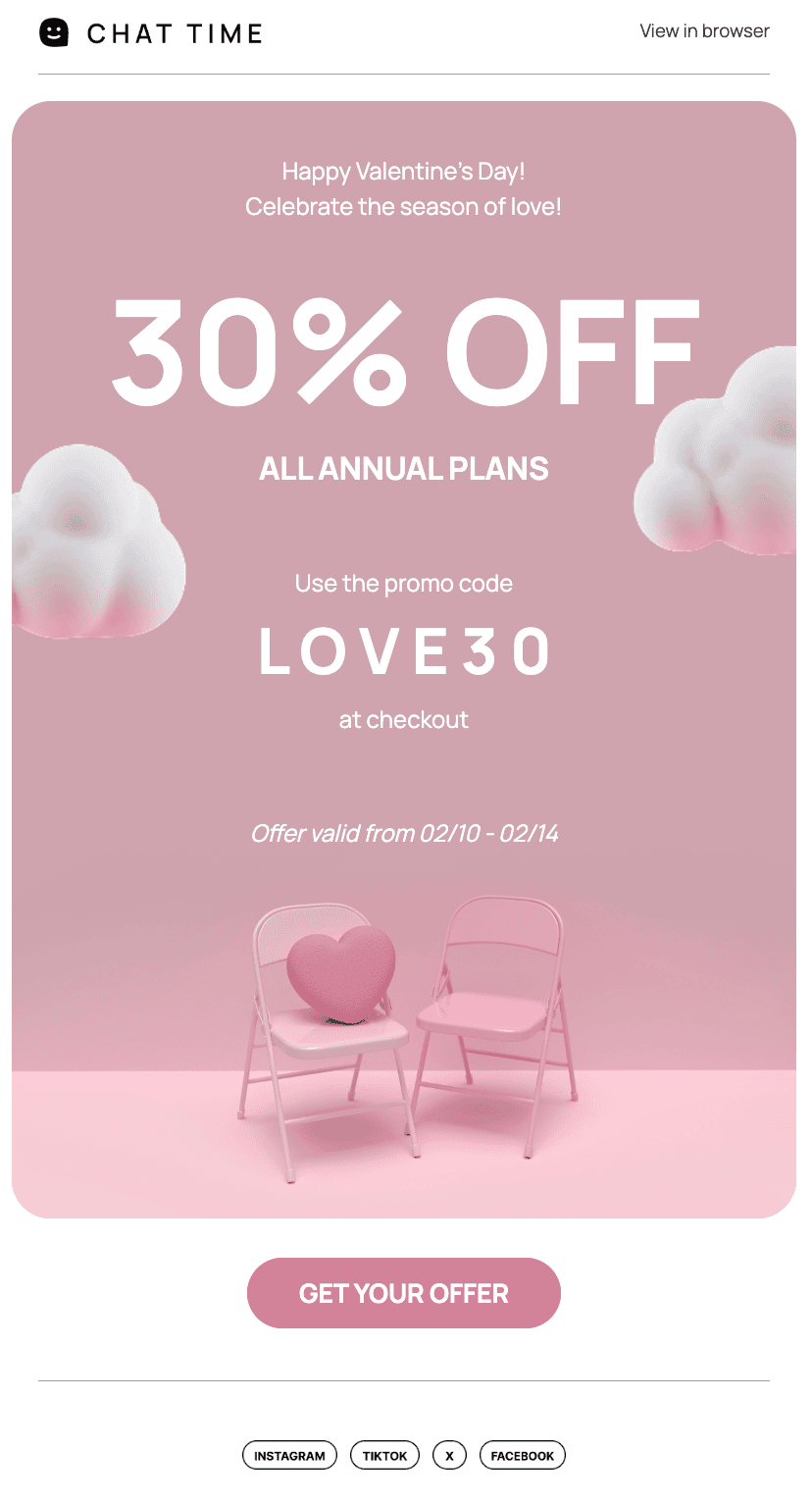
(Source: Stripo template)
Switch to the mobile design for targeted work.
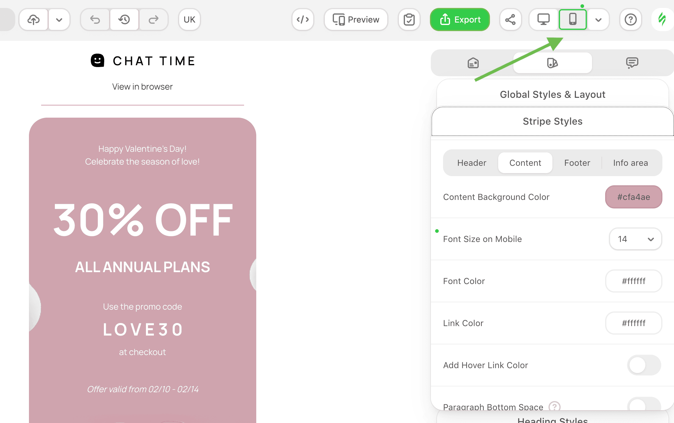
Follow the steps in this article. Create your email, taking into account the recommendations above and your communication goals, starting with the mobile design. Check all blocks and font sizes, increasing them in the settings, if necessary. Optimize images.
If you’re starting your email design from scratch, begin with the mobile version first. Once the mobile design is ready, switch to the desktop version and adjust the design as needed.
If you want to learn more about working with design in the mobile version, check out this article.
Best practices in mobile-first email design
Your design either helps customers make quick decisions or gets ignored. Long, complex emails can still work but only when they are extremely well structured. This creates extra guesswork for marketers. To reduce that risk, it is often better to keep emails short and focused.
Designing for mobile devices is not about limiting creativity. It is about earning attention. In fact, it often requires more creativity to communicate clearly and quickly. The reward for that effort is more attention, which makes it worth it.
Here are a few best practices to help you use this approach:
- Avoid multicolumn grids: They often look crowded on mobile screens and can feel overwhelming.
- Create text that stays readable even when images do not load: Your message should not depend on images to make sense.
- Verify CTA functionality: Make sure all links and CTAs are easy to tap and fully functional on mobile devices.
- Preview on multiple devices: Use email testing tools such as Stripo integration with Email on Acid to check how your email renders across different devices, operating systems, and email clients.
- Test on both iOS and Android: Emails can render differently across platforms, so testing on both helps ensure a consistent experience.
- Check load times: Test your emails on mobile networks, not just Wi-Fi, to see how quickly they load when connections are slow.
Test your emails carefully before sending them, and you can identify potential issues early and deliver a smooth experience for mobile users.
Wrapping up
Email opens on mobile devices continue to grow, which means email marketing teams need to consider mobile email client rendering throughout the entire production process, from design to pre-send testing. Building templates specifically for mobile devices and following proven best practices help improve quality and efficiency.
Whether you choose a mobile-first or responsive email design approach, the priority remains the same: respect your subscribers’ time and deliver a clear, positive email experience.


0 comments