Mobile-friendly email design in the Stripo editor

This manual explains how to create mobile-friendly emails in the Stripo editor. It focuses on practical setup, layout control, and common mobile issues, with clear step-by-step instructions and examples you can apply while working in the editor.
Key takeaways
- You can edit the mobile version directly, not guess the result: You can switch to mobile view in the editor, choose any settings, and see them the way they will appear on mobile phones.
- You can set global mobile styles first, then fine-tune any block individually if necessary: Stripo lets you define base mobile rules in General Styles and then override them for any stripe, structure, or block as necessary.
- You can control what appears on the mobile screen, not just how it looks: You can hide elements on the mobile screen, change the stacking order, adjust gaps, and decide which layouts are horizontal or stack vertically.
Understand how Stripo handles mobile displays
What “mobile-friendly” means in Stripo
All email templates you create with Stripo are responsive by default, so their layouts adapt to smaller screens. However, you can set additional mobile-friendly settings so that emails look exactly as you want them on mobile devices. These settings include font sizes, button sizes (including full-width buttons), spacing (margins and padding on mobile screens), container stacking behavior in structures, and hiding or showing certain extra elements on mobile screens.
Remember that the final result depends on the email client: mobile-specific settings rely on media queries, and some apps do not support them. For those clients, mobile overrides may be ignored, and the mobile display may look like the desktop version.
What changes applies only to mobile screens
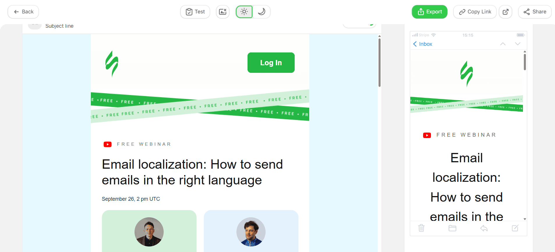
Mobile-only settings affect how an email looks on smartphones, not on the desktop version. They include mobile font sizes, button sizes (including full-width buttons), spacing (margins and padding on mobile screens), container stacking behavior in structures, and hiding elements on mobile screens.
When mobile settings do not work
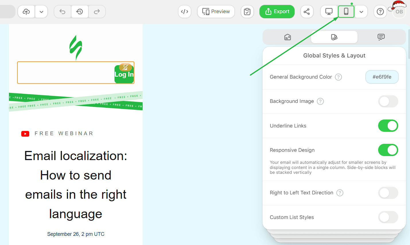
If mobile controls are inactive or changes are not indicated, check the Responsive design switch.
Responsive design in Appearance
Use this when you work with the Mobile Formatting settings:
1. Go to Global Styles & Layout.
2. Turn Responsive Design on.
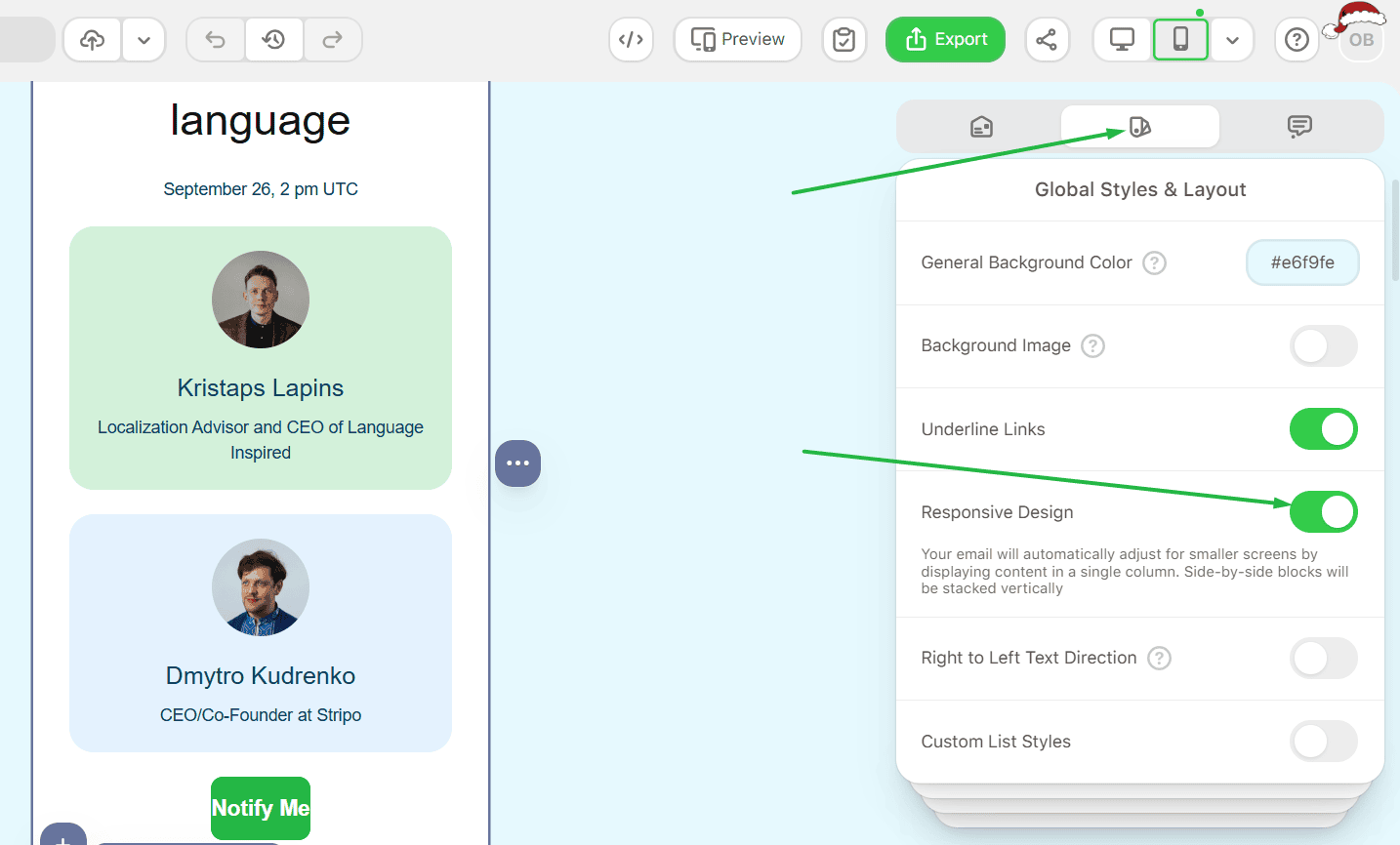
If Responsive Design is off, emails on mobile devices will look like the desktop version, and the Mobile Formatting section may be inactive.
Start with a clean base using General Styles
Switch between desktop and mobile styling modes
The General Styles menu lets you define default design rules separately for desktop and mobile screens. Use the device toggle in the General Styles panel to switch between desktop and mobile styling modes. Each mode stores its own values, so changes made in Mobile affect only the mobile view, not the desktop version.
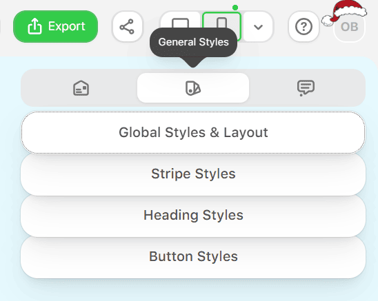
Set global layout and base rules for the entire email
Use General Styles → Global Styles & Layout to define how the entire email behaves before you work on individual stripes, structures, or blocks. Remember, not all desktop features are applicable to mobile.
However, if you are creating an email for both desktop and mobile screens, then you can do the following:
Step-by-step: Configure Global Styles & Layout
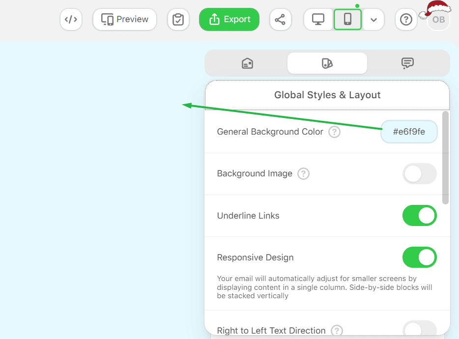
Set the general background:
1. Choose a general background color for the email message area.
2. On a desktop, the background color covers the entire message area.
3. On a mobile screen, this background is hidden.
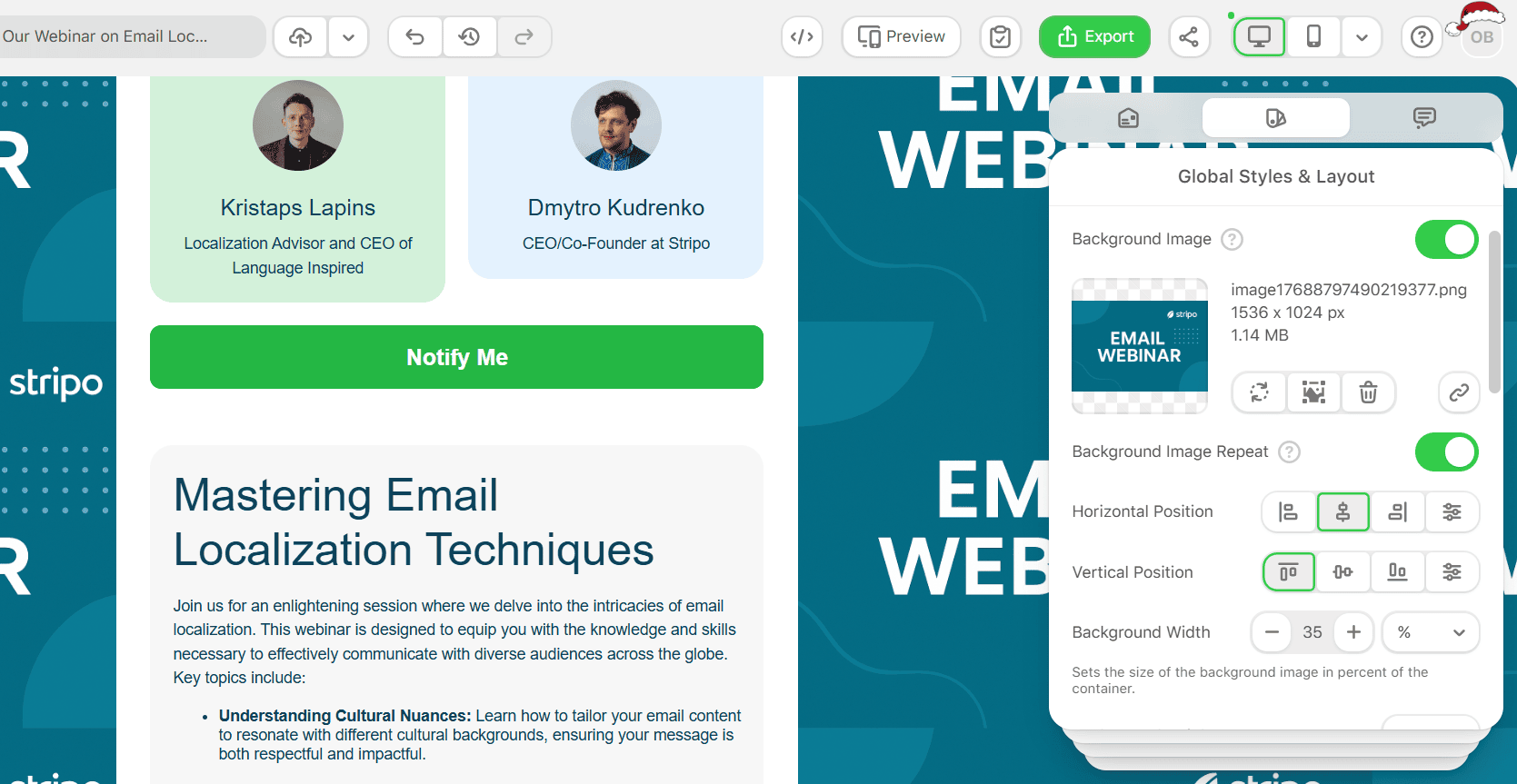
Add a background image (desktop only):
4. Select a background image and define its position.
5. Enable Background image repeat if the image should fill the entire length of the message.
6. Background images appear on desktop only and do not appear on mobile screens.
7. Some email clients, including Outlook, may not display background images at all, so set a fallback background color close to the image color.
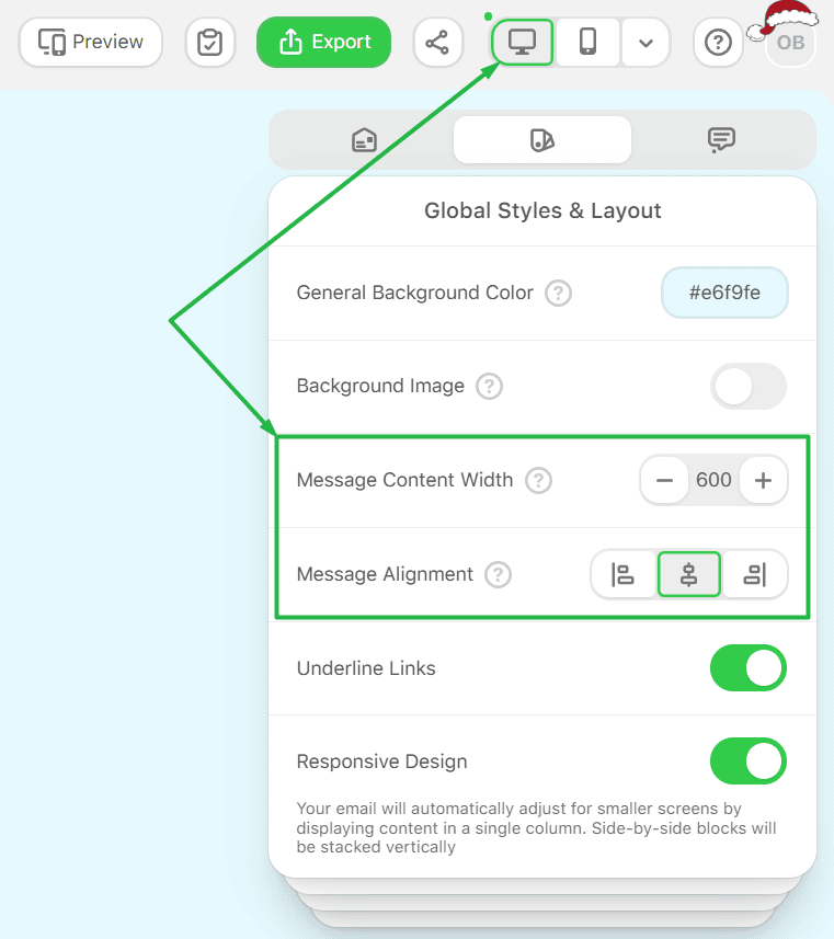
Setting message content width and alignment:
8. Width and alignment can only be set for desktop version.
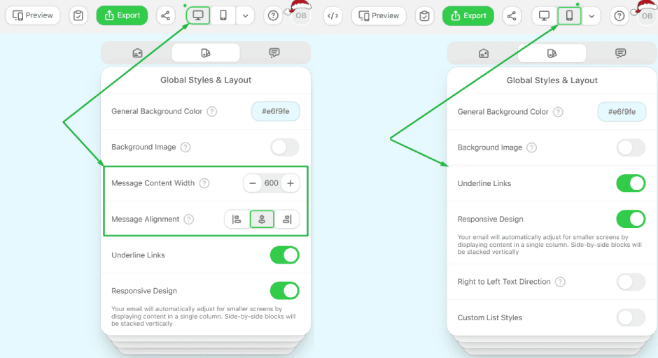
9. Define the width of the message content. The default is 600px.
10. You can set any value between 320px and 900px.
11. Choose the message alignment.
Control link underlining:
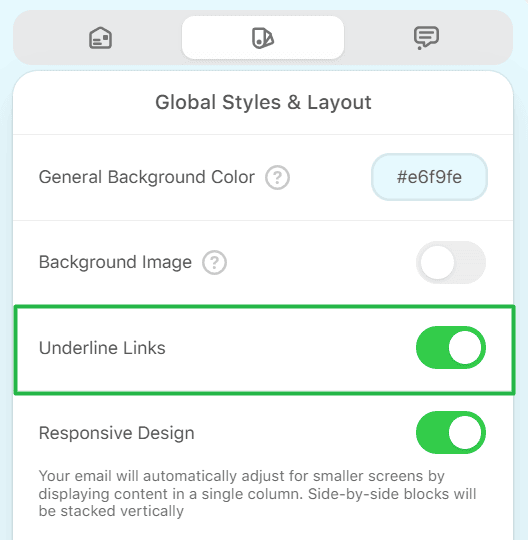
12. Enable or disable Underline links for the entire email template.
Enable right-to-left text direction:
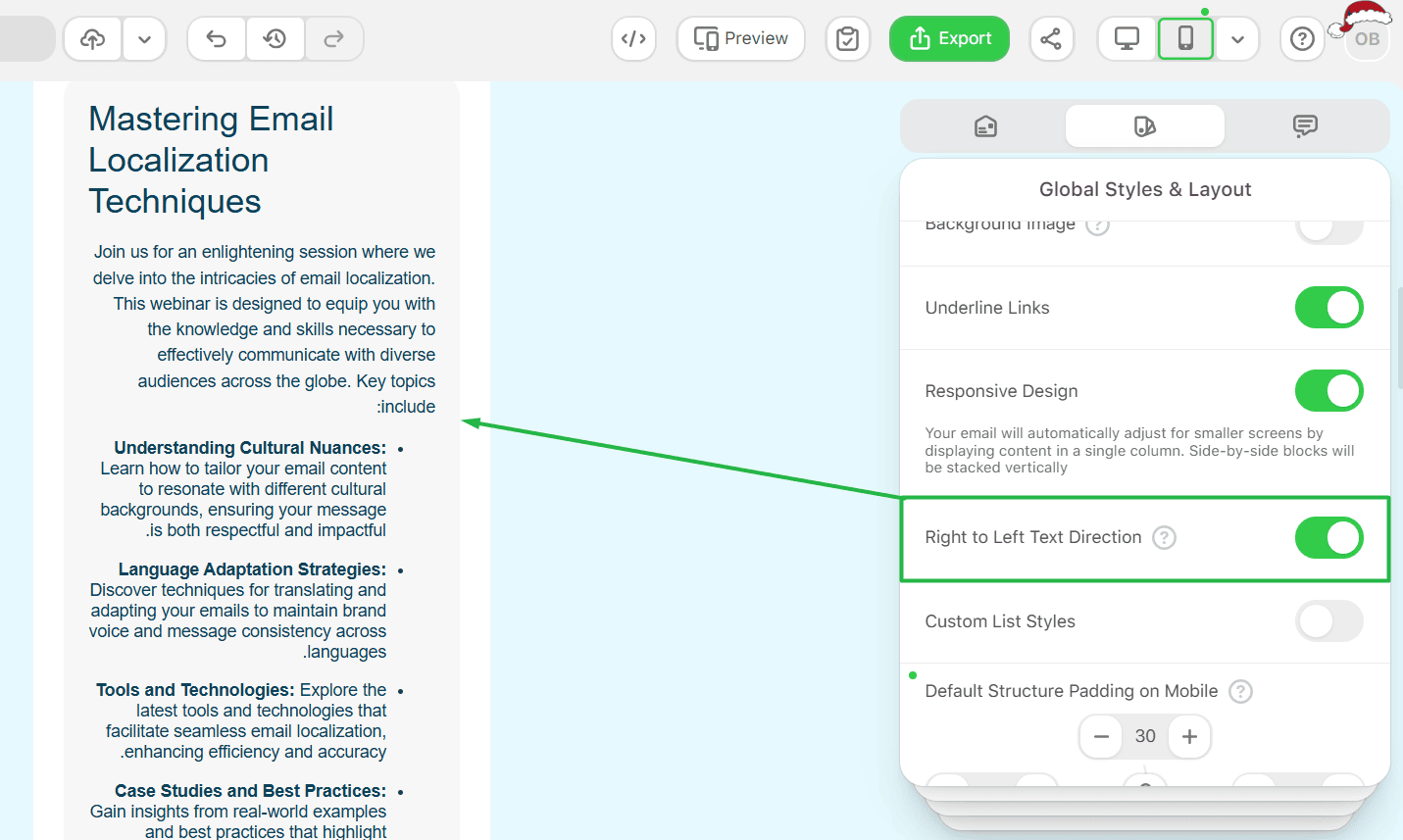
13. Turn on Right-to-left text direction for languages that require RTL scripts, such as Arabic and Urdu.
Set Custom List Styles:
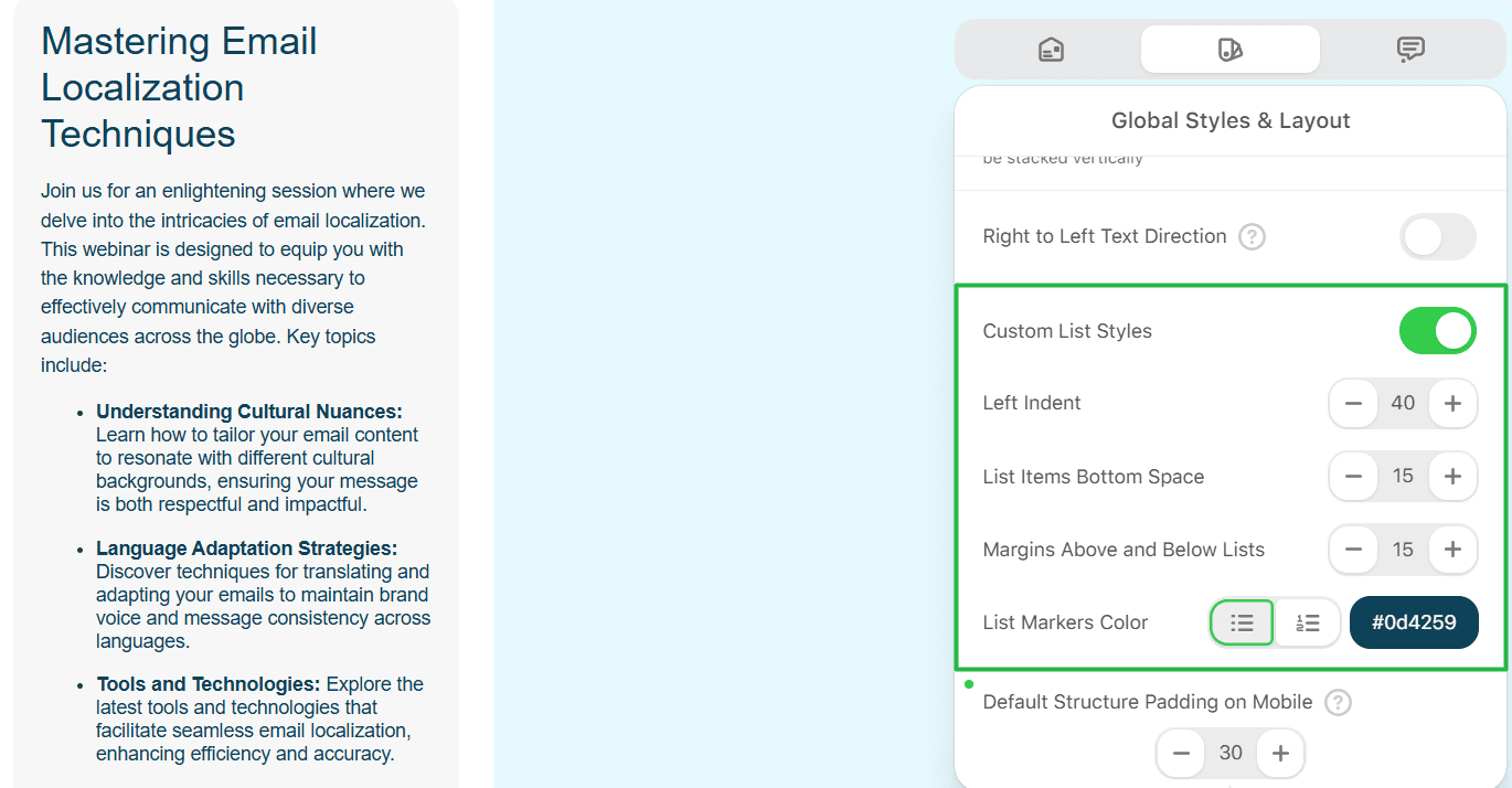
14. Define bullet list styles that will apply across the email.
Define spacing defaults:
15. Set Default Structure Padding. This padding is applied automatically to new structures.
16. Set Margins Around Message to control the spacing between the email content and the edges of the message area.
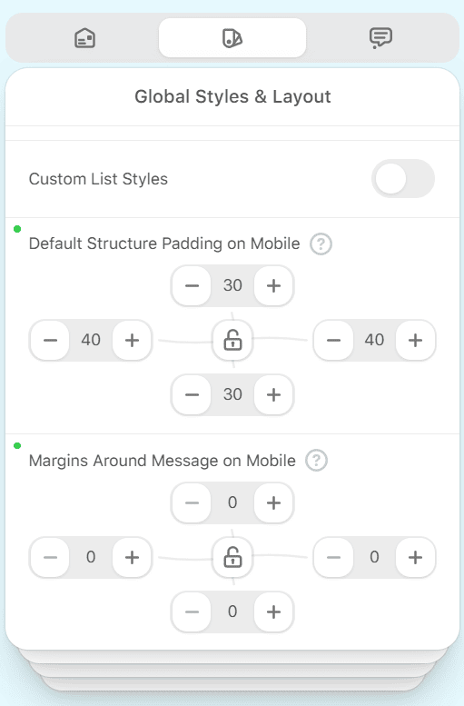
These settings create a consistent base across desktop and mobile versions, reducing the need for later adjustments.
Control typography and spacing for mobile readability
Global stripe typography
Step-by-step: Set stripe typography by type and fine-tune stripes
Set global stripe typography:
1. Go to General Styles → Stripe Styles.
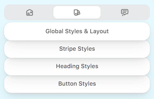
2. Select a stripe type.
3. Set the font family, line height, and letter spacing for text blocks. These settings do not affect headings.
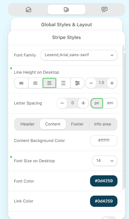
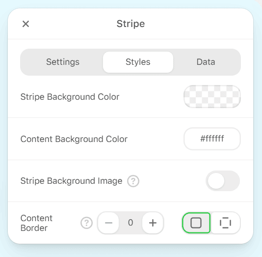
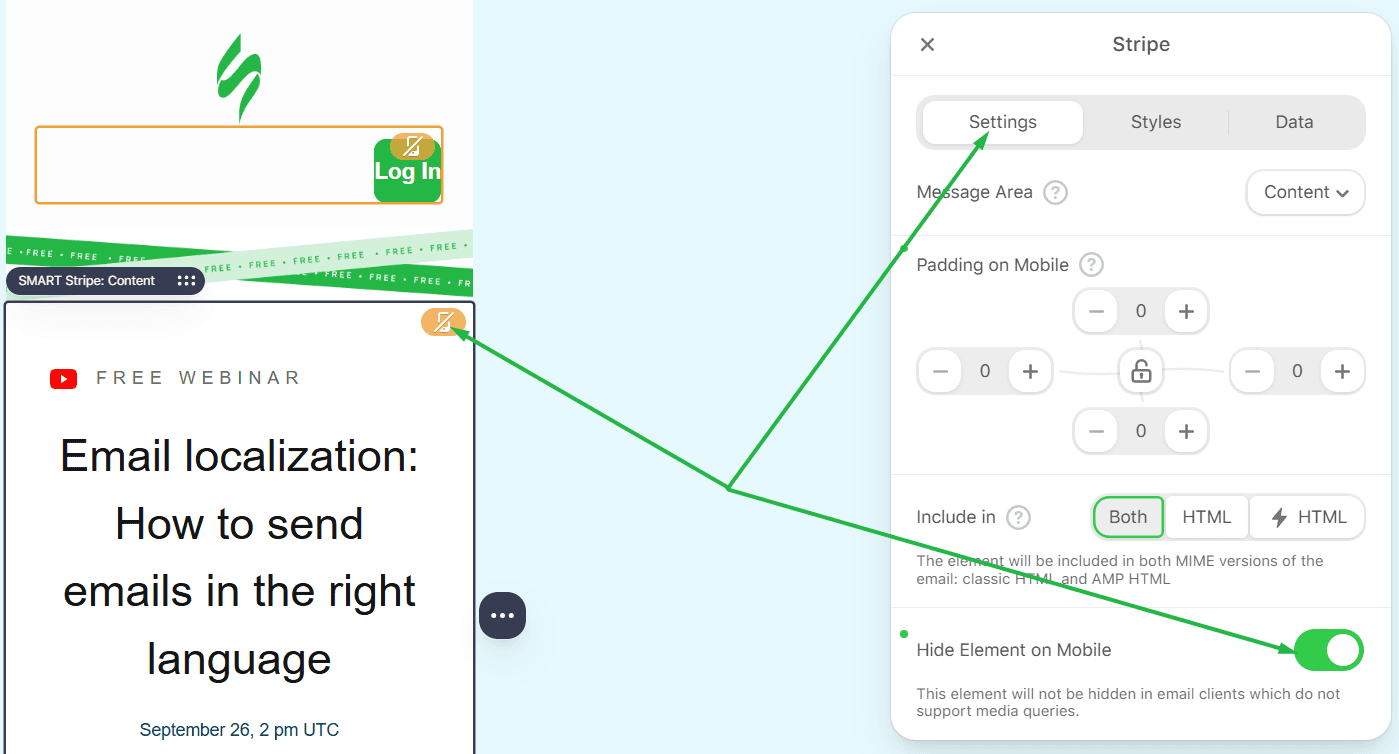
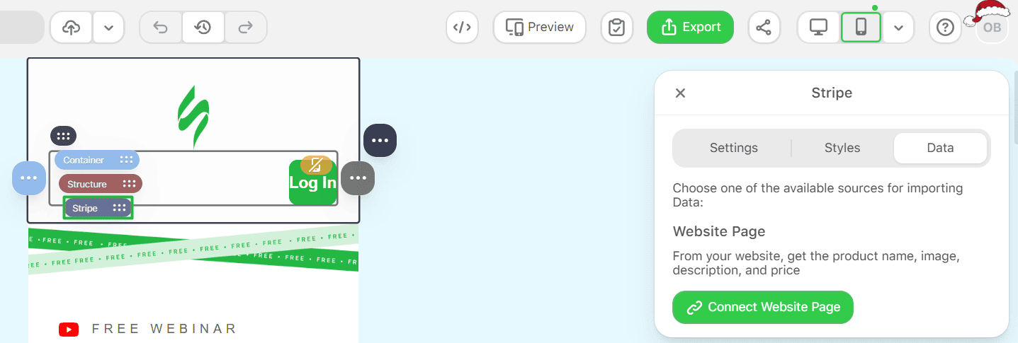
4. Also, you can click on the container block → Stripe.
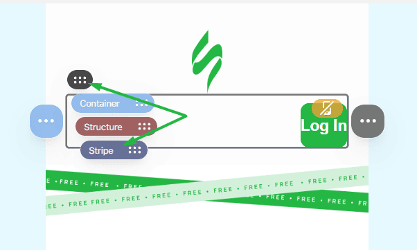
Set stripe backgrounds:
5. Define background color for the stripe and its content.
6. Add a background image if needed.
7. Set a fallback background color, as some clients, including Outlook, may not render background images.
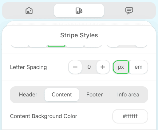
Or, if you open the stripe setting by clicking on the container block:
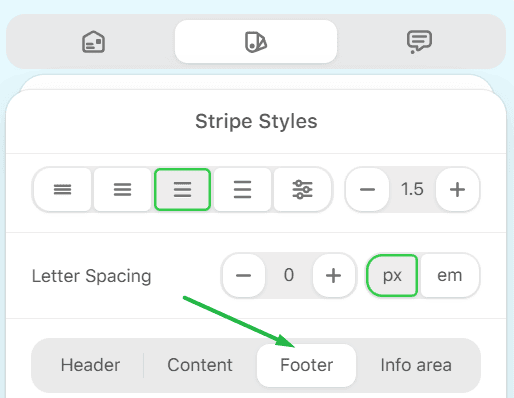
Define font size per stripe type:
8. Set default font size and line height for each stripe type.
9. Use smaller font sizes for the Footer stripe where appropriate.
Adjust stripe spacing on mobile version:
10. Select a specific stripe.
11. Set Padding on Mobile to control spacing around the stripe in the mobile view.
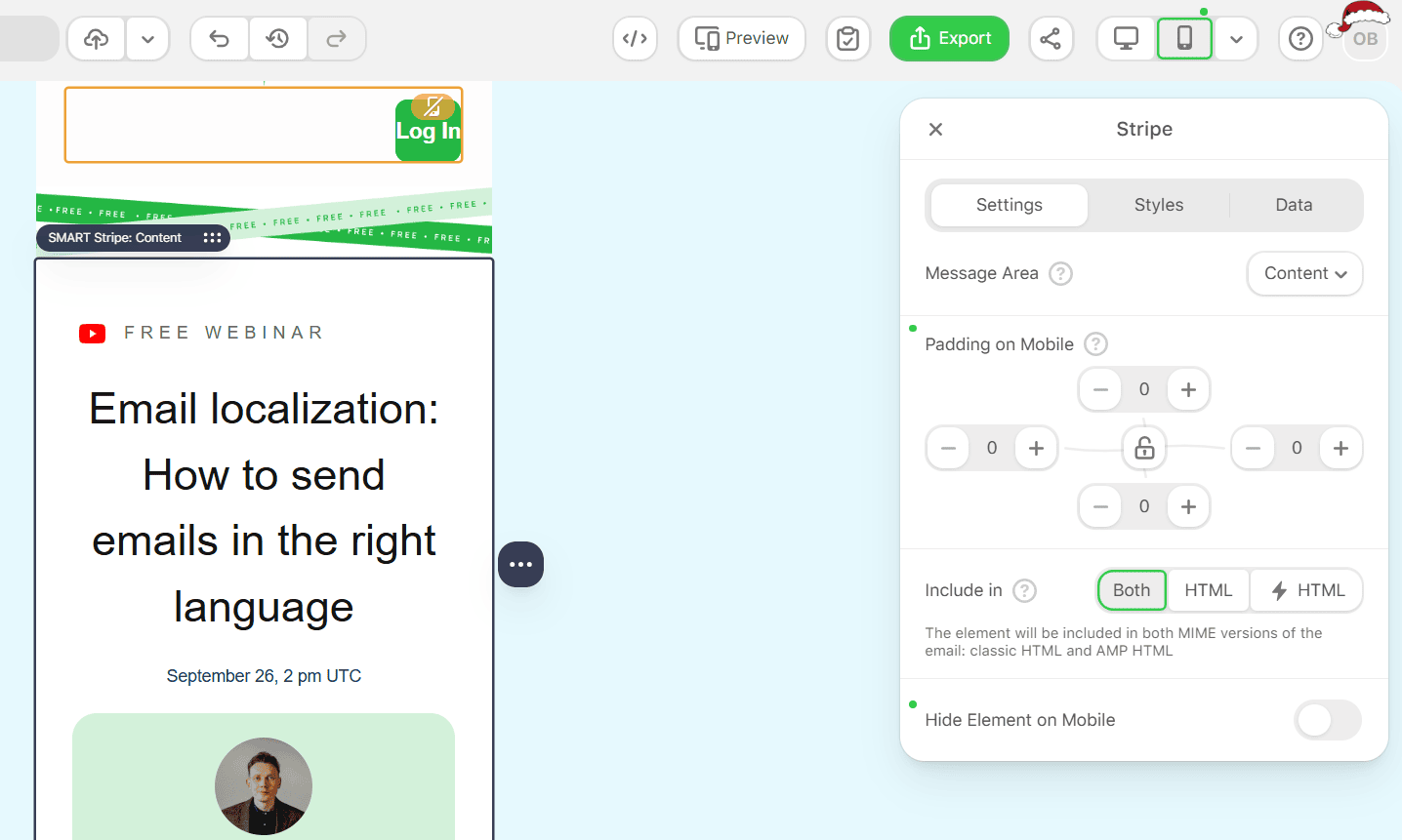
Hide a stripe on mobile version:
12. Enable Hide element on Mobile when a stripe should not appear on mobile screens.
Stripe-wide typography for different email areas
Stripes define large sections of an email and control the appearance of body text across repeated layouts. Each stripe can belong to a specific type, which allows for consistent styling.
Stripe types include Header, Content, Footer, and Info area. Using stripe types helps apply different font sizes and spacing rules, such as smaller font size in the footer.
Step-by-step: Apply custom block formatting for headings and set heading styles
Apply heading formatting:
1. Select text inside a text block.
2. Choose H1, H2, or H3 in the text formatting menu.
3. In mobile mode, set text alignment for headings when the desktop alignment does not work well on small screens.
Set custom Heading styles in the container:
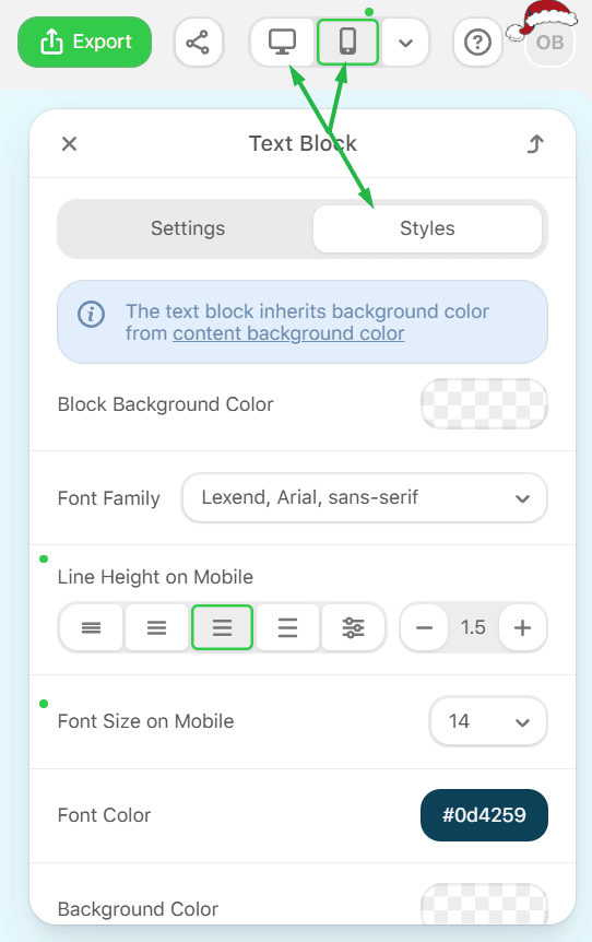
4. Open Styles and switch between desktop and mobile versions using the device toggle.
5. Choose the heading level you want to edit.
6. Set the font family, letter spacing, font size, line height, text style, and font color.
Build mobile-friendly CTAs that stay tappable
Button defaults that work across the whole template
Buttons on mobile version must be easy to read and tap. Text smaller than 18px reduces readability and increases mis-taps. A font size of 18px or higher is recommended for mobile buttons.
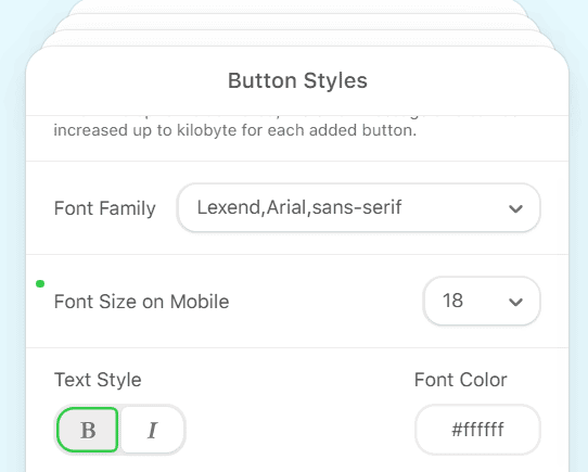
Set global Button Styles
Use General Styles to define button appearance once for the entire email, then adjust mobile values separately.
Step-by-step: Set global Button Styles
Open Button Styles:
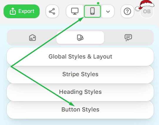
1. Go to General Styles → Button Styles.
2. Switch between desktop and mobile version using the device toggle.
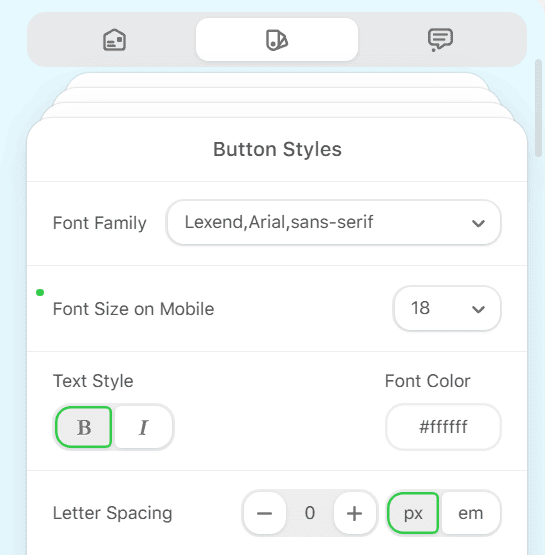
Set typography:
3. Choose font family.
4. Set font size and text color.
5. Select text style and letter spacing.
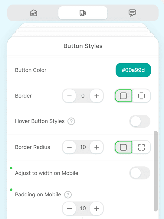
Define button shape and color:
6. Set button background color.
7. Configure borders, either all sides together or individually.
8. Set border color and border radius.
9. Add internal paddings.
Control button width:
10. Enable Fit to Container so buttons adapt to the container width (only desktop version).

Improve Outlook rendering:
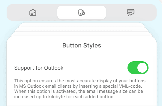
11. Turn on Support of Outlook to apply VML-based rendering for better button display for Outlook clients.
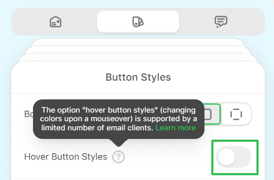
Set hover styles for desktop:
12. Configure hover background and text colors for desktop interaction.
13. These styles apply when the cursor is placed over the button.
Work directly in mobile view in the editor
Switch between desktop and mobile versions while editing
Stripo lets you edit the mobile version without leaving the editor.
Step-by-step: Switch between views
1. Use the device toggle in the top toolbar.
2. Select Desktop or Mobile to preview and edit the corresponding version.
3. Make changes in the active view. Desktop and mobile versions store separate values where supported.
Master the structure behavior on mobile version
Responsive structure: Stacking vs. staying in a row
As you know, Responsive Structure controls how containers behave in the mobile version. When it is on, containers stack vertically. When it is off, containers remain in a single row. Turning it off is useful when you want side-by-side layouts on mobile screens, such as product cards or small visuals with brief text.
Containers inversion: Controlling content order
In responsive layouts, container order matters. If text is on the left and an image is on the right, stacking may place text above the image. This is often not desired for mobile reading.
Step-by-step: Enable Containers inversion
1. Select a structure with two containers (click on Structure on containers).
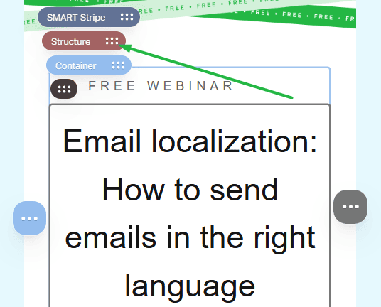
2. Turn on Containers Inversion on mobile.
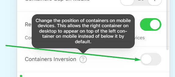
3. Preview the mobile view to confirm the order is correct.
Remember: Containers Inversion works only for structures with two containers.
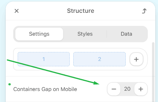
Add spacing between containers
Mobile layouts often need extra space between containers to avoid crowded content.
Step-by-step: Use Containers Gap on Mobile
1. Select the structure.
2. Set the Containers Gap on Mobile to add spacing between containers.
Apply structure and container padding in mobile version
Use mobile padding to fine-tune spacing without changing the desktop layout.
Step-by-step: Set Padding on Mobile for a structure
1. Switch to Mobile view.
2. Select the structure.
3. Set Padding on Mobile.
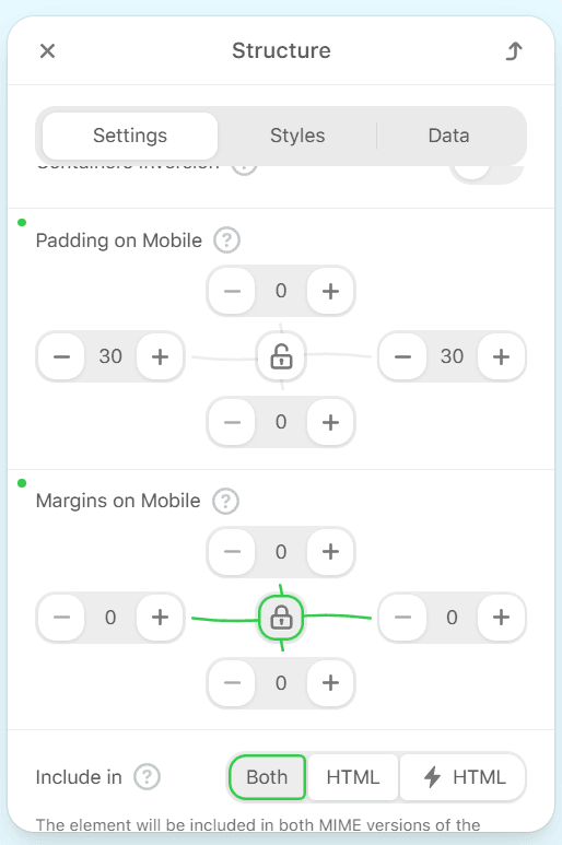
These settings apply only to the mobile version and leave the desktop spacing unchanged.
Mobile image handling that prevents stretching, scrolling, and bad cropping
Responsive image: When to turn it on
Large images can cause horizontal scroll or appear oversized on mobile screens. Responsive image adjusts the image width to the device screen and prevents these issues. This control works on devices that support media queries.
Small images (logos): Stop unwanted stretching
Small images, such as logos, should not stretch to full screen width.
Step-by-step: Disable Responsive image for small images
1. Switch to Mobile view.
2. Select the image.
3. Turn the Responsive image off.
4. Set the required image size manually.
Mobile image standards for email templates
For stable rendering across devices and clients:
- use JPEG, GIF, or PNG formats;
- keep image width within 600-800px;
- test images in mobile preview and for real clients.
Background images on mobile: What is possible and what is not?
Background images have fixed sizes and do not adapt to screen width in the same way as regular images. You can adjust the position and size of background images to improve appearance, but results vary by client.
Rendering limits to keep in mind:
- background images on containers, structures, and stripes do not display in Outlook;
- global background images render in desktop version but not in mobile version.
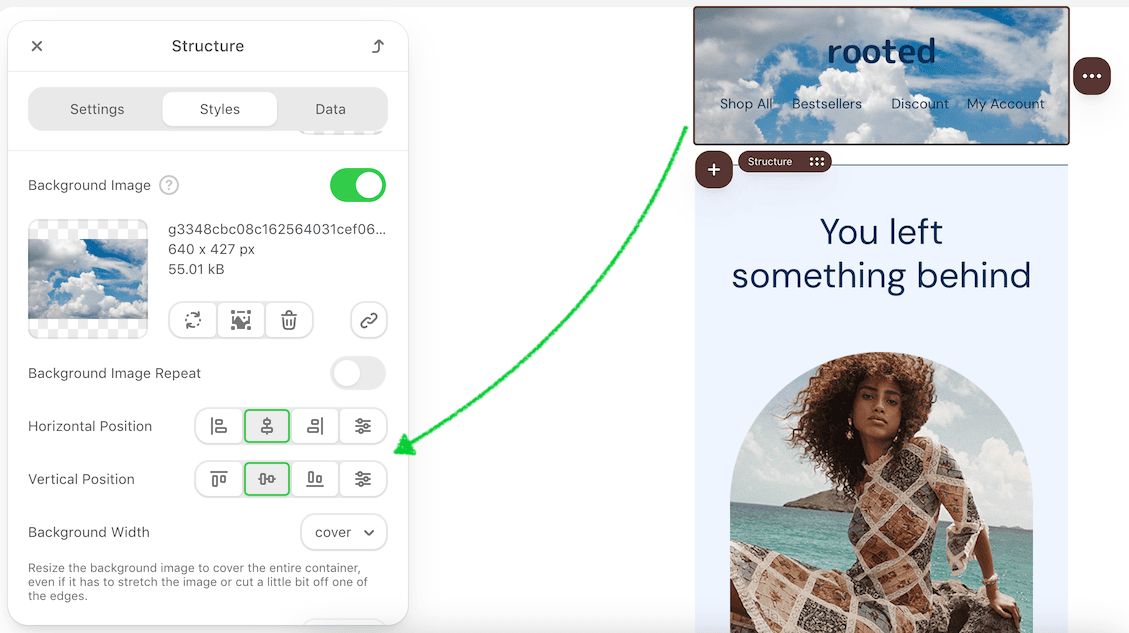
Always set a fallback background color when using background images.
Block-level mobile cleanup for text readability
Fix awkward line breaks in text blocks
On mobile screens, text can break into lines in an uneven way. A common example is a single word moving to a separate line, which reduces readability.
Step-by-step: Fix line breaks
Reduce font size in mobile version:
1. Switch to Mobile view.
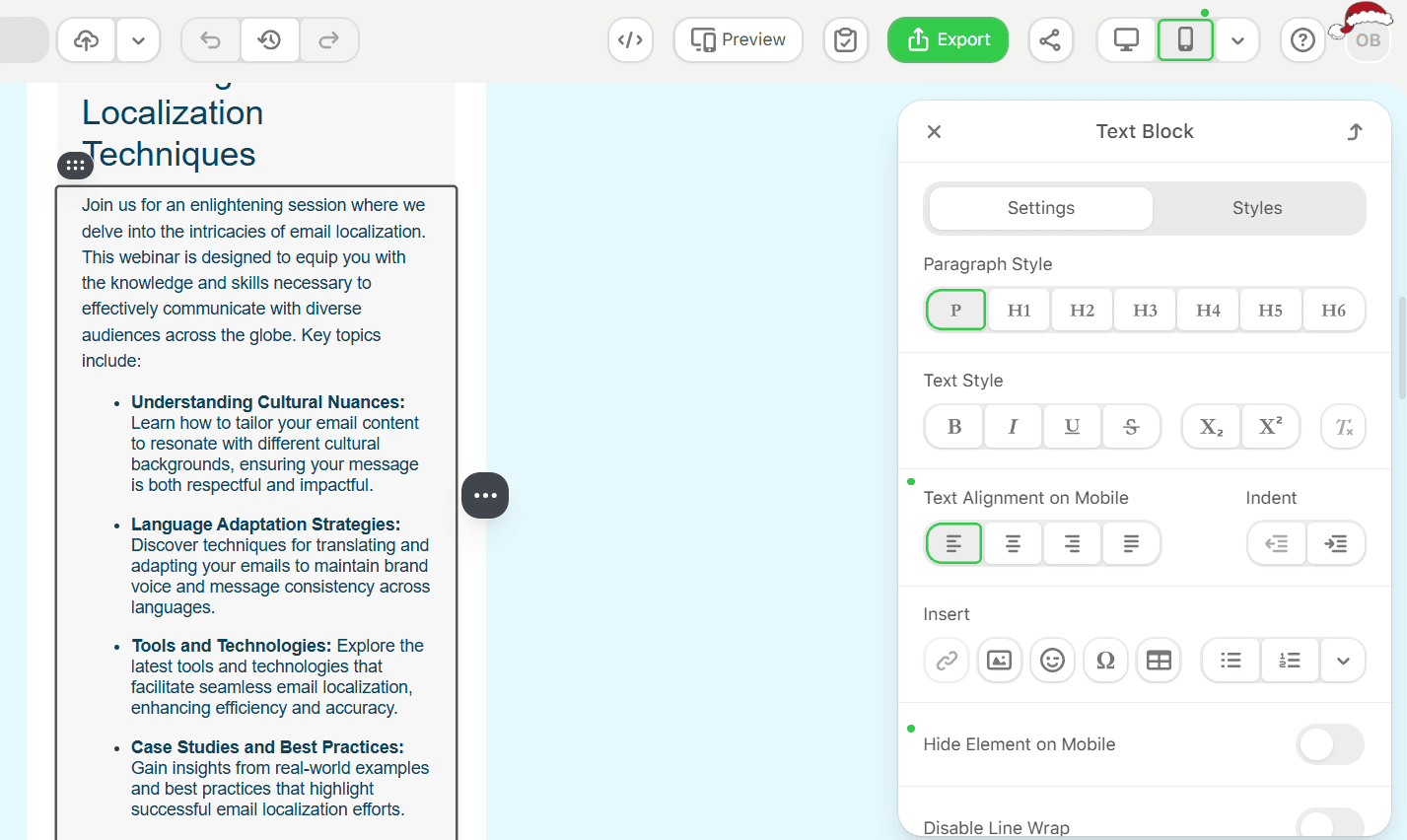
2. Select the Text block.
3. In Styles, decrease the font size for the mobile version until the text fits cleanly on one line.
Adjust alignment and paddings:
4. Check text alignment.
5. Reduce left and right paddings, since wide padding can force unwanted line breaks.
Disable line wrapping for a specific line:
6. Select the text line.
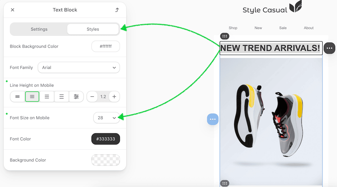
7. Enable Disable Line Wrap.
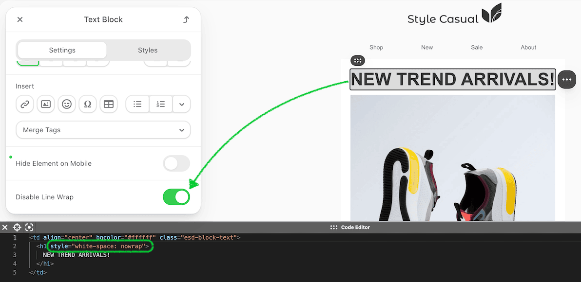
8. Use this option carefully. Long text lines with line wrapping disabled may not fit on the mobile screen and can cause horizontal scroll.
Troubleshooting: When your email turns non-responsive after sending
Why a responsive email can look like the desktop version on a mobile screen
Some mobile email apps do not support media queries. During sending or export, certain email clients strip responsive CSS from the code. When this happens, mobile-specific styles are removed, and the email renders like a desktop version on mobile devices.
Gmail case: Media queries removed after sending from Gmail
Gmail removes responsive CSS styles when emails are sent directly from the service. As a result, the mobile version may appear non-responsive.
Step-by-step: Keep responsiveness for Gmail
1. Export the email to an ESP that supports media queries.
2. Send the email to Gmail from that ESP.
In this flow, the email retains its responsive behavior in Gmail.
Outlook case: Responsive behavior differs by version and app
Not all versions of Outlook support responsive design. Some versions automatically remove responsive styles, which leads to non-responsive rendering on mobile screens.
Testing differences to note:
- test emails sent from Stripo to Outlook.com can be responsive on mobile screens.
Mobile QA checklist before you export
Before exporting or sending an email, review the mobile version in the editor.
Check the following in mobile preview:
- typography: heading sizes, body text readability, line breaks;
- margins and paddings: spacing around stripes, structures, containers, and blocks;
- buttons: text size, tap area, and full-width behavior where needed;
- container behavior: stacking order, inversion, and gaps between containers;
- hidden elements: confirm that elements hidden on mobile screens do not appear;
- images: responsive behavior, logo sizing, and background image fallbacks;
- horizontal scroll: check for wide images, large fonts, and non-responsive structures.
After previewing in the editor, test the email across different devices and email clients. Client behavior varies, especially on mobile devices, and real-device testing helps catch issues that previews may not show.
Wrapping up
Mobile email design depends on both editor settings and email client behavior. By setting a strong base in General Styles, using Mobile Formatting for quick adjustments, and fine-tuning structures, images, and text directly in mobile view, you can control how emails behave on small screens. Always review the mobile preview and test across clients before sending an email, especially when Gmail or Outlook is part of your workflow.


0 comments