Why dark mode still breaks email designs and how to take control


If you’re an email marketer who creates emails regularly, you’re probably familiar with this situation: Whenever you want to change something in a previously well-tested email template design, you’re forced to go through multiple testing iterations to ensure the design remains recognizable and consistent with your brand style in light and dark modes across all email clients.
It usually goes like this: you’ve carefully designed an email using brand colors, call-to-action buttons, backgrounds, and product images. Everything looks perfect in the editor. Then, you open the same email in dark mode and discover that the background has changed, the brand color looks different, the white text has become dark, or the logo is suddenly framed by an unwanted light border.
Your ideal scenario isn’t repeating the “create and test” process multiple times. Instead, you want email to look the way it was intended, without endless retests. In this article, we’ll explore why dark mode is a problem and whether it’s possible to integrate solutions directly into your email builder.
The dark mode problem: You design the email, but the email client decides how it looks
The main problem with dark mode in email design is its unpredictability. An email marketer technically controls the design they create but not necessarily the design the subscriber receives.
Different email clients implement different dark-mode transformations. Some support custom dark-mode CSS, some partially invert colors, and some ignore prefers-color-scheme altogether. Some clients (Apple Mail, Gmail desktop, Yahoo/AOL) leave emails “as is,” but others (Gmail Mobile, Outlook apps) invert light/dark in unpredictable ways.
The result can be broken branding: White logos vanish on dark backgrounds, or a purple CTA may suddenly turn green. Therefore, the same HTML email can look different depending on the client. Fixing this manually is time-consuming.
Is the dark mode really important?
About 35% of measurable email opens happen in dark mode, making it a standard viewing condition rather than an edge case. Nearly 90% of email opens occur in Apple Mail, iPhone Mail, and Gmail, where the dark mode is widely used or enabled by default. So, if your subscribers just can’t read your email, the cost of not solving the problem is high.
However, most email builders and ESPs pay little attention to this problem and lack native dark-mode editing; they rely on manual fixes and post-send previews.
Why dark mode is still so difficult to control
Why can’t email marketers still make sure what an email should look like in dark mode, and be sure it will look that way? The reason is that dark mode is not a single standardized rendering behavior or a single technology.
A marketer creates one design but actually removes many of its versions, because in dark mode, a different email client can:
- not change anything;
- partially invert colors;
- completely invert colors;
- use your prefers-color-scheme styles or ignore;
- change background/text, otherwise leave images without changes;
- condense the power of logic down to its smallest elements.
For example, Apple Mail favors custom dark-mode styling, whereas Gmail does not provide the same level of control and limits the power of transformations. Outlook also varies by platform version.
The same design can produce different problems. For example, contrast becomes too low, and CTA colors change. In partial-inversion clients (like Gmail on Android), light and dark elements coexist poorly. A section with a dark background and a light background side by side can end up mismatched, harming the design.
 |
 |
 |
| Original version in the light mode: Check its web version |
Dark mode in the |
In Gmail on iOS 26, |
Gmail can also make visible light text around images, and Outlook can change white text to dark text.
Email design with images that have rounded corners can look perfect in light mode. However, when the email is opened in Gmail’s dark mode, a light-colored outline appears around the corners of the images:
 |
 |
Among the most common pitfalls of dark mode are invisible logos or text. A white logo on a transparent background vanishes when the client’s background turns black. Similarly, dark text can vanish on dark backgrounds if contrast isn’t managed.
In addition, the email text may become unreadable if a newsletter uses dark-gray text on a light-gray background. An incomplete inversion may produce medium gray on medium gray, reducing readability.
These failures often become obvious only after sending or in QA previews, costing precious time to fix. The unpredictability across clients is why some email pros advise “design for dark mode” by default: use neutral colors and transparent assets, so that the email “survives” inversion. However, without direct editor controls, this is a compromise, not full control.

How marketers currently work around dark mode
In their endless struggle with dark mode, email marketers rely on best practices for using colors and images, manual HTML and CSS editing, and various workarounds that only partially predict how a design will look in dark mode. However, the main flow remains testing and editing. All this makes email design in dark mode time-consuming because no single method offers a full guarantee and does not let you check everything.
Here’s how email marketers are trying to simplify the task.
Approach 1. Design for inversion
One of the most popular approaches used by marketers is to use colors and images that automatically invert. They have developed various hacks to cope with dark mode. None is perfect, and many must be tested on a client-by-client basis.
For example:
- avoid pure black/white and design elements that depend on a specific background;
- use transparent PNG/SVG logos: Saving logos and graphics as transparent images allows them to blend with whatever background the client uses;
- add outlines or halos around logos;
- choose high-contrast colors and outlines: Use off-white/dark-gray instead of pure white/black to avoid inversion. It requires reworking brand colors and may not fully match brand standards;
- use a dark mode palette: Create special guidelines and palettes for working with dark mode.
Typically, in dark mode, if something goes wrong, it is possible to notice it after testing. You must return to the designer and find a compromise between good design and what is normally displayed in dark mode. To avoid wasting time testing every time, CleanMyMac developed a palette to use to determine how the colors and their combinations look in the layout for different designs. This saves time when designing and building emails.

This approach is the least technically complex, but it allows you to design around what the email client might do.
Approach 2. Use dark-mode CSS
For email clients who support prefers-color-scheme, you can create separate dark-mode styles. That is, for each email, create light and dark versions of the background and text as well as alternate button colors and image versions.
This gives you much more control but requires HTML/CSS expertise. Most importantly, this does not solve the problem for all email clients. For example, Gmail does not behave the same as clients that support custom dark-mode CSS.
Approach 3. Create alternate images
For logos, icons, hero images, and other graphic elements, email marketers create a separate dark-mode version. This avoids situations in which automatic inversion renders the image unreadable.
To achieve this, versions of the element for both light and dark modes are included in the HTML code, with one version hidden via CSS (using a media query or an Outlook-specific method).
But such workarounds add extra design work, extra assets, and require writing HTML/CSS logic and testing. Image swapping doesn’t work the same way across all clients.

Approach 4. Edit the HTML manually
For complex cases, marketers and developers can use more sophisticated approaches. For example, adding media queries and client-specific selectors, and adding Outlook-specific code.
Additionally, adding dark-mode styles to media queries will make your email compatible with all email clients and devices. The metatags tell the style sheets of a recipient’s email clients, browsers, and operating systems what to load and not load.
This provides the most control but shifts the problem from email design to coding and QA.
Approach 5. Use tools for choosing colors, previewing design, and testing
In all these approaches, due to the unpredictability of email customer behavior, testing has become a key strategy for email marketers to avoid issues with emails appearing in dark mode. Some specialists still prefer manual testing, but for large volumes of emails, specialized tools come to the rescue.
Here are the most popular tools email marketers use to test dark mode at various stages of email creation:
- For choosing colors: The color inversion tool will help you carefully choose colors for your emails before designing them and avoid colors that won’t look good in dark mode.
- For dark mode emulation: Some email builders and editors within ESPs offer a dark-mode preview to simulate and preview how your email design looks in dark mode. For example, in Stripo, you can use the preview mode to check how your email renders overall and ensure every element displays correctly.
- For dark mode emulation when creating emails: In the Stripo editor, you can switch between light and dark modes to see how different design elements look in each version during the design process.
- Testing tools like Litmus or Email on Acid will help you see how your emails appear in all popular email clients. This feature is also built into the Stripo editor through its integration with Email on Acid, which allows you to test email rendering across all desktop and mobile display variations on various devices, including those with dark mode.
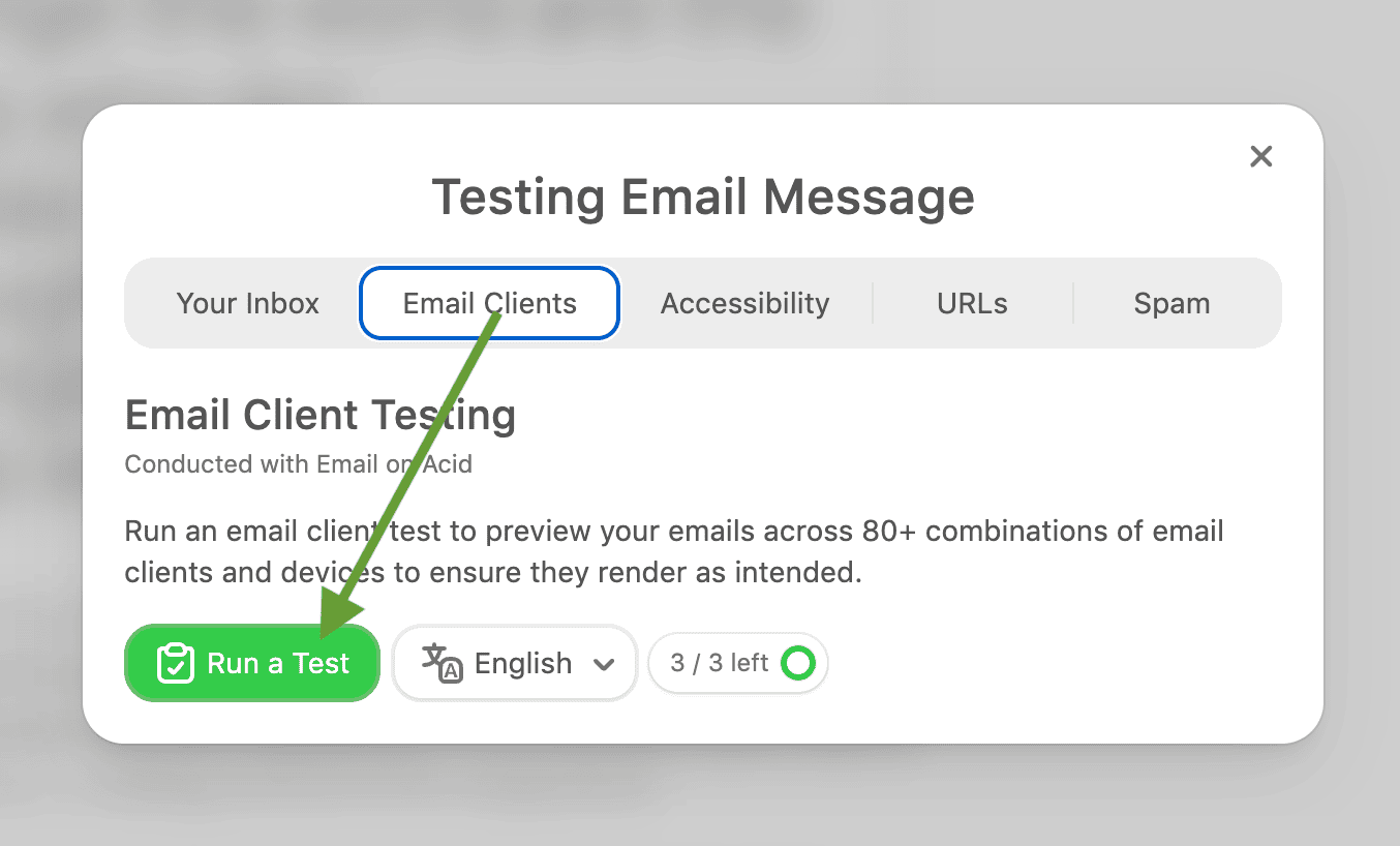

In addition to the dark mode email testing tools mentioned, there are many others. However, the fundamental problem remains: they do not eliminate the need for constant cycles of fixes and retesting, and with some tools, each test even incurs a cost.

Why do these workarounds not fully solve the problem?
All these workarounds come with trade-offs. Media queries and metatags cover only certain clients, so fallbacks (transparent images, midtone colors) must cover the rest. Any hack adds complexity and must be tested in every target client.
In practice, designers use testing suites to preview dark mode across clients. Even then, every update or new brand color requires retesting. In short, these techniques can mitigate dark-mode issues, but they add development effort and are error-prone without visual tooling.
We propose to evaluate all the approaches according to the following criteria:
- control (predictability and brand consistency): The email should appear as intended across all dark-mode clients. Replacing client guesswork with explicit dark-theme values prevents surprises;
- effort: Setting dark-mode variants should save time versus manual fixes. The editor should avoid requiring repeated “design twice” workflows or extensive QA;
- expertise (ease of use, no-code control): Marketers, not developers, should be able to set dark-mode variants with minimal steps. An intuitive UI is key. This avoids having to hand-edit HTML or CSS;
- coverage (cross-client fidelity): The solution should work or have predictable fallbacks across major email apps. We care about Apple Mail (iOS/macOS), Gmail (web/iOS/Android), Outlook (Win, Mac, web, mobile), Yahoo/AOL, etc., covering >90% of opens;
- reusability and scalability: Dark-mode settings should be reusable across emails. The feature should scale to dozens of emails without extra work.
This table provides a summary of all the approaches discussed above.
|
Approach |
Control |
Effort |
Expertise |
Coverage |
Reusability |
|
Design for inversion |
Low |
Low |
Low |
Broad but unpredictable |
High |
|
Dark-mode CSS |
High in supported clients |
High |
High |
Limited by the client |
Medium |
|
Alternate images |
Medium–high |
Medium |
Medium |
Client-dependent |
Medium |
|
Manual HTML/CSS |
High |
Very high |
High |
Client-dependent |
Low |
|
Preview and testing tools |
Finds problems |
Medium |
Medium |
Broad |
N/A |
Do you also feel like something is missing here? Actually, there is one more step you can take.
From dark-mode preview to custom dark-mode control
Complex, code-based approaches are time-consuming and require specialized skills, yet they can still yield unexpected results. Against this backdrop, the dark-mode preview features found in some email builders and email service providers (ESPs) appear useful and user-friendly, although they do not offer precise control over the email’s appearance.
The introduction of dark-mode preview functionality marked a significant step forward. Marketers gained the ability to see how a design looks when opened in dark mode and to identify issues before sending. However, spotting a problem is not the same as solving it.
What dark-mode preview solves
A preview helps answer a practical question: What happens to the email when it is opened in dark mode?
It eliminates the need to spend time testing across various email clients and devices to find flaws, allowing you to view the dark-mode version while actually creating the email. This makes it easier to spot issues such as insufficient text contrast, disappearing visual elements, or distorted brand colors.
However, there is a significant limitation: The preview only provides an approximation of how the email might appear in an email client. It does not “tell” the client exactly how the marketer intended the email to look.
What it doesn’t solve
A key issue remains: The final say on how an email is displayed rests with the email client.
Different clients implement dark mode in different ways. Without a reliable method to specify exactly how the email should appear in dark mode, you will still need to spend time checking its visual presentation, although the number of iterations might be reduced.
This creates a reactive workflow:
Design the email → preview dark mode → find a problem → look for a workaround → edit the code or assets → test again.
Previews and testing merely signal that something has gone wrong; they do not provide a simple way to specify the exact alternative design version you want to achieve.
The missing layer: Defining the intended dark version
The missing link between the preview and testing stages is the ability to intentionally design a dark-mode version of an email. Marketers need a way to explicitly select colors and images for dark mode directly in the editor without writing code. This ensures that readability and visual integrity are maintained across email clients, such as Apple Mail, Gmail, and Outlook, regardless of how each client implements dark mode.
Crucially, the light-mode design remains unchanged, while the dark-mode settings create a separate version of the email for clients that support this mode.
Of course, this will not eliminate differences between email clients or guarantee an identical appearance everywhere. However, it will provide marketers with something they currently lack: the ability to deliberately design for dark mode rather than simply reacting to the email client’s automatic rendering behavior.
How Stripo will give marketers more control over dark mode
Optimizing workflows for dark mode isn’t about anticipating every possible way an email client might transform an email; it’s about giving marketers greater control over the version being sent.
To address this, Stripo is developing the new Custom dark mode feature within its editor. This feature allows marketers to adjust key dark-mode settings, such as specifying exact colors and swapping images for dark-mode versions, to create a dedicated dark-mode email variant rather than simply relying on an email client’s automatic inversion. All of this is achieved using the editor’s built-in controls, eliminating the need for manual code editing.
With this functionality, you can define specific background and font colors for any email element and replace images with dark-mode-optimized versions. The original light-mode design remains intact, while the dark-mode version serves as a carefully crafted alternative for email clients that support user-defined styles.
This transforms dark mode from something that merely requires testing into a design element you can actively create and control.
Important note: The Custom dark mode feature does not override the rendering rules established by email clients, nor does it guarantee identical results across all email services; email clients still determine how emails are processed and displayed. However, this feature provides marketers with a ready-made dark-mode design, removing the need to rely solely on automatic color inversion.
Why the Custom dark mode is a better approach, according to the previous criteria:
- more control: Instead of accepting whatever colors an email client generates, you can define the dark-mode values that best preserve your brand, hierarchy, and readability. This gives you more control over the intended appearance of your email;
- less effort of manual work: The Custom dark mode moves these tasks into the email editor, reducing the amount of code and manual work involved;
- a lower technical barrier: With the Custom dark mode, marketers can configure alternative colors and images directly in the editor without having to build every dark-mode rule from scratch;
- more predictable design decisions: Defining dark-mode values lets you make those decisions intentionally. You can decide that a brand color should become lighter, that a background should use a specific dark shade, or that an image needs a dedicated alternative;
- scalable and reusable across campaigns: Dark-mode settings can be saved with reusable modules. This means you do not have to recreate the same dark-mode decisions every time you build an email. Once a module has been designed for both themes, it can be incorporated into a repeatable workflow for future campaigns.
The result is a more intentional approach to dark mode: Design the dark version, define the values you want, and then test how email clients render it.
The Custom dark mode feature is coming soon to the Stripo editor, and we will show you how it works.
Wrapping up
The issue of how emails render in dark mode will continue to challenge email marketers for the foreseeable future, primarily due to the unpredictability of the display. However, it is no longer something to ignore, as your subscribers and customers are increasingly viewing your emails in this mode.
Therefore, the best approach is to devise a workflow that optimizes the effort your email marketing team invests in this area while making the design outcome as predictable as possible.
0 comments