Email white space: The design principle behind higher-performing campaigns


Only 35% of people spend more than 9 seconds reading an email. This means that the majority of your recipients don’t read every word. Instead, they scan the layout to find a specific reason to stay. If your layout is dense, the eye can’t settle on a starting point, and the reader often closes the message.
White space acts as a structural tool to manage the speed at which a recipient processes your information. By leaving parts of the canvas empty, you create a path for the eye to follow, leading it directly to the information that matters most. In this article, you will learn how to use white space in email design to make it easier to read, visually cleaner, and increase click-through rates.
Key takeaways
- white space is not just a design choice but a functional tool: By reducing cognitive load, strategic gaps guide the recipient’s eye toward the most important information;
- active vs. passive space serves different goals: Active white space is an intentional gap used to isolate conversion points, such as CTA buttons, while passive white space (like line height and margins) ensures that long-form text remains legible and accessible;
- accessibility and mobile optimization depend on spatial management: Following Web Content Accessibility Guidelines (WCAG) standards for line height (1.5x font size) and using responsive percentage-based margins ensures that your message is readable for all subscribers across all device types;
- clean design protects long-term list health: Beyond immediate click-through rates, well-spaced layouts reduce subscriber frustration, leading to lower unsubscribe rates and fewer spam complaints.
What is white space in email design?
In email design, white space is the area of the layout that remains empty. Despite the name, it doesn’t have to be white; it simply refers to the gaps among images, blocks of copy, and navigation elements.
The primary function of white space is to prevent visual overstimulation. By separating different content blocks, you give the recipient’s brain time to process one piece of information before moving to the next.
Active vs. passive white space: A working definition
The difference between active and passive white space is, basically, the difference between space left by accident and space placed with intent. Here is a closer look:
Active white space is an intentional gap used to emphasize a specific element or to guide the recipient through a sequence, for example, by increasing the margins around the “Buy Now” button to separate it from the surrounding product description. This ensures that the primary goal of your email campaign is immediately obvious, as the eye moves directly to the conversion point.
Passive white space refers to the natural gaps between small elements, such as the space between letters (kerning) or the distance between lines in a paragraph (leading), for example, the default margins around a logo or the standard space between a headline and the body text. This improves legibility and ensures that the email doesn’t appear as an unformatted block of text.
What email white space is not
There are common technical misconceptions about what white space means in an email context. To design effectively, you should distinguish it from these two things:
- It isn’t the inbox white space: Marketers sometimes refer to white space in an inbox, meaning the gap between your subject line and the one below it. In design terms, white space refers only to the internal layout of your specific email.
- It isn’t a single CSS property: There is no white-space command in HTML that creates these layouts. Instead, you achieve this by using a combination of padding, margins, line height, and transparent spacers. It is a result of structural choices rather than a single setting.
How white space improves email readability
White space determines how quickly a recipient can scan and understand your message. Without sufficient gaps, words blur together, and the effort required to read increases. Using space correctly reduces this cognitive load, making the content feel manageable, even on a small screen.
Paragraph length and blank-line rules for email
Long blocks of text are difficult to track in an inbox. When a paragraph exceeds five or six lines, the recipient often skips it entirely. To avoid this, follow the following rules:
- Keep paragraphs short: Aim for two to four sentences. This creates more natural entry points for the eye.
- Use one blank line between paragraphs: Don’t rely on simple indents. A full line of white space clearly signals the end of one thought and the start of the next.
- Break up lists: If you have a series of points, move them from a paragraph into a bulleted list with padding between each item.
Line height and letter spacing: Recommended values
The space between lines and letters directly affects reading speed. If the lines are too close, the eye can lose its place when moving from the end of one line to the start of the next.
You can follow the standards set by the WCAG for text spacing:
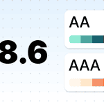
- line height (leading): 1.5 times the font size: This vertical gap helps the eye track from the end of one line to the start of the next without jumping or losing its place. For a standard 16 px font, this equates to a 24 px line height;
- spacing following paragraphs: 2 times the font size: Leaving a gap of at least twice the font size between paragraphs creates a clear break in thought. In most email editors, you achieve this by adding a full blank line or adjusting the bottom padding of the text block;
- letter spacing (tracking): 0.12 times the font size: Increasing the space between letters makes them easier to distinguish. Adding a slight increase of roughly 0.5 px-1 px prevents characters from blurring together, which is particularly helpful for recipients with visual impairments;
- word spacing: 0.16 times the font size: Maintaining this minimum distance between words ensures that sentences do not appear as a continuous string of characters, allowing for faster scanning.
Manually calculating these ratios for every text block can be time-consuming and prone to rendering errors in certain email clients. Stripo addresses this by including a built-in accessibility checker that automatically scans your code, providing actionable adjustments for line height and letter spacing throughout your layout.
CTA isolation: How white space lifts click-through rates
The more space you place around a button, the more important it looks. When a CTA is crowded by text or images, it competes for the recipient’s attention. By isolating the button with active white space, you signal that this is the primary goal of the email. This visual focus reduces the time a recipient spends searching for the next step, which directly impacts click-through rates.
How much padding to place around a CTA button
A button needs enough room to stand out as a distinct interactive element.
If it is too close to other links or text, recipients (especially those on mobile devices) may struggle to tap it or ignore it entirely:
- the 44-pt rule: According to Apple’s Human Interface Guidelines, every interactive element should have a hit target of at least 44 × 44 pt. This includes the button itself and the empty space immediately around it;
- safe-tap distance: A common UX rule is to leave at least 8 px–10 px of clear space between any two clickable elements.
Before and after: CTA white space in action
Consider a typical promotional block:
- before: A headline, two sentences of copy, and a button are all stacked with only 5 px of space between them. The button feels like part of the paragraph, and the layout looks heavy;
- after: The same elements are used, but with a 24 px line-height for the text and 30 px of padding around the button. The button becomes the first thing the eye sees when scanning, and the copy is easier to digest.
The two types of white space in email, in depth
To use space effectively, you need to understand the functional difference between active and passive white space. One is used to draw attention, while the other is used to maintain structure.
Active white space: Where and why to place it
Use active white space to break the flow of the email and prompt the recipient to pause and focus on a specific element.
Strategically placing active white space allows you to break the flow and command attention in these key areas:
- Around CTA buttons: Placing extra space above and below a button separates the action from the persuasion. It tells the recipient that the reading part is over, and the clicking part begins.
- Between distinct content sections: If you move from a product feature list to a customer testimonial, a large block of white space acts as a visual chapter break. This helps the recipient categorize information as they scroll.
- Emphasis on headlines: A headline with 40 px of space above it feels more important than one with only 10 px. The extra space signals a fresh topic.
Passive white space: Margins, padding, and edges
Passive white space is usually dictated by the edges of your layout and the technical settings of your text blocks.
You can refine your layout’s foundation by managing passive space within these technical elements:
- Side margins: This is the space between your content and the edge of the email window. Consistent margins keep your layout centered and professional and prevent text from pressing against the edge of the screen on mobile devices. Use a consistent spacing scale, such as 4- or 8-unit increments, to keep your layout balanced. Google Material Design 3 recommends responsive layout margins of 16 dp on compact screens and 24 dp on medium and larger screens.
- Line-height and kerning: The space between lines and letters is subtle. You don’t notice it when it’s correct, but readability suffers when it’s too tight. WCAG 2.1 Success Criterion 1.4.12 says content should remain readable and functional when people adjust text spacing, including line height to at least 1.5 times the font size, letter spacing to at least 0.12 times the font size, and word spacing to at least 0.16 times the font size.
- Padding within blocks: This is the internal space within a container, such as the space between button text and the button’s edge. Use enough internal padding so that links and buttons are easy to recognize and interact with, especially on mobile devices. WCAG 2.2 requires pointer targets to be at least 24 × 24 CSS pixels or to have enough spacing so that they do not overlap with nearby targets.
Visual hierarchy: Structuring reader attention with space
Visual hierarchy is the arrangement of elements in a way that implies importance. White space is a highly effective way to create this without adding visual noise, such as excessive colors or oversized fonts.
How readers scan emails: The diagonal pattern
Scanning behavior typically follows predictable shapes. Depending on the visual weight and placement of your elements, the reader’s eyes will generally travel along these paths:
- Z-pattern (visual layouts): On layouts with minimal text and strong imagery, eyes move horizontally across the top, diagonally down to the left, and horizontally across the bottom. This is ideal for conversion-focused emails with a single clear CTA.
- F-pattern (text-heavy layouts): When faced with dense information, readers scan the top horizontally, move down slightly for a second horizontal scan, and then skim the left side vertically.
- The layer-cake pattern: This is a variation in which readers scan headlines and subheadlines while skipping the body text entirely. Strategic white space around these headings acts as a speed bump, forcing the eye to stop.
What gap sizes signal to your reader
The physical size of a gap acts as a non-verbal cue. If you use a consistent spacing scale, your readers will subconsciously understand your email’s structure:
|
Gap size |
What it signals |
Practical application |
|
Small (4 px-8 px) |
“These items are one unit.” |
Space between a label and an input field or an icon and its text. |
|
Medium (16 px-24 px) |
“This is a new paragraph or a related sub-point.” |
Space between body paragraphs or between an image and a button. |
|
Large (40 px-64 px) |
“This is a completely new topic or section.” |
Space between the hero section and the body or between the body and the footer. |
Email white space on mobile vs. desktop
Designing for different screen sizes requires a shift in how you allocate empty space. While desktop monitors allow for expansive layouts, mobile screens demand a more functional approach to ensure readability and ease of interaction.
How the same spacing is rendered across screen sizes
A fixed spacing value can change the entire feel of a layout when the screen width shrinks. A fixed spacing value that looks perfect on a monitor can become a liability on a smaller screen:
- desktop (600 px+ width): A 40 px side margin feels like a standard frame, leaving ample room for wide text blocks and side-by-side images;
- mobile (320 px-414 px width): That same 40 px margin on both sides consumes a significant portion of the screen, leaving very little room for content. This forces text to wrap aggressively, which can make a short paragraph look like a long wall of text;
- scale shift: On desktop, large active white space highlights specific elements. On mobile devices, that same large gap might push your most important information completely off the first screen, requiring the reader to scroll before they see your value proposition.
Responsive padding strategies for email
To make sure your email looks professional on every device, you should move away from static values and adopt a flexible approach.
To ensure a seamless transition between devices, adopt the following padding strategies:
- Percentage-based margins: Use percentages for side margins instead of fixed pixels. Setting margins to 5% or 10% ensures that the content always occupies a consistent proportion of the screen, regardless of the device width.
- Media queries for padding: Use CSS to reduce padding specifically for mobile devices. For example, a 60 px vertical gap used to separate sections on desktop can be reduced to 30 px on mobile to keep the content compact and visible.
- Stacking with gaps: When multi-column layouts stack vertically on mobile devices, ensure that there is a spacer or padding at the bottom of each block. Without this, the last item in the top column will touch the first item of the next column, breaking the visual hierarchy.
- Mobile-first padding: Design for the smallest screen first. If a layout feels cramped on a phone, it will likely feel cluttered everywhere. Start with a 15 px to 20 px margin and expand only when the desktop screen allows for more visual luxury.
While these strategies often require manual coding, modern visual editors simplify the process for nontechnical users. If you’re working in an editor like Stripo, responsive email layout and padding are handled at the block level. You can set one spacing value for desktop and a completely different one for mobile via a toggle, automatically generating the necessary media queries for you.
White space and email marketing metrics
Strategic spacing functions as a core element of engagement and directly affects how subscribers navigate content. The following data highlight the relationship between clean design and performance outcomes.
CTOR and CTR: What the data show
Current data show that click behavior remains one of the clearest ways to judge email readability and layout performance:
- standard benchmarks: A healthy email click-through rate typically falls between 2% and 5%. While promotional emails average a 1.69% click rate, automated flows can reach 5.5% or higher, especially when the message is easy to scan, and the CTA has enough visual space to stand out;
- CTOR: Depending on the email type, this benchmark ranges from 8% to 12%;
- mobile conversion likelihood: Mobile devices are the primary reading environment for the majority of subscribers. For example, Apple accounts for 45.51% of email opens (this includes Apple Mail, Apple iPhone, Apple iPad, and Apple Mail Privacy Protection opens). This makes smartphone optimization critical; strategic white space keeps your links and buttons easy to tap on smaller touchscreens.
White space and long-term list health
The structural clarity of your campaigns directly influences subscriber retention and your overall sender reputation.
Proper spatial organization prevents reader fatigue and ensures that essential links remain accessible, which supports these specific health benchmarks:
- unsubscribe rates: A cluttered or hard-to-scan email can make subscribers less willing to keep reading, especially if the value is not immediately clear. As a practical benchmark, aim to keep unsubscribe rates below 0.3% per campaign;
- spam complaints: Poor layout alone doesn’t cause spam complaints, but frustration does. If the unsubscribe link is hard to find, recipients may mark the email as spam instead. Aim to keep spam complaints as low as possible. Gmail recommends staying below 0.1%;
- bounce rates: While spacing doesn’t directly cause bounces, a clean layout helps keep bounce rates below 1% by encouraging higher engagement, which signals to email providers that your content is wanted and reputable.
How to add white space in your email templates
Technical execution requires choosing between modern CSS and traditional table-based methods to ensure consistent rendering. Choose your implementation method based on your technical workflow and the specific rendering requirements of your subscribers’ inboxes:
Padding vs. margin in email HTML
While padding and margin serve similar visual purposes, their technical reliability in email differs greatly.
Padding is usually more reliable in email HTML. It adds space inside an element, between the content and the element’s edge.
Example:
<td style=“padding: 24px 32px;”>
Your email content goes here.
</td>
Margin adds space around an element, but support can be inconsistent across email clients, especially Outlook.
Example:
<p style=“margin: 0 0 16px;”>
This paragraph has space below it.
</p>
For email templates, prefer padding on <td> elements for layout spacing and use paragraph margins carefully for text spacing.
Spacer divs and empty table cells
For vertical spacing that won’t collapse, using structural elements is the most robust strategy. These act as fixed physical barriers between your content blocks:
- the spacer table row: Create a new table row with a specific height to act as a divider. To prevent email clients from collapsing an empty cell, always include a non-breaking space ( ) and set the font-size and line-height to match the height of the gap;
- the 1 px transparent GIF: This classic method remains a foolproof way to force a specific width or height. By inserting a transparent pixel and stretching it with HTML attributes, you create an invisible structure that keeps your padding consistent, even in the most limited email clients.
Adding white space in drag-n-drop editors
Visual editors provide a user-friendly way to manage spacing without manual coding. Most builders offer multiple layers of control to help you refine your layout:
- global layout settings: Use these to set consistent outer margins for your entire template. This prevents text from touching the edge of the mobile screen and maintains a uniform frame for your content;
- dedicated spacer blocks: Most builders allow you to drag an adjustable spacer between content modules. This is the most efficient way to add vertical separation among headlines, body text, and buttons without adjusting individual padding values;
- inner padding controls: Fine-tune the spacing around specific elements, such as images and buttons. Increasing the internal padding of a button not only makes it more visually prominent but also expands the clickable area, making it easier for mobile users to engage.
In Stripo’s drag-n-drop editor, you can set padding separately for desktop and mobile views, so reducing a 40 px gap to 20 px on mobile doesn’t touch your desktop layout at all.

Common email white space mistakes (and how to fix them)
Even small errors in spatial management can lead to a disorganized appearance that frustrates the recipient. By identifying these specific mistakes and implementing the corresponding solutions, you can create a layout that is readable and high-converting.
|
Mistake |
Description |
How to solve |
|
Inconsistent vertical rhythm |
Using random pixel values for gaps among headers, images, and paragraphs makes the email feel fragmented. |
Standardize your spacing. Use a consistent scale (such as an 8 px grid) for all vertical dividers to create a cohesive flow. |
|
Suffocated call-to-action |
Placing a button too close to text or other images reduces its visibility and makes it difficult to tap on mobile. |
Isolate the CTA. Ensure there is at least 20 px to 30 px of clear space around your primary button to maximize its prominence. |
|
Cramped typography |
When the line spacing is too tight, the eye has difficulty tracking from one line to the next. |
Adjust line-height. Set your line height to approximately 1.5 times the font size to create enough horizontal white space for easy reading. |
|
Edge-to-edge content |
Text that runs directly to the side margins of the screen feels overwhelming and is difficult to focus on. |
Create a frame. Set side margins of at least 15 px to 20 px on mobile to make sure the content remains centered and digestible. |
|
Cluttered footer links |
Crowding the footer with legal text makes it difficult for recipients to find the unsubscribe option, often leading to spam reports. |
Provide a safety gap. Add extra padding specifically around the unsubscribe link to make the process frictionless and to protect your reputation. |
A/B testing your email spacing
Email spacing affects readability, click behavior, and whether your message feels polished or overwhelming. Small layout changes can make a real difference, but test one variable at a time, so you know what caused the result.
To run these tests, use a built-in tool in your ESP (Email Service Provider) or prepare template variants. Stripo allows you to quickly clone a template and change one value:
One quick way to set up a spacing test is to duplicate your template in Stripo, change one padding value, and export both versions to your ESP for splitting.
What to test first
Start with the spacing elements most likely to affect scanning:
- Compare a standard 16 px gap against a more open 24 px or 32 px space between blocks of text to see which improves readability.
- Test the browser default (usually 1.2) against the WCAG-recommended 1.5 times the font size to reduce eye strain.
- Try increasing the padding around your main button from 10 px to 30 px to make it stand out from the surrounding copy.
- Compare compact sections with 20 px dividers against distinct chapters separated by 40 px to 60 px of white space.
- Check whether a 40 px margin that looks balanced on desktop should be reduced to 15 px or 20 px on mobile to prevent excessive scrolling.
- Test a 10 px space above subheadings against a more prominent 24 px gap to see if it helps readers navigate the hierarchy faster.
How to measure and act on results
Measure the results against the email's goal. For a sales or newsletter email, track the click-through rate. For a longer informational email, look at clicks, scroll depth if available, and unsubscribes. For a campaign focused on conversions, track the downstream action, not just email clicks.
Run the test with only one spacing change at a time. Split your audience evenly, keep the subject line and content the same, and let the test run long enough to reach enough recipients before choosing a winner.
After the test:
- Keep the version that improves the main metric.
- Check that it did not hurt secondary metrics like unsubscribes or conversions.
- Apply the winning spacing pattern to similar emails.
- Retest later, especially when your template, audience, or offer changes.
The best spacing is not always the widest. The best version is one that makes the email easier to read and encourages the action you care about.
White space in plain-text email
You can create structural clarity in plain-text emails by using empty lines and character-based formatting.
Since you cannot use CSS padding, you must rely on standard keyboard spacing to create a clear visual hierarchy and improve legibility:
- paragraph breaks: Avoid long walls of text by inserting double line breaks between ideas. Keeping paragraphs limited to two or three sentences creates a vertical flow that is much easier for a recipient to scan on a mobile device;
- bullet point indentation: Use a single space or a tab before symbols like hyphens or asterisks to set them apart from the main body text. This creates passive white space on the left margin, making your lists stand out and your key points easier to find;
- the signature gap: Place at least two empty lines between your final sign-off and your contact information. This separation ensures the reader recognizes where the personal message ends and the professional footer begins;
- visual dividers: Use a line of underscores or dashes to create a horizontal break between different sections, such as the main message and a postscript. This acts as a structural border, providing the active white space needed to signify a shift in the topic.
Wrapping up
White space is a structural design tool that helps recipients process information faster, focus on key messages, and interact with your email more easily. Often, the strongest results come from removing clutter, simplifying hierarchy, and giving each element enough room to breathe.
As with any design element, the best spacing strategy comes from testing. Small adjustments to padding, margins, or line height can significantly change how subscribers engage with your emails. Start with readability first, refine based on performance data, and treat white space as an active part of your conversion strategy rather than just background design.
FAQ
1. What is the ideal amount of white space in an email?
There is no single fixed number, but a common standard is to maintain 15 px-20 px side margins and use a line height of 1.5 times the font size. The goal is to balance clarity with information density.
2. What is the difference between active and passive white space?
Active white space is intentionally placed to guide the eye toward a specific element, like a button. Passive white space occurs naturally between lines of text or margins to improve general readability.
3. How much padding should I put around a CTA button?
Isolate the button with at least 20 px-30 px of clear space to maximize prominence. For functional tapping, follow the 44 × 44 pt rule for the total hit target and maintain an 8 px-10 px safe-tap distance from other clickable links.
4. Does white space affect email deliverability or spam scores?
Not directly, but it influences list health. A cluttered layout with a buried unsubscribe link can frustrate recipients, leading to more spam complaints that eventually damage your deliverability.
5. How should I adjust white space for mobile vs. desktop?
Desktop supports large 40 px margins, but the same value on mobile devices can crush your content. Use percentage-based margins (5% or 10%) or media queries to reduce vertical gaps (e.g., shrinking a 60 px desktop gap to 30 px on mobile).
6. Can too much white space hurt email performance?
Yes. On mobile devices, excessive gaps can create a “scale shift” that pushes your primary value proposition or CTA completely off the first screen, forcing the recipient to scroll before seeing the main offer.
7. Does white space in email affect accessibility?
Yes, it is a key component of WCAG standards. Proper spacing prevents characters from blurring, helps the eye track from one line to the next, and ensures that interactive targets are at least 24 × 24 CSS pixels so they do not overlap.
8. What is the CSS white-space property, and how well is it supported?
The white-space property is a technical setting for text wrapping, not a design tool for layouts. Support for clients like Outlook and Gmail is inconsistent; instead, use padding on table cells and transparent spacers for reliable results.
0 comments