Email accessibility best practices: The complete guide 2026

Call your mom and tell her you deliberately made emails she can’t read. That’s what skipping accessibility really means.

Email accessibility is a real, large-scale need. Email remains one of the most preferred communication channels: 69% of consumers worldwide say it is their preferred way to hear from brands. At the same time, according to the World Health Organization, 1 in 6 people worldwide experience significant disability that affects their digital experience.
This means emails should be accessible so that everyone can read, understand, and interact with your messages. Accessibility is also becoming a legal requirement across regions. Together, these factors make email accessibility no longer optional but a baseline requirement for responsible digital communication.
Key takeaways
- WCAG 2.2 Level AA is the practical target for email teams. It is the most commonly referenced benchmark for digital accessibility and gives teams a realistic standard for improving email copy, design, and code.
- Accessible emails benefit both subscribers and businesses. Subscribers receive messages they can read and interact with without barriers, while businesses reduce legal and reputational risks, improve usability, and avoid accidentally excluding customers.
- Accessibility requires copy, design, code, and testing to work together. Clear language, meaningful alt text, descriptive links, readable design, semantic code, automated checks, screen reader testing, keyboard navigation, and manual review all support stronger email accessibility.
What is email accessibility?
Email accessibility means creating emails that all subscribers can read, understand, navigate, and interact with, including people with disabilities and those who use assistive technologies, such as screen readers, keyboard navigation, voice control, zoom tools, or accessibility settings.
This topic has been discussed for over 10 years now; however, accessible email is still far from the norm. According to the Email Markup Consortium’s 2025 Accessibility Report, 99.89% of tested HTML emails contained serious or critical accessibility issues. In 2024, that number was 99.97%. The percentage change may look small, but it still shows slight progress: the number of emails without serious or critical issues increased from 28 out of 409,357 emails in 2024 to about 488 out of 443,585 emails in 2025.
This progress is still very limited, but it shows that more teams are starting to pay attention to accessibility and that there is still a long way to go.
WCAG for email: levels, principles, and how they apply
Accessibility laws and standards around the world often rely on the Web Content Accessibility Guidelines, or WCAG. Created by the World Wide Web Consortium (W3C), WCAG explains how to make digital content more accessible to people with disabilities.
WCAG 2.2, issued in 2023, is the latest version of these guidelines and is now the most up-to-date benchmark for digital accessibility. While WCAG itself is not a law, many accessibility laws and regulations use WCAG-based requirements to define what accessible digital content should be.
WCAG is based on four core principles, known as POUR:
- Perceivable: People must be able to access the information, whether visually, audibly, or through assistive technology. For example, text should have enough contrast against the background.
- Operable: People must be able to use and navigate the content. For example, interactive elements should work without relying solely on a mouse.
- Understandable: Content should be clear, consistent, and predictable. This includes readable copy, logical structure, and familiar layouts.
- Robust: Content should work reliably across different devices, email clients, and assistive technologies, including screen readers.
These principles are the foundation of most accessibility recommendations. Every practical guideline, from alt text to color contrast to keyboard navigation, connects back to one or more of them.
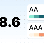
WCAG also defines three conformance levels: A, AA, and AAA:
- level A covers the most basic accessibility requirements. It helps remove major barriers, but it does not make content fully accessible on its own. For example, Level A requires that color should not be the only way to communicate meaning;
- level AA is the level most commonly referenced by accessibility laws, standards, and policies. It builds on Level A and covers a wider range of recipient needs. For email teams, WCAG 2.2 Level AA is usually the most practical and recommended target;
- level AAA is the highest and most advanced level. It can be useful as an aspiration, especially for specific elements, but it is usually too strict to apply as a standard requirement for every piece of content.
In practice, meeting Level A alone is not enough. Most teams should aim for Level AA because it offers a stronger accessibility baseline and better aligns with accessibility standards for email.
This matters not only for the recipient experience but also for compliance. Around the world, accessibility laws and policies increasingly use WCAG-based standards to define what accessible digital content should look like.
Legal compliance: ADA, Section 508, and the European Accessibility Act
Legal requirements differ by country, industry, and organization type, so this section is not legal advice. However, the direction is clear: digital accessibility is becoming a formal requirement in more regions, and emails can be part of that digital communication ecosystem.
Here are the key regulations that email teams should know about:
- Section 508: It applies to US federal agencies and requires their information and communication technology to be accessible to people with disabilities, including employees and members of the public. This can include official digital communications, internal systems, documents, and email messages.
- Americans with Disabilities Act (ADA): In the US, the ADA prohibits discrimination against people with disabilities, and digital accessibility is increasingly treated as part of equal access to public services and online experiences. The DOJ’s 2024 ADA Title II rule requires state and local government web content and mobile apps to meet WCAG 2.1 Level AA.
- European Accessibility Act (EAA): The EAA sets accessibility requirements for many products and services offered in the EU market. Since June 28, 2025, covered businesses have had to meet accessibility obligations, with technical standards such as EN 301 549 heavily based on WCAG.
- Accessible Canada Act (ACA): The ACA aims to identify, remove, and prevent accessibility barriers across federally regulated organizations in Canada. Its regulations include penalties based on the severity of noncompliance, with higher penalties for more serious violations.
- Equality Act 2010: In the UK, the Equality Act 2010 requires service providers to make reasonable adjustments so that people with disabilities are not excluded from access to services. For digital experiences, WCAG is commonly used as the practical benchmark for meeting accessibility expectations.
Compliance is one reason to care about accessibility, but it should not be the only one. Accessible emails are ultimately about people: the subscribers who need to receive information without barriers, and the businesses that want their messages to reach and serve the full audience.
Who benefits from accessible emails?
Accessible emails create value for everyone involved. Subscribers receive messages they can read, understand, and use without barriers. Businesses get stronger communication, fewer avoidable risks, and a better chance of reaching the full audience they intended to reach.
1. Your subscribers benefit from accessible emails
When you follow HTML email accessibility standards, they can be read, understood, and interacted with by people who were previously excluded:
- 2.2 billion people worldwide have some form of vision impairment;
- 45 million people are completely blind;
- around 340 million people are colorblind (about 1 in 12 men and 1 in 200 women);
- 1.2 billion live with dyslexia (15% of the world’s population), affecting how they read and process text;
- 430 million people live with disabling hearing loss;
- about 5% of people with epilepsy have photosensitive epilepsy, in which flashing content can trigger seizures;
- 12.2% of the US population has very significant motor skill disabilities;
- many more experience situational or temporary limitations, such as injuries or age-related changes.
2. Businesses benefit, too
When accessibility becomes a baseline, emails do more than help brands avoid legal and reputational risks. They become easier to read, understand, and act on. That matters for business performance. If subscribers can clearly understand your message, follow the structure, click the right link, and complete the intended action, your emails have a better chance of supporting engagement and conversions.
Financial companies I work with see increases in all metrics after improving accessibility. They also avoid lawsuits and even get feedback like “Your emails are easy to read.”
Ryan Phelan,
Accessibility also helps businesses avoid excluding customers by accident. People with disabilities are subscribers, customers, employees, and decision-makers. When emails are inaccessible, brands may unintentionally make it harder for part of their audience to read messages, understand offers, or take action.
The disability market controls over $13 trillion in annual disposable income globally.

Understanding why accessibility matters is only the first step. The next step is turning it into a repeatable email production process: from the words you write to the code your email builder or developer generates.
Steps to creating accessible emails
Now that we’ve covered the standards, legal context, and business value, let’s move from theory to practice. Accessible emails are created through the combined work of copy, design, code, and testing. Focusing on only one area, such as color contrast or alt text, is not enough because different barriers affect subscribers in different ways.

Here’s how to do it:
Step 1. Writing accessible email copy
Disabilities it covers: Visual and cognitive/learning/neurological disabilities.
Accessible text guidelines include:
- write concise copy so recipients can quickly grasp your point without needing to read lengthy texts;
- use straightforward language that a 7th or 8th grader could easily understand. Avoid complex jargon or academic terms;
- set the line spacing to about 1.5;
- break your content into sections with clear subheadings to make your emails easier to scan;
- set headings rather than just using larger fonts.
Step 2. Optimizing alt texts
Disabilities it covers: Alt text is especially important for screen reader users, but it also helps when images are blocked, slow to load, or unavailable.
First, let us explain the difference between the alt attribute and alt text:
- the alt attribute is the HTML attribute used within the image element;
- alt text is the content placed inside the alt attribute.
Though often used interchangeably, these terms are distinct.
Let us show you what happens when there is no alt attribute:
- people who use screen readers will hear the filename if the image is unlinked, or the image URL if the image is linked;
- none of the recipients will have a clue what the image is about if the image is blocked.

(Source: Webinar with Sarah Gallardo)
Alternative text best practices include:
- only add alt texts to meaningful images, avoid adding them to decorative images;
- consider both the content and context of the image;
- ensure your alt text conveys what the image depicts;
- aim for descriptive alt text;
- keep alt text concise, ideally around 100–120 characters, so it remains easy to understand;
- skip phrases such as “this image is about,” as screen readers already indicate an image’s presence;
- use sentence or title case, avoiding all caps;
- ensure good contrast between the alt text and the background for visual clarity.
Bad example: Shirt.
Good example: Men’s white long-sleeved shirt with blue buttons.
Please note that you can use AI to generate alt text in Stripo. Stripo’s AI analyzes your image and suggests meaningful, specific alt text for it.


Step 3. Making links accessible
Disabilities it covers: Supports users of screen readers and those with motor impairments.
Accessible links best practices include:
- stick to an intentional linking strategy: only add links to essential images and avoid linking decorative ones;
- use descriptive link text to clearly indicate where the link leads, avoiding generic phrases such as “Learn more” or “Click here”;
- ensure the alt text for linked images describes the destination of the link;
- ensure links stand out by using formatting methods such as underlining or bolding rather than relying solely on color;
- whenever possible, encase links in call-to-action buttons to assist those with low vision or motor disabilities in clicking them.
Please note that Stripo’s Accessibility Checker can help you review your links. It spots nondescriptive link text and lets you generate clearer, more accessible link descriptions with AI in seconds.

Step 4. Optimizing email design for accessibility
Accessibility needs to be included in the design process from the start.

Due to its complexity, this step is divided into several groups.
Group 1. Text formatting accessibility guidelines
Disabilities it covers: Individuals with low vision, those who use screen readers, and dyslexics.
- avoid using all caps, as they can be misinterpreted by people with dyslexia, and screen readers may read them as abbreviations;
- include punctuation marks at the end of bullets and headings;
- minimize the use of italics and underline for emphasis and avoid underlined italics entirely;
- only underline text if it’s a hyperlink;
- WCAG does not specify a minimum font size. However, for good readability, aim for at least 14px on desktop and 16px on mobile;
- use accessible fonts, such as OpenDyslexic, Comic Sans, and sans-serif options such as Arial, Verdana, Tahoma, Century Gothic, Trebuchet, Calibri, and Open Sans;
- align body copy to the reading direction of the language: left for left-to-right languages and right for right-to-left languages. Avoid centered body copy, full justification, and manual line breaks.
Although Success Criterion 1.4.8 (AAA conformance) allows it, best practice recommends avoiding justified text for the reasons mentioned. Align text to one side only.

Group 2. Working with colors
Disabilities it covers: People with color blindness, low vision, and dyslexia.
- ensure sufficient color contrast between text and images: for texts under 16px bold and 24 normal, it should be 4.5:1, while for texts above this threshold, it should be 3:1;
- check color contrast in both light and dark modes;
- use single-color backgrounds;
- this is not a specific WCAG 2.2 requirement, but it is recommended by the British Dyslexia Association: pure black text on a pure white background can feel too harsh for some dyslexic readers; instead, use dark-colored text on an off-white background;
- avoid using colors alone to highlight important information in emails;
- when using images to indicate right or wrong answers (with red and green, respectively) or trends in numbers, complement with text descriptions or “+” and “-” signs for clarity.
(Source: Email from HubSpot)
Group 3. Working on imagery
Disabilities it covers: People with color blindness, low vision, dyslexia, and photosensitive epilepsy.
Here, we are talking about GIFs and static images:
- use GIFs with three or fewer flashes per second;
- use one animated image (GIF) per screen;
- maintain color contrast as outlined previously;
- include meaningful alt text for images. For GIFs that convey instructions or significant information, provide additional descriptions below the GIF.
Step 5. Meeting accessibility requirements in email code
Disabilities it covers: Supports those who use screen readers and other types of assistive technology.
Accessible email starts with code. If the code is not structured properly, people who use screen readers, keyboard navigation, or other assistive technologies may struggle to access the message, even when the email looks visually polished.
- use paragraph tags for body text: Wrap meaningful text blocks in <p> tags so the email has a clear reading structure;
- use real heading tags: Apply <h1>–<h6> tags to organize the content and help screen reader users move through the email more easily;
- code lists properly: Use real <ul> and <li> elements instead of visual-only bullets, emojis, or symbols;
- handle layout tables correctly: Because HTML emails often rely on tables for consistent rendering, make sure layout tables are marked with role="presentation" or role="none" so that screen readers do not treat them as data tables;
- add proper alt attributes: Use meaningful alt text for informative images and empty alt="" attributes for decorative images;
- make links readable for assistive technologies: Every <a> tag should have clear, discernible text. Avoid empty links or image-only links without alternatives. If an image is linked, provide meaningful alt text, visible or hidden link text, or an aria-label;
- link images intentionally: Add links only to images that need to be clickable. Avoid linking decorative images, as this can create extra noise for screen reader users;
- set the correct language: Add the lang attribute to <html> and direct children of <body>. This redundancy is necessary, as some email clients may remove it from the <html> element. Use the correct language code whenever possible; if the language is unknown, use lang="und" as a fallback;
- wrap content within the <body> with a dir attribute for directionality.
Stripo helps reduce many code-related accessibility risks by generating structured email code and supporting key settings such as language, text direction, alt attributes, and accessible links. However, teams should still review the final email because accessibility also depends on the content, design, and links added during production.
Step 6. Checking if your emails meet HTML email accessibility standards
You have to eat your own dog food. Meaning you need to test the outcome.
Mike Paciello,
Even if you follow every accessibility guideline while writing, designing, and coding your email, you still need to test the final result. Accessibility issues often appear at the last stage: an image may miss alt text, a link may sound unclear out of context, color contrast may break after a design update, or email code may change during export.
That is why accessibility testing should be part of your pre-send process, not something you do only once in a while.
Use a combination of testing methods:
- Automated accessibility checks: Use accessibility tools to scan your email for common issues, such as missing alt text, missing language attributes, incorrect structure, poor color contrast, and code issues that may affect assistive technologies.
- Screen reader testing: Open the email with a screen reader, such as VoiceOver, NVDA, Narrator, or TalkBack. Check whether the reading order makes sense, images and links are announced clearly, headings help navigation, and the CTA is understandable without visual context.
- Keyboard navigation testing: Navigate the email without using a mouse. Check whether links, buttons, and interactive elements are reachable, usable, and follow a logical order.
- Manual review: Read through the email as a subscriber would. Check whether the message is clear, sections are easy to scan, links are descriptive, images have meaningful or empty alt text where appropriate, and the main action is easy to understand. For measurable issues, such as color contrast, use a dedicated tool rather than judging by eye.
We have prepared a detailed guide to email accessibility testing tools, where we cover solutions for checking code structure, alt text, links, contrast, color blindness, photosensitivity risks, screen reader compatibility, and overall accessibility quality.

Step 7. Using a manual accessibility checklist before sending
Even after automated checks and tool-based testing, a final manual review is still important. Tools can detect many technical issues, but they cannot always judge whether an email feels clear, logical, and easy to use for a real subscriber.
Throughout this guide, we have covered accessibility recommendations for email copy, design, code, links, images, and testing. To make the final review easier, we’ve combined the most important checks into one practical checklist. You can use it before sending a campaign or turn it into an internal QA step for your team.
1. Structure and code
Make sure your email structure can be understood by screen readers and other assistive technologies:
- set the correct lang attribute on <html> and, where helpful, on key content containers, since some email clients may strip attributes from the root;
- set dir on <html> and <body> so assistive technologies can present text in the correct reading order;
- avoid using tables for layout when possible. If a layout table is necessary, add role="presentation" or role="none" to the <table> element;
- use heading tags <h1> to <h6> to show content hierarchy and help recipients navigate the email;
- wrap each meaningful text block in a <p> tag to create a clear reading structure;
- use real list elements such as <ul>, <ol>, and <li> instead of visual-only bullets or emojis;
- add meaningful alt text to informative images, and use empty alt="" for decorative images;
- add links only where they support the recipient journey. Do not link decorative images;
- make sure every link has clear, discernible text. Do not leave links empty or rely on an image alone unless it has meaningful alt text or another accessible label.
2. Content and meaning
Make sure the content is easy to understand and does not depend on visuals alone:
- write meaningful alt text that clearly describes the image’s purpose. Keep it under 100–120 characters;
- use CTA text that tells people what will happen next, instead of vague phrases such as “Click here”;
- keep sentences short, clear, and easy to follow;
- break content into sections with meaningful headings;
- provide transcripts for audio, captions or subtitles for video, and meaningful descriptive alt text for GIFs;
- do not rely on color alone to show meaning. Add text labels, icons, or other cues.
3. Visual design and readability
Make sure the email is comfortable to read and interact with:
- use a contrast ratio of at least 4.5:1 for regular text and 3:1 for large text;
- test your palette with color blindness simulators;
- avoid flashing or fast-moving content. Keep flashing below three times per second, and use no more than one animated element per screen, including GIFs;
- avoid long passages in italics, all caps, or underlined text that is not a link;
- use accessible font families such as Arial, Verdana, Tahoma, Trebuchet, Calibri, Open Sans, or OpenDyslexic;
- WCAG does not specify a minimum font size. However, for good readability, aim for at least 14px on desktop and 16px on mobile;
- use line spacing around 1.5 for body text;
- use solid, single-color backgrounds behind text. Avoid patterns or images behind text;
- make buttons easy to notice and large enough to tap comfortably, ideally at least 44 × 44 px;
- make links visually distinct without relying only on color. Underlining is often the clearest option;
- align body text according to the reading direction of the language: left for left-to-right languages and right for right-to-left languages. Avoid centered body text and full justification;
- consider softer color combinations, such as dark gray text on an off-white background, as they may be more comfortable for some readers than stark black on bright white.
Step 8. Maintaining email accessibility over time
Accessibility does not end after one audit or one successful test. Email templates change, brand styles evolve, new modules are added, and email clients update their rendering rules. This means an email that worked well yesterday may develop accessibility issues later.
To maintain accessibility, make it part of your regular email workflow:
- review master templates and reusable modules regularly;
- update alt text, links, and headings when content changes;
- check accessibility after design updates, rebranding, or template redesigns;
- document accessibility rules for everyone involved in email production;
- train marketers, designers, and developers to follow the same standards.
Accessibility works best when it becomes a shared habit, not a last-minute fix. The goal is to make every future email easier to read, understand, navigate, and interact with by default.

Wrapping up
Email accessibility is not one small fix or one final checkbox before sending. It is a full approach to email production that affects copy, design, code, testing, and the tools your team uses every day.
When emails are accessible, more subscribers can read your message, understand your offer, follow the structure, click the right link, and complete the intended action. That improves the experience for people with disabilities and also makes your emails clearer and easier to use for everyone.
Accessibility is also an ongoing process. Standards change, email clients behave differently, and small design or content updates can create new issues. That is why the goal is not to make one perfect email once. The goal is to build accessibility into your workflow, so every campaign becomes easier to read, easier to use, and more inclusive by default.
Below are a few common questions email teams often ask when they start working with accessibility standards and testing workflows.
FAQ
1. Does email accessibility affect deliverability?
Yes, but mostly indirectly. Accessibility is not a standalone deliverability factor, but many email accessibility best practices overlap with good email quality standards.
Descriptive alt text and clear structure help both subscribers and automated systems understand your email. They also reduce common issues such as image-only layouts, broken rendering, or suspicious-looking code.
Accessibility can also improve engagement. When more people can read and interact with your emails, this may support stronger sender reputation over time.
The bottom line: accessible emails do not guarantee inbox placement, but they can support deliverability by making emails cleaner, easier to process, and more useful for subscribers.

2. How do I test email accessibility without a screen reader?
A screen reader test is still highly recommended because it shows how real subscribers may experience your email. Built-in screen readers are available on most devices, such as VoiceOver on Apple devices, Narrator on Windows, and TalkBack on Android.
However, if you cannot run a screen reader test at this stage, use accessibility testing tools to check whether your email is technically prepared for screen readers. These tools can help detect issues in code structure, missing or unclear alt text, nondescriptive links, missing language attributes, incorrect heading structure, and other problems that may affect how assistive technologies read your email.
You can also run an accessibility check in Stripo before sending. It checks both technical and visual accessibility issues, including code structure, alt text, link text, language settings, color contrast, and more.
The best approach is to combine automated testing, a manual accessibility checklist, and, when possible, a screen reader test. Automated tools can catch many issues, but they cannot fully replace testing the real reading experience.
3. What WCAG level should my email meet?
Your email should aim to meet WCAG 2.2 Level AA because Level AA is the most widely used benchmark for digital and email accessibility and the level most often referenced by accessibility laws, standards, and policies.
WCAG 2.2 defines three conformance levels: A, AA, and AAA. Level A covers the minimum accessibility requirements, while Level AA is the practical target for most teams because it covers a broader range of recipient needs and is realistic for everyday email production.
Level AAA is an advanced accessibility goal. It is worth striving for where possible, especially for specific elements, but it is not usually expected as the standard requirement for every email.
Stripo’s Accessibility Checker is designed to help teams check whether their emails align with email accessibility standards based on WCAG 2.2 Level AA and follow stronger email accessibility guidelines before sending.
4. Do I need accessible emails if I send only to internal employees?
Yes. Internal emails should be accessible too. Even if legal risks may differ from external marketing campaigns, accessibility still matters for employee experience, inclusion, and equal access to important information:
- according to the World Health Organization, about 1 in 6 people worldwide experience significant disability. In a digital workplace, this means some employees may have a disability that affects how they read, understand, or interact with emails;
- some disabilities are also invisible or diagnosed later in life, including color blindness, dyslexia, or certain cognitive and visual conditions. Others can be temporary, such as eye strain, an injury, or recovery after surgery.
This is why internal emails should follow the same accessibility principles as external emails: clear structure, readable design, descriptive links, meaningful alt text, and content that works well with assistive technologies. Accessible internal communication helps everyone receive the same information without extra effort.

5. Does plain text email count as accessible?
Not really. Plain text emails avoid some common email accessibility issues found in HTML emails, such as broken layout structure, image-related issues like missing alt text, or poorly coded elements.
However, plain text has its own limitations:
- senders have little to no control over visual styling, such as font size, font family, text color, background color, or line spacing. These settings usually depend on the recipient’s email client, device, app, and accessibility preferences. And for people with cognitive disabilities, a long block of unformatted text can be harder to process than a well-structured HTML email;
- you cannot add real headings, buttons, or styled sections, which some recipients rely on to scan content quickly. Links often appear as raw URLs instead of descriptive anchor text, which can be confusing for screen reader users.


0 comments