Email review
CityRealty vs. Zillow
Dive into the real estate industry’s email marketing with these two brands’ emails, focusing on providing the most important information for those who seek the perfect house or apartment.
First impression
First impressions are important when you see an email. It's time to tell you about ours before we begin to break down and analyze each email component by component.
CityRealty
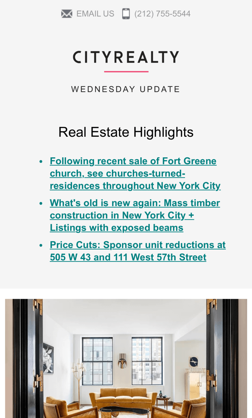
- The email starts with links to market insights on their website, which can be useful for both ordinary recipients and professional Realtors.
- The entire email looks detailed and filled with useful information about each listing that eliminates the need to visit the website. However, there is a convenient button under each listing that leads to the corresponding page on the website.
- Cut prices are marked with different colors, which are immediately visible and draw attention.
- The email is pretty long, so the email client cuts it. Recipients must click on “View entire message,” which isn’t the most convenient thing.
- The overall email’s design is minimalistic and clear, yet has excellent and big images of the real estate.
Zillow
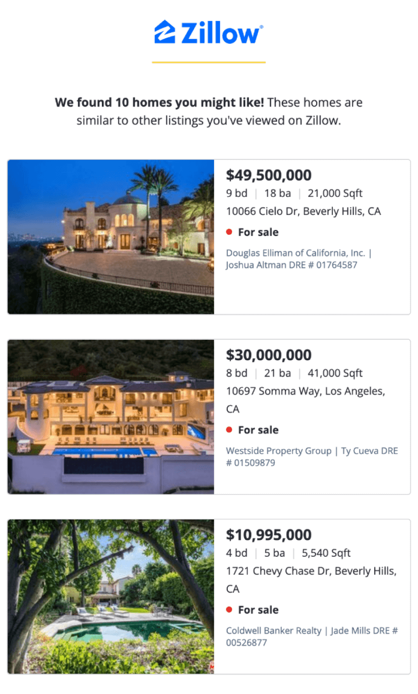
- The email’s design is minimalistic and is a collection of short information and photos of real estate.
- Real estate listings have the most vital information. However, recipients will need to click on each to see the full information on the website.
- There is a convenient option to tweak search requirements to improve future recommendations through newsletters by clicking on the special part of the email, which leads to the recipient’s account page on the website.
- Visiting each listing’s page requires clicking on its photo, since there are no intuitive buttons for it. In our opinion, it’s not the most user-friendly design decision.
Usability
1. Email web version
2. Clickable images
3. “Follow us on socials” section
4. Additional information links
5. Clickable buttons
Why are these points important?
1. It’s vital for an email to have a web version, as it allows recipients to view it as a webpage if it does not display correctly or images do not load.
2. Clickable images add another layer of user friendliness and intuitiveness to your email, as users can click both on dedicated buttons and images to see what you propose to them.
3. Social media are great tools for gaining popularity and brand awareness. Follow buttons to various social media in emails can help you raise your number of followers.
4. It’s crucial for apartment seekers to have quick access to additional information about listings they like. Embedding additional information sources about real estate is a good touch and shows care for recipients.
Design
Design aspects are vital for every email, so we decided to review each aspect of today’s email separately.
Optimization for mobile devices
Even though both brands adapted their emails for mobile devices well, Zillow has a slight problem of cutting listing images to narrow stripes to fit the width of the screen. We are not quite sure if this was intentional or the result of an adaptation mistake. This makes Zillow’s email less readable and informative on mobile screens.
Optimization for dark mode
Both CityRealty and Zillow are on the cutting edge of trends and quality-of-life features, as both their emails are adapted to dark mode. Fonts, colors, buttons — everything is well adapted for the dark theme.
Brand consistency
Both emails follow a fairly understated design that matches the design codes of their brands and websites. Emails do not have fancy elements, bright colors, abstract shapes, and so on. The designs are simple and white. CityRealty separates listings with light lines, while Zillow uses prominent borders for each listing. Active elements such as buttons are made in opposite colors: CityRealty uses a strict black, while Zillow uses light blue.
Email accessibility
Email accessibility is not just a trend; it’s a must-have for every email that lands in recipients’ inboxes. So, let’s examine how today’s brands adhere to accessibility requirements.
Sans-serif font
Text readability
Line spacing at 150%
Single-color backgrounds
The “lang” attribute
Alt texts for images
The “role=presentation“ attribute
Email copy
Intro
Both brands get straight to business. Their emails don’t have a full-fledged intro, even though Zillow has a small introduction about the listings below compiled into an email, according to the recipient’s previously viewed real estate listings.
Headline
CityRealty and Zillow don’t have proper headlines, as their emails compile the most suitable listings for the recipient. Nothing more, nothing less.
Buttons
CityRealty has many buttons throughout the email, each leading to the website with a “View listing” or “Learn more” copy. Meanwhile, Zillow has only one button with a clever “Find more homes” call to action that leads to the main page of the website.
Legal requirements
Each country has its own regulations with different rules, such as CanSPAM, GDPR, and much more. It's vital to abide by them to avoid legal and reputational issues. Let’s check how our heroes are doing on this part.
Physical postal address
Unsubscribe option
Reason for receiving a message


