Email review
Mercedes–Benz vs. Porsche
Exploring the artistry and strategy behind Mercedes’ and Porsche’s captivating emails — focusing on usability, brand consistency, accessibility, and design elements, all key to their success.
First impression
Mercedes–Benz
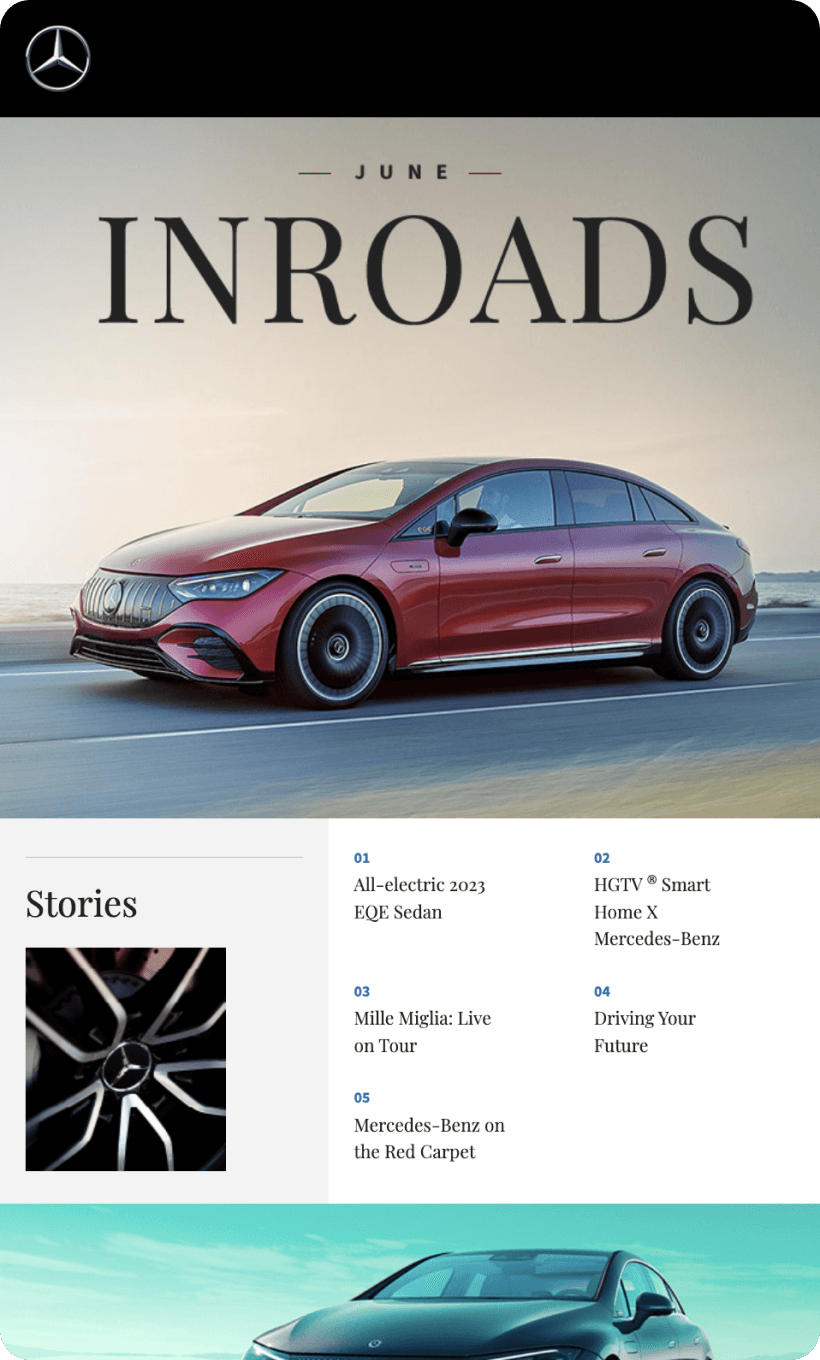
- Mercedes captivates with its “Elegance Redefined” campaign, skillfully drawing attention, especially when introducing a new vehicle model.
- The depiction of the vehicle in a luxurious environment not only showcases the car but also establishes a high-end, aspirational ambiance.
Porsche
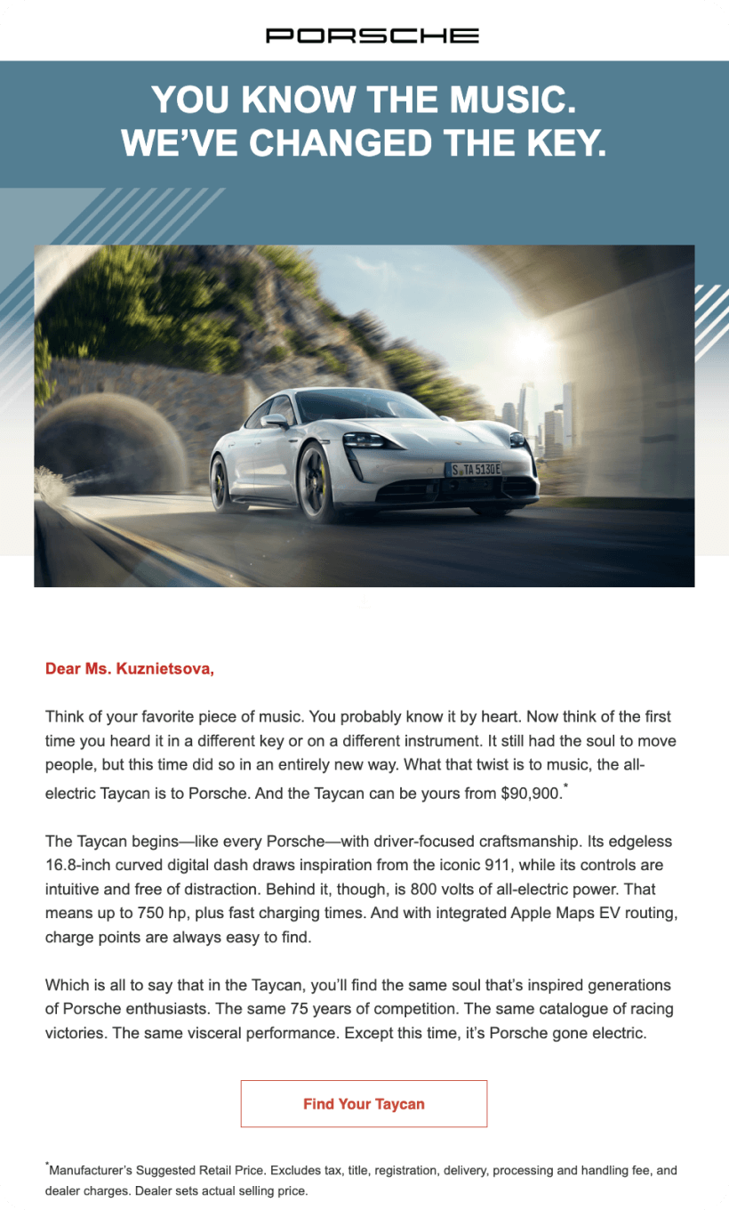
- Porsche’s “Innovation Meets Tradition” opener positions the company as a forward-thinking yet heritage-rich brand.
- Dynamic imagery, such as a rotating view of the car, adds an interactive and engaging element to the email.
Usability
Navigation menu with anchor links
Email web version
Clickable images
Why are these points important?
1. Navigation menus with anchor links are crucial for enhancing user experience, especially in longer emails. They allow recipients to jump to the section that interests them most quickly.
2. The email web version is an essential feature for ensuring accessibility. When images or content do not load correctly in an email client due to various technical issues, the web version link serves as a reliable backup.
3. Clickable images enhance the interactivity of an email. They not only engage users but also serve as intuitive gateways to additional content or offers.
Design
Optimization for mobile devices
Both Mercedes and Porsche excel with a mobile-first design, ensuring no horizontal scrolling and maintaining legibility with appropriate font sizes.
Optimization for dark mode
Each brand’s emails display well in dark mode. Mercedes uses a monochrome palette that looks elegant in both settings, while Porsche’s vibrant colors remain distinct without losing their impact.
Brand consistency
Both maintain their signature colors and tone of voice. Despite limitations in email clients regarding custom fonts, the essence of each brand’s typography is preserved.
Email accessibility
Today, email accessibility is not simply an option—it is a must for social, business, legal, and inclusivity reasons. So, are the emails from these famous brands accessible?
Both brands use Sans Serif font, aiding readability. Sans serif fonts are advised for enhanced accessibility, catering to individuals with dyslexia and visual impairments.
Line spacing at 150%
Extra space around headings and adequate line spacing enhance readability.
Single-color backgrounds
Punctuation marks at the end of sentences and lists
The “lang” attribute
Alt texts for images
Email copy
Intro
In its “Elegance Redefined” campaign, Mercedes introduces its email with a sophisticated tone, while Porsche’s “Innovation Meets Tradition” showcases a blend of modernity and legacy.
The “Book a Test Drive / Early Access” option
Mercedes effectively communicates the invitation to experience its vehicles firsthand, while Porsche entices potential customers with early access to its latest innovations.
Product description
Mercedes provides comprehensive details about its vehicle, from safety features to environmental considerations. Porsche, while offering less detail, invites readers to explore more on its website, creating a sense of intrigue.
Legal requirements
Physical postal address
Unsubscribe option
The reason why they’re reaching out
Both brands excel in acknowledging the importance of transparent communication, adhering to EU guidelines by reminding recipients of their consent and complying with the US CAN-SPAM Act, ensuring respect for customer preferences and legal compliance.


