Email review
Tiffany & Co. vs. Monica Vinader
Here, we compare and contrast the Christmas emails of two brands—Tiffany & Co. and Monica Vinader—and assess them on various elements.
First impression
We have deliberately chosen emails that are similar in structure. Let us share our first impressions of these brands’ newsletters before we dive into the details.
Tiffany & Co.
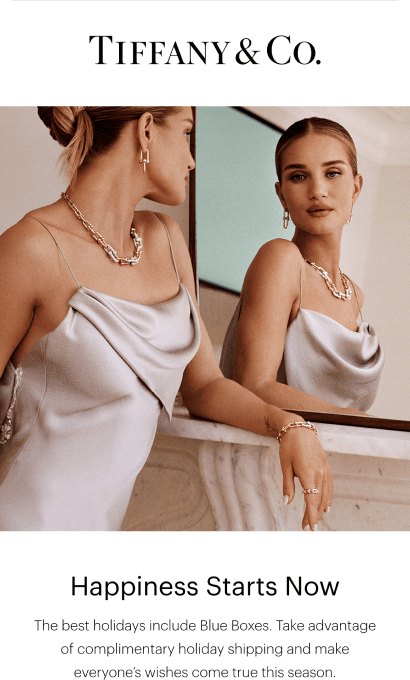
- Tiffany & Co. had us at the headline “Happiness Starts Now.” The idea of Tiffany’s products providing happiness was appealing to us, as it probably is to many consumers. The pursuit of happiness is a strong drive in human beings.
- The email begins with the announcement of free delivery and extended returns, along with the requirements for free delivery.
- The focus is on the “gifts for her” section, which uses the brand color. This may sound unremarkable, but the use of it gives an appearance of sophistication, especially since this is the only instance in the email where Tiffany uses its brand color.
- The design is very minimalistic, featuring ample white space. It appears clean and uncluttered.
Monica Vinader
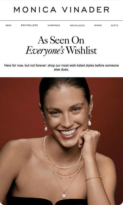
- The phrase “here for now, but not forever” suggests a limited offer, effectively encouraging shopping without instilling a fear of loss.
- The gift guide section demonstrates that the brand is ready to help customers find a gift for their significant other. This section is highlighted in red to ensure people see it.
- All the products are divided into categories. Presenting the products this way makes shopping easier, as customers can directly browse the necessary item category.
- The navigation menu, located in the email header, provides easy access to the key sections of the brand’s website.
Usability
1. Email web version
2. Email copy
3. Clickable images
4.“Follow us on socials” section
Why are these points important?
1-2. Network errors can cause email images to fail to load, making the information in them inaccessible. Marketers should therefore refrain from embedding essential details in images. If images fail to display recipients might skip checking the web version.
3. Many recipients naturally expect that images and banners, will lead them somewhere if clicked. By not making such images clickable, you might confuse or frustrate the recipient.
4. Many recipients naturally expect that images and banners, will lead them somewhere if clicked. By not making such images clickable, you might confuse or frustrate the recipient.
Design
We'll address each aspect of email design individually.
Optimization for mobile devices
Both brands stand out here. However, Monica Vinader's header navigation menu, with six tabs, lacks legibility. Optimizing for mobile by reducing tabs can enhance clarity.
Optimization for dark mode
Tiffany & Co. and Monica Vinader both excel at dark mode optimization. Buttons, fonts, and copy colors are well adjusted.
Brand consistency
Both brands employ their brand colors, tone of voice, and established product presentation. Tiffany & Co. even uses its brand font, visible only in the web version of the email—email clients often substitute custom fonts.
Email accessibility
Today, email accessibility is not simply an option—it is a must for social, business, legal, and inclusivity reasons. So, are the emails from these famous brands accessible?
Sans serif font
Text readability
Line spacing at 150%
Single-color backgrounds
The “lang” attribute
Alt texts for images
The “role=presentation“ attribute
Both brands excel at optimizing for screen readers, with only minor improvements needed in their copy for dyslexic and color-blind people.
Email copy
Intro
Both brands excel at optimizing for screen readers, with only minor improvements needed in their copy for dyslexic and color-blind people.
Headline
Monica Vinader impresses with “As Seen on Everyone’s Wishlist,” while Tiffany & Co. shines with “The Best Holidays Include Blue Boxes,” referring to the brand’s signature packaging and color.
Buttons
Tiffany & Co. also stands out with its button copy. The phrase “find the perfect gift” sounds very welcoming and encouraging.
Legal requirements
Each country or continent has its own regulations, such as CAN-SPAM and GDPR, that relate to the ability to opt in or out of emails. It is important to abide by them. If you are a global brand, you should consider the laws in your target countries. Let’s have a look at how the featured companies did.
Physical postal address
Unsubscribe option
Each country or continent has its own regulations, such as CAN-SPAM and GDPR, that relate to the ability to opt in or out of emails. It is important to abide by them. If you are a global brand, you should consider the laws in your target countries. Let’s have a look at how the featured companies did.


