Creating modules for emails with product cards: A step-by-step guide

This article we’ll show you how modules work and how to create them using an email with product cards as an example. You will discover all the ins and outs of modular email design to level up your email game.
It is difficult to overestimate the importance of product cards for emails if you are an e-commerce business. They serve to not only showcase a product but also actively entice the recipient to make a purchase. Promoting products via email requires creating multiple product cards for each individual email, which can be quite time-consuming if done manually; at the same time, it can be tricky to avoid errors (incorrect product price, typos in the description, etc.). Modules can serve as an excellent tool for saving time and making the process of creating product cards mistake-free.
In this article, we will consider in detail how to create a product card and pack it into a module and tell you about smart elements that are ideal for working with product card modules and can help you save time.
Email structure
In this article, an email with a product card will look like this: a beautiful and simple email design. However, before creating it, it is worth quickly going over its main components:
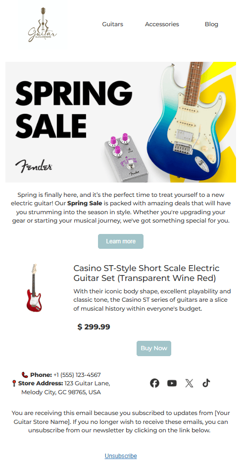
- header with logo and menu;
- body with banner and text description of the sale;
- product card with type, title, description, price, and the Buy button;
- footer with social media links and text.
These elements are integral parts of many emails that contain product cards. It took me three hours to create such an email manually. But what if you need two or three such emails? This is where modules come to the rescue. Their capabilities can significantly boost the efficiency of your email design process by:
- allowing you to save all created elements in a module for subsequent reuse;
- helping create a whole library of different versions of product cards and other elements for simultaneous diversity and compliance with the design code in subsequent emails;
- enabling you to make each module a synchronized smart module, which allows you to make changes to multiple templates in a couple of clicks;
- letting you make each module smart, which allows you to pull information from other sources (which is especially important for product cards).
Now, let’s not waste any time and create this type of email from scratch.
Important note: In this guide, we will consider how to create a module for emails after mock-ups have already been created by the designer, which are necessary for creating modules. If you do not have mock-ups, you should first create these before proceeding to creating the module. This will significantly simplify and speed up the process of creating modules.
How to create an email with a product card
We’ll split our guide into four major sections, and each will be dedicated to a separate module of our email.
Important note: All the steps shown below are intended to enable the complete reproduction of the design of the module shown in the example. Our objective is to illustrate the creation of a standard email with a product card, whereas your emails can follow any design and structure according to your needs.
Header
Let’s begin the email design process with a header.
Step #1. Creating a rough sketch
First, we need to create a basic layout of your future module using structures from our editor:
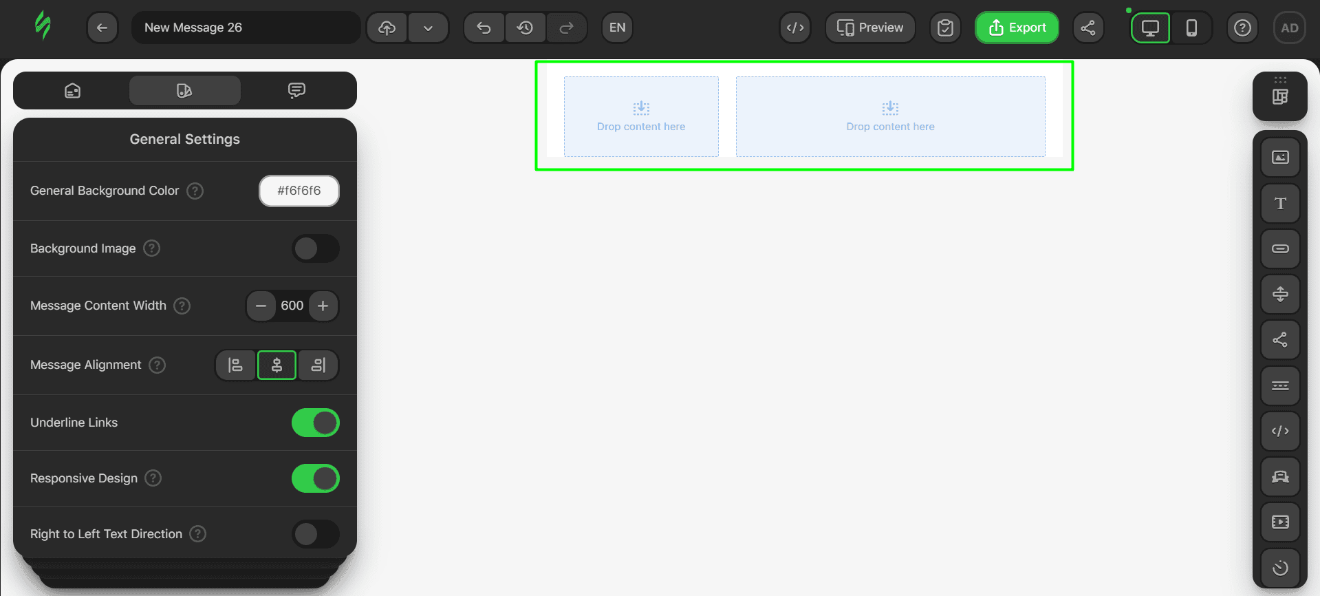
- for our header, a basic structure with two containers should suffice, which has been provided in our basic empty template, so just pick this from the given templates;
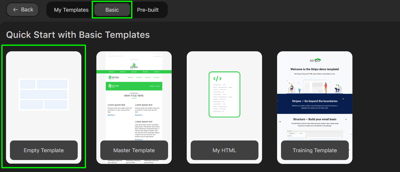
- delete the content and footer structures, which are unnecessary for our header structures;
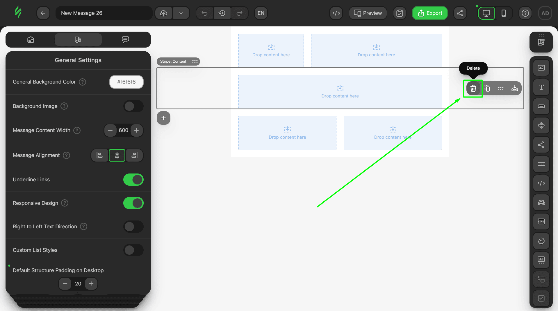
- in the final result, you should see only one structure with two containers;
Step #2. Adding the main content
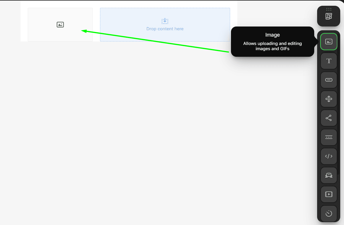
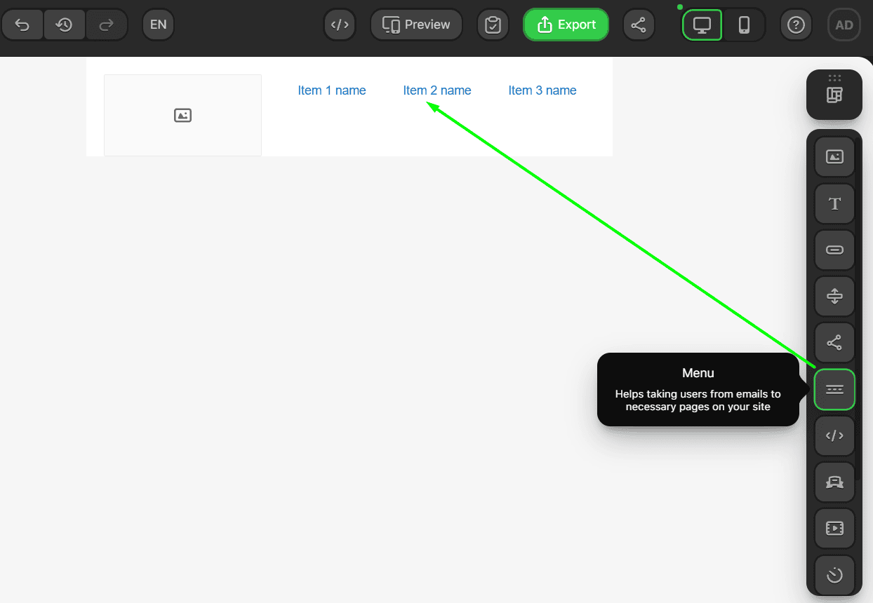
Now, let’s add the main content of our header. To recreate the email from the example, we’ll need an Image block and a Menu block for navigation.
- add the Image block here;
- and the Menu block here.
Now, let’s add the content we need to these blocks, starting with the image that will serve as our logo:
- click on the Image block to open it;
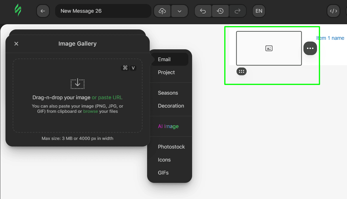
- click on the “Paste URL” button to open the pasting settings and paste the link of the image in the corresponding field;
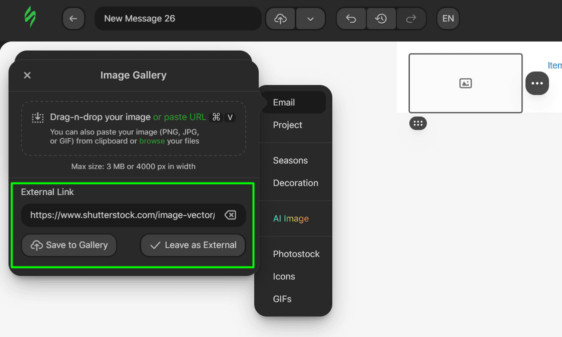
- click on the “Leave as External” button to apply the image (or on “Save to Gallery” if you want to save the image in your Image storage).
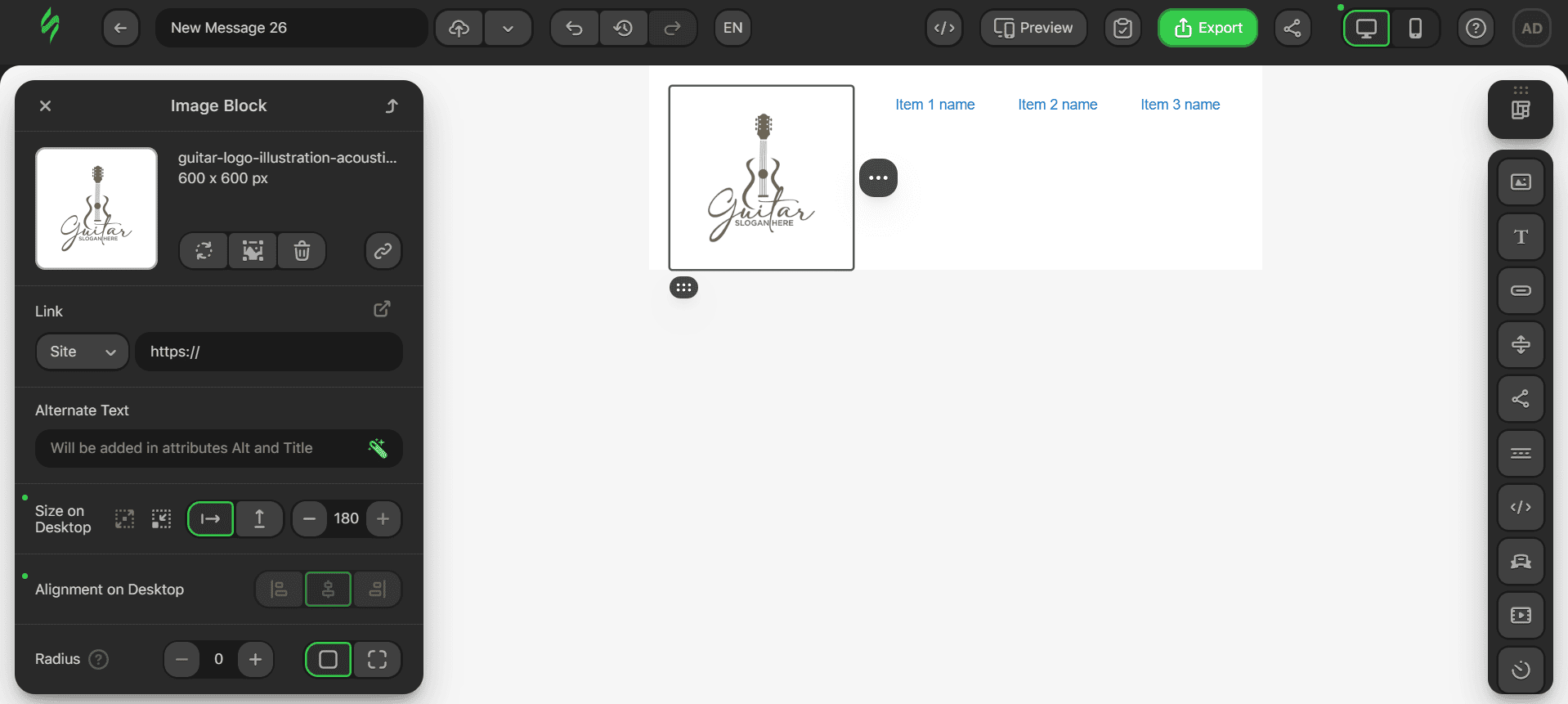
Next, let’s add text to the menu items:
- click on the Menu block to open its settings;
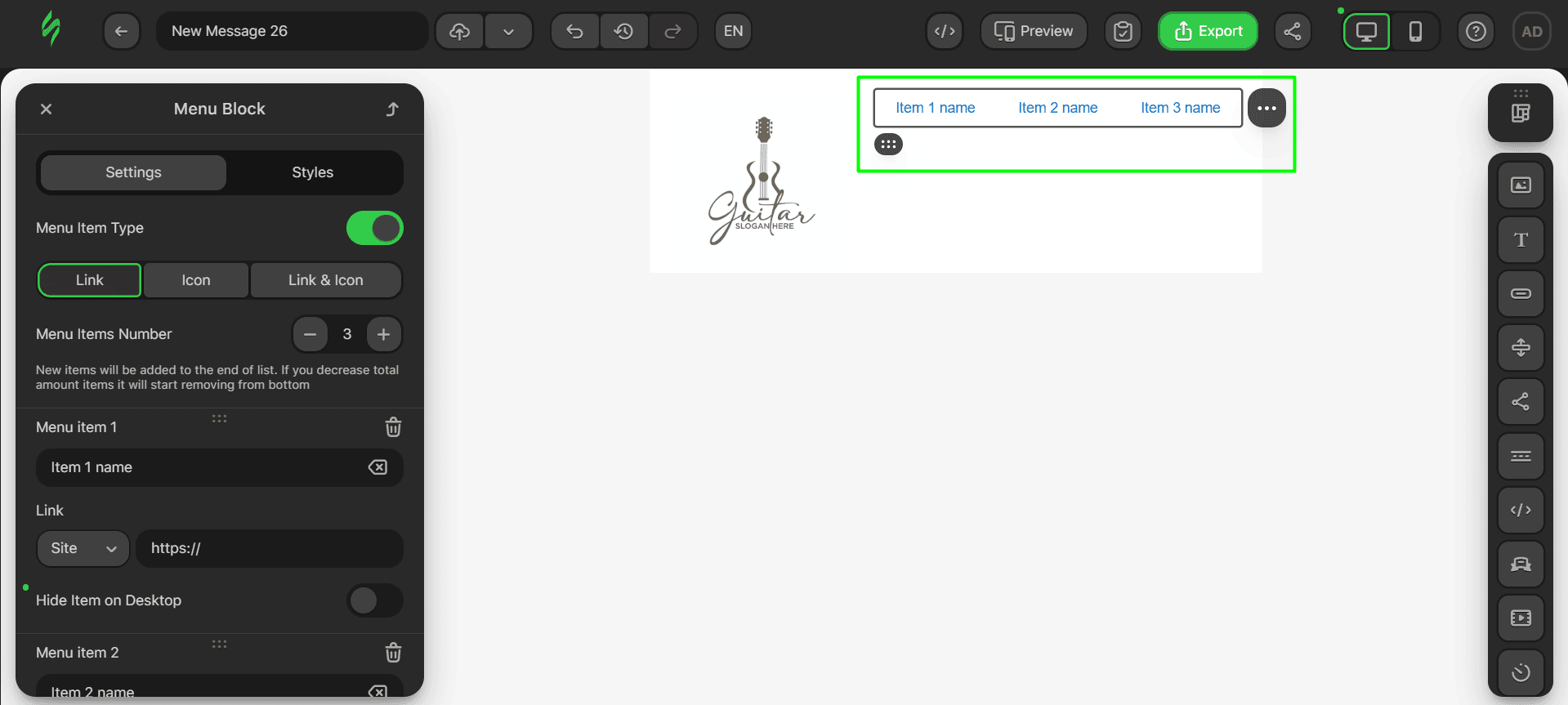
- each menu item has its own settings and input field for your text, so just put the necessary text in these fields to name the items.
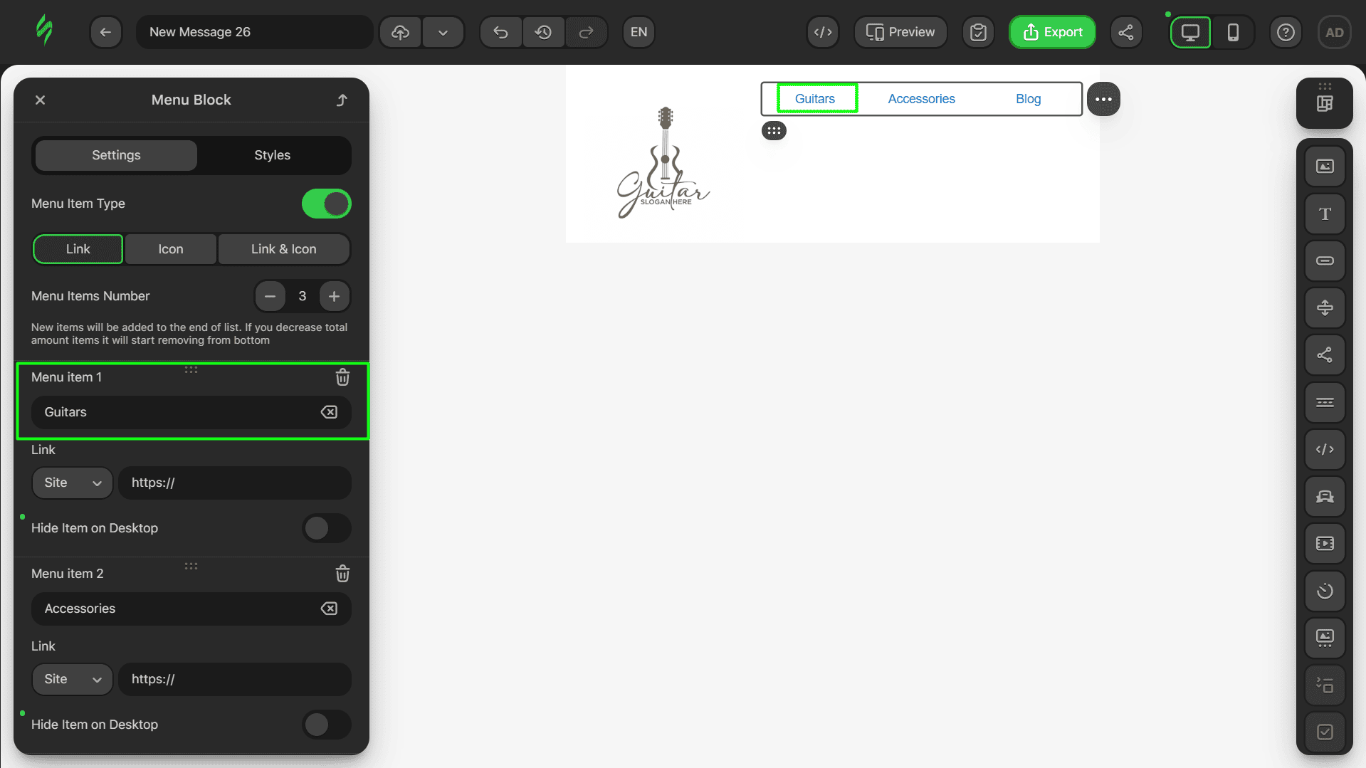
Step #3. Adding links
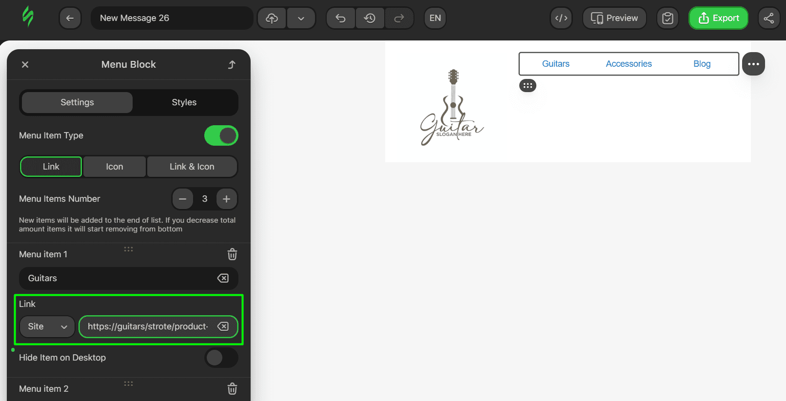
Let’s add the necessary links next. In this header, only our Menu block contains links.
- as shown above, each menu item in the block has its own settings, so you can add the necessary links in the corresponding link field.
Step #4. Tweaking looks
Next, let’s tweak all the content to make it look good:
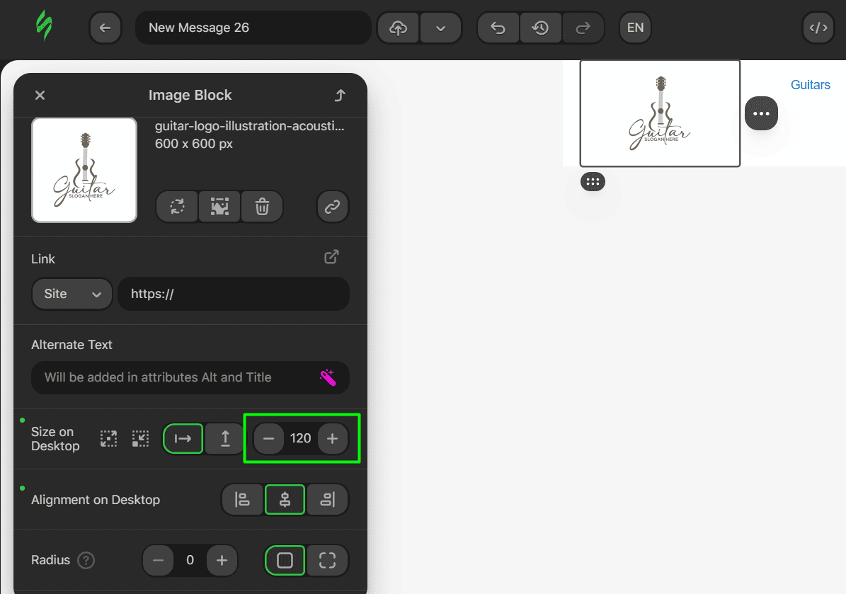
- first, let’s make the image smaller by clicking on the Image block and reducing its size in the settings;
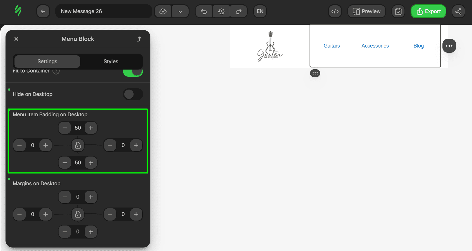
- once this is done, let’s change the menu item paddings to center them in our heading;
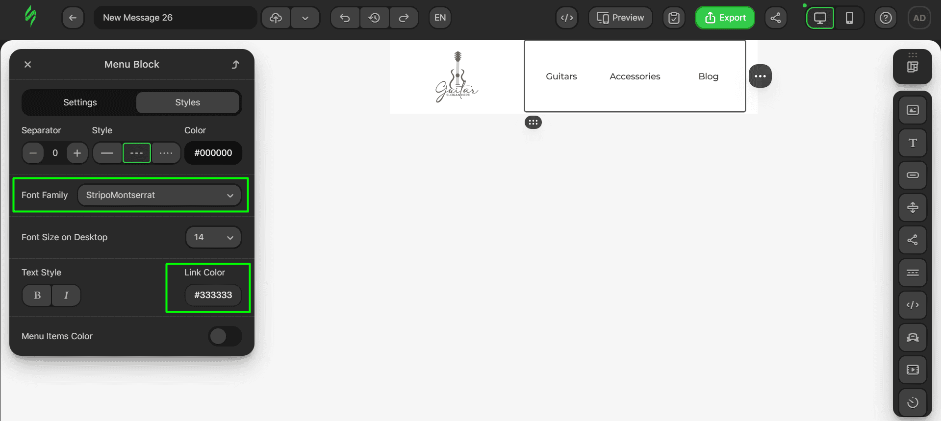
- after that, let’s change the font of our Menu block and the color of the links.
Step #5. Saving a module
Our header is now done, so it’s time to save it as a module. The whole sequence is simple:
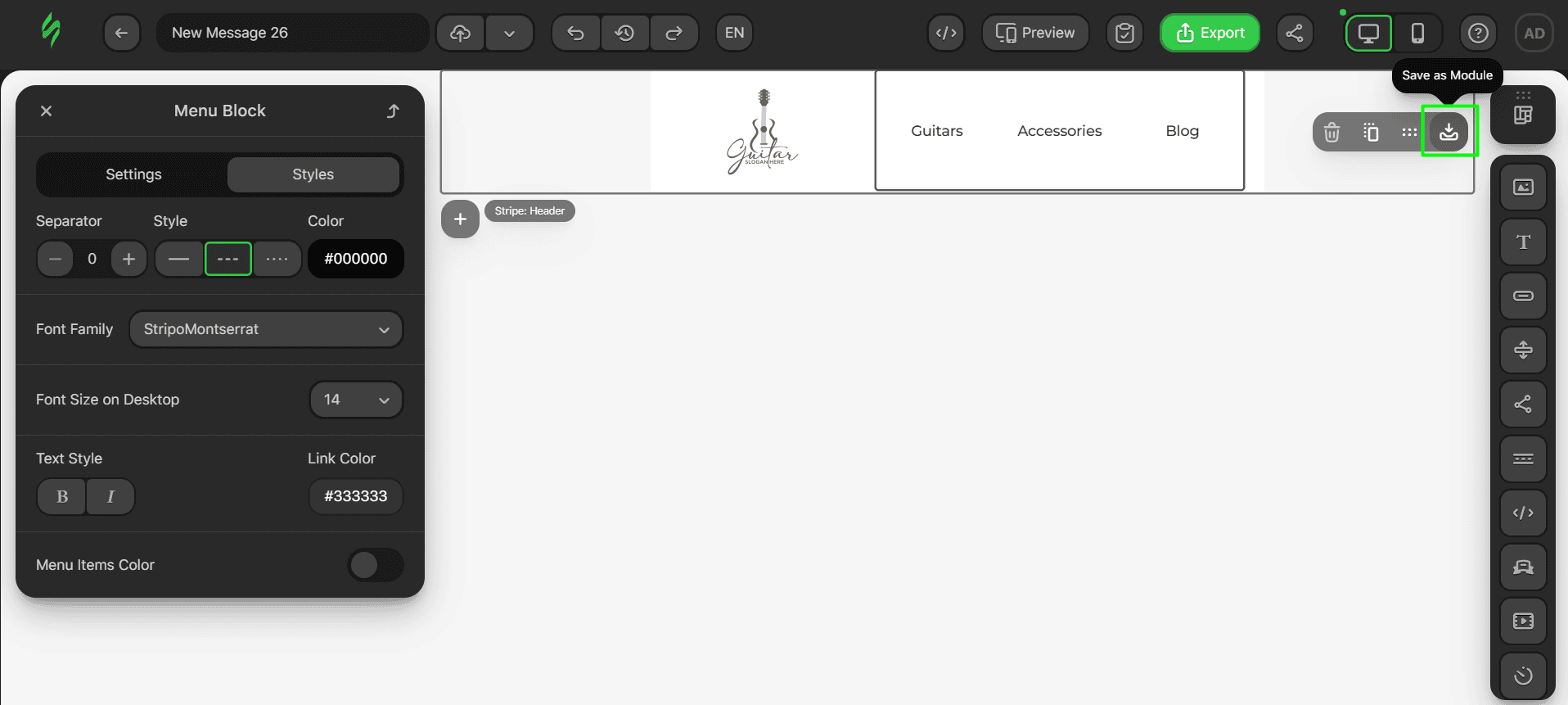
- hover over the future module and click on the “Save as Module” button;
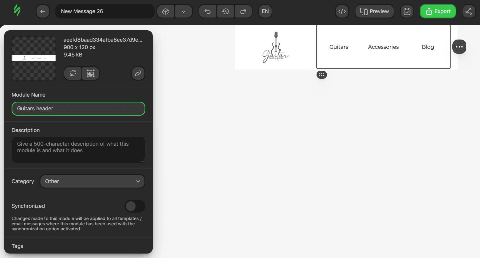
- next, choose a name for your module;
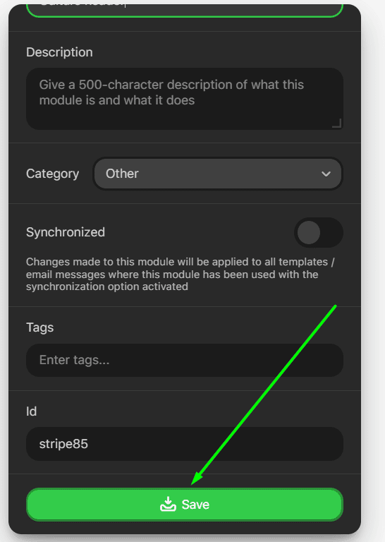
- to save your module and changes, click on the “Save” button.
Body
Let’s continue our email design process with the body element, which will include a banner that indicates an ongoing sale, a Text block for description, and a button that takes the recipient to the relevant website page.
Step #1. Creating a rough sketch
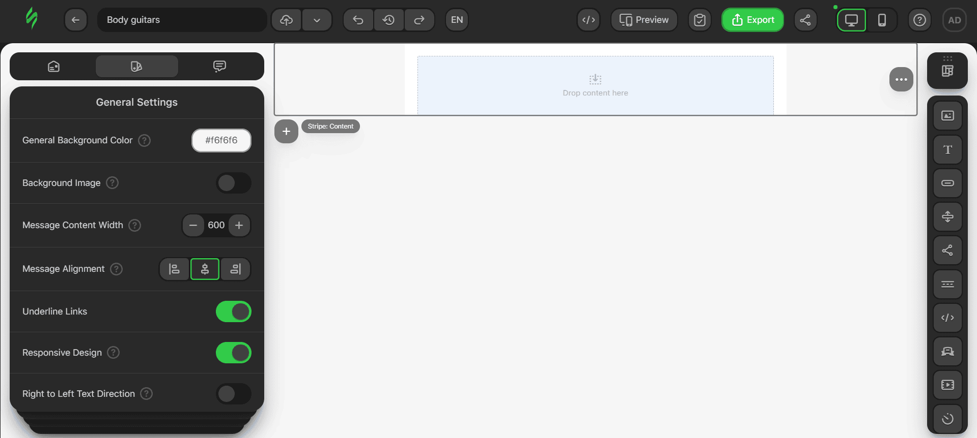
Take the same empty template from our pre-built templates library and reduce it to one structure by deleting the unnecessary structures till there is only one structure with one container.
Let’s now add the content blocks we need:
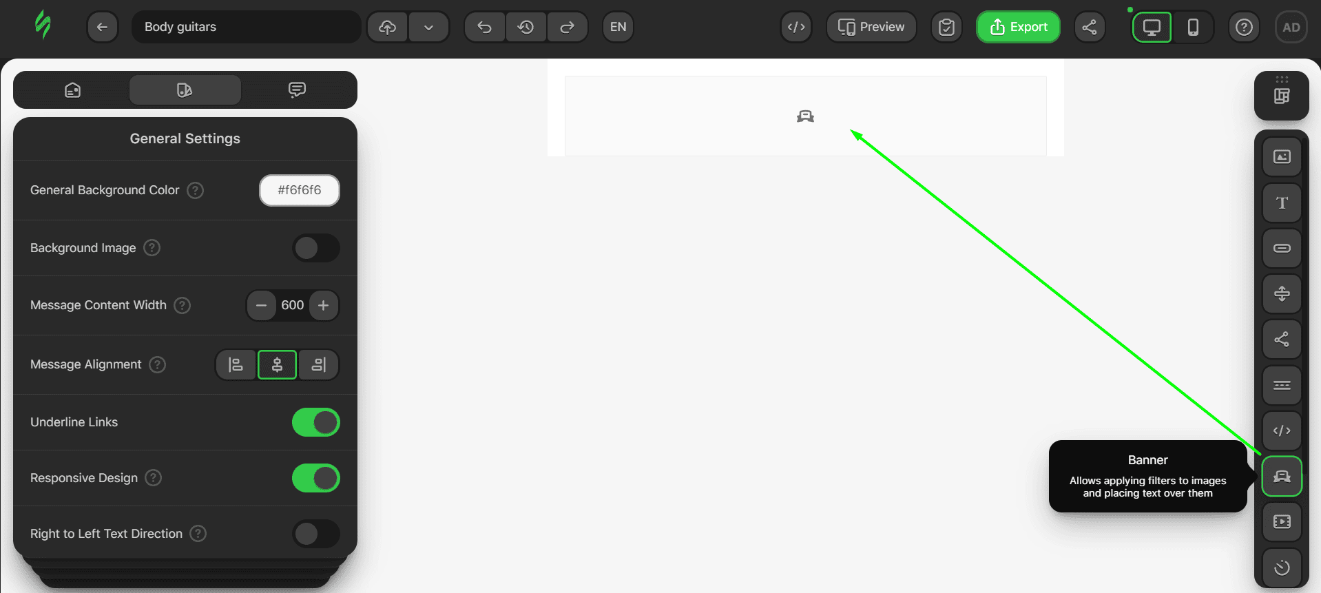
- drop the Banner block into the container;
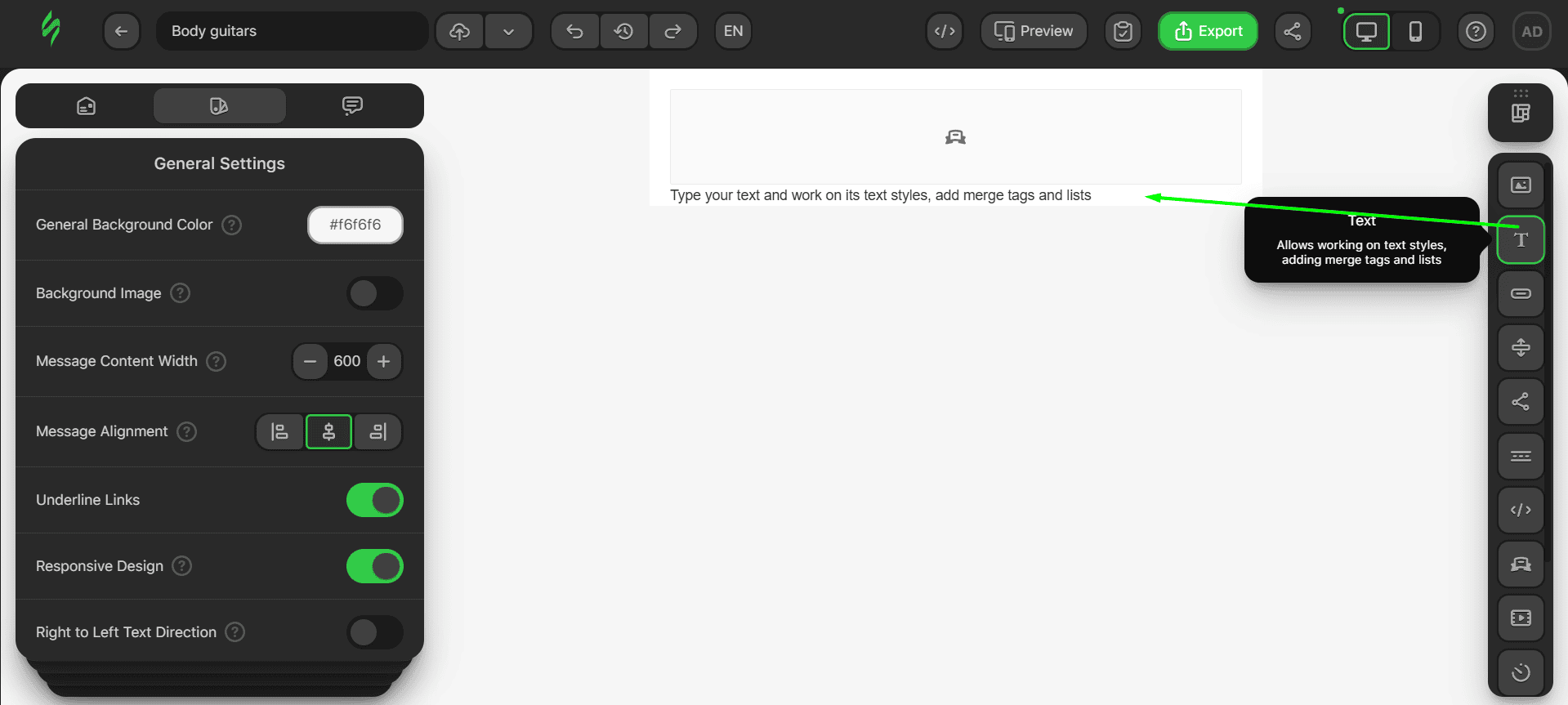
- right below it, drop the Text block into the same container;
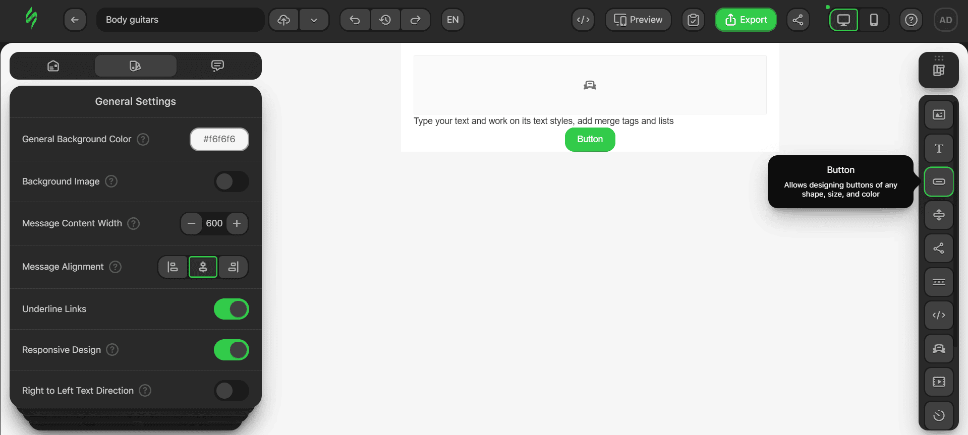
- next, place the Button block below the Text block.
Step #2. Adding main content
It’s time to enrich our email body with meaningful content. First, we need to add an image to our banner.
- click on the banner and then click on the “Paste URL” button;
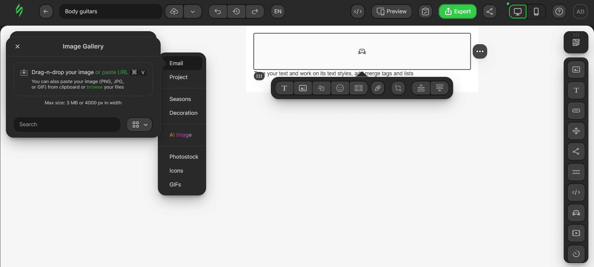
- paste your image link into the corresponding field and then click on the “Leave as External” button;
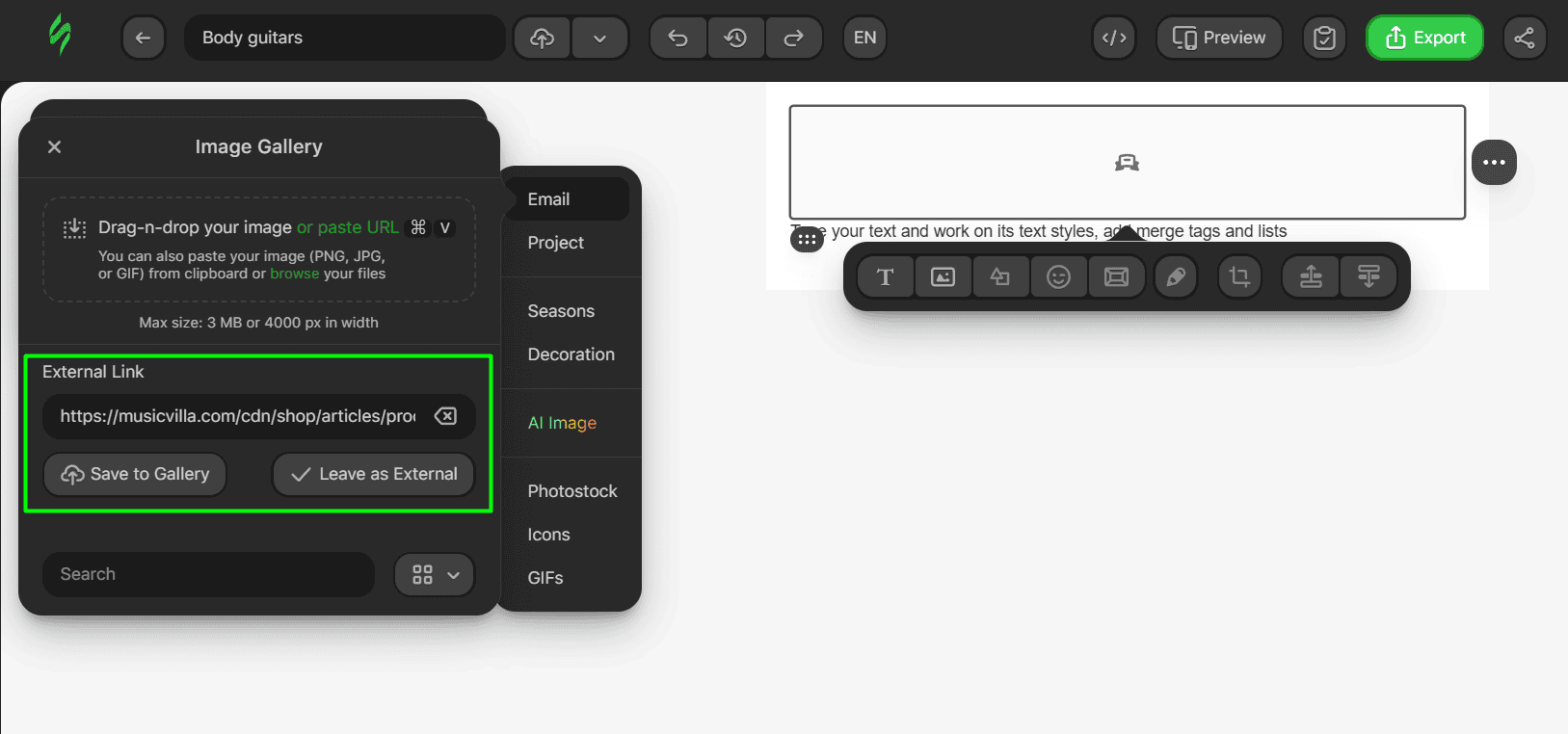
- the whole link should look like this.
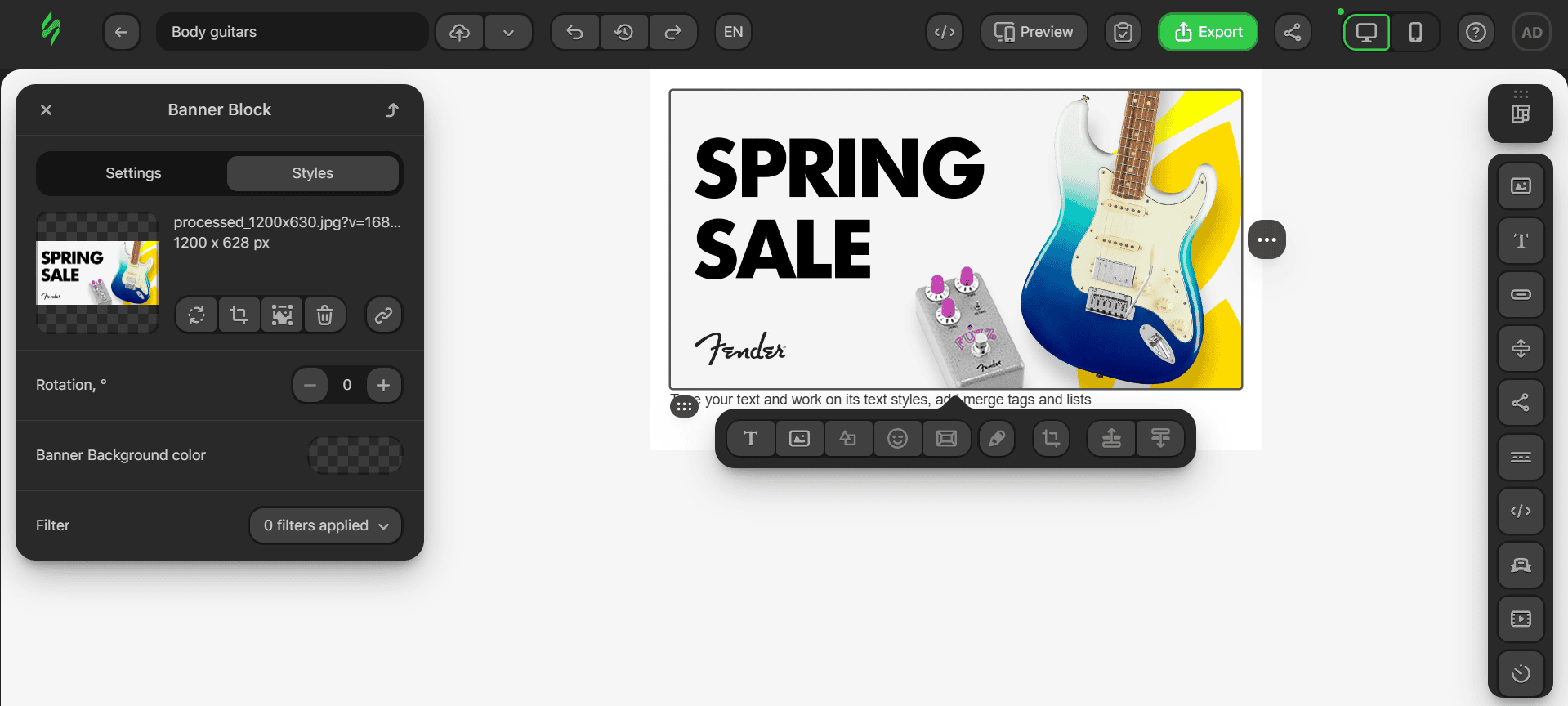
Now, it’s time to add text that describes our spring sale. To do this, click on the Text block below the banner and add the necessary text to it.
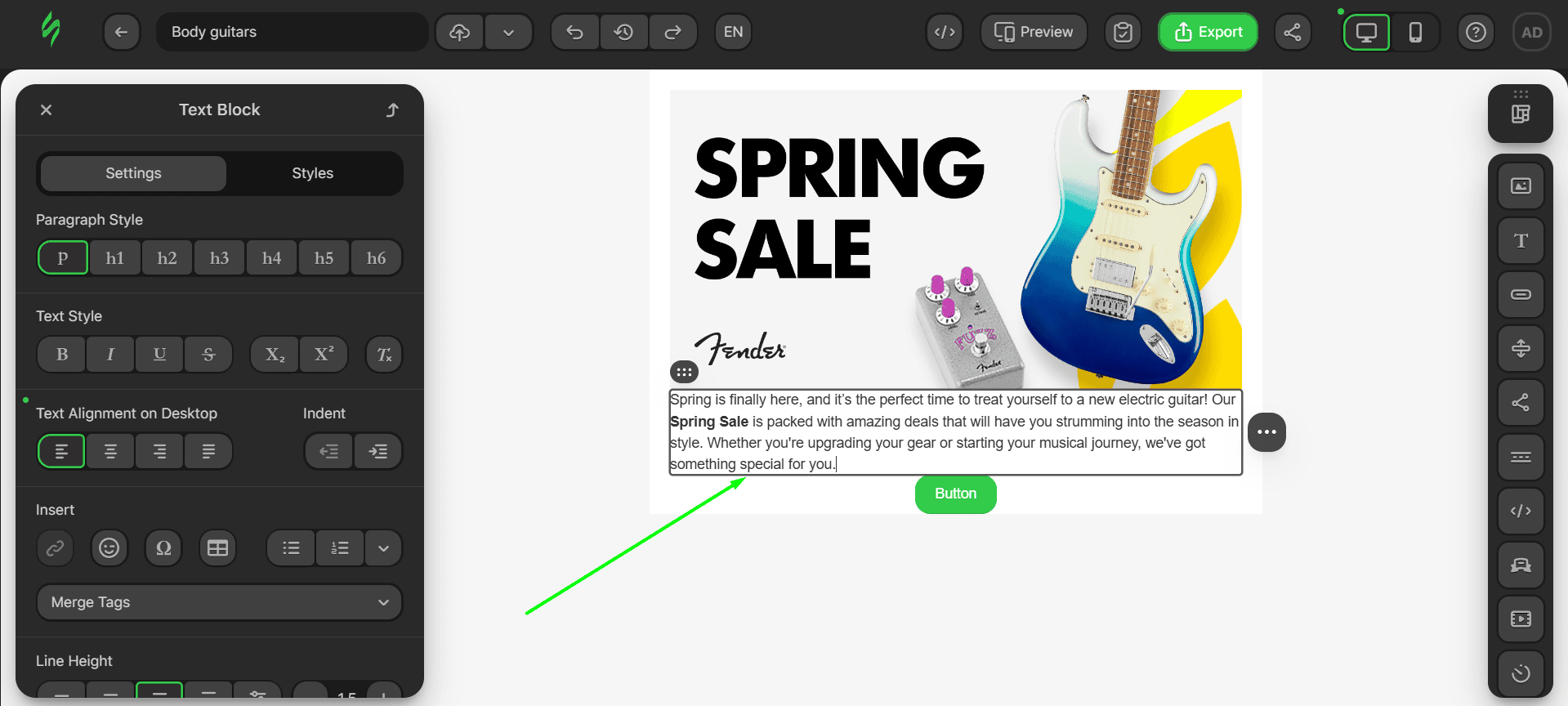
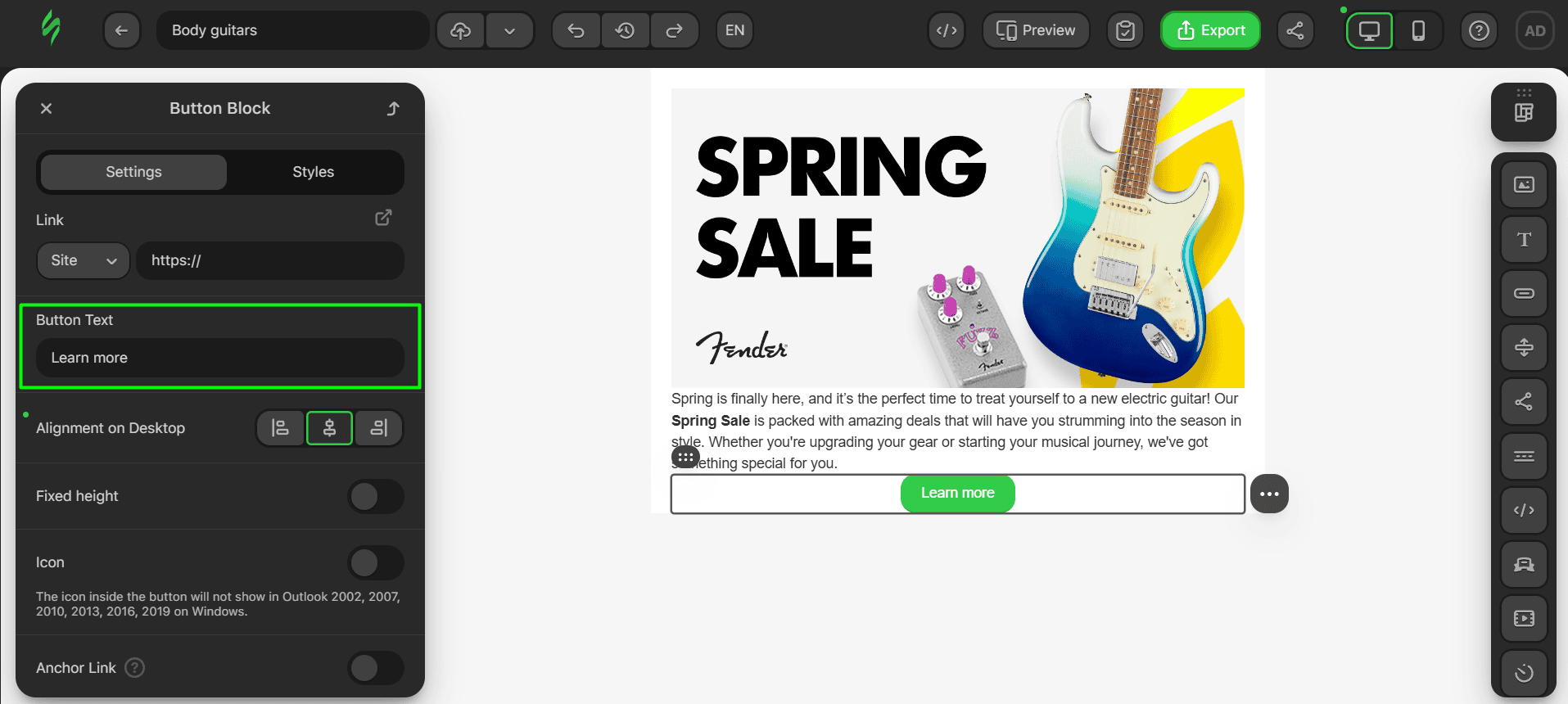
Last but not least, let’s add text to the button:
- click on the button to open its settings;

- add your text into the corresponding field.
Step #3. Adding links
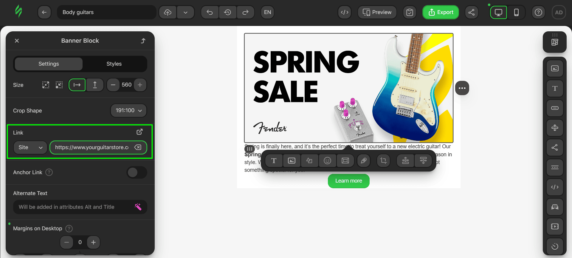
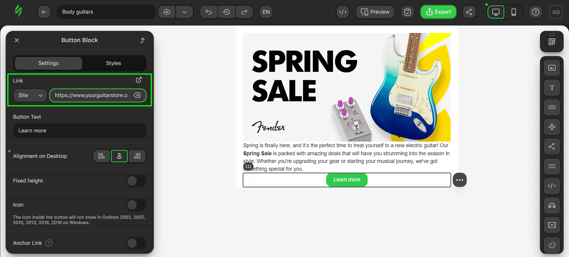
Our email body will have two links: one hidden in the banner to make it clickable and one in the button.
- click on the banner to open its settings;
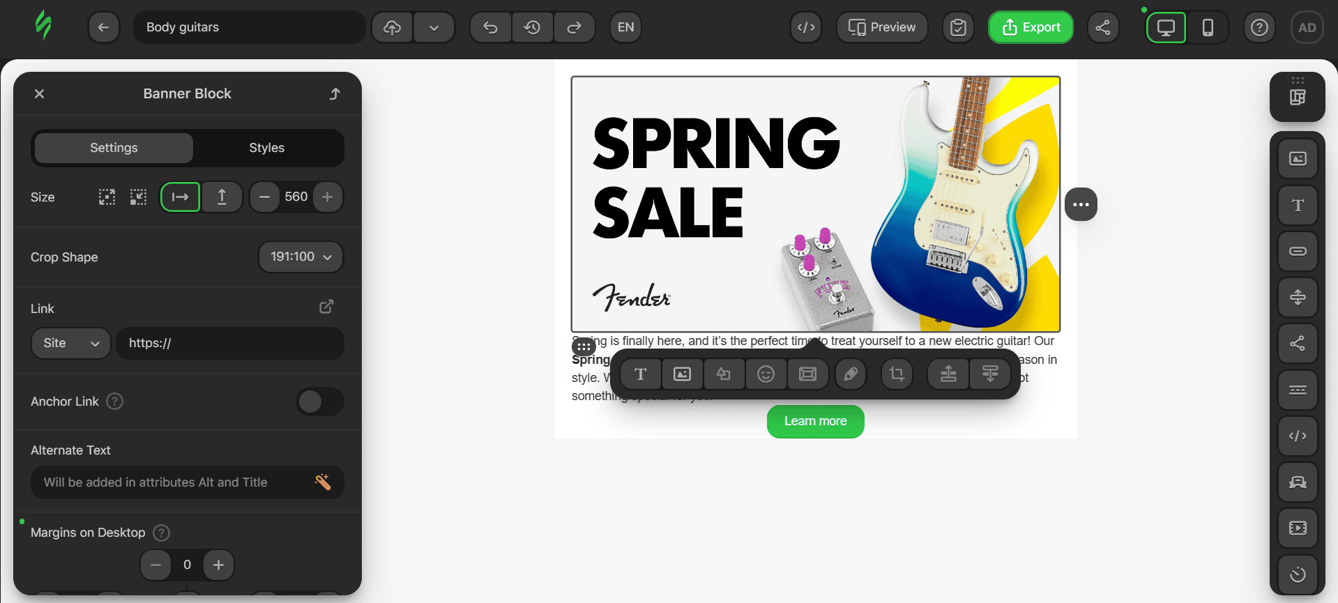
- add your link in the Link field;
- next, click on the button to open its settings;
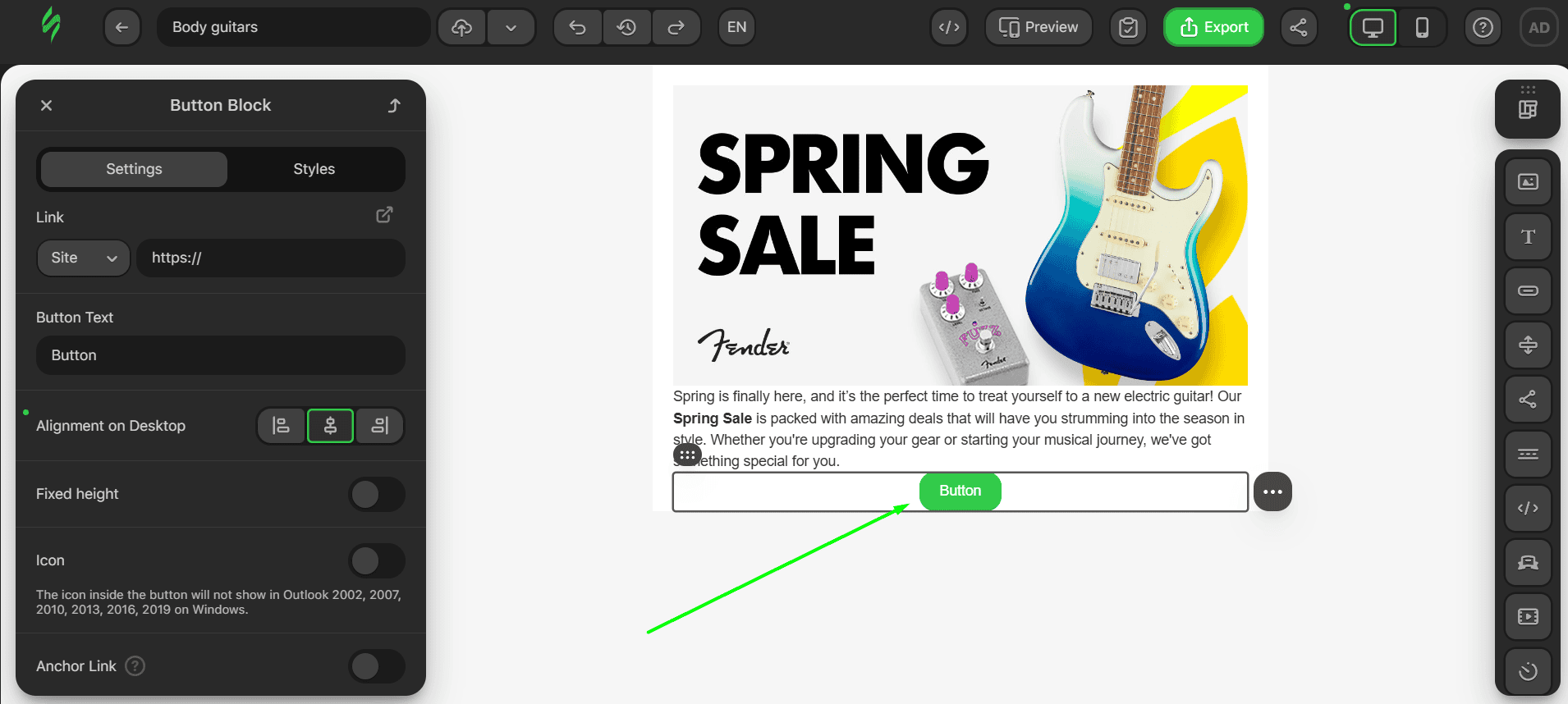
- paste the relevant link into the Link field.
Step #4. Tweaking looks
Now to customize the look of our future module. We’ll tweak how the text looks as well as the button visuals:
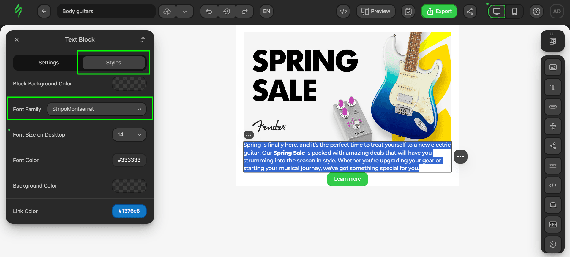
- select the whole text to open its settings and change the font through these settings;
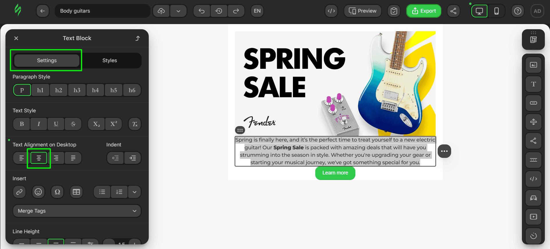
- let’s change the position of our text by clicking on the center alignment setting;
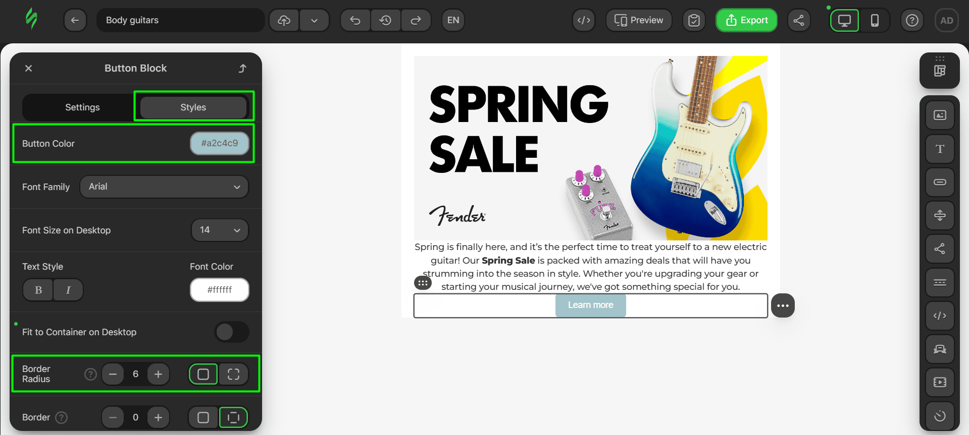
- changes to the button are also simple, and you need to change its color and make it more square-shaped by reducing its border radius.
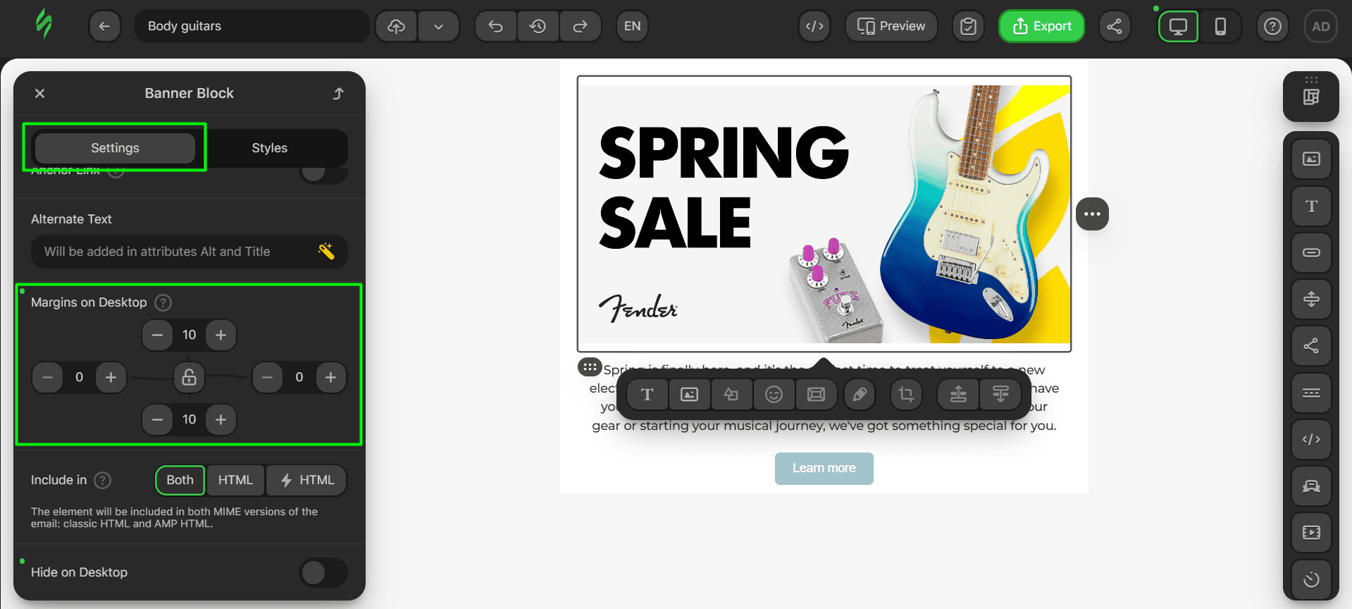
The last thing we’ll tweak is the paddings for all the elements in this email section to give each one some “personal space.”
Here are the paddings for our banner.
These are the figures for our Text block paddings.
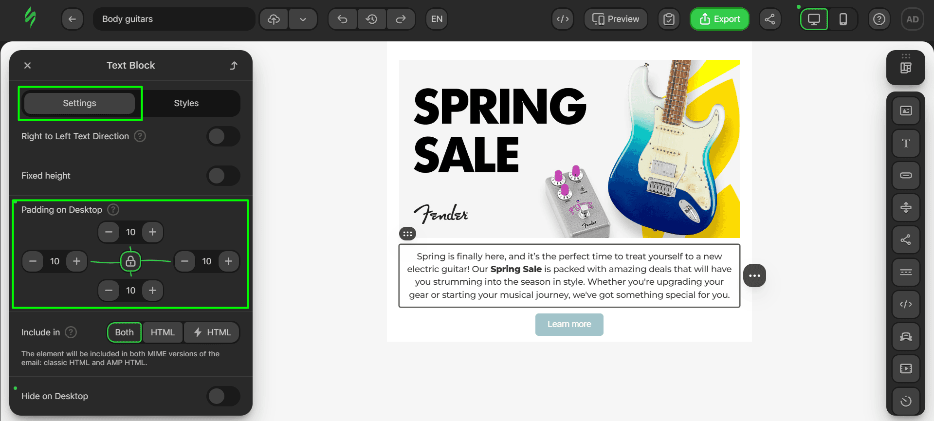
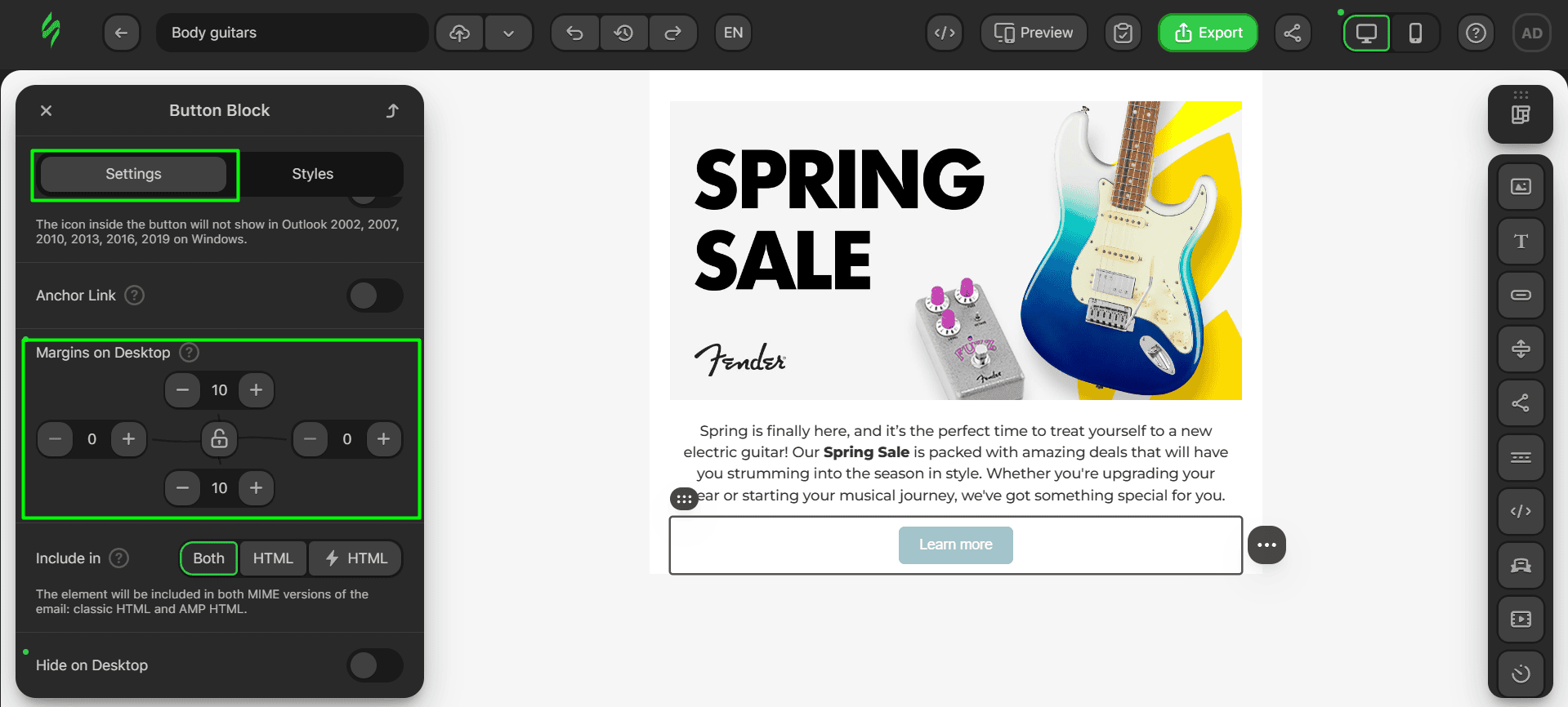
And last are the margins for our button, which will look like this.
Step #5. Saving the module
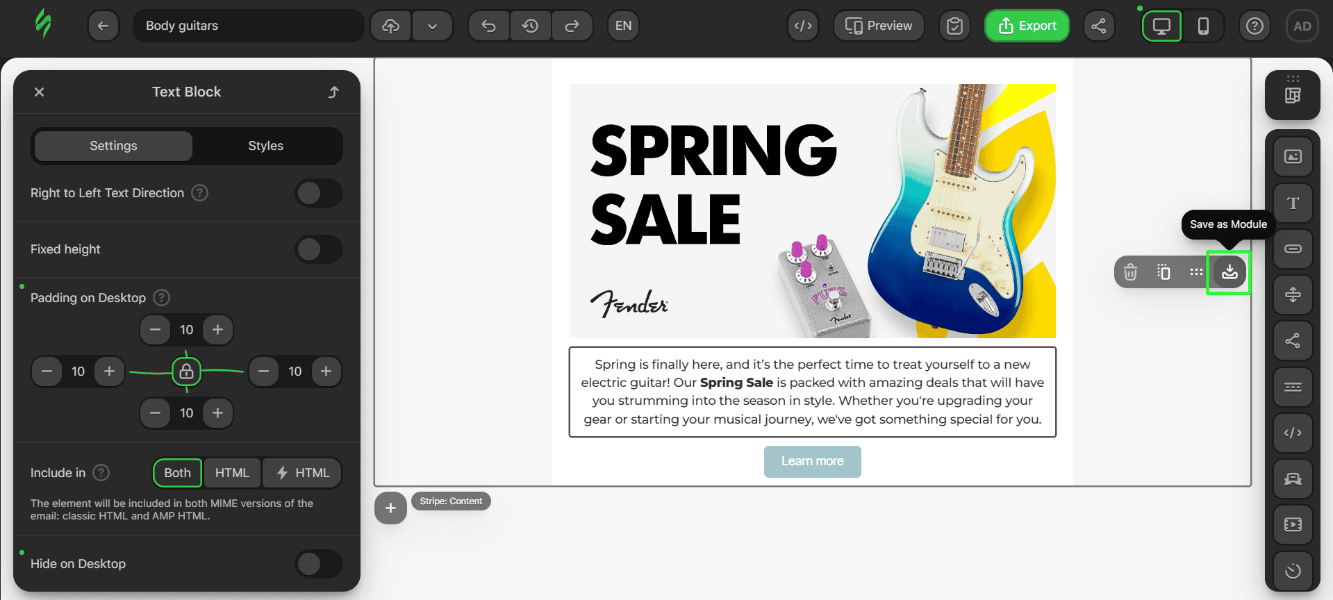
Now, let’s save this module. The process for this block is the same. Hover over it and click on “Save as Module.”
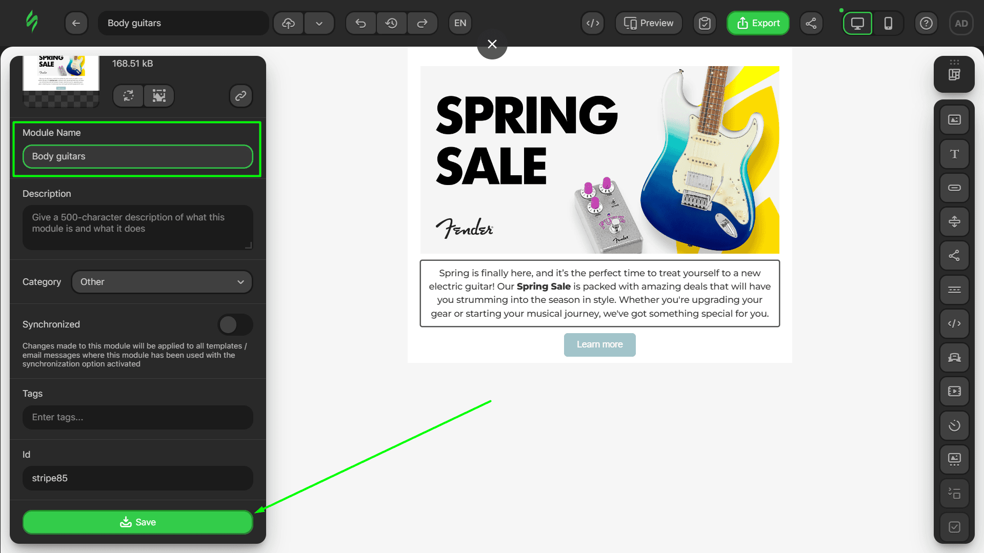
Enter the name of your module and click on the “Save” button.
Product card
It’s time to create the cornerstone of our email: the product card. To make it look the same as the one in the email preview, we’ll need an Image block, a few Text blocks, and one Button block.
Step #1. Creating a rough sketch
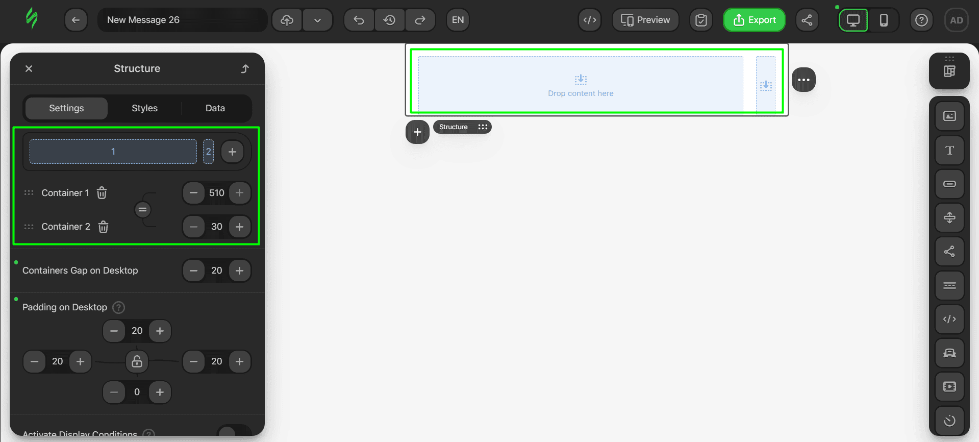
Let’s outline our product card. We’ll take the familiar empty template and reduce it to one structure with two containers. One container will store the product images, while the other will hold the text and buttons.
- click on the trash bin button to delete all the structures except for the one in the middle;
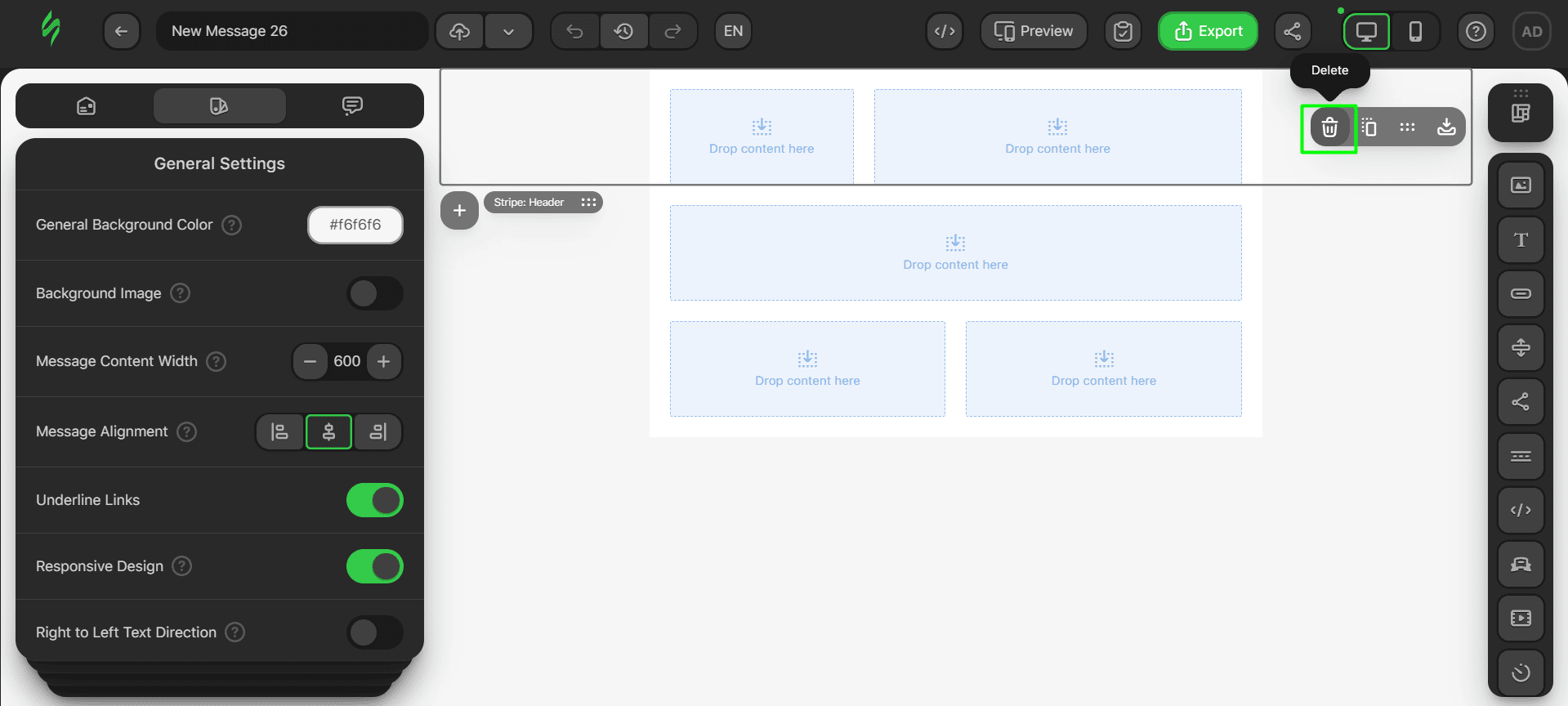
- to add a container to the structure, click on it and then on the Plus button in the structure’s settings.
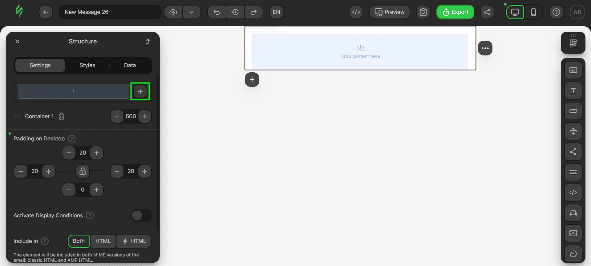
Once you’ve done this, your structure for the product card should look like this.
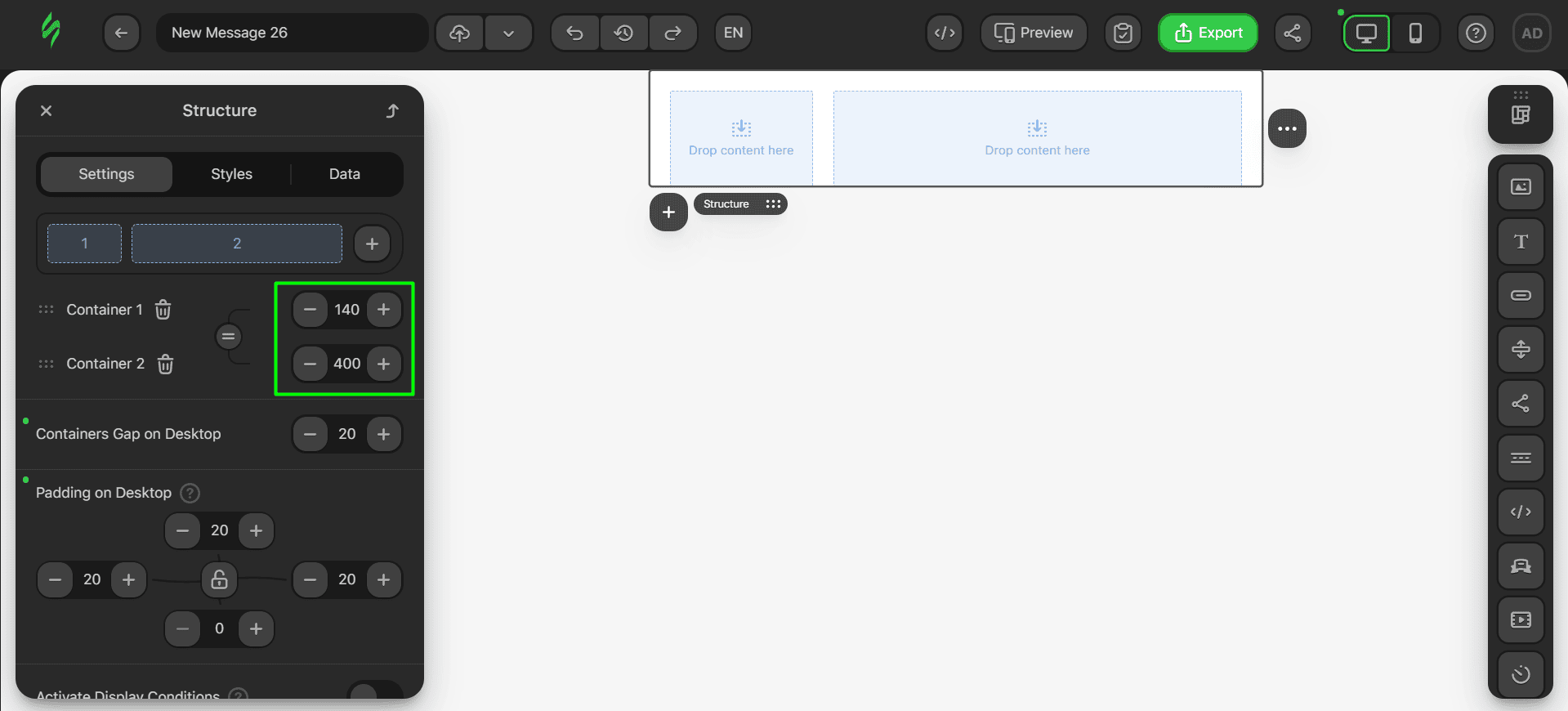
Let’s modify the size of our containers, as they currently look a bit odd. The left container will display product images, so we’ll make it smaller, while the right one will hold all the text, such as product names, descriptions, and so on. To alter the sizes of the containers, simply change these parameters to the ones shown in the screenshot.
Step #2. Adding the main content
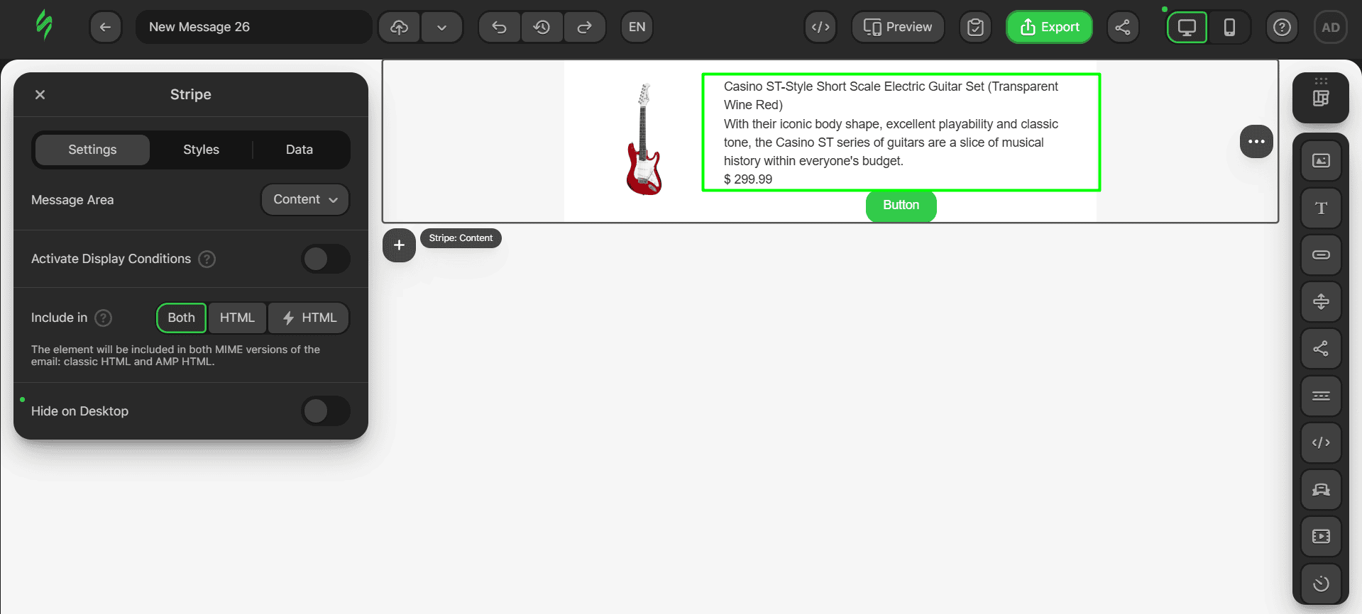
Let’s add the content now. As we mentioned above, the product card will contain one Image block, three Text blocks (product title, description, and price), and one Button block.
- first things first, drop an Image block into the container on the left;
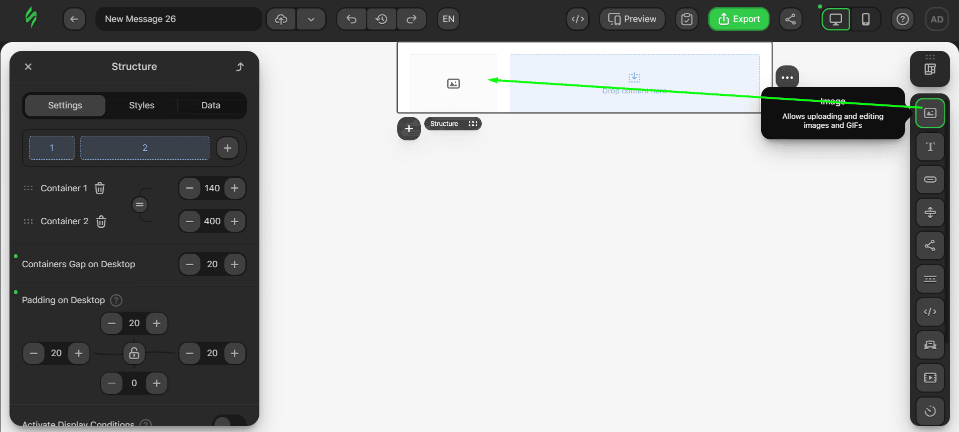
- after that, drop three Text blocks one below the other into the container on the right;
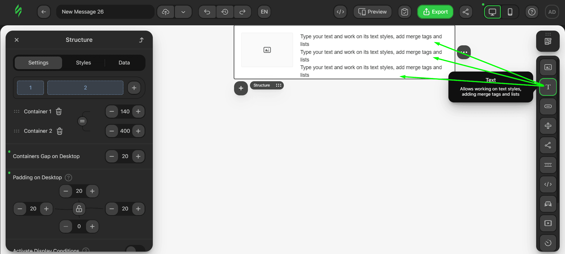
- the last thing left to add is the Button block right below the Text block.
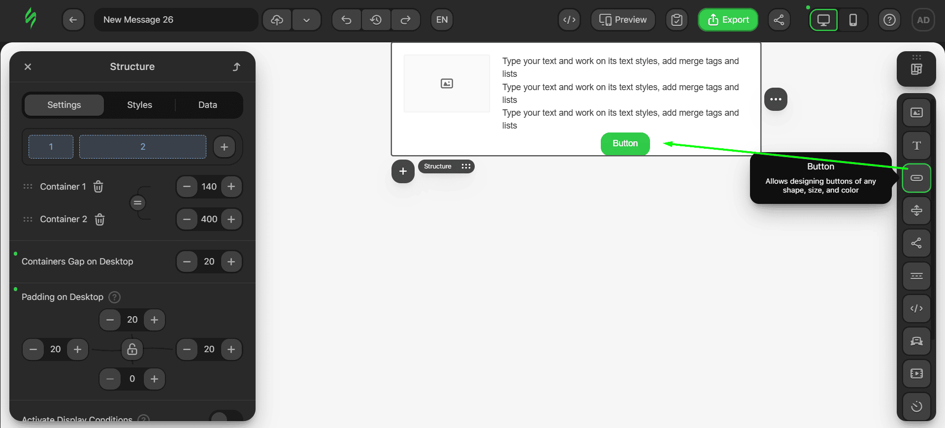
Let’s now add our image and text. These actions are the same as those for the other blocks. First, we will add our product image.
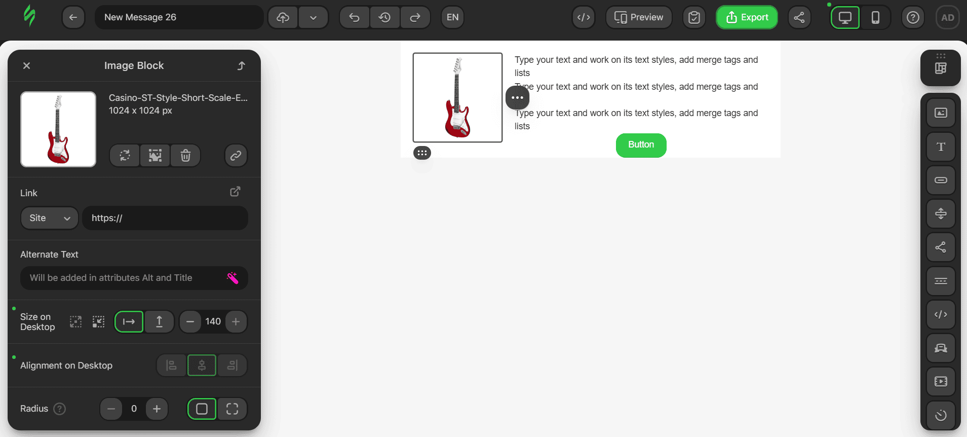
Next, we will add our product title, product description, and price.
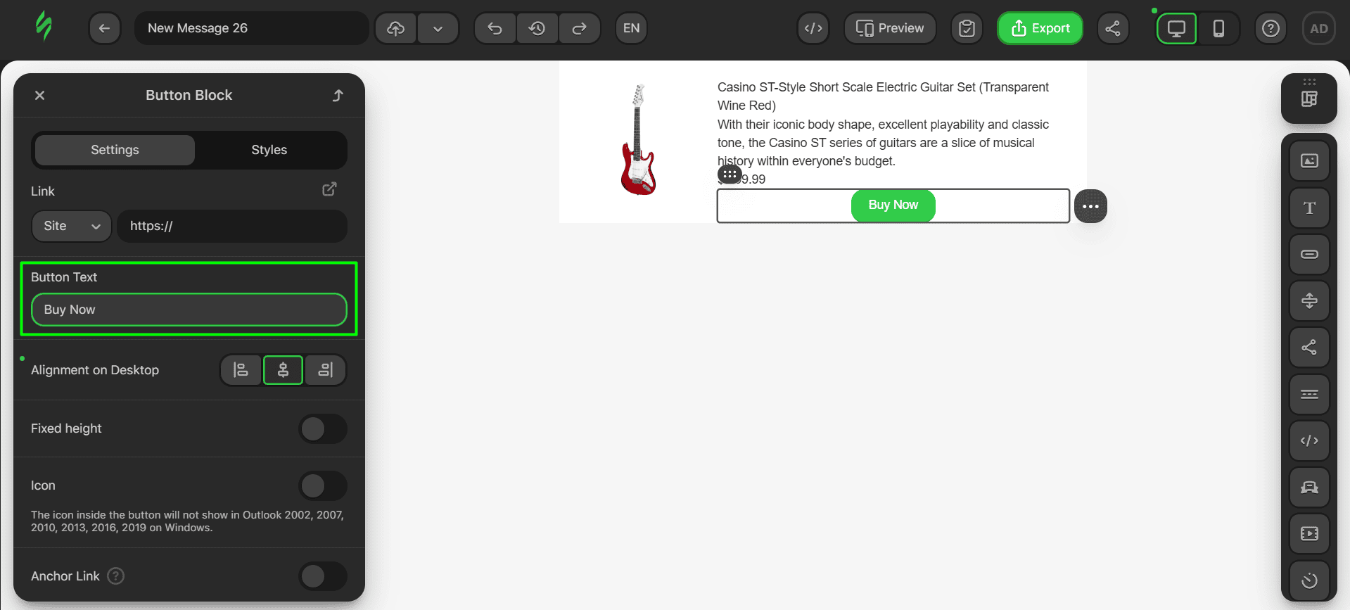
The last thing we will add is the text for our button.
Step #3. Adding links
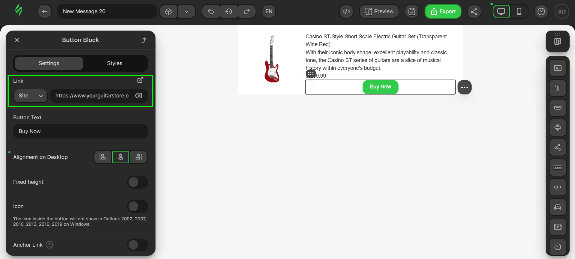
In this part, we’ll add only one link to our button. Usually, these buttons lead to the related product pages on the website. The whole process of adding links is the same as previously described. Click on the Button block and paste the link into the corresponding field.
Step #4. Tweaking looks
Customizing the styles for our product card will include changing the fonts, button aesthetics, and paddings for our block elements:
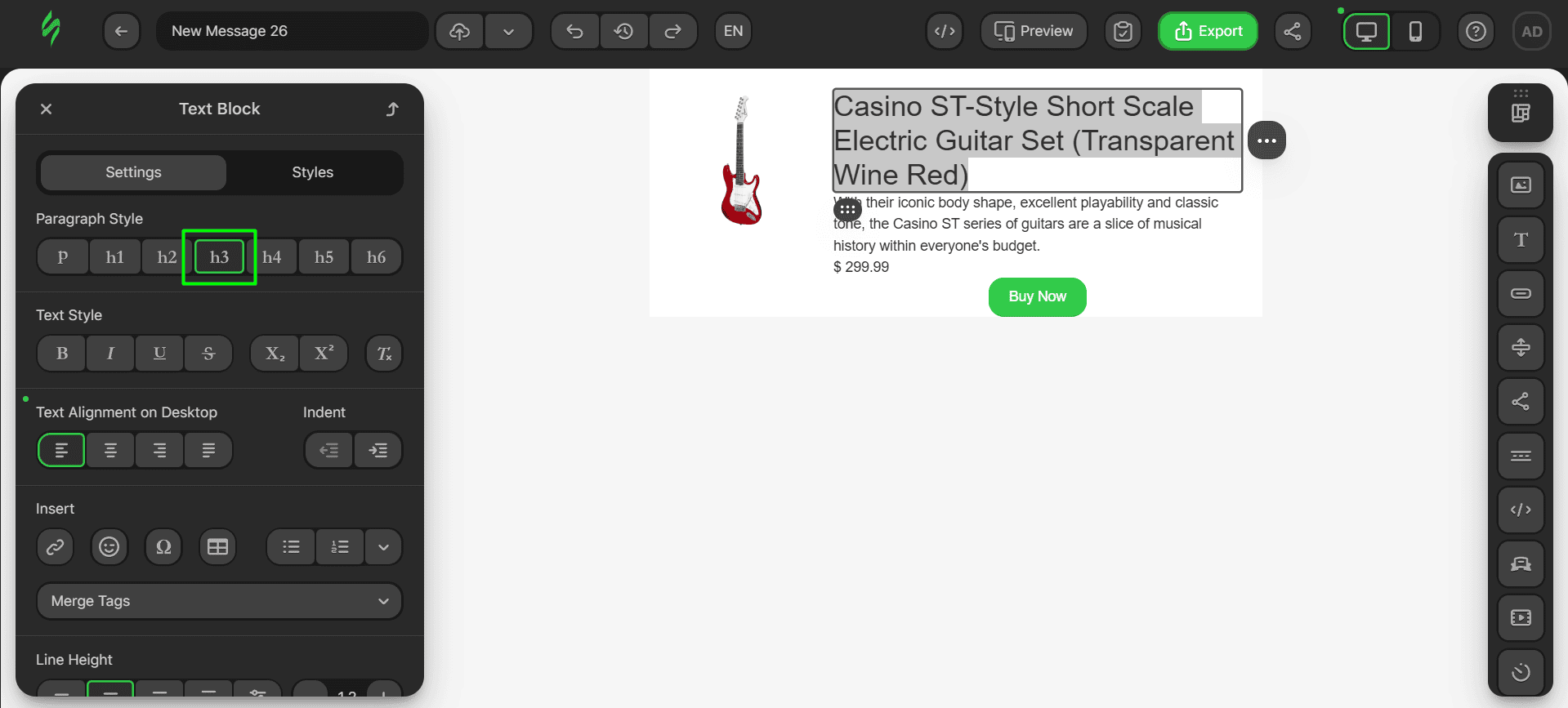
- first, change the paragraph style of the product title to h3;
- then, change the font of the title;
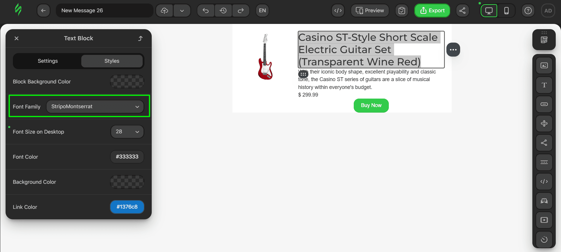
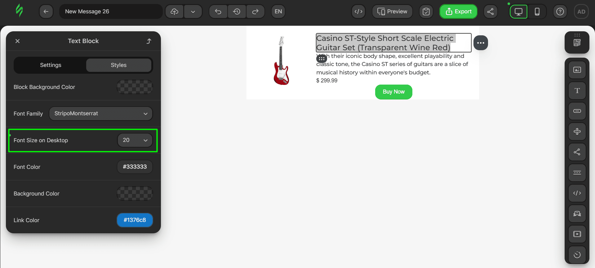
- next, reduce the size of the title;
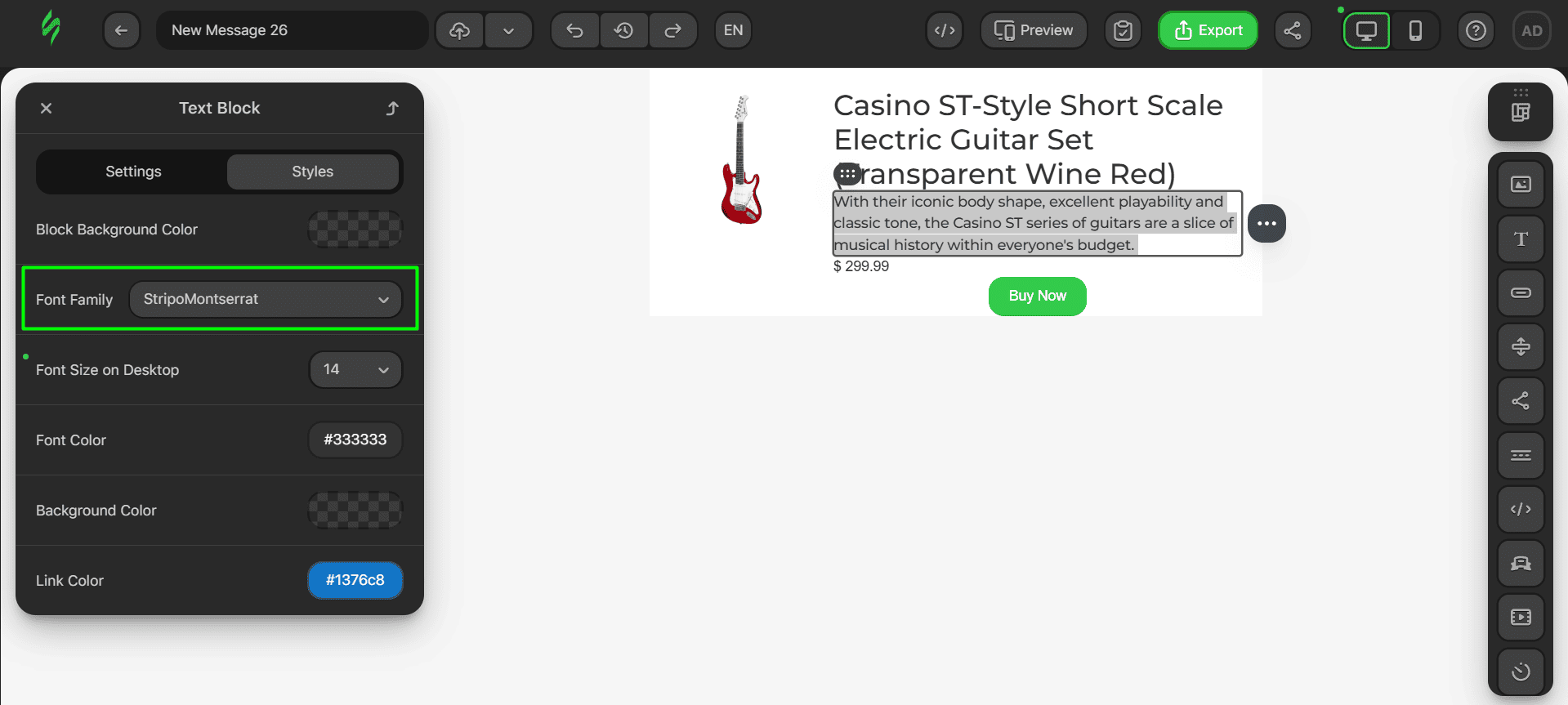
- once this is done, change the font of the product description;
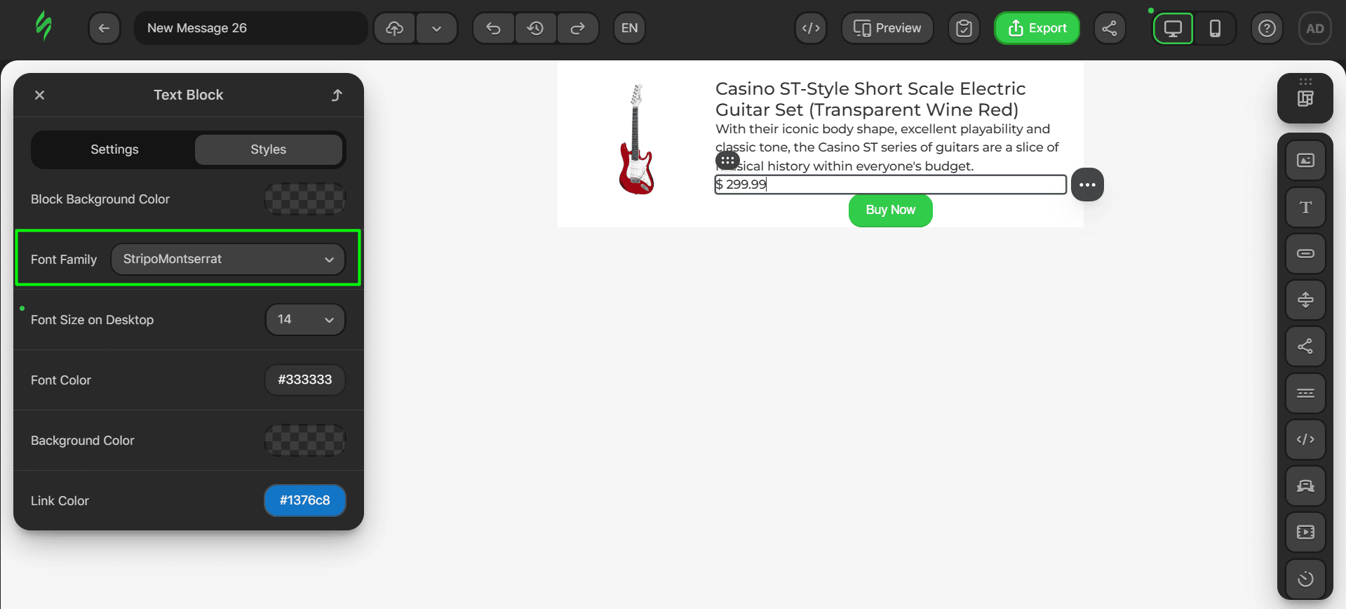
- the same process is to be followed for the price;
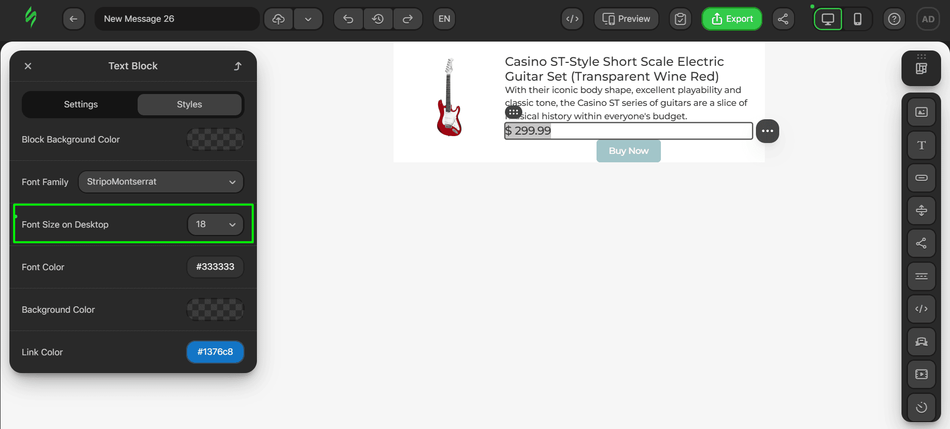
- increase the size of the button to make it more visible;
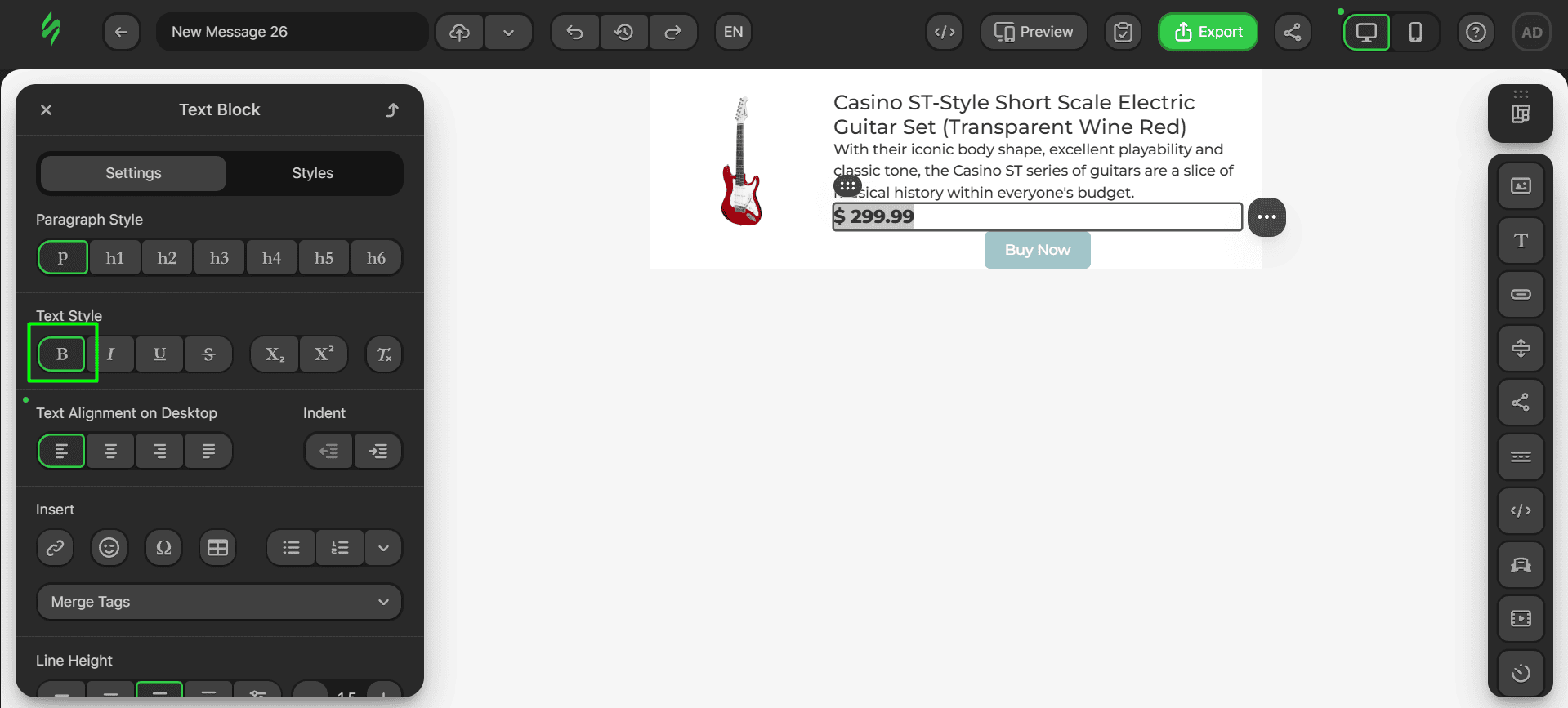
- change the text style to bold to make the price text pop;
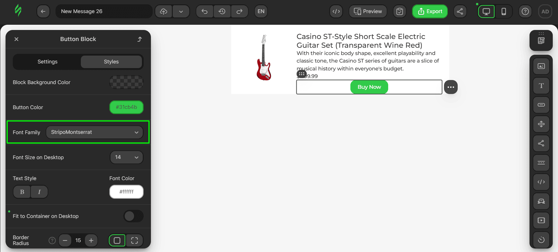
- now, let’s modify the button by changing its font as well;
- next, reduce its border radius to make it more square-shaped;
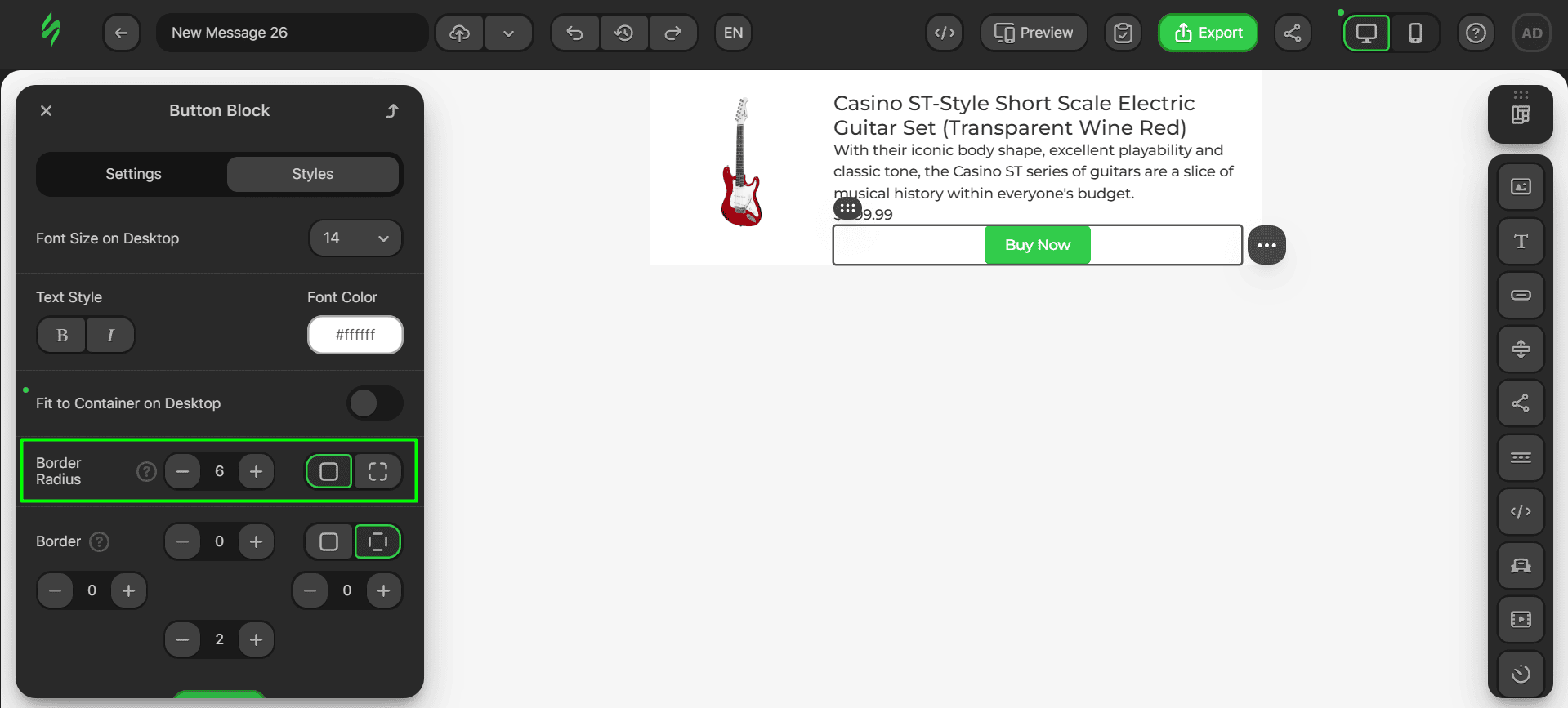
- once this is done, change its color to match that of the button in the body of the email.
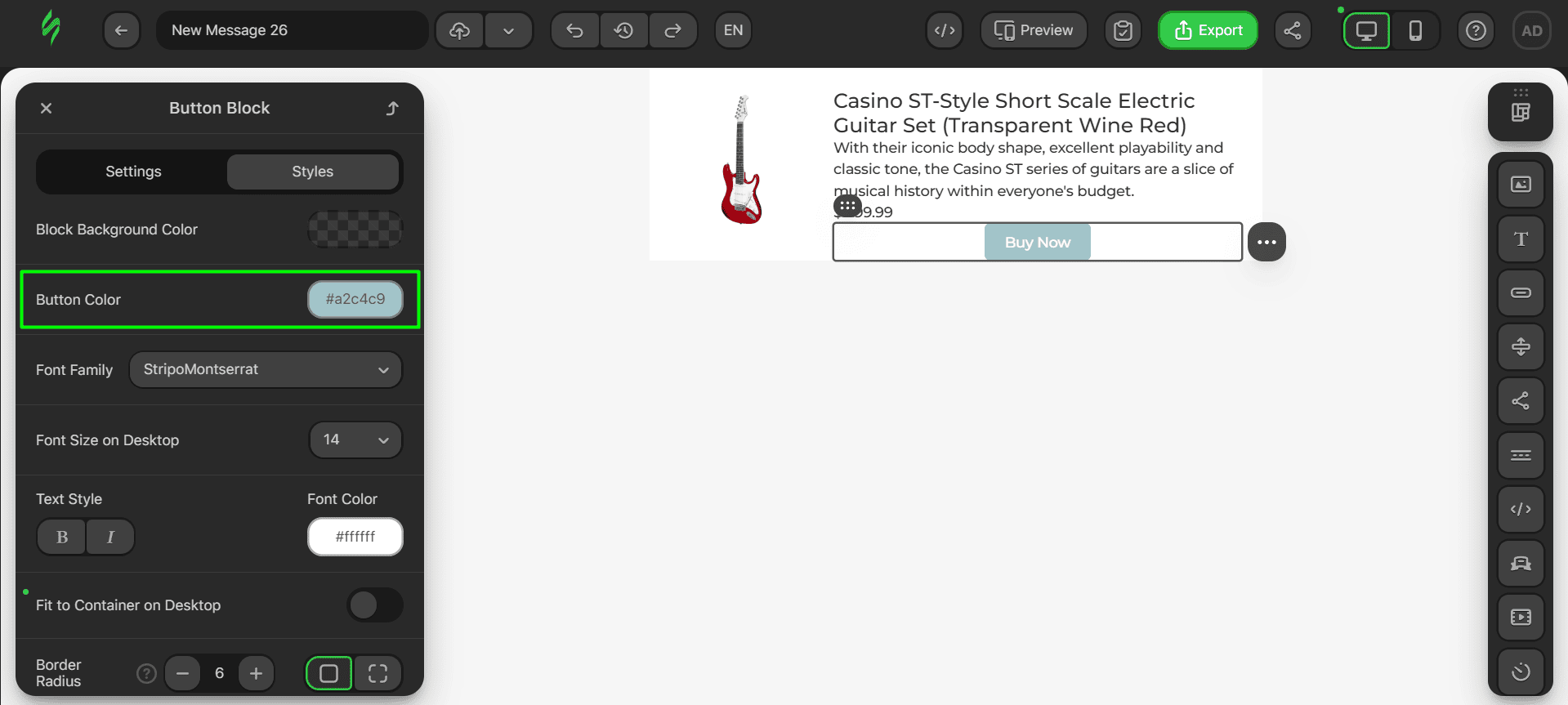
The last thing left to alter is the paddings for our product title.
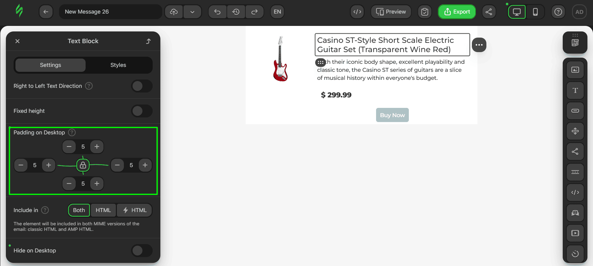
These are the paddings for the product description.
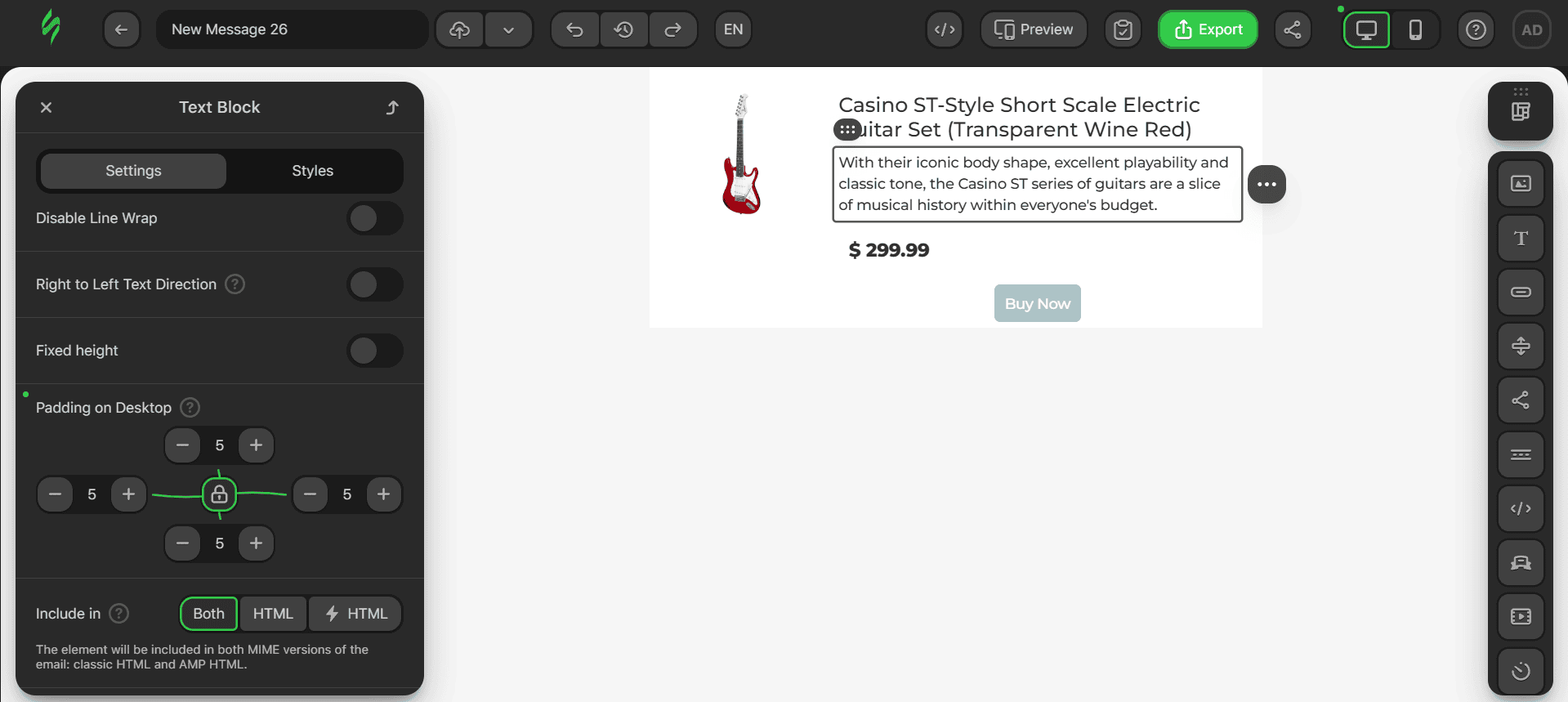
The paddings for the price are a bit different to separate it from the rest of the text.
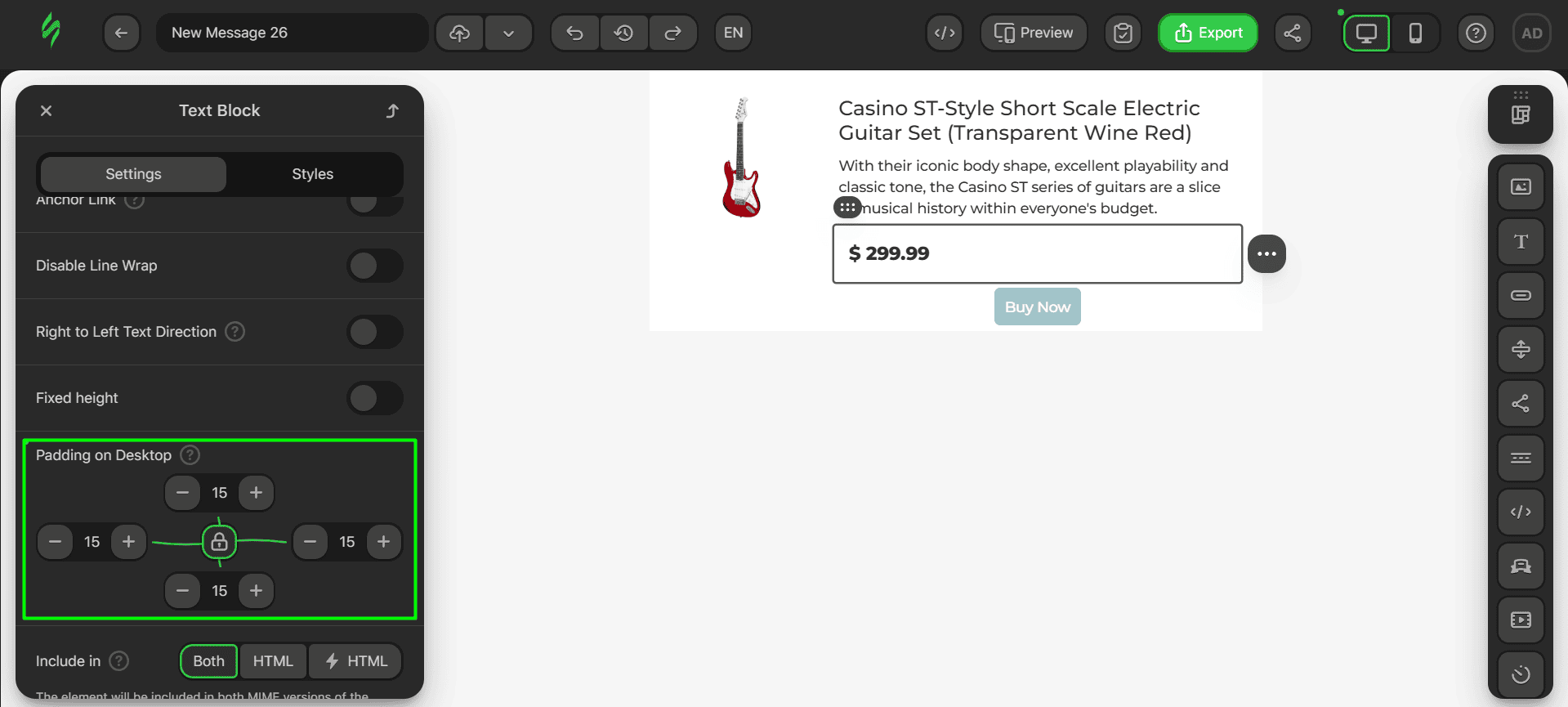
The last aspect to be changed is the margins for our button.
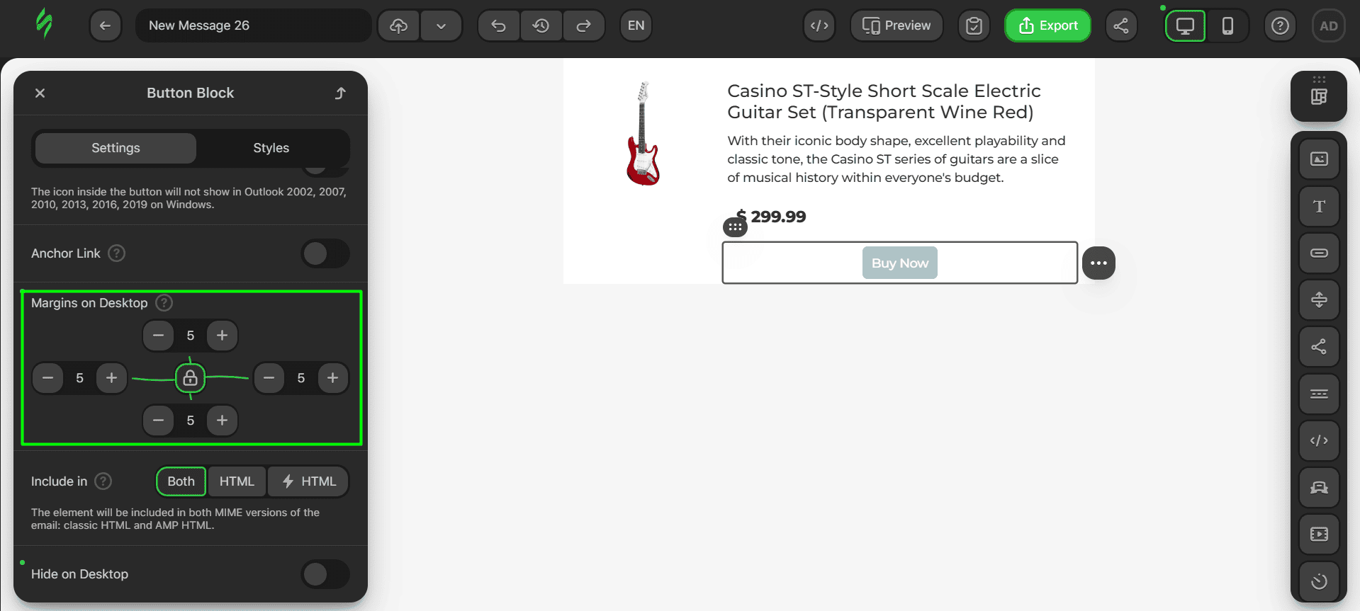
Step #5. Saving the module
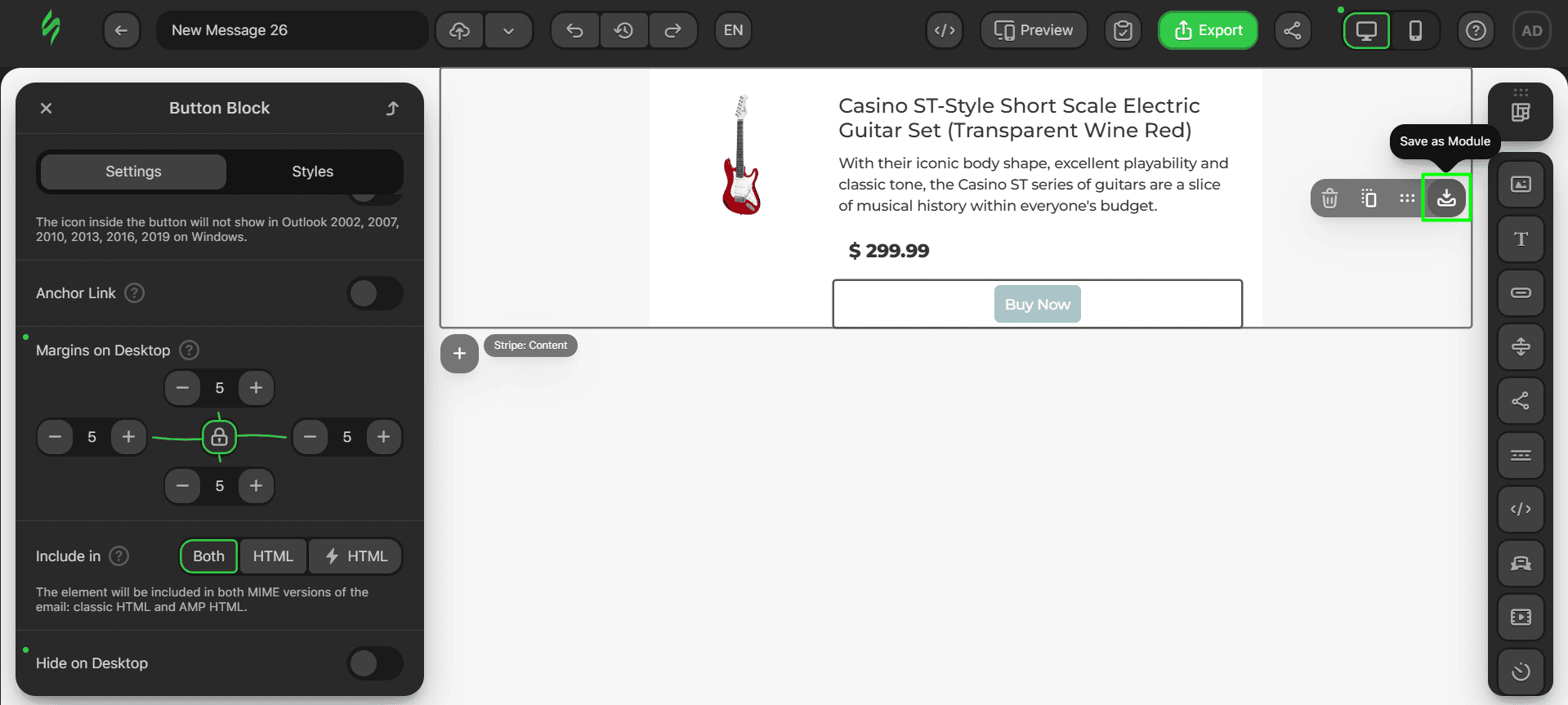
Let’s save our product card module. Hover over the future module and click on the “Save as Module” button.
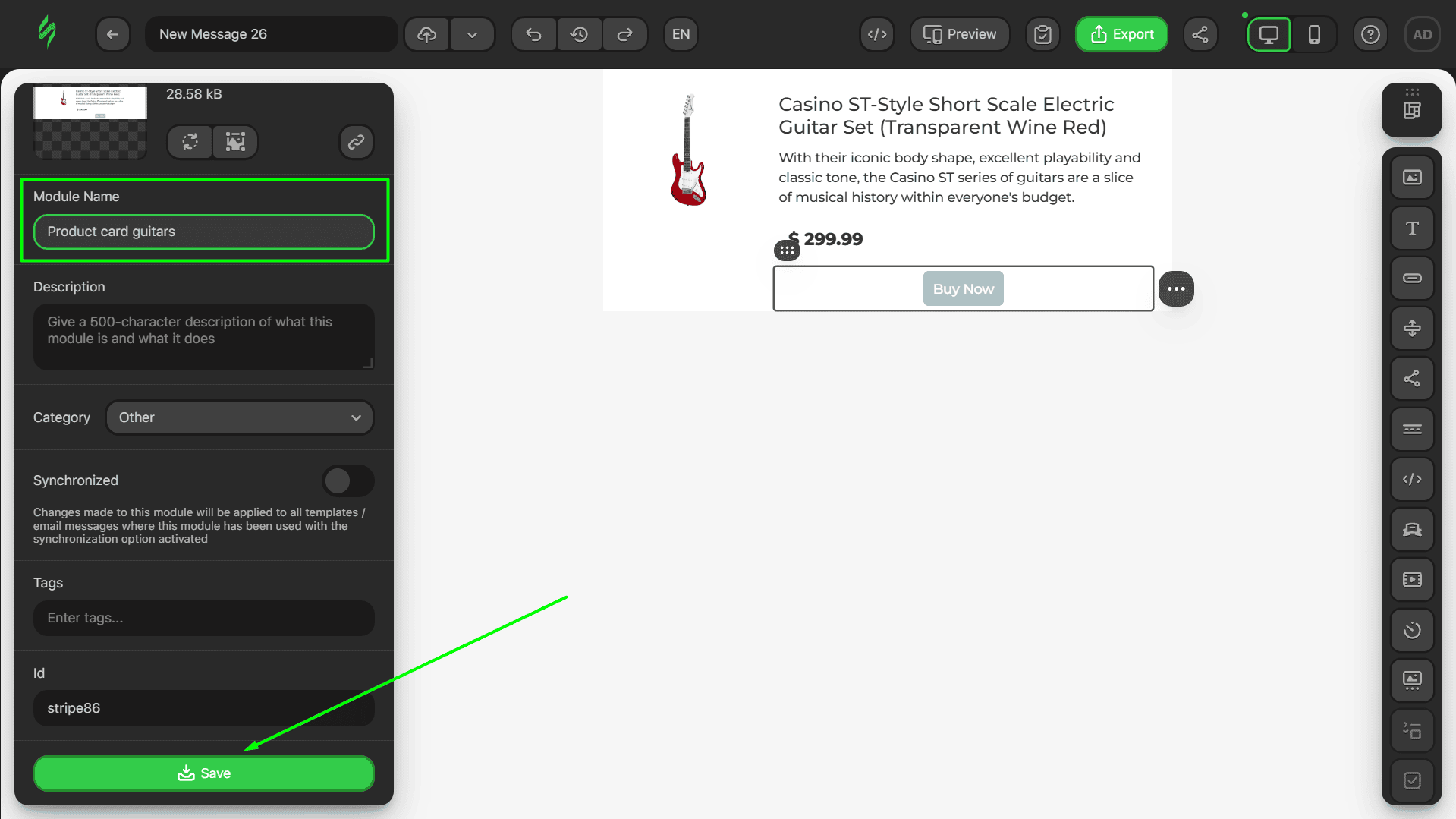
Enter the name of the module in the corresponding field and click on the “Save” button.
Pre-built modules library
To make the process of designing your email easier and give you a boost of inspiration, our pre-built module library has dozens of ready-made modules with product cards created by our professional designers.
You can pick the ones you like, discover the elements that they have been built with, gain inspiration, or use them right away for your newsletter. The choice is yours.
To check out our module library, click on the “Structures and Modules” button.
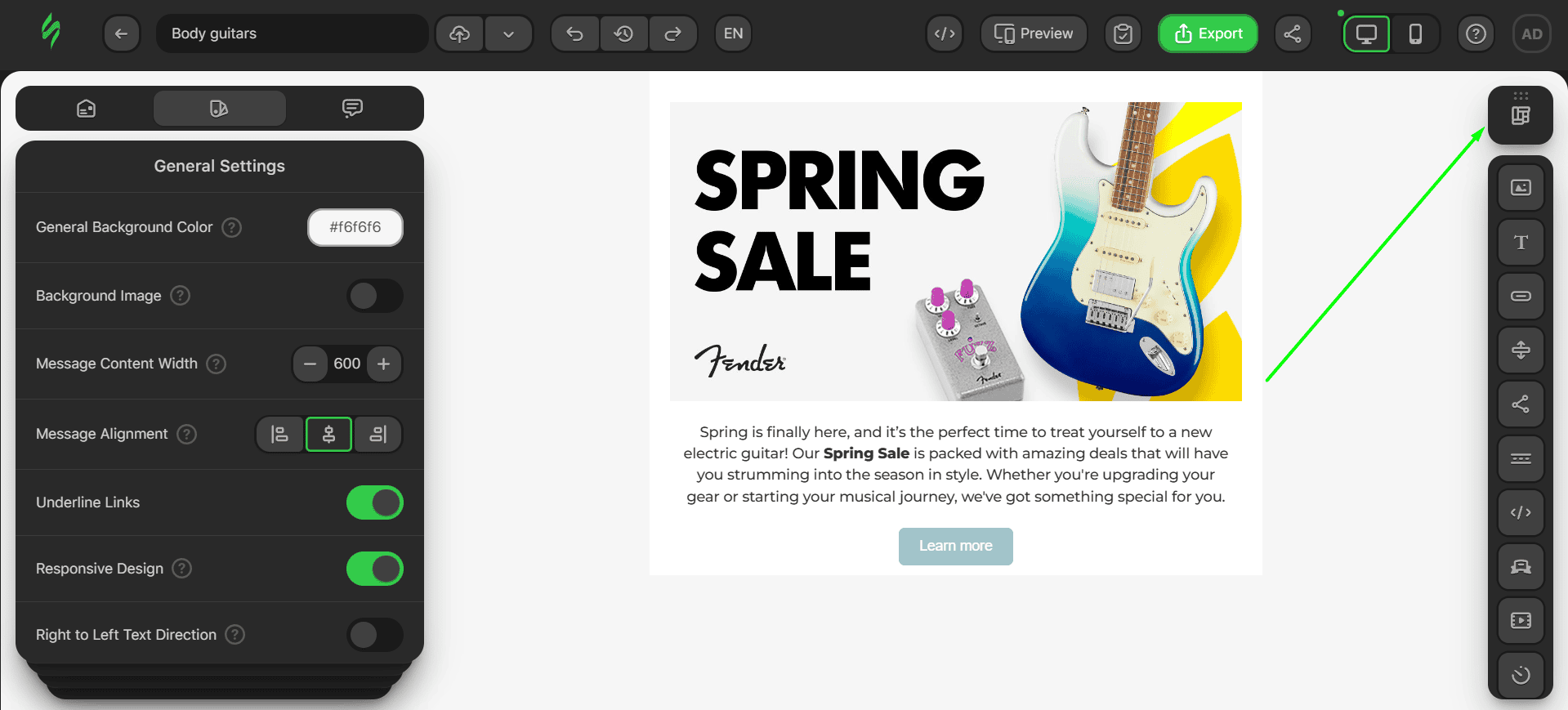
Go to the search settings and choose to display only modules with product cards.
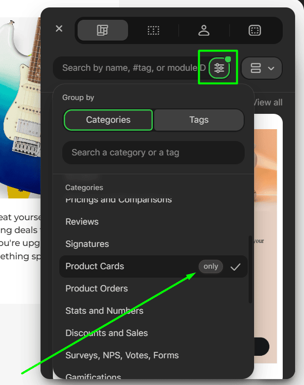
Voilà, our entire product card modules library is at your disposal.
If you want more tips and inspiration for how you can design product cards correctly, we have provided all the necessary information in our dedicated article.
Footer
The final thing that recipients see in any email is the footer. To complete our footer design, we’ll need a few Text blocks and Social Networks blocks with the corresponding links.
Step #1. Creating a rough sketch
As done for the previous parts of our email, we will use our empty template reduced to one structure with two containers:
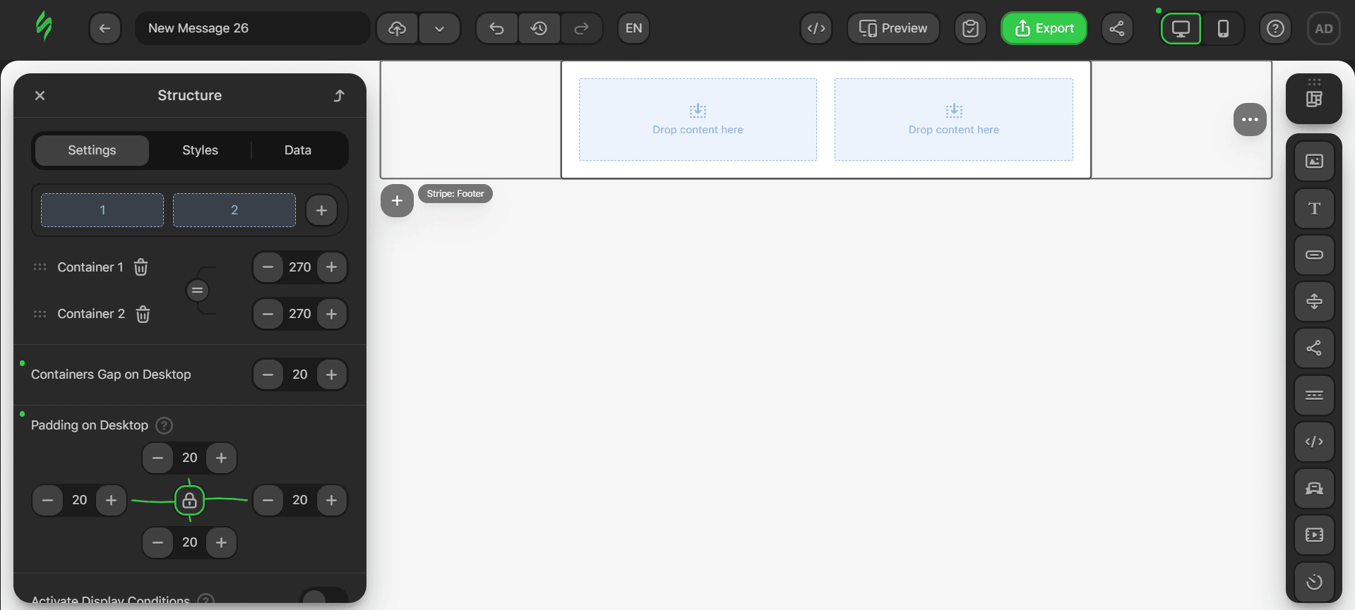
- to make this email block suitable for our design, we need to add two more structures by clicking on the plus button (which turns into a cross once the drop-down menu appears) and selecting the structure from the drop-down menu;
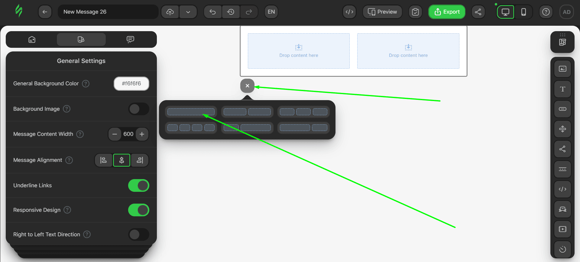
- using this method, add two more structures with one container each.
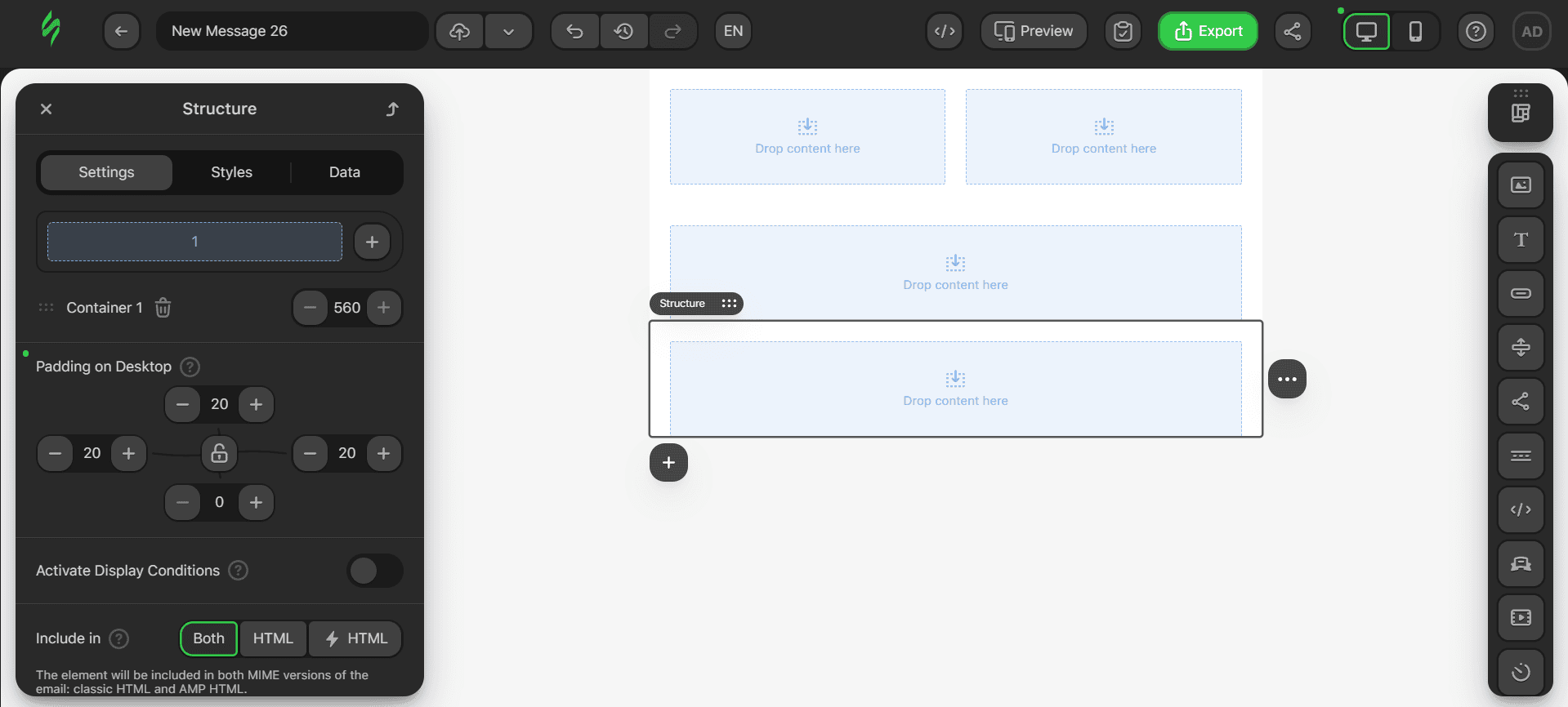
Step #2. Adding the main content
Let’s now add the content we need. First, place the Social Networks block in the first container and the Text block in the next container of the same structure.
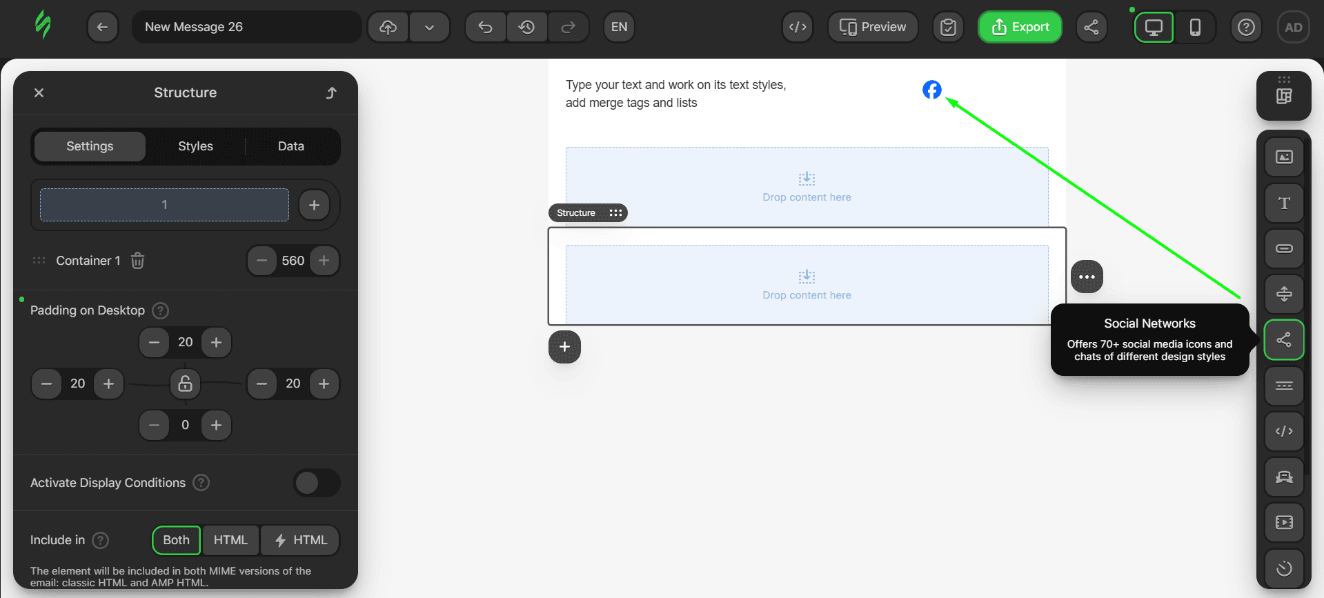
- after that, add two Text blocks, with each going in its own container.
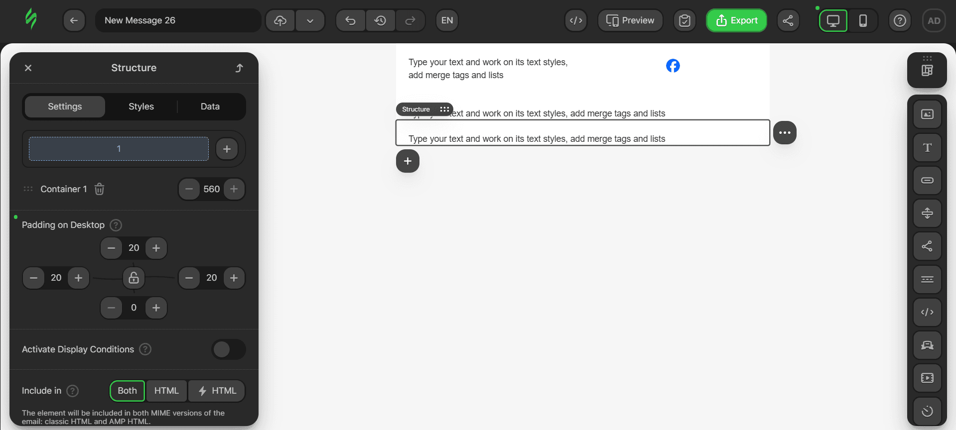
The only thing that’s left is to add our text to the Text blocks.
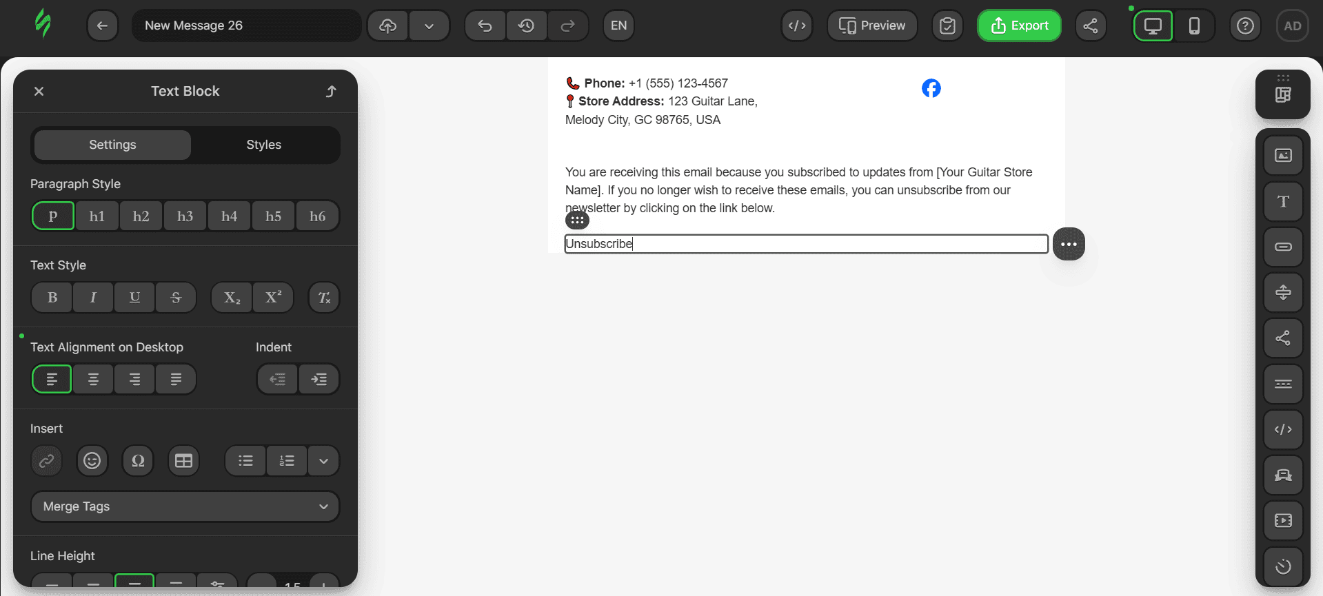
Step #3. Adding links
Our footer will have five links. Each social media button will have its own link, and there will be a dedicated “Unsubscribe” link at the bottom of the email:
- click on the Social Networks block to open its settings;
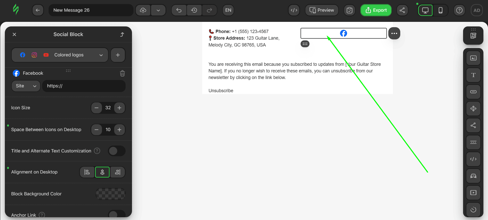
- choose the style of the logo using this drop-down menu;
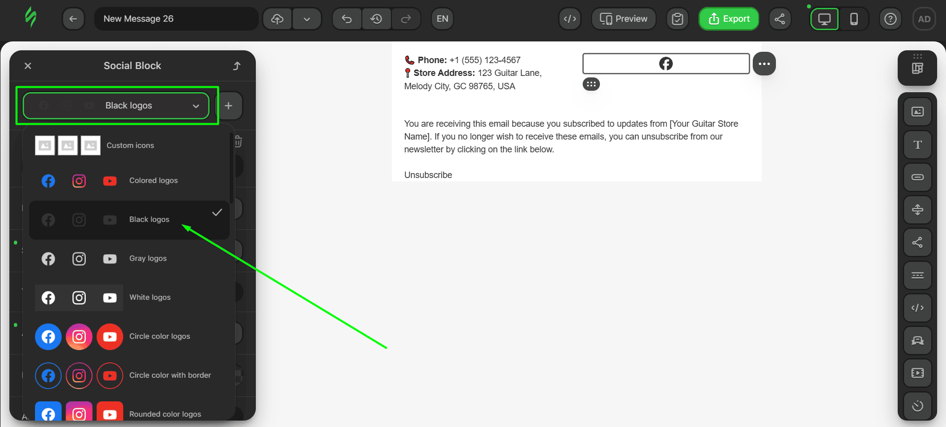
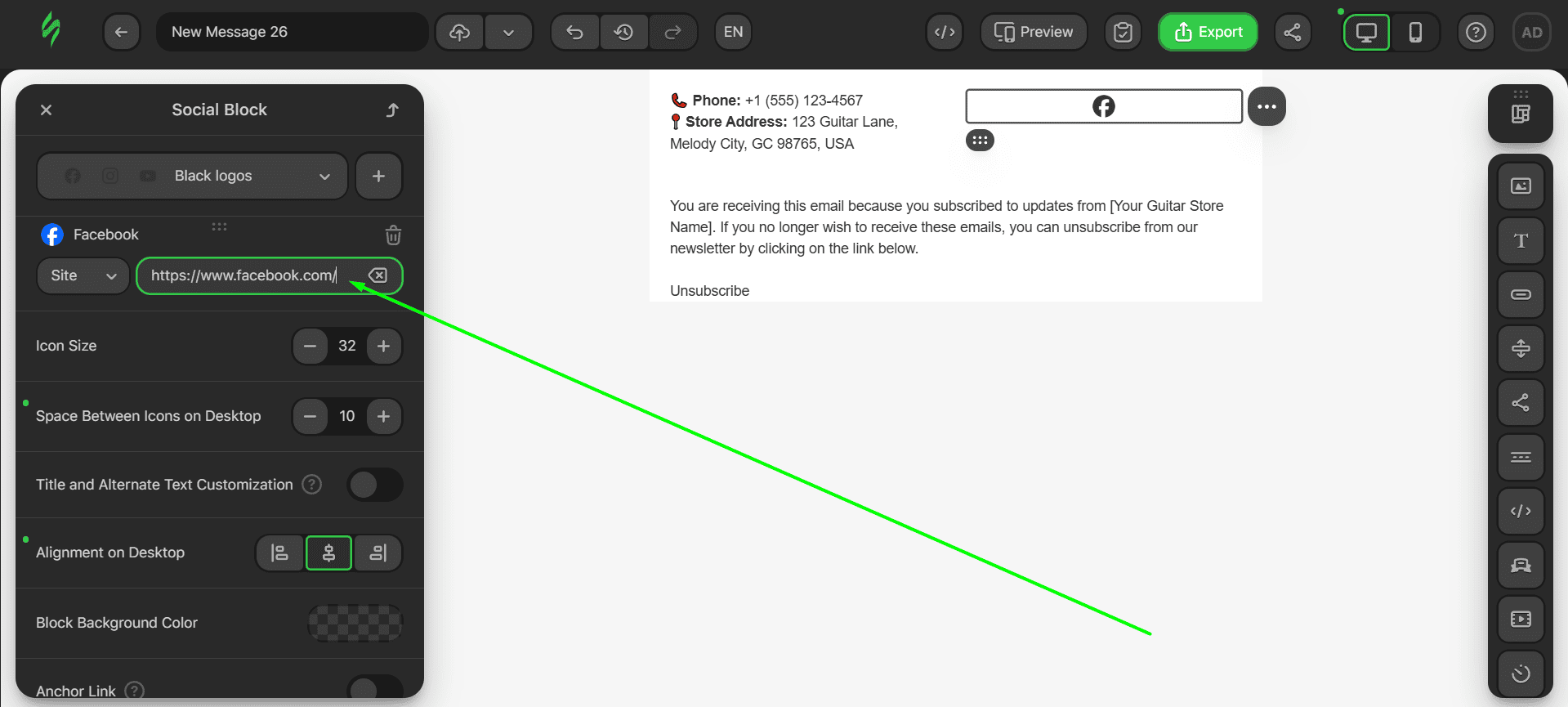
- once this is done, add a link to the corresponding social media platform in the “Link” field;
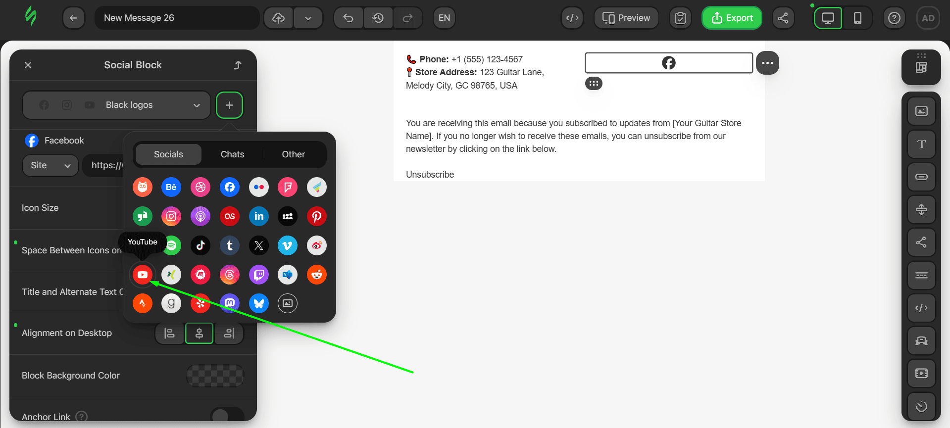
- to add different social media platforms, use the plus sign and pick the required social media platform from the drop-down menu;
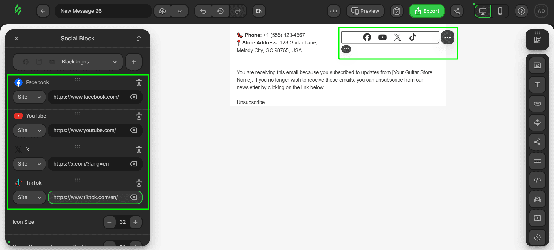
The entire procedure of using the Social Networks block is the same. Once you’re done, your footer, with all the social media buttons, should look like this:
The last thing we have to add is the “Unsubscribe” link.
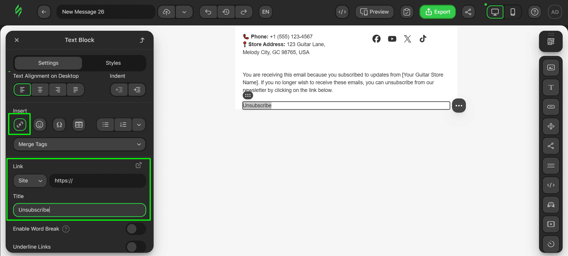
Step #4. Tweaking looks
Now, let’s tweak the styles and paddings of our content:
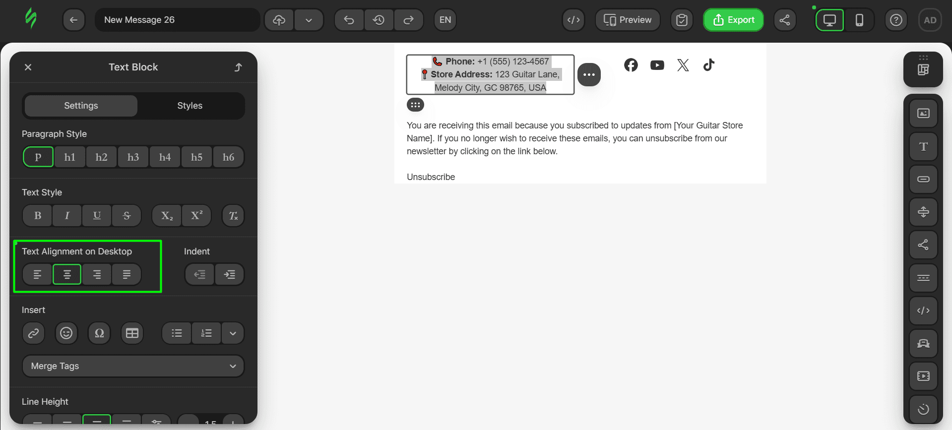
- first, change the alignment of our phone number and address to center them;
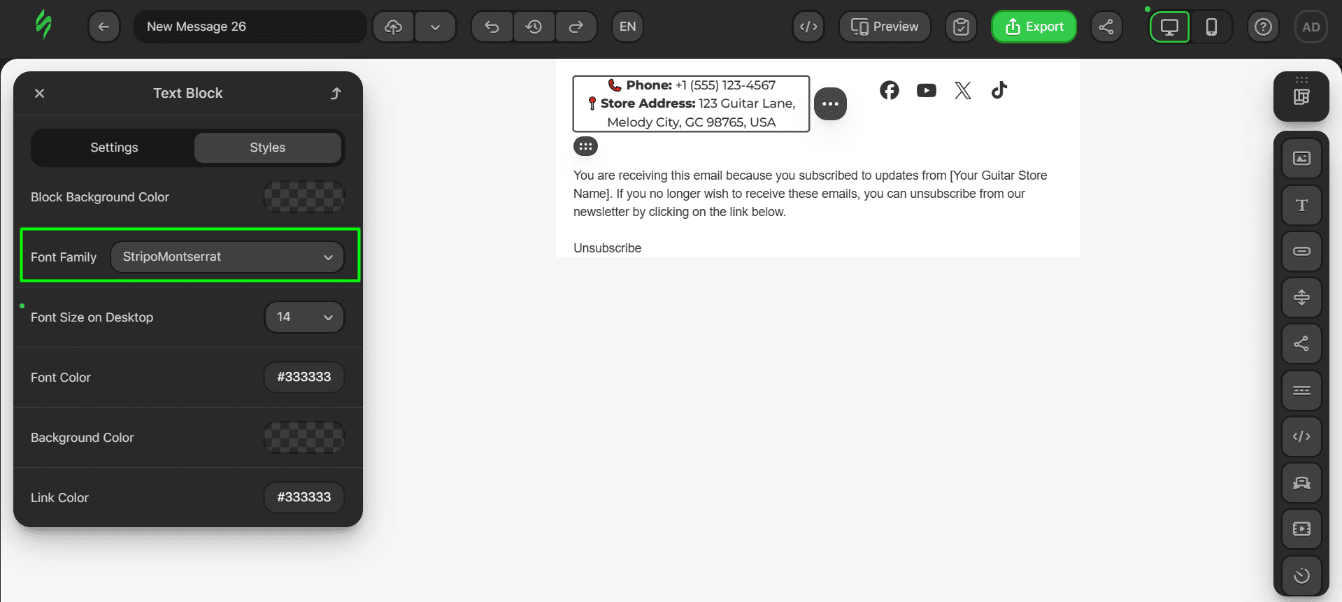
- after that, change the font of our text.
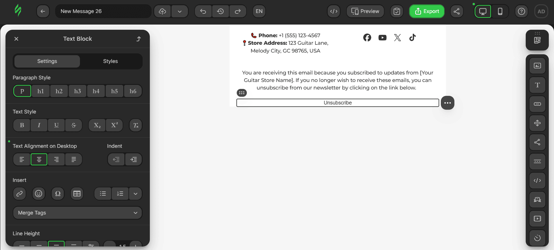
The same steps are to be used for all of the Text blocks. Ultimately, your email footer should look like this:
Now, it’s time to tweak the paddings. These are the paddings for the Social Networks block.
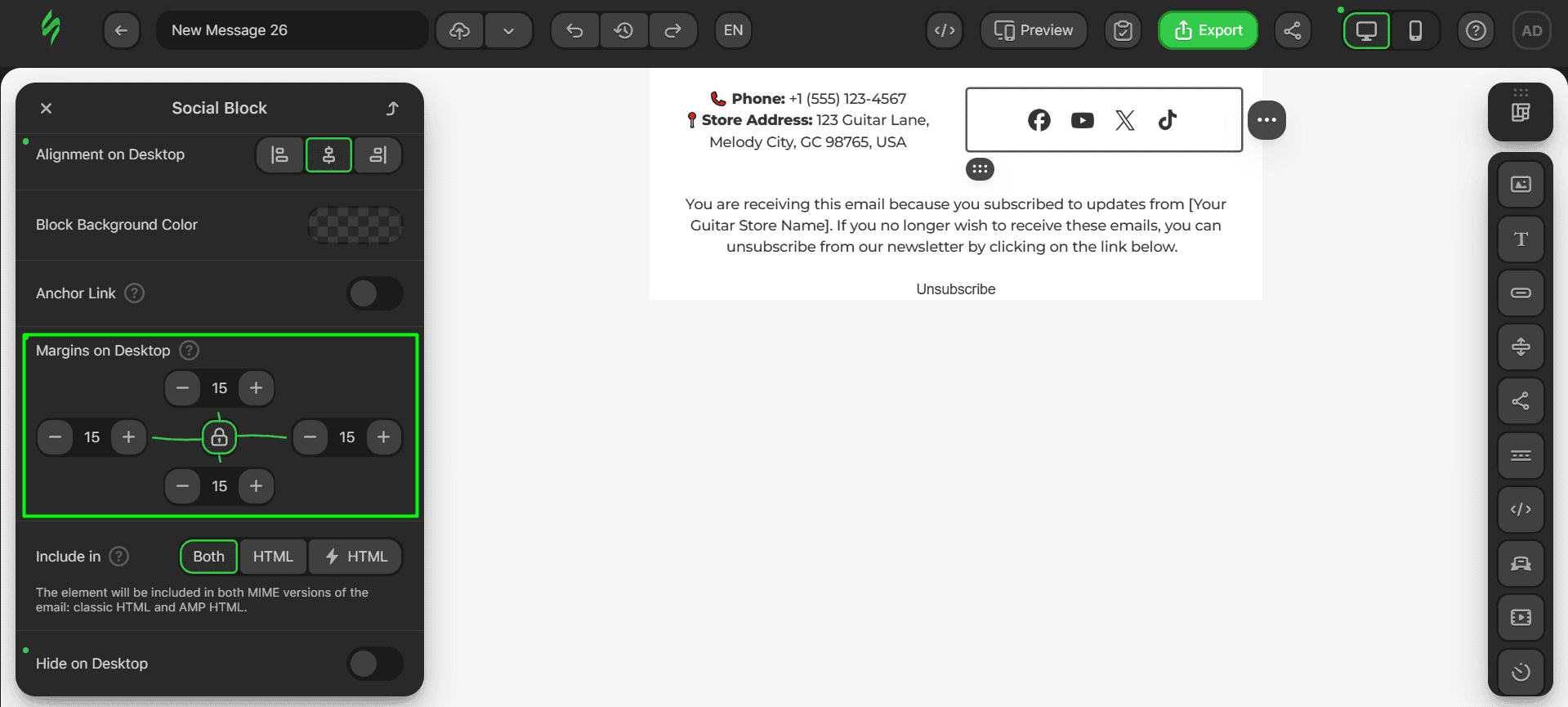
Here are the paddings for the Text block in the middle of the footer.
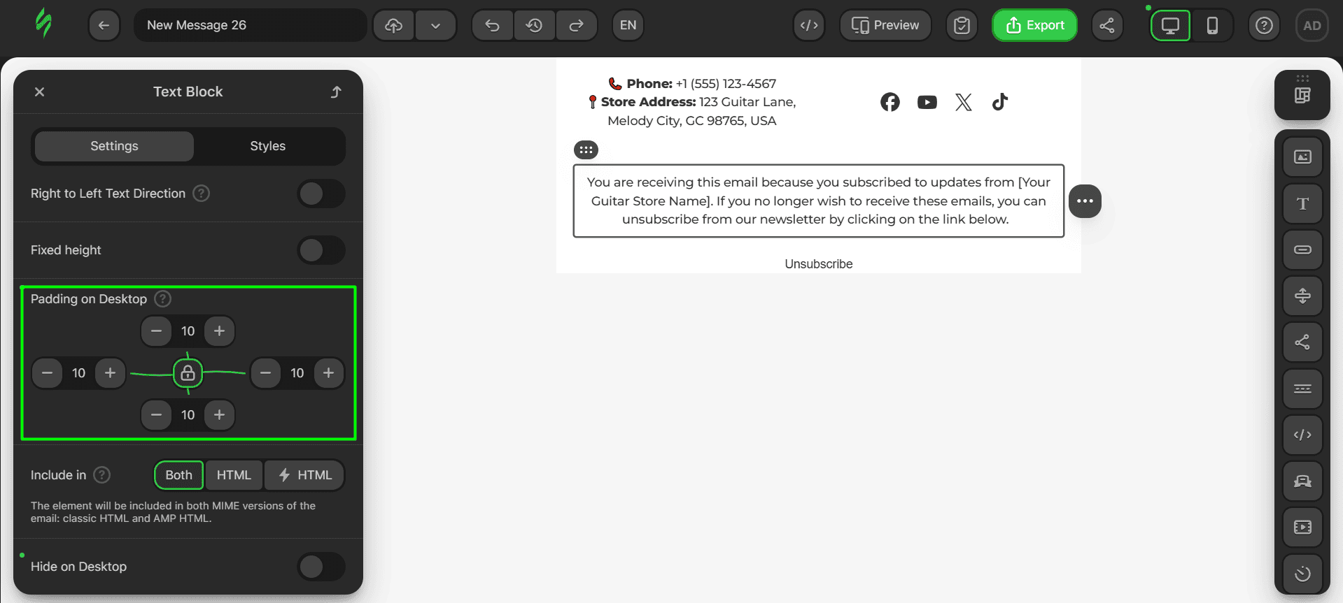
Finally, these are the paddings for the “Unsubscribe” button.
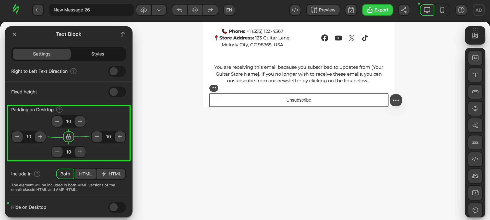
Step #5. Saving the module
Let’s save this last module. The procedure for this is the same as before. Hover over the structure and click on the “Save as Module” button.
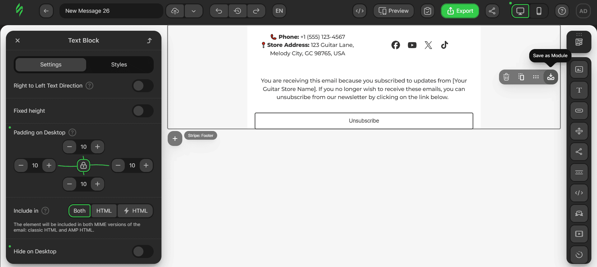
Add a name for the module and click on the “Save” button.
Synchronized modules
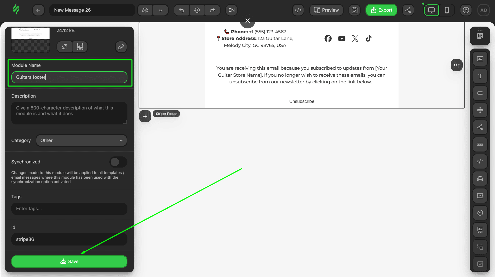
Synchronized modules are another tool that makes the life of email marketers easier. At its core lies the feature that makes it so that whenever you make changes to a synchronized module within just a specific template or email, the changes automatically get applied to all other templates and emails in which that module is used.
Any module can be saved as a synchronized module. To do this, click on the “Synchronized” switch and save the module.
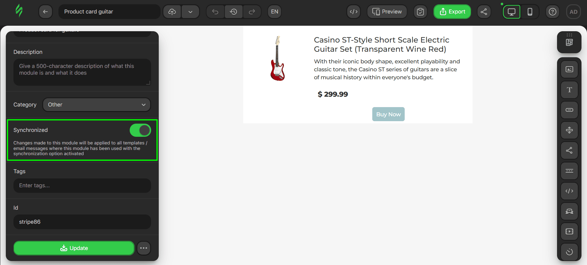
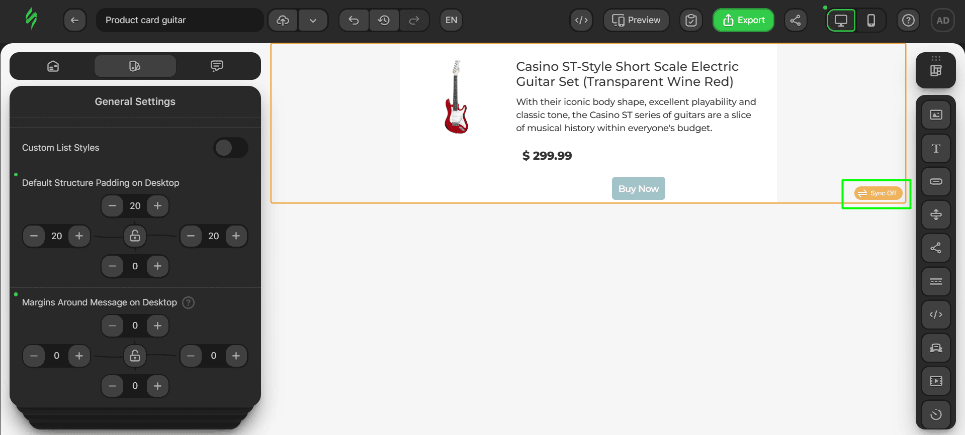
Once you do this, the module will obtain an orange frame and “Sync Off” button, which indicate that the feature has not been activated yet.
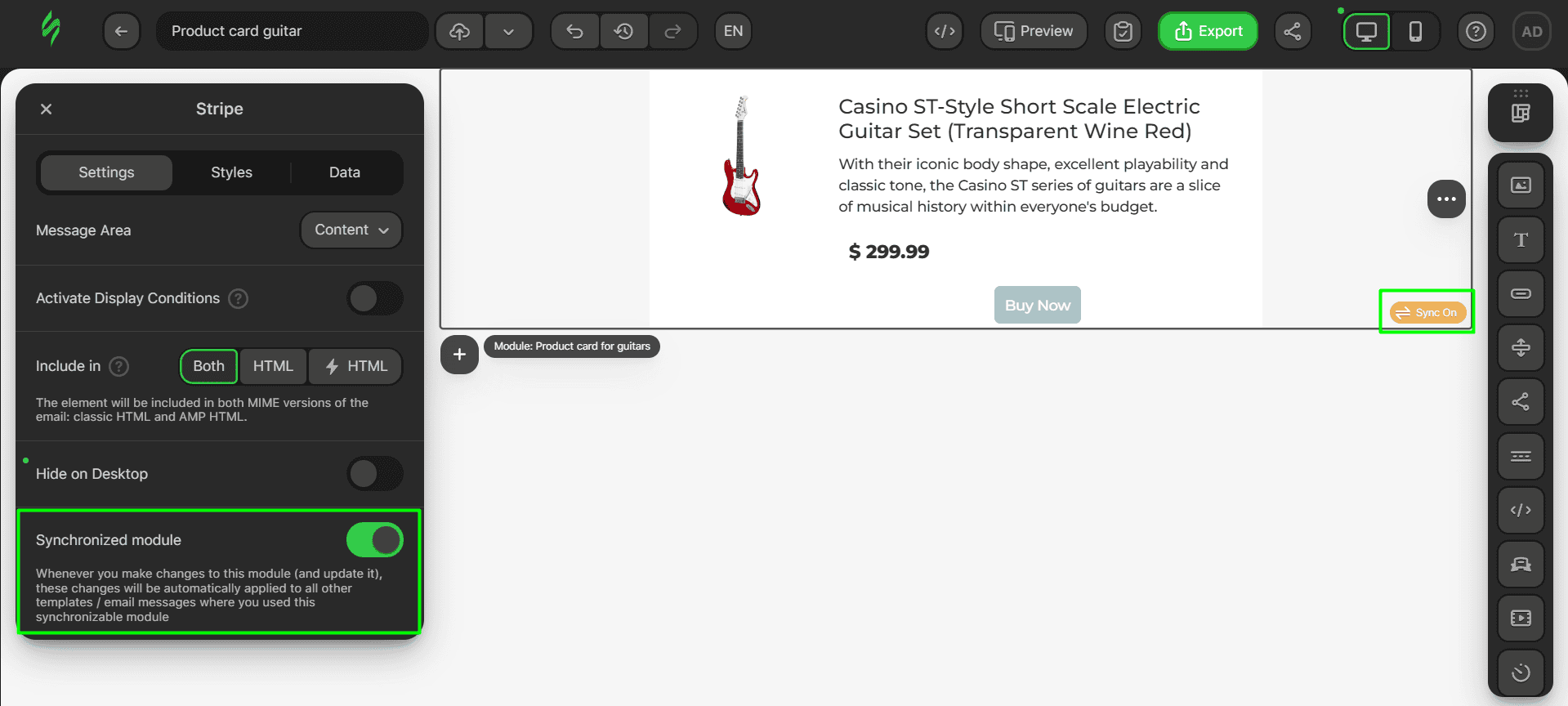
To activate the synchronization feature, click on the “Sync Off” button to open the settings and then click on the “Synchronized module” switch. Your “Sync Off” sign will change to “Sync On,” which means that the feature has been activated. Now, any change you make to this module will automatically be applied to all emails that contain this module. To turn the feature off, simply click on the “Synchronized module” switch again.
Smart elements: What are they, and how to use them?
Let’s talk about a vital component for product cards that we mentioned earlier: smart elements. Imagine that you’ve created your product card module and have started using it. You drag and drop it into your template and seem to be good to go. But there’s a catch with product cards: you need to update them for each email, with new goods, new photos, new descriptions, or new prices. Well, you get the idea.
This is where our smart elements come into play. A smart element is a structure, container, or stripe in which all the same basic blocks are present, such as Image, Text, and Button blocks; but for these, the option of obtaining data via variables from external sources is activated.
- first, to use this feature, click on the structure and go to the “Data” tab;
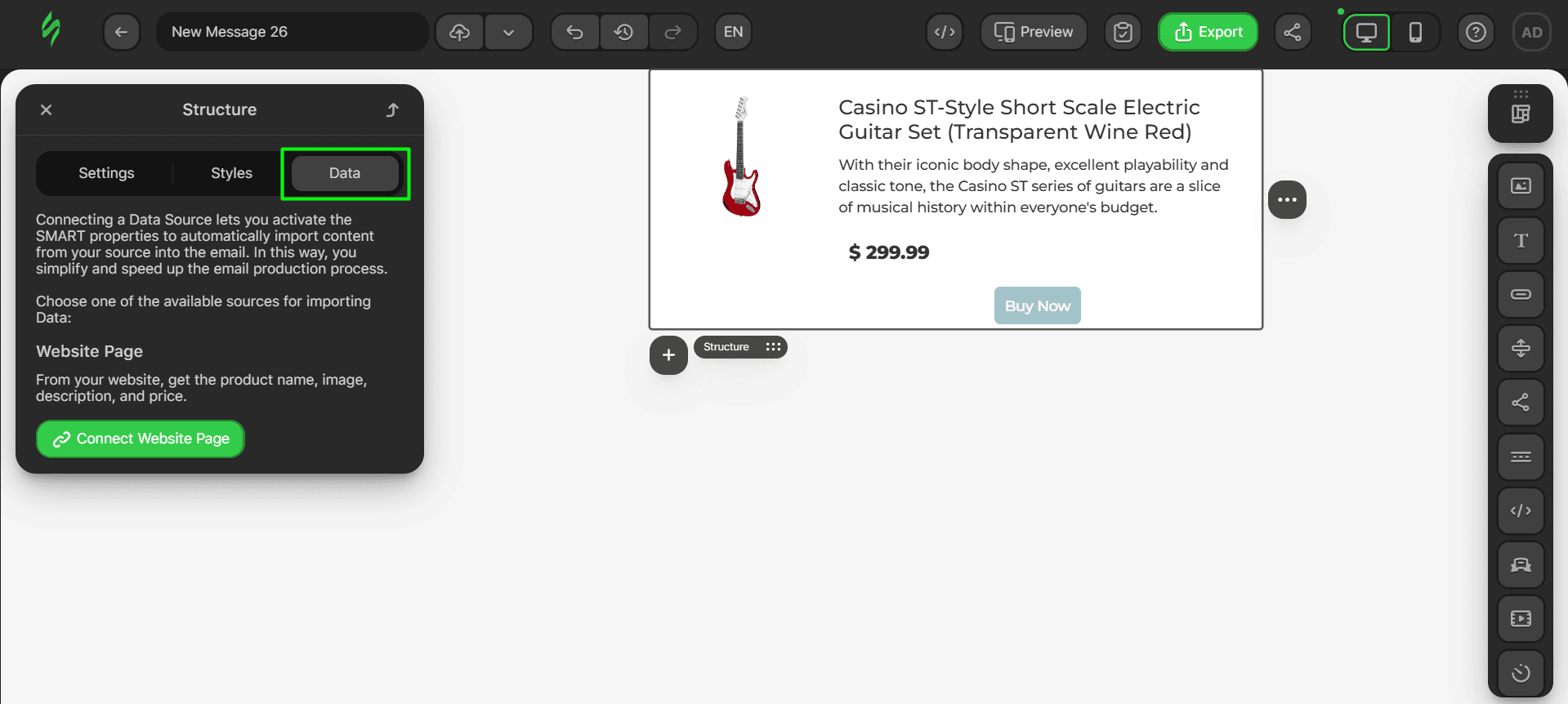
- click on the “Connect Website Page” button to activate the smart feature.
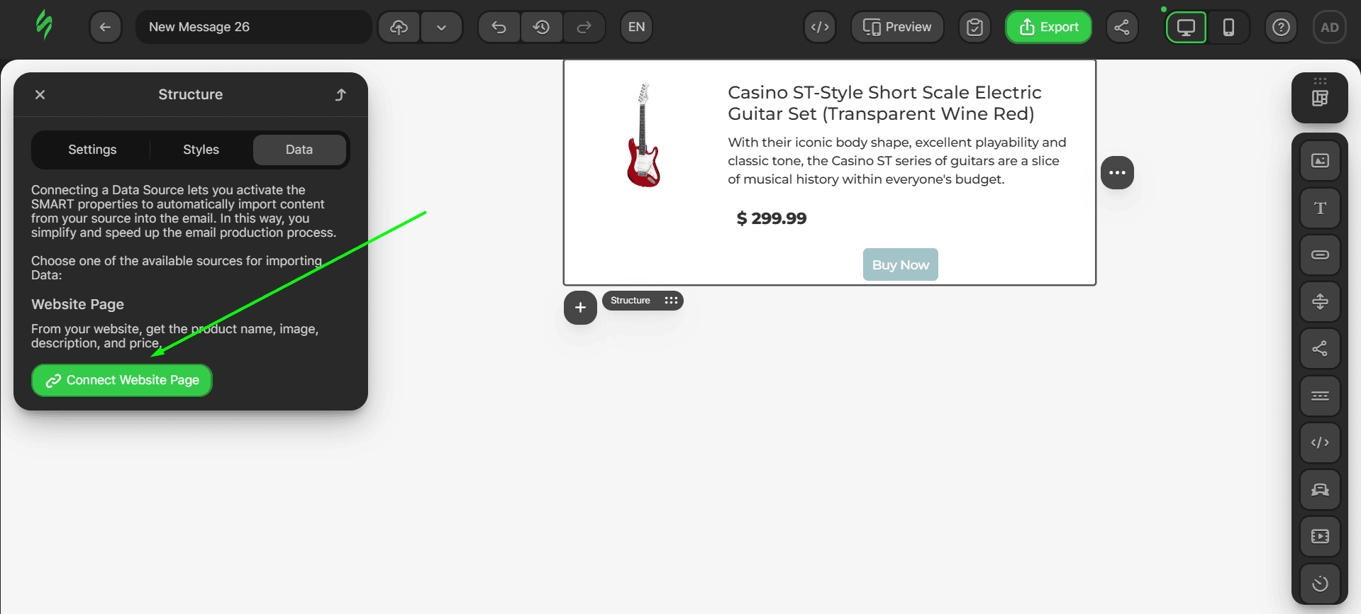
Now, our structure has been converted into a smart structure. It is also able to recognize our Text blocks as Title, Description, and Price, which will be subsequently needed to receive the associated data from the source.
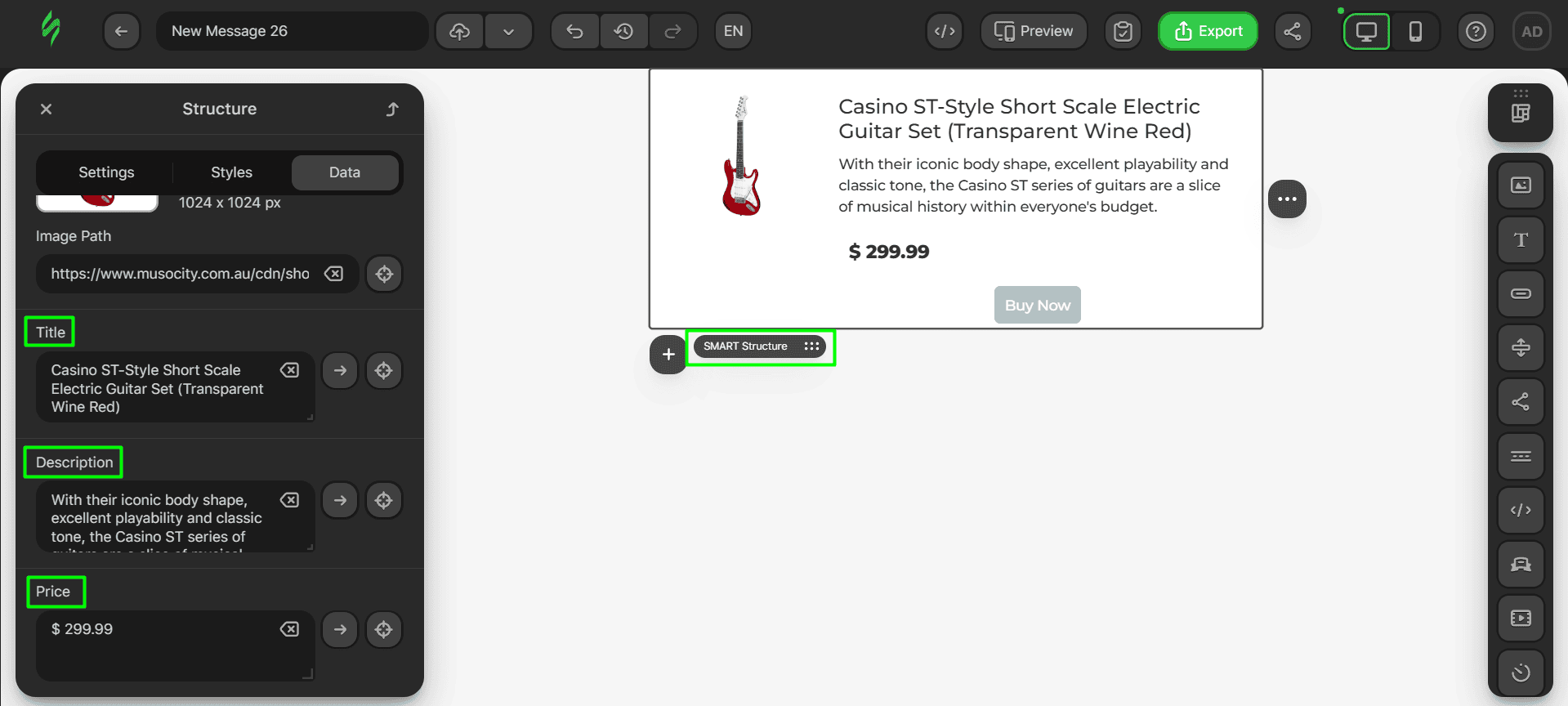
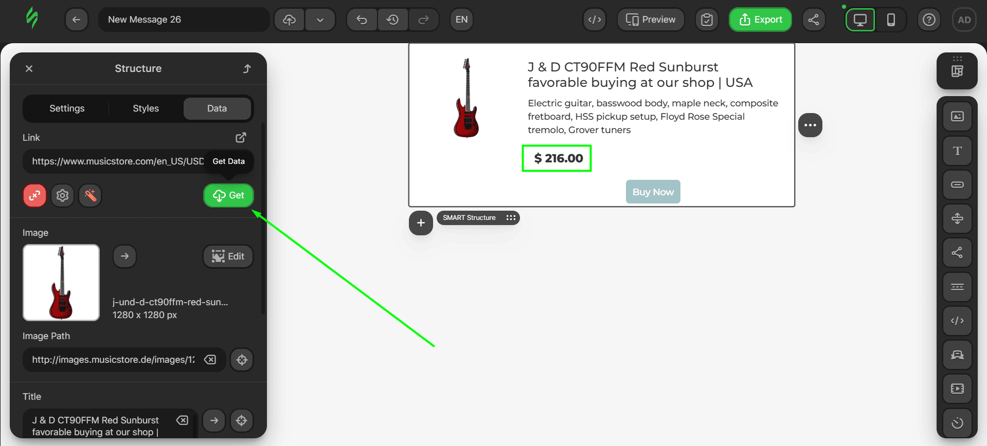
Now, let’s take some information from the website page. Imagine that you need to change the product shown in this card. This entails changing the title, description, price, and photo, which, if done manually, is time-consuming. However, using smart elements, you can simply paste your product page link in the designated field, and the smart element will obtain the associated data and place it in the corresponding fields.
Let’s consider a web page for a new guitar. Copy its link and paste it in the smart element.
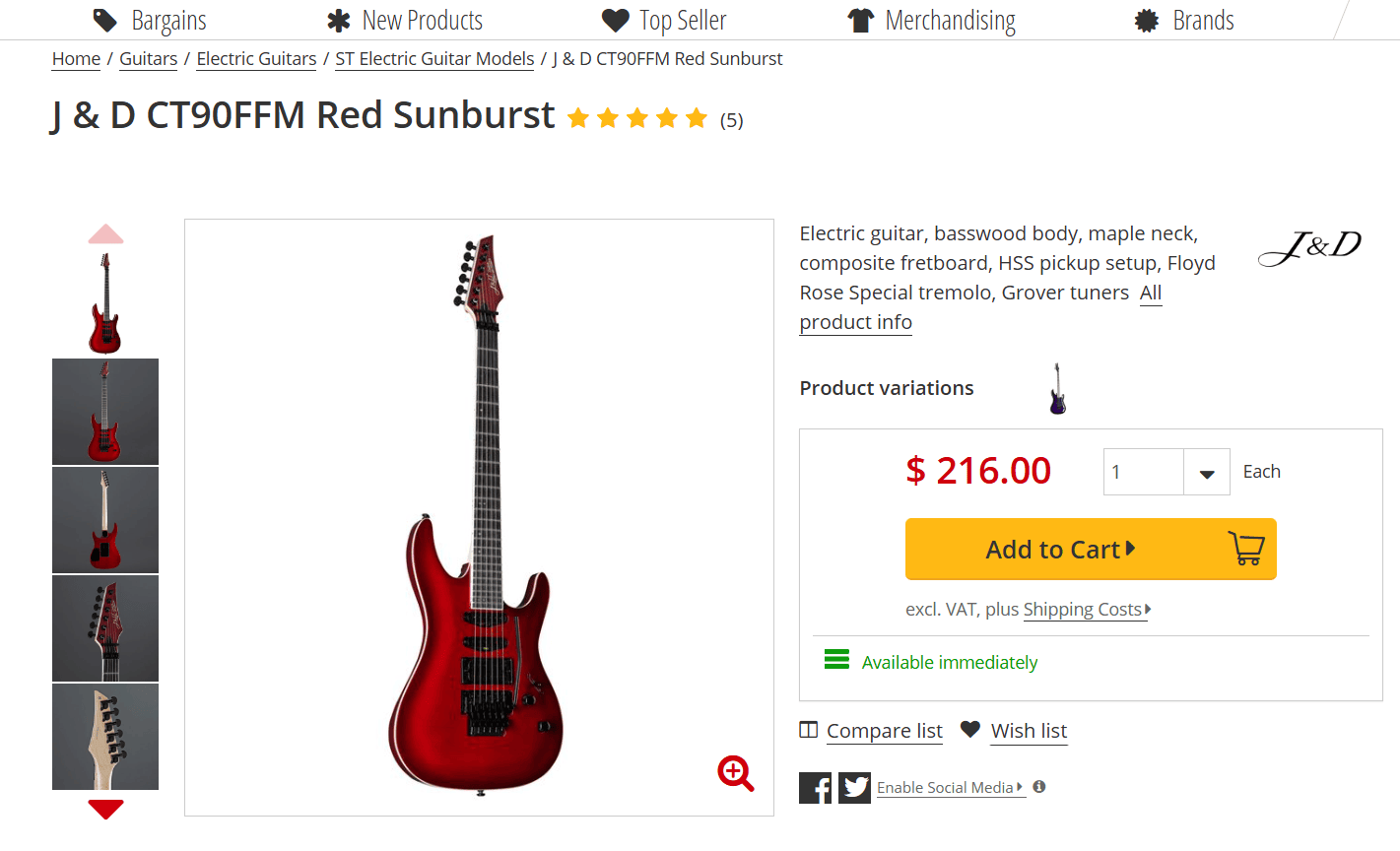
- copied links must be pasted into this field;
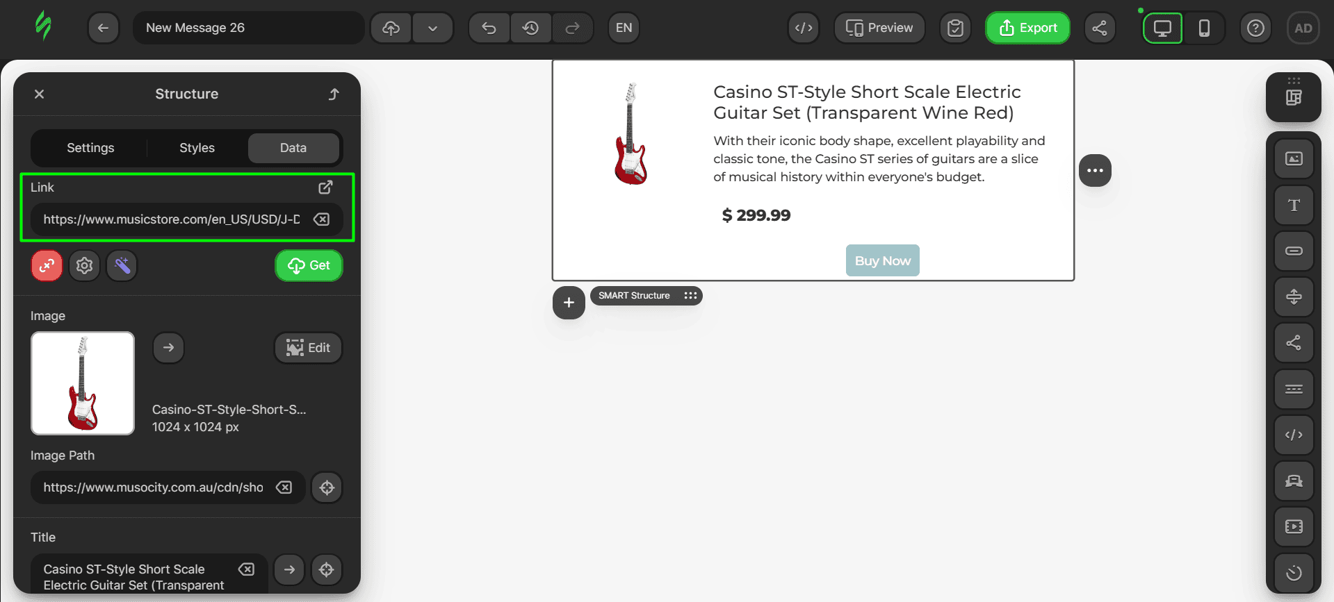
- to pull the data from the page, click on the “Get” button.
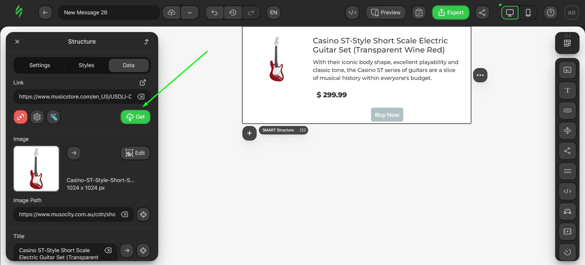
Voilà, we’ve got our new image, title, and product description. However, the price is still the same.

This is the catch with smart modules. Since they search for the relevant parameters and, consequently, pull the associated data, sometimes, they are unable to obtain them because parameters such as price can have a custom ID that differs from the standard ones.

To fix this, you need to manually enter the direction rule for our smart element to find the price on your website.
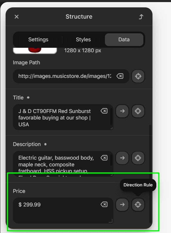
- to do this, click on the button with a crosshair sign to open the Direction Rule settings;
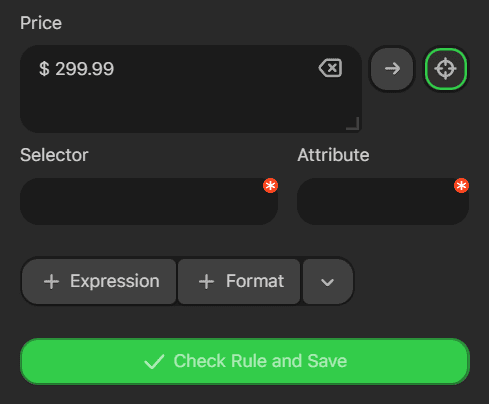
- go to the web page of the product and press the F12 button to open the page code;
- click on the arrow button and then hover over the product price. The line that is now highlighted in the code is your price selector;
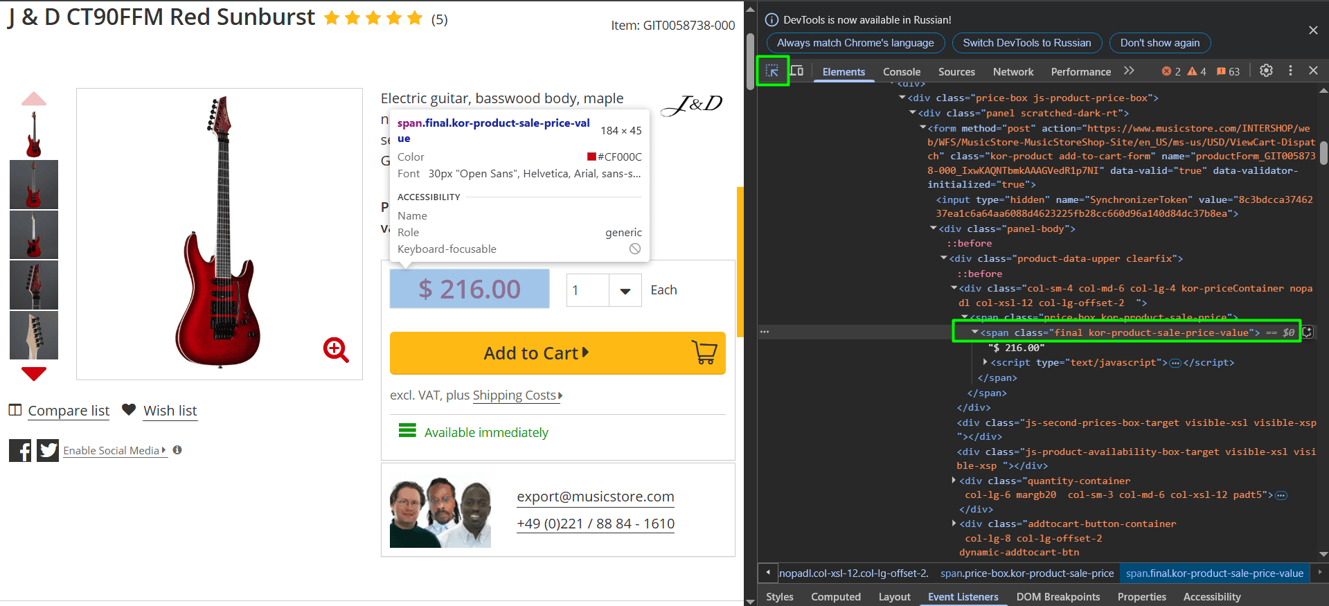
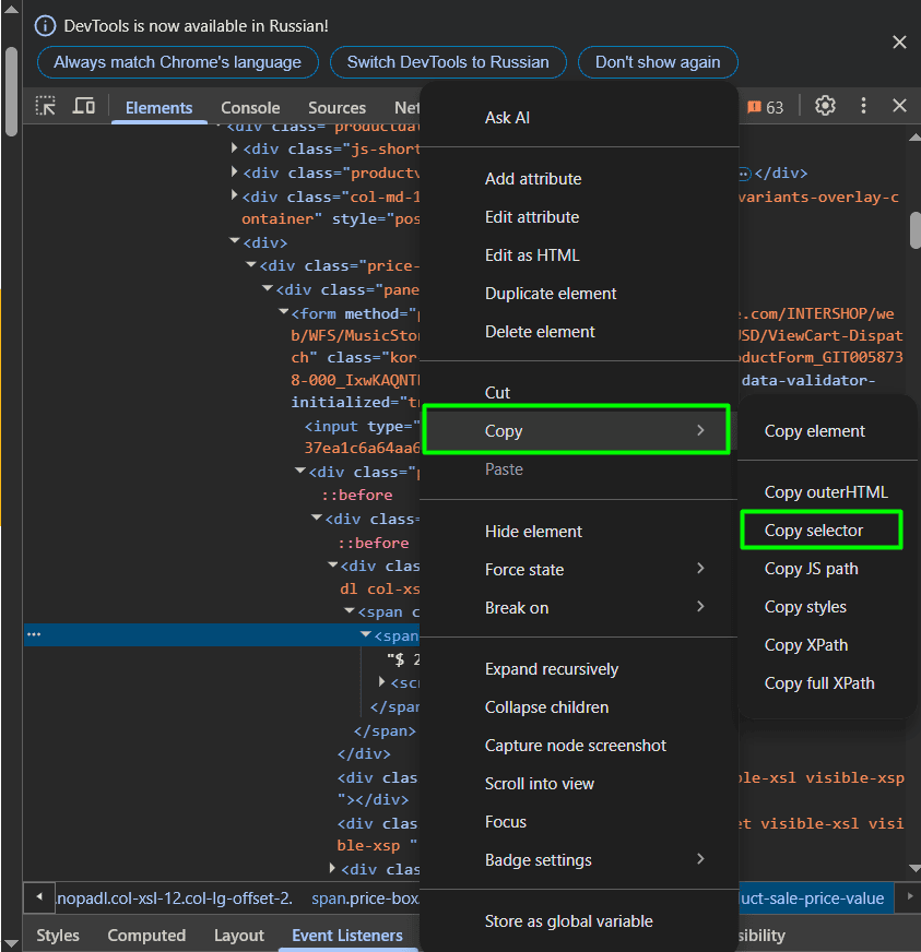
- copy it by right-clicking on it and selecting “Copy” and then clicking on “Copy selector”;
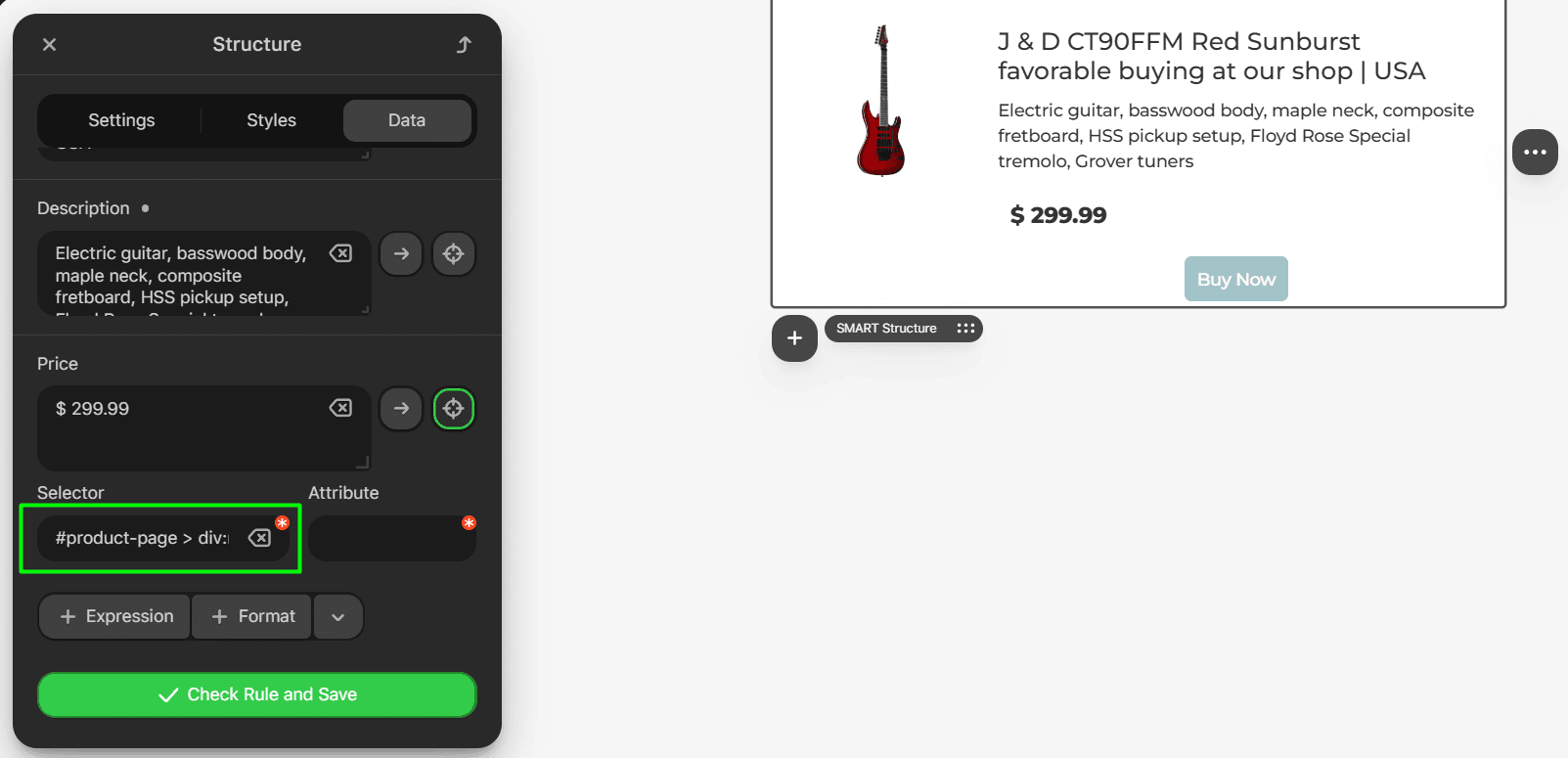
- next, paste this selector into the “Selector” field;
- save the changes by clicking on the “Check Rule and Save” button.
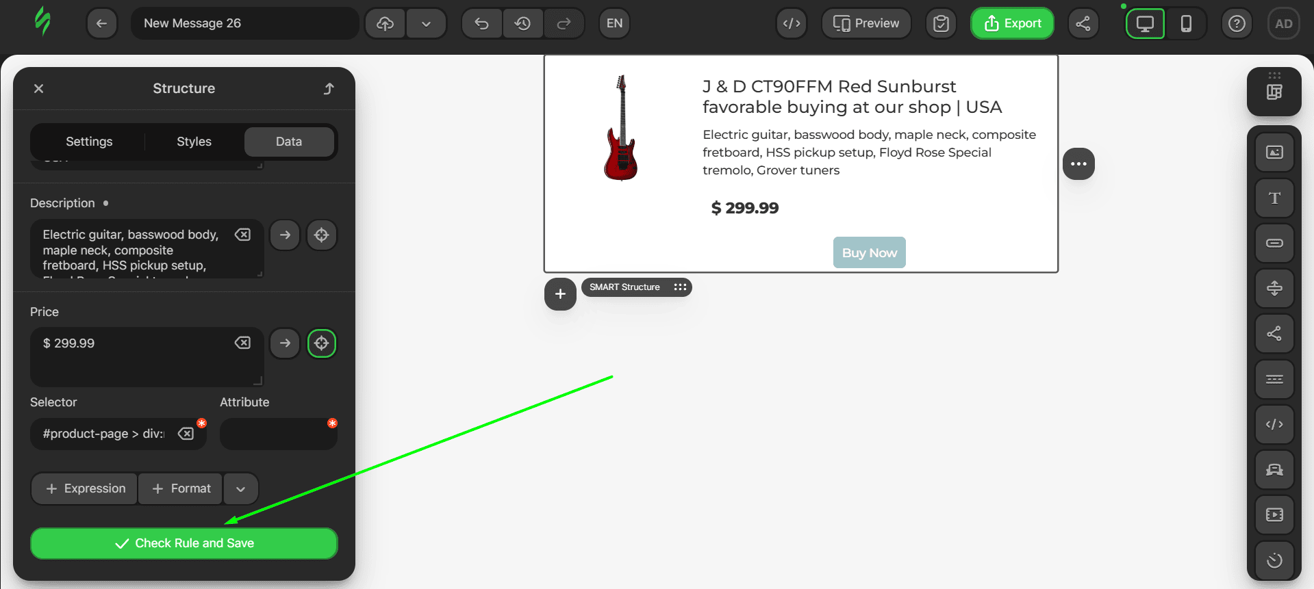
Now when you repeat the data retrieval process, the price should be the same as the one shown on your web page.
To learn more about smart elements, check out our Help Center article.
Tweaking smart elements with GenAI
To make editing your product cards simpler and quicker, we’ve implemented a GenAI feature that improves the text of your smart elements. This feature not only saves you time but also boosts your email performance, as the unified approach to GenAI copy creation increases CTOR by 41.34%.
For example, let’s consider you have a product card module that is a smart element. While it looks good at first glance, the text part may seem a bit dry. Instead of brainstorming over how to make it sound catchier, you can simply use our feature powered by GenAI.
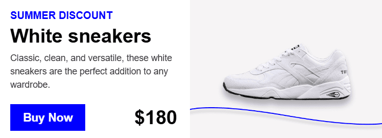
- first, you need to click on the structure to open its settings (it’s important to select the whole structure for GenAI to better grasp the complete context and generate better text);
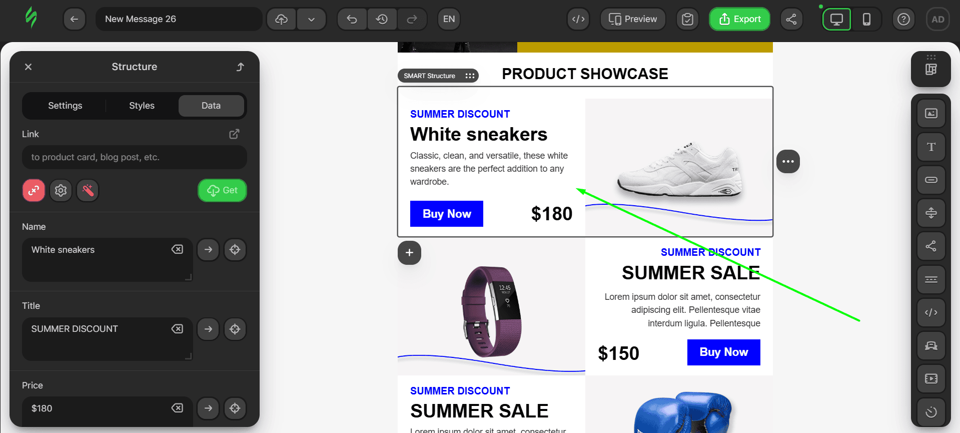
- next, click on the button with a magic wand to modify your smart structure using GenAI;
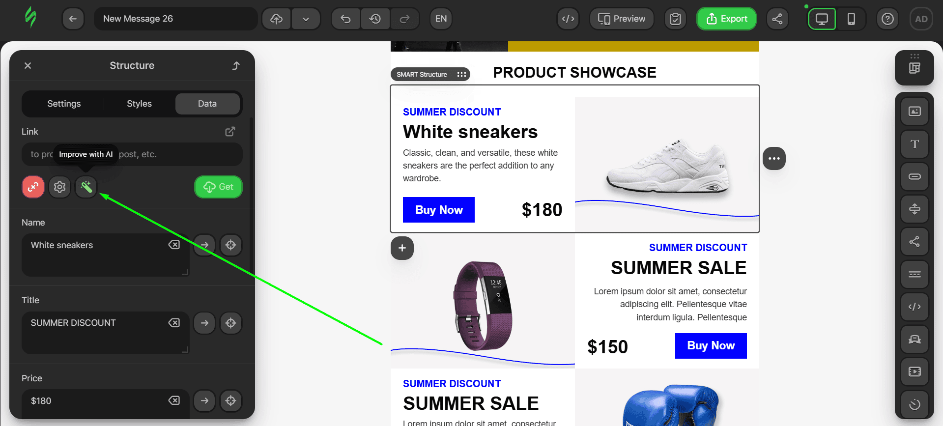
- in a matter of seconds, your text will be updated to an enhanced version created by GenAI.
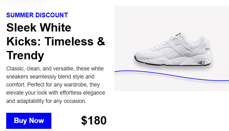
Now that’s more like it. The new text is definitely catchier and conveys emotions. You can use our GenAI feature as many times as you like until you obtain a result that satisfies you.
Wrapping up
This guide may be quite long, but that’s the price for covering all you need to know about modules and how to create the right ones for your product card email. Learning this process once will save you hundreds of hours in the future and will make the process of designing your emails much smoother.
Modules can turn email creation into a simple process of creating a library of reusable content that can be modified and updated in a few clicks, which is important for e-commerce businesses that have to satisfy ever-changing customer needs. So don’t be afraid to use modules, as they can serve as your ultimate tool for changing your email design game.




0 comments