Making emails more compact: Manual for adding Tabs in email


In email design, there is a constant tension between the volume of content and the practicality of the email, often necessitating compromises. It is a common experience to delete sections of content to avoid making the email excessively lengthy.
Our new mechanism, referred to as Tabs, aims to address this issue. This article will explain the concept of Tabs and provide detailed instructions on how to integrate Tabs into your emails.
Understanding Tabs interactivity
The Tabs interactivity mechanism is designed to fit a large amount of information into a small space, allowing emails to be more compact without sacrificing content. This feature enables you to place content in special tabs that recipients can flip through to view all the information you want to present. For instance, you can organize multiple articles, menus from different restaurants, various schedules, product descriptions, or catalogs of goods for different demographics (women, men, children) within tabs. This tool is advantageous as it allows you to deliver comprehensive information to the recipient while maintaining a concise email format.
Next, we will guide you through the creation process. We will demonstrate how to create an AMP version, as well as an interactive HTML and fallback version, ensuring that your emails are compatible with all possible email clients. This approach maximizes the likelihood that your subscribers will be able to see and interact with the tabs you create.
We will show you step-by-step how to craft an email incorporating AMP, interactive HTML, and a fallback version to ensure optimal compatibility and engagement across all email clients.
Creating an AMP version of email Tabs
First, let’s discuss the AMP version of email Tabs. For this, we use the amp-selector component, which is a list of elements or options that allows the recipient to select one or more options.
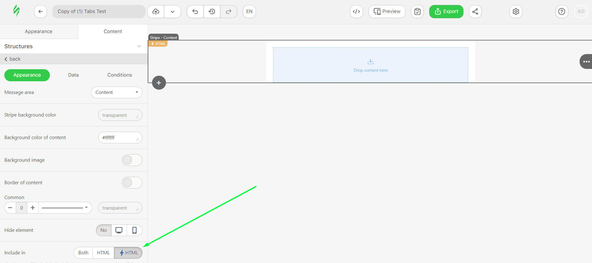
First, add an empty structure to the email and specify that it should be included only in AMP HTML.
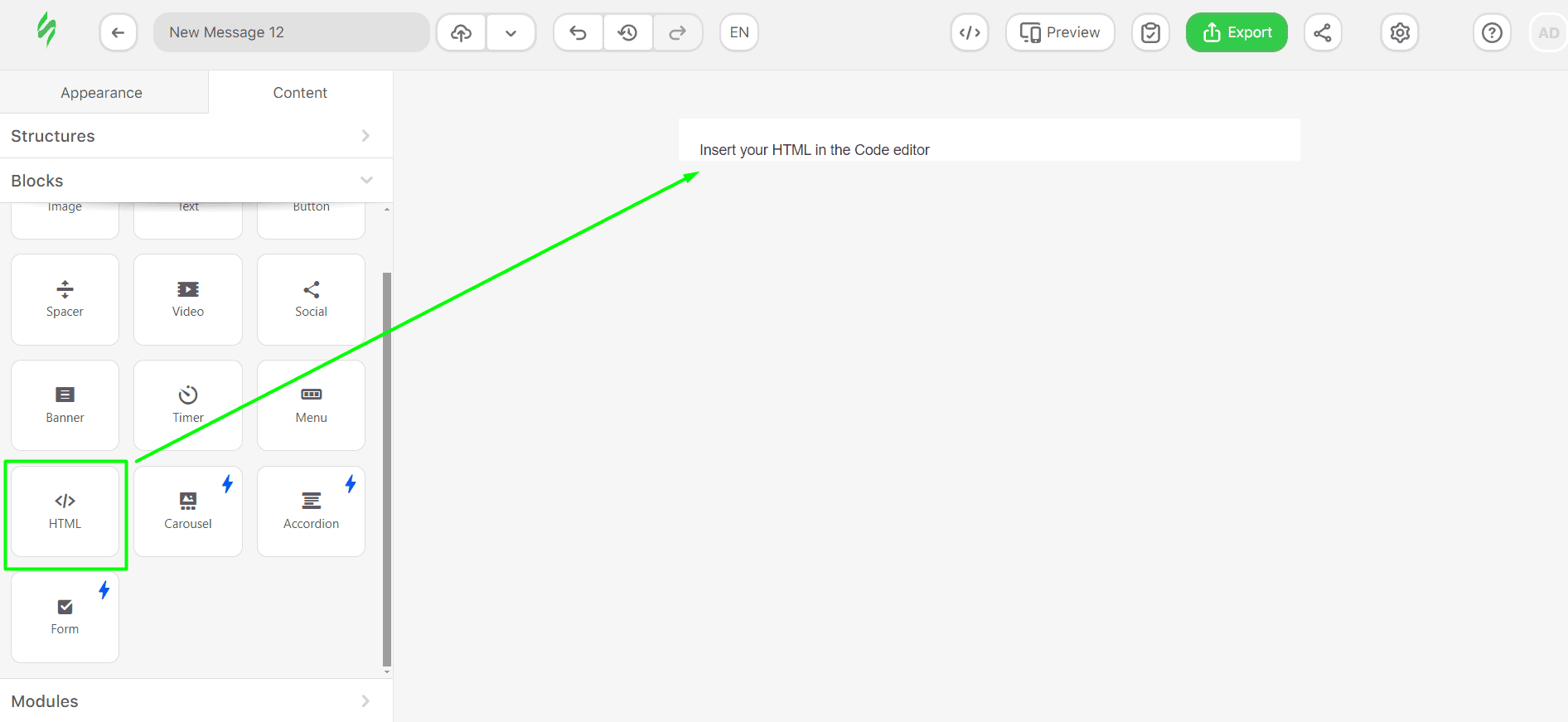
Next, add an HTML block to this structure.
Once it is done, insert the following code into the HTML block:
<amp-selector class="tabs-amp" role="tablist">
    <div id="tab1" class="tab-title" role="tab" aria-controls="tabpanel1" option selected>
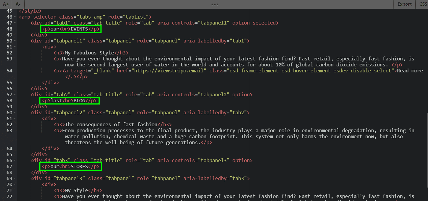
        <p>our<br>EVENTS</p>
    </div>
    <div id="tabpanel1" class="tabpanel" role="tabpanel" aria-labelledby="tab1">
        <div>
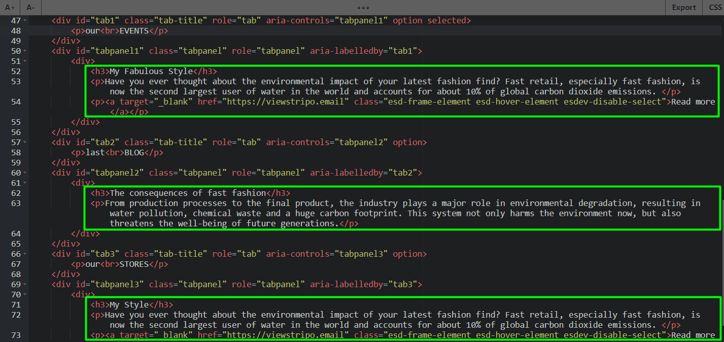
            <h3>My Fabulous Style</h3>
            <p>Have you ever thought about the environmental impact of your latest fashion find? Fast retail, especially fast fashion, is now the second largest user of water in the world and accounts for about 10% of global carbon dioxide emissions. </p>
            <p><a target="_blank" href="https://viewstripo.email">Read more</a></p>
        </div>
    </div>
    <div id="tab2" class="tab-title" role="tab" aria-controls="tabpanel2" option>
        <p>last<br>BLOG</p>
    </div>
    <div id="tabpanel2" class="tabpanel" role="tabpanel" aria-labelledby="tab2">
        <div>
            <h3>The consequences of fast fashion</h3>
            <p>From production processes to the final product, the industry plays a major role in environmental degradation, resulting in water pollution, chemical waste and a huge carbon footprint. This system not only harms the environment now, but also threatens the well-being of future generations.</p>
        </div>
    </div>
<div id="tab3" class="tab-title" role="tab" aria-controls="tabpanel3" option>
        <p>our<br>STORES</p>
    </div>
<div id="tabpanel3" class="tabpanel" role="tabpanel" aria-labelledby="tab3">
        <div>
            <h3>My Style</h3>
            <p>Have you ever thought about the environmental impact of your latest fashion find? Fast retail, especially fast fashion, is now the second largest user of water in the world and accounts for about 10% of global carbon dioxide emissions. </p>
            <p><a target="_blank" href="https://viewstripo.email">Read more</a></p>
        </div>
    </div>
</amp-selector>
Pasting the code will create the frame of the future tabs, which will look like this:
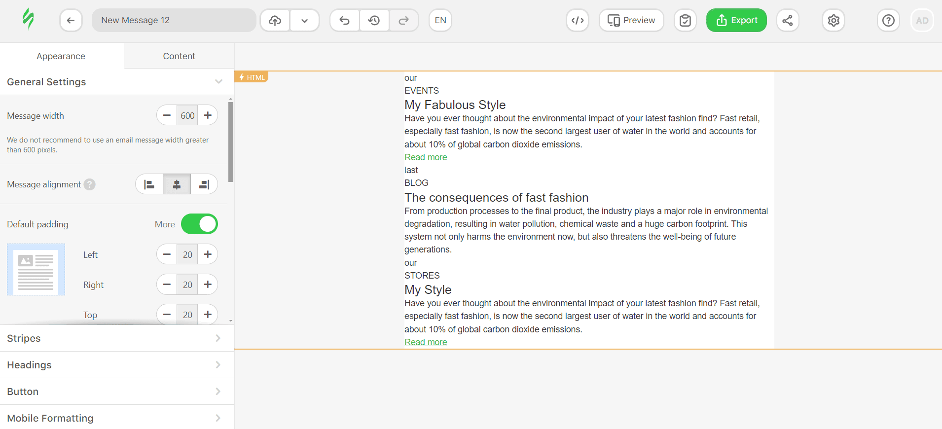
All the code for the Tabs is contained within the AMP selector <amp-selector class="tabs-amp" role="tablist">. Let’s examine the contents to understand the role of each component in detail.

Let's begin with role="tablist", an attribute that specifies that the selector will function as a tabbed interface.
Next are the headers, which switch the contents of the tabs. They look like this:
<div id="tab1" class="tab-title" role="tab" aria-controls="tabpanel1" option selected><p>our<br>EVENTS</p></div>
This part of the code consists of several components that are worth examining individually:
- id="tab1": This is the tab identifier used to bind to the content (specified in the “aria-labelledby” attribute of the element below the content). The number increments sequentially, such as tab1, tab2, tab3, and so on.
- role="tab": This attribute indicates that the element functions as a tab-switching button.
- aria-controls="tabpanel1": This attribute specifies the ID of the content block that will be displayed when the recipient clicks on this header.
- option: This required attribute for the amp selector indicates that the element is selectable.
- selected: This attribute is added to only one element, making it the default selected tab. In our example, it is applied to the first header.
Now let’s discuss the block containing the tab contents, which is framed by the following code:
<div id="tabpanel1" class="tabpanel" role="tabpanel" aria-labelledby="tab1">...</div>.
Key elements of this code include the following:
- id="tabpanel1": This identifier is used to bind the content block to the corresponding tab (specified in the “aria-controls” attribute of the element above). The number increments sequentially as tabpanel1, tabpanel2, tabpanel3, etc.
- role="tabpanel": This attribute indicates that the element functions as a tab panel (a block containing the tab content).
- aria-labelledby="tab1": This attribute specifies the ID of the tab that needs to be clicked to display this content block.
Creating styles
At this stage, we have only completed the technical part of the functionality. Now, it is time to enhance the appearance by adding styles. To make the tabs visually appealing, we insert the following code right above the amp-selector:
<style amp-custom>
    .tabs-amp {
        display: flex;
        flex-wrap: wrap;
    }

    .tabs-amp .tab-title {
        background: #f8f3ef;
        border-bottom: 2px solid #f8f3ef;
        flex-grow: 1;
        text-align: center;
    }

    .tabs-amp .tab-title p {
        display: block;
        padding: 20px 0;
        color: #64434a;
        font-size: 20px;
    }

    .tabs-amp .tab-title[selected] {
        background: #f4cccc;
        border-bottom: 2px solid #64434a;
        outline: none;
    }

    .tabs-amp .tabpanel div {
        padding: 30px 30px 15px;
    }

	.tabs-amp .tabpanel h3,
    .tabs-amp .tabpanel p {
        padding-bottom: 15px;
    }


    .tabs-amp [role=tabpanel] {
        display: none;
        width: 100%;
        order: 1;
    }

    .tabs-amp [role=tab][selected]+[role=tabpanel] {
        display: block;
    }
</style>
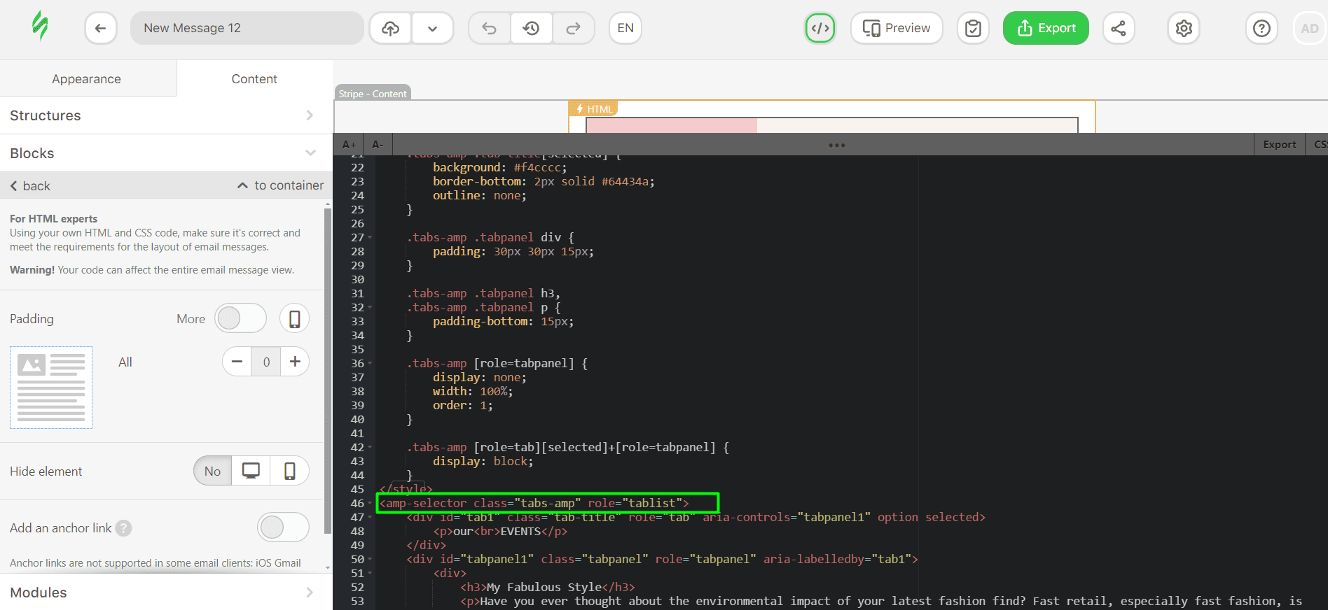
Once we have done this, the whole tab element will look like this:
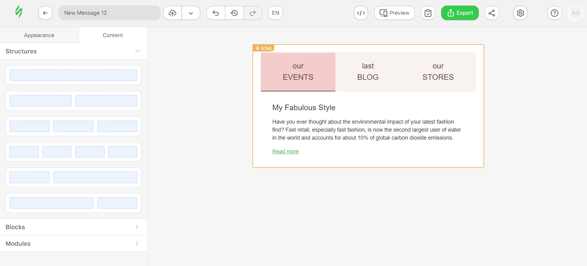
The styles themselves can be divided into several small blocks based on their functionality.
Customizing the selected tab style
As the name suggests, this style is responsible for the appearance of the currently selected element, and in code, it looks like this:
.tabs-amp .tab-title[selected] {
background: #f4cccc;
border-bottom: 2px solid #64434a;
outline: none;
}
To customize these styles, choose the respective parameters:
- background
- border-bottom
- outline
Modifying the color scheme and adjusting the borders will enhance the appearance of active tabs.
Mechanics of operation styles
These styles are essential for ensuring the overall functionality from a visual perspective, specifically for switching tabs. Initially, all blocks containing content are hidden using a specific style, implemented with the following code:
.tabs-amp [role=tabpanel] { display: none;width: 100%;order: 1; }
After this, a specialized code is required to display the contents of the active tab:
.tabs-amp [role=tab][selected]+[role=tabpanel] { display: block; }
Customizing inactive tabs styles
To customize the styles of inactive tabs, you can modify attributes such as background, color, and font size by using the following style code:
.tabs-amp .tab-title-1[selected] {
        background: #f4cccc;
        border-bottom: 2px solid #f4cccc;
    }

    .tabs-amp .tabpanel-1 {
        background: #f4cccc;
    }

    .tabs-amp .tab-title-2[selected] {
        background: #c3c3ff;
        border-bottom: 2px solid #c3c3ff;
    }

    .tabs-amp .tabpanel-2 {
        background: #c3c3ff;
    }

    .tabs-amp .tab-title-3[selected] {
        background: #f7ed8b;
        border-bottom: 2px solid #f7ed8b;
    }

    .tabs-amp .tabpanel-3 {
        background: #f7ed8b;
    }
For the code to function correctly, it should be added as an additional code block in the styles section, immediately before the closed styles:
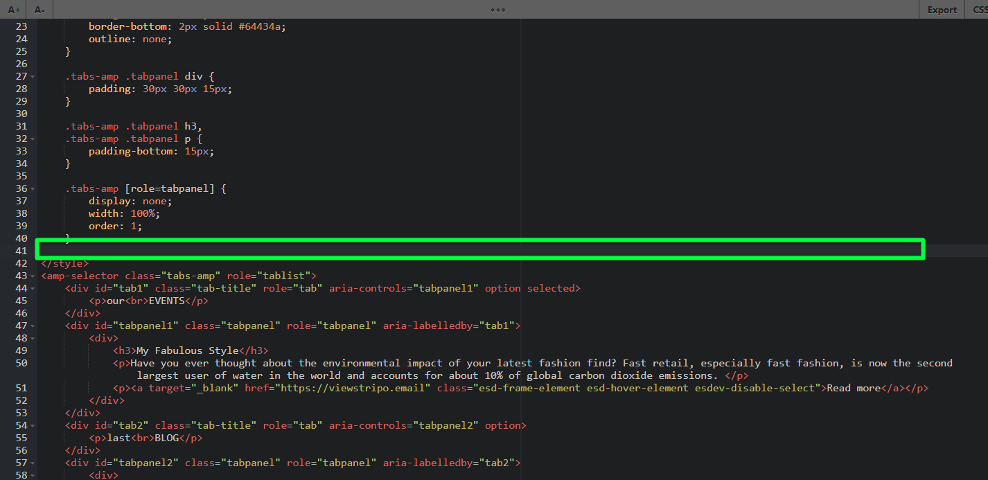
By changing these parameters for each tab, you can set a unique background for your tabs.
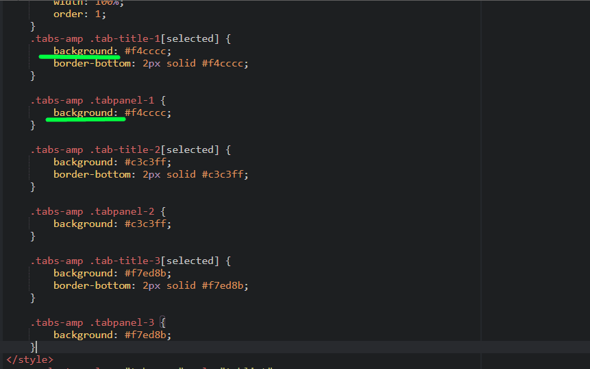
If there is a need to make each tab and corresponding content block (where all your information within the tab is saved) to have the same background color, we need to add different classes to each element and style with color.
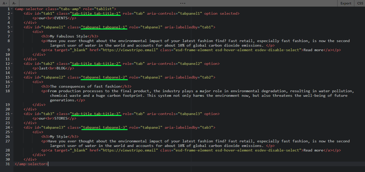
Here is the whole piece of code shown in the screenshot:
<amp-selector class="tabs-amp" role="tablist">
    <div id="tab1" class="tab-title tab-title-1" role="tab" aria-controls="tabpanel1" option selected>
        <p>our<br>EVENTS</p>
    </div>
    <div id="tabpanel1" class="tabpanel tabpanel-1" role="tabpanel" aria-labelledby="tab1">
        <div>
            <h3>My Fabulous Style</h3>
            <p>Have you ever thought about the environmental impact of your latest fashion find? Fast retail, especially fast fashion, is now the second largest user of water in the world and accounts for about 10% of global carbon dioxide emissions. </p>
            <p><a target="_blank" href="https://viewstripo.email" class="esd-frame-element esd-hover-element esdev-disable-select">Read more</a></p>
        </div>
    </div>
    <div id="tab2" class="tab-title tab-title-2" role="tab" aria-controls="tabpanel2" option>
        <p>last<br>BLOG</p>
    </div>
    <div id="tabpanel2" class="tabpanel tabpanel-2" role="tabpanel" aria-labelledby="tab2">
        <div>
            <h3>The consequences of fast fashion</h3>
            <p>From production processes to the final product, the industry plays a major role in environmental degradation, resulting in water pollution, chemical waste and a huge carbon footprint. This system not only harms the environment now, but also threatens the well-being of future generations.</p>
        </div>
    </div>
    <div id="tab3" class="tab-title tab-title-3" role="tab" aria-controls="tabpanel3" option>
        <p>our<br>STORES</p>
    </div>
    <div id="tabpanel3" class="tabpanel tabpanel-3" role="tabpanel" aria-labelledby="tab3">
        <div>
            <h3>My Style</h3>
            <p>Have you ever thought about the environmental impact of your latest fashion find? Fast retail, especially fast fashion, is now the second largest user of water in the world and accounts for about 10% of global carbon dioxide emissions. </p>
            <p><a target="_blank" href="https://viewstripo.email" class="esd-frame-element esd-hover-element esdev-disable-select">Read more</a></p>
        </div>
    </div>
</amp-selector>
Modifying texts
Adding custom text to the tabs is straightforward. Simply replace the example texts with your own in the designated code lines.
Important note: The process for changing texts in both AMP and interactive HTML versions is identical. Therefore, the instructions provided for the AMP version apply equally to the interactive HTML Tabs. If you need to modify texts for your interactive HTML Tabs, refer back to this section.
Editing a Tab name
To assign unique names to the tabs, modify the text within the following code lines. The <br> element can be used to insert a line break within a tab name if needed:
Changing texts inside the Tab
Inserting custom texts inside the tabs is also straightforward. There are specific lines in the code that hold the text, and you only need to replace the example texts with your custom content.
Adding links
Besides that, if you need to change the links, the only way to do that is through the code.
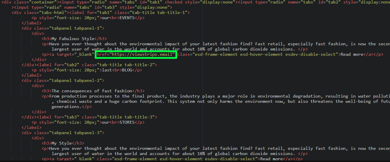
To add custom links, use the following code snippet as shown in the screenshot below, and replace the example link with your custom link:
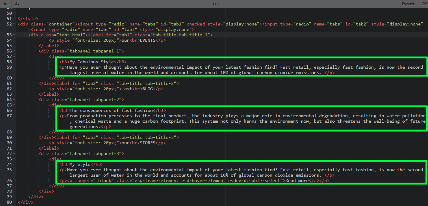
<p><a target="_blank" href="https://viewstripo.email" class="esd-frame-element esd-hover-element esdev-disable-select">Read more</a></p>
To ensure your link appears within the desired tab, paste this code with your custom link into the corresponding class of the tab you wish to modify:
Creating an interactive HTML version of email tabs
This section explains how to create an interactive HTML version of email tabs, tailored for compatibility with Apple Mail and Samsung Mail.
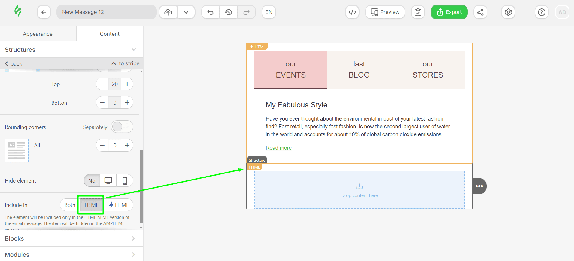
First, we insert an empty structure and select “include in HTML only”. After that, we pull the “HTML” block into the empty structure we just created and add the following code:
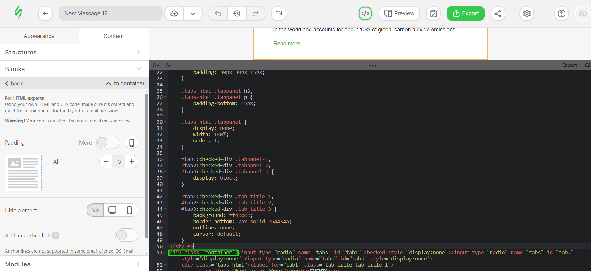
<div class="container">
	<input type="radio" name="tabs" id="tab1" checked style="display:none">
	<input type="radio" name="tabs" id="tab2" style="display:none">
	<input type="radio" name="tabs" id="tab3" style="display:none">
    <div class="tabs-html">
    	<label for="tab1" class="tab-title tab-title-1">
            <p style="font-size: 20px;">our<br>EVENTS</p>
        </label>
        <div class="tabpanel tabpanel-1">
            <div>
                <h3>My Fabulous Style</h3>
                <p>Have you ever thought about the environmental impact of your latest fashion find? Fast retail, especially fast fashion, is now the second largest user of water in the world and accounts for about 10% of global carbon dioxide emissions. </p>
                <p><a target="_blank" href="https://viewstripo.email">Read more</a></p>
            </div>
        </div>
        <label for="tab2" class="tab-title tab-title-2">
            <p style="font-size: 20px;">last<br>BLOG</p>
        </label>
        <div class="tabpanel tabpanel-2">
            <div>
                <h3>The consequences of fast fashion</h3>
                <p>From production processes to the final product, the industry plays a major role in environmental degradation, resulting in water pollution, chemical waste and a huge carbon footprint. This system not only harms the environment now, but also threatens the well-being of future generations.</p>
            </div>
        </div>
        <label for="tab3" class="tab-title tab-title-3">
            <p style="font-size: 20px;">our<br>STORES</p>
        </label>
        <div class="tabpanel tabpanel-3">
            <div>
                <h3>My Style</h3>
                <p>Have you ever thought about the environmental impact of your latest fashion find? Fast retail, especially fast fashion, is now the second largest user of water in the world and accounts for about 10% of global carbon dioxide emissions. </p>
                <p><a target="_blank">Read more</a></p>
            </div>
        </div>
    </div>
</div>
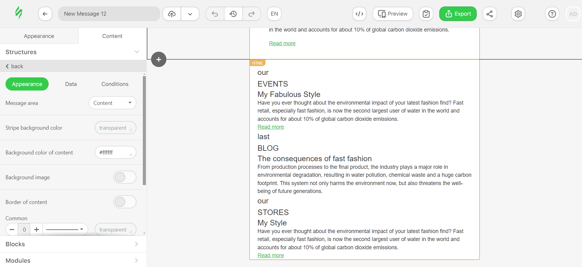
In contrast to the AMP version, the tabs in this implementation are constructed using label elements that are linked to input elements. The visibility of the corresponding content blocks is controlled by the checked state of these inputs. It is essential that the number of input elements corresponds exactly to the number of tabs:
<input type="radio" name="tabs" id="tab1" checked style="display:none">
<input type="radio" name="tabs" id="tab2" style="display:none">
<input type="radio" name="tabs" id="tab3" style="display:none">
This code consists of several elements:
- id="tab1" is the id of the input with which we bind this input to the label.
- checked is needed to indicate which tab will be active by default.
- style="display:none" hides inputs since, visually, we use labels for tabs.
The next one is the label tag for tabs that looks like this:
<label for="tab1" class="tab-title tab-title-1">...</label>, where for="tab1" is an attribute that indicates the ID of the input associated with this tag.
For the content of the tabs, we use a special block with classes:
<div class="tabpanel tabpanel-1"></div>
The nuance is that each tab and content has classes with the numbers tab-title-1, tab-title-2, tabpanel-1, tabpanel-2, etc. These classes display and highlight the active elements in styles.
Creating styles
Now, it is time to make your interactive HTML tabs beautiful. To do so, we add this code before the <div class="container">:
<style>
    .tabs-html {
        display: flex;
        flex-wrap: wrap;
    }

    .tabs-html .tab-title {
        background: #f8f3ef;
        border-bottom: 2px solid #f8f3ef;
        flex-grow: 1;
        text-align: center;
        cursor: pointer;
    }

    .tabs-html .tab-title p {
        display: block;
        padding: 20px 0;
        color: #64434a;
    }

    .tabs-html .tabpanel div {
        padding: 30px 30px 15px;
    }

    .tabs-html .tabpanel h3,
    .tabs-html .tabpanel p {
        padding-bottom: 15px;
    }

    .tabs-html .tabpanel {
        display: none;
        width: 100%;
        order: 1;
    }

    #tab1:checked~div .tabpanel-1,
    #tab2:checked~div .tabpanel-2,
    #tab3:checked~div .tabpanel-3 {
        display: block;
    }

    #tab1:checked~div .tab-title-1,
    #tab2:checked~div .tab-title-2,
    #tab3:checked~div .tab-title-3 {
        background: #f4cccc;
        border-bottom: 2px solid #64434a;
        outline: none;
        cursor: default;
    }
</style>
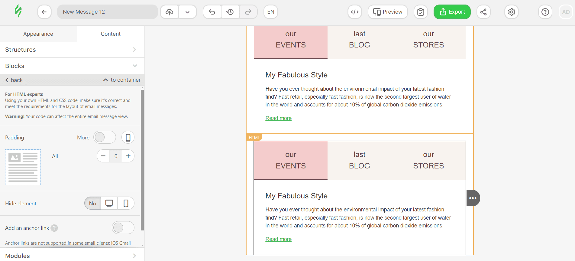
Once done, the whole interactive HTML tab version will look identical to the AMP version.
Adding and changing styles for the active tab
These styles are necessary for the overall look of the active tab.
#tab1:checked~div .tab-title-1,
#tab2:checked~div .tab-title-2,
#tab3:checked~div .tab-title-3 {
background: #f4cccc;
border-bottom: 2px solid #64434a;
outline: none;
cursor: default;
}
It is important to note that you can customize the appearance of active tabs by adjusting the parameters background, border-bottom, and outline. Modifying these properties allows for a distinct visual presentation of the selected tabs.
Styles for the selected content
Meanwhile, this code is responsible for displaying content inside the selected tab.
#tab1:checked~div .tabpanel-1,
#tab2:checked~div .tabpanel-2,
#tab3:checked~div .tabpanel-3 {
display: block;
}
Important note: Adding new tabs requires mentioning them in styles.
Customizing styles for inactive tabs
Making your tabs unique is also easy by adding a special code as an additional one before the styles block end:
#tab1:checked~div .tab-title-1 {
        background: #f4cccc;
        border-bottom: 2px solid #f4cccc;
    }

    .tabs-html .tabpanel-1 {
        background: #f4cccc;
    }

    #tab2:checked~div .tab-title-2 {
        background: #c3c3ff;
        border-bottom: 2px solid #c3c3ff;
    }

    .tabs-html .tabpanel-2 {
        background: #c3c3ff;
    }

    #tab3:checked~div .tab-title-3 {
        background: #f7ed8b;
        border-bottom: 2px solid #f7ed8b;
    }

    .tabs-html .tabpanel-3 {
        background: #f7ed8b;
    }
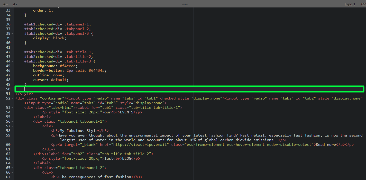
However, if you wish for each tab and its corresponding content block to share the same background color, you must apply specific styles for each element and remove the general color (background: #f4cccc;) and border bottom (border bottom: 2px solid #64434a;) from the overarching styles.
An interactive version has been completed. Only one final step remains before finalizing the project.
Creating a fallback version of email tabs
The final step is to develop a fallback version of the email tabs for mail clients that do not support interactive HTML (such as Outlook and others). This fallback version will feature a layout similar to the interactive tabs but will lack interactivity. Instead of providing interactive functionality, clicking on the elements will redirect users to the web version of the email.
To integrate this fallback version, continue working within the block containing the interactive HTML previously created. Insert the following code between the </style> and <div class="container"> tags:
<!--[if !mso]><!--><input type="checkbox" id="fallback_ctrl" class="fallback_ctrl" style="display:none !important;mso-hide:all;" checked>
<!--<![endif]-->
<!-- FALLBACK -->
<div id="fallback" class="fallback">
    <table width="100%" cellspacing="0" cellpadding="0">
        <tbody>
            <tr>
                <td>
                    <table width="100%" cellspacing="0" cellpadding="0">
                        <tbody>
                            <tr>
                                <td width="33%" align="center" style="background: #f4cccc;border-bottom: 2px solid #64434a;padding-top:20px;padding-bottom:20px">
                                    <p style="font-size: 20px;">our<br>EVENTS</p>
                                </td>
                                <td width="33%" align="center" style="background: #f8f3ef;border-bottom: 2px solid #f8f3ef;">
                                    <p><a href="https://viewstripo.email/e860845b-6830-4fbb-abc8-89419af596241719312061771?type=amphtml" target="_blank" style="display:inline-block;font-size: 20px;text-decoration:none;color: #64434a;line-height: 30px;">last<br>BLOG</a></p>
                                </td>
                                <td width="33%" align="center" style="background: #f8f3ef;border-bottom: 2px solid #f8f3ef;">
                                    <p><a href="https://viewstripo.email/e860845b-6830-4fbb-abc8-89419af596241719312061771?type=amphtml" target="_blank" style="display:inline-block;font-size: 20px;text-decoration:none;color: #64434a;line-height: 30px;">our<br>STORES</a></p>
                                </td>
                            </tr>
                        </tbody>
                    </table>
                </td>
            </tr>
            <tr>
                <td style="padding-top:30px;padding-right:30px;padding-bottom:15px;padding-left:30px;">
                    <h3>My Fabulous Style</h3>
                </td>
            </tr>
            <tr>
                <td style="padding-right:30px;padding-bottom:30px;padding-left:30px;">
                    <p>Have you ever thought about the environmental impact of your latest fashion find? Fast retail, especially fast fashion, is now the second largest user of water in the world and accounts for about 10% of global carbon dioxide emissions. </p>
                </td>
            </tr>
        </tbody>
    </table>
</div><!-- /FALLBACK -->
<!--[if !mso]><!-->
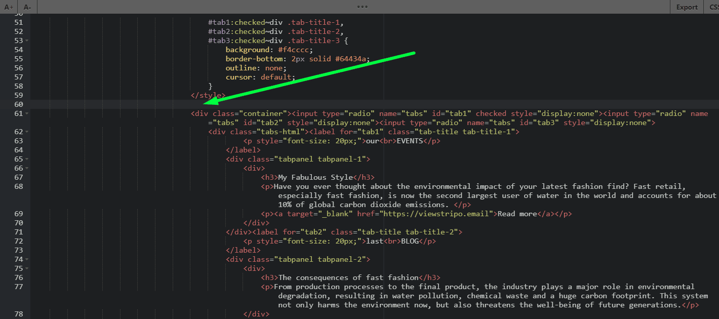
In addition, at the very end of the code, we add one more piece of code:
<!--<![endif]-->

Currently, we have links to our website as a demonstration of how all things should work.
To ensure that the example functions correctly in your case, you will need to replace the placeholder links in the fallback version with your own URLs.
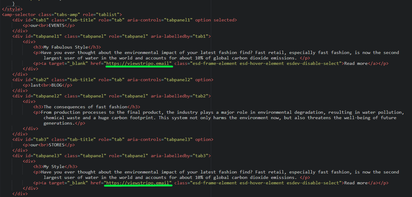
Now, both versions are visible simultaneously: the fallback version and the interactive HTML version.
To ensure that only the appropriate version is displayed based on the email client’s capabilities, add the inline style style="mso-hide:all;display:none;" to the <div class="container"> tag to hide it by default. Use additional styles to control which version should be visible.
Creating styles
To make a fallback version stylish, we add the following code to the style tag:
@media screen and (-webkit-min-device-pixel-ratio: 0) {
        input.fallback_ctrl:checked~.container {
            display: block !important;
        }

        input.fallback_ctrl:checked~#fallback {
            display: none !important;
        }
    }

    [owa] .container {
        display: none !important;
    }

    [class~="x_container"] {
        display: none !important;
    }

    [id~="x_fallback"] {
        display: block !important;
    }

    @media screen and (max-width: 600px) {
        body[data-outlook-cycle] #fallback {
            display: block !important;
        }

        body[data-outlook-cycle] .container {
            display: none !important;
        }
    }
Let’s delve into the specifics to clarify the setup. The code snippet below handles the display of the fallback version:
<!--[if !mso]><!--><input type="checkbox" id="fallback_ctrl" class="fallback_ctrl" style="display:none !important;mso-hide:all;" checked>
<!--<![endif]-->
This input element is crucial for toggling the visibility of the fallback version using styles. It is enclosed within conditional comments <!--[if !mso]><!--> … <!--<![endif]--> to ensure it remains hidden in the Outlook Desktop client.
The next one is <div id="fallback" class="fallback"></div>, which is a block that contains the entire layout of our fallback version. It should have a simple, tabular layout suitable for Outlook. In our example, it is represented as a table of tabs with links leading to the web version of the content. You can adjust this layout to display the tab contents sequentially if preferred, but ensure it remains understandable for Outlook users.
There are no universal styling rules applicable to every email client, but the following hacks can be used to fine-tune the display:
- Styles beginning with [owa] are for Outlook.com. If these styles do not work, use [class~="x_container"] styles as a fallback for the same email client.
- Body[data-outlook-cycle] styles are intended for Outlook on iOS and Android mobile devices and should include mso-hide:all; to ensure proper display.
Full code
Once you have completed all the stages, your code should resemble the following example:
<style>
    .tabs-html {
        display: flex;
        flex-wrap: wrap;
    }

    .tabs-html .tab-title {
        background: #f8f3ef;
        border-bottom: 2px solid #f8f3ef;
        flex-grow: 1;
        text-align: center;
        cursor: pointer;
    }

    .tabs-html .tab-title p {
        display: block;
        padding: 20px 0;
        color: #64434a;
    }

    .tabs-html .tabpanel div {
        padding: 30px 30px 15px;
    }

    .tabs-html .tabpanel h3,
    .tabs-html .tabpanel p {
        padding-bottom: 15px;
    }

    .tabs-html .tabpanel {
        display: none;
        width: 100%;
        order: 1;
    }

    #tab1:checked~div .tabpanel-1,
    #tab2:checked~div .tabpanel-2,
    #tab3:checked~div .tabpanel-3 {
        display: block;
    }

    #tab1:checked~div .tab-title-1,
    #tab2:checked~div .tab-title-2,
    #tab3:checked~div .tab-title-3 {
        background: #f4cccc;
        border-bottom: 2px solid #64434a;
        outline: none;
        cursor: default;
    }

    @media screen and (-webkit-min-device-pixel-ratio: 0) {
        input.fallback_ctrl:checked~.container {
            display: block !important;
        }

        input.fallback_ctrl:checked~#fallback {
            display: none !important;
        }
    }

    [owa] .container {
        display: none !important;
    }

    [class~="x_container"] {
        display: none !important;
    }

    [id~="x_fallback"] {
        display: block !important;
    }

    @media screen and (max-width: 600px) {
        body[data-outlook-cycle] #fallback {
            display: block !important;
        }

        body[data-outlook-cycle] .container {
            display: none !important;
        }
    }
</style>
<!--[if !mso]><!--><input type="checkbox" id="fallback_ctrl" class="fallback_ctrl" style="display:none !important;mso-hide:all;" checked>
<!--<![endif]-->
<!-- FALLBACK -->
<div id="fallback" class="fallback">
    <table width="100%" cellspacing="0" cellpadding="0">
        <tbody>
            <tr>
                <td>
                    <table width="100%" cellspacing="0" cellpadding="0">
                        <tbody>
                            <tr>
                                <td width="33%" align="center" style="background: #f4cccc;border-bottom: 2px solid #64434a;padding-top:20px;padding-bottom:20px">
                                    <p style="font-size: 20px;">our<br>EVENTS</p>
                                </td>
                                <td width="33%" align="center" style="background: #f8f3ef;border-bottom: 2px solid #f8f3ef;">
                                    <p><a href="https://viewstripo.email/e860845b-6830-4fbb-abc8-89419af596241719312061771?type=amphtml" target="_blank" style="display:inline-block;font-size: 20px;text-decoration:none;color: #64434a;line-height: 30px;" class="esd-frame-element esd-hover-element esdev-disable-select">last<br>BLOG</a></p>
                                </td>
                                <td width="33%" align="center" style="background: #f8f3ef;border-bottom: 2px solid #f8f3ef;">
                                    <p><a href="https://viewstripo.email/e860845b-6830-4fbb-abc8-89419af596241719312061771?type=amphtml" target="_blank" style="display:inline-block;font-size: 20px;text-decoration:none;color: #64434a;line-height: 30px;" class="esd-frame-element esd-hover-element esdev-disable-select">our<br>STORES</a></p>
                                </td>
                            </tr>
                        </tbody>
                    </table>
                </td>
            </tr>
            <tr>
                <td style="padding-top:30px;padding-right:30px;padding-bottom:15px;padding-left:30px;">
                    <h3>My Fabulous Style</h3>
                </td>
            </tr>
            <tr>
                <td style="padding-right:30px;padding-bottom:30px;padding-left:30px;">
                    <p>Have you ever thought about the environmental impact of your latest fashion find? Fast retail, especially fast fashion, is now the second largest user of water in the world and accounts for about 10% of global carbon dioxide emissions. </p>
                </td>
            </tr>
        </tbody>
    </table>
</div><!-- /FALLBACK -->
<!--[if !mso]><!-->
<div class="container" style="mso-hide:all;display:none;"><input type="radio" name="tabs" id="tab1" checked style="display:none"><input type="radio" name="tabs" id="tab2" style="display:none"><input type="radio" name="tabs" id="tab3" style="display:none">
    <div class="tabs-html"><label for="tab1" class="tab-title tab-title-1">
            <p style="font-size: 20px;">our<br>EVENTS</p>
        </label>
        <div class="tabpanel tabpanel-1">
            <div>
                <h3>My Fabulous Style</h3>
                <p>Have you ever thought about the environmental impact of your latest fashion find? Fast retail, especially fast fashion, is now the second largest user of water in the world and accounts for about 10% of global carbon dioxide emissions. </p>
                <p><a target="_blank" href="https://viewstripo.email" class="esd-frame-element esd-hover-element esdev-disable-select">Read more</a></p>
            </div>
        </div><label for="tab2" class="tab-title tab-title-2">
            <p style="font-size: 20px;">last<br>BLOG</p>
        </label>
        <div class="tabpanel tabpanel-2">
            <div>
                <h3>The consequences of fast fashion</h3>
                <p>From production processes to the final product, the industry plays a major role in environmental degradation, resulting in water pollution, chemical waste and a huge carbon footprint. This system not only harms the environment now, but also threatens the well-being of future generations.</p>
            </div>
        </div><label for="tab3" class="tab-title tab-title-3">
            <p style="font-size: 20px;">our<br>STORES</p>
        </label>
        <div class="tabpanel tabpanel-3">
            <div>
                <h3>My Style</h3>
                <p>Have you ever thought about the environmental impact of your latest fashion find? Fast retail, especially fast fashion, is now the second largest user of water in the world and accounts for about 10% of global carbon dioxide emissions. </p>
                <p><a target="_blank" class="esd-frame-element esd-hover-element esdev-disable-select">Read more</a></p>
            </div>
        </div>
    </div>
</div>
<!--<![endif]-->
You can paste this code into your email and play around with it as you see fit. It contains both interactive HTML and fallback versions.
Wrapping up
This comprehensive guide is designed to assist email marketers of all technical levels in enhancing their emails with our new tab mechanics. By following these instructions, you can easily integrate tabs into your email campaigns, enriching your content presentation and expanding your email marketing capabilities.




0 comments