Leveraging email popups: Examples and tips


Email popups convert 3.8% of website visitors. Now, the question arises: How do we kick-start our email list? Here, email popups enter the stage as a compelling tour de force in subscriber generation.
Keep reading as we unpack email popups, share fresh ideas, and reveal the secrets behind successful implementation from leading brands in various niches. It’s time to fuel your imagination and learn from the best!
The power of email popups
Let’s define them first. Email popups are small dialog boxes on your website to collect visitors' email addresses. However, their influence stretches far beyond this simple task. Here are the five most common reasons someone decides to do this:
- Email popups can easily collect emails from site visitors, which is necessary for further lead generation and building human-brand communication. Also, you can use this data for your future email campaigns.
- Email popups show high conversion. On average, brands get 380 email subscribers from a site with 10,000 monthly visitors due to popups only.
- Popups can be a strategic tool to guide visitors down the sales funnel at every possible stage:
- awareness stage: Explainer popups, which meet a visitor on your webpage, can give them a brief overview of your products and services;
- interest or Consideration stage: Popups can offer eBooks, case studies, or free product trials in exchange for visitors’ email addresses;
- evaluation and Decision stage: Offer popups can show time-sensitive deals, discounts, or bonuses to create a sense of urgency;
- purchase stage: Popups can offer add-ons or upgrades relevant to the items in the visitor's cart;
- retention stage: Popups can ask for product reviews, offer customer loyalty programs, or ask for referrals to friends.
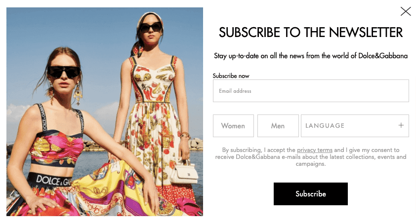
- Popups open the door to personalization opportunities. There are several ways to add personalization to the popup:
- personalized greetings: These popups greet visitors based on their behavior, location, or demographic information. For instance, a popup could say, "Welcome back, Sarah!" if she's a returning visitor, or "Hello, New York! Looking for fast delivery?" to visitors from New York City;
- custom special offers: Websites can use cookies, customer behavior, or buying history to show popups with custom discounts or special offers. For example, if a visitor has repeatedly browsed a particular product category (like shoes), a popup might say, "Just for you! Get an exclusive 20% off on all shoes for 24 hours!";
- seasonal offers: Popups may be devoted to a time of the year or be holiday-specific. For instance, during December, a popup could read, "Christmas is сoming! Add a gift for your loved ones to your order and enjoy a 15% festive discount!" Or, for a visitor's birthday captured through visitor data, "Happy Birthday, John! Here's our gift: a 10% discount on your purchase today!".
(Source: Dolce&Gabbana)
- They can bring results with little effort. They require minimal capital but have the potential for high returns. Now, let's put this into perspective.
Suppose you run an online fashion store. You add an email popup to your website asking visitors to subscribe for style tips and exclusive deals. Implementing the popup overall might take one to two days with the help of a designer, copywriter, and developer.
Now imagine that of the approximately 5,000 monthly visitors to your site, about 10% (500 visitors) subscribe to your mailing list. You then send out weekly newsletters featuring curated outfit ideas and special offers.
Of those 500 subscribers, 2% of people purchase from your site because of your email campaign. That's ten sales monthly that you might not have had without the popup. If each sale is worth $100 on average, you've just made an extra $1,000 monthly or $12,000 yearly.
Types of email popups
Now that we know how helpful email popups can be, let's look at the different types you can use. Some types work better in certain situations, so understanding them helps you utilize them more effectively.
Entry and exit popups
Setting up popups on a website can start with establishing what visitors see as soon as they enter the website and when they are about to leave it.
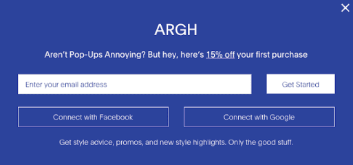
Entry popups are the first interaction that greets visitors when they land on your website. These popups can share a range of details, such as:
- special offers or discounts: Entry popups might announce a limited-time offer, a seasonal sale, or exclusive discounts for first-time visitors;
- newsletter sign-up: Popups might encourage visitors to subscribe to your newsletter;
- latest products or services: Entry popups can highlight new product releases, features, or recent blog posts that might interest visitors;
- user guidance: An entry popup might provide a short guide or tips for complex sites or applications to help people navigate;
- policy updates or legal notices: Entry popups might direct visitors’ attention to recent changes in privacy policies, terms of use, or other important legal notifications.
(Source: Frank & Oak)
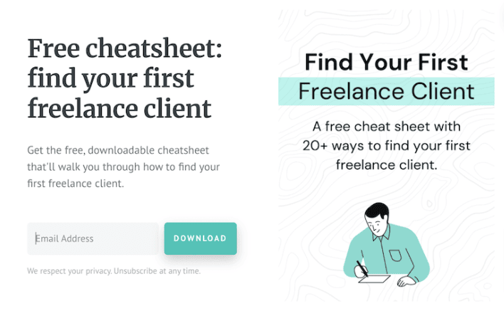
Exit popups may be a final engagement tool as they emerge just as visitors are gearing up to leave. The triggering mechanism behind exit popups typically involves tracking a visitor's cursor movement. When the cursor moves towards the close button or URL bar, it interprets this as the visitor's intent to leave and shows an exit popup. What can an exit popup offer?
- discount codes or special offers: To keep visitors from leaving, websites may offer a unique discount or a tempting deal;
- free downloads: Exit popups might offer freebies like eBooks, whitepapers, or free trials of any product or service;
- surveys or feedback forms: A quick feedback form or survey popup is a way to gain insights about the user's experience on the site.
(Source: Peak Freelance)
Mobile exit intent popups
A mobile exit intent popup appears when a visitor on a mobile device shows signs of leaving a website, such as scrolling up or reaching the top of the page. Unlike desktop exit popups that track cursor movement, mobile exit intent popups trigger based on specific behaviors, offering a final opportunity to engage users before they exit.
The key benefits of mobile exit intent popups include increasing conversions and boosting engagement by displaying targeted offers like discounts or personalized content. This can help recover abandoned carts and encourage users to subscribe to newsletters or updates, ultimately growing your email list.
To maximize effectiveness, the popup should be non-intrusive and mobile-optimized, ensuring it displays properly across different screen sizes and orientations. It’s also important to time the popup appropriately to avoid interrupting the user experience. When implemented correctly, mobile exit intent popups can significantly enhance user retention and conversion rates.
Scroll popups
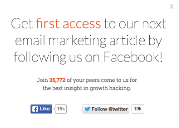
Some popups may be triggered once a visitor moves past a certain percentage of your webpage. This method is commonly used in blog posts or longer articles. It keeps the reader interested as they continue scrolling through the content.
However, it's crucial to maintain a delicate balance to avoid irritating readers or disrupting their experience. So, how, then, should you use scroll popups without adverse effects?
- timely trigger: Setting an appropriate scroll percentage for the popup to be triggered is essential. Setting it too early (20 or 30% of the page scroll) may disrupt and annoy visitors still evaluating if your content is worth their time. Conversely, setting it too late (80-90% of the page scroll) might mean missing out on capturing the user's information. I am convinced that it is best to set the trigger at around 50-60% of the page scroll. At this stage, the visitor is usually interested in your content, increasing their chances of interacting positively with the popup;
- relevant content: Make sure the content of the popup is relevant to what the visitor is reading. If the user has scrolled further into an informative blog post, a popup offering a related eBook or an invitation to a related webinar would seem more fitting and less intrusive;
- easy dismissal: Ensure your popups can be easily dismissed with a clear “x” or “no, thanks” option;
- measurable and adjustable: Always check how well the popups are performing. If more people leave after you put them in, you might need to change their design, content, location, or when they show up.
(Source: Wishpond)
Timed popups
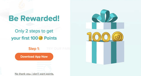
These popups appear after a visitor spends a specific amount of time on your site or page. The idea behind timed popups is that if a visitor has stayed on your page for a specific duration, they are likely to be interested in your content and, hence, more receptive to your popup message.
When setting up a timed popup, it’s crucial to identify the optimal time. You can figure this out by looking at how long people usually stay on your website (you can find this in your website's analytics). For example, if people typically stay for 2 minutes, you might want the popup to show up after 1 minute. That way, it shows up when people are interested but doesn't bother them too early.
(Source: Pampers)
Click-based popups
These popups are triggered when visitors interact with certain elements on your webpage. This interaction could be clicking on specified links, images, buttons, or textual cues. Here are some ways they might be used:
- showing detailed product descriptions or enlarged images: A click-based popup can show more details or a larger image view if a visitor clicks on a product or an image thumbnail on your site;
- displaying additional content: Clicking on a link could open a popup with further information, references, or resources, saving the visitor from navigating away from the page;
- terms and conditions or privacy policies: Similar to the sign-ups, a visitor clicking on links to your terms of service or privacy policy could have these in a popup, keeping them on the current page;
- social media sharing: Clicking on a “share” icon could activate a popup, allowing users to share your content directly on their preferred social platforms;
- downloading content: When clicked, an eBook, a whitepaper, or any downloadable content could be offered through a popup, which may request a visitor's email or other details in exchange.

(Source: Marlow)
There are also lightbox popups, sticky bars, side messages, and many more popups you may learn about. Once you understand the different types of email popups available, it's time to see how to make them work for your website.
When to make them pop and how to do it successfully
A well-designed popup can turn a bothersome interruption into a golden opportunity. Let's dive into three scenarios, with examples, to help you craft popups that steal the show.
Using behaviorally timed popups
One way to capture a visitor's attention is by using popups timed with their behavior. Let's say a visitor has been viewing a specific product for 2 minutes. This likely signals a high level of interest in that product. This is when an appropriately timed popup can come into play.
You could display a popup offering a tempting discount on the product they've been viewing or provide additional valuable information about that product. This shows visitors that you understand their interests and offers them an exclusive benefit, potentially boosting your conversion rates and reducing customer churn.

(Source: Lugz)
Let's say a visitor has been spending significant time checking out a pair of designer shoes. They might be interested, but perhaps they're hesitant and need a little push. At this point, a popup could offer a special 10% discount exclusively on the boots they’ve shown interest in. With this surprising offer, you're encouraging them to buy and showing you value their interest in your products.
Crafting popups for cart recovery
It's common for customers to fill their carts and then leave without buying anything when shopping online. One way to get these customers to complete their purchases is by using popups for cart recovery. These popups show a special offer to customers just as they're about to leave your site. What are the best practices when setting up such popups?
- timely triggering: The popups should be triggered at the right moment, typically when the customer shows signs of abandonment, such as moving their cursor toward the close button or the URL bar or going to another page without submitting an order;
- personalized messaging: Popups should be personalized to the customer's cart content. For instance, if the cart contains clothing items, the popup could offer a discount on similar accessories;
- A/B test: Regularly test different versions of your popups. Monitor their performance and adapt the content and triggering criteria based on analytics data.

(Source: SwissWatchExpo)
Consider a customer shopping at an online bookstore. They have a few novels in their cart but start moving their cursor to exit or leave the checkout page. Here, a popup appears. It's personalized to the customer's shopping behavior, offering a 10% discount on books in the cart or a special deal where buying three books will get them a fourth one for free.
To make it even more convenient, the popup features a dropdown selection of popular fiction books they can choose their free book from, guaranteeing the offer perfectly aligns with their reading interests.
This is a prime example of an effective cart recovery popup. It shows up just when the customer is about to leave the cart. Plus, it uses what we know about customers to show them special offers they might like.
Capturing emails of new visitors
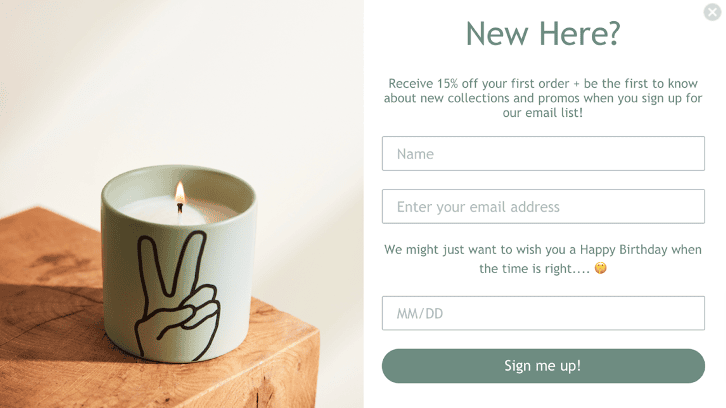
Getting the emails of new visitors is a critical task for any online business. It helps cultivate relationships, gauge customer interests, and create robust email marketing strategies.
(Source: Paddywax)
To avoid annoying your visitors with repeated popups, use conditional logic that controls when and to whom the popup appears. This can be set up in the following way:
- first-time visitor: Ensure the popup only appears to those visiting your site for the first time;
- session duration: The popup should trigger after the visitor has spent some time on your page. Instant popups can overwhelm new visitors;
- exit intent: If the visitor moves to leave the site without interacting with the popup, do not display the popup again during the same session.
Let's say a visitor lands on a trendy clothing brand's site for the first time. After a minute of browsing, they're greeted with a well-designed popup that offers a 15% discount on their first purchase in exchange for providing their email address.
Encouraging sign-ups for a free trial
Offering a sneak peek of your product or service through a free trial can hook in visitors. A strategically timed popup offering a free trial can result in a high sign-up rate.

(Source: Asana)
Consider your company operates a well-designed language-learning app. A visitor arrives on your site and begins to explore the different languages and resources you offer. They spend some time reading about the app's unique features and benefits.
When they're showing considerable interest, a tailored popup offers a free 7-day trial. The offer includes full access to all resources and lessons, encouraging them to truly experience your product before deciding.
This method not only potentially captures their email and increases trial users but also offers visitors a chance to fully explore your services, providing them with value while also potentially converting them into a paying subscriber.
Promoting limited-time offers
Popups can motivate users to purchase or take other necessary actions more promptly, especially if they indicate that our offer is temporary. What to keep in mind when setting up a timely-limited popup?
- highlight urgency: Emphasize the limited availability of the offer;
- clear offer details: Be transparent and straightforward about the offer's specifics, such as the discount percentage and duration of the sale;
- bold and clear CTA: Use an easy-to-identify call-to-action button like "Shop Now" or "Grab the Offer" to lead customers to the sale items directly;
- include a countdown: A ticking clock can build urgency and spur the customer to act immediately.

(Source: Christopher Cloos)
Suppose you're running an online store selling luxury homeware items. You decide to run a flash sale, offering a flat 30% off select products for 24 hours only. A dynamic popup springs up as soon as a visitor lands on the webpage. It announces the flash sale details and includes a countdown timer ticking away the hours, minutes, and seconds left.
These strategies can increase sales now and help build long-term customer relationships. You can get their email for future messages about special discounts and deals.
Upselling and cross-selling
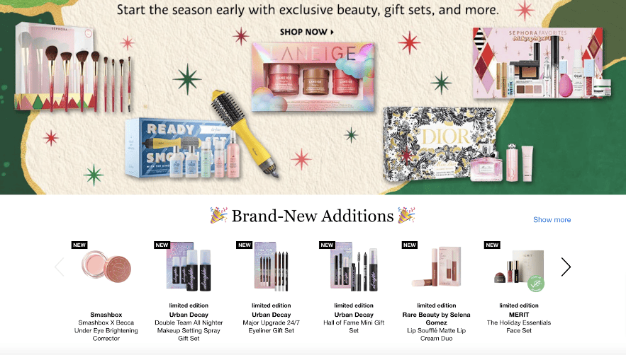
Popups can also be an excellent tool for upselling or cross-selling to your existing customers. Creating a targeted popup can encourage customers to spend more or consider additional items. The upselling popup should offer products or services that complement the customer's purchase. It means understanding your customer's buying behavior and tailoring the upsell or cross-sell accordingly.
Also, it’s essential to make adding the upsell or cross-sell to their purchase seamless and straightforward. One-click should be able to add the item to their cart.
(Source: Sephora)
Let’s imagine that there is a customer who has just selected a new swimsuit from your online store. As soon as they add the swimsuit to their cart, an as-per-designed popup appears, offering a deal they would likely be interested in — a pair of high-quality swimming goggles at an exclusive discount. In this case, the popup is relevant to their purchase, and adding the goggles to their cart is simple. This raises the total sale amount and improves the customer's shopping experience by providing an item they might need.
Gaining feedback
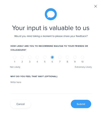
Collecting feedback via popups can provide valuable insights, helping to improve the customer experience and tackle the issue of cart abandonment. Here's how you can effectively implement it:
- shown at the right moments: The best time to ask for feedback is after the customer has interacted with your site. This could be after they make a purchase, leave a review, or, in the case of cart abandonment, when they exit without buying, triggering a cart abandonment survey to understand why;
- clear and concise: The popup should ask explicit questions to get specific insights. For instance: "What stopped you from completing your purchase?";
- easy-to-interact: Multiple-choice responses or a rating scale make it quick and easy for customers to respond;
- appreciation: Thank customers for their feedback and reassure them that their input will be used to improve their experience.
(Source: Mailtag)
This strategy keeps customers engaged even after leaving, provides crucial insights into the reasons behind cart abandonment, and shows your commitment to improving the overall experience. Each feedback can be an opportunity for you to address issues, fix gaps, and, ultimately, convert abandoned carts into successful purchases in the future.
Best popup practices
To make the most of email popups and enhance user experience, it's important to focus on effective strategies and positive examples.
Set the right timing
Determining the timing for email popups is critical and involves careful testing and analysis. It isn't as simple as picking and using a pre-set duration. There should always be A/B testing to see the effectiveness of different timings.
Also, you can move with small steps and try iterative testing, where you adjust the timing by 5-10 second increments or decrements and measure the changes in interactions and conversions. The interactions may repeat until you find your site's most effective popup timing. Additionally, you may follow three steps when setting up initial timing:
- consider user behavior: Analyse how long users spend on your site before making interactions. This could be their average time before purchasing, signing up for a newsletter, or downloading a resource;
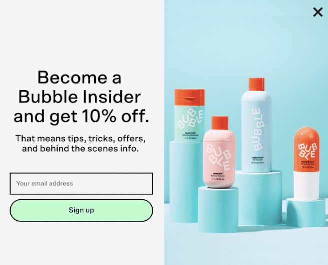
- initial timing estimate: Based on your users' average interaction time, set a preliminary timing for your popup. A general rule of thumb is to trigger the popup after a visitor has spent around 30 seconds to 1 minute on your site;
- factor in page importance: If your site has pages where users typically spend more time, consider setting different popup times for other pages. For instance, a popup on a product page may appear faster than on a blog post page.
(Source: Bubble)
Remember that while timing is a crucial aspect, the content of the popup also plays an essential role. It must be compelling, relevant, and valuable to the visitor to capture their email effectively.
A/B test your popups
When A/B testing, you create and display two different versions (Version A and Version B) of a popup to different segments of your site visitors. You then measure their performance to determine which version was more effective. Many aspects can be tested:
- headline: Test different headlines to see which grabs your visitors' attention more effectively;
- lead magnets: You could test different lead magnets (e.g., an eBook vs. a discount code) to see which one drives more sign-ups;
- call to action: Adjust the text, color, size, or shape of your CTA button to see if it impacts engagement;
- design elements: Make changes to color schemes, fonts, images, or overall layout. Even small adjustments can significantly impact the effectiveness of your popups;
- timing: Experiment with when the popup appears. Does displaying it immediately upon site entry yield more sign-ups? Or is it more effective after a visitor has spent time on the site?
- copy: Test various copy lengths and tones. Some audiences may respond better to brief, direct copy, while others prefer detailed, descriptive text.
By often conducting simple A/B tests, you can improve your popups based on actual user behavior and response.
Cater to the visitor's journey
Email popups aren't just about capturing email addresses; they should be about enhancing your website's user journey. Hence, it's best to tailor different popups for different user journey stages:
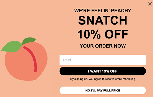
- initial interaction: Keep the popups more general for first-time visitors or those who are merely browsing. The aim here is to build a connection and encourage deeper exploration;
- middle of the journey: For visitors spending more time on specific pages or products, start providing more targeted and personalized popups;
- end of the journey: For returning visitors or those showing strong buying intent, provide popups leading toward culmination, such as limited-time offers, personalized discounts, or loyalty rewards;
- post-purchase journey: After making a purchase, use popups to confirm their order, offer additional, complementary items, or ask for feedback.
(Source: Peachy)
Turn popup into lead magnet
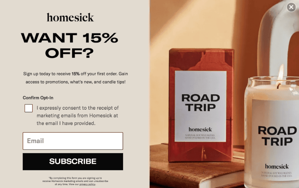
Always sweeten the deal when you're fishing for customer information. This could be through a lead magnet — a bonus in exchange for their email address. Think of a free eBook, a money-off voucher, or the golden key to exclusive content.
(Source: Homesick)
What can potentially be a lead magnet? Here are the ideas for you:
- free eBook: Offer a free downloadable eBook related to your industry or products;
- discount vouchers: Instantly workable codes that offer a percentage or flat rate on their first or next purchase;
- exclusive content: Provide access to exclusive, members-only content, like in-depth guides, webinars, or video tutorials;
- free trials: This is especially useful for service-based businesses. You can offer a free trial period of your service, enticing users to get firsthand experience;
- giveaways or contest entries: Offer automatic entry into a competition or giveaway upon sign-up;
- free consultation or demonstration: If you're in a consultation-based industry, offering a free consultation can be a persuasive lead magnet;
- membership benefits: Special perks like free shipping, priority access to new collections, or complimentary samples with purchases can attract a lot of sign-ups.
The more aligned the lead magnet is with your audience's needs and interests, the more effective it will be. Always test different options to find your unique audience's most successful lead magnet.
Use double opt-ins
A double opt-in process requires users to verify their email address after signing up through a popup form. It confirms that the subscriber is ready to get your email content.
The benefits of having such a popup in place:
- by adding a verification process, you filter out potential fake emails;
- double opt-ins ensure compliance with specific email and privacy laws in many countries, ensuring the subscriber has knowingly and willingly subscribed to your email list and given you their contact data;
- email providers appreciate double opt-ins because they consider them safer, leading to better deliverability of emails;
- subscribers who have gone through double-opt-ins are less likely to unsubscribe or mark their emails as spam because they explicitly opted in.

(Source: Email from Workona)
Show only one popup at a time
Overdoing popups can potentially overwhelm and annoy visitors, negatively affecting their experience on your website. The key is maintaining a careful balance — ensuring visibility and effectiveness without hampering user engagement. How do you regulate your popups?
- make it a rule to display only a single popup at a time. This will prevent visitors from feeling bombarded and allow them to focus on the current offer or message;
- implement a cap on how often a single visitor sees a particular popup. Too frequent, and they might get annoyed; too rare, and they might miss it;
- the placement of popups should be strategically aligned with the user's journey on the site. Show popups at natural breakpoints or when they have shown interest.
Imagine such a situation: a user visits a news website and is instantly greeted by a popup asking for a newsletter signup. Overlapping with it comes the second popup, promoting an ad-free premium subscription. The user, barely processing the double popups, can close them and click into an article. On entering the article, a third popup appears requesting cookie acceptance, followed by a fourth popup offering a discounted premium subscription.
Will such an experience be pleasant for the user? Will at least one popup play its role? The answer is no, and businesses should cautiously add new popups to their pages.
Mind your mobile users
A significant chunk of website traffic rolls in from mobile users. Turning a blind eye to the mobile experience could trip up your marketing efforts. Ensuring your popups work well on mobile is indeed essential.
Here's how to do it:
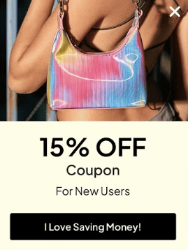
- responsive design: Your popup should adjust properly according to the screen size;
- readable text size: Make sure the text in your popups is large enough to be read easily on smaller mobile screens;
- efficient layout: Avoid cramming too much content into a tight space. Keep the design simple and clean, with clear call-to-action buttons that are easy to tap;
- easy to close: Mobile users should find it easy to close the popup if they wish to. A small, inaccessible “x” button could create frustration;
- lightweight: Ensure your popups don't drastically increase your site's load time. Mobile users are often on the go and have less patience for slow-loading content.
(Source: Zaful)
Have only clear CTAs
Avoid beating around the bush with your messaging. Stay clear of vague phrases, and make sure your call to action is engaging and hits the nail on the head, clearly telling the user what you want them to do.

(Source: Zavvi)
Offer clear opt-in and opt-out
Confusing opt-in or opt-out choices can cause visitors to subscribe unintentionally. You should always clearly let the visitor understand what and how they subscribe to, even for what we collect this information.
Also, not offering a simple exit strategy for popups can come across as pushy and invasive. Always include an opt-in and opt-out choice, as this maintains balanced interactions and promotes a positive user experience.
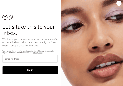
(Source: Glossier)
The opt-out option must be visible but not compete with the main offer. A practical opt-out choice could be a clear text link under the email input field stating, "No thanks, just let me shop." This phrase creates an explicit, respectful way for users to decline the offer, contributing to a positive user experience.
Wrapping up
If played right, email popups can be a heavy hitter for lead generation, conversions, and business expansion. They pave the way for a strong connection with your visitors, allow you to dig into their preferences, and reel them in for meaningful engagement.
Remember, the magic formula for successful popups is striking the right balance between your visitor's experience and marketing targets. Always put premium content that adds value and spices up your visitor's journey on the front burner. Be clear with your messages, keep your tactics above board, and continually tweak and polish for the best outcomes.



0 comments