7 Reasons to Add Infographics in Your Emails


Long and complex texts are rarely read to the end. Volumetric content in email newsletters needs to be organized easily, and clearly for the reader. The solution is to convert a piece of text information to infographics. In this blog post, we share the 7 reasons to try this marketing trick out and share the best examples of infographics in emails.
What is an infographic?
Infographics are a visual representation of information that helps graphically display complex data in a simple and understandable way like pictures, icons, graphs, charts, diagrams, maps, and so on. It might take a bit more time to create one rather than just writing a plain text, but the benefits of infographics in the email are far too good.
Reason 1. Instructions are easier to perceive this way.
According to Levy and Lentz (1982), people who follow instructions with text and visualization do the job 323% better than those who follow only text instructions.
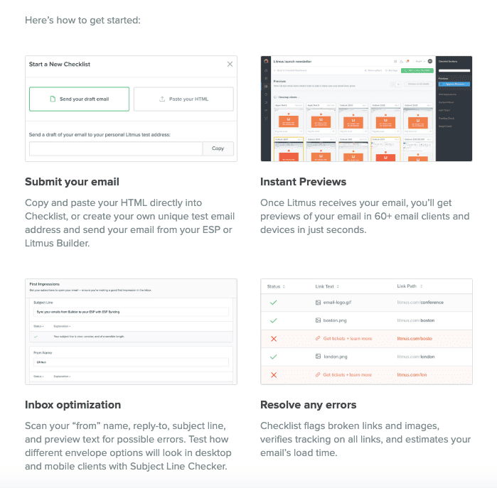
(Source: email sample by Litmus)
Reason 2. Dates and numbers are easier to remember that way.
In the average user's mailbox, emails have long been vying for reader attention. To win, your email must stand out. Marketers use different tricks for this, and one of the most effective is using infographics in email marketing.
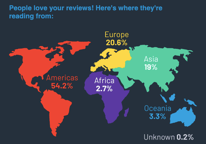
(Source: email from G2 Crowd)
Reason 3. Easier to highlight your strengths.
Check how Grammarly uses infographics in their promo email. They offer customers to switch to a more expensive subscription and show in numbers all the advantages of this switching. The company groups statistics in an easy-to-read graph and proves its reputation as a reliable application for everyone who writes.
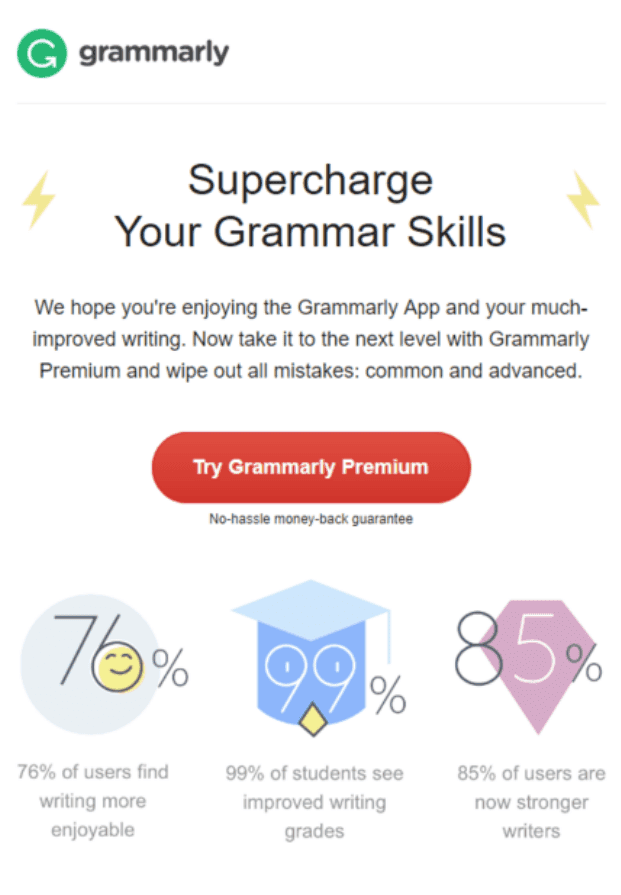
Reason 4. The email is pleasant to read.
Contrasting colors, arrows, fonts, diagrams — all visual elements focus readers on important things. Good infographics simplify complex things.
For example, when receiving an email from Alaska Airlines, it will not be difficult for you to understand at a glance what news your airline brought today and what their call to action is.
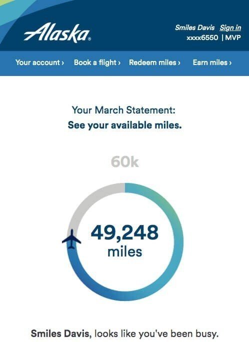
(Source: Really Good Emails)
Reason 5. You will quickly convey a thought.
Some studies say that you only have 8 seconds to win the reader’s interest.
Make your newsletter capacious, and compact. Infographics convey figures and facts. Just take a look at this email from LogMeIn. It would be too boring to read if their annual report contained just written content.
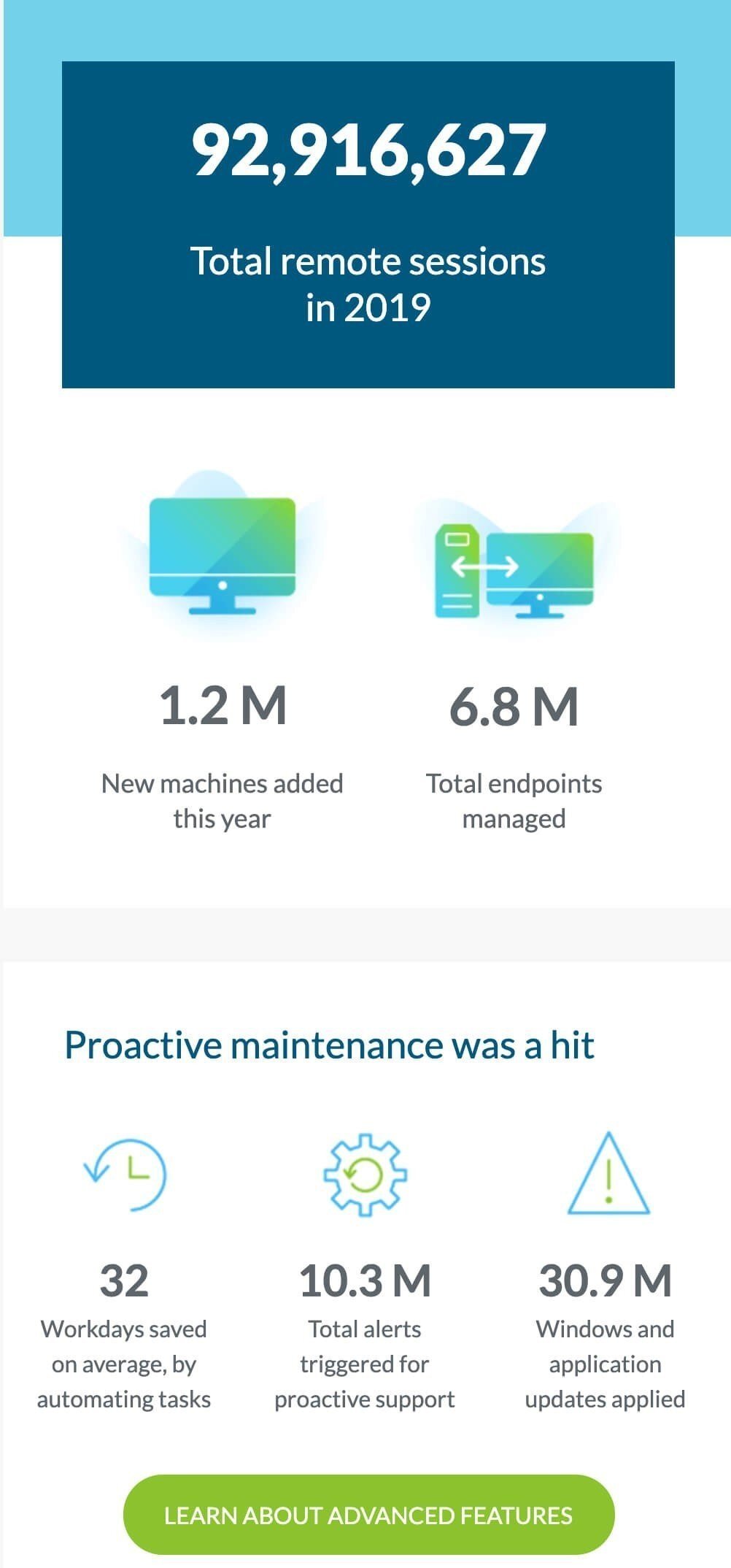
(Source: email from Central)
Reason 6. Your emails will get opened more often.
The word "infographics" in the email’s subject line or preheader might increase your open rate discoveries. Give it a try. 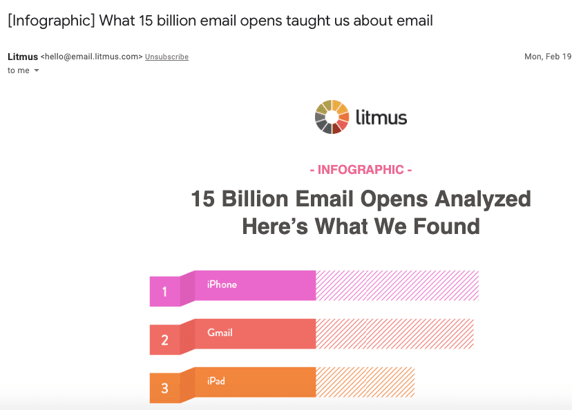
You can set a subject line and a preheader text right in Stripo. Add emojis if you like.
Reason 7. Your brand will go viral
Infographics are shared. Recipients willingly share useful information. Especially when it is framed in a beautiful, original, and understandable design.
They do it by means of sharing content across social media or even upload your graphs to Pinterest.
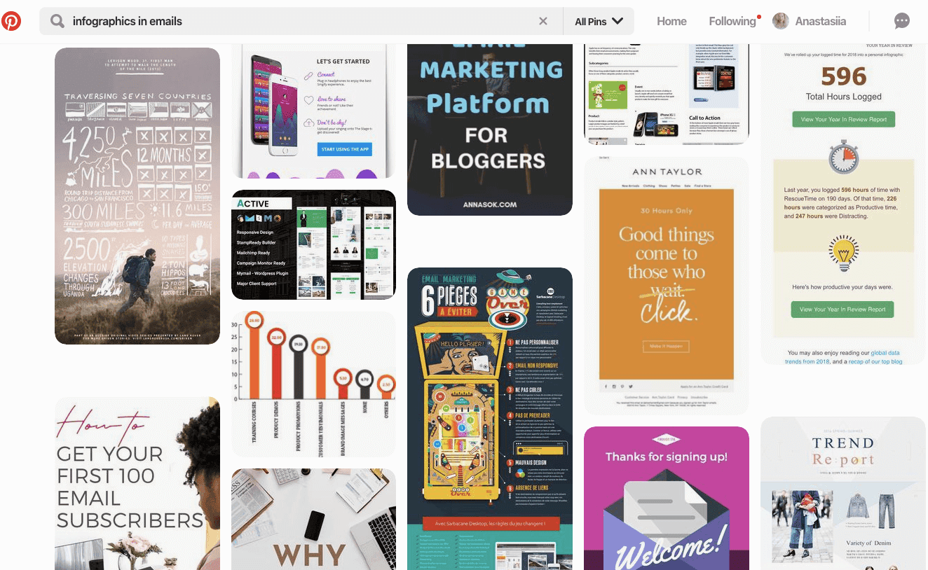
They can also forward your email to tell their friends how awesome you are. You all must have heard about Grammarly and their awesome reports.
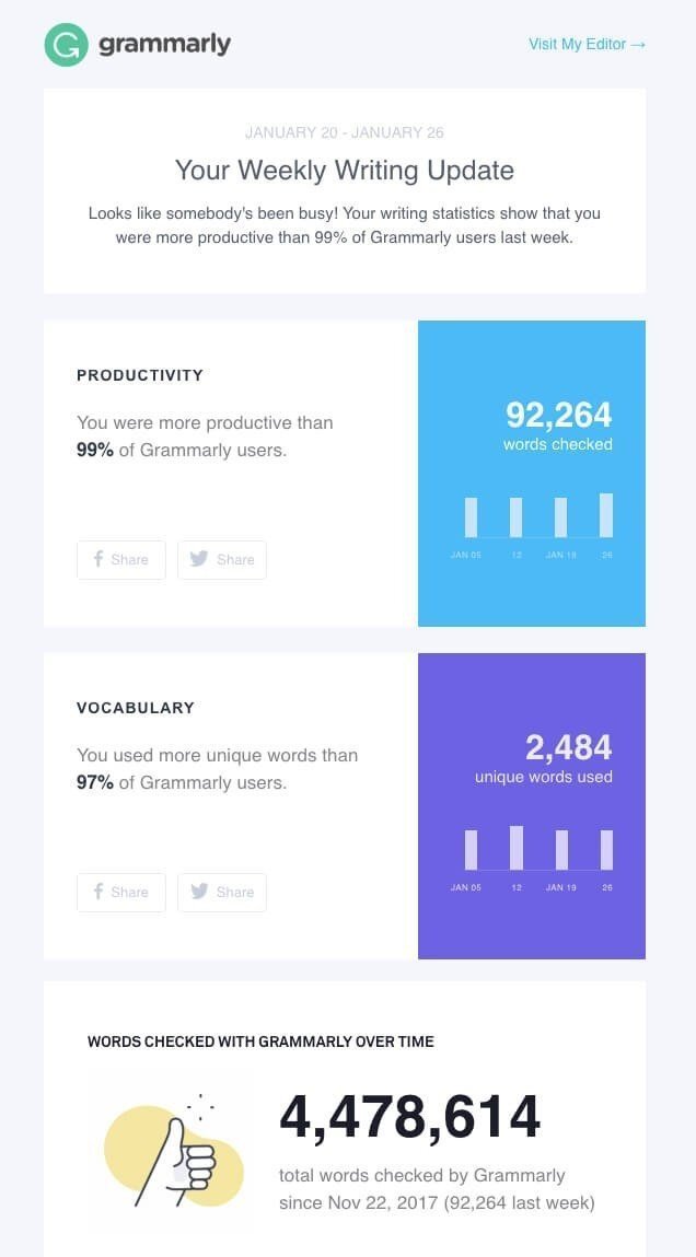
These reports have been widely shared and forwarded. And in 2018 and 2019 there was no conference where these emails would go unnoticed.
Things to decide on before you start creating your infographics
You can’t just draw a diagram and expect it to boost sales. As always, your content should be relevant!
1. Decide on your target audience
Your design inspiration will be wasted if the infographic is aimed at the wrong audience. To select the relevant data to create, think about who will receive your message: teens or business people, men or women.
2. Decide on what content to convert to infographics
As soon as you understand who you are addressing your current email to, you will need to understand what exactly you want to tell these people. Think of up to 4-5 questions that the infographic should answer, thoroughly investigate the topic, and divide the information into semantic blocks.
3. Decide on the ways to visualize your content
Decide how you want to display the data: in a graph, chart, picture, colorful text, map, or something else. Then proceed directly to creating the infographics:
-
color: choose up to five colors, including traditional white and black. Make sure they blend together and you use different colors for headings and body text. It’s a good idea to use brand colors;
-
background: choose a background color that will complement the entire color scheme;
-
fonts: stick to one main font and use bold to highlight semantic accents and make the text legible. Be sure to avoid Italic (this font style is not welcome according to the accessibility requirements);
-
graphic elements: graphs, charts, pictures, and icons should be combined with the color scheme and not overload the overall picture. Keep your infographics easy to read.

Recommendations on using infographics in emails
Just a few of them:
1. Remember to add some text
Make sure you use not only graphs, but also some text. First of all, you need it to pass SPAM filters.
Second of all, people with visual impairments use screen readers. And readers can “read” texts only.
2. Use text instead of images where possible
Where possible, instead of using just a heavy image with a colorful copy wrapped in a decorative font and placed over a colorful background image, write text applying colors and add a colorful background to this container. This will have a positive impact on your email load speed.
Besides, if you are going to send personalized reports like Grammarly or American Airlines, you will have to add a dynamic variable to your email. How to do it? — Place it as a text over a colorful background. That’s it.
3. Mix copy and infographics
Of course, diagrams ease perception. However, we should not forget about texts also ))
Infographics are meant to help us, but not to replace all texts at all :)
So, it’s best when you mix these two elements.
If you like, you can either create your infographics from scratch on your own or use prebuilt infographic templates.
4. Be sure to add alt texts
You do it, again, for accessibility, screen readers, and for spam filters.
Also, if your images do not load for some reason, recipients will see their meaningful alt texts.
Best examples
We have selected the best examples for your inspiration.
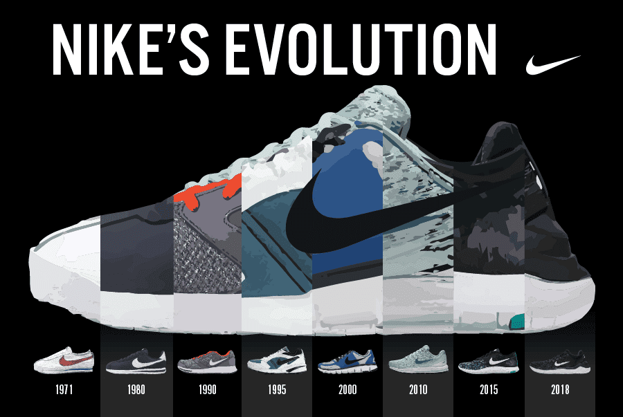
Example 1. Nike — they used infographics to show the brand's “Evolution”.
For fans of this sports brand, the company sometimes creates such infographics that show different segments of the brand’s evolution.
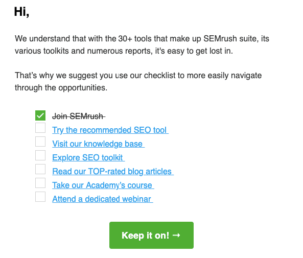
Example 2. SemRush — they used infographics as a psychology trick.
Seeing these boxes with just one box checked makes you think that you are halfway there. Only a few steps to go before you reach the top in SEO.
Example 3. Samsung — they used infographics to better introduce their new product.
Advertising a new phone model, Samsung embeds infographic in an email that shows all the benefits of the new gadget.
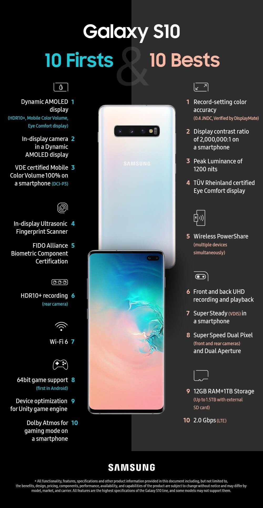
It should be noted that this is a very smart approach considering that every year the gadgets have more and more functions and it becomes more difficult to show it in the form of plain text.
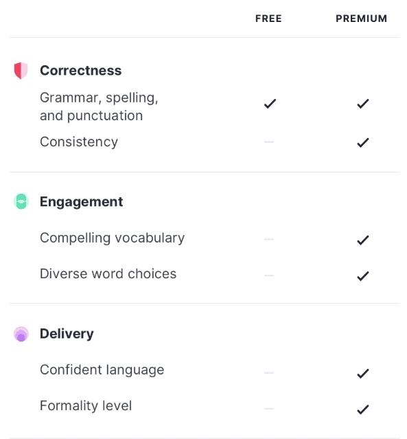
Example 4. Grammarly — they used infographics to show the pros of their product.
We have already given an example of Grammarly using infographics in emails in this blogpost. However, many of their emails deserve attention, since this is their most powerful way of communicating with customers.
Example 5. McDonald’s — they used infographics to boast about the achievements they are proud of.

Love the simplicity yet the beauty of this email. It's not overloaded with images, still, it's not boring and does not contain long reads.
Final thoughts
Now that you are aware of the importance of infographics in emails, you can start building it right away. You can do it on your own, even if you do not have a design team. Consider your audience, choose the tool that you like best, set aside time, and create infographics that will be remembered by readers.
Now that you've created your infographics, we should proceed to building the email. Here, too, you can easily cope on your own if the right tool is at hand. Using infographics in emails that you build with Stripo, you’ll increase your brand awareness!





0 comments