Email marketing is a powerful tool that allows businesses to communicate with their audience directly through email. It has become an essential strategy for promoting products, services, and events, as well as strengthening customer relationships and driving conversions.
Did you know that colors increase brand awareness by 80%? In email marketing, the colors you choose for your messages are more than just design elements — they're powerful brand communicators.
This article explores why aligning your email colors with your brand is essential for establishing consistency, recognition, and trust with your subscribers.
Understanding color psychology
Different colors evoke specific feelings and associations, and harnessing this knowledge can significantly impact email engagement.
When designing email campaigns, marketers must consider the psychological impact of color choices. Warm colors like red, orange, and yellow can create a sense of urgency or excitement, ideal for promoting limited-time offers or sales.

(Source: MarketSplash)
On the other hand, cool colors such as blue, green, and purple can evoke a sense of calm and trust, making them suitable for building brand loyalty or sharing informative content.
Bright colors grab attention and create a sense of energy, making them effective at highlighting calls to action or important information.
Complementary colors, which are opposite each other on the color wheel, like blue and orange, can create visual contrast and enhance the overall email design.
Examples of color psychology
In this exploration of color psychology, we will delve into a range of examples that illustrate the profound impact colors have on our lives.
1. Red signifies excitement, energy, power, fearlessness, and passion. In sales, it's used in call-to-action buttons to prompt urgency and conversions. Red also stimulates hunger.
Yet, it has a dark side, representing anger, danger, and aggression. In branding, it works when contextually appropriate. With its iconic red, Coca-Cola encourages consumption and aligns with an exciting brand image, reflected in the motto "Real Magic.”
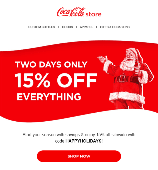
(Source: Email from Coca-Cola)
2. Yellow embodies youthfulness and happiness, associated with smiley faces, sunflowers, and joy. Brands use it to convey optimism, creativity, extroversion, and warmth. However, yellow can also evoke fear and anxiety, as seen in police tape and traffic signs.
McDonald’s leverages yellow in its golden arches, creating a positive, youthful association. The combination of appetite-inducing red and yellow smiley faces on Happy Meals reinforces its kid-friendly reputation.

(Source: Email from McDonald’s)
3. Blue is the world's favorite color, preferred by 57% of men and 35% of women. It's also the top logo choice, with 33% of leading brands using it. The color evokes feelings of security, strength, wisdom, and trust.
Social media platforms like Facebook and Twitter choose blue to project dependability, which is crucial for businesses handling user data. However, blue has drawbacks — it suppresses appetite and may convey coldness.

(Source: ReallyGoodEmails)
4. Green symbolizes life, evoking feelings of relaxation, health, prosperity, hope, and freshness. However, due to its primitive associations, it can also convey boredom and blandness. Whole Foods strategically uses green to align with its mission of offering fresh, high-quality products, positioning itself as "America’s healthiest grocery store."
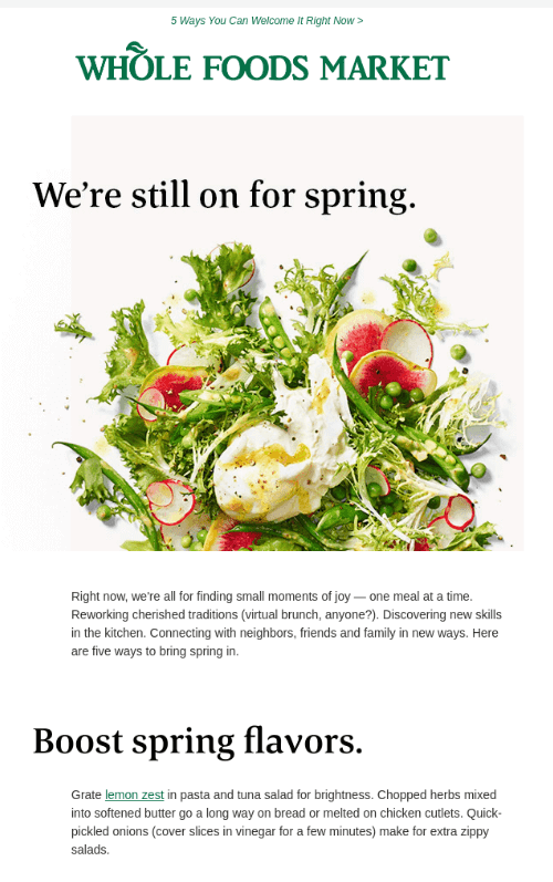
(Source: ReallyGoodEmails)
5. Black is a staple color on websites, emails, and logos, conveying sophistication, power, and elegance. Luxury brands like Chanel and high-tech companies use black for a sleek look.
However, black can also symbolize oppression, coldness, and even evil. Black is rare in the health industry, where it has negative connotations and resembles death and mourning. Nike effectively uses black in its advertising and its swoosh logo to reinforce a power-focused brand aligned with its message of empowering athletes and helping customers grow stronger.
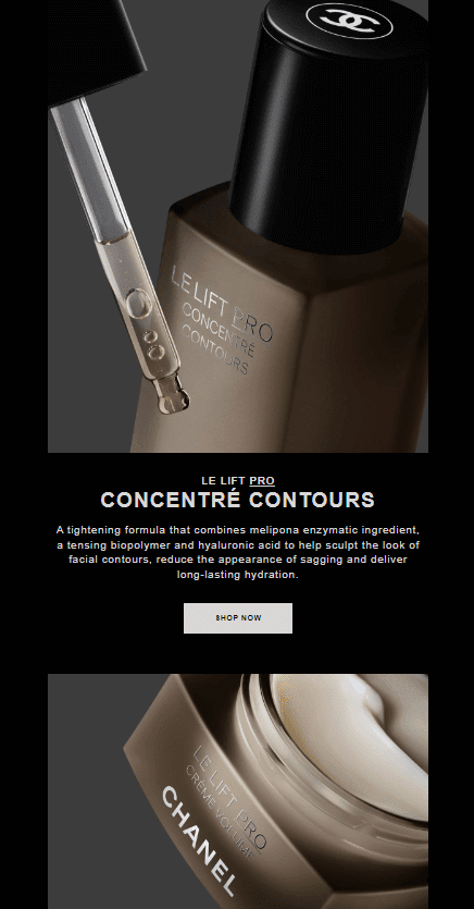
(Source: Email from Chanel)
6. Purple symbolizes royalty and superiority, worn by high-ranking Roman officials and even banned by Queen Elizabeth I for non-royals. This history creates an aura of wisdom, wealth, and sophistication.
Brands use purple to signal superior service or products, but it can also convey decadence and moodiness, so balance is crucial. Hallmark employs purple to connect with its predominantly female audience and highlight its unique movie offerings, standing out in a market with few purple brands.
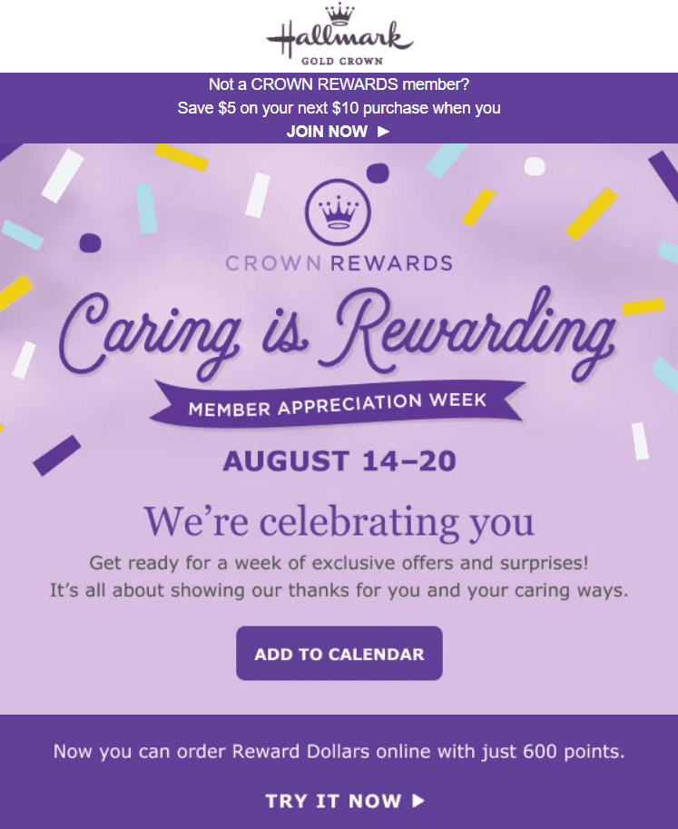
(Source: Milled)
7. White is ideal for a clean, simplistic vibe, evoking a modern, pure, innocent, and pristine look. However, it can feel sterile, making a brand seem plain without colors. Context matters, and innovative brands like Apple and Tesla use white effectively.
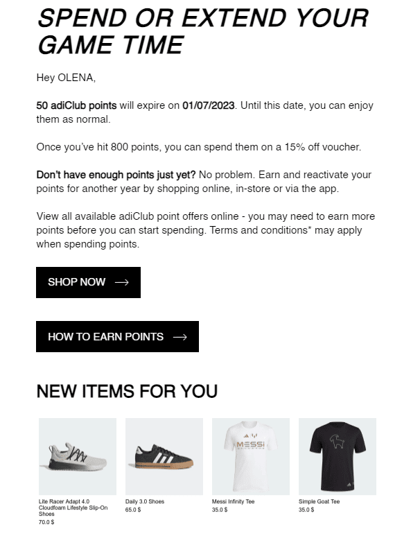
Similarly, Adidas utilizes white to tap into a simplistic, universal appeal, targeting a less athletic customer base than Nike. The choice between black and white depends on the brand's messaging and target audience.
(Source: Email from Adidas)
Statistics and insights on color usage in email marketing
When it comes to color usage in email marketing, statistics reveal some interesting insights. Data shows that the most commonly used colors in email campaigns are blue, red, and green.
Color and brand recognition
One of the most profound impacts of color on consumer behavior is its role in brand recognition. Studies have shown that color alone can increase brand recognition by up to 80%.
Consider iconic examples like the red and white of Coca-Cola, the blue of Facebook, or the cheerful yellow of McDonald's. These colors have become inseparable from their respective brands, leaving an indelible mark on our collective consciousness.
Color and purchasing decisions
Color doesn't just stop at recognition and significantly influences consumers' purchasing decisions. Research indicates that up to 90% of snap judgments about products can be based on color alone.
However, the impact of color on purchasing decisions can be nuanced, influenced by the type of product and an individual's preferences, cultural background, and past experiences.
Color and perceived quality
A product's color can shape consumers' perceptions of its quality. For instance, products in black or darker colors are often perceived as higher quality, while lighter-colored products may be seen as more budget-friendly alternatives.
Colors play a significant role in influencing shoppers' emotions, with feelings weighing 1 1/2 times more than any other factor in decision-making. Emotional responses are highly coveted in retail, especially considering that 35-49% of purchases are impulse buys, varying by age group.
of purchases are impulse buys
The psychology of color is crucial in marketing, as specific hues can evoke emotions that shape thoughts and feelings. Each color in the color spectrum has the potential to evoke different emotions.
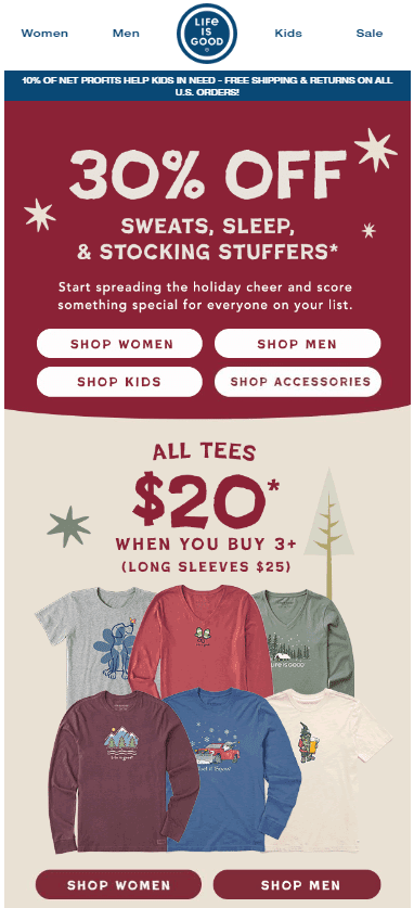
Studies show that red increases heart rates, signaling an adrenaline rush associated with danger. It represents intense emotions, particularly love, making it robust for encouraging impulse buys.
(Source: Email from Life is Good)
Used in clearance sales for its ability to create a sense of urgency, 59% of the world's largest retailers incorporate red into their branding.
of retailers use red in their branding
Color and emotional response
Colors are emotional triggers that evoke many feelings. These emotional responses, in turn, can influence consumer behavior.
For instance, red can create a sense of urgency and compelling impulse purchases, while blue can instill trust and loyalty, encouraging long-term relationships with brands.

(Source: Email from The Folio Society)
Color and conversion rates
Online businesses have recognized the power of color in influencing conversion rates. Simple changes, like altering the color of a call-to-action button on a website, can lead to significant impacts.
An illustrative example involves a company that switched its call-to-action button from green to red, resulting in a remarkable 21% increase in conversions.
3 examples of the color psychology importance
From the iconic branding of global corporations to the transformation of living spaces and the enhancement of user experiences, these real-life examples showcase the art and science of choosing the right hues.
1. Airbnb
Airbnb incorporates a warm color scheme of bright orange and gray, which aligns with their brand identity and evokes a sense of excitement and adventure.
Using warm colors can effectively capture the attention and interest of recipients, which could lead to higher engagement and conversions.

(Source: ReallyGoodEmails)
In areas with a high concentration of Airbnb listings, the company's branding efforts have been linked to an 8-10% decrease in hotel revenues, underscoring the effectiveness of their visual identity in attracting guests. This success is a testament to the power of color in branding.
Airbnb's thoughtful use of hues enhances its seasonal marketing campaigns and resonates deeply with customers, fostering a sense of belonging and warmth, particularly during special occasions and holidays.
Airbnb may incorporate seasonal colors and themes into its marketing campaigns and website design for special occasions or holidays.

(Source: ReallyGoodEmails)
2. Nike
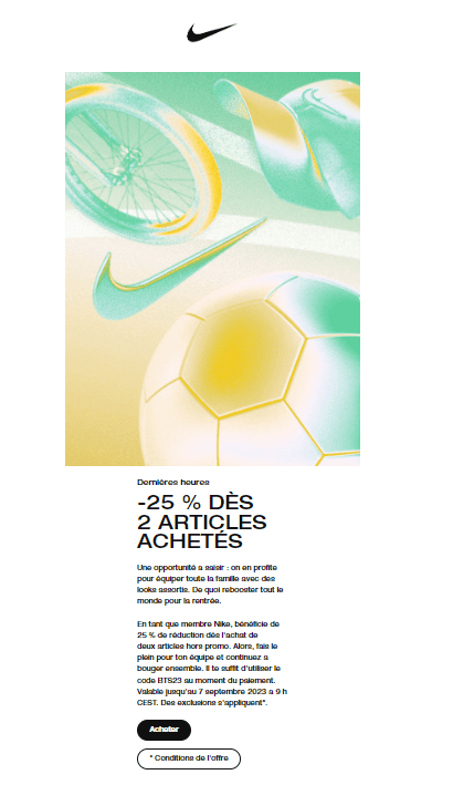
Nike's email marketing strategy includes using bold and vibrant colors, such as red and black, to convey a sense of power and energy.
These colors reflect the brand identity and create a sense of urgency and motivation among the recipients.
Insights from industry experts back the effectiveness of this strategy. According to an article in The New York Times, "The Secret Psychology of Sneaker Colors," color can significantly impact a consumer's subconscious judgment of a product, with between 70 to 90 percent of that judgment made within just a few seconds based solely on color.
For instance, Nike's choice of the neon lime Volt color was calculated based on its visibility and the emotional response it elicits. This color has become a signature for Nike, instantly recognizable and associated with the brand's innovative spirit.
(Source: Email from Nike)
The key takeaway is that eye-catching colors that align with the brand image can significantly impact the audience's response and drive desired actions.
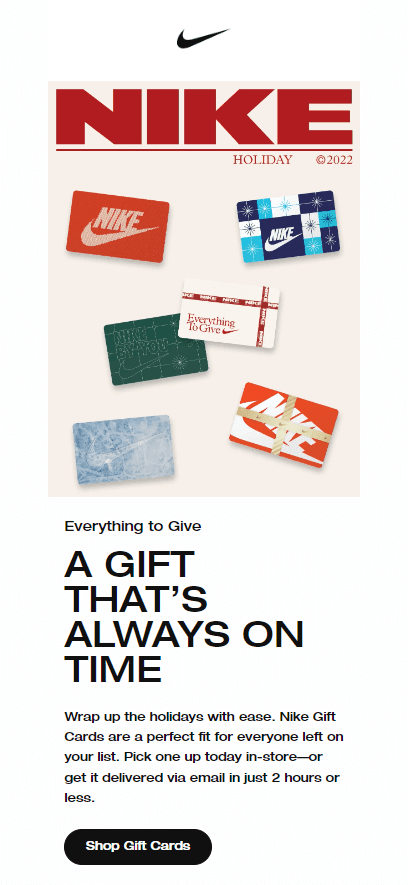
Nike often releases unique edition sneakers and clothing lines incorporating seasonal colors to align with various sports seasons or events.
For example, during the holiday season, Nike might release limited-edition sneakers in festive colors like red and green or designs inspired by holiday themes.
(Source: Milled)
3. Starbucks
Starbucks has successfully used warm and cool colors in its email marketing campaigns.
They often incorporate shades of green and brown, symbolizing nature and warmth. These colors create a sense of reliability and comfort, making the recipients feel more connected to the brand.
This approach has led to increased customer loyalty and engagement. The lesson learned from Starbucks is that combining complementary colors can effectively convey the desired mood and message to the audience, resulting in a positive response and brand affinity.
Starbucks introduced its annual "Red Cups" campaign during the holiday season. The red cups, featuring various holiday designs and symbols, have become a seasonal tradition that signals the start of the festive period.

(Source: ReallyGoodEmails)
According to Statista, brand awareness of Starbucks among restaurant chain customers is at a staggering 92% in the U.S. This high level of recognition is a testament to the effectiveness of the Starbucks logo and branding strategy in creating a strong and widely recognized visual identity.
7 color psychology mistakes to avoid
Recognize the errors that often arise when applying the principles of color psychology to ensure that our choices align with our intentions and the message we wish to convey.
Some common mistakes to avoid include:
1. Using too many bright colors: While bright colors can be attention-grabbing, too many can overwhelm recipients and make your email appear messy and unprofessional. Stick to a few key colors that align with your brand and message.
2. Ignoring cultural and industry standards: Different cultures have unique associations with colors, so it's essential to consider your target audience when selecting colors. Additionally, specific industries may have standard color palettes that consumers recognize and expect.
3. Lack of contrast: Poor contrast between the text and background can make your email harder to read, leading recipients to delete or unsubscribe from your list. Ensure enough contrast between text and background colors, and avoid using light-colored text on a light-colored background.
4. Misinterpreting color meanings: Colors have different psychological associations, so choosing colors that align with your desired message is crucial. When choosing colors for email marketing, overlooking color harmony and accessibility can diminish your campaign's impact.
Consider these key points:
- color blindness oversight: Neglecting a significant portion of the population with color vision deficiencies is a mistake you should avoid. Ensure your content is understandable without relying solely on color. Use patterns, labels, or contrasting shades for inclusivity;
- low contrast choices: Low-contrast color combinations hinder readability. Opt for high-contrast combinations, improving readability for everyone, including those with color vision deficiencies;
- exclusive color reliance: Include additional cues like icons or text labels to make your content universally interpretable.
3 practical tips for applying color psychology
Here are some practical tips to help you apply color strategically in your email campaigns:
1. Select the right colors for your brand and audience
Consider your brand values and target audience when choosing colors. Research color associations and their impact on emotions and behavior. For example, blue may convey trust and security, while green symbolizes hopefulness and optimism. Find colors that align with your brand personality and resonate with your audience.
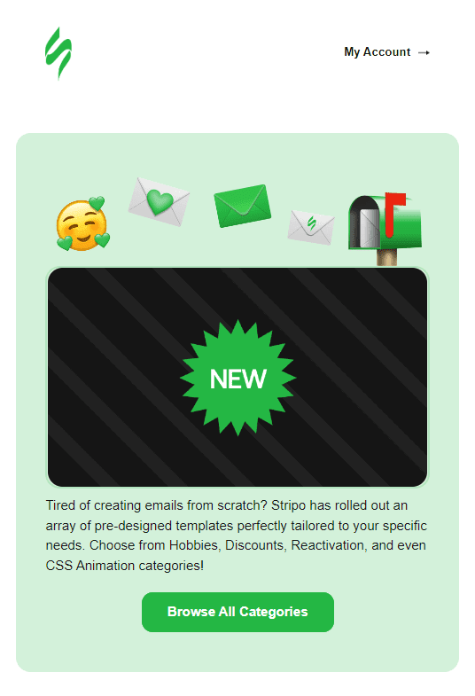
(Source: Email from Stripo)
2. Use color strategically
It’s crucial to use color strategically in different email elements to guide your recipients' attention to specific elements. Choose colors for headers and banners and create a solid first impression. Use contrasting colors for text and background to enhance readability. Make call-to-action buttons prominent with bold, attention-grabbing colors.
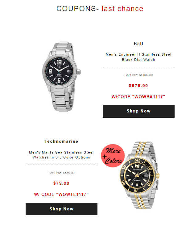
(Source: Email from World of Watches)
3. A/B test and continuously optimize color choices
Experiment with color combinations to determine the best response. Conduct A/B tests to compare the performance of different color variations. Monitor open, click-through, and conversion rates to determine which colors resonate with your audience. Continuously optimize your color choices based on these insights.
Remember, color psychology is not a one-size-fits-all approach. Cultural factors, industry standards, and individual preferences may influence the impact of colors. Stay tuned to your audience's feedback and adjust your color choices accordingly.
The impact of cultural and demographic factors
Different cultures have unique associations and meanings attached to specific colors, which can affect how they respond to email marketing campaigns. When segmenting email campaigns based on cultural and demographic factors, it is essential to research and understand the color preferences of different groups.
For example, in the United States, blue is often associated with trust and security. However, in some Asian cultures, blue may symbolize mourning or sadness.
The color white also carries positive connotations of purity and goodness for many Americans. However, in certain Asian countries like China, Korea, and Japan, white symbolizes misfortune, loss, or mourning. It is commonly worn at funerals in Eastern cultures, contrasting with its representation of light and purity in Western society, particularly in North America.
In a general sense, purple is often associated with wealth and luxury. However, exceptions exist, such as in Italy and Brazil, where purple signifies grief. Also, in Japan, purple is not the first choice of color for mass markets either.
Demographics such as age and gender also impact color preferences. For instance, younger audiences may be more drawn to vibrant and bold colors, while older audiences may prefer more muted and traditional colors.
Gender can also influence color preferences, with studies showing that women tend to be more attracted to warm colors, while men lean towards cooler hues.
Wrapping up
Color psychology plays a crucial role in email marketing campaigns. Understanding the impact of color on individuals and various demographics can significantly enhance engagement and response rates.
With color psychology integrated into email marketing strategies, businesses can communicate messages more effectively and grab attention amid the clutter of inboxes. The power of color can enhance brand perception, increase engagement rates, and drive conversions in the highly competitive digital marketing space.





0 comments