We Choose Media Queries. The Stripo Manifesto


This document is our manifesto on the layout method chosen by Stripo. We gave the reasons for using this layout method, and our vision of this industry development, as well.
Story of the problem
This is about the adaptability of emails on mobile devices. In the email development industry, there are two methods: one of them is connected with using CSS Media Queries, let’s call it “Adaptive”, and the second one is — without using Media Queries, which is named “Fluid-hybrid”.
The problem is there still are mobile email clients which do not support email Adaptive layout. That is why in 2015 Nicole Merlin suggested the Fluid-hybrid method which allows imitating adaptability in email clients which do not support Media Queries. Yet, this method is not universal.
The Stripo Manifesto
When making strategy regarding the editor creation, we surveyed and tested both layout methods on different kinds of emails. Judging by the received results and world-tendency of product development, we consciously chose the Adaptive method with Media Queries.
The truth is that in the development industry there were no clear standards, and due to this fact developers were allowed to interpret code the way they liked. Even the email giant like Google had not supported Media Queries in its Gmail App until recently.
In November 2016, Google in its application started supporting a wide range of styles, including Media queries!
In other words, the tendency is that very soon the problem will be solved on its own, and there will be no need the alt Fluid-hybrid method.
Currently – in the middle of 2018 – adaptability is not supported by:
- Gmail app IMAP Android
Emails are displayed the way as on desktops – the web-version is downloaded.

- Yandex.Mail
We assume that Yandex will follow Google’s example soon. Currently, web-version is downloaded.
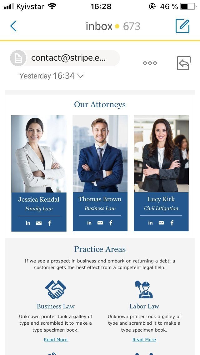
- Gmail Mobile Webmail
We think that using a smartphone email client is a rare and weird case.
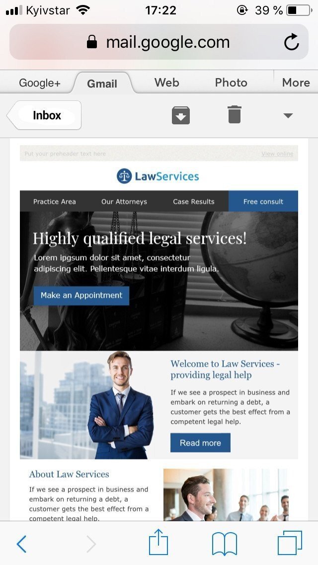
- Old Android 5.1 and 6.0 Vanilla
There is a mechanism in these versions of the application that imitates adaptability. This means that emails will look adaptive, yet with some problematic issues.
For instance, in our Adaptive layout method, the third or the fourth (the last) block in structure will be always right-aligned. In the Fluid-hybrid method, these blocks will be all one-line-aligned, but even this fact did not convince us to use this method.
As there is one coming problem for both layout methods – content will never be full-screen-width. The more containers there are in the structure, the narrower they will be. And this means there will be “space” that cannot be filled in.
In the end, we can see short illegible text lines, small images, and buttons which are difficult to click on. Unfortunately, we have not managed to fix it.
All the mentioned above issues connected with the Adaptive layout method do not seem crucial to us – in any way, the emails look great, legible and bring the main idea to the readers.
|
 |
|
It appears that Fluid-hybrid method has the disadvantages that are equally crucial for us, but in addition to everything, they cannot be fixed eventually. Here are some of them:
- In order to set the margins within containers, Margin-left and Margin-right styles are applied. They work properly in general on most email clients. They do not impact the containers’ adaptability nor the way they are displayed if the containers’ width is less than the device screen width;
In case it is wider, we see the following effect: margin indents are added out of containers and are not considered in general width calculations, like Paddings.

- If there is only text in containers, then in Outlook which is used by 7% mostly corporate clients, arises a problem with the containers sizes. The issue is that block table cannot be adjusted to 100% width, and the text itself cannot widen the table to the given size like an image does. This is the reason why the indents between containers can be less than given ones;
This problem could be solved by setting a fixed width for the block table, but then another issue arises for some email clients – email loses its adaptability. Hybrid-method requires fixed dimensions for the block table.
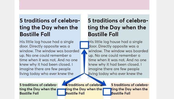
- Due to the font-size: O, which is added to <div> in containers, in order to get rid of empty spaces between the sells, it is required to duplicate text styles into the parent element. For example, into a sell of the Text block in a table. Otherwise, text in Lotus Notus will be maximally small. (Scale 1:1);

This could be fixed automatically, by setting CSS styles for the text in all blocks. But if a user manually makes changes to text in one block, for instance, this change will not work for Lotus Notes.
- The fluid-hybrid method requires the use of equal indents around all containers in order to be vertically aligned on a mobile version. This means that on desktop versions there can be double indents.
For simple emails, this may be not critical, but for structures with a big number of containers and various indents, this becomes a real problem.
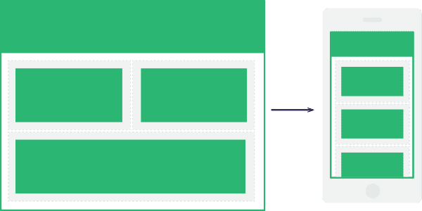
The issues with the Adaptive layout method will be solved on their own with eventual email clients updates. Yet, we will have to accept the fact that issues with the Hybrid-fluid layout method will always remain. We look far in the future and bet on Media Queries.
Of course, if you need to create one or two simple messages, you can use the Fluid-hybrid method. But when it comes to the strategic growth of our editor which is built for years, we choose the Media Queries method.
If you have ideas, constructive criticism or ways to solve the mentioned above issues, share this information with us on Facebook or email us at contact@stripo.email – we will be happy to take it into consideration. We are open to discussion.



0 comments